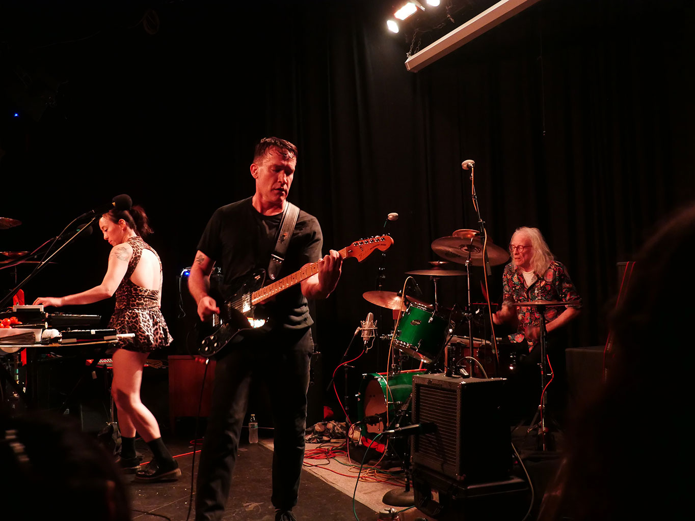
Sarah Winchester is a multi-talented gal. After graduating from MassArt in Boston, Winchester has embraced a life rich with art and music. On the art side, Winchester paints, draws, and makes linocuts, while satisfying her musical side through A Weather and her personal project; Team Love put out her digital EP, The Northeast Kingdom Demos, which is available as a free download through the Team Love Library.
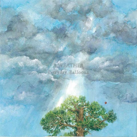
Read on, as Winchester discusses the approach she took towards crafting the artwork for A Weather’s Everyday Balloons, and find out why the band’s sparse musical grooves are fitting for such an airy cover.
Listen to “Spiders, Snakes” – DOWNLOAD MP3
How did you become involved in designing the album cover?
I am the co-vocalist and drummer for A Weather, so I am invested in every aspect of the band. At the beginning, I designed and made fliers for our shows. That led to the cover for our seven inch, The Feather Test. So, like many indie bands, I ended up as the official A Weather artist out of necessity, but also because my artwork fits our music pretty well. I really enjoy the process of developing our aesthetic. The Cove cover brought with it the need for a poster, a sticker, and a t-shirt, and they all grew from each other. The Everyday Balloons art is my attempt to expand on our foundation.
What restrictions, if any, were you given?
No restrictions really; Team Love is incredibly trusting and supportive. And so is the rest of the band. I did decide that all the text would be hand-written, which I knew I would learn to regret. And I did in a way; [it was] very tedious, [but] hopefully worthwhile. I am a hand-drawn kind of person; I don’t know how to make graphic text look the way I want it to, so that was my solution.
What medium / processes were involved in the creation?
From the initial sketches for the EB art, I knew I wanted to incorporate illuminated letters into the liner notes, and that each illumination would be based on its accompanying song. I was also pretty attached to using watercolor. But the cover design process and concept were a little harder. I am very new to watercolor as a medium, and I often unintentionally use them like I am painting with oils, which you can see on the front cover. There are some watercolor-y moments too, I think. I just learned as I went, and made A LOT of mistakes on that cover. There was a lot of crying, and many fuck-ups, and several times I thought I was going to have to throw the whole thing out and start over. Luckily, I managed to rescue it from the brink.
I work from a combination of life drawing, imagination, books, and photos. I use a lot of my own snapshots of animals and places – Vermont mountains, Oregon trees, family pets, etc; – as references. I also checked out a lot of big, coffee table books about wildlife and nature from the library. Some were the kind that measure three feet across and weigh about twenty pounds. Those were awesome.
What was the concept behind it?
It went through a lot of stages, and Aaron (Gerber; guitarist [and] co-vocalist) and I had some conversations about key components — like, would including a balloon on the cover be way too literal? Eventually it seemed like I could make it work and I think it does. I wanted an emotional, subtle, little balloon.
I always try to think of the music of course. Using a lot of negative space that became sort of a focal point, in that it really is a painting of a sky; that was deliberate and somehow reminded me of the songs. In general, the cover came from a combination of A Weather’s connection to the East Coast/New England and to Oregon — both [to] the landscapes and emotional qualities of those places.


