Last year, the Seattle Art Museum (SAM) unveiled their Olympic Sculpture Park, a… sculpture park… located near the water, next to the Spaghetti Factory. Conveniently enough, I work right next to the sculpture park and can check it out regularly.
But I don’t.
Because it sucks.
SAM managed to really pull a flopper on this one. They had in their hands a really amazing idea that turned out to be just hype met with crappy delivery. They could have given the park a well-rounded feel, representing many types of sculpture and styles of sculpture… yet, they chose to make every sculpture of the “contemporary” art variety, making the Sculpture Park a bit tiresome at BEST. I mean, how cool would it have been to have a traditional sculpture piece ala “The David” sitting in the middle of Seattle? It would have been fucking awesome. But SAM failed to have the foresight to represent sculpture in a diverse manner.
Maybe they know they have a real stinker on their hands, though, because they’ve been introducing some ways to remedy this stifling abomination of a Sculpture Park. (Okay, fine, it’s not THAT bad simply because the metal tree is AWESOME, but it is, as a whole, pretty bad when put next to the idea of what it COULD have been.)
For starters, SAM is inviting a new artist every year to create a site-specific project in the PACCAR Pavilion, which is a teeny-tiny building located on the corner of Western and Broad. There’s a cute little cafe inside and cheap all-day parking in the parking lot directly underneath.
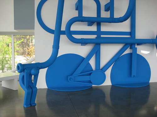
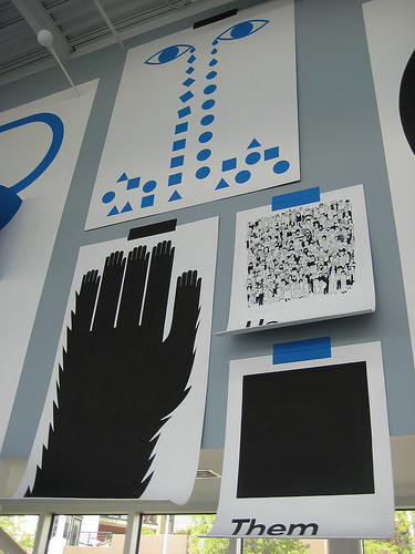
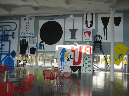
This year they invited Los Angeles-based artist Geoff McFetridge to put up an installation that involves giant chairs, giant poster tape, giant thumb tacks, and giant all sorts of regular everyday objects. There are wooden slabs, curved at the corners and painted white — made to look like giant sheets of falling paper. The whole installation is painted extremely basic colors like blue, red, and yellow, and one can’t help but think that the installation is inspired by childhood. A multimedia element is introduced to the mix as well, and visitors are invited to put on headphones and view matching videos which are quite strange (clips soon to come).
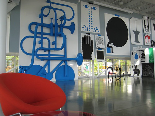
It’s funny, though, because although this installation is cool as fuck, the SAM fails again. In their press release, they hype up the fact that McFetridge is an accomplished graphic designer and has worked for brands like Burton, ESPN, and Stussy, but fail to hype up the nature of the installation. The release has one sentence describing the installation itself, and that was, “He treats the giant wall in the pavilion as an over-sized bulletin board, complete with out-of-scale thumbtacks.”
That one sensible, visual-conjuring sentence is followed by mumbo-jumbo like, “The motifs and posters he has developed for the space echo the concerns of many of the sculptures in the park, such as the relationship between man-made and natural forms, the interplay between two- and three-dimensional space, visual conundrums, and the arbitrariness of boundaries between different cultural practices.”
If you’re reading that last sentence, I think you probably see what I see, which was something like, “blahablhahahshahasdpretentionansdbalahablahbalahtrashablahcanbesaidaboutanyinstallationpieceontheplanet.”
This vague message and bio are echoed in the placard in the Paccard Pavilion. Dammit, SAM, no one wants to hear that this guy is a corporate sellout again and again and again. People want to hear what inspired the piece and what it means. I’d say Alice In Wonderland played a role, as did childhood. If those things did, fucking awesome.
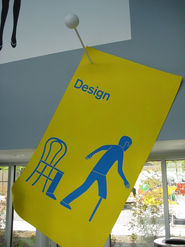


Hello, Geoff McFetridge here. Thanks for the write up. The piece was inspired by a lot of what I was seeing as a child and the sort of language we use to talk to kids, but we are really talking about ourselves. I would not give the SAM too much grief about the press release as so much of the installation happend without them really seeing anything. They were doing their best. But, public space needs to be shared and criticized, which is part of the anxiety of creating the installation for me. I really wanted to created something that contributed to the city. I wanted to make a piece that would sort of invade the heads of kids, nannys, businessmen, and condodwellers. I also wanted the people in the cafe not to be sick of it after a year. We will see.
[…] FSP is not an elitist sculpture park where only one kind of style is acceptable (like, *cough* the Olympic Sculpture Park in Seattle), which allows for a diverse and unique […]
[…] If you’re wondering what the current / last installation by Geoff McFetridge looked like, click here. […]