While the decommissioning of NASA’s space program seems to be an outward indicator of a global lack of interest in the great beyond, one can always look to the arts to realize that the human fascination in space and sci-fi are as strong as they’ve ever been, if not stronger. This is perhaps most obvious in film: Star Wars and Star Trek are constantly enjoying modern revisions; Gravity recently portrayed space in remarkable new ways; 2001: Space Odyssey is still eternally being cited as influential; the list goes on.
In the music world, space’s ability to stir the imagination manifests in less obvious ways. Lyrics and band names may pay homage to the stars above, but it is often the wordless feeling between dramatic instrumental music and the final frontier that leads to the most recognizable connection.
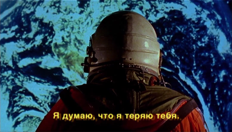
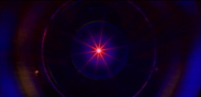
A recent collaboration between New York’s Infinity Shred and director Dean Marcial of the Brooklyn studio Calavera builds off of their mutual interest in the work of Carl Sagan and space, in general. Marcial’s 2010 short film, Darkmatter, comprises the grainy first portion of the video and provides its foundation. As the narrative continues, the film’s astronauts pass through multiple dimensions, and Marcial uses increasing fidelity and morphing aspect ratios to subtly drive this concept home.
The effect of pairing instrumental spaciness with literal images of spaces brings the entire audio-visual experience up to new heights. As the release of films like Gravity lead the world to question whether a film might save NASA, you have to wonder what our fascination will lead us to; for media, that aggregate of collective imaginations, seems to prove that we will never fail to be stirred by space’s mysteries.
In this dual interview between Infinity Shred’s synth master Damon Hardjowirogo and director Dean Marcial, the two sound off on the process behind this music video, the overarching themes, and the scale of it all.
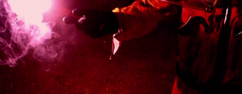
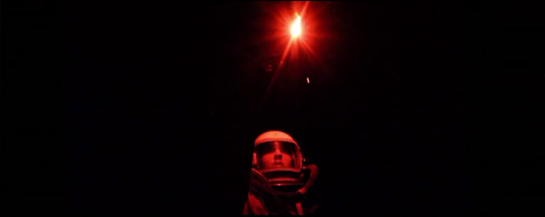
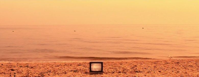
Infinity Shred – “Mapper” Music Video
How did the collaboration between musician and director first come to form, and how much of an exchange of ideas was there?
I knew Damon through our mutual friend and awesome production designer Esther Kim. We’d known each other for a couple of years and she suggested that we work together, as we were both into space and extradimensional things.The band gave me a lot of support all throughout pre-production and post, from the initial concept to planning out the shots; we even sat down to edit together when I was hitting walls. I think because of this closeness between the musicians and myself, we were able to create a piece where the music melded into the images and vice versa.
Fun fact: I met Esther on Xanga
What are the themes and concepts driving this video? Was it inspired at all by Ray Bradbury’s “Kaleidoscope”, and if so, how?
I actually tried to adapt Kaleidoscope into a short film and had called the publisher for the rights after writing the script, but they told me Warner Bros. had an option on it, and it would cost me a bazillion dollars anyway. So I did the next best thing and changed the names, cut it down to two characters, threw in a bit about a dark matter cluster, and hoped that the studio and/or the publisher wouldn’t sue me.My original thematic pitch for this video was, “What if 2001 was made by a Russian B-movie crew and beat Kubrick to the punch by a couple of years?”. We wanted to explore those large-canvas themes of being stuck and unstuck in space and time in a different, decidedly lo-fi way.
The first half comes from “Darkmatter”, a 2010 short film. How was it decided that this music video would be an extension of that? Are there particular qualities or themes shared between the song and the short film(s) that made this particularly attractive, as opposed to starting over completely?
I am an editor by trade, and “Darkmatter” was my junior thesis film at my university. I always really liked the film but I never really did anything with it, so in meeting with the band and not having a lot of money, I offered up re-cutting the movie, preserving some of the really good bits of dialogue, and doing it in time with the song. It wasn’t starting over as much as it was digging deeper, and it became more and more apparent to me that this collaboration was the intended final product.What I find incredible about their music is that it captured so many things in notes that I was trying so hard to pursue through images and dialogue. It’s at once haunting and reassuring, it transports you to those rare heights of thought that gets your head wrapped up around the significance of being stardust.
Can you tell me a little bit about the Russian typography used throughout this film, primarily in the graphical intro credits and chapter headings? They’re totally amazing.
All of those titles were designed by our good friend Erik Carter, who is an incredible and extremely talented graphic designer. He also designed the rear-projection backgrounds you see in the film as well as the special effects.The main inspiration for them were the trailer titles for a movie called Battle Beyond the Sun, which was originally a heady Soviet science-fiction film about astronauts who travel to Mars that was acquired by Roger Corman in the late 1960s, heavily re-cut, dubbed, and partially re-shot to make a fairly incoherent but aesthetically beautiful action B-movie by none other than a very young Francis Ford Coppola.
Though we’ve received a few complaints about the titles and subtitles not being completely accurate, I actually feel like this is fulfilling some sort of revenge fantasy for the Russians, taking an American sci-fi action film, and re-editing and subtitling different dialogue to make it more like one of those depressing Russian space movies about existentialism.
I am assuming that the new portion of the footage kicks in at about halfway as the music reaches particular heights; is this correct? It also seems to have less grain, more fidelity, and more graphical elements. Was there a debate over the video quality between the old and the new? Was the reason for the shift technical or philosophical?
Originally we were going to try to match the video quality, but in the end, we both found it best to have the footage look better and better as the film goes along. That’s actually where the idea of changing aspect ratios comes from — starting out in 1.33 pillarboxed, then moving onto 1.66, 1.78, 1.85, and eventually 2.35 and winding up at 2.55, which is wider than Cinemascope. We never quite got it to Hype Williams/Ben-Hur’s 3:1, but that might’ve been going overboard anyway.
Conceptually we all also became attached to the idea of the fidelity of the video increasing steadily throughout the piece.
What is your favorite fact, piece of media, or idea related to space?
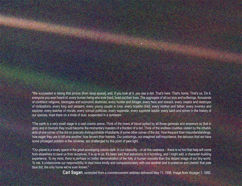
I always really loved Carl Sagan‘s idea of the pale blue dot, and the story behind it. When the Voyager One was reaching the edge of our solar system, Sagan had convinced NASA to take one last picture of Earth before it powered down for its long journey into the abyss, not for any scientific purpose, [but] just to get a sense of perspective about our place in the cosmos. It’s something that really stayed with me, and I go back to that idea when I need some much needed perspective. A lot of drama and anxiety seems very petty when you put it that way.
Space has fascinated me since I was very young. The best I can commit to any one thing about space being my favorite would be that it represents the unknown and our natural human desire to explore and make sense of the universe.
Ω


