“I can’t think of a director who has done more with film as a medium,” says Van Loon of Tarkovsky. “I was dealing with the assignment of dense conceptual material during the painting process. I found it easier to speculate on the latent aspects of both films; the psychological confrontations posed by the pace, sound, and color.”
Though Van Loon readily admits that both films felt initially inaccessible to him, the Q&A below will show how repeat viewings led to the gelling of his artistic style with philosophical and psychological interpretations of Tarkovsky’s themes.


(TOP) The Moguls (Stalker) Diptych 24″x40″; (BOTTOM) The Moguls (Stalker) Detail – Watercolor, graphite
View entire Stalker Series On Jacob Van Loon’s Website
The Moguls (Stalker) & Let Alone A Planet (Solaris)
Did you watch the films while creating these pieces?
I had to step back from both films, sort of like stepping back from a large painting after inspecting the surface detail. I came back to both films when I initially received the commission from Mitch/Mondo, but after watching them again, I put them away before I began painting. It took some time for my thoughts to congeal before I was ready to begin translating them onto the panels. It was also to attempt to let my mind naturally recall the colors and forms I recognized in both films, instead of referencing them directly from screencaps. Tarkovsky felt strongly about the use of color in film, and I felt like a direct replication of his choices would be contrived.
On a more technical level, these pieces seem to differ from your other series. What is it about those films that led to the creation of this new style of work?
I’m a new painter, and still in the process of building a technique that coincides with a concept. The fact that The Moguls (Stalker) and Let Alone A Planet (Solaris) have a basis of specificity is where they differ from the rest of my work. I had not previously painted under the direct influence of a single film or artist. I have yet to conclude if it’s coincidental, but my work in the Arbor series (Editor’s Note: see below) is heavily influenced by the Russian Futurists and Constructivists from the earlier 1900s. That basis for aesthetic felt very natural when applied to the work of Tarkovsky.

(LEFT) Nate, 2011; (RIGHT) Anais, 2011 – Watercolor, digital media
View entire Arbor Series On Jacob Van Loon’s Website
Can you tell a little bit more about your technical process with these paintings? They look as though they may have taken many steps over a course of time.
Layering and obliteration is a functional component of the concept in this set. It’s important that some of each step in the process shows through in the final composition, but it tends not to be delineated. I don’t build up volume from a center point and move outwards; the distribution of progress is staggered and dynamic. In these paintings, there’s several layers of graphite between coats of primer, and the markmaking muddies the white of the primer. I also let the primer gum up a little bit in the open air, and run a dry brush through each layer to give the surface volume. Even before [any] pigment is down, light [hits] the surface of that panel in an active way, over a whitewashed, sanded panel. Building color is something I still experiment with in each new painting.
As you mentioned, your color choices are somewhat representative of those used in Tarkovsky’s films. What are they psychologies in Stalker and Solaris that you were most interested in capturing?
Both films center around protagonists who are fundamentally terrified of knowing themselves. The loose connection is that both characters enter a place with varying levels of indiscernible characteristics. As they attempt to define the parameters of these worlds, you begin to realize that they are attempting to define themselves. The guarded journey becomes an uncontrollable plummet into the depths of their own consciousness.
There were small handfuls of major influential aspects from both films. The important characteristic of Stalker is that none of the main characters had actual names. They functioned as misfiring hemispheres, who, on some loose mechanical cycle, tried to pull together and gain an understanding of The Zone (Editor’s Note: The Zone is a fantastical place within Stalker, in which a person’s innermost desires are rumored to be fulfilled). The film switches from sepia to full color, which gave Tarkovsky’s worlds great impact. In Solaris, Henri Burton appears before a committee and, with great detail, recollects his experience with the invasive, organic surface of the planet. The tension built during that monologue still resonates with me.
Superimposing uncharacteristically bright, organic colors on top of and underneath more subdued blues and browns in The Moguls (Stalker) seemed to be the best way to address that aesthetic distinction in Stalker. Living and dying tissue was the main inspiration behind the colors in Let Alone A Planet (Solaris), outside of the imagery Tarkovsky designed when showing the surface of the planet in Solaris.
(TOP) Montage of clips from Andrei Tarkovsky’s Stalker; (BOTTOM) Theatrical trailer for Andrei Tarkovsky’s Solaris


(TOP) Let Alone A Planet (Solaris) Diptych – 24″x40″; (BOTTOM) Let Alone A Planet (Solaris) Detail – Watercolor, graphite
View Entire Solaris Series On Jacob Van Loon’s Website
Are the geometric arrangements you’ve chosen also related to the mood and psychologies of the films? If so, how? If not, what informed them?
The geometric motif was established in my work prior to this set of paintings, based on unrelated research. It may go generally unnoticed, but The Moguls (Stalker) and Let Alone A Planet (Solaris) are different from the rest of my work aesthetically, because of how I designed the intersections of detail. I was using a lot of angle and counterweight that I had never used, which, in my mind, emphasized the confrontations offered by either film.
I originally started dealing with this motif based on inspiration garnered from the Russian Avant Garde, and research I had been compiling on the development of commerce in the United States at the turn of the 20th century.
While working, did you attempt to put yourself in the same mental space as that which you gleaned from the films? If so, was there certain music you used or anything that otherwise aided the process?
I think removing myself from the films before painting was sort of like muscle memory; I was able to act quickly on impulses and the process seemed automatic, after some initial hurdles. I listen to a lot of Tim Hecker, William Basinski, Library Tapes, and Max Richter while painting. I find William Basinski’s approach to sound relatable, so it enforces my train of thought about painting in some ways.

(LEFT) Preliminary sketch for The Moguls (Stalker); (RIGHT) Preliminary sketch for Let Alone A Planet (Solaris)
— Andrei Tarkovsky, from Sculpting In Time
See all artists influenced by Andrei Tarkovsky
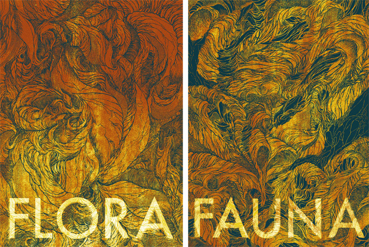
Flora/Fauna

“The training I received as as an illustrator emphasized the importance of aesthetic versatility. The way something is illustrated can have a big impact on the narrative. A lot of my technical work focuses on the tangibility of aesthetic. In the case of Flora/Fauna, it also touches on interchangeability. I built associations between different types of organic forms. Both panels have a distinct look. The text may point the view in a particular direction with the piece, but while designing the final images, I switched the words between each panel a lot. I used a variety of items to influence the structures — chard, tobacco plants, cabbage, cured meat, the human figure, and in more extreme cases, police investigation photos taken from scenes where gun-related suicides had occurred. The colors chosen in the print runs were meant to exploit the forms, not to lead the viewer to an unwavering conclusion about the scale or context of the set.” — Jacob Van Loon


(TOP) Roman Ring, an earlier rendition of the Flora/Fauna Series; (BOTTOM) Roman Ring Detail
Triptych

(TOP) Triptych; (RIGHT) Triptych Detail – Watercolor, acrylic, graphite
“I attended Northern Illinois University in DeKalb, which is about seventy miles west of Chicago. Several local highways intersect within the town, but the core of the university is based off Route 38 — part of what is known nationally as the Lincoln Highway. That road was the first national highway that existed in a more finished (paved) state, running from New York to California. Eventually, I toured a small section of the road, all the way out to central Iowa. Small towns like DeKalb abbreviate the highway every so often, representing a paradox between distinction and anonymity, [as they are] stuck at an uncomfortable place in history, stifled by the current economic climate. The idea of the Lincoln Highway was birthed from Midwestern minds, and it planted the seed for greater structures of commerce. Starting in 2010, I started to address a range a stories and research of the highway in my work.”
— Jacob Van Loon
Ω


[…] his piece “The Moguls (Stalker)” remarks that I feel are revealing of his style. In Redefine Magazine van Loon told writer Vivian […]