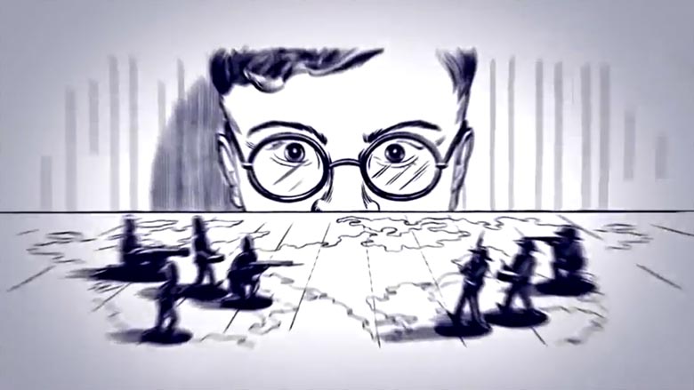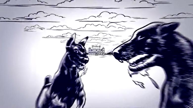
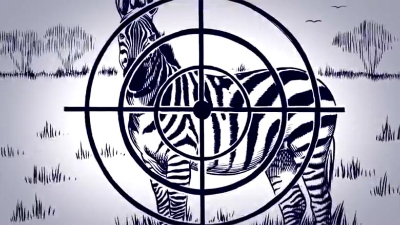
Constantly marching ahead in warp-speed fashion, the “Bad Kingdom” music video mixes and matches a series of blue-lined illustrations that unfold to tell the tale of mankind’s cruelty and helplessness — all the while intending to challenge existing social and political structures.
In the Q&A below, the design collective details their experience working on this music video, and we review some of their other works.

How did you come to collaborate with Moderat? How much artistic direction and freedom were you given?
We [have been] collaborating with Moderat since the first day — starting with their first release “auf Kosten der Gesundheit” in the early 2000s. We kept on collaborating and enjoying each other’s work. In 2009, we released the Moderat CD/DVD, where we visualized each track with an individual material (wood/water/paper/concrete etc.) This was followed up by a worldwide live show with a special video/light setup to translate the intense music into space and room. Besides that, we are responsible for the Modeselektor artworks and live shows as well as Apparat’s DJ/VJ show in 2011. So, we[‘ve] know[n] each other for a long time; that’s why Moderat have great confidence in our work.
Can you tell us a little bit about the philosophies or narratives which drove the video?
“this is not what you wanted. not what you had in mind”
We wanted to draw an image of a man who wants to escape from the system of military and injustice he was born into. He turns towards literature, aesthetics and dandyism in the early ’60s and gets involved in the same mechanisms of cruelty he once wanted to escape from.
Starting with high ambitions and getting stuck in the power structure that is ruling most of [today’s] world is the main story behind it.
Recognising this but not being able to change it is the key message of the story.
Moderat – “Bad Kingdom” Music Video
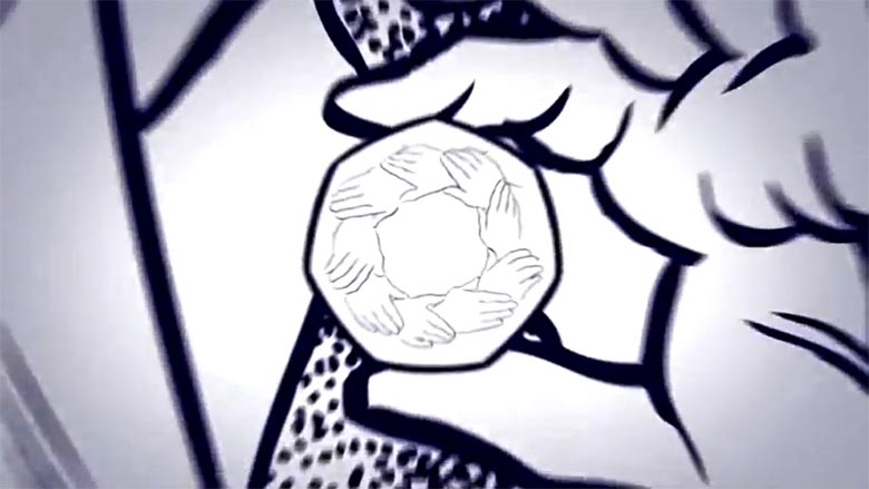
Is there any important symbolism we should know about? I noticed, for instance, that certain visuals came back repeatedly – a circle of joined hands, for one.
The self-development of the main character is influenced by professional conduct and social conventions in a day when only few people call the shots. To visualize that concentration of power, we wanted to create an emblem, which should be simple, [a] little frightening and related to human manner. The circle of joined hands originate from the seance. We liked to capture the moment; the power appears in an uncertain, non-objective way.
How were the illustrations for the piece created? It seems like some were mixed-and-matched; how many different frames were utilized, and how long did this process take?
As we are mainly digital dudes here in Pfadfinderei, we kind of asked artists and friends we worked together with on a regular basis.
As there were a lot of motifs, and very little time, we needed more than one illustrator. So, we did a kind of a small casting, showed people our visions (that arose under the influence of Charles Burns and our cover artwork for Moderat) and worked with those who understood the style and could imagine to walk that way with us. As we never did a hand-illustrated video before, this was complete[ly] new terrain for us, as we mainly work with graphic animation and video. But we learned that you shouldn’t limit yourself to the medium you are proficient in; it is totally worth to expand your creativity to other dimensions or media.
How did the decision to just use blues and whites come about?
Because the main character is a blue-blooded villain.
Director / Producer:
Pfadfinderei
Illustrators:
Bernado Maldonado Morales
Daavid Mörtl
Benedikt Rugar
Arne Jysch
Moritz Friedrich
The music videos below are also created for Moderat by Pfadfinderei, and additional works can be seen at:
www.pfadfinderei.com
Moderat – “Les Grandes Marches” Music Video
Moderat – “Rusty Nails” Music Video
Ω

