Article compiled by Vivian Hua, Sammy Baek, and Brian Meyers
If you are just joining us, START FROM THE BEGINNING.
#18
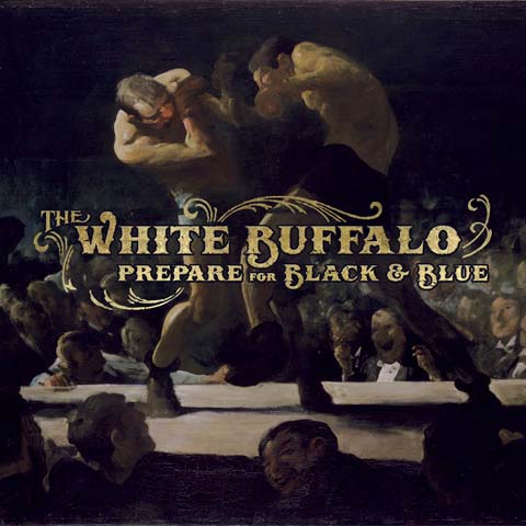
The White Buffalo
Prepare For Black & Blue
Ruff Shod Records
For the cover of Prepare For Black & Blue, The White Buffalo used an oil painting by George Bellows, courtesy of the National Gallery Of Art In Washington. “They were very specific about the colors being true to the original,” explains Jake Smith, aka The White Buffalo. “This took a few revisions and actually pushed back the release of the album.”
The oil painting was chosen by Simon Cassels, the art director for the album, who also crafted the text.
The original piece of art, created in 1907, is set in an athletic club in New York called Sharkey’s. According to the Metropolitan Museum Of Art, “Bellows summarizes with ferocious painterly shorthand the two pugilists’ boxing at peak intensity. He increases the drama by condensing the ring to a bright sliver of space, compressing the towering men’s agitated forms with the upper edge of the canvas, illuminating the smoky interior with hellish light, and placing the observer in the second row amid the bloodthirsty crowd. Some seamy neighborhood saloons like Sharkey’s were destinations for slumming, as the spectators in evening dress on the far side of the ring indicate. This detail invites bourgeois viewers of the painting to experience the gritty scene as if they, too, were slumming swells. Like contemporaneous images of cowboys and cavalrymen, Bellows’s boxing scenes—with which he became identified—glorify virile action more than quiet thought, and popular experience more than highbrow culture.”
“The idea was to play with the title, Prepare for Black & Blue, as a literal meaning,” Smith explains. The equal focus on both the album artwork and the typography really gives power the importance of this relationship between form and content.
About The Artist
Painting by George Bellows.
Art direction by Simon Cassels. – www.simoncassels.com
#17
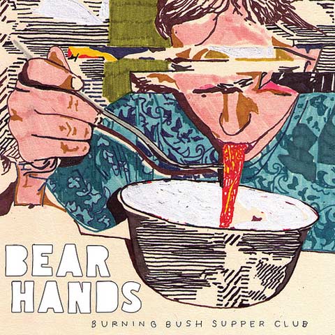
Bear Hands
Burning Bush Supper Club
Cantora Records
The artist behind the artwork for Burning Bush Supper Club goes by the name VRNO, and he’s a bit of an anonymous chap. Nonetheless, this is a solid illustration that serves as another installment of the band’s fun-loving identity. Scrawly penwork, with patterning that occasionally glitches out like a scrambled digital image, conveys this.
About The Artist
Illustration by VRNO. – vrno.tumblr.com
#16
The New Pornographers
Together
Matador Records
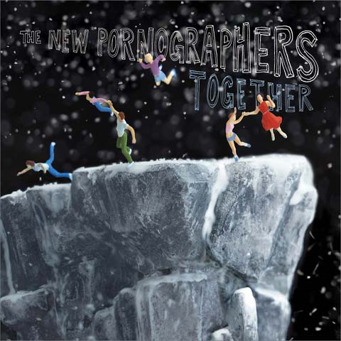
Childish joys and a sense of solidarity are captured in the album cover for Together. For the release, The New Pornographers joined collaborative hands with musicians such as Zach Condon of Beirut, Annie Clark of St. Vincent, Will Sheff of Okkervil River, and the horn players from Sharon Jones & The Dap-Kings. The artwork seems to capture just such a spirit of togetherness.
The image, entitled The Cliff, was produced in 2006 by artists Walter Martin and Paloma Munoz.
“The body of work which includes The Cliff began in 2001 with a series of snow globes we created and then photographed,” Martin explains. “Later, we began making larger sets and submerging them in tanks of water to photograph them. The Cliff is derived from one of those larger sets.”
A common setting running through these works by Martin and Munoz are snow-covered landscapes which are typically found in snow globes. “The scenes can suggest open-ended narratives with the possibility of multiple interpretations,” Martin explains. “There are often surreal elements, and the tone tends towards dire. The open question with The Cliff is: are they flying or falling? I think the band liked the flying idea.”
About The Artists
Artwork and design by Walter Martin and Paloma Munoz, of Martin-Munoz. – www.martin-munoz.com
#15
Anberlin
Dark Is The Way. Light Is A Place
Universal Republic Records
Since its days of being a pop-punk staple band, former Tooth And Nail signee, Anberlin, has certainly matured. The band now sees its music on a global scale and finds its music on mass market, mainstream radio.
In contrast to its music, Anberlin has generally opted for fairly minimal album cover artwork. The artwork for Dark is the Way, Light is a Place is no different, boasting a monochrome image of a horse suspended and surrounded by negative space. It’s awkward, yet full of movement and intrigue.
About The Artist
Artwork by Michael Zavros, a well-known Australian fine artist. – www.michaelzavros.com/
Layout and Design by Jordan Butcher.
#14
Prince Rama
Shadow Temple
Paw Tracks
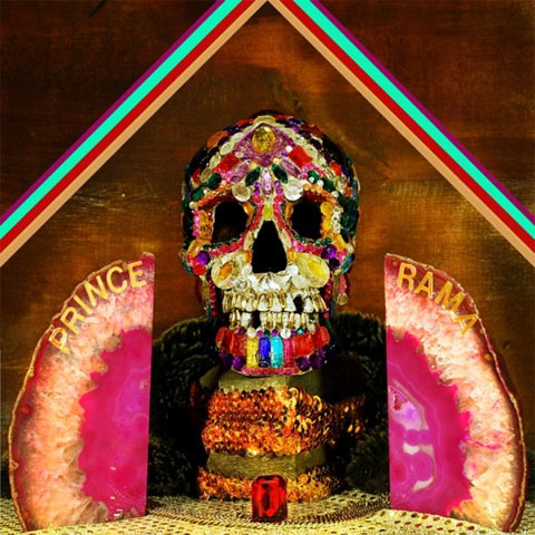
Brooklyn-based Hare Krishna psych band Prince Rama seems like just the type of band that would be into synesthesia. From the band’s press photography to its album artwork, everything is cohesive and well-planned, and the album cover for Shadow Temple is, as well.
As the band members were also the designers of the artwork, a visual and musical continuity lies in Prince Rama’s work. Band member Taraka Larson touches upon this idea, saying, “I think it makes a lot of sense in terms of linking visual and audio experiences together for a synesthetic, wholistic package. These days, it is so easy to disregard this concept of wholeness and just consume bits and pieces of albums… so I think it is nice when the artist gives attention to providing their record with a cohesive corporeal form. It gives the music more of a visual trail, an aura. A reflection.”
Starting with just the music, Prince Rama expanded upon themes and ideas from Shadow Temple. “A lot of the Shadow Temple songs were intended as personal hymns in a way, so we found it necessary to construct a sort of shrine to house them in,” explains Larson. “I feel like the process of making a record becomes a process of making a mummy in a way… once you have put live tracks down on a record, those sounds, those voices, that moment is frozen in time… dead, in a way. The record becomes like a body that has been embalmed… the case of the record is like a sarcophagus to house the sonic artifacts…”
“For Shadow Temple, I was interested in doing a sort of DIY homage to Damien Hirst’s diamond skull. We found a plastic skull and spent two weeks adorning it with cheap glue and fake gems that we then constructed a sort of pseudo altar around, with geodes and sequins, and photographed it. Just as life can be a metaphor for decorated death, an album cover can be treated as a visual metaphor for decorated sonic death.”
About The Artist
All three members of Prince Rama are art school graduates. “Michael does a lot of 3-D photography and sculptural installations, Nimai does mostly embroidery and pen and ink drawing, and Taraka has done a lot of film, sculptural installation, and multimedia performances.” – www.princerama.com
#13
Sightings
City Of Straw
Brah Records
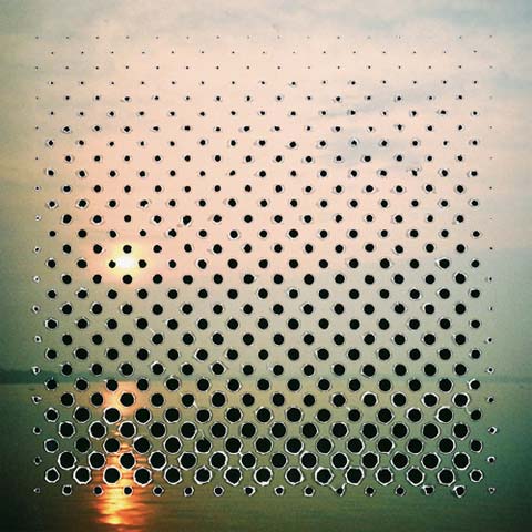
Friend of Brah Records and long-time designer for Oneida, Dan Schechter was invited by Oneida’s Kid Millions to work on the album cover for Sightings’ City Of Straw. Though the album title might infer certain types of imagery, Schechter’s interpretation actually embraced what is the direct opposite of straw in both feel and texture; rather than turning to soft, warm colors, Schechter turned to cold, hard metallics.
After a phone conversation with Sightings about the band members’ thoughts and musical processes behind the album, Schechter got to work, turning the aural interpretation of the music into visuals which have a sense of tangibility.
“The music has, at times, an electronic, technical feel, yet the sound very much comes from the musicianship and the electronics rather than a digital process,” explains Schechter. “One thing I wanted to do with the design was to match that process. I wanted it to feel very physical and tangible. Conceptually, I wanted to play off of this tension as well.”
The tension is represented through the use of carefully-created shapes. “In tearing through the ‘picture plane,’ I wanted to create something abstract and monolithic — another play on the tension between the geometric and the organic,” says Schechter. “The band had the idea for the back to be the inverse of the front, with the image from the cover being revealed through the holes. I punched all of the holes out by hand and photographed the result.”
About The Artist
Artwork by Dan Schechter, a designer and mixed-media artist. His focuses are on interactive and print design, as well as some collage and photography. – www.danschechter.com
#12
Kvelertak
Self-Titled
Indie Recordings
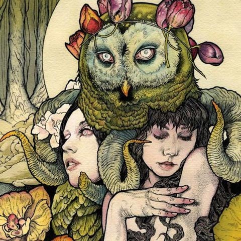
Last year, our huge oversight was forgetting to include the album cover for Baroness’ Blue Record, illustrated by Baroness’ frontman, John Dyer Baizley. We won’t make the same mistake of leaving Baizley out again this year.
Within this gorgeous cover lies the music of a Nothern European sextet that has been quite well-received as of late. Kvelertak combines elements of black metal with classic rock n’ roll and punk; in the band’s own brand of Norweigian-English, Kvelertak says it creates “brutally catchy punkrock/metal with a taste of groovy darkness!”
What that means is: accessible metal, for all. And luckily for the band, the tempting cover, by the always reliable and outstanding Baizley, acts as the best marketing tool possible.
About The Artist
Illustration by John Dyer Baizley, of Baroness. – www.myspace.com/johndyerbaizley
#11
Double Dagger
Masks EP
Thrill Jockey Records
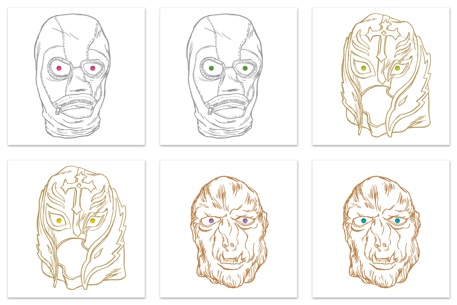
Earlier this year, Baltimore-based punk rockers Double Daggers released an EP entitled Masks, which lyrically explores the metaphorical ideas behind masks. With the band’s album artwork, it opted to “translate the idea visually into actual masks,” according to designer Bruce Willen, of the design firm Post Typography.
The album covers, despite being extremely minimalistic upon first glance, embrace the concept of masks to the furthest reaches possible.
“The mask illustrations (there were about 12 total including LP labels, etc.) were all drawn in pen and ink and then printed in metallic inks,” says Willen. According to Willen, Double Daggers’ record label, Thrill Jockey, was “psyched on the idea of printing three different limited edition covers.”
Each of the three different colors was printed in different color ink, and the LP and CD versions have die-cut holes which change color, depending on how the inner CD is oriented.
“Plus the holes and drawings on the LPs are sized so that the jacket can actually be used as a mask!” Willen adds. You’ve gotta hand it to them; they really know how to work out an idea.
About The Artist
Design and illustration by Post Typography, www.posttypography.com, a design firm of which Double Dagger’s Nolen Strals is a founder.
#10
Land Of Talk
Cloak And Cipher
Saddle Creek Records
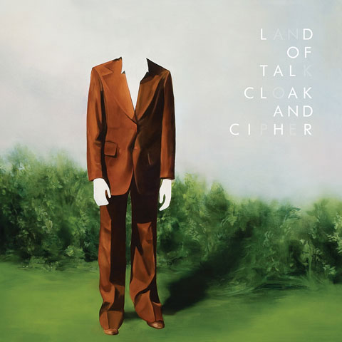
Indie rock band Land Of Talk is subtle with its beautiful melodies, and the album artwork for Cloak And Cipher seems to evoke a Magritte-like quality of surrealism, while honing in on typographical decisions that really give the album title some weight — or lightness, depending on how you look at it.
About The Artists
Artwork by Corri-Lynn Tetz.
Layout and design by Jack Nipper.
#9
AIDS Wolf
March To The Sea
Skin Graft Records
Bright-colored and in-your-face, March To The Sea‘s Sesame Street-type vibes certainly don’t scream, “AIDS Wolf!!!!!!!!,” but the photographs sure are a little more gory and twisted than one might gather upon first glance…
About The Artists
Artwork by AIDS Wolf band members, Chloe Lum and Yannick Desranleau, who are also involved in a Montreal-based art collective called Seripop. – www.seripop.com
#8
Balmorhea
Constellations
Western Vinyl
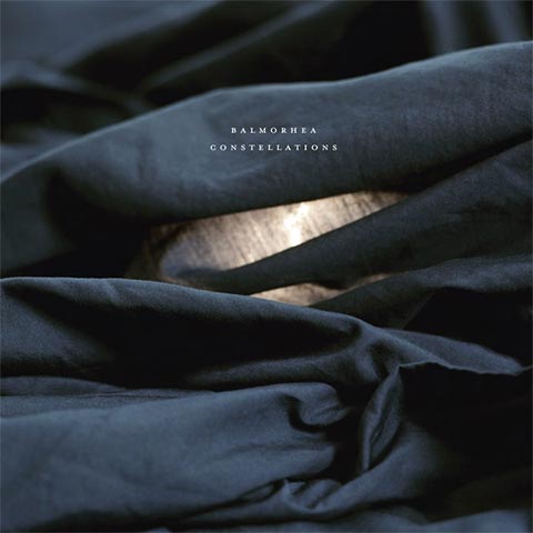
Balmorhea’s album, Constellations, is a concept record, basically about the great wide unknown that is space. By default, the theme comes attached with an endless amount of readily available imagery, which is why it’s so wonderful Balmorhea didn’t take the easy route. Rather than neatly packaging its music in existing visions of space, the band opted to use a tried-and-true process for album art creation, that the band has adhered to for its past seven releases.
“We usually have started with an image or idea for an image, or color palette that seemed to spring forth and fit,” explains Balmorhea’s guitarist/bassist, Michael Muller. For the band’s past releases, some of the images have been taken by Balmorhea’s pianist/guitarist Rob Lowe, while others have been contributed by Lowe’s girlfriend, Megan Carney, Lowe’s sister, Ann, or friend of the band, Travis Klunick.
“I think photographs capture better (at least they have in the past) what we are trying to do,” explains Lowe. “More than any kind of graphic design or manipulations…”
Monetary limitations do play a role in the final pieces of artwork for Balmorhea’s releases as well, but it certainly has not hurt the band’s aesthetic. “Sometimes you have an idea for a photograph that might require 100 people or a hot air balloon or $100,000 cash to throw up in the air, but it’s not feasible. So, you just take a photo in your room or on a trip or something,” says Lowe, who photographed the cover for All Is Wild, All Is Silent on a trip to West Texas, and the cover for Constellations in his room.
The simplistic approach with which Lowe and Muller approached the packaging for Constellations is very much representative of the music of the album, which feels pure in its beauty.
About The Artists
Photographed and designed by band members Rob Lowe and Michael Muller. According to Muller, “Lowe is a visionary and usually comes up with the overall concept of each record’s design. He has a very clear mental pathway to express his internal eye which is truly a gift. He also has a lovely penchant for composition. Lowe’s art also enlies in the actual music composition. My artistic foray is embedded more in the structure, organization and space of the design. I also do photography and minimal graphic arts as a day job.” – www.myspace.com/balmorhea
#7
The Black Angels
Phosphene Dream
Blue Horizon Adventures
Akin to Animal Collective’s cover for Merriweather Post Pavilion from 2009, The Black Angels have gone the route of bold psychedelic visual trip out feast with its album cover for Phosphene Dream. Neon red-orange and a near-cyan shade of blue combine for an uncomfortably loud and arresting combination — one which is best viewed away from digital mediums.
About The Artist
Design suspected to be by band member Christian Bland.
#6
Wild Nothing
Gemini
Captured Tracks
At the time of publishing, we were still unable to figure out the artist behind the wonderful cover for Wild Nothing’s Gemini… which is a damned shame, because it seems this album cover, which stereotypically captures the duality of the astrological sign of the twins, was lauded time and time again for its brilliance. Something tells us that the man behind Wild Nothing, Jack Tatum, is probably responsible for this black-and-white lovely, but it has yet to be confirmed.
Edit, January 20th, 2011:
About The Artist
The designer of the album cover, Joanne Ratkowski, contacted us to set the record straight. We apologize for the omission. She is a wonderful photographer, and we strongly encourage you to check out her work.
#5
Black Mountain
Wilderness Heart
JagJaguwar
With Wilderness Heart, band member Jeremy Schmidt designs yet another album cover to enlighten us all with.
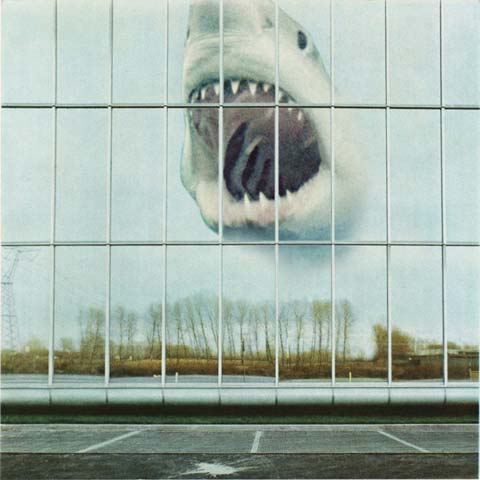
This album cover is yet another reminder that Black Mountain can kick visual stereotypes into the bucket and make it out on top; Schmidt has the Midas touch — one which can collage together images of a parking lot, Great White Shark, and stark autumn landscapes in a way that works, in a psychedelic throwback kind of way.
About The Artist
Artwork, design, and layout by band member Jeremy Schmidt.
#4
Surfer Blood
Astro Coast
Kanine Records
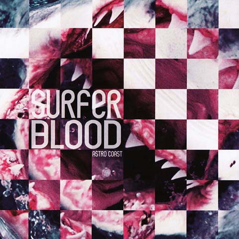
The cover art for Astro Coast takes a traditionally threatening image and remixes it into a scrambled square puzzle which is only vaguely decipherable. Once the image is descrambled by the viewer, though, the Great White Shark baring its large white teeth seems simply to be a homage to the happy-go-lucky surf rock vibes of Surfer Blood.
About The Artists
Artwork by unknown.
Layout by Jason Rueger of We Are Country Mice. – www.myspace.com/wearecountrymice
#3
Zola Jesus
Stridulum EP
Sacred Bones
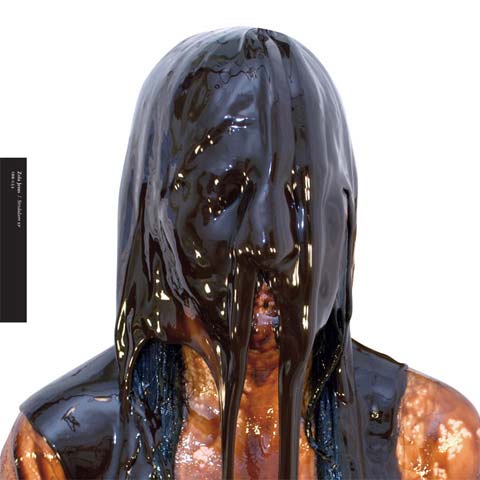
The cover of Zola Jesus’ Stridulum EP captures vocalist Nika Roza Danilova in a ghastly state, smothered beneath a orifice-suffocating waterfall of chocolate. According to Pitchfork, Danilova was inspired by the 1974 film, Sweet Movie, in which “a woman is rolling around in chocolate syrup.”
For Danilova, the experience of having her orifices smothered by chocolate was one of simultaneous pleasure and terror.
About The Artist
Photography by Indra Dunis.
Layout by David Correll. – http://www.davidcorrell.net/
Concept and modeling by band member Nika Roza Danilova.
#2
Tame Impala
Innerspeaker
Modular Recordings
This year, psychedelic rock newcomers Tame Impala worked with ace designer Leif Podhajsky to establish a solid “look” for its music. That look soon cascaded its way through all of the band’s print collateral and releases, effectively marketing the band in a way that drummed up immense amounts of attention beyond simply a musical scale. Using repeating images retreating backwards towards horizon lines, Podhajsky’s got a knack for using basic photo manipulation functions to great merits.
About The Artist
Design and artwork by Leif Podhajsky, an artist who is knee-deep in digital art. – www.leifpodhajsky.com
#1
Kanye West
My Beautiful Dark Twisted Fantasy
Roc-A-Fella Records
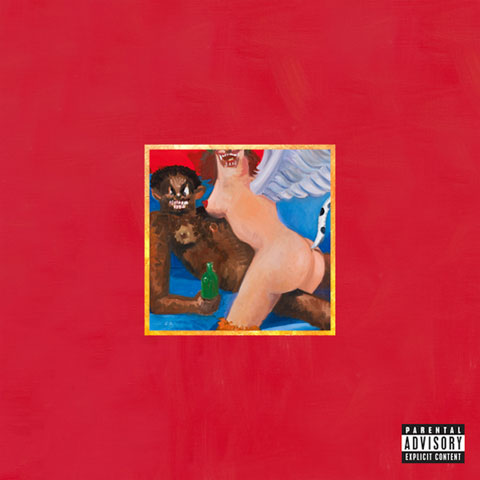
Just as it is kind of painful to admit that Kanye West’s latest album, My Beautiful Dark Twisted Fantasy, is brilliant, it is difficult to admit that the album artwork for it is rather brilliant, as well. World-reknowned painter George Condo is behind the five album covers created for the album, and he explains the concepts behind the pieces in an article with NY Mag. Evidently, there are themes of “early baroque era religious figures,” “cubism and classicism forged together in a single painting,” and many more fabulous ideas.
Many of the artists we’ve interviewed for this article love this artork as well. Check it out:
“I’ve been looking a lot of Kanye West’s album cover last weeks. Its got great artwork and great design.” – Jaakko Mattilla, artist behind A Sunny Day In Glasgow’s Nighttime Rainbows
“I’ll admit that I haven’t heard it yet, and I’m not even a huge fan, but I’ve really enjoyed the fact that Kanye West enlisted George Condo to do his cover art. It’s a pretty sublime mash-up.” – Douglas McQueen, artist behind Callers’ Life Of Love
“I am a big George Condo fan, so I like the paintings he made for Kanye West, it’s a surprising collaboration that has yielded great results.” – Alejandro Cardenas, of Violens
“Though I hate to say it, I think the new Kanye West LP artwork is great, as was the Power artwork.” – James Hines, artist behind Munch Munch’s Double Visions
“I think Kanye West’s cover is cool.” – Luke Temple, of Here We Go Magic
“I’m leaning towards Kanye’s “My Beautiful Dark Twisted Fantasy.” The vinyl version has various covers in the gatefold that you can swap to display on the front, which is awesome.” – Hassan Rahim, artist behind Superhumanoids’ Urgency
And here are the other four:
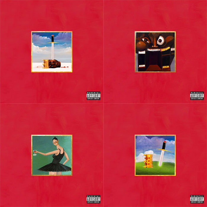
About The Artist
Paintings by George Condo, a contemporary painter and sculptor of great standing.










[…] THE EXTRAS “The cover for Absolute II was drawn in pen and reversed. The entire cover of the album is wrapped in the illustration. Actually, it’s a pattern repeating from left to right and bottom to top. The inside of the gatefold contains a collage. You need to see the real thing. It’s a whole package. The cover and inside are stylistically very different but equally important. When working on the cover illustration, I actually kept turning it so that from a creation stand point, there is no up or down. Since it’s a looping pattern, I just figured out which section [and] orientation I thought looked the best for the cover.” RELATED ARTICLES: DAN SCHECHTER’S COVER FOR SIGHTINGS’ CITY OF STRAW ON 90 NOTABLE ALBUM COVERS FROM 2010 […]
[…] ARTICLES: “VESSEL” ON TOP SONGS FROM 2011 + CONATUS ALBUMS OF THE YEAR RUNNER-UP + ZOLA JESUS’ STRIDULUM ON 90 NOTABLE ALBUM COVERS FROM 2010 + ANGEL CEBALLOS FOR PERFUME GENIUS’ LEARNING ON 90 NOTABLE ALBUM COVERS FROM […]