Was there any conceptual rule or underlying philosophy governing this video?
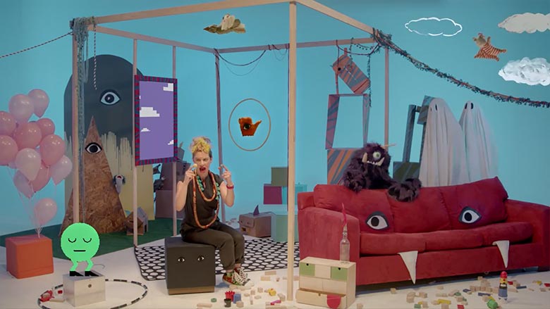
The intention was to create a video that felt like it could be cut from moments of a fictitious kids show. So that was the foundation that everything else was built on.
How closely did you work with tUnE-yArDs throughout the creative process? How much artistic freedom were you given?
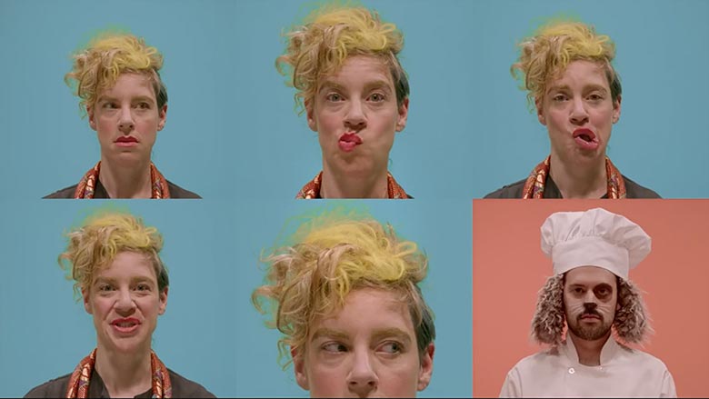
There was an initial brief from Merrill [Garbus of tUnE-yArDs] that had mentioned dancing and Peewee’s Playhouse. So I wrote a treatment with that in mind; I kinda threw a bunch of ideas at them in the early stages, and they really liked them. From there, we had several phone calls and I refined them more and more. We all had a mutual love for the children’s TV we grew up with and the really tactile animation that is present in them. There was a great amount of freedom while still being collaborative. I like to leave some room for artists to put their mark on it too. We had lots of conversations that helped ideas develop organically. Nate [Brenner] had mentioned he wanted dog ears, so I wrote his a part for him being a dog/man chef and called it “Lunch Date with Nate”.
Past tUnE-yArDs music videos have had some similar visual overlaps — specifically in the form of bright colors and geometric shapes. How important was it to keep some of this look while creating something new? Was there anything you kept in mind while trying to strike this balance?
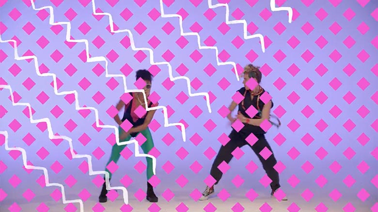
I had seen the previous videos and I watched them before I wrote the treatment, partly to make sure I didn’t overlap too much with what had been done in the past. I think the geometric shapes and organic materials and hand-drawn elements are things that I’ve done in previous work too, so I guess it just meant we were coming into the video already speaking a similar language. Merrill was great on the shoot day and during the editorial process, at making sure we were in a space that wasn’t too similar to the previous stuff. I think they also have a strong identity and aesthetic, they know who they are, and that will inevitably be present in all things they do.
A lot of your work is fairly interdisciplinary, but from what I’ve seen, this piece might be the most interdisciplinary one yet. Can you tell me about all of the different components in this video? Why the decision to incorporate so many different things?
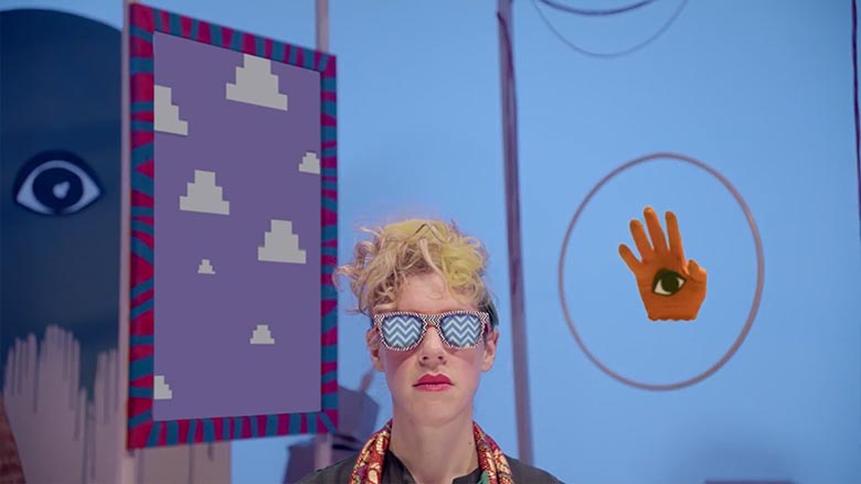
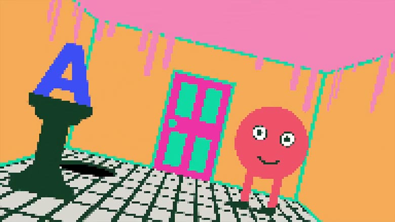
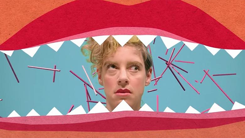
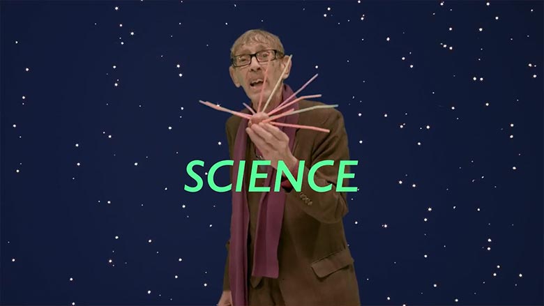
I think the concept of a bent kids show really allowed me to be free to use any medium available. I really like jumping between animation and live action and then the space in-between. Some jobs determine you do one or the other, but I think this really allowed us to go to town. There’s hand-drawn animation, digital animation, composited effects, puppetry, art directed elements, science lessons, and basketball.
Did you receive much outside assistance did you receive on each of the components, such as character design and creation, set designs, painting, etc.?
There were plenty of people helping on this one. I drew some rough character sketches and then the production designer and art director took them and made some of the characters. We had a couple of puppeteers make and operate them. The purple Cyclops was something the head puppeteer Brad had been working on for a while, so that was a real bonus. Some parts of the set were pieces of discarded wood we found on a near by building site and we painted up. I had a good friend Rob and old collaborator help on the more digital animated parts.
What were some of the major challenges and/or things you learned?
Time was really tight; we had a limited time to design and build the set, so that was real challenge. Everyone knows music video budgets are tight, and we had some awesome people on board who really went above and beyond to make it all happen.
A lot of your films feature bits and pieces of text. What draws you to that and why did you first decide to incoporate that?
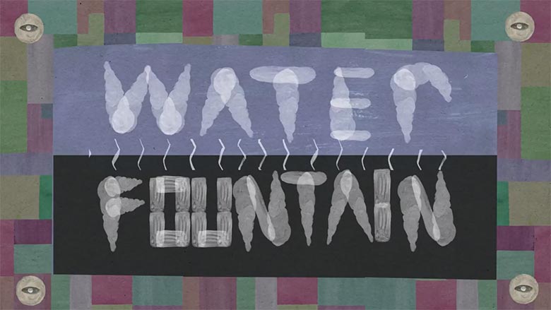
Hmmm, I studied fine art and design, so that world often seeps into my work, and I think the marriage of image and text can offer up new meanings that are greater than the sum of their parts. The hard lines of text are a nice disruption to the softer photographic images, too. In the case of “Water Fountain”, the text was used as titles for the micro segments of the show we were creating.
Do you have any favorite scenes or moments?
The shoot day was a lot of fun, and the talent we had to shoot — from the band to the extras — were amazing. I really like how the Lunch Date scene turned out; the colour palette is super tight there. I like the variation of Merrill’s facial expressions too; she really takes you into another place.
What’s next for you?
I’m working on an animated documentary short at the moment; it is due to be finished at the end of the month, [along with] some album art work. Other than that, mentally preparing for the reality that twins are on the way!
Producer: Ian Blair / John Curtis
Executive Producer: Danielle Hinde
DP: Mishka Kornai
Production Designer: Megan Burns
Animation: Joel Kefali and Robert Wallace
Colorist: Alana Cotton @ Images
Ω


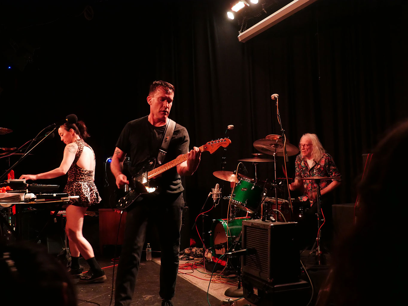

[…] tune yards water fountain music video director joel kefali Tune Yards Water Fountain Tune Yards Water Fountain 2016 Size: 780 X 439 | Source: http://www.redefinemag.com […]
[…] tune yards water fountain music video director joel kefali Tune Yard Water Fountain Elegant Tune Yard Water Fountain Ideas Size: 780 X 439 | Source: http://www.redefinemag.com […]
[…] tune yards water fountain music video director joel kefali Water Fountain Tune Yards Elegant Water Fountain Tune Yards Inspirations Size: 780 X 439 | Source: http://www.redefinemag.com […]
[…] tune yards water fountain music video director joel kefali Water Fountain By Tune Yards Elegant Water Fountain By Tune Yards Gallery Size: 780 X 439 | Source: http://www.redefinemag.com […]