THE BREAKDOWN
12 Collage
+ 14 Digital Illustration, Drawing, Design
+ 19 Illustration, Painting, Drawing
+ 8 Black And White Photography
+ 22 Color Photography
+ 6 Deluxe Packaging
+ 10 Fashion, Sculpture, Installation
_____________________________
91 Album Covers For 2011
QUOTES FROM:
JEFF KLEINSMITH, ART DIRECTOR
THEMES & CONCEPTS
“Dee Dee from the band… had a very specific idea in mind, but I feel like it isn’t my place to speak for her on this.”
CREATIVE PROCESS
“There is a phenomenon called astral projection or astral travel which is the idea that there are two bodies – an astral body and a physical body, and there are some who believe that the astral body can travel outside of the physical one. There are some pretty famous photos depicting the astral body leaving the physical body, and Dee Dee wanted to make her own version with herself as the subject. Again, she would know better than I what this particular imagery means to her.
Well, I LOVE the image. It is one of the most interesting images I’ve worked with in a long time. That’s not exactly some high-minded insight, but it’s how I feel about the image. Dee Dee never told me if it has personal meaning to her. I know she was going through some things, so it’s possible that the image is directly related to that.”
THE EXTRAS
“Tthe only thing to mention is the silver foil stamp on the front and back and maybe the old-style packaging. I’m referring to when LPs were first made, they were actually raw cardboard which was cover by a thin printed paper skin — as opposed to printing directly on the cardboard. Most modern packaging is done this way, and this piece was done in the old style. Also, there is a 22″ x 22″ foldout poster inside along with a snazzy CD dust sleeve.”
Record Label
Sub Pop Records
The Artists
Art Direction & Design – Dee Dee & Jeff Kleinsmith
Photography – Shawn Brackbill
Mediums & Materials
Photography, Postcard, Computers
Record Label
Hardly Art

PRESS PHOTO BY JARED GRAVES
Record Label
Western Vinyl
QUOTES FROM:
MARK TAPPIN, DESIGNER
SUSAN BURNSTINE, PHOTOGRAPHER
THEMES & CONCEPTS
The artwork brief for the Guillemots’ third album demanded otherworldly imagery that gave the viewer a sense of being lost, to show someone trying to find their way home. We were immediately reminded of Susan Burnstine’s evocative dream-like, metaphoric works that capture the moment between dreaming and waking, those blurred seconds in which imagination and reality seem to collide. We felt both the meaning and the aesthetic of Susan’s work to be a perfect fit with the sound of the record and the title of the album.” – Matt Tappin (MT)
CREATIVE PROCESS
“The images they licensed… were shot a few years before. The image used for the cover, entitled Reflect, was an element of a nightmare I had. My process is that I have a dream, wake, write it in my journal, then go out and shoot it that same morning while I’m still the fog of that dream. I never detail specifics of my dreams as individual interpretation must be left to each viewer while my personal meaning must remain my own. I don’t plan any of my shots. In a sense, they plan me. The results are purely instinctual as my entire process from dreaming to creation is deeply rooted in my subconscious.” – Susan Burnstine (SB)
COLLABORATION
“The original image for the cover was created in 2006, and Mark contacted me early 2011 about the cover… my images have always been printed true black and white. Mark and the band really wanted the images to be toned in a blue hue similar to cyanotypes or a brown tone similar to pictorialist-like palladium prints. I understood the need to tone, but it took a long time to agree and accept to the interpretation. Mark was great about explaining his take on the toning. He sent me numerous tests to assure I would be happy with the finished product and he pulled back on tones for specific images that I felt could not be heavily toned. Once I saw the actual CD, I realized the interpretation was correct for the music and packaging. But it did take a lot of effort on Mark’s behalf to convince me to allow them to change the tone.” – SB
COLLABORATION
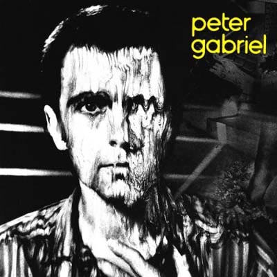
“Mark Tappin contacted me and asked if I’d be willing to license seven of my existing images to Geffen/The Guillemots for the cover of Walk The River and the interior booklet. Growing up, I always dreamed of having my work on an album cover especially after I bought Peter Gabriel’s third album Peter Gabriel when I was in eight grade. That image of his face melting stayed with me for years.” – SB
EXTRAS
“I use handmade, medium format film cameras and lenses that I have personally built and designed to generate one-of-a-kind effects on the negative which emulate my unconscious world. The cameras are primarily made of plastic, rubber, and thick black garbage bags, and all twenty-one of them are named after musicians such as John Lee Hooker, Koko Taylor, Johnny Cash, James Brown, PJ Harvey, and my latest, Trent Reznor.” – SB
Record Label
Geffen Records
The Artists
Layout & Design – Mark Tappin & Simon Gofton
Photography – Susan Burnstine
Mediums & Materials
Photography (custom cameras)
QUOTES FROM:
BRIAN AZER, DESIGNER
THEMES & CONCEPTS
“My goal with the album art was to really highlight the photographs, and not let the any design get in the way. The music and the photography is the most important thing in my mind.”
CREATIVE PROCESS
“This album artwork was going to be photography-based, and I wanted to find a photographer that I felt visually connected to the music. I was given a few tracks to listen to, but I am also a fan of Justin [Broadrick]’s music and I know a lot of his music very well. I also keep in mind the previous album covers he has done for his label and I wanted to keep the same sort of tone so that they artwork fits with what we do at Caldo Verde Records as well as Justin’s Avalanche label.
“I came across these beautiful and haunting photographs by this Russian photographer Stanislav Markov. The minute I saw Stanislav’s work, I knew this was the photography I wanted to use for this album. I then showed Stanislav’s photos to Justin K Broadrick of Jesu, and he loved them as well. The playground photo was chosen as the cover almost right away, and Justin was also drawn to the bed photo that was used on the inside of the album sleeve. There was just something so eerie and also memorable about these photos that I really felt connected with the music. His work to me is very cinematic, like I was watching a film.”
Record Label
Caldo Verde Records
The Artists
Art Direction & Design – Brian Azer
Photography – Stanislav Markov
Mediums & Materials
Photography (unmanipulated)
QUOTES FROM:
MARCUS JOONS, KORALLREVEN
THEMES & CONCEPTS
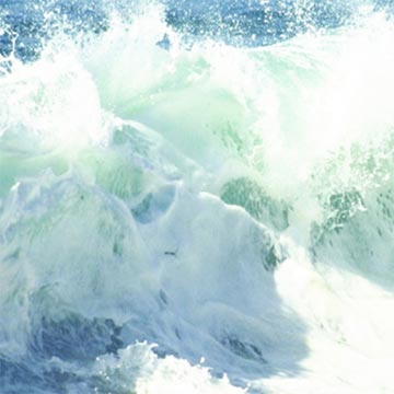
“Korallreven all started in my mind when I was in the Polynesian island Samoa in 2007. After that, I felt that I wanted to make music that should feel as high and loved-up as I had felt here. This is a kinda grand subject so therefore I thought that the album should be introduced with four singles where the artwork had the theme of the pretty grand four elements. The first single, with the title Loved-Up, had tsunami waves (water), the second, The Truest Faith, blood-dipped feathers (air), the third, Honey Mine, white roses (earth) and the fourth, As Young As Yesterday, a forest fire (yup, fire).
“When all these four elements were done, I wanted the album artwork to remind of Samoa, so therefore I chose to take a picture of this dreamy veil with this Samoan triangle pattern that is very common as a tattoo in Samoa and the Polynesia on top of that in shiny silver print.”
THE EXTRAS
“The vinyl is white with silver haze print.”
Record Label
Acéphale Records
The Artists
Art Direction & Design – Rory Them
Concept & Photography – Marcus Joons
Mediums & Materials
Photography, Photoshop, Illustrator, InDesign


Record Label
Friendly Fire Recordings
Record Label
XO Records




[…] 12 Collage + 14 Digital Illustration, Drawing, Design + 19 Illustration, Painting, Drawing + 8 Black And White Photography + 22 Color Photography + 6 Deluxe Packaging + 10 Fashion, Sculpture, Installation […]
[…] 12 Collage + 14 Digital Illustration, Drawing, Design + 19 Illustration, Painting, Drawing + 8 Black And White Photography + 22 Color Photography + 6 Deluxe Packaging + 10 Fashion, Sculpture, Installation […]
[…] 12 Collage + 14 Digital Illustration, Drawing, Design + 19 Illustration, Painting, Drawing + 8 Black And White Photography + 22 Color Photography + 6 Deluxe Packaging + 10 Fashion, Sculpture, Installation […]
[…] 12 Collage + 14 Digital Illustration, Drawing, Design + 19 Illustration, Painting, Drawing + 8 Black And White Photography + 22 Color Photography + 6 Deluxe Packaging + 10 Fashion, Sculpture, Installation […]
[…] 12 Collage + 14 Digital Illustration, Drawing, Design + 19 Illustration, Painting, Drawing + 8 Black And White Photography + 22 Color Photography + 6 Deluxe Packaging + 10 Fashion, Sculpture, Installation […]
[…] 12 Collage + 14 Digital Illustration, Drawing, Design + 19 Illustration, Painting, Drawing + 8 Black And White Photography + 22 Color Photography + 6 Deluxe Packaging + 10 Fashion, Sculpture, Installation […]