
THE BREAKDOWN
12 Collage
+ 14 Digital Illustration, Drawing, Design
+ 19 Illustration, Painting, Drawing
+ 8 Black And White Photography
+ 22 Color Photography
+ 6 Deluxe Packaging
+ 10 Fashion, Sculpture, Installation
_____________________________
91 Album Covers For 2011

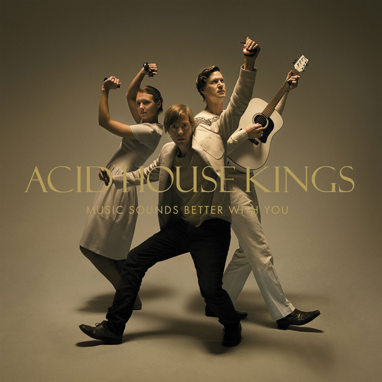
Acid House Kings – The Lack Long After
Record Label
Labrador Records
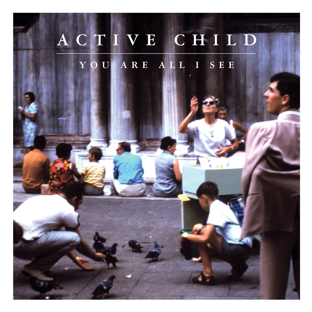
Active Child – You Are All I See
Record Label
Vagrant Records
The Artists
Art Direction – Benjamin Goetting & Jacob Escobedo
Photography – Augusto Grossi
Back Cover Photography – Ricky Chapman
“Intense, surreal and moody…”
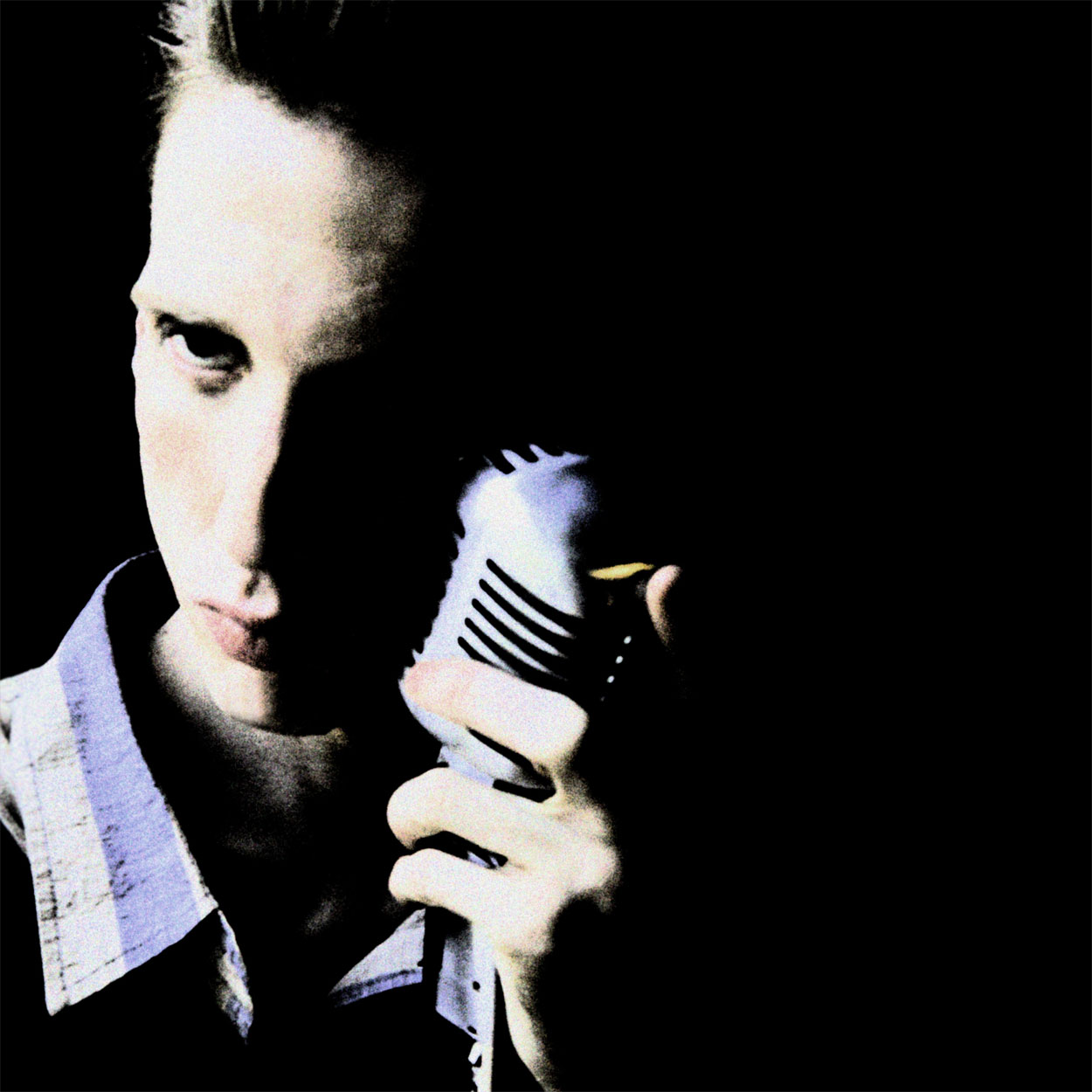
Atlas Sound – Parallax
QUOTES FROM:
MICK ROCK, PHOTOGRAPHER
THEMES & CONCEPTS
“To produce compelling, charismatic and memorable images of Bradford [Cox]. What was important was the process of the session itself and the energy exchange between me and him.”
CREATIVE PROCESS
“It was a very thorough exploration of Bradford’s image [and] aura, and we shot a variety of setups. After the session, Bradford emailed me: ” hanks for the magic. What a dream. Thanks again for the trip thru primitive and primordial fucking punk art…..!” Obviously he enjoyed the session as much as I did. It was a memorable communication between our raw psyches. He’s definitely my kind of subject!!”
COLLABORATION
“A mutual friend Michael Stipe [of R.E.M.] made the introduction. He thought it would be a perfect combination. He was right! Another mutual friend, Karen O of the Yeah Yeah Yeahs, also provided encouragement!”
“We met and [Bradford Cox] played me the music on the album. Then Bradford also sent me images of mine that he liked and a few others that appealed to him. But that was just to further communication. We had no interest in duplicating any image.”
EXTRAS
“There is no typography on the front cover itself… that was Bradford’s decision. Although the record label did insist on a sticker on the shrink wrap.”
Record Label
4AD
The Artists
Photography – Mick Rock
Mediums & Materials
Photography (Hasselblad + Digital, Canon 5D)
Balam Acab – Wander / Wonder
Record Label
Tri Angle Records
“Arid.”

Barn Owl – Lost In The Glare
QUOTES FROM:
JON PORRAS, BARN OWL
THEMES & CONCEPTS
“It was a photo we were both immediately drawn to. So it was more of an intuitive pull toward the image as opposed to fulfilling a strict concept. We sort of knew we wanted a landscape to give a visual representation of the drawn out, spatial music on the record.”
CREATIVE PROCESS
“Evan stumbled across the photo in an old nature magazine. It was taken in Death Valley. We decided on a color palette before actually choosing the image. We felt deep blues would match the somber, shadowy feel of the record. When we saw the image, we knew it would work nicely.”
Record Label
Thrill Jockey Records
The Artists
Photography – Mark Muench
Booklet Photography – Jon Porras
“Mortal.”

Blouse – Self-Titled
QUOTES FROM:
CHARLIE HILTON, Blouse
THEMES & CONCEPTS
“We knew we wanted a strong photograph, something feminine and slightly dark.”
CREATIVE PROCESS
“We searched a long time for the right image. In the original photograph, there’s a very faint rash on the woman’s wrist. The photographer said it was something he always liked (the arm belonged to his girlfriend). I wanted to leave it in, but not everyone in the band felt the same way. We’re democratic, so I removed the rash in Photoshop. I’m not bitter.”
“Tangible”

Braids – Native Speaker
QUOTES FROM:
MARC RIMMER, PHOTOGRAPHER AND DESIGNER
THEMES & CONCEPTS
“I was going for something fairly abstract. Something that accompanied the music and spoke to it, but didn’t give any ideas as to how the songs should be interpreted or what they are saying. I’m not the biggest fan of artwork that gives much away, or is a literal interpretation of lyrics, so there was definitely a conscious decision to not do that. Going into it I just had ‘texture’ and ‘color’ in my mind.”
CREATIVE PROCESS
“The main element of the packaging, the photography, is a photo of a forest taken through prismatic plastic… the kind that covers fluorescent lights in old government buildings, offices and schools. It’s pretty simple, but produced a really nice, effective result.”
“I went through a lot of different ideas along the way, and was going through a patch where I just couldn’t come up with something I was super excited about. It sounds pretty ridiculous, but I was in an old school one day and I literally just looked up and saw the light. Hah. I immediately ran to a hardware store and bought a sheet of the plastic and started experimenting. I remember it was freezing, and extremely windy that day… and hauling a giant sheet of plastic around was like carrying a sail. I cut my hands up on it; it’s super sharp!”
COLLABORATION
“I’ve known the folks in BRAIDS for quite awhile now. We are both from Calgary, where I used to play in a band and do photography and design work for bands, so we naturally met through those things. Now we both call Montreal home and see each other regularly; we’re all neighbours!
“BRAIDS were pretty cool and trusting in that they gave me full creative control. Knowing the members in the band and their tastes I had some basic ideas, but the funny thing about their visual tastes is that they all have very strong, varying opinions. One of them is a huge minimalist, one loves lots of colours, one of them likes a more loose, DIY aesthetic… so the challenge was not only coming up with something that spoke to the music, but something that each individual was happy with. It was actually pretty damn stressful at first.”
EXTRAS
“If you don’t have a copy of the artwork in front of you, there is a glossy spot varnish over top of the black information area, which I think it a pretty important detail. Originally, I wanted to have the sleeve featuring only the colored texture, and have the information as a sticker, applied afterwards (not on top of the plastic wrap, but as a permanent part of the packaging), but the band and label had some logistical concerns. We ended up going with the spot varnish to set it apart instead. They are meant to be viewed as two very different elements — the fluid, colourful, textural part, and the black/white, rigid, calculated part of the information area. I feel it is like the music in that it is very textural, lush, vast, but if you listen closer it is actually very technical and considered.”
Record Label
Kanine Records
The Artists
Photography – Marc Rimmer
Mediums & Materials
Photography, Graphic Design

“violent. lonely.”
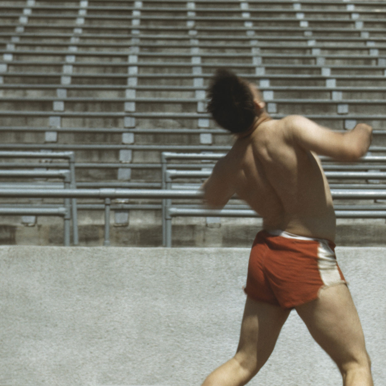
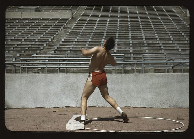
Cataldo – Prison Boxing
QUOTES FROM:
ERIC ANDERSON, Cataldo
CREATIVE PROCESS
“I was looking through a Library of Congress photo set of color photographs from the 1940s. I think the idea of the project was to capture a wide array of American life, perhaps a hold over from depression era New Deal programs. I wasn’t looking for album art but nevertheless this image struck me as perfect. It’s actually a photograph of a University of Nebraska Shotputter–I loved the motion, the color pallette, and knew if I played around with the cropping I could imply a some kind of surreal boxing. Kiersten Miller, my collaborator on the design of the rest of the artwork, helped me decide on the current flipped image and the crop as you see it. Other than that we just punched up the color a bit and that’s what you see on the record.”
The Artists
Layout & Design – Eric Anderson, Kiersten Miller
Photography – John Vachon
Mediums & Materials
Photography (Color slide)
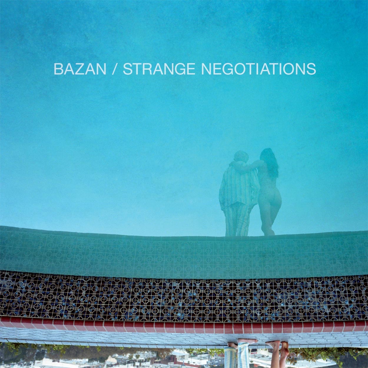
David Bazan – Strange Negotiations
QUOTES FROM:
CODY CLOUD, DESIGNER
THEMES & CONCEPTS
“The original pictures were made with the intentions of showing a tender relationship between an old man and a young woman that was playful but not sex-driven. They ended up feeling as if the woman was a ghost.”
CREATIVE PROCESS
“David was over to our house, and I was showing him some pictures. I think he was looking at the S magazine where the story was originally published in. He was flipping through the pages and when he came to the cover image, he immediately turned the magazine upside down and said this would be a rad cover.”
COLLABORATION
“The real collaboration started in diapers. That’s how long I’ve known David.”
Record Label
Barsuk Records
The Artists
Layout & Design – Julia Galdo & Cody Cloud
Mediums & Materials
Photography (medium format), Computers
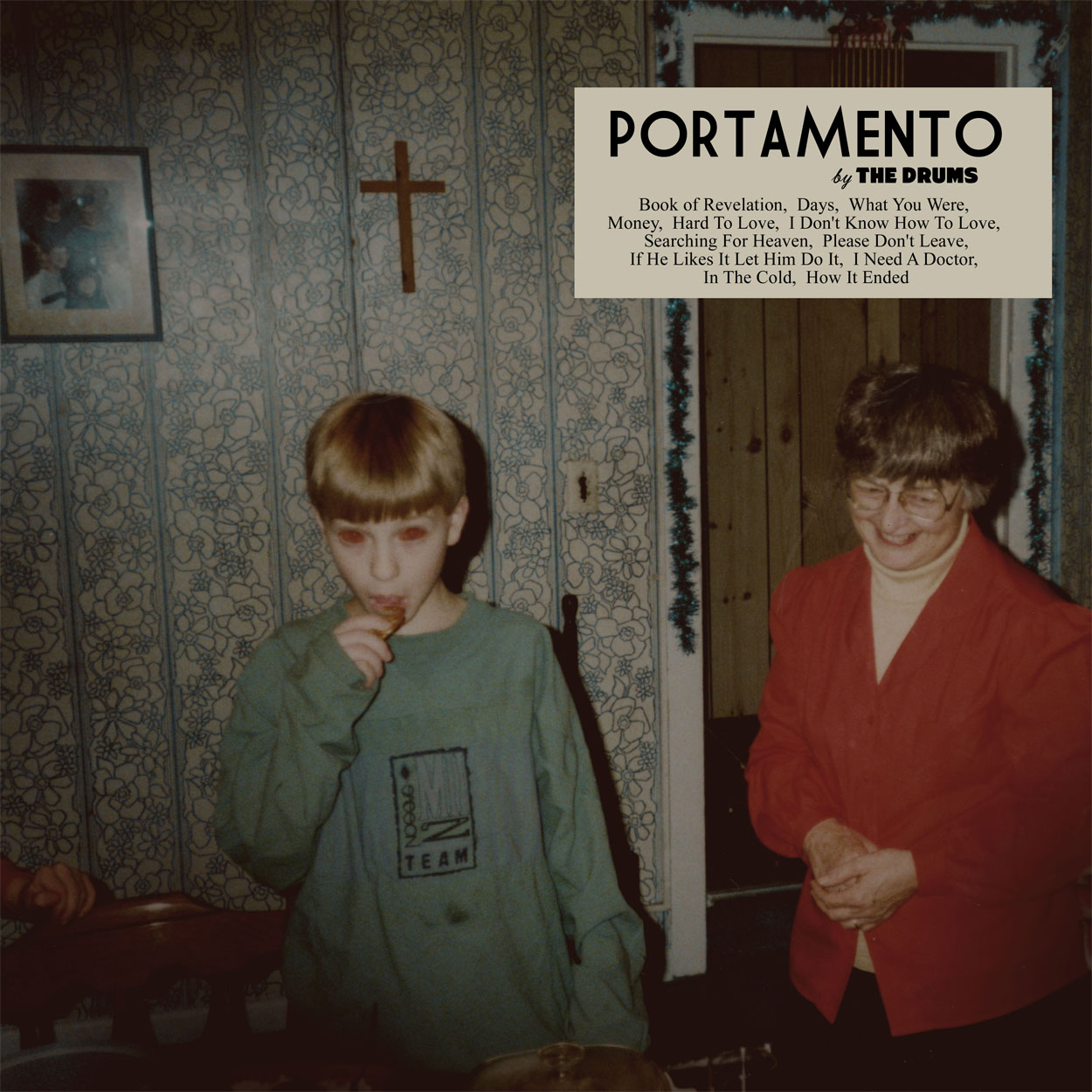
The Drums – Portamento
Record Label
Moshi Moshi / Island Records
The Artists
Design & Layout – Jacob Graham
Back Cover Photography – Rachael Wright
Booklet Photography – Mathias Mentze
Gang Gang Dance – Eye Contact
Record Label
4AD
The Artists
Art Direction – Brian DeGraw
Graphic Guidance – Chris Bigg
Cover Photography – Miroslaw Swietek
Booklet Photography – Thomas Shahan
“Iconic.”

Mister Heavenly – Out Of Love
QUOTES FROM:
JEFF KLEINSMITH, ART DIRECTOR
THEMES & CONCEPTS
“I know [Mister Heavenly] are very thoughtful about art and design, so I’m sure there were many discussions amongst themselves. They had discussed a number of directions before landing on this one.”
CREATIVE PROCESS
“It was really just a lot of back and forth about different ideas and imagery until something stuck. This image was actually something they were pursuing from the beginning but we weren’t sure we’d be able to pull it off. In the meantime other directions were looked into (which were all pretty great, actually).
“While I really enjoyed working with the band as I mentioned, I also really enjoyed working with the photographer, David Belisle. It was amazing the way he brought this shoot together. He hired the models, location, car, everything.”
THE EXTRAS
“There is a 12-page booklet inside with a number of other images from the various shoots they did. It gives a little more back story to how the young couple got to where they are on the cover.”
Record Label
Sub Pop Records
The Artists
Art Direction – Jeff Kleinsmith & Mister Heavenly
Photography – David Belisle
Mediums & Materials
Photography (film), Photoshop, Illustrator

M83 – Hurry Up, We’re Dreaming
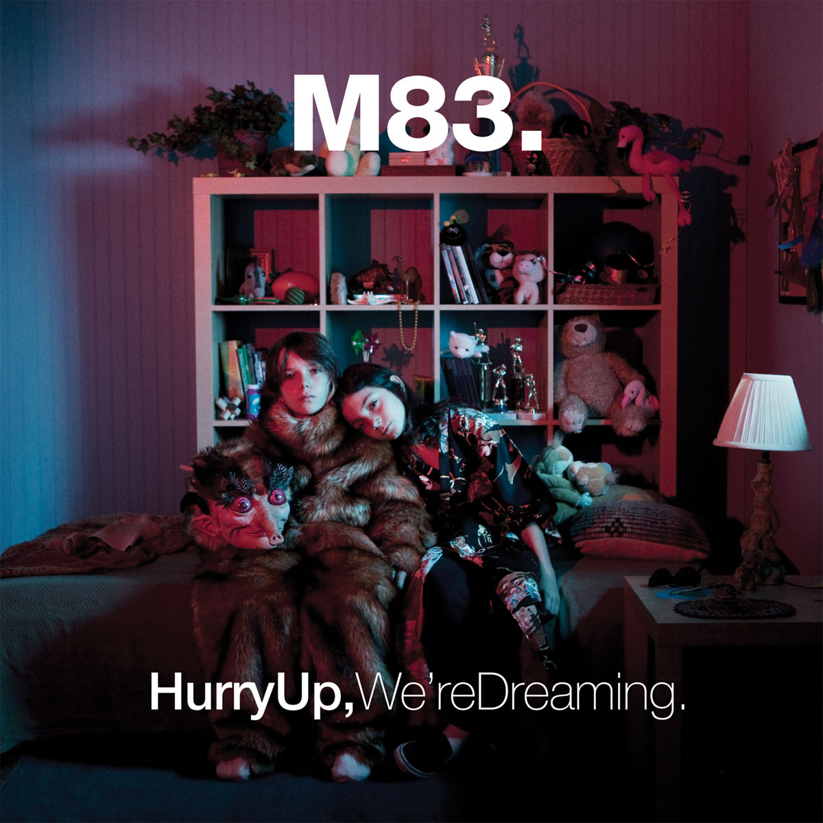
QUOTES FROM:
ANTHONY GONZALEZ & MORGAN KIBBY, M83
COLLABORATION
“We love Anouck. Being camera shy is not a beneficial quality as an artist, but since first working with Anouck for the cover of Saturdays=Youth, it was clear that in her hands we were safe and could come out of our shells. Her ability to convey such unique perspective in all her work is not only inspiring, but rare… from the studio to the bus, Anouck became our mascot, our cheerleader, and the documentarian of our life on the road. You’ve never seen such amazing tour photos. Even with a disposable camera, Anouck brings magic to her photos. We love Anouck.” FROM NERO MAGAZINE
Record Label
Mute Records
The Artists
Layout & Design – Anouck Bertin & Anthony Gonzalez
Photography – Anouck Bertin
Photography Assistants – Ben Grieme, Baker Wardlaw


Nurses – Dracula
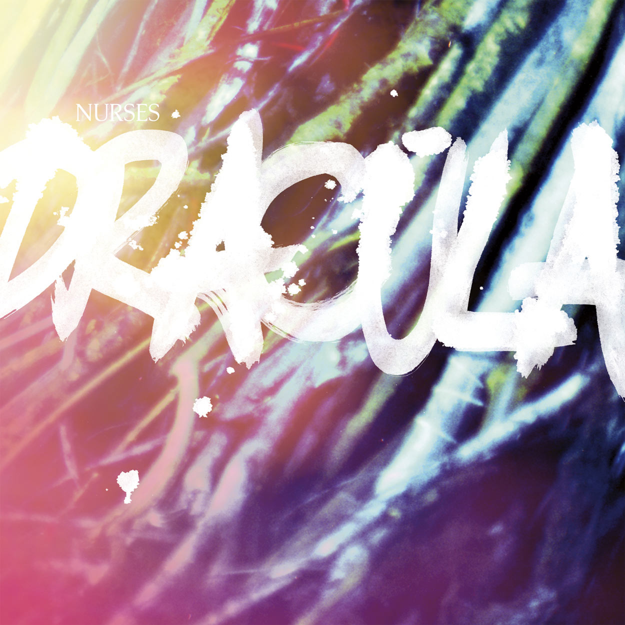
QUOTES FROM:
ANDREA GLASER, ARTIST AND DESIGNER
THEMES & CONCEPTS
“We were thinking about dark and light and good and evil a lot, and how dark things are sometimes good guys and good guys sorta dark when looked at differently. Kinda like, when you’re afraid of the woods behind your house when you’re a kid, cuz dark scary things live there, then when you finally get the guts to go in, you find that’s it’s this whole beautiful secret world that is real and scary in some ways, but also new and fun and operates on totally different rules from what you know. Or when you’re back there in the dark woods and suddenly the sun streaks in through the trees — and you realize it’s actually totally breathtakingly beautiful and it’s just sorta you that was making it dark.”
THE EXTRAS
“The image on the back is a still from some VHS footage John took while recording at the cabin. The front is a stick basket seat thing that we painted in backlight paint. The blue face on the back came from these weird photos we took — I think around the same time but unrelated — trying to make Aaron look like an unearthed corpse with a death shroud.”
Record Label
Dead Oceans
The Artists
Concept & Design
Nurses & Andrea Glaser
Mediums & Materials
Photography (shitty digital cameras), Painting (black light), Black Magic
“Calm and contemplated.”
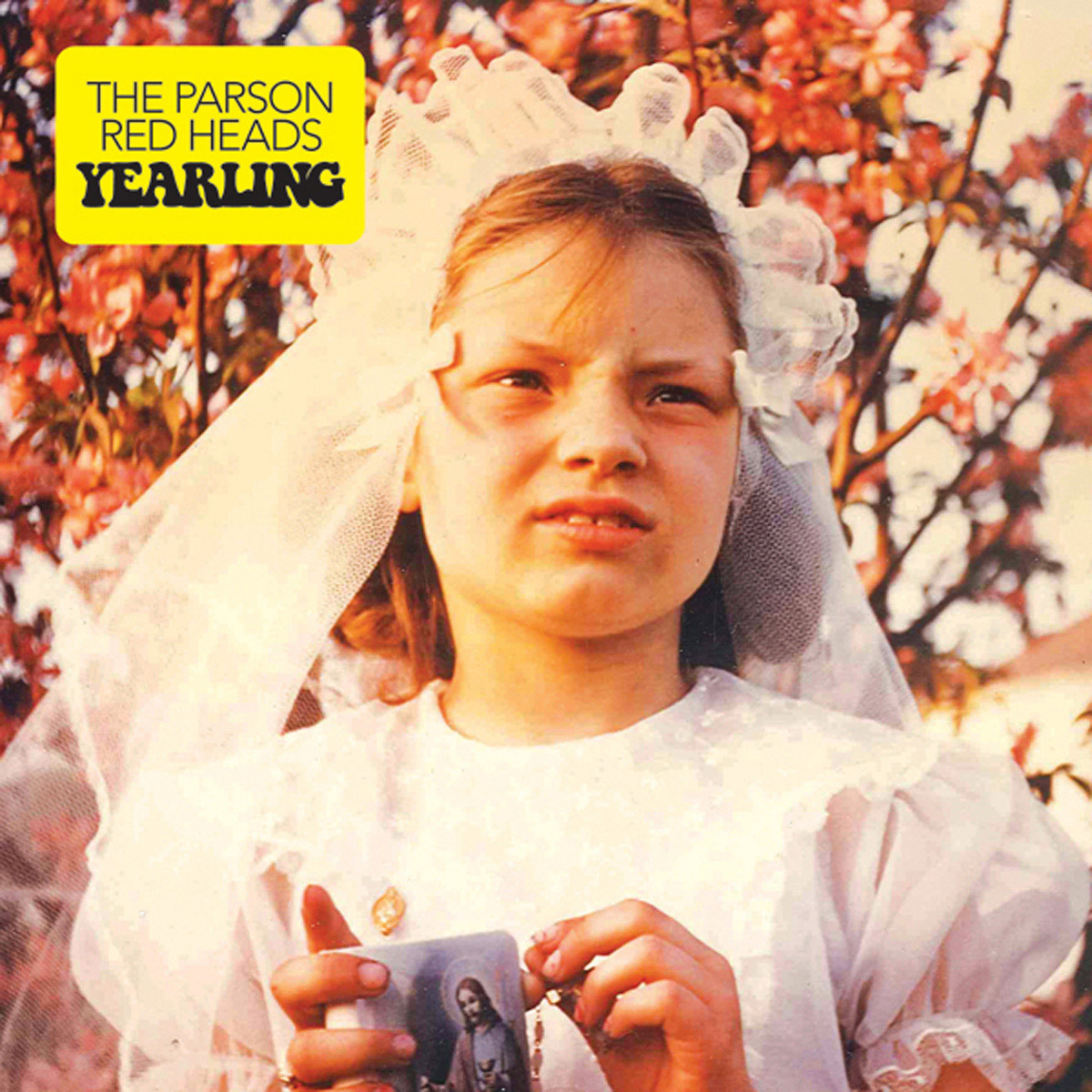
The Parson Red Heads – Yearling
QUOTES FROM:
EVAN WAY, The Parson Red Heads Guitarist and Vocalist
THEMES & CONCEPTS
“First off, the Parson Red Heads have a theme of trying to use old family photos for all our full-length album covers. First album [had] Brette’s mom, and this album [has] Sam’s aunt.”
CREATIVE PROCESS
“Once we found the photo we wanted for our cover, everything else was chosen according to how well it fit with the feel and color scheme of the cover photo.
“We were sitting in the office of our guitar player’s father. Sitting on his desk was this photograph of Sam’s aunt Jane, and Sam and I both saw it at the same time and were immediately struck and both thought the same thing: “That is our next album cover!” And from that moment on the decision was made.
“We chose the photo before we even had the album completed, or before we had chosen a title for it — but it ended up working perfectly with the themes on the album, and the idea of the title. The album is called Yearling, which is a term for a horse between 1 and 2 years of age. The songs on the record are often about growing up and learning how to live, learning lessons, and loving people. Using the past as a compass, but not letting it guide you (if that makes sense). We thought that a photo of a young girl at her first communion, with a look of serious responsibility, or maybe even some hestitation, or fear (or all of the above) in her eyes was very appropriate to the themes of the record. And on top of that… it is just a beautiful, one-of-a-kind photo!”
EXTRAS
“The interior image (an insert in the vinyl, a gate-fold image of the interior of the CD booklet) is a collage I created right after we finished the album, using all photos taken from the tours leading up to the making of this record, and during the recording of it. It features all the folks who play prominently on the album. It was inspired by the collage on the back of the first, self-titled, Beachwood Sparks album.”
Record Label
Arena Rock Recording Company / Timber Carnival Records
The Artists
Layout & Design – Noel Ryan Brandon
Back Cover Photography – Francesca Tamse
Booklet Photography – Liz Devine
Mediums & Materials
Photography (35mm, 1954, unedited)

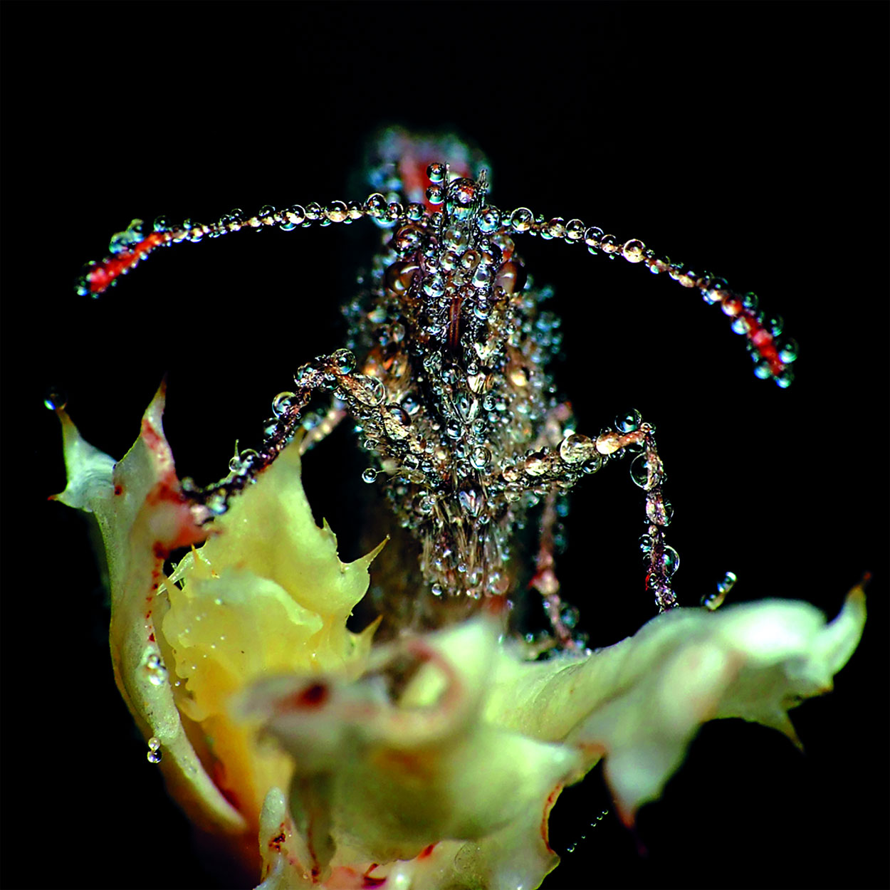
Pianos Become The Teeth – The Lack Long After
Record Label
Topshelf Records

Real Estate – Days
Record Label
Domino Records
“Minimal, very personal.”
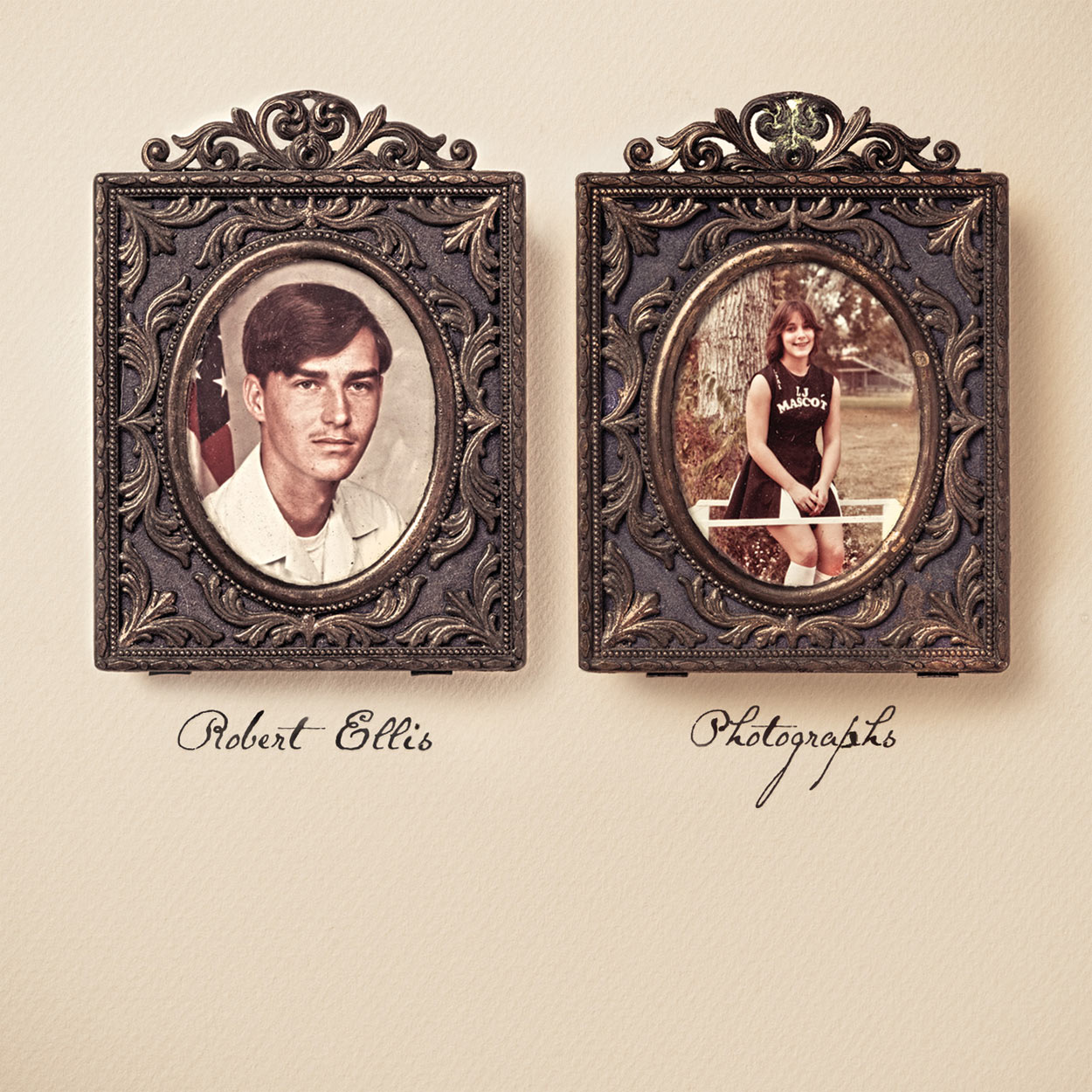
Robert Ellis – Photographs
QUOTES FROM:
ROBERT ELLIS
JASON COOPER, CONCEPT
PAUL MOORE, ART DIRECTOR
THEMES & CONCEPTS
“We had a copy of the white album sitting on my kitchen table that we were using as a blank to come up with ideas.” – Robert Ellis (RE)
“I had been thinking about ‘photographs’ and had thought about the idea of having a frame of some kind on the cover. I literally looked up and saw those two framed photos of Robert’s parents sitting on his piano, and I just kinda set them on the white album the way they look on the record.” – Jason Cooper
“Robert brought the concept up to me at SXSW, and I was immediately intrigued and began conceptualizing how to best approach it to make it come off as unique as we could.” – Paul Moore (PM)
THE EXTRAS
“All the photos are personal family related photos of mine. Some of them even relate to specific songs on the record. The pen,and the watch were both keepsakes from my Grandfather who I was very close with growing up. All of the objects/photos were photographed kind of elevated to make them appear as if they were floating.” – RE
“While working on the cover, it was decided to emboss the frames in levels and to also add a spot UV over the photos themselves to give them a glass effect.” – PM
Record Label
New West Records
Mediums & Materials
Photography, Mixed Media, Digital
“hazy and muted”
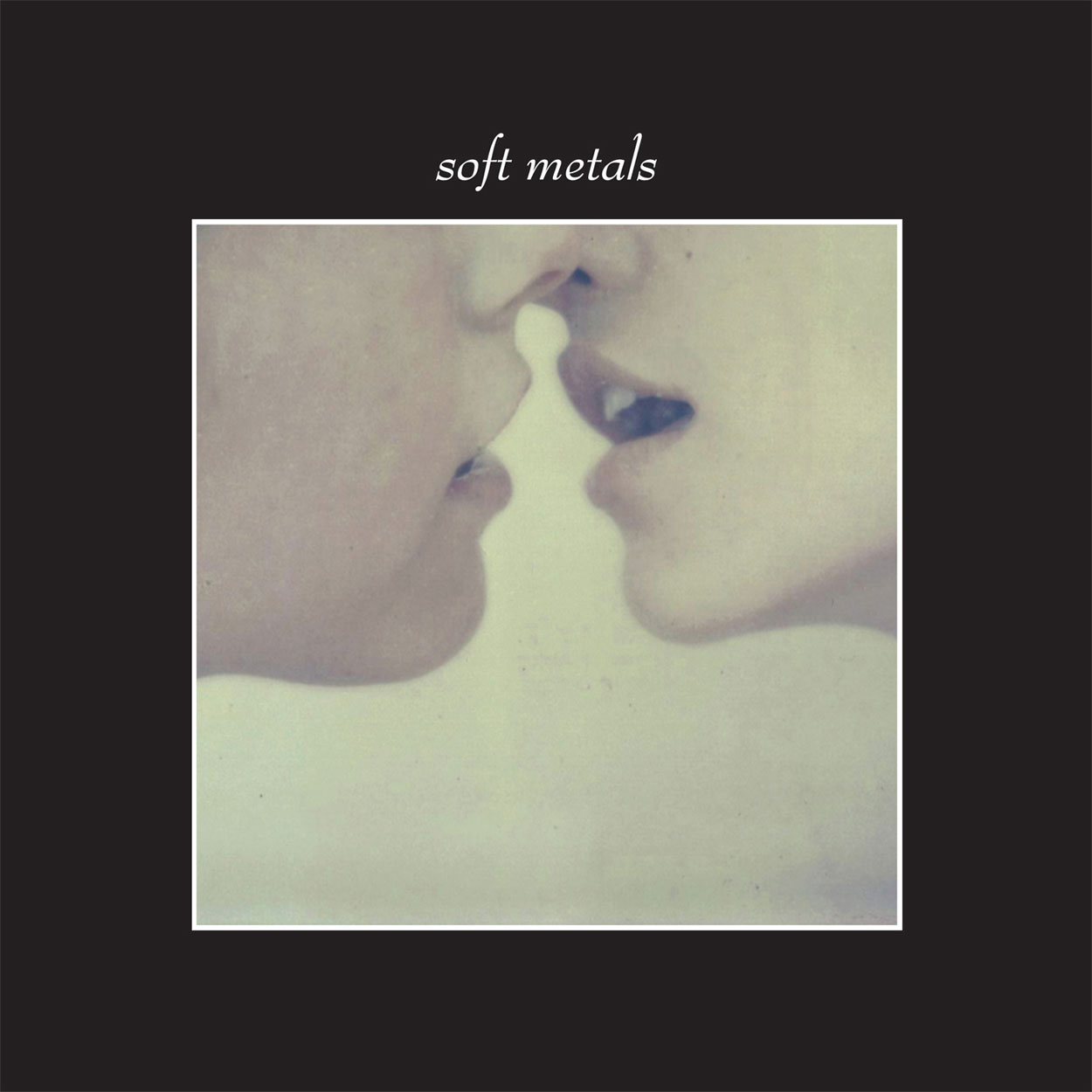
Soft Metals – Self-Titled
QUOTES FROM:
PATRICIA HALL, SOFT METALS
ANNA MOROSINI, PHOTOGRAPHER
MIKE SNIPER, DESIGN AND LAYOUT
THEMES & CONCEPTS
“We wanted a simple photograph representing love and tension. We like how the to figures could be of any combination of genders.” – Patricia Hall (PH)
“I try to roll with the punches and come up with layouts and fonts that work with the band; in this case I was thinking in terms of Factory and late ’70s fashion ads.” – Mike Sniper (MS)
CREATIVE PROCESS
“Ian and I had been hunting for images on Flickr that would somehow fit the mood of the album. We came upon the work of Italian photographer Anna Morosini, and it just felt like the right fit. We asked Captured Tracks to contact her to see if we could get permission to use some of her images for the album artwork, and she approved.” – PH
“They sent me their album to know if it worked for their music according to me, too.” – Anna Morosini (AM)
“As soon as Patricia showed me Anna’s work I knew it was a perfect marriage between the music and imagery. She really nailed it in choosing those images, it was as if Anna had taken the photos for the record, which of course she didn’t, but you’d never have known.” – MS
“[Anna Morosini’s] art is heavy with mood and we feel it can be easily be related to one’s own life. We like the dark tones and dim lighting in her work. It was winter and we were living in rainy, dark Portland when we recorded the album. These images really fit with the environment we were immersed in at the time.” – PH
“I felt like the band needed something hazier and more muted then their prior 12″ EP cover… The photos were great in and of themselves, so it was easy to make it work. I went with a serifed and italic font to kind of soften the stark black/white background and borders.” – MS
EXTRAS
“We opted for a glossy finish for the fonts and photos which you can’t see unless you have the vinyl LP and remove the cellophane. It looks fantastic if you do!” – MS
Record Label
Captured Tracks
The Artists
Layout & Design – Mike Sniper
Photography – Anna Morosini
Mediums & Materials
Photography (Polaroid, SX 70 Camera with artistic TZ film), Scanner

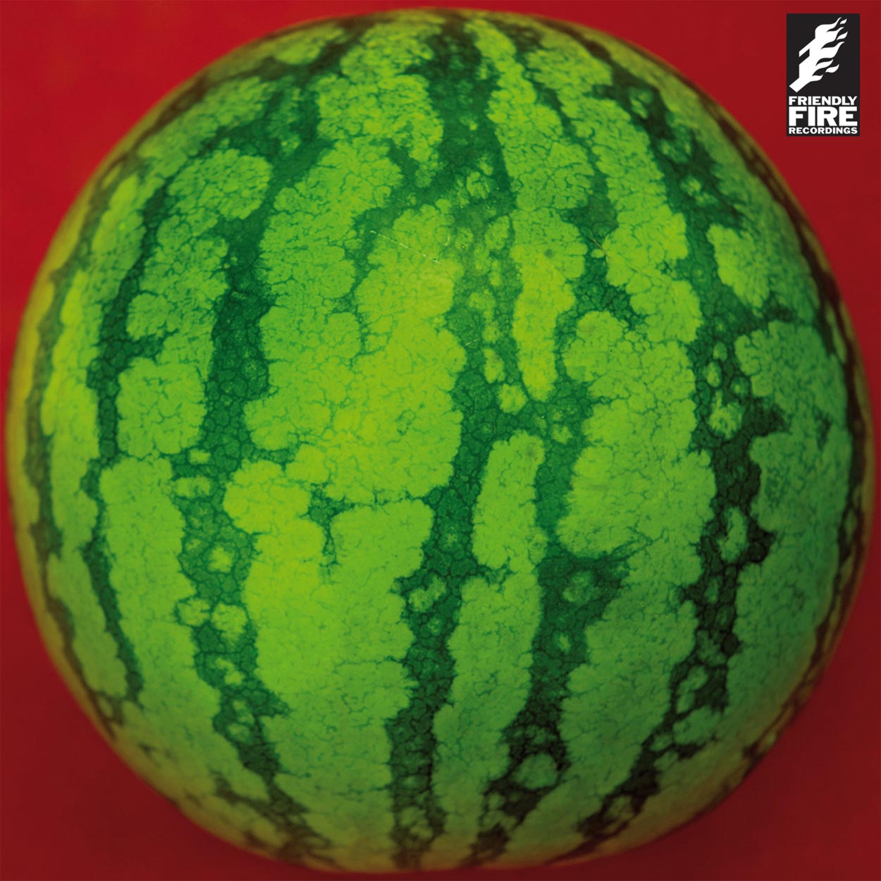
Toro Y Moi – Underneath The Pine
Toro Y Moi – ‘Still Sound’ Remixes EP by amazingsoundsrecords
QUOTES FROM:
CHAZWICK BUNDICK, TORO Y MOI
THEMES & CONCEPTS
“I took the photo in a mirror in a hotel in Austin, Texas. It was my birthday and someone gave me a pomelo that day. I’d never seen or eaten one before. So when I peeled it, it was kind of a ridulous amount of work, and it didn’t really taste good… That’s when I decided to take photos of it because I doubt that I’ll peel [another] one open anytime soon. What also made me want to take pictures was how big the wedges were; they were like the size of my hand.”
CREATIVE PROCESS
“When I got home I started to play with the photos on the computer and the image just stuck in my head for a while. that’s when I knew I wanted to make it the cover.”
“I thought the photo had a lot of similar elements of the album too — like how it was timeless, intimate, and weird. I also was giving a nod to other record covers from the ’70s, they always seemed sexy and cryptic.”
Record Label
Carpark Records
The Artists
Layout & Design – Chazwick Bundick
Photography – Chazwick Bundick
MEDIUMS & MATERIALS
Photography (digital), Photoshop
“Juicy.”
Treefight For Sunlight – Facing The Sun
QUOTES FROM:
ASKE ZIDORE, DESIGNER
CREATIVE PROCESS
“We had discussed how we wanted the front/back/label photos, and had a pretty good idea about how we wanted the booklet photos to be as well. I had produced their record, so I knew how they wanted it to be at that time. We had discussed the album art during the year it took to produce, so when it came down to the actual designing it was pretty easy.”
EXTRAS
“We thought about using pictures from their residential neighborhood, but then Arcade Fire’s The Suburbs came out, and then we didn’t want to do it.”
Record Label
Friendly Fire Recordings
The Artists
Layout & Design – Aske Zidore & Treefight For Sunlight
Photography – Tore Hallas
MEDIUMS & MATERIALS
Photography, Handwritten Text

Wye Oak – Civilian
QUOTES FROM:
MICHAEL PATRICK O’LEARY, PHOTOGRAPHER
CREATIVE PROCESS
“The artwork was just captured as part of a casual spontaneous shoot. Plain and simple, we were just playing in the pool at night with cameras.
Jenn [Wasner] and Andy [Stack] [of Wye Oak] are actually friends and have been for many years. They came across that image prior to recording the album and asked me about using it for the cover. They chose the artwork before recording the album. I think a lot of times this is done in the reverse order, where a band would record an album and then find some suitable cover art based on the music.”
Record Label
Merge Records
The Artists
Layout & Design – Cady Bean-Smith
Photography – Michael Patrick O’Leary
MEDIUMS & MATERIALS
Photography (digital, underwater housing), Photoshop


[…] Drawing, Design + 19 Illustration, Painting, Drawing + 8 Black And White Photography + 22 Color Photography + 6 Deluxe Packaging + 10 Fashion, Sculpture, Installation _____________________________ […]
[…] Drawing, Design + 19 Illustration, Painting, Drawing + 8 Black And White Photography + 22 Color Photography + 6 Deluxe Packaging + 10 Fashion, Sculpture, Installation _____________________________ […]
[…] Drawing, Design + 19 Illustration, Painting, Drawing + 8 Black And White Photography + 22 Color Photography + 6 Deluxe Packaging + 10 Fashion, Sculpture, Installation _____________________________ […]
[…] Drawing, Design + 19 Illustration, Painting, Drawing + 8 Black And White Photography + 22 Color Photography + 6 Deluxe Packaging + 10 Fashion, Sculpture, Installation _____________________________ […]
[…] Drawing, Design + 19 Illustration, Painting, Drawing + 8 Black And White Photography + 22 Color Photography + 6 Deluxe Packaging + 10 Fashion, Sculpture, Installation _____________________________ […]