
THE BREAKDOWN
12 Collage
+ 14 Digital Illustration, Drawing, Design
+ 19 Illustration, Painting, Drawing
+ 8 Black And White Photography
+ 22 Color Photography
+ 6 Deluxe Packaging
+ 10 Fashion, Sculpture, Installation
_____________________________
91 Album Covers For 2011

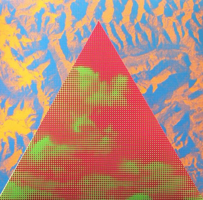
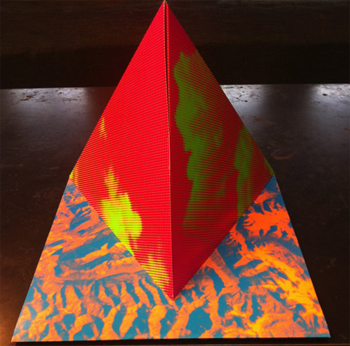
The Alps – Easy Action
Record Label
Mexican Summer
The Artists
Design – Tauba Auerbach
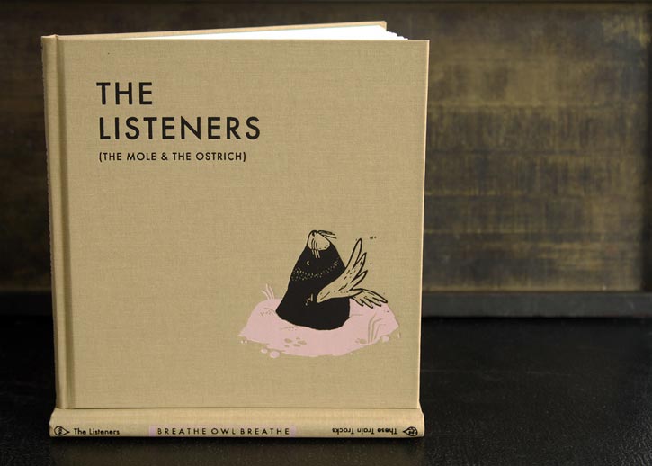
Breathe Owl Breathe – The Listeners
Record Label
Self-Released
The Artists
Story & Artwork – Micah Middaugh
Mediums & Materials
Illustration, Woodcut, Printing
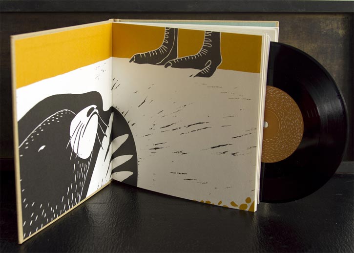
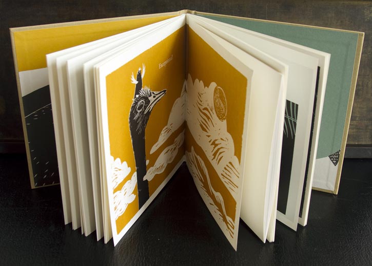
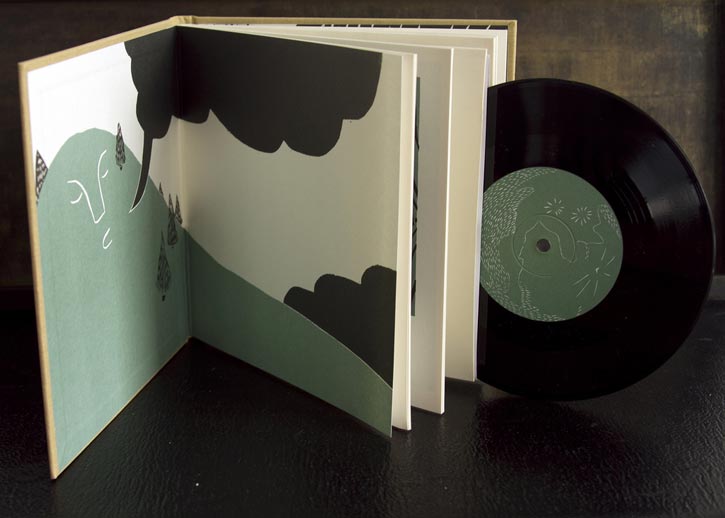
“Minimal / Ominous / Reminiscent / Sentimental”

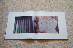
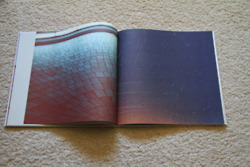
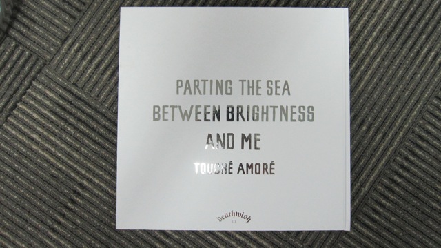
Touche Amore – Parting The Sea Between Brightness And Me
QUOTES FROM:
NICK STEINHARDT, TOUCHE AMORE GUITARIST AND ALBUM ART DESIGNER
THEMES & CONCEPTS
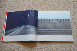
“The artwork is based around the lyrical themes present on the record — the consequences of being gone as much as a touring band’s nomadic lifestyle requires. Having your idea of home not actually being one concrete place. The idea of the road as a physical and emotional barrier. I wanted the photography to feel familiar but absent and partially removed, and the typography referenced roadside signage — as you’d see from the window of a car.”
CREATIVE PROCESS
“My initial visual research was conducted pretty widely, collecting various reference over a long period of time to familiarize myself and the photographer as somewhat of a mood board. From there, I’d say the photography was done much more spontaneously, but from a thematically-informed perspective. On the design end, I work very loosely at first, get a lot of ideas out on paper (or computer), assess and clarify concepts, then refine and structure.
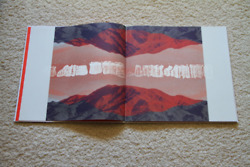
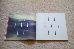
“When I met with our photographer to go over the shoot, I instantly connected to the mountain image used on the cover… It had a perfect sort of stark quality and deadpan perspective, and just felt like driving through nowhere. I think the creation of the ‘asterisk’ road/sun icon really ended up anchoring the whole piece and giving it some further weight. It’s also when I had the idea for the minimal graphic / typographic interventions to bring additional meaning when overlaid and paired with the rich and grainy photographic textures.”
EXTRAS
“The standard LP is just a single jacket with a printer inner sleeve. For the deluxe LP we went all out. It’s a 28 page LP sized, foil stamped hardbound/smyth-sewn photo book with a pocket for the 180 gram LP glued on the inside back cover. This edition was limited to 1000 and the pre-order crashed our record label’s website.”
Record Label
Deathwish Inc.
The Artists
Design & Art Direction – Nick Steinhardt
Photography – Ryan Aylsworth
Mediums & Materials
Film Camera, Pen, Paper, Scanner, Photoshop, Illustrator, InDesign

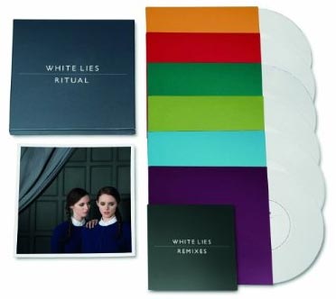
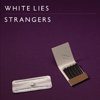
White Lies – Ritual
Record Label
Fiction Records
The Artists
Design & Art Direction – Tom Hingston Studio
Photography – Jonathan de Villiers


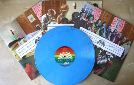
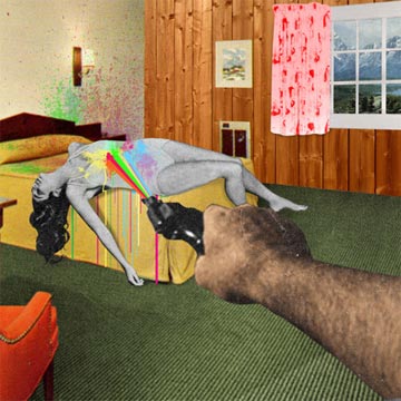
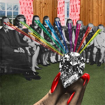
White Wives – Happeners
QUOTES FROM:
JESSE LENZ, ARTIST AND DESIGNER
CHRIS “#2” BARKER, WHITE WIVES’ GUITARIST AND VOCALIST
THEMES & CONCEPTS
“We decided to revision the Seven Deadly Sins as it would take place in suburban America. Unfortunatly we couldn’t print all Seven, but there might be a special release vinyl coming out… We wanted to twist the “plot” once the viewer got half way through the artwork, so we put the families in a huge lab where these Big Brother / Corporate America looking figures were watching them. They could be studying them or forcing them to sin.” – Jesse Lenz, on his website
“We wanted to create every aspect of the art, the CD, the vinyl itself, to our shirts, pins, whatever. They are all planned to compliment one another and achieve the goal of creating a reaction to the imagery.” – Chris “#2” Barker (#2)
CREATIVE PROCESS
“We gave [Jesse Lenz] music, song titles, lyrics, all as quickly as we could. We were in the studio when the art was created. I remember viewing the cover after tracking some vocals and really believing our vision was coming together.
It was digital mostly, but I know that Jesse uses a vast catalog of vintage magazines and ads to create his collages. I believe the hand cut images get cut, pastes, manipulated, scanned, organized. It’s the definition of mixed media.” – #2
COLLABORATION
“My wife is a graphic designer and worked with Jesse Lenz on a project at her work. She recommended I call him for the White Wives artwork. She was way right! I loved the meeting we had at a chinese restaurant. It was so simple. We instantly clicked; he brought a portfolio that blew our minds. The food was terrible. I don’t think Jesse ate.” – #2
EXTRAS
“The art was created to have no singular cover. Each panel can be moved into that position. For the vinyl, we released 3 separate jackets. We also created silk-screened posters that went out with album pre-orders where we had a local friend re-draw and print his interpretation of the covers.” – #2
Record Label
Adeline Records
The Artists
Layout & Design – Jesse Lenz
Mediums & Materials
Collage, Digital

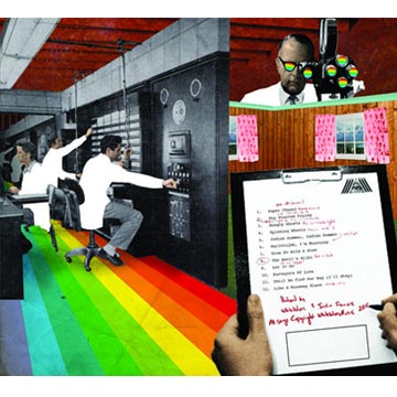

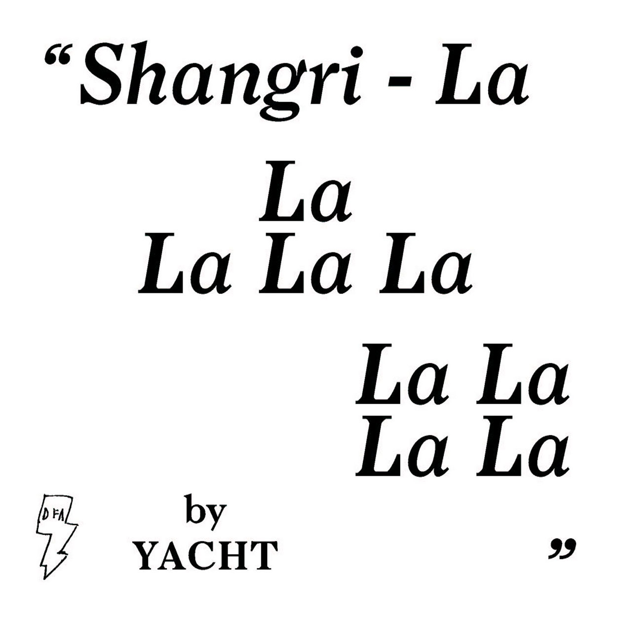
YACHT – Shangri-La
YACHT usually manage all aspects of their design and branding, in every medium and every field. The only exceptions are their last cover for See Mystery Lights, which was illustrated by Boyd Elder, a Texas-based artist, and this packaging for Shangri-La, which is quite an experiment in pushing the definition of what album art can be.
QUOTES FROM:
YACHT
THEMES & CONCEPTS
“Because ‘YACHT’ is the name we use for everything we do — music, text, objects, video, and design — we don’t consider any part of our output to be peripheral. The design of the YACHT website is as important to the experience of YACHT as our live shows are. So it should go without saying that we go to great pains to make sure that the physical copies of our albums are things worth owning. Of course we are great advocates of the online, of the massive interconnected reality of ineffable connection, but we also believe that touch matters. Physical objects matter. As Hermann Hesse wrote, they give ‘life to the dead world around us, endowing it in a magical way with new instruments of love.’
“Shangri-La is definitely such an instrument of love. It pulls together a wide array of our favorite influences into one encyclopedic document that belongs on a bookshelf as much as it belongs in a record store bin. It was important for us make something that came from print design — not music or commercial design — which is why we enlisted the help of Scott Ponik, who largely makes books.”
“Shangri-La is a very rigidly designed object… As far as we know, no one has ever packaged an LP or CD quite like this. The LP and CD are both nested in four removable nesting dust jackets, each of which is a high-quality oversized print document that could stand on its own. The outer dust jackets are like inverted liner notes; the album borrows formal elements from books, stylizing and exaggerating them to illustrate that the album plays both with narrative and literary themes. The dust jackets display lyrics and colophon on their inner flaps, and large-scale images on their outer pages. The images we chose range from 18th century utopian architectural studies to science-fictional texts that speak to the larger aspirations of this band. Each image provides fans the opportunity to dive deeper into the raw materials of what makes YACHT what it is.”
EXTRAS
“It was extremely difficult to make this album look the way it does. To date, the European version of our album is a standard booklet-in-jewel-case thing; we couldn’t convince our label over there to invest in such an object. We believe, of course, that people don’t buy CDs not because they don’t want to participate in owning the music, but because CDs aren’t made to last, and aren’t made to add value or beauty to the world. We’re lucky to have a record label (DFA Records) that understands the importance of attention paid to design. They took a risk with this, and we hope it’s been a worthwhile experiment.”
“It was also important to us that people understand how this album is different from others–and how it actually works–so we made an “unboxing” video (borrowing from the trope of online “unboxing” videos, usually reserved for technology products) in the woods.”
Record Label
DFA Records
The Artists
Layout & Design – Scott Ponik
Additional Graphics – Aaron Draplin
Photography – Alin Dragulin
Painting – Jim Burns
Mediums & Materials
Film Camera, Pen, Paper, Scanner, Photoshop, Illustrator, InDesign
PURCHASE: CD (FROM DFA RECORDS) + LP (FROM DFA RECORDS)


[…] 12 Collage + 14 Digital Illustration, Drawing, Design + 19 Illustration, Painting, Drawing + 8 Black And White Photography + 22 Color Photography + 6 Deluxe Packaging + 10 Fashion, […]
[…] 12 Collage + 14 Digital Illustration, Drawing, Design + 19 Illustration, Painting, Drawing + 8 Black And White Photography + 22 Color Photography + 6 Deluxe Packaging + 10 Fashion, […]
[…] 12 Collage + 14 Digital Illustration, Drawing, Design + 19 Illustration, Painting, Drawing + 8 Black And White Photography + 22 Color Photography + 6 Deluxe Packaging + 10 Fashion, […]
[…] 12 Collage + 14 Digital Illustration, Drawing, Design + 19 Illustration, Painting, Drawing + 8 Black And White Photography + 22 Color Photography + 6 Deluxe Packaging + 10 Fashion, […]
[…] 12 Collage + 14 Digital Illustration, Drawing, Design + 19 Illustration, Painting, Drawing + 8 Black And White Photography + 22 Color Photography + 6 Deluxe Packaging + 10 Fashion, […]
[…] 12 Collage + 14 Digital Illustration, Drawing, Design + 19 Illustration, Painting, Drawing + 8 Black And White Photography + 22 Color Photography + 6 Deluxe Packaging + 10 Fashion, […]
[…] We aren’t the only ones who thought the CD was beautiful. Seattle based Redefine Magazine listed it in their article ”Album Covers of the Year 2011″. […]
[…] Photography + 6 Deluxe Packaging + 10 Fashion, Sculpture, Installation _____________________________91 Album Covers For 2011 […]
[…] Photography + 6 Deluxe Packaging + 10 Fashion, Sculpture, Installation _____________________________91 Album Covers For 2011 […]
[…] Photography + 6 Deluxe Packaging + 10 Fashion, Sculpture, Installation _____________________________91 Album Covers For 2011 […]
stfu