If you are just joining us, START FROM THE BEGINNING.

#54
The Black Keys
Brothers
Nonesuch Records
Though the album artwork for The Black Keys’ Brothers is very obvious and literal, a lot more thought went into it than one might realize.
Designer Michael Carney is the brother of drummer Patrick Carney, and has long designed the band’s collateral. “I have done all of the artwork for all of their releases and almost all of their t-shirts since the band started. we are all good friends and also have an amazing working relationship,” Michael Carney explains.
“There was really no concept given to me to work with on this one… and I actually didn’t get the title till really late,” Carney says. “The concept that we used was something we had all joked about for a few years… I figured it was kinda a long shot, but I mocked it up and sent it to them, and we all decided to just run with it.”
That attitude is reflected in The Black Keys’ music and live performances, which have a worry-free attitude. Yet, on the part of the design, Carney incorporated small elements which are only visible to those who are really looking. “The type was laid out on the computer, printed, and then hand-drawn,” he says. “I did some other stuff to it too; I basically wanted it to feel really subtly hand-done. The background color was painted and done by hand to give it texture.”
About The Artist
Art direction and design by Michael Carney, a freelance designer, artist, and musician. – www.carneymatter.com

#53
Gangrenator
Tales From A Thousand Graves
Apocalyptic Empire Records
With song titles like “Cyclops Tribes Of Inner Earth” and “Irradiated Renegades,” Tales From A Thousand Graves is an album set, contextually and lyrically, in fantastical worlds. According to the Norwegian death metal and grindcore band, “The album is a collection of hooded ghouls, mangling murderers and heavy gravestones of grinding death, carried by tentacled creatures from the phosphorescent abyss. No form of life will survive their skeletal gesticulations!”
Bridging the gap between the music and art for this monster and ghoul-inspired release is Skinner, a Northern California artist whose works are heavily inspired by fantasy, comic, and science fiction. The finished product is set in what looks like a cemetery surrounded by skulls, but battling creature-warriors lighten the tone a bit.
About The Artist
Illustration by Skinner, a multi-disciplinary artist. – www.theartofskinner.com
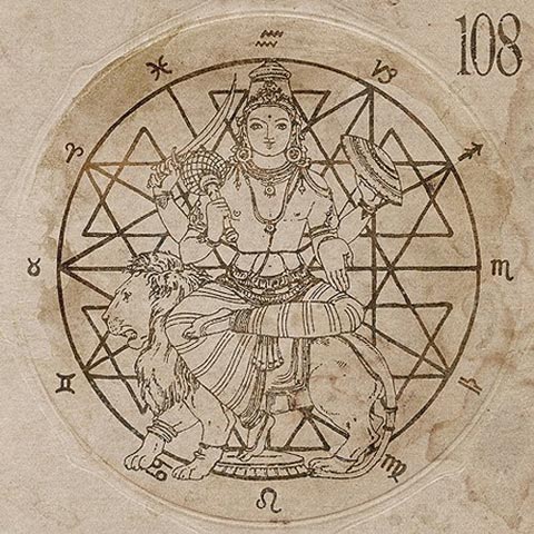
#52
108
18.61
Deathwish, Inc.
From an outside perspective, 108 is a band that is rather distant and mysterious. Its members are of Hare Krishna faith, and the band’s latest album, 18.61, is a reference to “the 61st couplet of the 18th chapter of the sacred Hindu scripture, the Bhagavad Gita,” according to Noisecreep. The passage translates in English to, “The controller of all lies at the heart of the machine, and connects its wires to the living being who is under its spell.”
With such a solid theme for the album, it makes sense that the band had a clear idea for the album artwork as well. The pen and ink illustration, created by Jacob Bannon, a close friend and collaborator of the band, was executed under what Bannon calls “a ton of direction and instruction from the band members.”
“The goal was to create something that embodied all of the spiritual and personal leanings of the band. In the end, I felt we collectively reached that goal,” says Bannon. “108 is a complicated band, but that volatility and drive to explore and question is what makes them so passionate, as well as interesting to work with.”
About The Artist
Artwork and design by Jacob Bannon, artist, designer, writer, and frontman for Converge. “Some people consider what I do as ‘life’ art, as it’s all encompassing,” says Bannon. “If I’m not working on my own projects, I’m promoting the work of others who I believe in and want to champion.” – www.jacobbannon.com
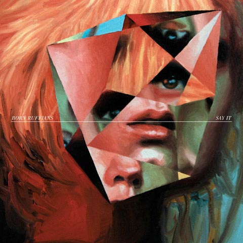
#51
Born Ruffians
Say It
Warp Records
Say It‘s cover is an oil painting depicting how holding back and avading communication can create confusion and build up tensions. The image, created by fine artist Jeremy Olson, features a discombobulated portrait. Similar to a cubist piece, the rearrangement of the face is strategically placed in a prism-like organization, with eyes, nose, and mouth everywhere except for where they should be. The mouth is the focus, placed in the space between the band’s name and the album title. The placement conveys conversation, capturing the ever-present theme of the disc, about speaking out truthfully and passionately about what you feel.
The cover serves as a portrait of Born Ruffians in a particular stage of its band life. In an interview with Stereogum, Born Ruffians’ frontman Luke Lalonde speaks of tension between band members, likely due to “too much touring.”
With the album released and more touring adventures to come, Say It is a reminder to the band members to speak and hold nothing back, lest they fall victim to another quibble with one another.
About The Artists
Design by Rob Carmichael at SEEN Studios. – www.seenstudio.com/
Painting by Jeremy Olson. – www.jeremyolson.com

#50
Caribou
Swim
Merge Records
The dizzying album artwork for Swim might be taken for granted, given its album title. The elements which comprise the rings of the hypnotically-captivating arrangements are surprisingly comprised of flowers and flame-like patterns, all of which stray far from the reality of bodies of water. Such geometric mysteries and stylistic surprises are, essentially, what we’ve grown to expect from Caribou’s Daniel Victor Snaith, and its great to see that sense of mystery in Swim‘s album artwork.
About The Artist
Art direction, design, and photography by Jason Evans. – www.jasonevans.info
#49
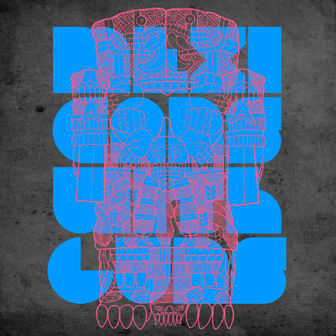
Mexicans With Guns
Me Gusto
Innovative Leisure Records
Mexicans With Guns has come out with his EP, Me Gusto, and if looks could kill, this album would shotgun your face… but you’d like that. With music that has been referred to as “Mexican Dubstep,” his music is definitely fresh to death, and this cover, created by the musician himself, is a matching ensemble of his music.
“Mexicans With Guns put a gun to my head and demanded that I create a design for the EP or else I’d get blasted; we are one [and] the same person though, so the whole scenario felt a little like Fight Club,” says Ernest Gonzales.
Gonzales wanted the album artwork to serve as a visual representation of the Mexicans With Guns sound. “The MWG sound is a combination of modern bubbling synths and hard drums combined with various Latin folk music elements,” he says. “I decided to represent this old and new by combining a minimal font with the line drawing of an old Aztec Goddess. The artifact represents age, but also represents the indigenous sounds that I was starting to bring in with my sound.”
About The Artist
Design by Ernest Gonzales, of Thought Control. – www.antipop.net/wordpress

#48
The Moondoggies
Tidelands
Hardly Art
Creating the album art for The Moondoggies’ Tidelands was a step-by-step process, with a result that attempts to capture the mood and themes of the album. Enlisting the help designer Wes Duvall, who created the artwork for their last EP, You’ll Find No Answers Here, the Seattle-based band worked with multiple potential photographers to capture the right feel.
“They had some photographers picked out to shoot ideas,” Duvall explains. “I received great images from Christopher C. Nelson, Kevin Faulkner and Ryan McMackin. Once I saw Ryan’s shot of Rattlesnake Lake from outside of Seattle, I built the rest of the package around that central image. It’s very iconic and set a mood.”
The mood which comes across is one of muted beauty, majestic and grand — a portrait of the band’s hometown in the Pacific Northwest.
“I listened to the record, and it made me think of Rockaway Beach or Coney in the fall,” says Duvall. A good feeling, but a little somber and uneasy at the same time.”
About The Artists
Photography by Ryan McMackin. – www.rmcmackin.com
Design and layout by Wes Duvall, who also creates editorial illustrations and prints. – www.wesduvall.com

#47
Viernes
Sinister Devices
Kanine Records
After meeting Viernes through mutual friends and subsequently hearing the band’s musi, artist Charles Bergquist knew immediately that he wanted to collaborate. The creative relationship began with a music video Bergquist directed for “Liquid Tunnel,” and continued with show posters and full-length projections for the band’s live sets. A transition from there to album art design was almost brainless, and amazingly easy.
“They let me just go off for a week, create a bunch of ideas and then bring them back,” Bergquist explains. “We combed through them, collaborated, and eventually arrived at the artwork. Overall, we knew we wanted it simple, colorful, yet have the main image [be] haunting, but beautiful…” says Bergquist.
At the forefront of all of Bergquist’s designs is photography. “Everything I design is with all original photography, scans, textures… etc. This process was the same. I was in Washington in the summer and a storm had come up quick. The clouds looked surreal, so I used that as a base,” he recalls. “From there, I worked on color overlays and a lot of textures… there’s a lot of detail in there.”
Amongst the intricacies that Bergquist mentions is a hidden image — a staple inclusion of his. Unfortunately, this detail is largely lost when the album cover is viewed on the web. “Another reason to pickup the album, especially on vinyl,” hints Bergquist.
About The Artist
Artwork by Charles Bergquist, who works at Fiction as a director, Pitchfork as a video and photography contributor and Sezio, a San Diego non-profit arts organization, as a designer, photographer and video contributor. – www.charlesbergquist.com

#46
The 1900s
Return Of The Century
Parasol Records
In its second LP, Return Of The Century, The 1900s comes back from its hiatus of three years with a sound that is embodied by the album art for Return Of The Century. As the designer of the album, Michael Renaud explains, “I think it really feels like a clean slate. The vibrance and life on the cover is due to its simplicity. And if you know the band, this is true for them as well, especially now.”
The original image is a photograph by Jessica Labatte, and was chosen by the band before Renaud became involved. Because the band liked the image so much, however, the remainder of the album artwork was created with a minimalist approach in mind.
“I basically tried to make everything as understated as possible while sticking with the feeling of the photo, so I used one typeface at one size and reproduced her greyscale background for the panels,” explains Renaud. “I created a gradient that used the colorway of the ribbon to use throughout the text blocks, spine and barcode.”
The use of negative space on the album packaging easily leads the viewer’s eye to points of interest, guiding his or her attention to only what is determined worthy of being noted: the band’s name, the ribbon, and the details of what contributed to the album. It’s a compact piece of work that has a large roar for such a small bite. With Return Of The Century, the 1900s has paved a clear return back into the spotlight with something simple, clean, and beautiful.
About The Artist
Photography by Jessica Labatte. – www.jessicalabatte.com
Design by Michael Renaud, a noted fixture in the graphic design community and long-time friend of the band. www.michaelrenaud.com.
The Extras
The back cover was utilized to highlight the band name and album name. “I typeset them, printed it at the weight that would match the width of this spool of ribbon I had, and taped pieces of clipped and curled ribbon to the stems and terminals on the typeface. I used my phone to take pictures of the monochromatic collage and finished it on the computer,” Renaud says.
#45
Yeasayer
Odd Blood
Secretly Canadian
The Odd Blood cover is rather outlandish, just like the album itself. Odd Blood is visually and musically a love it or hate it creation, but regardless of that, one can’t deny that it succeeds in being memorable, just like every other outwards-facing project Yeasayer has undergone this year.
About The Artist
Layout and design by Daniel Murphy, Secretly Canadian’s in-house designer.

#44
Buke & Gass
Riposte
Brassland
“Danger! Danger! Don’t run with scissors!”
“But it’s my favorite sport! The look on people’s faces are classic.”
And with Buke & Gass by your side, you definitely have an eye opener (literally and figuratively) in their debut LP, Riposte. This LP is a threat to all that is good and organized. Even though the picture is simple, it is gloriously rebuking you and your simplicity.
“Arone gleefully occupied herself with scanning her hand in uncomfortable positions holding random items found within reach,” explain the band members, Arone Dyer and Aron Sanchez. Monetary limitations led the two to create the album artwork themselves, through modest means. “The outcome proved to be interesting, with the original scans sharing an eerie aesthetic resemblance to that of a 1920’s photo close-up. Colors were removed or enhanced, making it look a bit more like a chalk drawing, but overall, there was very little post-production done to the scans.”
It’s good to see the band not only active in the creation of its album art, but having a hand in creating it. With an album that cuts so many different genres and categories into a unified (and sometimes disjointed) sound, how appropriate it is that the album cover features Dyer’s hand carrying scissors!
After all, as the duo itself says, “Buke & Gass are very hands-on.”
About The Artist
Artwork by band members Arone Dyer and Aron Sanchez. –
The Extras
The liner notes and lyrics were also hand-written on a sheet of paper over the course of two hours. “Words cannot express the tedium involved,” Dyer and Sanchez say.

#43
Terrible Things
Self-Titled
Universal Records
Terrible Things’ latest self-titled album is lyrically centered around vocalist Fred Mascherino’s hometown of Coatesville, Pennsvylania, whih was affected by over 40 arsons in the course of only a few months. By working with photographer Ryan Russell, Terrible Things managed to visually portray the topic of arson in a playful way that seems fitting of the band’s name.
“At first, we thought about trying to figure out how to have a bunch of rowhouses in the shot from the actual places, [but] we didn’t feel that would be telling a story [so] much [as] just displaying what was left of the damage,” explains Russell. Once the two decided to instead set a small house on fire, serendipity swooped in.
“A day later, Fred was driving down the road, and someone threw an entire dollhouse in the garbage; he hopped out and got it and immediately called me saying we had our house,” Russell continues. “After more discussions, we thought it would be cool to take on the role as the arsonist.”
Mascherino and Russell set up the dollhouse in Mascherino’s backyard, covered it with lighter fluid, and, in Russell’s words, “just set it in on fire with kids and a very nervous wife close by.”
About The Artist
Artwork and photography by Ryan Russell, who is a photographer. “I do a lot of press/live music photography but mainly I just go around documenting the places I visit around the country, and a lot of my home state of Alabama,” he says. – www.ryanrussell.net
The Extras
“We shot the rooms of the dollhouse originally with items inside, to make it as the arsonist’s home after his family discovered his secret and left,” says Russell. “Once we shot the cover with the house burning, the rooms looking burnt out had this incredible aesthetic, so we shot photographs of that as well. They ended up being all the interior photographs for the record, except for the one under the disc. That is actually one of the original inside shots we set up, and Fred loved it too much not to use it somewhere.”
#42
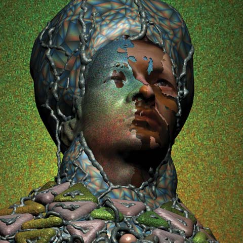
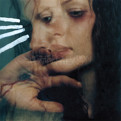
Light Pollution
Apparitions
Carpark Records
A record born out of isolation and steeped in ambient textures, Apparitions is a hauntingly beautiful listen. The album cover artwork, featuring a photograph by Alexi Tan, was one that band member Jim Cicero had had for a long time.
“It’s a photo from a pretty old photography book I had… I’ve been carrying it around and in love with it for years. It fit all the themes on the record so perfectly, all the spiritual and religious concepts… I had to use it,” he says.
About The Artist
Photography by Alexi Tan.
Design by Rob Carmichael at SEEN Studios. – www.seenstudio.com/
Concept and additional design by band member Jim Cicero.

#41
Les Savy Fav
Root For Ruin
Frenchkiss Records
Root For Ruin‘s album cover boasts a captivating color palette of pinks and blues, and slight angularities make it fascinating for inexplicable reasons. Bold and educated typography draws a viewer in, and it’s exciting that band members Seth Jabour and Harrison Haynes were responsible for this creation.
“As a band whose members straddle both fields, music and art, and who have always hung around with other bands that design their own cover art… it just seems like the way things are done,” says Haynes, regarding musicians creating their own album artwork.
When the band was recording Root For Ruin, Haynes was working on still life photography in his art studio. The members of Les Savy Fav began to see parallels and connections between the photography and the music on Root For Ruin. It was surprising, as most album titles with the name Root For Ruin “seemed to be about embracing catastrophe.” Les Savy Fav instead began with a sculptural diorama Haynes created, using mirrors, mylar tape, extruded foam, and safety netting, and shot the arrangements from many different angles, until one clicked.
“There was a seductive, illusionistic thing going on,” explains Haynes, “but also an acknowledgment of the smoke-and-mirrors, fake-out vibe, too. I would say that one of the defining traits of our band is the exposed apparatus, or an inability to achieve slickness.”
Once a final photograph was decided upon, Jabour stepped in and arranged the copy, layout, and packaging specifics. “We were going for as much of a handmade look as possible,” says Jabour. “Harrison wrote all the type out by hand, and I placed it digitally.”
The final product is messy and imperfect in a beautiful way, just like the music of Les Savy Fav.
About The Artists
Concept by Les Savy Fav.
Photography and type by band member Harrison Haynes. Haynes was recently invited to participate in a museum exhibition called The Record: Contemporary Art And Vinyl, which is on display through February 6th and again at ICA Boston from April 15 through September 5. “The curator, Trevor Schoonmaker, researched, gathered and exhibited videos, paintings, photography and sculpture by an array of international artists who, during the last 20 years, have acknowledged record albums as important to their practice,” explains Haynes. “Along with six other artist/musicians, I was invited to put together a crate of 20 albums whose cover images are related by some visual or conceptual thread. I spent the year prior to the opening searching for LPs with cover images related to reflection, refraction or mirrors.”
Layout and design by Seth Jabour.
The Extras
“I used the mirror theme from the front and back cover and created a motif that’s used throughout the CD booklet and LP gatefold,” Jabour explains.
#40
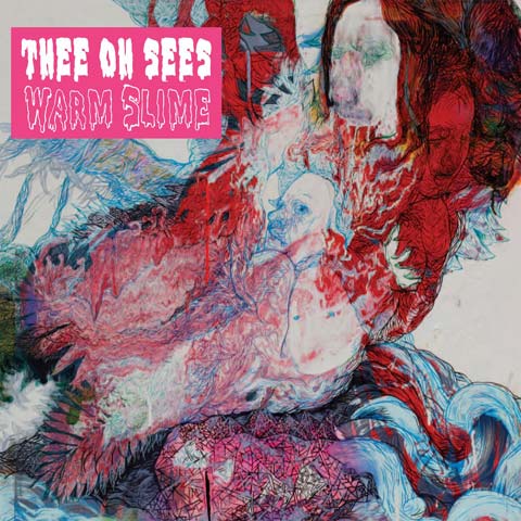
Thee Oh Sees
Warm Slime
In The Red Recordings
For Warm Slime, Thee Oh Sees enlisted the help of frontman John Dwyer’s former roommate, Kyle Ranson.
“John saw the painting at my friend Kim’s house and asked if he could use the image for a record,” says Ranson. “I guess when he saw the painting, he thought Warm Slime.”
The original painting, created by Ranson on an old silk screen which was used to make wallpaper, involved a process which incorporated elements of randomness. “I pushed paint through the screen then twirled it to get a strange spin art affect,” Ranson explains. “Then the amorphous shapes began to look like figures and faces that I just pulled out with detail.”
Choosing an already-formed piece of art seemed to work well for Thee Oh Sees and Ranson.
“I love John and his music, so I was into it,” says Ranson. “He generally has some of my favorite local artists do covers. People who don’t necessarily do album covers.”
About The Artist
Artwork by Kyle Ranson, a Bay Area painter and installation artist.
#39
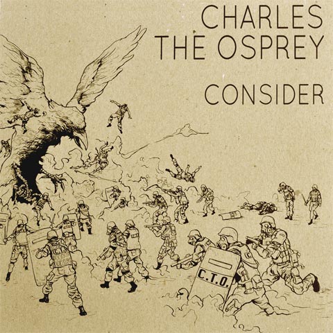
Charles The Osprey
Consider
Fiction Records
Though illustrator Ryan Hill didn’t even have the chance to listen to Charles The Osprey’s Consider before crafting the album artwork for it, he could not resist an offer from band member Derek Lancioni for Hill to submit his artistic ideas.
“I wasn’t given a concept for the album, other than to make something that was bad-ass. That type of freedom to create can be the most enjoyable, unless you over-think it,” says Hill, who had seen the band perform live, and therefore knew what kind of vibe to incorporate.
“For no inherent reason, I had wanted an excuse to do a riot scene for awhile, so jumped at the chance. Wondering what the conflict might be, I figured the band’s mascot could get involved,” Hill says. “Since the album is instrumental, I thought it would be nice to keep the illustration open-ended.”
Evidently, the band enjoyed his contribution, and the inclusion of the osprey as the major character in the illustration tied it all back to the band. Though the image was scanned in and digitally laid out, Hill tends to stay away from digital media, opting instead to stick to “a healthy dose of ink, watercolor, and oil painting.”
About The Artist
Illustration by Ryan Hill.

#38
Suckers
Wild Smile
Frenchkiss Records
When designing the album cover for Wild Smile, the members of Suckers kept in mind their opinion about the small part album artwork seems to play in the music industry these days. Austin Fisher of Suckers explains by saying, “I just imagine most people see an album cover on the computer screen first these days, and it’s usually going to be a small image, so I wanted something that could work in that format as well as in the traditional physical formats.”
Though the band didn’t have a clear and concise concept from the very start, it knew it wanted “something loud.” “We wanted something that would make you look twice if you saw it on the shelf at a record shop,” says Fisher. “I had found the mandrill photograph a few years ago, and I kept it around, thinking it might be useful for something someday. As we were tossing around ideas for the album art, I dug it out, and it seemed to fit the mood of the record to us.”
The fact that the mandrill image was a found image from the internet seems to jive completely with the band’s attitudes towards technology and music consumption. “On one hand, the whole package is very important to me. A good cover can enhance your experience with the music,” says Fisher. “On the other hand, most of the time, I’m listening to music through an iPod or computer. Album artwork isn’t as tied to the experience of listening to a record as it was when I was a kid. We have a very visual culture now due to computers, but imagery seems more dispensable.”
With the intense eyes of the mandrill peering out at listeners, the cover of Wild Smile is immediately engaging. And, if you give it a chance, it might run even deeper than that. Says Fisher, “If you stare into the eyes of the mandrill for long enough, you’ll grow hair where there wasn’t hair before.”
About The Artist
Created by Suckers. – www.suckersmusic.com
Art direction by Adam Squires.

#37
Callers
Life Of Love
Western Vinyl
Throughout the recording process of Callers’ Life Of Love, Douglas McQueen, a long-time friend of the band, served as a springboard to bounce ideas off of.
“At my request, Ryan was constantly giving me new mixes and versions of the songs as they were being recorded,” reveals McQueen. “At various points, we would hang out, drink cups of whiskey, and go over the entirety of things as they were being developed and recorded.”
Throughout this process, McQueen familiarized himself with the recording, and when Callers approached him about doing the album art, he combined inspiration culled from outside sources, as well as from the music, to create the final product.
“… The BP spill in the gulf had been going for about a week. I was seeing these beautiful and extremely tragic shots of the spill dispersing out over the surface of the water. I was thinking about the idea of wells (oil wells, wells of emotion and creativity) that, once tapped, explode beyond any control,” McQueen says, regarding the acrylic painting. “And, although it’s an abstract image, lyrics from the album played a big part in the creation, as well.”
Though McQueen is more of an mp3 consumer than what he calls a “vinyl fetishist,” he sees the importance in creating memorable packaging. Callers’ Live Of Love features a die-cut package. “I believe that, these days, if a band is going to go to the trouble of producing an actual vinyl recording of their sound, than they should go the full distance,” says McQueen. “Make the entire package a cohesive and complete experience. From the album art to the music contained inside, give the person who discovers your album 10, 20, 100 years from now an object to really hold onto and think about.”

About The Artists
Artwork by Douglas McQueen. – www.dougmcqueen.com
Design and art direction by Brian Sampson, owner and operator of Western Vinyl. “It was [Sampson’s] idea to die-cut the lettering and reverse and slightly mute the original painting, which of course gives the whole thing that excellent psychedelic effect,” says McQueen. “This, by the way, was about 2 hours after he got the original image in his email. Callers approached me (perhaps a little apprehensively) to show me the adjustments he had made. I said, ‘Do it,’ without any hesitation. I was blown away.” – www.westernvinyl.com