THE BREAKDOWN
12 Collage
+ 14 Digital Illustration, Drawing, Design
+ 19 Illustration, Painting, Drawing
+ 8 Black And White Photography
+ 22 Color Photography
+ 6 Deluxe Packaging
+ 10 Fashion, Sculpture, Installation
_____________________________
91 Album Covers For 2011
QUOTES FROM:
ELENA JOHNSTON, DESIGNER
THEMES & CONCEPTS
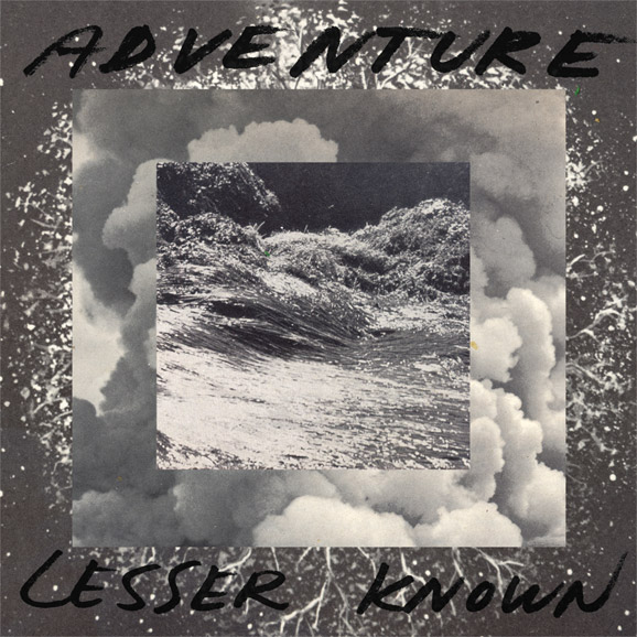
“I had been working with the idea of framing compelling found images with other found images to play with texture and spacial relations. I was also really into water imagery and space imagery at the time, so I played with how these two ideas visually and conceptually play with each other.”
THE EXTRAS
“I hand-drew the typography, and it was eventually printed in glossy ink onto the matte finish of the image, so it stands out more.”
Record Label
Carpark Records
The Artists
Design – Elena Johnston
Booklet Design – Benny Boeldt
Mediums & Materials
Collage, Digital
Adventure “Rio” by Carpark Records
QUOTES FROM:
DEWEY SAUNDERS, ARTIST AND DESIGNER
THEMES & CONCEPTS
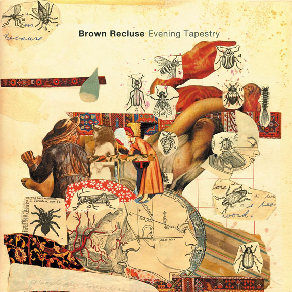
“Basically, it started with a zipped file from Tim of images he was interested in. It was mostly really vintage posters with a lot of collage work that kind of sparked the initial brainstorm. The imagery came from a variety of sources such as an old Grey’s Anatomy, Webster’s Dictionary, a book on Alchemy and Mysticism, handwritten notes, slices from a collection of Encyclopedia Britannica from the 1950s. There is also a book cover from an ancient copy of Alice in Wonderland included in the piece.
“The cover is the anatomy of dreaming, and it has a nightmarish quality that parallels the music. The album is really kind of haunted in a playful, poppy kind of way, and I think the artwork kind of tapped into that surreal world of eerie juxtapositions and a beautiful darkness.”
CREATIVE PROCESS
“When I work on a collage, I flip through my collection and certain pictures speak to me. It is a very intuitive project. Although there are about 15-20 books that I sourced from, all of the images share a certain quality and go together in a cohesive image. The entire act of creation was very lucid and automatic, kind of the process of artists from the Surrealist movement. The process was fueled by the deep movements of my subconscious, and I allowed myself to be a vehicle for the inspiration.”
THE EXTRAS
“All of the collages I did for the back and interior are pretty risqué, and I covered up a lot of the graphic imagery to make a tasteful package that creates intrigue.”
Record Label
Slumberland Records
The Artists
Collage & Design – Dewey Saunders
Mediums & Materials
Collage, Mixed Media
SEE: DEWEY SAUNDERS’ BLOG, HUMBLE WONDER, AN ARCHIVES OF PRINTED MATTER AND FOUND VINTAGE EPHEMERA


Record Label
Planet Mu
“girls in bikinis wearing giant diamond-covered mickey mouse heads dancing at a pool party.”
Emil & Friends – Lo & Behold
QUOTES FROM:
CHRISTOPHER MONRO DELORENZO, ART DIRECTOR AND DESIGNER
THEMES & CONCEPTS
“[It’s a] colorful collage of light and magic on the roof of your skull. When I first heard the song ‘The Beast’ — which later got cut from the album — I just imagined this burst of confetti and people rollerskating. From there, it’s just history. The confetti took shape and the name Emil emerged. I wanted to make something timeless and cool, over-the-top but not overwhelming, with a nod to classic ’70s bands like Chicago and The Steve Miller Band.”
CREATIVE PROCESS
“Emil gave me a lot of creative freedom for the artwork, since it originally came from my unsolicited design idea for his EP. They just fell in love with it, and we all agreed it was a perfect fit.”
Record Label
Cantora Records
The Artists
Art Direction & Design – Christopher Monro DeLorenzo
Photography – Mike Dravis
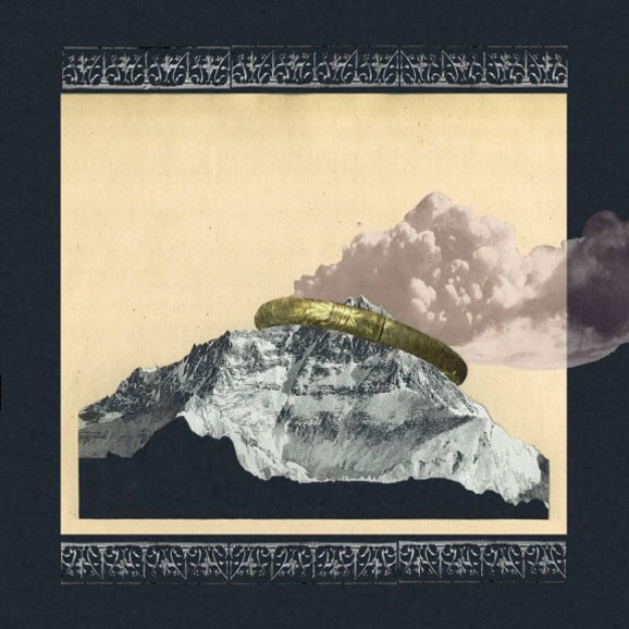
Family Portrait – Self-Titled
Record Label
Underwater Peoples
The Artists
Collage & Design – Martin Courtney, Mike Mimoun, Evan Brody, Ari Stern
Logo Design – Robert Beatty
QUOTES FROM:
SONNY KAY, ARTIST AND DESIGNER
THEMES & CONCEPTS
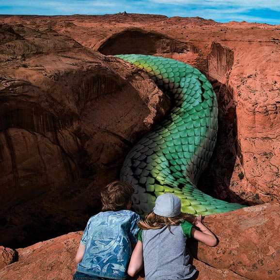
“The Glitch Mob approached me with essentially one concept in mind. They wanted to illustrate a situation where people were noticing something truly out of the ordinary in the context of their everyday lives. Beyond that idea, I was free to come up with really any concept I thought might fit. I wound up with a handful of ideas I thought might be good, although one of them (the snake in the canyon) was definitely the most striking, and that became the cover art. The band ended up using three others in the iTunes digital booklet. They didn’t want to include text, so the task was basically to find/create the most interesting single image to convey the idea.”
CREATIVE PROCESS
“The Glitch Mob and I first worked together last year on a pair of singles and then the cover art for their Drink the Sea album. Since the Drink the Sea album cover had a kind of “southwestern” feel to it, I thought it would be interesting to continue with that theme, as if the scenarios in the images were happening just down the highway from where the album cover was taking place.”
Record Label
Glass Air
The Artists
Art Direction & Concept – The Glitch Mob
Artwork & Design – Sonny Kay
Mediums & Materials
Found Imagery, Photoshop


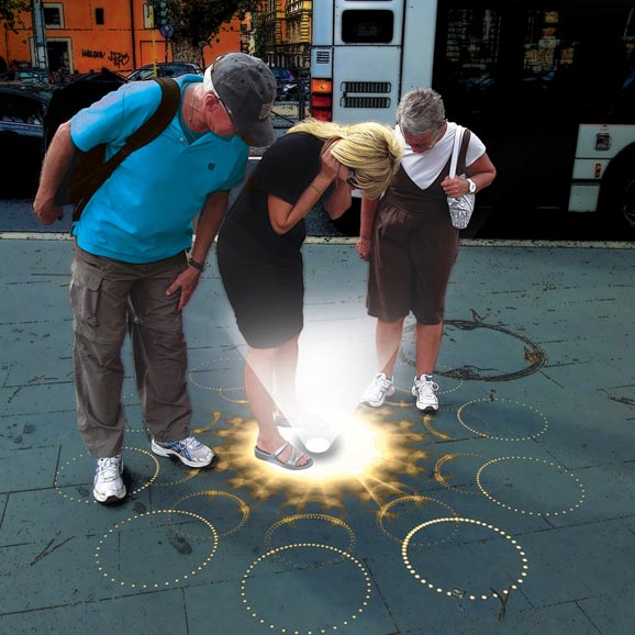
Listen to “I Led Three Lives” – DOWNLOAD MP3
QUOTES FROM:
EMIL AMOS, GRAILS’ DRUMMER
THEMES & CONCEPTS
“We were pulling from 2 different elements. First, the title of the record was taken from a writer named Peter Dale Scott who coined the phrase ‘Deep Politics’ in an attempt to explain hidden motivations in the shadow of the collective consciousness. He’d written a pioneering book on the factors behind why JFK was killed… and, tangentially related, the legend of ‘the Umbrella Man’ is one of the stranger aspects of the assassination. He’s captured on film raising the umbrella up and down just after JFK is shot; standing right next to the limo as it passes. It’s one of the events at the scene of the crime that implies conspiracy in plain view… remaining an insidiously opaque gesture that is simultaneously well-documented but out of reach of our understanding. The Umbrella man has been the focus of decades of bizarre analysis.”
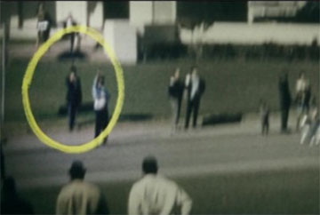
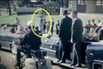
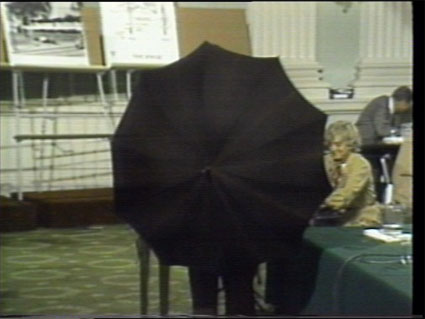
“We’d also used a figure turned away from the viewer for the second jacket cover of Doomsdayer’s Holiday… a quick and easy way to represent the unknowable.”


CREATIVE PROCESS
“The second element we borrowed from was the culture of rare television soundtrack LPs made in the 70s (‘Library records’)… the jacket was designed to look something like a British soundtrack to a ’70s Secret Service drama. At the time, I was super obsessed with a show on the BBC called The Sandbaggers… I think that show and the opening theme by Roy Budd had a somewhat unconscious effect on the aesthetic vibe. The illustrations of Big Ben inside the gatefold were taken from the cover of a rare British TV soundtrack LP called Expanding Horizons.”
“The overall look, fonts and colors of the packaging were all put together by Alex Hall [Grails guitarist]. There’s a particular street-level mystique in spy films and conspiracy themes that I think comes through in the artwork… rather than the aesthetics of fantasy or escapism. In addition, the yellow tint and the title font Alex used were subtle nods to Italian Giallo paperbacks and film posters.
“The covers usually begin by digging out an old collage I’ve made, and then Alex re-envisions it using Illustrator.”
THE EXTRAS
“I’d had a serious run of making collages for a few years that’s largely been replaced by making videos in a similar way. It’s a late-night drinking meditation method… also a way to take breaks from mixing while battling with severe bouts of Tinnitus.”
Record Label
Temporary Residence LTD
The Artists
Design – Alex Hall
Mediums & Materials
Collage, Digital, Typography (hand-drawn)
QUOTES FROM:
ELIAS BENDER RØNNENFELT, ICEAGE
“The cover is made from two different newspaper cuttings of a fire in an apartment building located in the small danish town Helsingør. One of the pictures is used as background, and the other is cut out in the shape of our logo. I made the cover during the days we recorded the album, and I think it fits the collection of songs quite nicely. A detail I like is that you can see the small letters from the backside of the news cuttings if you look closely.”
Record Label
What’s Your Rupture?
Mediums & Materials
Collage, Newspapers
Record Label
Planet Mu
The Artists
Design – Sam Chirnside
Editor’s Note: Pardon our mistake; this is actually a 2012 release.
“Daydream Suburban”

Sad City – Gestures
QUOTES FROM:
DAVID SAMPETHAI, ARTIST
THEMES & CONCEPTS
“Before I had even listened to the record, I had a discussion with Gary about his music and electronic music in general. Through that talk we both realized we were interested in the ritualistic, daydream-inducing function of repetition in electronic music compositions. As an artist, I am particularly interested in the mental visual response one gets from listening to repetitive electronic music because it is almost as if the music is presenting or giving access to another world to the listener. The front cover of Sad City’s Gestures was my response to the music and the name Sad City itself. The cover depicts some sort of modern Babylon with its only inhabitants being old sculptures and menacing figures made out of stone. It’s an expired world of nostalgia, where everything has frozen in time because of an obsession with reminiscing over old days instead of living in the now [and] planning for the future. There are elements on the front cover that reference or hint towards our time and belong more to our world than the world I imagined. For example, the entrance drawn in the center of the front cover looks like something out of a Nintendo video game like Mario Kart.”
THE EXTRAS
“The back cover presents something very different and visually lighter to the world of the front cover. It shows a minimal, dull suburban landscape with an empty field and a wooden fence, separating it from the empty blue sky. This contrast between the front and back cover serves as a hint or message to the listener as well. The normality of the back cover highlights the daydream, vision aspect of the front, and the loaded, dark imagery of the front cover makes someone suspicious about the normality of the back cover. This contrast serves to remind the listener that the music can transform situations and boring surroundings to an exotic experience. The round labels on the vinyl serve a similar purpose. I used images from Ancient Egyptian artifacts and slightly altered them, so they look like they could belong in the imagined, frozen world of the front cover. By playing the record the listener can see these objects come to life (as the record spins the images move too).”
EARLY RENDERING OF COVER ART

Record Label
Underwater Peoples
The Artists
Art & Design – David Sampethai
Mediums & Materials
Mixed Media (pens, rapidographs, inks, old markers, acrylic paint applied on the paper with cigarette filters)
QUOTES FROM:
ALEX CHITTY, ARTIST
THEMES & CONCEPTS
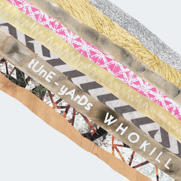
“The artwork plays off of some of the performance aspects of tUnE-yArDs. If you pay close attention, you can see how the whole thing is put together — how the parts make up the whole. The diagonal-patterned lines are intended to mimic the way the sound loops function in the performances. Though each one can stand alone, they are informed and enlivened by the textures that are layered before and after. Merrill [Garbus of tUnE-yArDs] wanted a cover with diagonals, so I incorporated some of the ideas I was working with in my own practice, and we expanded outward from there.”
Record Label
4AD
The Artists
Artwork – Alex Chitty
Photography – Anna Campbell
MEDIUMS & MATERIALS
Collage, Painting (watercolors), Found Imagery, Stencils, Scanner, Copy Machine
QUOTES FROM:
STEVE MOORE, Zombi
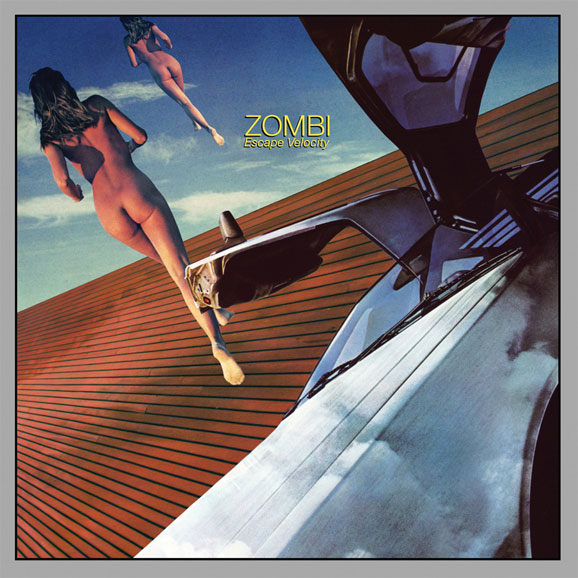
“We didn’t have anything in mind for the artwork. We sent rough mixes of the new album to Jeremy Schmidt [of Black Mountain] and told him to have fun. He earned our trust with the Spirit Animal cover; we knew he’d nail it. He doesn’t have a website but he plays keyboards in the band Black Mountain and recorded a very excellent solo record years ago under the name Sinoia Caves in case you wanna Google him.
Record Label
Relapse Records
The Artists
Artwork – Jeremy Schmidt









[…] 12 Collage + 14 Digital Illustration, Drawing, Design + 19 Illustration, Painting, Drawing + 8 Black And White […]
[…] 12 Collage + 14 Digital Illustration, Drawing, Design + 19 Illustration, Painting, Drawing + 8 Black And White […]
[…] 12 Collage + 14 Digital Illustration, Drawing, Design + 19 Illustration, Painting, Drawing + 8 Black And White […]