Narrative & Symbolic Album Covers of the Year 2012
Baroness – Yellow & Green // Coheed & Cambria – Ascension // The Dandy Warhols – This Machine // Dawnbringer – Into The Lair Of The Sun God // Dragged Into Sunlight – Widowmaker // EARTH – Angels of Darkness & Demons of Light II // // The Fixx – Beautiful Friction // Guardian Alien – See the World Given to a One Love Entity (Part 1) // mewithoutYou – Ten Stories // Murder Construct – Results // Shackleton – Music For The Quiet Hour / The Drawbar Organ EPs // Sigh – In Somniphobia // Sleep – Dopesmoker
Baroness – Yellow & Green (Relapse Records)
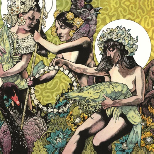
ARTWORK & ILLUSTRATION BY JOHN DYER BAIZLEY OF BARONESS
PROCESS & COLLABORATION
“I spend a fair amount of time researching my concepts, in order to visually interpret them in a compelling, if somewhat obscured way. If I am too direct, the work suffers from over-explanation; if I am too obtuse, from being too fantastic. I often make reference to classical works and well-established paradigms so that I might offer a compositional foundation which the viewer feels a connection with — from which they may dredge out some new perspective or a deeper, more idiosyncratic understanding. The rest of the band is kept in-the-loop with this process. After all, they have to feel the same way about the art that I do. These records are part of our legacy, and we should all feel connected to the project. Devotion to the full-scope of our creativity is important to our survival and development.” – John Dyer Baizley of Baroness
THE EXTRAS
“Color is a tricky device for me to wrestle with. I don’t have any natural aptitude for it. Like all of my perceived weaknesses, it has become the focus of my artistic battle. Thusly, we have based entire record titles on color, and there is an abundance of time spent developing the right chromatic look for each album cover. More often than not, I use my creative muscle to attack my own shortcomings rather than developing my proven strengths. It is unsurprising, with respect to the fact that I am an artist, that so much of Baroness’ lyrical themes refer to colors and tones; that seems like an inevitability. However, I will take the stance now that future Baroness records will no longer have chromatic titles. That idea has run its course.” – John Dyer Baizley of Baroness
AUDIO-VISUAL COMPONENTS
“We’ve been considering adding a visual component to our live show for some time now, though we haven’t actually seen any of our ideas come to light. Look for something new in our live production soon.” – John Dyer Baizley of Baroness
“Normally, I would find the literal reinterpretation of themes heavy-handed and problematic; however, since I make the art for Baroness as well as play the music, I am able to keep our visual and sonic aesthetics quite close, often running directly parallel. The tricky obstacle is capturing the right atmosphere and tenor of our music, through color, tone and visual metaphor. What is the color or shape of reflection? Of anxiety? Of struggle?” – John Dyer Baizley of Baroness
Coheed & Cambria – Ascension (Hundred Handed / Everything Evil)
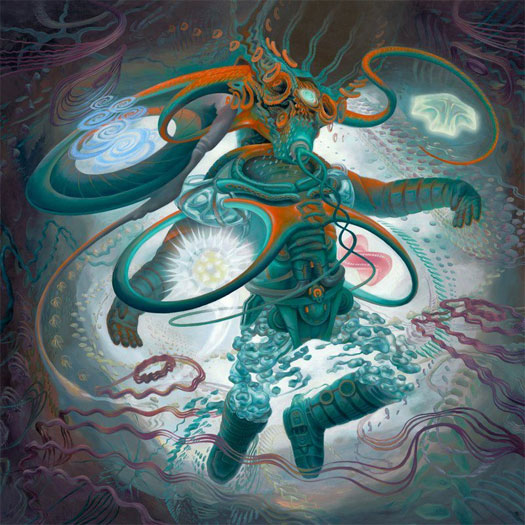
COVER ART BY HEIIDI TAILLEFER – heiditaillefer.com
BOOKLET ACRYLIC PAINTINGS BY NATHAN SPOOR – nathanspoor.com
GRAPHICS & PACKAGE DESIGN BY BILL SCOVILLE – scov.com
THEMATIC ELEMENTS
“The story is like an epic tale of a man (called Afterman) who heads into space to explore an energy band fueled by souls. Among these souls, he incorporates five into his suit, which fuel himself as well. Each of these souls — four men and one woman; three negative and two good — have personality traits unto themselves. One of them was once bad and turned to the good in the afterworld, so to speak. This Afterman heads up for a time that escapes him, since I guess interdimensionally, time ceases to be perceived, and after he comes back, he finds that his wife is deceased. He was so caught up in his explorations that he neglected her utterly and feels this huge pang of remorse and regret.” – Heiidi Taillefer
“There are lots of philosophical and thematic elements in Claudio [Sanchez of Coheed & Cambria]’s series of narratives. It’s pretty complex, but if you follow the band and what Claudio has been doing, it’ll make a lot of sense. He told me about the concept and about what each song would mean or should include before I heard any of the music. Between recording sessions, we would talk about the ideas since I would keep sending over drawings of what he might be looking for. Once we got even a part of something right, I would then keep doing new pictures until we got the final idea approved. Some of them were really quick and some others we went through dozens of drawings until we got there.” – Nathan Spoor
The Dandy Warhols – This Machine (Beat The World / The End Records)
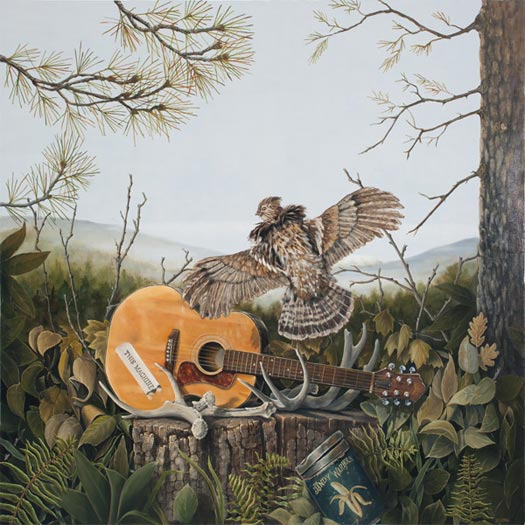
COVER PRODUCTION BY STEVEN BIRCH
DESIGN, LAYOUT & PHOTOGRAPHY BY SEAN GOTHMAN – seangothman.com
COVER PAINTING BY HICKORY MERTSCHING – hickorymertsching.com
COVER PAINTING PHOTOGRAPHY BY DAN KIVITKA – kivitkaphotography.com
“Peter Holmstrom and Courtney Taylor-Taylor [of The Dandy Warhols] each expressed certain elements they wanted to see in the painting,specifically their guitar displayed on a stump. Courtney Taylor-Taylor sketched out a doodle of the rough layout on a envelope, and we discussed trying to create a very regional Northwest landscape with a woodsy feel as the backdrop. Also, with Mt. St. Helens in the far distance. The antlers represent the by-product/refuse of This Machine; the guitar is the tool which creates the means to the end, and the ruffed grouse, which is found in the foothills of the Cascades and Coastal Range, makes a drumming sound with its wing movement; it symbolizes the music by taking flight into the aural senses and audio.” – Hickory Mertsching
Dawnbringer – Into the Lair of the Sun God (Profound Lore)
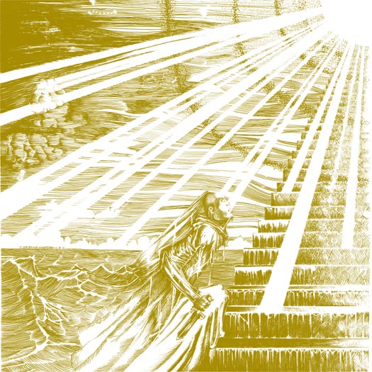
Artist unknown.
Dragged Into Sunlight – Widowmaker (Prosthetic Records)
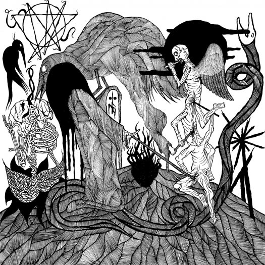
ARTWORK BY SINDRE FOSS SKANCKE – sindrefossskancke.com
THEMATIC ELEMENTS
“For me, as the artist who visualizes the music, it is of course important to get to know the ideas behind the music. We had lots of conversations before I started the physical work, and I of course listened to the album a lot. It was special working with Widowmaker; all of the visuals were done in an intense month isolated in my cabin. The ideas behind the album and the music corresponded well with my isolation at that point… I tried to nail the images that got into my head while listening to the album over and over, scraped down into whatever media that felt right for visualising the reality.” – Sindre Foss Skancke
PROCESS & COLLABORATION
“I got a lot of information before I started, then I would go to the city once a week and email my progress. I do not really work as a designer, so if I am going to work with a band, it has to be a band with both music and a vision that interests me. Good music needs custom visuals, and seeing this slice of music as a conceptual piece of sound, it would also need something that fits well visually, but also challenges it. I think we managed that.” – Sindre Foss Skancke
“We worked very closely together on an intellectual level and allowed an unspoken bond to grow. It comes from a creative drive innate with in both Dragged Into Sunlight and Sindre as an artist. When you are that passionate about a common vision, it’s almost telepathic, and the vision becomes a reality.” – T of Dragged Into Sunlight
AUDIO-VISUAL COMPONENTS
“Widowmaker has a 40-minute video which has not yet been released. It is produced by Dwid Hellion [of] Integrity. Integrity are as much of an influence as Eyehategod and all of the other raw to the bone artists out there. It has been our honor to work with so many great artists on Widowmaker. Only time can tell us what Widowmaker will look like; just like it has a sound and vision, it also has a form.” – T of Dragged Into Sunlight
“We are very particular about our sound and whilst Widowmaker was a very relaxed process. We recorded at least three drum versions, at least three guitar versions and three bass tracks, in the end we double tracked the bass, it needed to sound like molten lava. A lot of drugs and a lot of fucking insanity. The album was recorded between our trips out to Portugal for SWR Fest, Holland for Roadburn and Maryland for Deathfest, as well as a month long US tour. There are vast portions of the recording that no one actually remembers, a lot of getting fucked up on places, boats and in the back of vans, but that’s what this is about for us. A total exorcism, the music is a reflection of the chaos that unfolds wherever we go. We also recorded a live backing track for the entire record inside the [Sedlec] Ossuary in Czech Republic.” – T of Dragged Into Sunlight
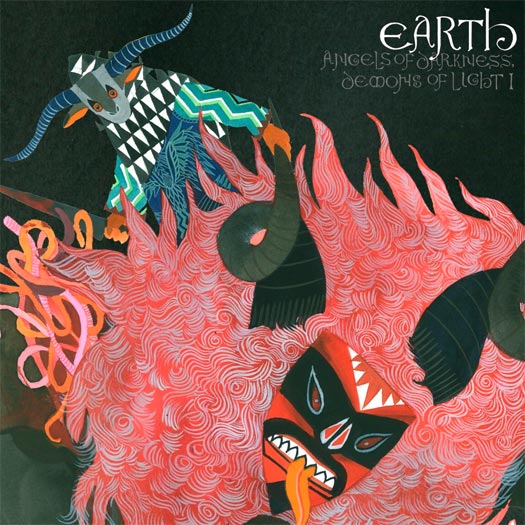
EARTH – Angels of Darkness & Demons of Light II (Southern Lord Records)
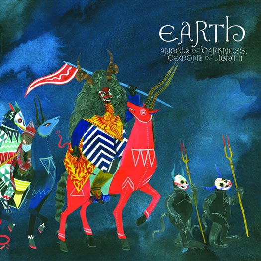
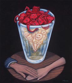
ARTWORK & ILLUSTRATION BY STACEY ROZICH
A visual continuation of Angels of Darkness & Demons of Light I. You can also read our interview with artist Stacey Rozich.
The Fall of Every Season – Amends (Grau)
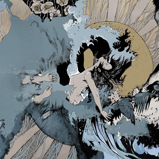
ARTWORK BY ROBERT HOYEM – attheends.com
BACK COVER PHOTOGRAPHY BY KIM KVALHEIM – kimvalheim.no
“This is actually the third shot at making the cover for the Amends. I’ve heard snippets and songs of the album over the last five years, so the album has been in the oven for quite some time. The initial ideas for the cover can be found on my blog, but after some time I decided to recreate the entire artwork — both to better reflect the music and lyrics and give the album a fresh boost. The artwork in its entirety is actually quite direct, and illustrates different aspects of the lyrics without any interpretation, more or less as an experiment to see how this kind of a cover would look in a more old school, illustrative approach.” – Robert Hoyem
“I feel that the grand scope of the album’s sound was reflected particularly well in the end result. It’s huge. Lyrically, the album contains a lot of very visual metaphors that work well as direct illustrations in the art.” – Marius Strand of The Fall Of Every Season

The Fixx – Beautiful Friction (Kirtland Records)
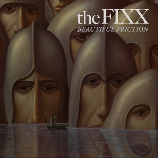
PAINTING BY GEORGE UNDERWOOD – georgeunderwood.com
ART DIRECTION BY TOMMY MOORE
“When The Fixx asked me to create an image for the cover, I had just finished working on a big painting called ‘I Talk With The Spirits’. I was really pleased they asked me because I had a good working relationship with them from the past with Reach The Beach, Phantoms, and Calm Animals. With the painting, the thought process was: lost civilisation, island of the dead, spiritual beings being visited or observed by another generation as if they were witnessing a religious experience [or] phenomenon. Then they said it was going to be called Beautiful Friction, and I realised that my painting could be interpreted exactly into that title. So I cropped it down until I thought it worked as a record sleeve.” – George Underwood
Guardian Alien – See the World Given to a One Love Entity (Part 1) (Thrill Jockey Records)
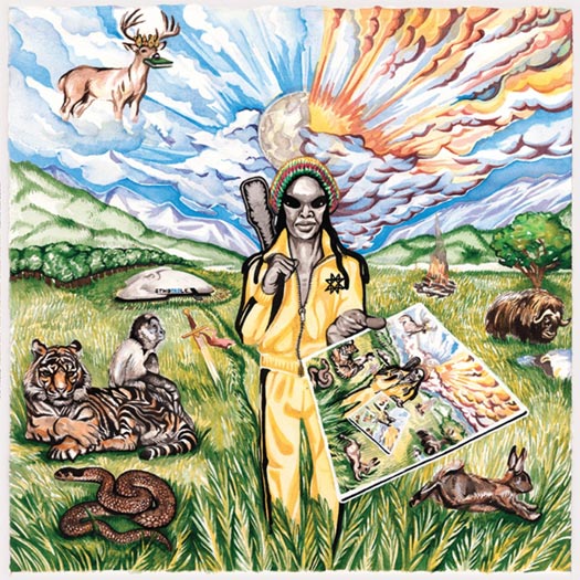
PAINTING BY TURNER WILLIAMS OF GUARDIAN ALIEN – turnerwilliamsjr.com
CONCEPT BY GREG FOX
“I was approached by the guy on the record cover; he showed me the album title and the art, which was him showing me the album title and the art. The idea was to basically just follow those instructions and not think about it too much otherwise. It was not a dream. I was fully awake when it happened. It is important to me that this is made clear. Calling it a dream suggests somehow that it didn’t really happen, and discounts it as not being as genuine of an experience as what we consider regular real life or whatever. I was fully conscious and completely stupefied by the experience, and to this day, I’m not completely sure what happened, mostly because I’m not sure how I feel about the whole alien phenomena in general.” – Greg Fox of Guardian Alien
mewithoutYou – Ten Stories (Pine Street)
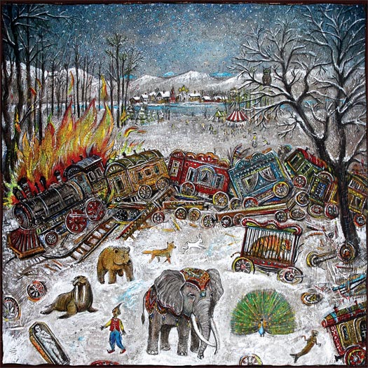
LAYOUT & DESIGN BY CHARLIE WAGERS OF THREE BEARS DESIGN – charliewagers.com
PAINTINGS BY VASILY KAFANOV, COMMISSIONED BY MEWITHOUTYOU – kafanov.com
ART DIRECTION BY AARON WEISS AND MIKE ALMQUIST – lookingiswrong.com
THEMATIC ELEMENTS
“The album artwork is meant to directly follow the storyline of the music contained in the album. The album is about a 19th century circus train that crashes in the mountains in Montana, and some of the animals escape. Each “story” is about the animals, where they go and what they do. For the artwork, Vasily Kafanov was commissioned to make a painting for each song, and another for the cover. The album artwork ties each painting to the songs, in such a way that it feels like an old, worn-out storybook from the same era.” – Charlie Wagers
PROCESS & COLLABORATION
“I love working with mewithoutYou because they are unlike any other band when it comes to artwork. They are always very involved in the artwork process. I would talk to Aaron Weiss (the band’s singer) or Michael Almquist (manager) at least once a day to check-in on the process. It’s great working with a band that is this involved; they are very critical, which is always pushing things to look their best. They also were consistently providing me with great ideas.” – Charlie Wagers
THE EXTRAS
“Vasily made 14 paintings, while I handled all other mediums. I did a lot of scanning old books and paper, to get the proper textures and little flourishes to add to the pages. I also spent a lot of time with the typography; namely the typefaces Mrs. Eaves & Dunelm, slightly distressing the letters to have the appearance that they were printed on an old printing press…”
“This was definitely a non-conventional album to create the packaging for. We did three different versions: a deluxe box-set that contained a double LP’s, a gatefold-packaged 7”, 18-page storybook and alternate-art CD. As well as a gatefold “standard” edition LP on colored vinyl, and a CD, both which came with a 12-page lyric booklet. And also an accompanying 7″ single for February 1878, with the b-side Four Fires… My favorite part of this package was the etching on the D-side of the deluxe-edition vinyl. It was my first chance to tackle illustrating for a vinyl etching, and I wanted it to follow the contours of a round record. The result was several of the stories’ animals, strung along in a circle around the record.” – Charlie Wagers
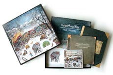
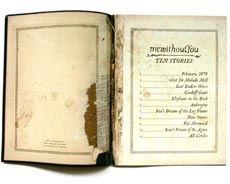
MORE IMAGES AT CHARLIEWAGERS.COM
Murder Construct – Results (Relapse Records)
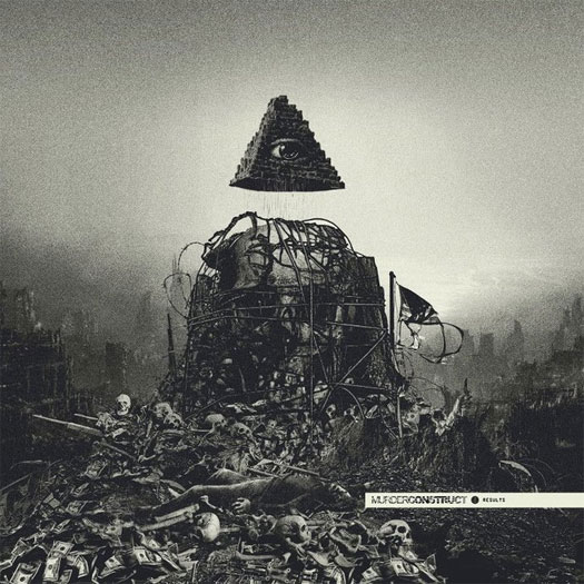
DESIGN BY ORION LANDAU – orionlandau.tumblr.com
“Orion kept us in the loop every step of the way. We initially had some other ideas for the artwork which weren’t fully fleshed out, and when Orion showed us what he was working on, we knew we were looking at what I would consider to be cover art of the year, haha.” – Leon of Murder Construct
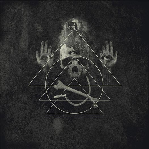
Shackleton – Music For The Quiet Hour / The Drawbar Organ EPs (Woe To The Septic Heart)
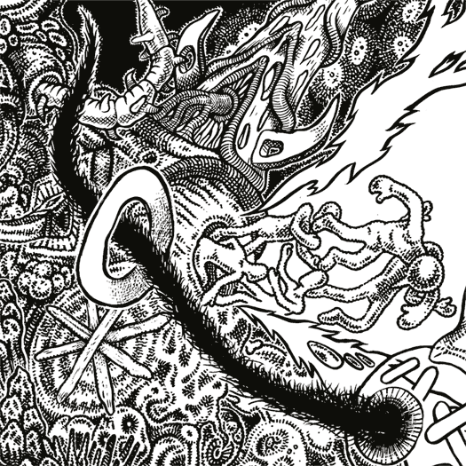
ARTWORK BY ZEKE CLOUGH – zekeclough.com
THEMATIC ELEMENTS
“It was partly inspired by the text by Tenfold Vengeance that was included in the release, by a conversation with Sam about the nature of a possible future apocalypse and by [his] own thoughts on time… The time aspect’s represented by the characters marching through the lens of the present. This was meant to show time as a way of defining the possible permutations of the past, (would have, should have, could have) and the potential of the future — pretty much my frustration that the potential of a lifespan is inevitably defined by the passage through time.” – Zeke Clough
“[The passage by Tenfold Vengeance] concerned a letter to his granddaughter who lives in the year 2065. Zeke told me that he had been working on themes which seem to overlap with the basic concept. We thought that it would be good to try to tie this all together with one package. From this early foundation, Zeke had free range but had input from Vengeance Tenfold’s words to interpret as he felt fitting… I do not really have a rule when it comes to Zeke’s stuff as he has his own fertile imagination and great ability. His sensibilities tie in with my own, pretty much. The only thing that I am a stickler for is aesthetic consistency for each series. This means that the artwork for this release needed to be stylistically connected to the previous Woe To The Septic Heart release and that these releases in turn needed to be stylistically different again from the Skull Disco releases.” – Sam Shackleton of Shackleton
THE EXTRAS
“There was also a vague story about charactors escaping a churning, primordial landscape by travelling into the bottom of a volcano. In the bottom of the volcano is relative tranquility and they are confronted by the time-defining gate/lens.” – Zeke Clough
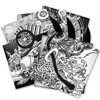
The box set contains three 12″s, one CD, and one 12″ x 12″ booklet of artwork from Clough.
Sigh – In Somniphobia (Candlelight Records)

ARTWORK & CONCEPT BY ELIRAN KANTOR – elirankantor.com
“All I did was to tell Eliran that the album concept was nightmare and to give him some demo tracks and the lyrics. I really did not think I had to give him further instruction or anything, as I 100% trusted him as an artist and I was completely sure that he would understand what kind of visions I had in my mind. We worked together for the previous album, Scenes from Hell, so I knew leaving almost everything to him would generate the best result.” – Mirai Kawashima of Sigh
AUDIO-VISUAL COMPONENTS
“Visuals are always very important live. We use a lot of fire and blood gimmicks and it’s not the same old pyro machine or anything. Most of those gimmicks are handmade by us, and I’m sure people have never seen a show like ours before.” – Mirai Kawashima of Sigh
THE EXTRAS
“All I’m willing to give out is a small silly trivia detail: in a classic Kind Diamond-like manner, the pregnant queen is based on my grandma. Nightmarish enough?” – Eliran Kantor
Sleep – Dopesmoker Reissue (Southern Lord Records Records)
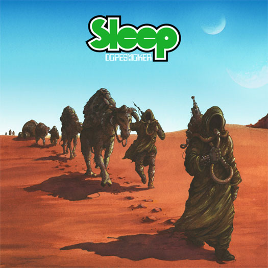
ARTWORK BY ARIK ROPER – arikroper.com


[…] work for the two new Spires That In The Sunset Rise LP & the Guardian Alien LP made REDEFINE’s album cover […]
[…] simpler approach. Though it wasn’t as originally intended, it did get mention as one of the top album covers of the year by Redefine Magazine. As the follow-up album was written in a similar era, we stuck with the aesthetic a second […]
[…] http://www.redefinemag.com/2012/2012-album-covers-of-the-year/7/#alice […]