Classically-Influenced Album Covers of the Year 2012


Aaradhna – Treble & Reverb // Best Coast – The Only Place // Black To Comm – Earth // David Byrne & St. Vincent – Love // Debruit – From The Horizon // Horrid Red – Celestial Joy // Hospitality – The Drift / Monkey // Om – Advaitic Songs // Para One – Passion // Peaking Lights – Lucifer // Steve Moore & Majeure – Brainstorm // Will Stratton – Post Empire // Xiu Xiu – The Air Force
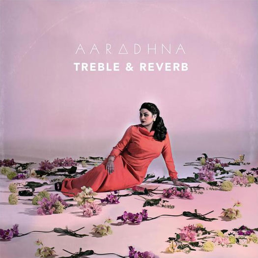
Aaradhna – Treble & Reverb (Dirty)
ART DIRECTION & DESIGN BY SPECIAL PROBLEMS – specialproblems.com
PHOTOGRAPHY BY TROY GOODALL
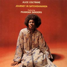
“I really wanted a bold powerful portrait of Aaradhna to be on the cover. I love the matter of fact cover portraits of artists like John Cale, Bob Dylan and Alice Coltrane. Alice Coltrane’s Journey in Satchidananda is a favourite for me. So I guess we were trying to do a modern take on that. A classic portrait of the singer/artist. Aaradhna has a beauty and power as a person and singer that we thought shouldn’t be ignored. We played around with a bit of hand-tinting parts of the photo afterwards, it helped push the photo into something a little more painterly.
For the typography and other vector patterns that appear throughout that album packaging, I wanted it to look like the kind of patterns you’d see on a Morton Subotnik record or [that of] some other early Electronic music pioneer. These were touch points in our thinking — elements to consider without falling into a recreation or something pastiche. It’s a modern take on something classic, like the album itself. You could maybe go as far as saying the warmth and organic nature of the photography contrasted against the hard vector shapes is our Treble & Reverb. The cover was about creating a new look for Aaradhna — one that was equally her and her personality but a side of her that her audience hadn’t seen before.” – Joel Kefali of Special Problems
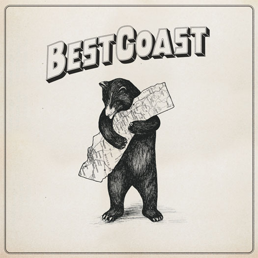
Best Coast – The Only Place (Mexican Summer / Wichita Recordings)
ART DIRECTION & DESIGN BY DAN SCHECHTER – danschechter.com
IN-STUDIO PHOTOGRAPHY BY DAVID BLACK
LANDSCAPE ILLUSTRATION BY JESS ROTTER
BOOKLET LIVE PHOTOGRAPHY BY PETER DOVGAN
BOOKLET 3D PHOTOGRAPHY BY ALEX MARKS
“Obviously, Best Coast is all about California. Everything from their name to their sound is influenced by the state. This album is no exception. The state is a backdrop behind all of the songs. Sometimes it’s a character. Sometimes it’s an ideal. Other times it’s a sweet and safe hiding place.
We wanted the album designs to capture this love for California… I found the illustration on the cover of a 1913 songbook for the state song of California, “I Love you California.” Even though the bear is the state animal of California, I was pretty surprised when I first saw it. The humor and sweetness of illustration seemed ahead of its time. I knew we had to include it somewhere on the album. Initially, it was on the back cover as a smaller illustration. Everybody was so drawn to it, though, that we eventually decided it would be perfect as the centerpiece of the cover. We redrew the bear and updated some details of the state. We wanted it to feel a bit more evocative of the golden age of California and [to] fit more in line with the bands previous artwork. It’s half-mascot, half-protector, and (humbly), kind of perfect.” – Dan Schechter
PROCESS & COLLABORATION
“The design was really a collaboration between Jess Rotter and myself. Jess works at the band’s label Mexican Summer, but is also a close friend of the band. [She’s an] incredible artist and illustrator in her own right[, and] we worked pretty closely on the concepts. She added an illustration of Highway 101 to the back cover and LP sleeve, and coordinated the photography for the back cover and the booklet included in the first run of LPs.” – Dan Schechter
MORE IMAGES ON DANSCHECHTER.COM
Black To Comm – Earth (De Stijl)
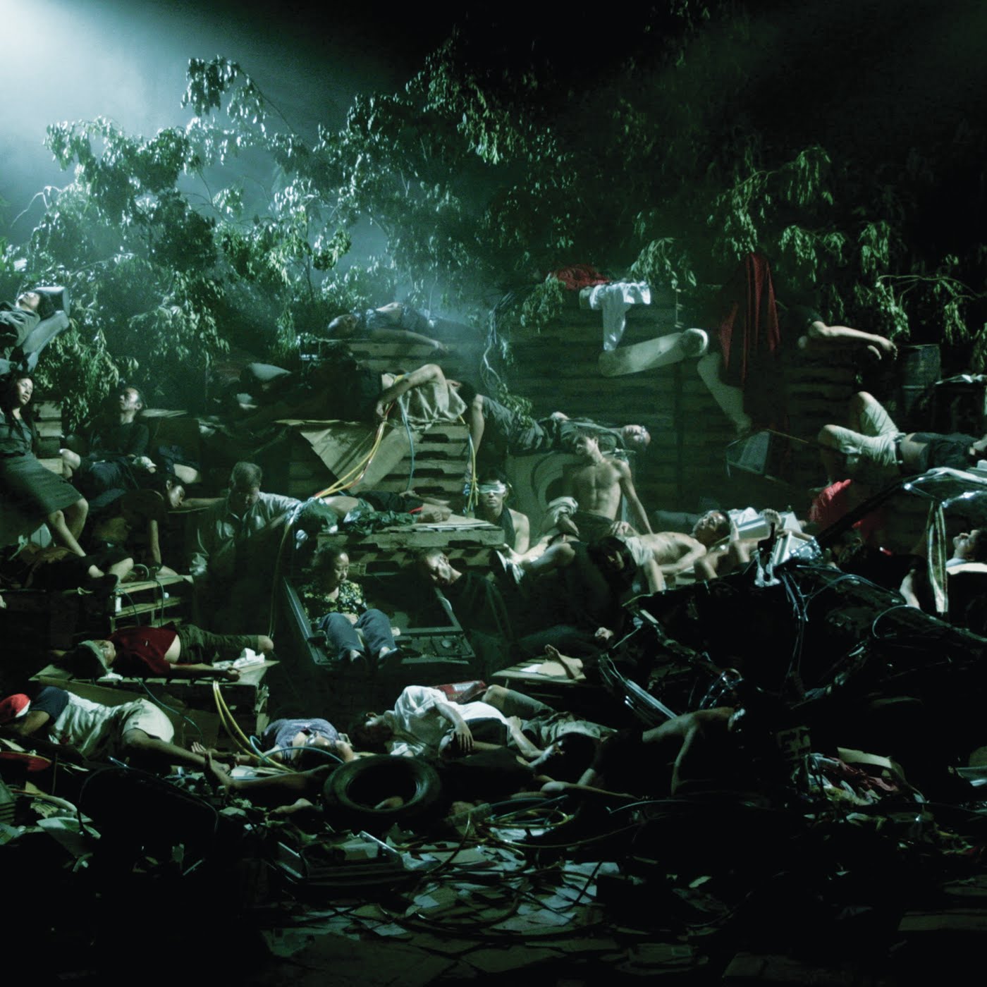
LAYOUT & DESIGN BY MARC RICHTER OF BLACK TO COMM
FILM STILL FROM HO TZU NYEN
THEMATIC ELEMENTS
“The Earth album contains studio versions of a live soundtrack we did for Singapore artist Ho Tzu Nyen’s film of the same name, so obviously we used images from the film for the album artwork. All the conceptual ideas had been realized musically (or in Nyen’s case, in the making of the film); doing the sleeve artwork was kind of a no-brainer. We were considering doing (fake) painted versions of the stills, but it wasn’t really necessary, since the whole film already looks like a huge classical painting.” – Marc Richter of Black To Comm
“This was a film still from a 42-minute film called EARTH, which I made. The film can be described as three continuous long takes that move in and out of a tableau vivant of 50 actors oscillating between sleep and consciousness. This particular film still that Black to Comm chose for the cover reveals the entire set — which is the site of an unknown catastrophe. In the next minute or so, golden light will permeate the scene and all 50 actors will come alive, and stare straight out at us. EARTH is my attempt to work through my obsession with the light and compositions of painters such as Caravaggio, Rembrandt, Girodet and Géricault.” – Ho Tzu Nyen
THE EXTRAS
“The layout was then done by myself, partly inspired by the origin of the name of the De Stijl record label where the LP and CD has been released, so the lettering is very much influenced by the original De Stijl magazine from the 1920s… We only had very low resolution stills at hand that you wouldn’t normally use, but the fuzziness actually added to the mysterious quality of the images.” – Marc Richter of Black To Comm
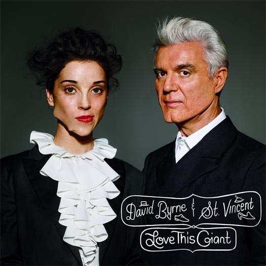
David Bryne & St. Vincent – Love This Giant (4AD / Todo Mundo)
The album cover is a play on Beauty and the Beast, and a strangely appropriate interview with The Daily Beast reveals more:
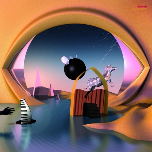
Debruit – From The Horizon (Civil Music)
.jpg” />
ARTWORK BY MARKUS HOFKO RAINBOW MONKEY – rainbowmonkey.de
“In the first place, it was just about creating a surreal landscape which would relate to the abstract elements of [Debruit’s] three preceding EP covers. Débruit asked for some sort of African influence in the design since his album is strongly based around West African music. The idea to do a homage to [Rene] Magritte’s The False Mirror came later in the process and locked the image concept in.” – Markus Hofko
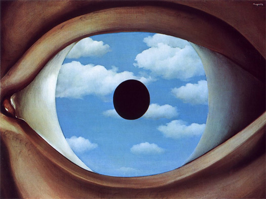
RENE MAGRITTE – THE FALSE MIRROR
THE EXTRAS
“The first press of the vinyl version included golden records, which added to the already spectacular make up.” – Markus Hofko
Horrid Red – Celestial Joy (HOLIDAYS)
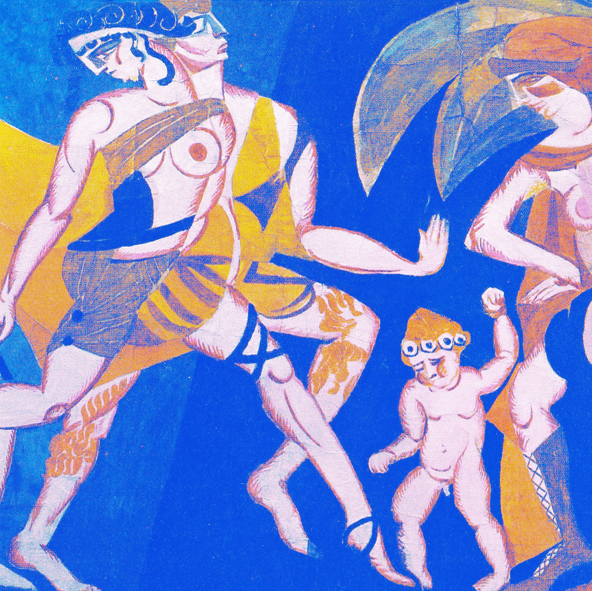
DESIGN BY EDMUND XAVIER
PAINTING BY ALEKSANDRA EKSTER – wikipedia.org/wiki/aleksandra_ekster
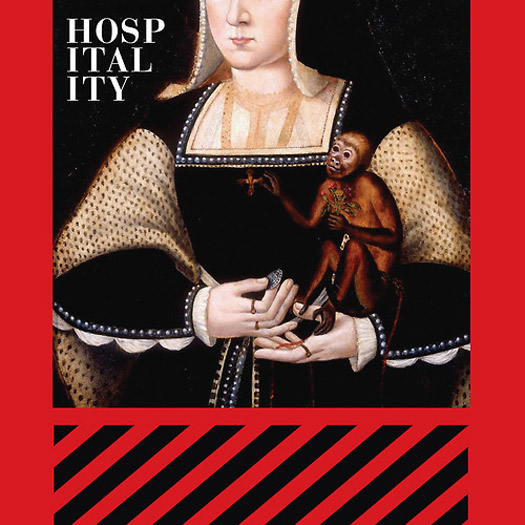
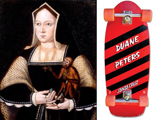
Hospitality – The Drift / Monkey (Merge Records)
DESIGN BY MAGGIE FOST
ADDITIONAL CONCEPT BY NATHAN MICHEL OF HOSPITALITY
“Our main idea was to combine two very different design ideas: the painting of Katherine of Aragon, which is from around 1525 and the design for the Santa Cruz Duane Peters Skateboard, from the early ’80s. Maggie Fost, the designer, made those two elements work beautifully… We wanted something that would really stand out, even in thumbnail form. I think this one does that for sure. Also, I own a Duane Peters skateboard. I’ve had it since I was a kid.” – Nathan Michel of Hospitality
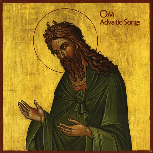
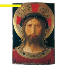
Om – Advaitic Songs (Drag City)
COVER ART BY UNKNOWN
INTERIOR CREST BY DAVID V. DANDREA – dvdandrea.com
The band declined to comment on the album artwork and would like to keep it open to interpretation.
A note from David V. Dandrea states that the cover is a traditional Greek Icon painting, though he is uncertain whether it is a contemporary interpretation or a vintage original.
This record was featured on our Psychoactive Soundscapes: Top 20 Mind-Bending Albums For 2012 article.
Para One – Passion (Marble Music)
DESIGN BY MUSEUM STUDIO – museumstudio.se
Artists could not be reached for comment.
Peaking Lights – Lucifer (Mexican Summer / Weird World)
ARTWORK BY ROBERT BEATTY – remainsstreet.com
INSIDE ARTWORK BY LEIF PODHAJSKY – leifpodhajsky.com
“A rule of thumb for us is that we always try to make something slightly reflective of the past. We drew from Cluster and Isley Brothers particularly in the final decision with the font. One other rule of thumb is that we make sure there is no bar code on the front or back, and Mexican Summer and Weird World were cool enough to let us approach the cover as pure artistic expression in itself.” – Peaking Lights
PROCESS & COLLABORATION
“[We] pretty much knew we wanted to have Robert Beatty do the cover of a record at some point; his art is amazing (so are his bands). I sent him a very loose sketch which had the Lucifer plugged In to a wall socket. He did a mock up and it was fine, but then we were really just vibin on the font he made; we thought it was stronger just as that. That was pretty much it — [plus] some loose stuff with size and color, but Robert is so good at what he does you can kind of let him run with it.” – Peaking Lights
THE EXTRAS
The insert was done by Leif Podhajsky — also an insane artist! He did our remix record on Domino’s cover [also]. With the insert, we had less of a clear idea of what we wanted, so that made it harder; there were a lot of revisions… but that was mainly us not being as clear in idea outside of wanting some sort of mandala.” – Peaking Lights

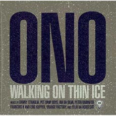
“The colors are slightly different on the US pressing, and if you look closely the first press cover is all matte except for the center of the font is glossy. We borrowed that idea from ’80s Polydor dance sleeves, particularly this Yoko Ono Walking On Thin Ice EP.” – Peaking Lights
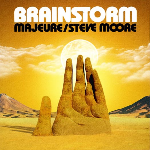
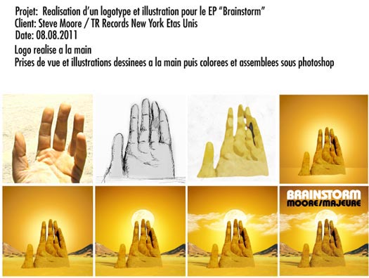
Steve Moore & Majeure – Brainstorm (Temporary Residence Ltd)
DRAWING & MANIPULATIONS BY ALEXANDER BURKART OF THE ZONDERS
“Alex is very easy and fun to work with. I remember seeing him post a photo of the Mano del Desierto, a large sculpture of a hand reaching out of the Atacama Desert in Chile. I mentioned to him that this could be a cool basis for the cover art and a few days later he was finished. Nailed it on the first attempt.” – Steve Moore
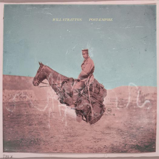
Will Stratton – Post Empire (Talitres Records)
ARTWORK BY JARED RAGLAND – jaredragland.com
LAYOUT BY WILL STRATTON
THEMATIC ELEMENTS
“Once I had decided that the title was going to be Post-Empire, I gave Jared free reign with that information in mind, and he came up with a few different images, all of which had sort of palimpsestic qualities that appealed to me in other work that he has done. I chose the image of the rider because it seemed the most singularly focused of the things he made, and it was vaguely nationalistic, which I liked. So, from my perspective, it was a process of elimination.” – Will Stratton
“I can’t make work without some set of rules or parameters, so each of my collages are created within certain conceptual boundaries and employ images from specific image archives. The collage used for Post-Empire comes from a series of works I made a few years ago that were inspired by Alfred Tennyson’s poem, ‘Charge of the Light Brigade,’ and primarily built from photographs made by Roger Fenton during the Crimean War (a war that – much like our own recent ones – was largely unpopular and highly criticized).” – Jared Ragland
PROCESS & COLLABORATION
“Originally the cover image was a little more complicated, with a bird on the rider’s head and I think some other elements that I asked Jared to pare down. And I ended up messing with the hue of the image so that the background and foreground were different colors; it started out sepia. Aside from that, the image was entirely Jared’s.” – Will Stratton
“Will sent two early demos of the album so I could respond to what he’d recorded. His music is really intricate and beautiful, so I initially wanted to make something that could visually represent that beauty. And honestly, my initial attempts were complete failures. Fortunately though, Will’s music is more than just pretty melodies, and this particular set of songs is full of allegory and metaphor from which I could draw ideas. At some point during the process, Will announced that the record would be called Post-Empire, and I immediately thought of this collage from the ‘Light Brigade’ series. I rearranged a few things, sent it to Will, and he thought it was right for the record.” – Jared Ragland
Xiu Xiu – The Air Force Reissue (Polyvinyl Records)
DESIGN BY JOE STEWART
PAINTING BY UNKNOWN (1600S PAINTER – “I saw at an art exhibit in Torino in 2005 called HELL.” – Jamie Stewart)
“My brother designs of our record covers. This is a reissue so we wanted a different cover, but I still wanted to use the central image. This was all I told him and just went for it. Blacker than black was the answer. I love that I can put it in his hands and he always makes something wonderful that I would never have thought of.” – Jamie Stewart of Xiu Xiu
2006 ORIGINAL


[…] work for the two new Spires That In The Sunset Rise LP & the Guardian Alien LP made REDEFINE’s album cover […]
[…] simpler approach. Though it wasn’t as originally intended, it did get mention as one of the top album covers of the year by Redefine Magazine. As the follow-up album was written in a similar era, we stuck with the aesthetic a second […]
[…] http://www.redefinemag.com/2012/2012-album-covers-of-the-year/7/#alice […]