Collage, Sculpture & Mixed Media Album Covers of the Year 2012
2D MIXED MEDIA
3D MIXED MEDIA
A Place To Bury Strangers – Worship // Alice Cohen – Pink Keys // Battles – Dross Glop Series // Bear in Heaven – I Love You, It’s Cool // Clown & Sunset – Don’t Break My Love // The Darkness – Hot Cakes // Dog Shredder – Brass Tactics // How To Dress Well – Total Loss // Tin Can Radio – Open Ears, Open Minds // Sun Airway – Soft Fall // Turbo Fruits – Butter // White Lung – Sorry // Woods – Bend Beyond // Young Magic – Melt
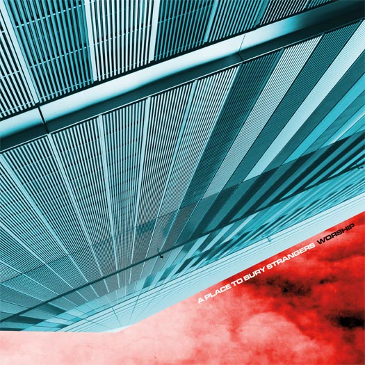
A Place To Bury Strangers – Worship (Secretly Canadian)
DESIGN BY DANIEL MURPHY OF SECRETLY CANADIAN
PHOTOGRAPHY BY DION LUNADON OF A PLACE TO BURY STRANGERS
“I took this picture while driving around Manhattan, and it sparked the idea to take photos in that area. Dion [Lunadon of A Place To Bury Strangers] shot the photo on one of our jaunts downtown, and then it was reworked by Daniel Murphy at Secretly Canadian.” – Oliver Ackermann of A Place To Bury Strangers
“The artwork is a combination of original photos taken by the band, along with some found photos, that have been collaged and heavily manipulated to push the colors in a more confrontational direction. We were hoping to invoke a sense of disorientation and vertigo with the design – to give the viewer the sense of moving at a great speed without being sure whether they’re going up or down. It felt like a good visual representation of the intensity of the music, without really being as visually dark as much of their previous album artwork. It’s an attempt to achieve “heaviness” with a lighter touch.” – Daniel Murphy
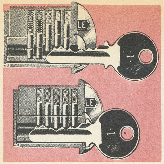
Alice Cohen – Pink Keys (Olde English Spelling Bee)
ART DIRECTION & DESIGN BY ALICE COHEN – alicecohen.bandcamp.com – AND TODD LEDFORD – oesbee.blogspot.com
THEMATIC ELEMENTS
“I came across the illustration of the keys in an old encyclopedia from 1938. The illustration was square, as an album cover is, and was basically used “as is” for the album art… something about the color scheme, and the design just grabbed me completely, and I said, “That is my next album cover”. I showed it to Todd from Olde English Spelling Bee Records, and for the following year after finding this picture, we called the concept and the album “Pink Keys”, based on the muted pink background color of the illustration. From that, I got into the symbolic ideas of “keys” and locking/unlocking as psychological/mystical concepts, which inspired me throughout the creation of the album. The color “pink” tied into this as well… so the one original image of the two keys on the pink background unlocked an entire world of ideas and metaphors that I could play with lyrically, musically and conceptually. – Alice Cohen
PROCESS & COLLABORATION
“[Todd and I] had worked together in the past on album art, and knew how each other work and what we were going for. We are both very particular about everything, including fonts, and we don’t like to use computer fonts at all…the lettering for the album was hand-done with colored pencil and stencils. We made an alphabet, scanned it, and put it together letter-by-letter. Both Todd and I like the artwork to be a sort of experimental and magical process – personal and done our “own way”, cohesive, and a very crucial part of the entire package – as important as the music, actually, and able to contain the same vibe as the music. We would pay a lot of attention to detail, and try a lot of things with lettering, lay-out, color, texture of paper etc – and all the details matter, no matter how minor they might seem. – Alice Cohen
AUDIO-VISUAL COMPONENTS
“As an animator, and video artist, I have performed live with my animations projected behind me. It makes for a really immersive performance, where the audience sees how my mind works visually as well as musically, and there’s usually a lot of connection between the two; even if I don’t plan it out, the audience can make connections between the two forms of expression.” – Alice Cohen
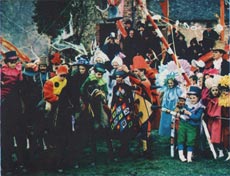
The photo on the insert for Pink Keys came from an old French film magazine, from the late ’60s, and is a still from the 1969 film Le Grand Meaulnes (pictured). The scene is called La Fete Etrange, and contains people dressed in colorful and bizarrely fantastical costumes. That image was an inspiration for the song “La Fete Etrange” and really piqued my curiosity, conjuring scenes of parades and processions of strangely dressed characters. – Alice Cohen
Battles – Dross Glop Singles Series (Warp Records)
A glorious extension from 2011’s full-length release, Gloss Drop, which similarly made our 2012 for its sculpturally satisfying bubblegum looks. See it on our 2011 Year-End Respect For Album Cover Art.
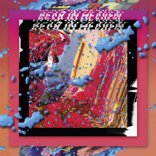
Bear in Heaven – I Love You, It’s Cool (Dead Oceans)
ART DIRECTION & DESIGN BY SADEK BAZARAA – sadekbazaraa.com
MOTION DESIGN ON WEBSITE BY ADAM WILLS OF BEAR IN HEAVEN
WEBSITE DESIGN BY NATE UTESCH – nthnl.com
“I’m sure Sadek had some grand plan. We were so focused on making the music that we left the artwork in his hands. Hometapes is also a big force in all of our artwork. They’re willing to push things to a new and fantastic levels.” – John Philpot of Bear In Heaven
PROCESS & COLLABORATION
“We’ve always worked closely on the album designs. The previous albums had a bit more interaction in that regard as I was still a performing member of the band. Removed from the rigors of practice, songwriting and touring, I was able to put more time and focus into the art direction of ILYIC. I put some mood boards together to get initial impressions from the gang and hit the ground running from there… There was a barrage of both analog and digital processes explored — scanner manipulations, Photoshop filters, photography, etc. I’m usually very process-oriented and generally most excited about experimenting with new juxtapositions and techniques to see what emerges. Perhaps ‘process’ would be considered the primary technique in and of itself.” – Sadek Bazaraa
“Sadek was in the band for years, so we’re comfortable communicating about creating something. He would listen to demos and generate ideas… I think we met up three times; in each meeting, he would take us on a visual journey. By the end of it, we would have made a few choices and had a few beers.” – John Philpot of Bear In Heaven
THE EXTRAS
“Sadek named the record by accident. He was in our practice space listening to demos and left me a note. It said, “Dear Jon, I love you, it’s cool.” – Jon Philpot of Bear In Heaven
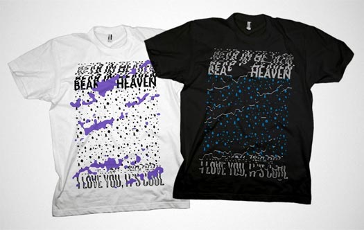
“I really enjoyed working on the tees which also had many variations — 3 colorways for the black body, a hypercolor version with inks that change in the sun, a floral print and a remix of the eyes from Beast Rest Forth Mouth. The initial feedback on the album art was pretty exciting as it was incredibly polarized. There were a lot of haters for sure… I was psyched that that many people took the time to discuss it at all, as it’s pretty hard to get any kind of reaction these days. I was actually hoping for Vice Magazine’s worst cover of the month slot although I’m not sure if they even do that any more.” – Sadek Bazaraa
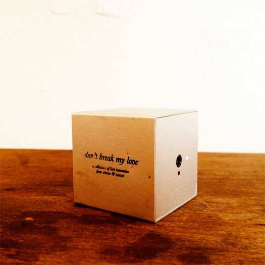
Clown & Sunset – Don’t Break My Love (Clown & Sunset)
ARTWORK & PACKAGING DESIGNED BY NIKITA QUASIM
“The prism is an aluminum cube, small enough to fit in your palm. It was designed by Jaar as a new medium for releasing music. This first release — CSA001 — features twelve (mostly) unreleased songs from Jaar and other Clown & Sunset collaborators.
The prism is a piece of art in and of itself; its contents beg to be shared. Twin headphone outlets encourage connections to the object and between the two listeners. The prism tries to restore physicality to the listening experience.
The medium and the method are as important as the music itself. The prism makes you consider how the music is being heard, the way the object feels in your hands, and its potential to foster intimacy between listeners.
When the prism is unplugged, a beam of light passes through the empty center, revealing a void. Someone is missing.” – Clown & Sunset
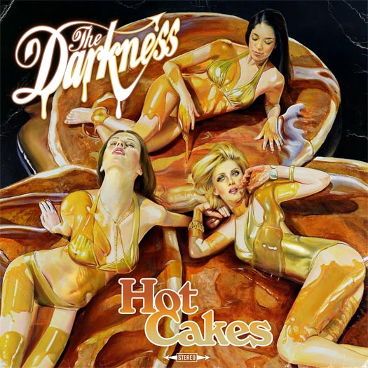
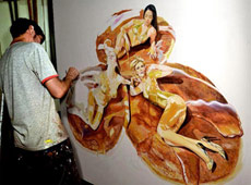
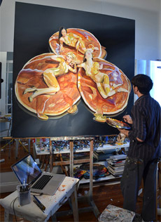
The Darkness – Hot Cakes (Canary Dwarf Records)
CONCEPT BY THOM LESSNER
PAINTING BY DIEGO GRAVINESE – diegogravinese.com
LAYOUT & DESIGN BY TOURIST – wearetourist.com
“Tourist put forward style boards for various props including gold bikinis, sunglasses, etc., the look of the models from magazine reference as well as how we wanted the syrup to drip off the pancakes… We sent all the style books to the band to approve before the shoot commenced. The band’s brief was to create ‘an unapologetically mainstream 70’s porn, kitsch Linda Lovelace vs Raquel Welch vibe’ with big, bold retro looking typography.
Trying to find a 3D-modeling company in London to build three giant 8-foot pancakes within the budget was impossible, so we had everything created in Argentina for the shoot… Diego was let loose to transform it into a retro looking piece of art after a considerable amount of retouching on the final photo to get the syrup looking just right. The album is out on CD Deluxe and gatefold LP mushroom vinyl on August 20.” – Rob Chenery of TOURIST, via DiegoGuevera.com
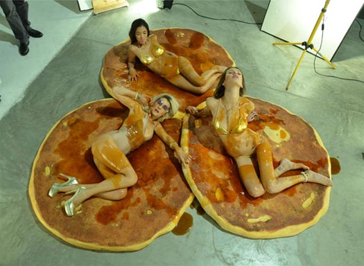
MORE PROCESS PHOTOS CAN BE SEEN AT DiegoGuevera.com
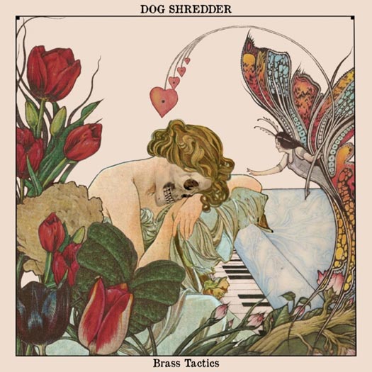
Dog Shredder – Brass Tactics (Good To Die Records)
ARTWORK & DESIGN BY JOHN OVERLY
Artist could not be reached for comment.
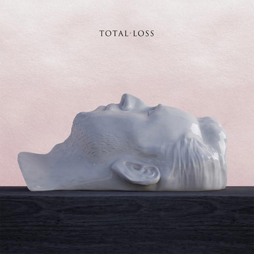
How To Dress Well – Total Loss (Acephale)
DESIGN BY JOSH CLANCY, TRAVIS STEARNS, AND PATRICK NORTH
ARTWORK BY MILE ERROR OF 3D
PROCESS & COLLABORATION
“Since we were working remotely from each other, it was too difficult to sculpt a real mask from Tom’s face and get it photographed just right. So instead, we opted to hire a 3D artist, Mile Error. We chose to render Tom in 3D because it allows for the control and construction of another, hyperreal world that is achievable with a relatively low production cost.” – Joshua Clancy
AUDIO-VISUAL COMPONENTS
“I incorporate visuals created by my long time friend, Nicky Reed. The visual element is paramount for the live show as it really brings home the affect of each song. The visual aspect of the show helps create an effective ambiance in which my songs can really take root and make a deep experience, for me and for the audience, truly possible.” – Tom Krell of How To Dress Well
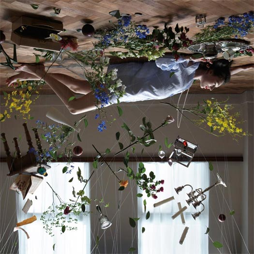
Sun Airway – Soft Fall (Dead Oceans)
This album cover artwork was featured in an in-depth interview with Japanese art collective NAM and Jon Barthmus of Sun Airway, in the article Soft Fall Album Cover: The Music of Sun Airway & The Art of Japan’s NAM.
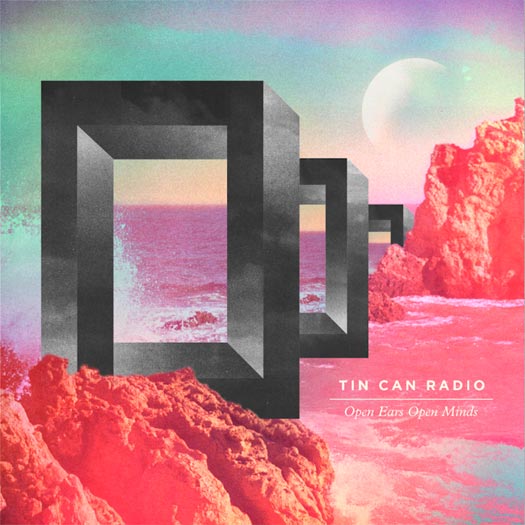
Tin Can Radio – Open Ears, Open Minds (Self-Released)
ARTWORK & DESIGN BY SAM CHIRNSIDE – samchirnside.com
Artist could not be reached for comment.
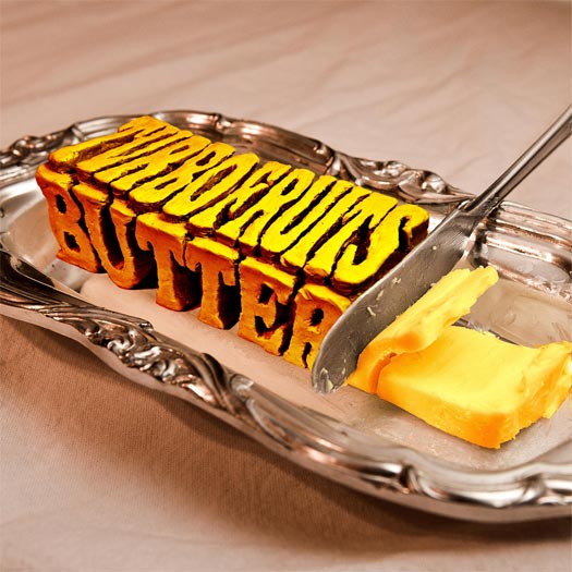
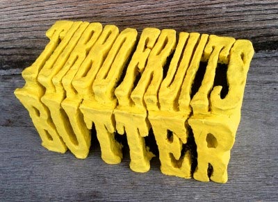
Turbo Fruits – Butter (Serpents And Snakes)
SCULPTURE BY MATT HEARN OF TURBO FRUITS W/ HELP FROM RUBY ROGERS
PHOTOGRAPHY BY ERIC ENGLAND
THEMATIC ELEMENTS
“We wanted an album name & album art that was striking but not loaded. We’re not a controversial or political band. We’re a rock n’ roll band with a lot of ’50s, ’60s, and ’70s rock influence, so we wanted an image that had the vibe of that era. Jonas and I worked together on the record art. Jonas came up with the name, Butter, and the idea of having a stick of butter with lettering on it. I saw what I wanted and started creating mockups out of yellow paper at the printing company I used to work at. I then worked with Ruby Rogers of the Black Belles to figure out how to carve the lettering out of clay so the negative space would have a lot of depth. I wanted it to look epic, like a miniature Stonehenge or something… I used clay to continue the medium used for the Echo Kid record cover and the hand-made feel of all the Turbo Fruits LPs. We wanted it to be something tangible & real but kind of surreal at the same time.” – Matt Hearn of Turbo Fruits
PROCESS & COLLABORATION
“Once the clay sculpture (http://turbofruits.com/08/2012/win-pot-butter-vinyl-1100-the-butter-sculpture-from-the-album-art/) was ready we met up with photographer Eric England (http://www.ericengland.net/) who I had photograph the sculpture from the same vantage point as a real stick of butter on a dish from Jonas’ parents’ house. After that, it was just a little Photoshop magic to get the sculpture to mesh with the background image.” – Matt Hearn of Turbo Fruits
“Closer to the album release VICE Noisey gave away the original clay sculpture to promote the record. I thought it would be cool for a fan to have it. It’s the kind of thing I’d value if I was a fan of a band.” – Matt Hearn of Turbo Fruits
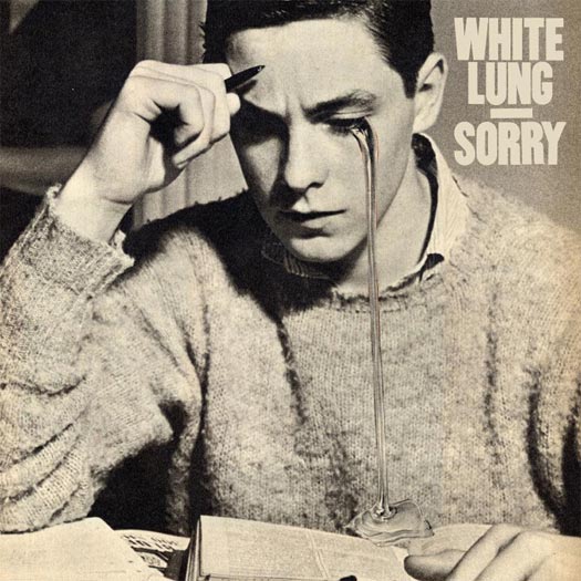
White Lung – Sorry (Deranged Records)
DESIGN BY RYAN DYCK
COVER ARTWORK BY JUSTIN GRADIN – justingradin.com
Artists could not be reached for comment.
Woods – Bend Beyond (Woodsist)
Artists unknown.
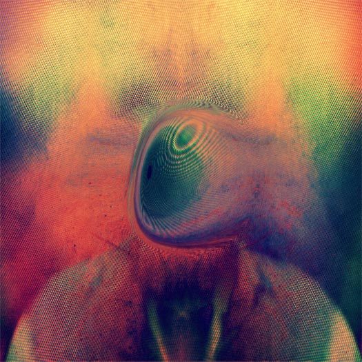
Young Magic – Melt (Carpark Records)
ARTWORK & CREATIVE DIRECTION BY LEIF PODHAJSKY – leifpodhajsky.com
THEMATIC ELEMENTS
“I think it was a product of resonance. Resonance in ideas and long talks. Leif had sent us this image before the album was completed, and it immediately spoke to us. Sometimes an image just jumps off the page and commands you to spend more time with it, to participate and engage with it. It symbolised the same palette of feelings we were exploring on this record; it too was sending out little tentacles into the world, seeing who it would touch. It amplified a lot of ideas Leif and I were discussing at the time. The beauty, colour and blur beyond the mundane. Breaking open the head. The intrinsic holographic equilibrium.
I’d eventually see the cover figure as existing in one level of these subtler levels of reality — don’t ask me which one — perfectly equanimous, although the image seemed to change shape every day I looked at it. It was as if someone had managed to sneak a photograph of the holographic world in its raw state, when all the concrete and tangible levels of reality had been surpassed and dissolved, leaving just the essence. A flick of the thumb, a peacock feather, a figure. It was all the same thing. The image was dense, complicated and very simple at once, like the music on Melt. – Isaac Immanuel of Young Magic
PROCESS & COLLABORATION
“I know [Young Magic’s] music and ideas well. I had free reign; it was a pretty organic process and one of the first pieces I did. It actually started out as an artwork for a side project, but once I created it, I knew there was something special about it. I got that feeling.” – Leif Podhajsky
“It was Leif’s concept, entirely and completely. Both 7” covers before Melt had been monochromatic, so we were definitely searching for color. He sent us a near finished version, and all we did was drag out the process, umming and ahhing on details, getting the colors right for weeks, until the deadline approached and we had to get real. Haa.” – Isaac Immanuel of Young Magic


[…] work for the two new Spires That In The Sunset Rise LP & the Guardian Alien LP made REDEFINE’s album cover […]
[…] simpler approach. Though it wasn’t as originally intended, it did get mention as one of the top album covers of the year by Redefine Magazine. As the follow-up album was written in a similar era, we stuck with the aesthetic a second […]
[…] http://www.redefinemag.com/2012/2012-album-covers-of-the-year/7/#alice […]