Photography & Digital Manipulations Album Covers of the Year 2012
MANIPULATED PHOTOGRAPHY
Acid Pauli – mst // Anberlin – Vital // The Antlers – Undersea // Bat For Lashes – The Haunted Man // Bomber Jackets – Centurion Travel 7″ // Callers – Reviver // Chromatics – Kill For Love // Clock Opera – Ways To Forget // Crystal Castles – III // Flying Lotus – Until The Quiet Comes // Miniature Tigers – Mia Pharoah // Naomi Punk – The Feeling // Paloma Faith – Fall to Grace // Ponderosa – Pool Party // // Savior Adore – Our Nature // Scissor Sisters – Magic Hour // Sleigh Bells – Reign of Terror
<
Acid Pauli – mst (Clown & Sunset)

PHOTOGRAPHY BY CAPERO
DESIGN BY STEFAN BOGNER
“I was looking through photos with Capero, and we selected some that we might wanna use for the artwork. This one instantly touched me in a strong way, and I felt there was some kind of connection between the picture and the music. Nevertheless, we sent all the pics we selected to [label co-owner Nicolas Jaar]. Guess what? He chose the same picture to be his favorite. So I sent it to my friend Stefan Bogner who is an amazing designer — one of those hard-to-find creatives who really know how to reduce to the maximum. He made some drafts, and we all liked the one which is upside down, [with] the little picture reversed, so that you don’t really get it at first sight. For me that’s a graphical synonym of what I try to make with music as well.” – Acid Pauli
Anberlin – Vital (Universal Republic)
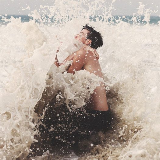
LAYOUT, DESIGN, ART DIRECTION, COLLAGES BY JORDAN BUTCHER – workofself.com
ART DIRECTION BY NATE YOUNG OF ANBERLIN
CUSTOM TYPOGRAPHY BY DARREN BOOTH – darrenbooth.com
COVER PHOTOGRAPHY BY AARON FEAVER – feaverishphotography.com
BAND PHOTOGRAPHY BY BLISS BRAOUDAKIS – blisskatherine.com
“Nate and I are like two peas in a pod on the artwork, usually. Our working relationship has grown to be a little direction up front, and then I’m sort of let loose. Usually when we disagree, we make fun of each other a bunch and then the outcome is much better. We have a unique kind of deal to be friends first and work on stuff like this when the time arises, so it’s actually a lot more fun for me than a usual package, and I tend to get a little more invested in Anberlin releases. For better or worse.” – Jordan Butcher
THE EXTRAS
“All the [interior] collage photos are the same girl. The gradients and color blocks happened by accident during the layout process… But I ended up letting them be the (in my opinion) main piece of the art… They kind of differentiate the different versions of the record that are out there.” – Jordan Butcher
“We only pressed the album on two 10″ instead of the standard 12″, and side D is fully smooth, with no etching. I’ve personally never seen that done. I’m not saying it’s groundbreaking, but it’s close. Ha.” – Nate Young


The Antlers – Undersea EP (ANTI-/Transgressive Records)
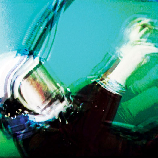
Artist unknown.
Bat For Lashes – The Haunted Man (Parlophone)

PHOTOGRAPHY BY RYAN MCGINLEY – ryanmcginley.com
Artist could not be reached for comment.
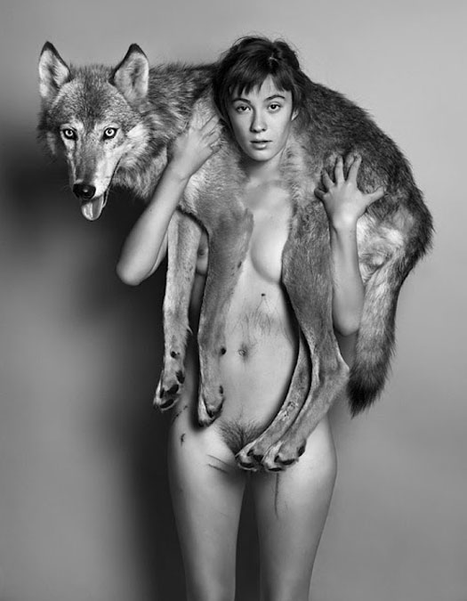
Bomber Jackets – Centurion Travel 7″ (Night School)

ARTWORK BY BILL KOULIGAS
Artist could not be reached for comment.
Callers – Reviver (Partisan Records)

PHOTOGRAPHY BY DERRICK BELCHAM – astorytoldwell.com
DESIGN BY SARA LUCAS, RYAN SEATON & LAUREN WOLFF
THEMATIC ELEMENTS
“Our last album cover for Life of Love in 2010 was a 4×4 foot colorful oil painting done by our friend Douglas McQueen, an artist living in Brooklyn. We really love how that turned out as it was very appropriate for that record — but for Reviver, we went in the complete opposite direction. With the photograph we chose, we wanted to present the album as something extremely personal and close to the skin. When creating the artwork for our albums, we’re not driven by branding and we want the album that we created to dictate the visual aesthetics, not necessarily the personality of the band or its members. This might backfire for us as we know that branding and icons sell these days. But since branding does not drive our sound or our writing, it’s not going to dictate our cover art either. Oops…” – Sara Lucas of Callers
PROCESS & COLLABORATION
“Initially, we had a very different idea of what the cover was going to look like and spent a very long time ruminating over it. The day before the artwork was due for the record, we realized that our initial idea wasn’t going to work. We called up Derrick Belcham and told him what we wanted. We went to his house after working all day, and he spent an hour getting the shot. It was very simple in the end and was finished in only a matter of hours. A friend of ours who is a designer, Lauren Wolff, helped us out with the type and placement afterwards. The cover was put together in one day… All I can say is you can spend months thinking about a cover and trying to execute it, totally fail and then spontaneously make it happen in a matter of hours.” – Sara Lucas of Callers
Chromatics – Kill For Love (Italians Do It Better)
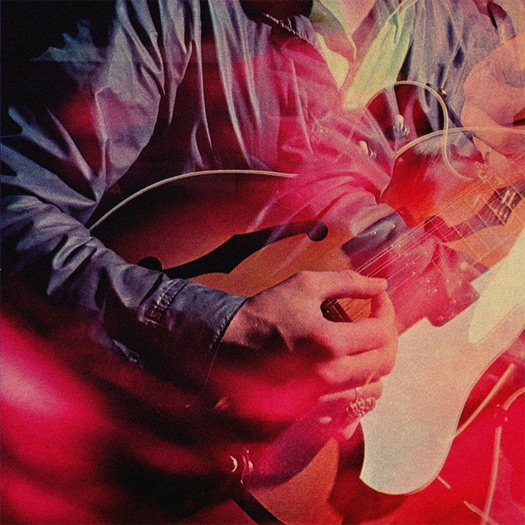
DESIGN BY JOHNNY JEWEL OF CHROMATICS – facebook.com/chromaticsband
The band declined to comment and would prefer to keep the album artwork open to interpretation.
Clock Opera – Ways To Forget (Moshi Moshi / Island Records)
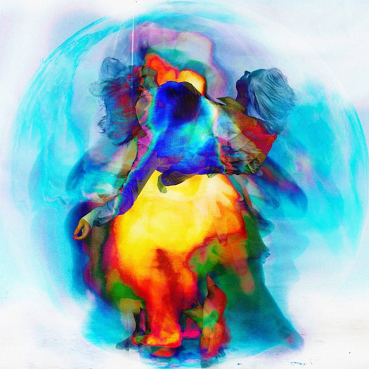
ART DIRECTION BY RICHARD ROBINSON – richardrobinsondesign.co.uk
PHOTOGRAPHY BY MADS PERCH – mads-perch.com
“[Me] and Mads Perch had an extensive meeting with the band [to discuss] directions for the campaign. They had a clear idea of how they wanted the record to feel — not so much of a finished visual, more the message they wanted to convey. They had references of Picasso paintings, distorted screens, vibrant colours and movement.
We took this on board and were really interested in the movement aspect, and particularly the work of Gjon Mili. Having experimented with multiple exposure techniques before, it was a great opportunity to push it further. The band are friends of a group of dancers called The New Movement Collective, and they were happy to come along and let us shoot them for the project. We had four dancers in total and over a day-long shoot, had them perform routines [we captured] as we went. Once we’d done the shoot, the band felt that it needed more emotion and colour, so I worked extensively processing the images to create a more layered, textured piece that had more of a painted quality, which ultimately reflected the music more accurately.” – Richard Robinson
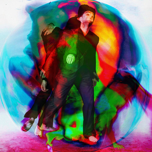
Crystal Castles – III (Fiction Records / Polydor Records)

ORIGINAL COLOR PHOTOGRAPHY BY SAMUEL ARANDA – samuelaranda.net
The main image used on this album cover was manipulated for III, but a description of the original image is as follows:
“Fatima al-Qaws cradles her son Zayed (18), who is suffering from the effects of tear gas after participating in a street demonstration, in Sanaa, Yemen, on 15 October. Ongoing protests against the 33-year-long regime of authoritarian President Ali Abdullah Saleh escalated that day. Witnesses said that thousands marched down Zubairy Street, a main city thoroughfare, and were fired on when they reached a government checkpoint near the Ministry of Foreign Affairs. Some demonstrators retreated, others carried on and were shot at again. At least 12 people were killed and some 30 injured. Ms. Qaws—who was herself involved in resistance to the regime—found her son after a second visit to look for him, among the wounded at a mosque that was being used as a temporary field hospital. Zayed remained in a coma for two days after the incident. He was injured on two further occasions, as demonstrations continued. On 23 November, President Saleh flew to Saudi Arabia, and signed an agreement transferring power to his deputy, Abdurabu Mansur Hadi. Saleh’s rule ended formally when Hadi was sworn in as president, following an election, on 25 February 2012.”

Flying Lotus – Until The Quiet Comes (Warp Records)
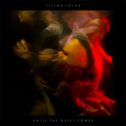
ART DIRECTION & DESIGN BY STEPHEN SERRATO OF B+ – sserrato.info
PHOTOGRAPHY BY DAN KITCHENS
Artists could not be reached for comment.
Miniature Tigers – Mia Pharoah (Modern Art)
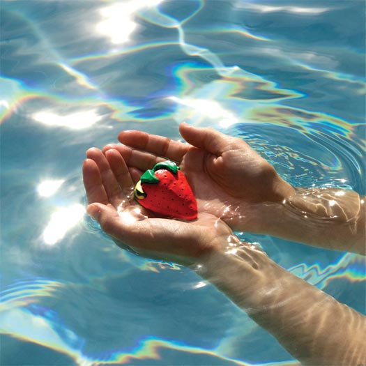
Artist unknown.
Naomi Punk – The Feeling (Captured Tracks)
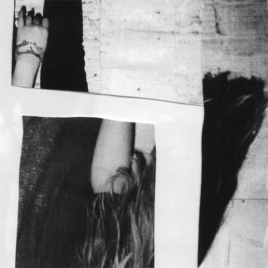
ARTWORK BY NAOMI PUNK
Artists could not be reached for comment.
Paloma Faith – Fall To Grace (Epic Records)

DESIGN & LAYOUT BY CHRISTOPHER J. PORTER – iseesea.co.uk
PHOTOGRAPHY BY DAVID STANDISH – davidstandish.co.uk
Artists could not be reached for comment.
Ponderosa – Pool Party (New West Records)
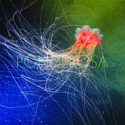
ARTWORK by ROB CARMICHAEL OF SEEN STUDIO – seenstudio.com
PHOTOGRAPHY BY ALEXANDER SEMENOV – clione.ru
“We wanted the music to drive the visual concept, so a psychedelic image for the album cover seemed fitting. However, we wanted to stay away from anything created in Photoshop. We felt that there was enough of that type of album art out there and didn’t want to do something that was already overdone. JT discovered the work of oceanographer and marine biologist, Alexander Semenov, specifically the jellyfish image and he was really passionate about using it as the cover. The rest of the band loved it. It was psychedelia in nature, it was a no-brainer. Fortunately Alexander is an awesome dude and granted us permission to use the image.
This species is the lion’s mane jellyfish and was photographed in the White Sea.” – Jeremiah Romo of Ponderosa
Raime – Quarter Turns Over A Living Line (Blackest Ever Black)
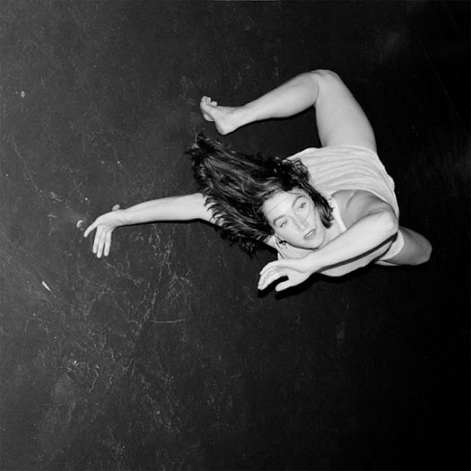
Artist unknown.
Savior Adore – Our Nature (Popular Recordings)
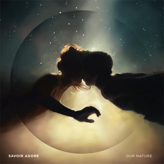
PHOTOGRAPHY BY LEAH ECKLIND
DIGITAL PAINTING BY DOUG OLSEN – dougolsen.com
DESIGN, LAYOUT & TYPOGRAPHY BY JULIAN BIALOWAS – julianbialowas.com
PROCESS & COLLABORATION
“The creation of the artwork was pretty complex for a few reasons, so we ended up working very closely with the artist(s) throughout the process. Unfortunately, there was no high res version of the photograph anymore, so it had to be re-enhanced and painted digitally. The cover is not simply a photograph, and wouldn’t have been possible without the work of three artists. It’s a digital painting of a photograph and then the typography and “circle frame” were created by a graphic designer. Leah Ecklind is the photographer, Doug Olsen is the painter, and Julian Bialowas was the graphic designer. We worked pretty closely with them, but for the most part, they perfectly captured what we were hoping for at each step.” – Savior Adore
THE EXTRAS
“We just found it so interesting and inspiring that we found the art and the artists we worked with all online. First we stumbled across the photograph on a friends page, then it took two weeks to track down the photographer, Leah (also would not have been possible without social networking), and then we ended up asking Julian to do the graphic design (we had followed his Tumblr page all year).” – Savior Adore
“I really wanted to focus on the lyrics and typography for this album. So often, lyrics are tucked away in books and miss out on the action, typically being set in standard 12-point, left-aligned format. With this layout. it’s the first thing listeners see before they even get to the disc… each and every line you see in the interior panels was 100% hand set, line by line, word by word, letter by letter. And believe it or not, it was done twice! (The original final designs were lost in a hard drive failure so the entire layout had to be redone by hand.) [It] was an insanely tedious process but so very worth it; the lyrics most definitely deserve the attention they got.” – Julian Bialowas
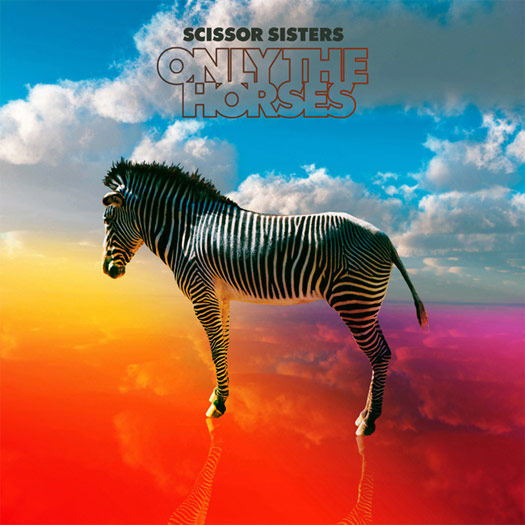
Scissor Sisters – Magic Hour (Polydor Records)

PHOTOGRAPHY & ARTWORK BY NEIL KRUG – neilkrug.com
DESIGN BY TREVOR TARCZYNSKI – studiodestro.com
“[Collaboration was] pretty close, in particular with Scott Hoffman (Babydaddy) from the band. He and I spoke almost everyday about ideas and new designs. Since the project was based in 3D, the options for perspective were endless, so it took us a moment to dial in what we were after.” – Neil Krug

Sleigh Bells – Reign Of Terror (Mom & Pop)
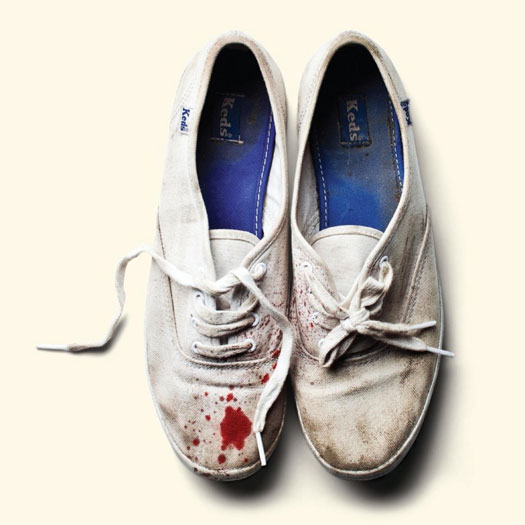
DESIGN & LAYOUT BY STEVE ATTARDO – stevenattardo.com
PHOTOGRAPHY BY JOE GARRAD – joegarrad.com
ART DIRECTION BY DEREK MILLER OF SLEIGH BELLS
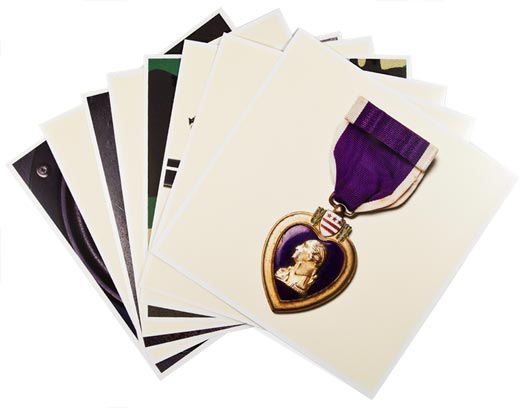
ADDITIONAL IMAGES AT STEVENATTARDO.COM
PROCESS & COLLABORATION
“This was a 100% collaboration. Sleigh Bells came to me with a pretty clear vision and passion for how they wanted to be perceived, what they wanted to include, and the story (though confusing and non-linear) they wanted to tell. From there, I felt it was my job to take it all in and show them which ideas were working, which weren’t, and how to show it in a considered / better way — how to make it really speak. We were working with a pretty simple and clean aesthetic from the start, so it really became about art direction and details.” – Steve Attardo
“The story I love to tell is about the cover. They had a different idea that they were passionate about but wasn’t going to be addressed right away, so I hired Joe Garrad to shoot these objects that Derek [Miller] and Alexis [Krauss] collected. If my memory serves me correct, they weren’t sold on their own idea of showing bloody Keds in the booklet. (Keds is an icon that represents Alexis since that’s pretty much all she wears. [with] blood to show pain and aggression which is very much within the songs themselves.) I said, ‘Let’s just shoot it; if we use it, we use it. If not, no harm done.’ After going back and looking at all the shots with Joe, I decided to put everything on a cream background to make it feel more like a considered piece of art, and the shoes JUMPED off the page. In our next meeting, I said something along the lines of, ‘Guys, I know you love your cover idea, but here’s your real cover’ (I probably didn’t come off as smooth and confident as that, but let’s just go with it) and showed them the Keds. Alexis and Will, the manager, immediately loved it. Derek liked it and said he wanted to live with it for a night and called me up the next day saying we nailed it. The decision to take the type off of the cover came a little later when it just felt like Joe’s photo was so much more powerful with no typography to share the attention.” – Steve Attardo




[…] work for the two new Spires That In The Sunset Rise LP & the Guardian Alien LP made REDEFINE’s album cover […]
[…] simpler approach. Though it wasn’t as originally intended, it did get mention as one of the top album covers of the year by Redefine Magazine. As the follow-up album was written in a similar era, we stuck with the aesthetic a second […]
[…] http://www.redefinemag.com/2012/2012-album-covers-of-the-year/7/#alice […]