Every year, we interview a number of musicians and artists about the intimate details and philosophical underpinnings of their album cover artwork. It’s an ever-massive undertaking, but we make sure to include every genre, from doom metal to disco, minimal electronic to mainstream pop, with the intention of highlighting the best visual art, regardless of why or who created it. You can see entries from previous years here, and browse 2013’s entries by either scrolling down or selecting a category below.
> Narrative & Mythological Album Covers
> Photographic Album Covers
> Illustrative Album Covers
> Mixed Media & Collage-Based Album Covers
Narrative & Mythological Album Covers
A.M.S.G. – Anti-Cosmic Tyranny ___ Profound Lore Records
Artwork and Layout by Anda Abrams, Demoniach and Chimere Noire/Joce
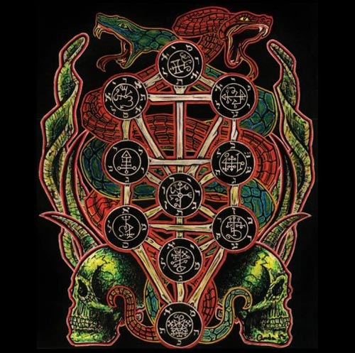
A.M.S.G. aren’t ones to fuck around. As they say matter-of-factly, “The artwork represents our devotion to the demon rulers of the Qliphothic spheres and the anti-cosmic Gods which are simultaneously all and nothing.”
These references to Kabbalah are further explored in their detail of the cover’s central image:
Arcade Fire – Reflektor ___ Merge Records
Album Artwork by Caroline Robert
Booklet Photography by Korey Richey & Caroline Robert
Cover Source Image of Auguste Rodin’s Sculpture – Copyright © The Metropolitan Museum of Art. Image source: Art Resource, NY
Biosphère – Archives de la Ville de Montréal
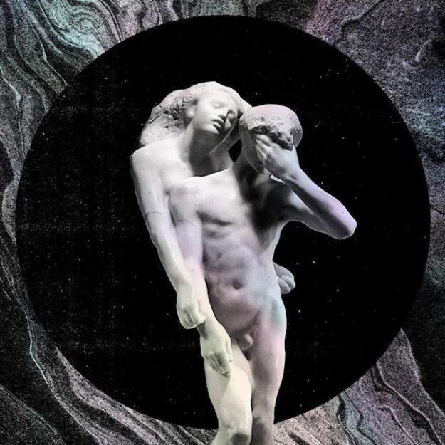
Undoubtedly one of the most talked-about releases of 2013, Reflektor once again sees Arcade Fire at their A-game when it comes to their visual presentation. With the help of visual artist Caroline Robert, the album artwork pays homage and takes inspiration from a number of past worlds and esoteric ideas. Roberts gives an in-depth summary of their philosophical motivations and aesthetic journey:
“For Reflektor, since the very beginning, the band fell in love with Rodin’s sculpture, Orphée et Eurydice (that we have on the album cover). Orpheus’ myth inspired them while writing some of their songs. They were also talking a lot about the influence of Caribbean culture on their music and their desire to bring back carnival energy into live performances. They wanted to create a clash between those two worlds: super classic and beautiful (Rodin’s sculpture, black and white) versus raw and spontaneous (Haitian raw art, voodoo, carnival, textures and colors). A tension that is very strong in their music.
The death of CD, the end of an era (reflective age) was also frequently in the discussions. They wanted to use old CDs as reflectors during live performance (collage on congas) but also on artwork. Once again, a clash between the fact that this shinny and multicolor object is at the same time the symbol of obsolescence or death.
Paradoxically, I wanted to make a CD jacket that people would like to have and not throw away in five years. Something that they would keep like a treasure. So, the idea that the artwork should be a reflektor came naturally.
I wanted this reflektor to feel organic, as if it was an open door to the Other side. Water is reflective and at the same time is a significant element that enable to access to another world in a lot of beliefs (sacrament, purification…).
So I started to do a lot of marbling prints (suminagashi), to petrify the surface of water. Those prints became the backdrop of the sculpture, and were also integrated through the artwork (inside panels, CD and vinyl labels).
The artwork, printed on holographic board, embodies this idea of passage between life and death. Dead and alive at the same time, the black and white artwork comes life thanks to light. It animates in colors when you move it, like a CD.
To me, the artwork had to be deeply connected to the music and to the band’s energy but at the same time it had to be strong, generous and playful, so people would also like to keep it and to re-appropriate.
People are taking pictures of the album cover and sharing it on social media. Each time, it looks different, depending on the context and the light.
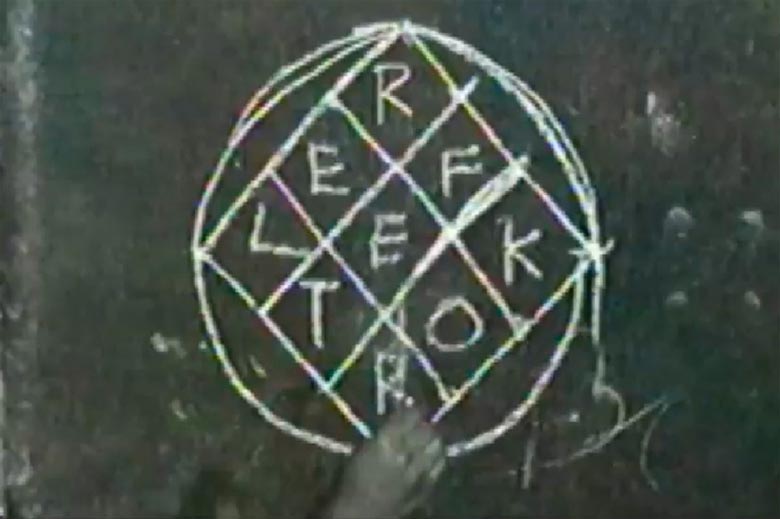
Included with the release is a Reflektor glyph, which Roberts first drew with chalk, in respect to voodoo art.
“At the very beginning, Win Butler lent me a book of Hector Hyppolite’s art, for inspiration,” explains Roberts. “Hyppolite was a great painter, but I was even more touched by his vévés drawing for their simplicity and their strength. Hand-drawn symbols that were meant to reach invisible forces. To me, Arcade Fire’s music is an invisible force…
“I wanted the symbol to be simple enough so that anybody could draw it but it also had to be strong, so people wants to draw it and make it live on walls, school tables… I didn’t expect this symbol to be shared all around the world. It is not mine anymore. It’s alive art! That’s my best reward.”
Darkside – Psychic ___ Other People
Photography by Jed DeMoss
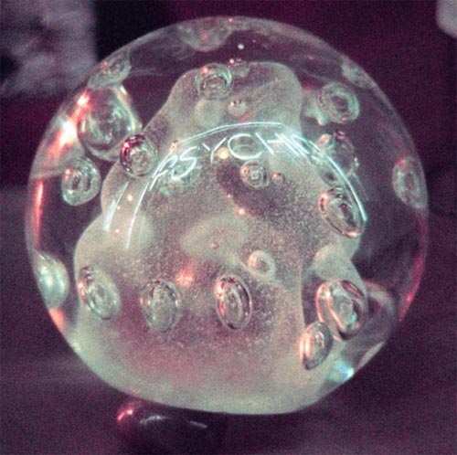
For the album cover of Psychic, the first full-length release by Darkside, photographer Jed DeMoss took cues from musicians Nicolas Jaar and Dave Harrington to photograph the crystal orbs of a Slovenian psychic in New York’s West Village.
“Nico and Dave saw telekinesis in their music; they felt like it had come from some extra-dimensional ether, and they wanted their album’s visual aesthetic to follow suit,” DeMoss explains.
The object, which is used by the psychic to determine the future of her clients, is lumpy, foggy, and nebulous in its evocation of the mystical, much like the moody electronic music of Darkside. DeMoss also took other iterations of clearer and more spherical images, but as he explains, “I think that the ‘lumpy’ orb is more accurate in its connection with the music than the cleaner, red and orange and blue one. That’s why we went with the former.”
Fyrnask – Eldir Nótt ___ Temple of Torturous
Cover Artwork by Benjamin A. Vierling
Back Cover Artwork by David D’ Andrea
Illustrated Scene by David D’ Andrea & Benjamin A. Vierling
Digital Layout and Design by Christopher Duis
Photography by Fyrnask
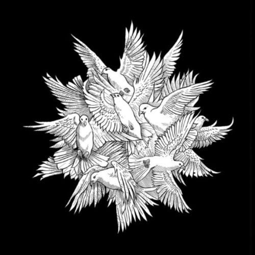
Benjamin A. Vierling creates visual work that is always exploratory in its themes and rich with embedded meaning – so it makes sense that his in-tandem collaboration with artist David D’Andrea round out a great work of art for German black metal band Fyrnask. Vierling explains process behind what he calls “a most unusual collaboration”, saying:
“The band initially approached me with the request for a solar theme based on the Mørketid, which is a Norwegian term for ‘the dark time’, when the sun dwells beneath the horizon. The goal was to create some imagery that would evoke the celebratory spirit of the Sun’s return after its long hiatus during the winter months. The intention of the visuals is to allude to these timeless cycles in an allegorical way.
Inspired by the complex patterns of birds in flight, the starburst of white birds evokes radiance, harmony, and sovereignty: the many coming together as one. A herald for the winter solstice, when the longest night kindles the divine spark of potential to come.
The back cover features a shadow version of this concept, rendered by David D’Andrea in the form of a sphere of dark birds. This graphic is the embodiment of the hidden, or esoteric sun.”
Grave Miasma – Odori Sepulcrorum ___ Profound Lore Records
Artwork by Denis Forkas
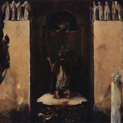
With its simple-stroked exterior, the weight of Denis Forkas’s artwork for Grave Miasma’s Odori Sepulcrorum might be lost in its shadowy elements. But lest ye not be fooled into thinking that the image is an old found image without direct connection to the band’s music – for this album cover has many, many layers to dissect, and is a wholly modern creation.
Forkas, an “avid scholar of classic Egyptian, Greek and Mesopotamian mythology”, was inspired by Odori Sepulcrorum to study the subject of Death’s Door. He speaks below of some of the themes, touching upon, “the notion of death as a means of transformation, a portal to a higher dwelling and – most importantly – a question rather than an answer is reflected in the Greek legend of Oidipous.”
“In the composition sketches I imagined the gateway to the city of Thebes as a crypt-like structure. The seeker – and the viewer! – would enter a sunset lit scene and confront the merciless Sphinx. The cypress grove would add to the air of grave danger and of course hint at Boecklin’s Die Toteninsel. The Sphinx would crawl out of the vault and offer the riddle to the seeker.
The arched opening of the vault and the beast’s figure together would form an eye-like structure alluding to the Eye of Providence and the Wedjat.
All the mentioned symbolic elements would then be balanced through the use of sacred geometry…
We were discussing the project in great detail at each stage of development. Grave Miasma’s music is quite complex and certainly requires an elaborate visual counterpart. About halfway through completing the painting I decided to do a companion drawing in order to add yet another dimension to the project. I followed the Greek red figure painting tradition very closely here and explored the poetry of “death’s door” in a decorative study…
Traditional Greek aesthetics seemed a perfect solution for the cover. My ambition was to create a vision of funerary architecture Vitruvius himself would consider as a place of his final rest. The top tier of the portal is decorated with a frieze of sculpted “shadows” (the veiled spirits of the deceased in Greek mythology). I wanted to introduce Gothic “mourner” sculptures while remaining within the limits of the ancient Greek aesthetics. The frieze along with the cypresses and the sunset lighting would hopefully inspire the viewer/listener to meditate on the subject of mortality.
The main character is either Oidipous/Oedipus or one of his less fortunate predecessors. The seeker is stretching his right arm toward the beast beckoning it to propose the riddle.”
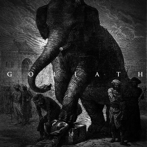
Imperial Triumphant – Goliath ___ Earsplit Records
Artwork by Louis Rousselet (“Le Tour du Monde” – 1868)
Jimmy Edgar – Hot Inside EP ___ Ultramajic
Artwork by Jimmy Edgar and Pilar Zeta
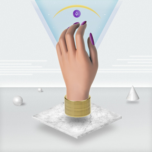
Using what Jimmy Edgar calls a “very obsessively meticulous and uses a combination of all mediums”, Edgar regularly works with Ultramajic label founder Pilar Zeta to create mixed media pieces that ultimately come to possess meditative qualities.
“Typically and idea will go through many versions until the final is something we feel it can be stared at a meditated on to find some deeper meaning within yourself,” explains Edgar. “[The album cover] are absolutely meditations and we use intuition with color’ we put all crazy ideas out on the table. Our newest design has a slinky in it!”
The use of hands has been fairly popular in album artwork as of late, and Edgar describes their use as “very symbolic”. “Hands give; that is their primary duty. We felt it was important to show this image. As for it being a manicured airbrush hand, we feel its always important to have a slick and fashionable look, because this attracts attention in a certain way. I feel it really interesting to make spirituality and philosophy “cool”, because most of the artwork you see around it is quite bad,” says Edgar.
In addition to the hands, symbols can be found in every aspect of the image, and it was important for Edgar and Zeta to subtly stress that the album was the label’s first release.
“When me and Pilar started this, we were really into inner alchemy philosophy and the symbols used by ancient alchemy,” Edgar recalls. “Pilar and I have a funny way of working, and she has now grown to appreciate my crazy ideas. I kept seeing a altar with a hand, and I would not shut up about it. I did some really ridiculous sketches that didn’t make any sense, and finally, Pilar sent over a sketch that looked really fantastic; it was a thrown together version of the basic structure. Then we work to perfect it together exchanging files and ideas, endless searches on Tumblr and Google. We wanted it to be the first fire from Ultramajic, the idea of Sulphur in alchemy; a burning hot symbol that would hold the image of warmth and heat within the viewer.”
“The symbol at the top is the alchemical symbol for Sulphur,” he continues. The yellow shape is a crescent moon bathed in yellow with symbolizes the sun about to rise. It’s the beginning of knowledge coming; the sun rising from the east. The sun is always represented as divine knowledge. The usage of gold is the transformation into gold, internally… although alchemy is about transcending materialism — but its essentially saying its part of the path to the light. The 3-D objects represent the 3-dimensional world we live in, and the first step of alchemy is still sort of stuck in the 3-D reality.”
(Editor’s Note: Read our in-depth interview with Jimmy Edgar about Ultramajic and his attempts to merge art, music, and philosophy here.)
Jimmy Edgar – Mercurio EP ___ Ultramajic
 Artwork by Jimmy Edgar and Pilar Zeta
Continuing with the symbolic alchemical references used on the Hot Inside album cover, Mercurio takes inspiration from water and moves from the fire altar to a new place of potential spiritual growth.
“This is the second release in the alchemical series; it’s the water release. Where water meets warm air and becomes steam or vapor. Mercurio is the meeting of high and low consciousness; it’s the decision to take one path or another,” explains Jimmy Edgar. We were moving from the altar to the platform, the stairs. We used a combination of Masonic imagery and Eastern philosophy to consider what this place would feel like.”
The empty background the image represents “the place of all that ever is” — and although one may find it difficult to make heads or tails of the emptiness, one can find one’s own bearings in the illuminated doorway, which almost doubles as a mirror. Duality is prevalent throughout the image.
“The chain in gold symbolizes two ideas — one about materialism and the other regarding continued path to inner alchemy enlightenment. Ultimately, duality is something we must transcend so the gold symbols have this dual meaning, which also brings us to the black and white tiles. These also symbolize duality, but [after] stepping through the door, [one] realizes they are both a part of the light; both help us to learn and evolve, so they are important in this way.”
(Editor’s Note: Read our in-depth interview with Jimmy Edgar about Ultramajic and his attempts to merge art, music, and philosophy here.)
Marijuana Deathsquads – Oh My Sexy Lord ___ Totally Gross National Product
Artwork by Michael Gaughan
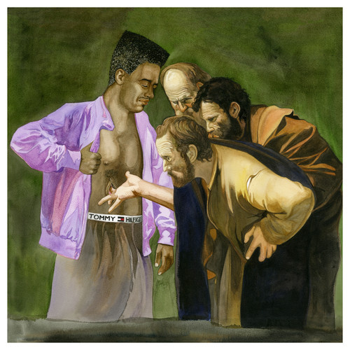
One almost has to do a double-take when seeing the cover for Oh My Sexy Lord; are those Biblical characters marveling at a black man’s nipple? Perhaps, and indeed. The question is why.
“Ryan Olson [of Marijuana Deathsquads] wanted something that was similar to a painting that I made called “wasted” (that parodied the Marat painting substituting the letter for Black Flag’s “Wasted” lyrics and a Tony Hawk Skateboard, etc., mixing the historic with the blatant pop (sub)culture references), so right off the bat we had a clear direction of what we wanted to make,” painter Michael Gaughan explains.
“He knew the title was called Oh My Sexy Lord, so on my end, it was a little tricky to incorporate a “sexy Jesus” in an interesting way,” Gaughan continues. “Then I remembered the “doubting Thomas” narrative in which Jesus’s disciple doubted that [his] wounds were real, and stuck his finger into the opening. That seemed pretty “sexy”. So I riffed off of the Caravaggio painting, which was aesthetically in line with what I knew Ryan would want, but made Jesus a black dude, and made his chest wound an obvious vagina-shaped opening. I also flipped Thomas’s fingers from down to up so it was the more sexual (less curious) way of fingering an opening on someone’s chest shaped like a vagina.”
Munly & The Lee Lewis Harlots – Munly & The Lee Lewis Harlots ___ Pesanta Urfolk
Original artwork by Benjamin A. Vierling
Layout and Graphic Design by Adam Torruella
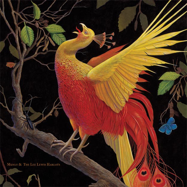
The creature adorning the cover of Munly & The Lee Lewis Harlots’ self-titled album is almost psychedelic in its realism, and even more fascinating in its symbolism, which is rooted in folklore and history.
“The painting features the mythical Zhar-ptitsa, the Firebird from Slavic folklore, executed in egg tempera and oil on panel,” explains artist Benjamin A. Vierling. “The concept is inspired by the bold iconography of Russian lacquered artifacts, which are traditionally decorated with scenes from myth and legend. The brilliant palette and kinetic forms, set like gems into the glittering ebony field, are here depicted in the manner of nineteenth century ornithological illustrations, wherein the delicate structures of feather and talon are rendered with naturalistic precision. By depicting a fantastical subject via the technique of methodical rendering, I endeavored to kindle the flames of imaginative speculation in the viewer.”
The painting was originally in a 2013 New York group show curated by Jon Gernon entitled Beautifully Strange.
Ras G. – Back On The Planet ___ Ninja Tune





[…] Redefine Magazine has listed Benjamin A. Vierling’s artwork used for the cover of Munly & The Lee Lewis Harlots to be one of the best Narrative & Mythological Album Covers of 2013. See that list here: http://www.redefinemag.com/2013/album-covers-year-2013/ […]
[…] TRAAMS / LADDERSEditOK This is a cover from the recent album campaign I photographed for Traams. I like their neo-kraut single ‘Klaus’. This particular cover was voted into the top 500million best covers by Redefine Magazine and you can read a short synopsis, if you have seven hours to scroll down, here. […]
Man, you guys really missed out on Underling’s (Bay Area Atmospheric BM) new artwork this year for their “Breathe Deeply” EP. They commissioned Richey Beckett to do the work. underling.bandcamp.com. Check it out for yourselves.
That’s a great one – thanks for sharing. As you imagine, we tried our best to catch them all but some definitely slipped through the cracks! – Vivian
Slava’s “Raw Solutions” makes me sooo think of “Diagnostic”‘s artwork (2005) from the french band Daisybox. I don’t know if it’s the same artist. Here is it : http://www.tranbavang.com/in/documents/collaborations/daisybox/Daisybox%20Album.jpg
Great article by the way
For sure. Thanks for sharing that!