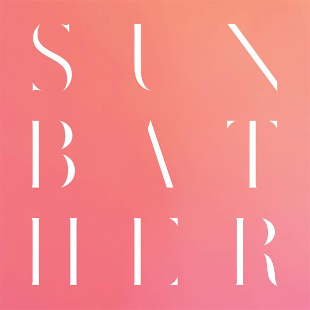
Mixed Media & Collage-Based Album Covers
> Narrative & Mythological Album Covers
> Photographic Album Covers
> Illustrative Album Covers
All Tiny Creatures – Dark Clock ___ Hometapes
Cover Collage by Amy Edgington
Illustration & Design by Adam Heathcott
Text Wrangling, Interface Design & Color Whispering by Jennifer James Wright

After it was decided that All Tiny Creatures’ 2013 full-length would be named Dark Clock, Hometapes founder Adam Heathcott brainstormed an album art concept that was, appropriately, very much inspired by ideas and image throughout history.
“… Immediately, my brain started swimming with ideas of an impossible artifact. Something unearthed that makes perfect sense at face value, but when you dig into the details, things don’t add up,” he explains. “”Kurt Vonnegut keeps saying ‘unstuck in time’ over and over again in my head. The band’s music speaks to these ideas, where sounds and compositional ideas can come from anywhere in the past 5 decades of recorded sound. We own a collage by Amy Edgington from Little Rock, Arkansas (our former home) and it’s been on our living room since its purchase. It perfectly represented the anachronistic approach we had in mind, so we immediately got in touch with her to secure usage.”
After the cover artwork was created, Thomas Wincek of All Tiny Creatures sent the label a number of other inspirational images to use on the record’s additional surfaces. Images of “primitive technology, classic sci-fi book covers, lasers, circuit boards, [and] old school typography”, coupled with Hometapes’ practice of having all of their bands write about the emotional and musical states of their minds during the creation of each track on a record, led to a final product that Heathcott describes “as holistically close to the music as possible.”
“The band gave us a bunch of rope, so we dove straight in,” says Heathcott.” We really tried to approach the whole package as being from another parallel civilization. They’ve got computers, too, they’re just different. Their OS designers have a weird take on color theory and typography. As you move into the inner sleeve, the lattice work of degraded grainy stripes represents another type of circuit board powering the inner core of this artifact. The computations are the music, the words are the underlying application. The words are slightly obscured to add to this frustration of impossibility. If you found an impossible relic from the future/past, would you really know how to process that information?”
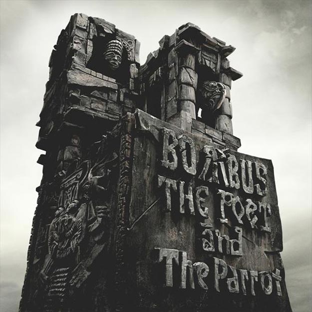
Bombus – The Poet And The Parrot ___ Century Media Records
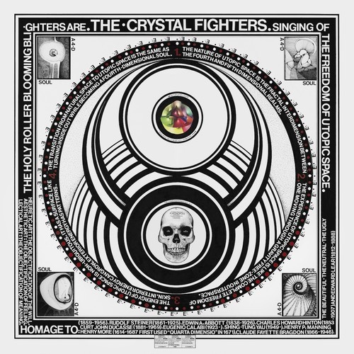
Crystal Fighters – Cave Rave
Cover Art by Paul Laffoley
Design by Tim Green
David Kanaga– DYAD OGST ___ Software
Design by Farbod Kokabi
With Materials from Shawn McGrath and David Kanaga

The score to the video game DYAD, the artwork for David Kanaga’s record takes inspiration from the psychedelic visuals of the game, created in part by of its developers Shawn McGrath.
“David, however, had sketched an extensive and distinct visual language documenting the relationship between the audio and visual dimensions of DYAD,” explains album art designer Farbod Kokabi. “He wanted this language to play a significant role in the packaging, so I worked within the game’s amorphous, maximalist themes to create a strong typographic framework to anchor David’s fascinating, and occasionally cryptic dialogue.”
Given the main assets by McGrath and Kanaga, along with a synopsis of what Kanaga felt he wanted to communicate, Kokabi was then given the freedom to interpret and build upon their ideas.
“It began as a bit of a kitchen-sink approach, which led to stripping away the excessive layers of brain splatter and giving the artwork more of a controlled chaos using negative space and printing techniques, leaving you with a more succinct and high-level look at the world of Kanaga and DYAD,” Kokabi says. “There’s a certain unhinged glory to David’s visuals; the haphazardness of it all can be misunderstood if you remove David’s kinetically-sincere music. So as a whole, it works.”
Disclosure – Settle ___ PMR

Eksi Ekso – Archfiend ___ Retroversal
Album art concept by Tom Kershaw and Tom Korkidis
Design and Layout by Tom Kershaw

A concept record based on the life of a serial killer gets a playful facelift on the cover of Eksi Ekso’s Archfiend.
“The content/subject matter is inherently morose,” explains designer Tom Kershaw,” but we wanted to look at it through a ‘pop art’ lens. In a way, there is a sensationalized quality to the depiction.”
“Archfiend is a ‘story’ album,” he explains, “based on the life of H.H. Holmes, America’s first recorded serial killer. The main cover feature of the artwork is an interpretation of one of two mugshots of Holmes, dating back to approximately 1895. Various carnival-like images are used to create sections of his face, and reference lyrics from the songs. Because Holmes, among other things, was a con artist, pulling the wool over many an innocent person’s eyes with murderous intentions, bright colors are employed to illustrate how appearances can be deceptive. It has one of those cartoonish/surrealist mid-‘60s graphic depictions.
Holmes was a really nasty guy. His life was one of swindling, infidelity, greed and murder. Tom wrote lyrics based on some aspects of Holmes’ life, taken from Erik Larson’s book, The Devil in the White City, and other research. We then matched images we found around those subjects and themes. Hence the photograph of the galloping horses, referencing the song ‘Trophy Horse’ (which references a horse swindle and Holmes’ objectification of women) as an example. The accidental nature of this was pretty fun.”
Running with Korkidis of Eksi Ekso’s original idea to create a collage made from separate images, the two Toms, long-time friends and collaborators, worked slowly on an image that ultimately blended digital and analog collage into a seemingly innocuous form.
Geist & The Sacred Ensemble – Beyond This Vessel ___ Moon Glyph
Artwork by Chris Segawa of Geist & The Sacred Ensemble
Additional Design by Matt Crosbie and Steve Rosborough of Moon Glyph
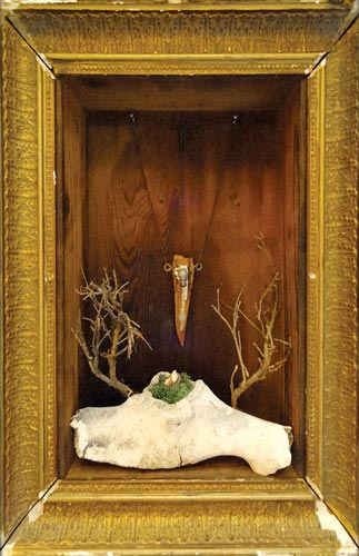
“We wanted to have artwork that encapsulated traits of our music and related to the title. We spent a couple days building a huge diorama world with our friend Matt using rocks, found trash, glass, etc. It took up [guitarist Chris] Segawa’s entire garage. Then we shot a lot of pictures of this ‘world’ in hopes that one of the photos would become the cover. While looking at the images on Segawa’s computer, a picture of an art piece he created a year ago appeared. After one look, we knew that we had to scrap what we did and use an image that excited before we started.”– Michael Sauder (Geist)
“The items in the image were all once parts of things that had a life of their own (plants, animals, machines, etc.) and have ended up together in this box. Sometimes it takes isolating something and boxing it up to see what’s beautiful in it. Art looks better in frames. But the vessel acts provisionally: it should suggest something beyond itself. “– Chris Segawa
Grammies – Award Winning
Artwork by Mark Dow
Design and Layout by Grammies
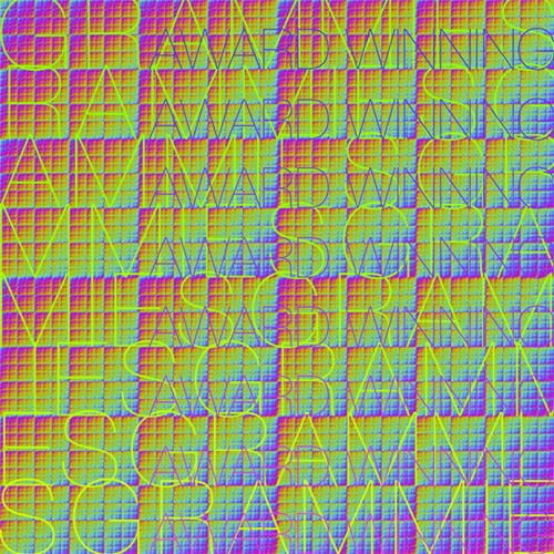
To try and translate a type of music that Grammies saxophonies Noah Bernstein says has “sort of clipart patchwork feel to it”, he and drummer Dan Sutherland scoured the internet for public domain goodies they could use for the album cover of Award Winning.
“Dan found the artist Mark Dow’s color phase cycle and it really clicked with the shifting abstract base of the music. So we set that as the background. I laid the text over it using the same concept of color blending and repetitiveness as a reflection of the fractal and mechanical nature of the album. We sent about 15 versions back and forth until we got the one that felt right,” explains Bernstein.
“Dow’s piece is actually an eight-frame .gif that’s super mesmerizing,” he continues. “We were hoping to be able to put the album out on vinyl with a hologram jacket that illustrated the full cycle. Alas, that didn’t happen this time around, but maybe when we rerelease it in a remastered GRAMMIES Greatest Mishaps, collection you’ll see the full realization of the design.”
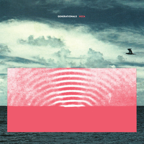
Generationals – Heza ___ Polyvinyl Records
Guerilla Toss – Gay Disco ___ NNA Tapes
Artwork by Keith Rankin
Representing the groovy noise-pop chaos of Boston’s Guerrilla Toss can’t be an easy task – which is what makes visual artist Keith Rankin’s mad interpretation such a delight. Guided by the simple goal of wanting “to match the exuberance and color of the music,” Rankin ran with all aesthetic feelings that popped up in his mind.
“The first image that popped into my mind while listening to the record was a slanted rocky surface set against a stark red background, and I took it from there,” Rankin explains. “Actually, I think Peter [Negroponte of Guerrilla Toss] referred to the ball at the top of the cover as the Disco Ball, but even that was unintentional. I just thought it would be decent to have a ball there for the composition!”
Huerco S. – Colonial Patterns ___ Mexican Summer

Jared Bartman – Misery Makes Strange Bedfellows
Artwork by Matthew Harlan

“I kept coming back to the dissonance between the sound/aural space (beautiful harmonies, rich rhythms, cheerful melodies) and the often dark surreal tableaus depicted lyrically (graveyards, drunken cavorting in cabanas). To me it echos that specific kind of sadness that happens on long summer days (or tropical vacations). There is also a recurring theme about fleeting experiences of clarity or happiness that have since been lost. Longing for a return of innocence, knowing it will never come…
The flowing grey textured element was meant to be a kind of labyrinth or lens through which moments of a lush tropical landscape are revealed. Glimpses of an unattainable time and place wrapped in the shroud of a continuing existence… It’s at once playful and dense/obscuring. There are allusions in other parts of the album artwork to string games (i.e. a cats cradle held between two dismembered statue hands) and other types of entanglement. At one point I was working with folded paper, but I really liked the mesmerizing effect of this visual element that turns in on itself.
– Matthew Harlan
Kid Cudi – Indicud ___ Universal / Republic

Monster Rally – Return To Paradise ___ Gold Robot Records
Art Direction, Artwork and Design by Ted Feighan
No Joy – Wait To Pleasure ___ Mexican Summer
Artwork by Shaun Durkan
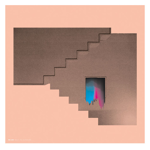
Laura Lloyd of No Joy:
“We really wanted something modern. I had been looking at a lot of architecture-inspired art, the cold/starkness of the Bauhaus movement and loved how timeless it looked. Another thing that really peaked my interest was the colours you see in an oil stain or a reflection, how bright they are and how strange that it’s natural. I sent a lot of images to [artist] Shaun [Durkan] like this…
We really thought it would be interesting to create contrast with these vivid, unnatural seeming colours. I remember discussing with Shaun the colours I find least attractive (magenta, cyan) and seeing if there was a way to make them seem beautiful/appealing… I suppose the only way we achieved this was by turning it into some kind of ooze, which I think is appropriate given the conversation we had surrounding those colours…
Shaun and I, before even starting this project, have talked about the “Non Sign II” sculpture you can see at Seattle/Vancouver border crossing. It’s basically a frame mounted high up with nothing in it., and the frame itself is noisy and chaotic, somewhat dystopian. I think somewhat subconsciously this is what I was hoping to evoke with our album art, but slightly more convoluted.”
Shaun Durkan:
“Both the band and I wanted to illustrate the growth in production and songwriting that the new album represented. It was important to them that the album was interpreted as a modern rock record, and not just a shoegaze or lo-fi record. So no blurry landscapes, layered imagery, etc…I immediately thought of architecture for some reason. Something solid, firm. Designing sound and designing buildings have a lot more in common than you might think. And I felt No Joy were adding floors, materials, and living spaces to their sound.
My roommate Duncan had some old college textbooks lying around, so I started scanning images in his architecture books that I thought were interesting. I was living in an empty bedroom in Greenpoint at this point, sleeping on the floor in a sleeping bag I borrowed from my roommates. I had just moved to NY from CA and literally lived hand to mouth. It was one of the darkest periods of my life, but I look back on it romantically now. I had two TV trays which I placed my laptop, scanner and printer on. My office was dubbed “Durkan & Durkan” by my roommates…
I scanned a lot of eighties porn, for some reason. I think Laura said she wanted something perverted. It was fun to do but was too literal, especially in relation to the title. Pleasure is just such a heavy word – it needed more abstract imagery to communicate the balance that the music delivers.”
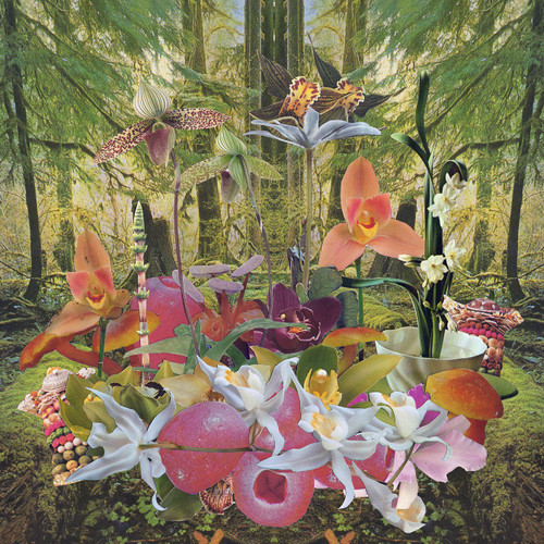
Plankton Wat – Drifter’s Temple ___ Thrill Jockey Records
Artwork by Phil French
With more than 400 pieces of individually-cut paper, this intricate album cover for Plankton Wat’s Drifter’s Temple was crafted by Phil French and contains 26 different birds, 7 flowers, 4 female breasts, and 8 points on the shaman’s antlers and the glowing leaf mandala above him. A long-time fan of Plankton Wat’s Dewey Mahood, French hoped to create a design that would “reflect the symbiosis of the mineral, plant, and animal kingdoms.”
“To my ears, Drifter’s Temple beautifully mirrors the diversity and abundance found in the Pacific Northwest’s natural environment,” he explains.
“Phil knows my primary inspiration comes from nature, so I knew he would run with the theme,” Mahood says approvingly.
To start, French began by creating six large-scale pieces that he then had Mahood choose from.
“My eye went to the shaman collage immediately and I said something about really liking that one,” Mahood recalls, “and Phil’s response was like, ‘That’s totally a Plankton Wat image!’ We both laughed and agreed it was the one. Then we narrowed the rest down to the three more abstract pieces to fill out the packaging. Phil was keen on keeping it to the worlds of plants and stones. There was this whole discussion of representing life from the micro to the macro. I decided to simply write out all the credits by hand so the packaging would have this feel of Phil and I just hanging out, using basic tools. Kind of a rejection of computers and modern technology, which is how the music is made too.”
When creating the album cover French’s mind kept going back to the idea of the “Tree of Life”, “an unshakable phrase that came to me like an automatic mantra in the making of the front cover.”
“The mountain-shaman in the center guards this Tree of Life,” he explains. “Yet right above him hangs a skull, death. That necessary black dot in the white field of the yin-yang. As Burroughs writes, ‘When I become Death, Death is the seed from which I grow.’ Without that seed there is no Life, so the mountain-shaman guards both, I suppose.”
“For me the cover image represents the uncontrolled beauty of the natural world,” says Mahood. “Humans try to sculpt the wilderness but the chaotic twists and turns of Mother Nature will always overshadow our attempts to homogenize. The shaman jumps out of the dense jungle forest to shout ’embrace the chaos of the natural world or be overtaken by it!'”
RUMTUM – Mystic Wonders ___ Gold Robot Records
Art Direction, Artwork and Design by Ted Feighan
Rykarda Parasol – Against The Sun
Photography by Jeanette Vonier
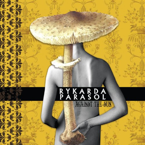
“All my album covers intentionally have a similar style, which is surrealistic feel. I want the albums to be part of a longer narrative and body of work. This album represents a departure of sorts. The foliage and coloring are different and this indicates to the viewer/listener they are in store for something a bit different, yet familiar. The artwork is almost as important as the music. I never wanted to be just anohter female artist who uses her photographic image on the cover. It’s about more than just me.
Thematically, this album dwells on topics of self and introversion, so I wanted to symbolize that. As the designer, I work pretty darn closely! I’ve always worked as an illustrator and paint in my spare time. I research what plant I want to connect the album to, so I go over a lot of literature and meaning and then, I create a pose that will tie in to the collage. I’ve always worked with Jeanette Vonier who photographs the nudes, and I feel really comfortable with her.
The nude represents an uncovering the self, but of course, you don’t see something, but not everything. It’s intimate, but you’ll have to listen and get to know the songs to hear/see more. Here, the figure has turned it’s back on you. Many of the songs are about drawing inward and departure. Travel outside, travel within. The mushroom represents something that grows in darkness out of debris. I relate to that. While my music is mired in darkness, there is always a hope to fetch the light.”
– Rykarda Parasol
Stygian Stride – Stygian Stride ___ Thrill Jockey Records
 Artwork by Arik Roper</strong and Jimy Seitang and Rich Cohen of Stygian Stride
A true collaboration between visual artist Arik Roper and Stygian Stride’s Jimy Seitang and Rich Cohen, the album cover for the band’s self-titled record was undertaken with the hopes of capturing both a analog and digital aesthetic, “from a video source to a hand-drawn feel”, according to Roper.
“In our first discussions about the direction Jimy wanted for the cover art we arrived at few mutually agreed upon conclusions. It was important for us that it relate to previous collaborations that were created during Jimy’s tenure in Psychic Ills. While he was with that band, I VJed for them during live performances under the moniker MOTiF. It was also important that while we wanted to relate to that period the imagery shouldn’t be directly reminiscent of that work, it should be original and evocative in its own right. And no triangle,” explains Cohen.
“My main thing,” Seitang says, “was that I wanted to do a Storm Thorgerson/Hipgnosis vibe to the album. Part photography/video, part artist rendering of multi images — both video and photography.”
After finding a kindred spirit in Roper, Seitang and Cohen experimented once again with projected visuals, as Seitang performed while Cohen manipulated the visuals live.
“In addition to original imagery I also use live camera feedback and mix the two sources; when there is something in between the stream, the feedback is affected. So Jimy’s movements triggered patterns through the feedback that I was able to control and play with,” Cohen says.
He then sent a number of video stills to Roper, who added to the image using scans of watercolor, then manipulated in Photoshop to create “organic high contrast textures”. I also created numerous layers of subtle lines and static marks to give it a weathered “video” feel. A lot of what I did is subtle and possible not noticeable at first but as a whole it created a real effect,” explains Roper.
Of the difference between the initial and final image, Cohen says, “I can only really say that what [Roper] produced is far beyond what I had imagined. When I look at the cover I feel my work is present but I can not see it; does that make sense?”
Tim Hecker – Virgins ___ Kranky Records
Ty Segall – Sleeper ___ Drag City
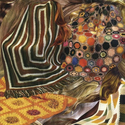 Artwork and Design by Denee Petracek
Layout by Dan O. at Drag City
“Without going too deep into it, I will say that Sleeper is a very personal and emotion album about dreams, love, loss, and relationships. Sleeper is about a moment in time. The cover represents that moment…
Ty is my boyfriend, so needless to say it was an extremely collaborative process. I had been planning a blanket collage for sometime but just couldn’t seem to get it out of my head and onto paper. So when he asked me to do the art for Sleeper, I knew that it was meant to be. We didn’t have to talk much about it. By now, we can read each other’s minds pretty well. The record pertains to a certain period of time in which I was closely involved. The songs just kind of just poured out of him all at once and somehow came together. I think the same sort of thing happened to me while making the art.
The back and front covers are collaged from my ever growing magazine collection. For the hair portions, I used fashion magazines from the sixties up to present day. For the blankets I used all sorts of fabric magazines. I always pick them up from thrift stores. I especially love the ‘60s and ‘70s afghan magazines because they have bold colors and psychedelic patterns. I shot the gatefold and sleeve portraits on my mini Diana.
On the front cover, you may have noticed that there are two blanket heads. However I didn’t see them until Ty pointed them out. Most of his albums thus far have featured his face or someone else’s. I guess I subconsciously put the faces on as part of an ongoing theme.”
– Denee Petracek
Washed Out – Paracosm ___ Sub Pop Records
Artwork and Design by Sara Cwynar

Starting from found images of flowers from the New York Public Library, artist and designer Sara Cwynar added a hand-drawn element to them, with the intention of making the album cover seem hyperreal. As she explains to Creative Bloq, “Ernest [Greene of Washed Out] really wanted the art to look natural and lo-fi. He wrote all the songs in a house in the country outside Athens, Georgia looking out into a lush natural setting and wanted the art to reflect the surreal, natural landscape where the songs were made, and also the warmer, analog instruments he used for this record.”
This intention is further stretched to the max via the visually-explosive music video for “Don’t Give Up”.
Yellowbirds – The Vanished Frontier ___ The Royal Potato Family
Album Cover Collage by Sam Cohen of Yellowbirds
Back Cover Layout and Design by Sarah Graves
Inner Sleeve Painting by Kara Smith

I wanted it to have a cinematic sweep to it, but also a physical impossibility. Sort of realistic (in terms of proportions and photo images) and magical at once. I think there’s a parallel there with the way the record sounds (at least how I imagine it sounding). There are musical moments of drama and it lives in this hazy dream, but it’s grounded by recognizable instruments and relatable vocals. The familiar is far from obscured, but it co-exists with a realm of more abstract possibilities.
The sky is a painting by Helen Frankenthaler. I love it so much. It’s so spacious and balanced. The gradient and textures feel spontaneous and perfect at the same time. It has a 4th dimensional quality which adds a layer to the meaning of the album title. The horizon and foreground are from a photo of the Cliff House in San Francisco taken in the very early 1900’s. To me, that house nearly hanging over the edge of possible settlement is a very literal image of a “vanished frontier”. I added the musicians, which I found in another book. I keep a lot of cutouts around and in folders, so I can’t remember what book they were in. They were from a funeral line in New Orleans. I like having them there to lament the “vanished frontier”. For me, there’s also this theme of the children in the foreground along with the musicians being the people who can gaze across abstract borders. – Sam Cohen of Yellowbirds
You’ve reached the end!
Or View All: Year-End Coverage + Previous Album Covers of the Year
Ω


[…] Redefine Magazine has listed Benjamin A. Vierling’s artwork used for the cover of Munly & The Lee Lewis Harlots to be one of the best Narrative & Mythological Album Covers of 2013. See that list here: http://www.redefinemag.com/2013/album-covers-year-2013/ […]
[…] TRAAMS / LADDERSEditOK This is a cover from the recent album campaign I photographed for Traams. I like their neo-kraut single ‘Klaus’. This particular cover was voted into the top 500million best covers by Redefine Magazine and you can read a short synopsis, if you have seven hours to scroll down, here. […]
Man, you guys really missed out on Underling’s (Bay Area Atmospheric BM) new artwork this year for their “Breathe Deeply” EP. They commissioned Richey Beckett to do the work. underling.bandcamp.com. Check it out for yourselves.
That’s a great one – thanks for sharing. As you imagine, we tried our best to catch them all but some definitely slipped through the cracks! – Vivian
Slava’s “Raw Solutions” makes me sooo think of “Diagnostic”‘s artwork (2005) from the french band Daisybox. I don’t know if it’s the same artist. Here is it : http://www.tranbavang.com/in/documents/collaborations/daisybox/Daisybox%20Album.jpg
Great article by the way 🙂
For sure. Thanks for sharing that!