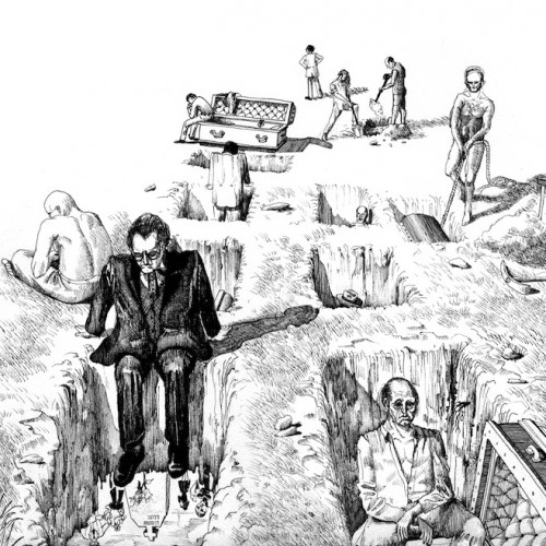
Illustrative Album Covers
> Narrative & Mythological Album Covers
> Photographic Album Covers
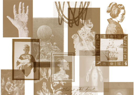
> Mixed Media & Collage-Based Album Covers
100% Silk – SILK Record Sleeves ___ 100% Silk
 Artwork and Design by Bobby Houlihan
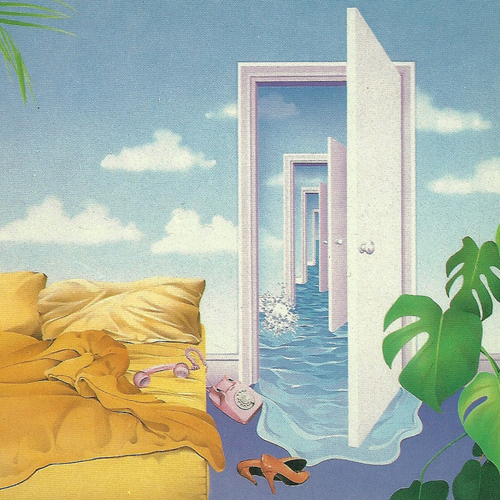
An update on the sleeve for 100% Silk’s label singles.
Baths – Obsidian ___ Anticon Records
Design & Typeface by Folder
Art Direction by Alex Takacs
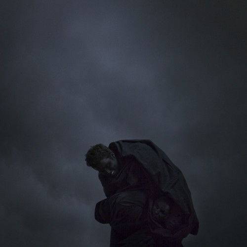
Beacon – The Ways We Separate ___ Ghostly International
![]() Artwork by Langdon Graves
Artwork by Langdon Graves
Sculpture Art by Fernando Mastrangelo
Based off of the last track of the album, entitled “Split In Two”, the album artwork for Beacon’s The Ways We Separate features a simple greyscale homage to the age-old magical trick of sawing an individual in half.
“We were excited by the possibilities of how we could frame the record with imagery based on the ‘saw in two’ illusion,” explain Beacon. “We immediately felt that this imagery could carry a multitude of meanings both literal and symbolic.”
After reading that illustrator Langdon Graves had been listening to their music, Beacon met with Graves to discuss some of the basic ideas and aesthetics they were looking for in the image.
Explains Graves:
“It seemed only fitting to create imagery for music that was already influencing my practice. They had a vision for the cover that played darkly on the album’s title, which I liked from the start. The allure of the old ‘sawing a woman in half’ illusion is the theater of violence and trust between the two people, and the gender swap puts a nice twist on the power at play.
The sound and concept of the record came across to me as passive heartbreak, moving in and out of sentiment, and the guys wanted an ethereal and vaguely nostalgic treatment for the visuals…
The beautiful couple on the front are friends of mine, Paul and Eve, who are an actual couple and posed for the drawings at my studio. Jacob [Gossett] and Thomas [Mullarney III] asked me to make a drawing for the back cover in the vein of work I’d done in the past, featuring a detailed object fading into a patterned silhouette. The wilting lilies echo the emotional decay that moves across the record, as if to mourn the separation created by the very saw they adorn.
“The drawings she presented to us were incredibly delicate yet had this menacing tone lurking beneath,” say Beacon. “She was able to filter all of our ideas through her own sensibilities and really capture the mood of the record.”
Beacon were also lucky enough to see a three-dimensional component in their LP’s release cycle.
“We were really fortunate to add an additional layer of packaging by working with our friend and artist Fernando Mastrangelo on a limited edition version of the LP,” say Beacon. “He is a sculptor that works primarily with unconventional materials, so we wanted to explore the possibilities of creating a unique object that would be a vessel for the record while also being an artwork in its own right. This version consisted of an edition of 20 cast sugar cases with TWWS embossed on the front of the piece. The record sits in a slight shadowbox on the backside of the sugar case.”
Blanche Blanche Blanche – Breaking Mirrors ___ Wharf Cat Records
Artwork and Design by RAFTAR (rugs, flags, towels, and rafts)
Brad Laner – Nearest Suns ___ Hometapes
Illustration and Design by Robert Beatty
On the album cover for Brad Laner’s Nearest Suns, illustrator and designer Robert Beatty runs free into the psychedelic landscape of his mind, to emerge with an image steeped in calming reds and oranges, like a blown-out sunset.
“I pretty much went freeform and drew the cover while listening to the record, taking some forms from my sketchbook and adapting them and some just emerged while listening to the music. I was very conscious not to make the album cover have anything to do with outer space or the sun because of the album title,” explains Beatty.
Beatty is constantly cycling through album art projects for musicians, but working with Laner became a display of mutual respect.
“Hometapes approached me saying they and Brad were both big fans of my work, which is pretty exciting because I’ve been following Brad’s music off and on for years,” says Beatty. “I was pretty much given free reign to interpret the music as I liked for the cover artwork, but we were communicating the whole time and throwing ideas for the packaging back and forth.”
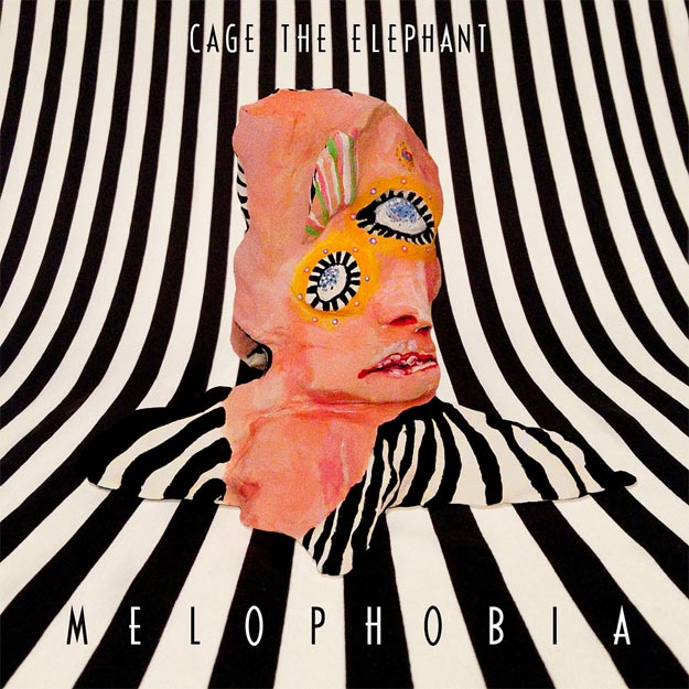
Cage The Elephant – Melophobia
Artwork by R. Clint Colburn
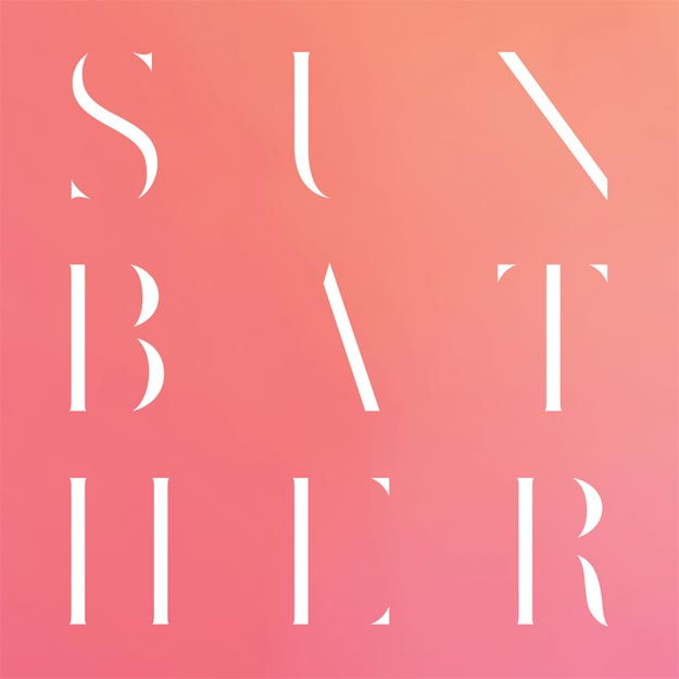
Deafheaven – Sunbather ___ Deathwish Inc.
Artwork by Nick Steinhardt

Drake – Nothing Was The Same
Artwork by Kadir Nelson
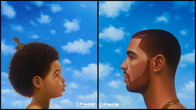
Drake’s Nothing Was The Same has an album cover that will be remembered for a long time to come. In two versions created by Kadir Nelson, Drake’s face can be seen on alternating versions of the album cover in both baby and adult form.
As Drake has explained to MTV, “What that album art is to me, is the fact that this is my most clear, concise thoughts from now, and my best recollection of them.”
“Drake wanted a signature painting; he didn’t want something that looked like a hip-hop album cover. He wanted something that was a little bit more artsy and had more weight to it, so I did a number of sketches, and when we picked out what he liked, I sculpted it together,” Nelson also explained to MTV.
Englishman – Unsafe & Sound ___ Self-Released
Cover concept by Andrew English of Englishman
Artwork & Layout by Robert Beatty
“At one point during the process, Andrew and some friends turned his living room upside down and tried to shoot a photo of the scene from the drawing, but it ended up being harder than they thought.” – Robert Beatty
Forest Swords – Engravings ___ Tri Angle Records
Artwork by Matt Barnes
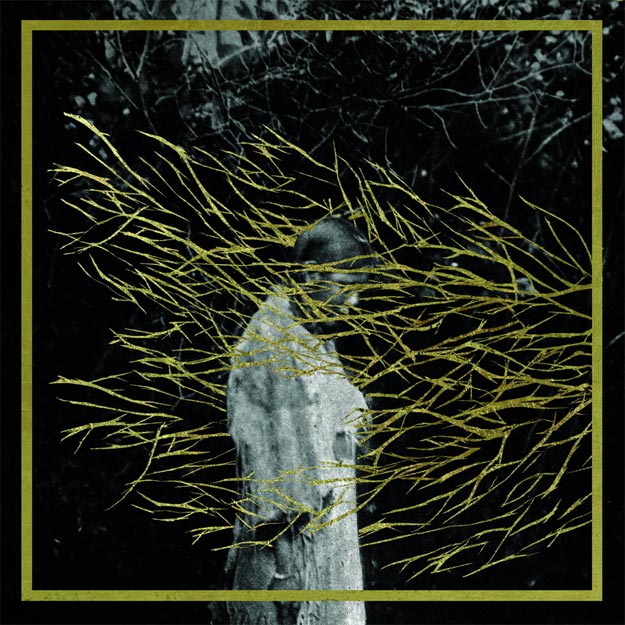
When Matthew Barnes of Forest Swords set out to make the artwork for the LP, he and the label had much more than just passing digital fads in mind. As beautiful and mysterious as the music on the record itself, the album artwork originally came with a limited edition, 20-page art and photography zine — bound with saddle stitch binding, printed on recycled paper, and accented by flat gold ink.
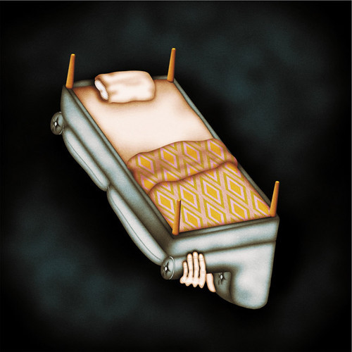
Glass Boy – The Shade ___ Self-Released

Found image.
Holograms – Forever ___ Captured Tracks
Kverletek – Meir ___ Roadrunner Records
Artwork by John Dyer Baizley

Laura Stevenson – Wheel ___ Don Giovanni Records
Laurel Halo – Chance of Rain ___ Hyperdub
Artwork by Arthur Chartow
Layout by Bill Kouligas
In stark contrast to Laurel Halo’s incredibly colorful 2012 album cover for Quarantine, the album cover for Chance of Rain is morbid and stark, depicting a black and white scene at a graveyard.
Laurel Halo spoke earlier this year to Dummy about this piece of artwork, which was given to her by her father years prior, rather nonchalantly. She is glad now that she is able to use the piece thematically in some way – and that it fits the music on Chance of Rain.
Leverage Models – Leverage Models ___ Hometapes
Creative Direction & Music by Shannon Fields of Leverage Models
Painting by Peter Rothmeier Ravn
Typography & Design by Jennifer James Wright
Creative Direction by Hometapes
Thanks to the pre-existing paintings of Danish artist Peter Rothmeier Ravn, a hard-to-discern mood dominates the album cover of Leverage Models’ self-titled album – and that discomfort seems to be exactly what musician Shannon Fields seems to like. As she explains:
“Like most of the things I end up drawn to and attached to, I don’t exactly understand [Ravn’s] images. And I can’t tell you what they’re about. I just feel them on a really gut level. On the surface, most of Ravn’s work could be described as painterly portraits of slightly worn out and tired looking middle-aged white men in plain clothes, often attempting or giving up on some sort of outmoded dignity, framed in narratively ambiguous ways, sometimes with distortions between background and foreground. Sometimes the narrative ambiguities are overtly disturbing, sometimes comic, but most of the time they hover in a place that grows odder and weightier the more you stare. The more you look the less you know what’s going on in these. In Onward, [which is used on the album cover,] you don’t immediately notice that the dragged body appears to be pushing himself up, but it’s not terribly clear… and so, whether he’s being dragged, pushed, helped, hurt, dumped… whether he is alive or dead… it’s not clear. That lack of clarity is wonderful and generous, in my opinion… especially because it’s not put across in an overt, quirky sort of way… you almost don’t notice… or at least, not until you’ve stopped appreciating it on purely visual terms. And the way that space is handled, the whole scene seems so absolutely motionless, further subverts any ability to understand or empathize. There is so much implied action and so much inaction in this image. I was obsessed with it.”
Lord Dying – Summon The Faithless EP ___ Relapse Records
Artwork and Art Direction by Orion Landau
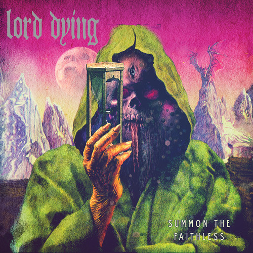
“The title of the album being Summon the Faithless is basically an invitation to those searching for something outside of the norm, perhaps something lurking, something wicked, which is what drove the art. The art depicts a reaper holding the sands of time inviting the listener to join him and what lies beyond.
The colors were chosen intentionally, in a way it pays homage to the album covers of the first several Death records. In the beginning, [Relapse Records Art Director] Orion [Landau] said he wanted to get away from typical metal covers (grayscale or muted colors) and add bright strange colors to make it stand out. We are very happy with the way it turned out.” – Erik Olson of Lord Dying
Lord Raja – Rubies EP ___ Ghostly International
Creative Direction, Artwork, and Design by Michael Cina

“I was given his EP to listen to and make something visual from it. When I heard the music, I felt like the cover needed a different look from everything else. Images and ideas come to my mind when I listen to music and this is what I saw… two arms reaching out with explosions and bats.
The figure is actually me but imitating his being. It’s not supposed to represent anything other than what you see though…
Originally, I had a round circle in the pink area to represent another world or dimension. I had my face in the center at first but that went away and then this shape appeared through many rounds of the direction changing.”
– Michael Cina
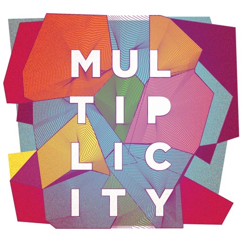
Loveskills – Multiplicity ___ No Shame
Creative Direction, Artwork, and Design by Anti/Anti
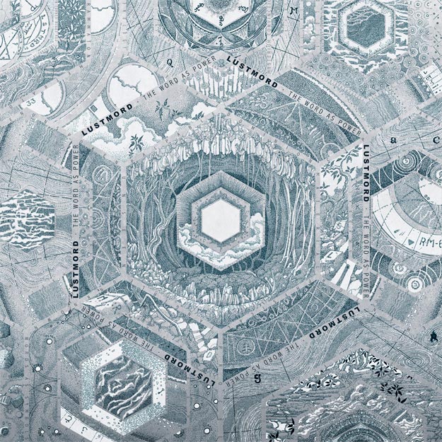
Lustmord – The Word As Power ___ Blackest Ever Black
Illustrations by Simon Fowler
Layout by Oliver Smith
Matt Duncan – Soft Times ___ Soul Step Records / Hop Hop
Artwork & Layout by Robert Beatty
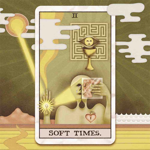
Tarot cards make an appearance on the album cover for Soft Times — an idea which was first concocted by musician Matt Duncan himself. After doing some research on the tarot and taking symbolic elements from the lyrics and song titles – such as a key in “Solitary Heart” and a cup in “Horn of Plenty” — Duncan enlisted the help of visual artist Robert Beatty to turn themes of darkness into light.
“Soft times are hard times that shouldn’t be hard – the times when you’re too soft to deal with life,” Duncan explains. “Traditionally, tarot cards are a bit more intense – Death, The Hanged Man, all those swords… I just liked the idea of presenting small problems in a grand, mystical way. It’s tongue-in-cheek, but it also makes the statement that your perception is your reality.”
Beatty also made a tarot card for each song on the record, incorporating symbolic ideas from Duncan’s lyrics the entire way. Unfortunately, printing tarot cards with Beatty’s artwork proved difficult – but the lucky individuals who received the first 100 copies of the record also received Rider-Waite deck tarot cards.
Moderat – II ___ Monkeytown Records
Ideas & Art Direction by Pfadfinderei
Collaboration for Realization with Siriusmo
Pfadfinderei, the creative visual force behind much of Moderat’s work, put their bold style to good use in 2013 with a reworking of Moderat’s logo, the cascading wallpaper album cover of II, and the narrative-heavy music video for “Bad Kingdom”. These visual exchanges between Pfadfinderei and Moderat are, as always, a display of trust in one another’s work.
“The artwork [for II] was designed to connect to the first one in order to build a series,” the design collective explains. “It visualizes the bipolar moment of a masquerade or demasquerade.”
“The key question is: is he putting on the mask or is he putting it off? And if so, why?”
(Editor’s note: Read our in-depth interview with Pfadfinderei about the music video for “Bad Kingdom” here.)
MOIN – EP ___ Blackest Ever Black
Artwork by George Stubbs
Creative Direction by Tom Halstead and Joe Andrews of MOIN / Raime
Graphic Design by Oliver Smith of BEB
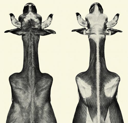
Tom Halstead and Joe Andrews are usually known as Raime — but for their 2013 EP-release, they’ve decided to switch it up with a name change to MOIN. What hasn’t changed is their preference for black and white imagery, as well as their involvement in the creative process. As they explain:
“Both of our parents have worked in similar fields; Tom’s mother was a medical illustrator and Joe’s father a typographer and printmaker, so we’ve grown up around this kind of illustration. This particular one is a close-up edit from an engraving by George Stubbs around the end of the 18th century. It is an anatomical etching showing the muscular structure of 2 cows from a bird’s eye perspective. We found it in the book, An Atlas of Animal Anatomy; which we got from Dover Street bookshop, a store stocking only ‘copyright-free’ material which has sadly since shut down and is now solely online. It was a great source for us and one that we will miss having a poke around once in a while…
We always take a lot of care in finding the right artwork, and we always enjoy it. I’m sure there is a subconscious (albeit fairly easily unearthed) level to it, and in this case, it felt like the right combination of form and detail – but if pushed on the specifics, I would say it’s the strange mix of gory confrontation that a skinned animal invokes and the rather beautiful grace of the illustration itself.
Mood Rings – VPI Harmony ___ Mexican Summer
Artwork by Vladislav Yarushin
Moon Honey – Hand-Painted Dream Photographs
Artwork by Jessica Ramsey of Moon Honey
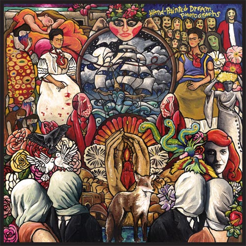
“This album/painting’s concept began as a solution for feeling exhausted and creatively lost. I’d say that everyone trying out their luck in the creative field frequently hits walls where they aren’t quite sure of who they are as a person, let alone as an artist. The theme and style of my life at the moment was wondering why I was so themeless and without style. I remember working on the first lyrics for the record. It was the most difficult of the bunch—trying to say something that I didn’t know how to say or if I should say it. It lacked inspiration. I came across a the dualistic self-portrait by Frida Kahlo, “The Two Fridas,” and it communicated the song to me more than I could express. Words came naturally and we named the song in honor of the painting. The remainder of album writing became a mad research project, searching through art and artist’s diaries for my own culturing.
The process reminded me of a drawing class where we were constantly challenged to find master artists we liked and redraw their pieces. It seemed like a waste of time when all you wanted to do was to focus on your own art, but the uncanny part about the exercise was what you discovered about yourself through the study. I found inspiration in strange places, prompting me to craft the drawings slightly different…suddenly they were reworked into something uniquely mine. The same thing happened with the music and album cover. I took to finding art that spoke strongly and expanded on it with my own words, colors and experiences. Each song was named after a masterpiece (in my opinion)—paintings, sculptures and poems. Once the album was finished, I printed out photographs of the pieces or artists, collaged them and repainted the whole as I saw fit.”
– Jessica Ramsey, Vocalist of Moon Honey
Oneohtrix Point Never – R Plus 7 ___ Warp Records
Artwork by Georges Schwizgebel
Artwork Recreated with Permission by Robert Beatty
Georges Schwizgebel – The Rapture of Frank N. Stein
Pissed Jeans – Honeys ___ Sub Pop Records
 Illustrations by Edward Kinsella III
Photography by Bradley Fry
Layout by Dusty Summers
Queen Elephantine – Scarab ___ Cosmic Eye Records / Heart & Crossbone Records
Artwork by Adrian Dexter
“Triangles and hexagons were central, ranging from the double-trio band and a dominant emphasis on minor thirds to parts of songs being mapped and visualized as iterative triangles to move through.
Another critical image was that of the band as a primordial cosmic chariot heaving a black-hole monolithic temple. A lot of discussion went into the exact nature of this temple, it being the casing of the Supreme and at the same time the void wherein collapse the mysteries of time and space.
We also thought about inhabiting spaces. We tried to balance each other sonically by representing different forces in the mix: Ian being earth, Nate being metal, Mat water, myself (Indrayudh) wind. Srini and Brett are the swarm and the divine mosquito respectively, so while the two drones aren’t quite elements, they’re sort of like the bindu at the head of the beast.
And of course all of our music is for the goddess and each album has presented a different aspect of Her. Her stone head graces this particular cover.”
– Indrayudh Shome of Queen Elephantine
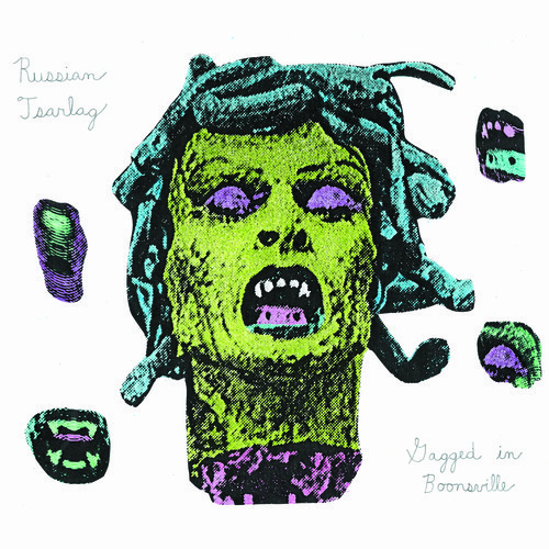
Russian Tsarlag – Mystic Wonders ___ Not Not Fun
Slow Magic – Youth Group ___ Self-Released
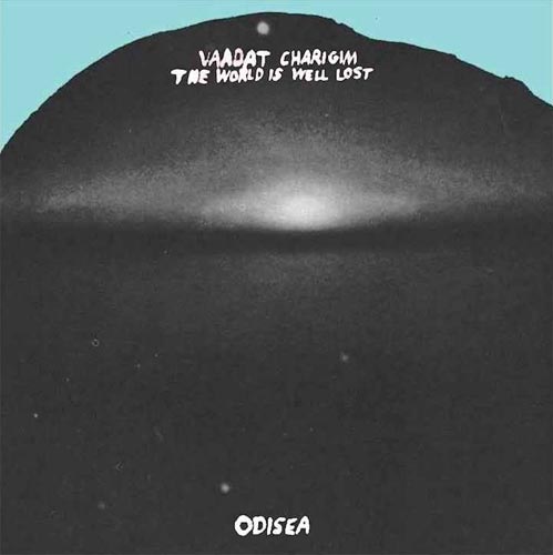
Vaadat Charigim – The World Is Well Lost ___ ANOVA / Burger Records / Warm Ratio
Artwork and Design by Nathaniel Russell
Van Dyke Parks – Songs Cycled ___ Bella Union
Cover Artwork by Kenton Nelson
Additional Artwork by Multiple Artists (see below)
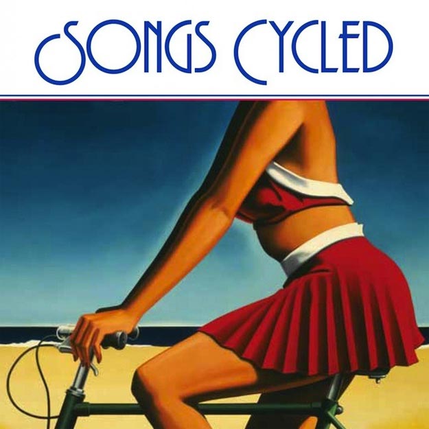
As art has always been what Van Dyke Parks calls “a pivotal component to my audio efforts”, it seems a natural progression that the album artwork for Songs Cycled is as immersive and expansive as it is. Including pieces donated by a number of his artist friends, who he asked to respond to his lyrical content, the album artwork is like a gallery show in and of itself, meant to project “a sense of place”. He gives a rundown of how each artist was chosen:
“Each artist was a personal friend of mine. I met everyone of them in one era or another in my life.
Ed Ruscha was an Art student when I met him in 62. We were both brunettes. He responded to “Dreaming of Paris” with a minimalistic colored-pencil “Paris” via email one evening. Less than 24 hours later, he sent that same picture dated 1962 and added a few notations. This, with the entire title of the tune “Dreaming of Paris”. And wrote “Van Dyke—what think?” In this case, I felt that a man whose one work has commanded more than seven figures would be prima facie in autograph alone, an incalculable benefit for my recording!
Likewise, Frank Holmes had been a friend for decades. We’d met at The Insomniac Coffee House in Hermosa Beach in ’62. Frank provided the artwork for Smile, the album I did with Brian Wilson in ’67. Frank knows my commitment to ecology [and] my outrage at the oil industry practices. So he wrapped up my song “Black Gold” with a “Cartoon Consciousness” (which is his signature trademark).
My wife Sally is a watercolorist. We’re both born Mississippians [who] have a parallel love affair for the Gulf Coast, despairing its fragility after the BP oil spill and Katrina. She illustrated “Missin’ Missippi” in her “Route 49” (that famous highway is the northward-escape route for those in peril on the coast).
Klaus Voormann, who’d done the Beatles’ Rubber Soul cover, is a close friend of mine. He responded immediately, with his affectionate disregard for me in the illustration for “The All Golden”.
Klaus is the only non-Yankee in this album branded “Americana” — yet, he’s way into our vernacular.
He sent that oil from Munich within 24 hours of my asking him. Note that it puts me in an irreducible minimum on the lower right-hand of the painting — a hawk-eye-view of a man in overalls facing a vast wheat field.
Art Spiegelman and I met decades ago, when he approached me to collaborated on a “Comix” opera. That Pulitzer prize winner had a parallel experience to 9/11 (he and his daughter were 4 blocks away from “ground zero” that hour, and my daughter was 7 blocks away as the Twin Towers collapsed. Art and I had both commented on a falling couple holding hands, having leapt from the heights. Such synchronicity brought a dark aspect to my album.
Art also contributed “In Excess”, for “Money Is King”, to reflect on our disdain for greed.Billy Edd Wheeler is the most august of singer-songwriter poets and artists of Appalachia. He lives in Swannanoa North Carolina, a stone’s throw from the small town where my wife and I got married. I knew Billy Edd, and had always wanted to do his song “Sassafrass”. He not only wrote the song, but illustrates it here, in acrylic,
with “Mountain Hay Time”. Like Thomas Harte Benton, Mr. Wheeler gives vernacular art an epic dimension.
Stanley Dorfman’s Joshua Tree is the only non-representative work in the album. A close friend in L.A., I followed his career from the time he escaped Apartheid South Africa in the ’48, his adventures at L’Ecole des Beaux Arts in Paris, chance encounter with Picasso etc. All that, an era in Art that demanded homage.
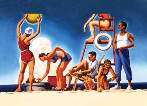
How to wrap all of this in an exterior cover? Considering the darkening nature of the songs within, I needed a confectionary coating, and sought the informed optimism of (fellow Pasadenan artist) Kenton Nelson. Kenton’s a new friend. We met at a local restaurant a couple of years ago. He came over to our booth, introduced himself, and offered me use of his works, gratis, if I ever needed such. Like Wow! Kenton’s work paints a California landscape that is at once seductive, yet filled with a nostalgia that’s anything but mawkish. It’s a world that is disappearing, a handshake away, but one we we’ll remember, of an idealized Eden — with images that drew us to California in the first place. The propagandist nature of “Orange Crate Art” come to mind. Kenton has taken that determinant into the prism of a contemporary awareness. I’m lucky to have met this genius.
In a nutshell, my album is basically a musical tribute to visual artists, with a sub-text of what defined their struggles to arrive.”
– Van Dyke Parks
Wolf People – Fain ___ Jagjaguwar
Artwork by Joe Hollick of Wolf People
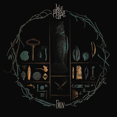
Blues and earth tones meet with symbolic elements on the intricately detailed album cover art for Wolf People’s Fain — and its main visual elements are furthermore extended into the music video for “Empty Vessels”. As director Phil Poole explains, the video is “as an abstract piece exploring the many layers and depths to the track, through a combination of unorthodox visuals and motion graphics”; it features many objects as seen on the album cover, but are communicated in a vastly different way.
Wrekmeister Harmonies – You’ve Always Meant So Much To Me ___ Thrill Jockey Records
Artwork by Simon Fowler
 Having never heard Wrekmeister Harmonies prior to this release, artist Simon Fowler took his first impressions of You’ve Always Meant So Much To Me and translated them into an inviting image of frozen tundra, using pen drawings and watercolors layered to mimick old Chinese and Japanese print processes.


[…] Redefine Magazine has listed Benjamin A. Vierling’s artwork used for the cover of Munly & The Lee Lewis Harlots to be one of the best Narrative & Mythological Album Covers of 2013. See that list here: http://www.redefinemag.com/2013/album-covers-year-2013/ […]
[…] TRAAMS / LADDERSEditOK This is a cover from the recent album campaign I photographed for Traams. I like their neo-kraut single ‘Klaus’. This particular cover was voted into the top 500million best covers by Redefine Magazine and you can read a short synopsis, if you have seven hours to scroll down, here. […]
Man, you guys really missed out on Underling’s (Bay Area Atmospheric BM) new artwork this year for their “Breathe Deeply” EP. They commissioned Richey Beckett to do the work. underling.bandcamp.com. Check it out for yourselves.
That’s a great one – thanks for sharing. As you imagine, we tried our best to catch them all but some definitely slipped through the cracks! – Vivian
Slava’s “Raw Solutions” makes me sooo think of “Diagnostic”‘s artwork (2005) from the french band Daisybox. I don’t know if it’s the same artist. Here is it : http://www.tranbavang.com/in/documents/collaborations/daisybox/Daisybox%20Album.jpg
Great article by the way 🙂
For sure. Thanks for sharing that!