Photographic Album Covers
> Narrative & Mythological Album Covers
> Illustrative Album Covers
> Mixed Media & Collage-Based Album Covers
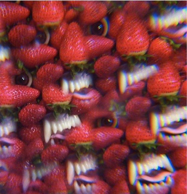
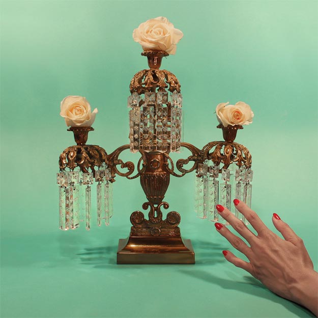
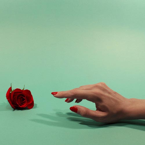
ADULT. – The Way We Fall ___ Ghostly International
Photography by Nicola Kuperus & Adam Lee Miller
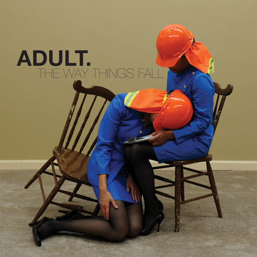
Time and time again, visual artists and musicians ADULT. are able to combine their interdisciplinary skills into an artful package that maintains their brand without becoming stagnant or predictable.
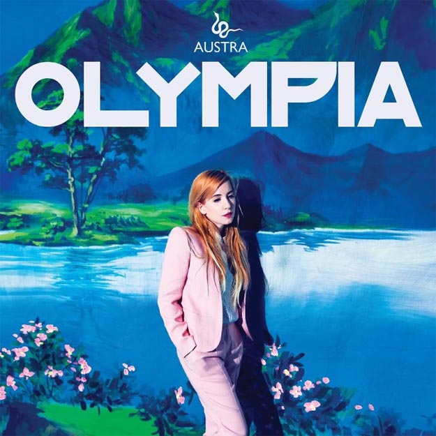
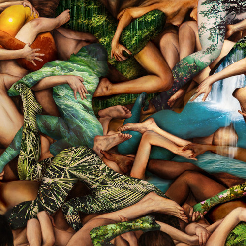
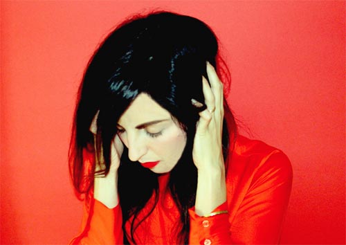
Austra – Olympia ___ Domino Records
Photography by Norman Wong
Autre Ne Veut – Anxiety
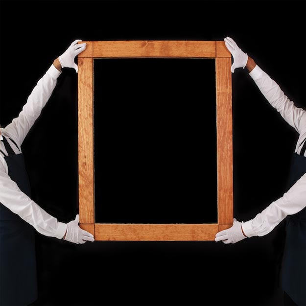
Bestial Mouths – Bestial Mouths ___ Clan Destine Records
Concept by Bestial Mouths
Photography by Michael Thiel
Additional Artwork by Michael Chase
Layout by Ella Orleans
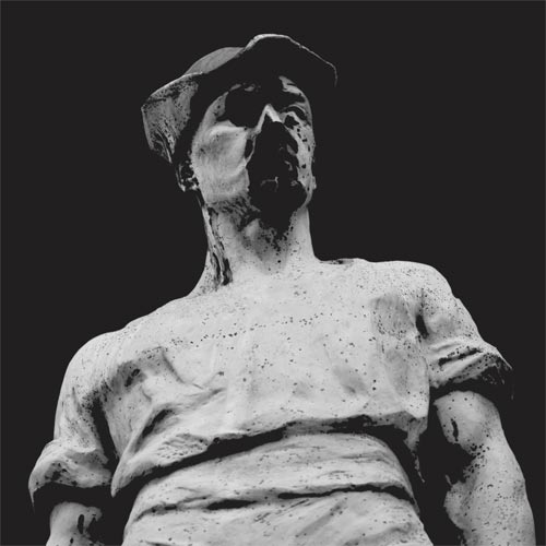
“We found the statue from the cover while on tour in Europe last year. We happened to have a day off in Brussels on my Birthday and we were walking back from celebrating when we came across this small church with this little statue in front. You can’t tell in the photos, but it’s really only a few feet tall. I thought it looked interesting so I took a quick photo with my phone. Later, while we were recording the album, we looked back through the photos from tour and as soon as we saw the statue we knew we wanted to use it for the cover. Since my photo was pretty low quality and dark, we asked our friend Michael Thiel, who lives in Brussels and is a photographer, to take a better one. We edited it a bit and used a piece from the artist Michael Chase, with whom we had been planning to work with for a very long time, for the back. Ella Orleans did the final layout and text.
The photo was appealing to us because of its severity. It tied in well with the lyrics for the record and to our general aesthetic. The song ‘Faceless’, in particular, deals with similar imagery.
I’ve tried looking for any other images of that statue, but I haven’t found any. Googling “statues in Brussels” only gets you the Mannekin Pis and a whole lot of peeing babies.”
– Christopher Myrick of Bestial Mouths
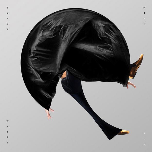
Black Rebel Disco Club – Black Moon White Sun ___ Lo Recordings
Design by Non-Format
Blouse – Imperium ___ Captured Tracks
Concept and Art Direction by Anna Alek and Patrick Adams
Photography by Anna Alek
Font by Charlie Hilton
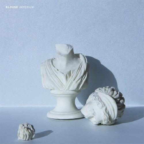
Working off the album title, Imperium, Anna Alek, Patrick Adams, and Charlie Hilton transformed a tiny miniature bust purchased from a secondhand store into a simple, life-sized beauty. One wouldn’t even know that the background was only 8.5″ x 11″ large.
“I was really nervous to break the bust because I wanted it to not just shatter into a bunch of tiny pieces,” recalls Adams. “Luckily, it was a pretty clean break. The statue itself is actually very small, only about two inches tall. I remember we were most excited about the light that was coming through the warehouse window. We had limited time with this magical light before the clouds took it away.”
“The headless bust is a metaphor for pure thought. There is something very clean about the photo, but it doesn’t seem sterile to me. It’s warm and a little imperfect, like that one ambiguous piece that’s out of focus. I think this ties into the record very nicely,” explains Hilton.
Camp Counselors – Huntress ___ Lefse Records
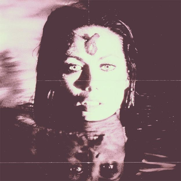
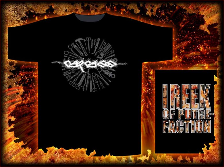
Carcass – Surgical Steel ___ Nuclear Blast
Concept by Jeff Walker of Carcass
Photography by Ian T. Tilton
Layout and Design by Rob Kimura of Nucler Blast
Band Photography by Adrian Erlandsson
Additional Graphics by Mircea Eftemie
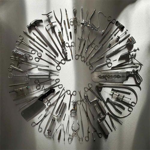
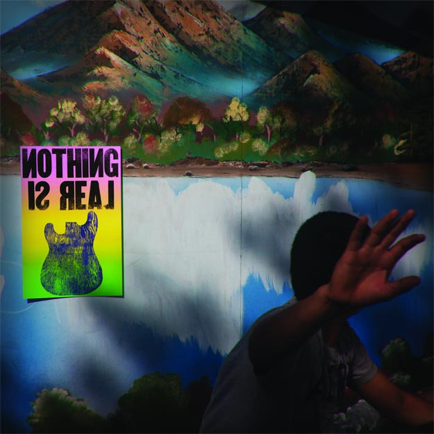
Crystal Antlers – Nothing Is Real
Art Direction, Artwork and Design by Ted Feighan
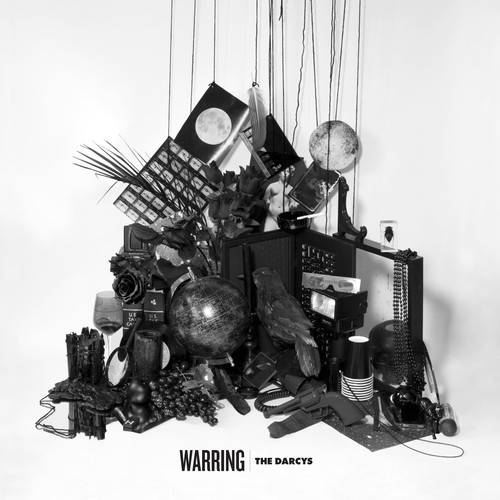
The Darcys – Warring ___ Arts & Crafts
Artwork and Design by Sara Cwynar
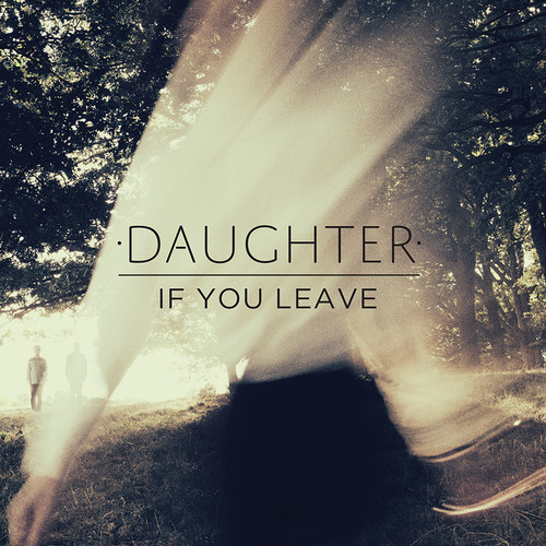
Daughter – If You Leave ___ 4AD / Glassnote Records
Art Direction and Design by Alison Fielding
Photography by Eliot Lee Hazel
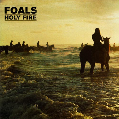
Foals – Holy Fire ___ Jagjaguwar
Design and Art Direction by Leif Podhajsky
Photography by Thomas Nebbia
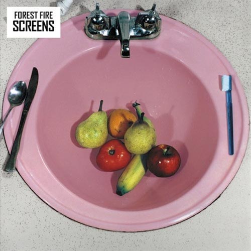
Forest Fires – Screens ___ Fat Cat Records
Photography by Sandy Skoglund
Design & Layout by Dave Thomas
Fort Romeau – Stay/True EP ___ Ghostly International
Creative Direction, Artwork, and Design by Michael Cina
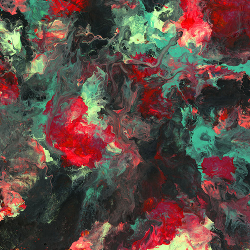
“I started by picking up where the last cover left off. I worked on some ideas and then he sent some ideas of what he was thinking over. He wanted to go in a geometric direction, but nothing was really panning out.
I worked on a lot of different directions, and then one day I found this older painting that I had done. It represented this cover while also transitioning from the last cover. I presented it to him, and we ran with it.”
– Michael Cina
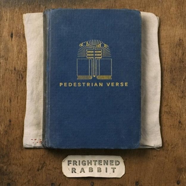
Frightened Rabbit – Pedestrian Verse
Artwork by Scott Hutchison
Photography by Joby Barnard
Fuck Buttons – Slow Focus ___ ATP Recordings
Artwork by Benjamin John Power
Photography by Alex De Mora
Hookworms – Pearl Mystic ___ Weird World
Artwork by JW
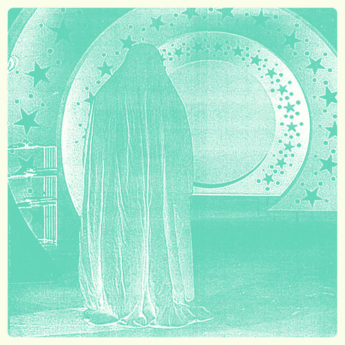
“I’d be lying if I said that I’d really sat down and considered what the album art was going to look like. I had found the image of the person under the shawl ages ago and saved it on my computer because there was something eerie and beautiful about it. As a band, we’ve semi seriously played around with being mysterious; we don’t use our real names and shy away from photos and music videos (this also has it’s practical sides as some of us work in public organisations and education), and I guess that the shawled human represents that. I wanted to show the warmth/fuzzy sound of the band, which I don’t think is possible just through using a found photo, there were many hours spent and photocopiers broken to get the right level of fuzz and distortion.
I think the success of the album art is the contrast between the doomy/gothy photograph and the bright overlay. There’s a similar vibe to the music too; there’s obvious themes of depression and failed relationships but some of the music is fairly bright and blissful. The physical format of a 12″ record definitely influenced the design too, we wanted the packaging to fit with the fuzzy tone of the record, we specifically asked for matte sleeves and heavy vinyl. Absolutely 100% never glossy (either aurally or aesthetically), which I hope comes across in our live shows, artwork and music.”
– JW, Guitarist of Hookworms
Jesu – Every Day I Get Closer to the Light from Which I Came___ Avalanche Recordings
John Grant – Pale Green Ghosts ___ Partisan Records
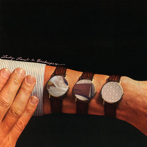
Lady Lamb The Beekeeper – Ripley Pine
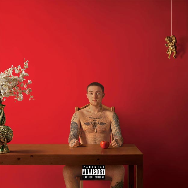
Mac Miller – Watching Movies With The Sound Off___ Rostrum Records / Universal
The National – Trouble Will Find Me ___ 4AD
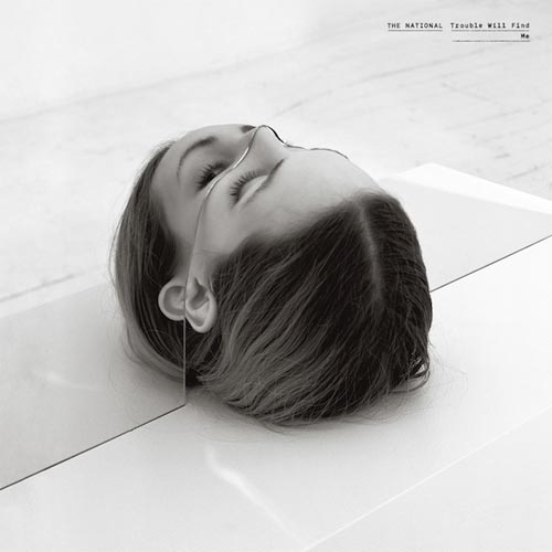 Artwork and Installation by Bohyun Yoon
One of the most thought-provoking album covers of the year, The National’s Trouble Will Find Me enlists the help of installation artist Bohyun Yoon to create a dizzying, mind-bending space. Yoon explains his process in detail, citing a parallel between the record’s themes of “passages” in his work, in general:
“In this project, I used the body and mirrors to cut or extend, distort, reconstruct and fragment, to create a chaotic image of a human. I used mirrors for integrating reality and illusion. My work poses the question: what is reality? I take advantage of illusion to explore and answer this question. I use the human body as a metaphor for the people of contemporary society. In my work, the human body is the medium that stands on equal ground with the present audience and invites them to immerse themselves in a very specific place. Presently, I am interested in highly-developed technology, science, medicine and other fields, and moreover, I am curious how human perception will change and be affected by this technology and what this development will mean for the human life. Through my art, I want to pose questions about the use of technology and its relationship to reality and illusion…
Glass is an artist material that has fascinating characteristics and expressions. I use mirrors for integrating reality and illusion… I carefully measured model’s contour line and fabricated [a] plexi mirror to perfectly fit into [her] body. This was performance piece at the gallery, and male and female models had to stay in this fixture.
I am interested in location for art. Many artists have their own website these days and invite viewers into virtual exhibition spaces. [This] was the first time I [was] challenged for [a] music album, but packaging can be mobile exhibition space, because it’s still physical presence.”
– Bohyun Yoon
Nick Cave & The Bad Seeds – Push The Sky Away ___ Clan Destine Records
Photography by Dominique Issermann
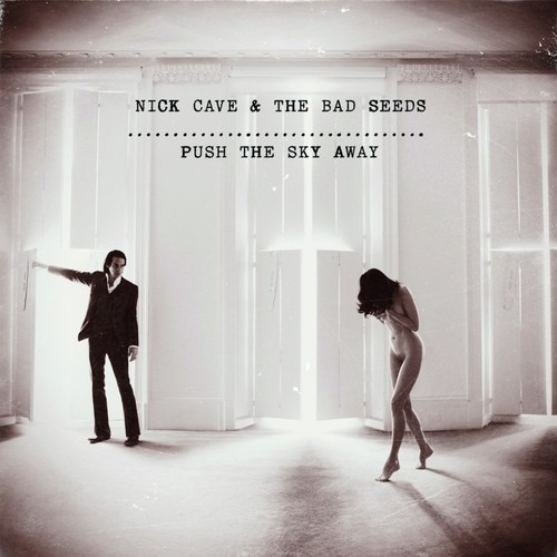
Much has been written about the album cover for Nick Cave & The Bad Seeds’ Push The Sky Away — and rather than sorting through all of it, we decided to speak directly to photographer Dominique Issermann about the experience. The first order of business was sorting out whether the image was an accidental capture, as some have reported, and Issermann assures it was not. Recalling the day of the shoot and the process afterwards, she details:
“Nick Cave asked me to do a shooting for the new album, Push the Sky Away. We organized it for the day following an editorial shooting for a French fashion magazine starring Susie Bick Cave, Nick’s wife. I was talking to Susie in the main room, still in a great disorder from the previous shooting day. I had a vision of Susie and Nick in the glowing light coming though the shutters of the three spectacular windows on the sea. The hardest part was to empty totally the room.
I shot the picture with the two of them and then single portraits of Nick Cave. We tried some layouts on the computer, and then later in the week, Nick decided to use the one with the two of them standing in front of the windows.
The image is mysterious, precisely because there was no brainstorming or conceptual process about the project. The luxury was to have Nick and Susie ‘s total trust! The image is unreal without unrealistic effects. It is very simple and shows the beauty of the intimate, though exposed, moment between a man and a woman, with the hint of a classic ‘annunciation’ or ‘revelation’.
Nick was a lot shyer wearing his suit than Susie totally naked. Susie is the most extraordinary model to work with, we did many jobs together. She is collaborating to the picture in an amazing creative way. I love them both; they are wonderful, eccentric, talented true persons. They are ‘pushing the sky away’.
– Dominique Issermann
People of the North – Sub Contra ___ Thrill Jockey Records
Artwork by Daniel Schechter
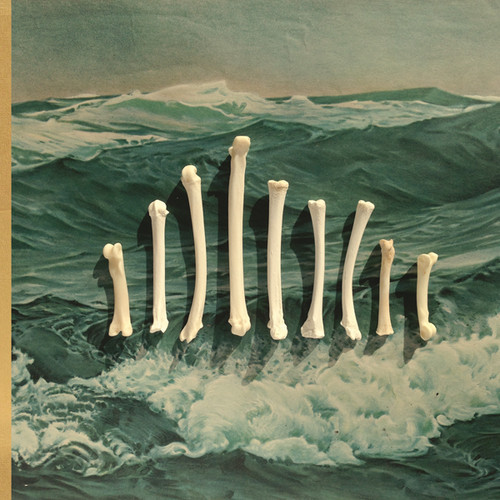 Using what was advertised to be real bobcat bones, artist and long-time People of the North / Oneida collaborator Dan Schechter overlooked his love for big cats to create this dramatic album cover for Sub Contra.
“I was mostly thinking about structure and tension. I was thinking a lot about world exploration. In particular I had this image in my mind of an old edition of Thor Heyerdahl’s Kon Tiki. I’ve never actually read the book, but I the cover image has always stuck with me as being very evocative of putting yourself on the edge through exploration. I like to think that’s the headspace the people of the North guys get in while they play.
The previous two albums also included bone structures on them. Though those were stylistically much different, I wanted to keep the reference. I think the duality of bones, structural yet organic, is a good analogue to their music.” – Dan Schechter
Pete Swanson – Punk Authority ___ Mexican Summer
Photography by Ryan Burke
Makeup by Sara
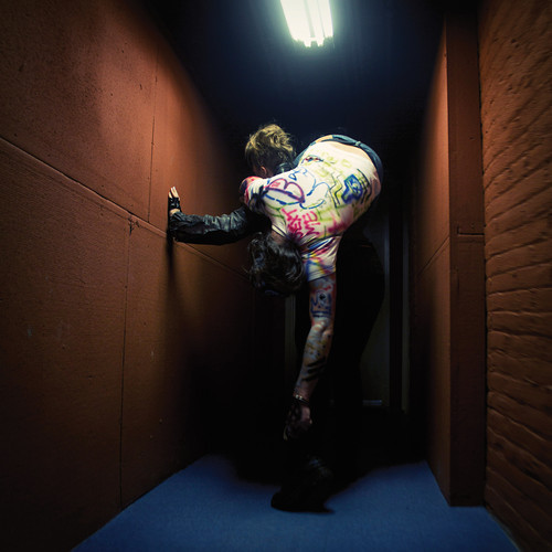
It might look damned silly upon first glance, but Pete Swanson is here to tell you that his album cover is in fact thoroughly thought-out and meaningful. As he explains thoroughly:
“The whole record was about embracing and enhancing failure.. so there’s sort of a literal addressing of the failures of the punk community to police itself and how it embraces oppressive systems when it tries to deal with people who don’t fit within the values of that community. There’s also a very overt fixation on creating dance music that is breaking and cannibalizing itself, which is what basically forms the narrative of the pieces on the record. The visuals are crafted from distant memories of past fixations on film portrayal of punk-related characters in a way that was not attempting to be accurate, [but] only to echo those past impressions.. There’s also an element of self-deprecation and attack on the ego in the artwork… All of these elements went into the mix on the shoot, and we went through an incomplete narrative… We only ended up with the one picture that we all really thought captured the right feeling. The press photos were all actually taken before we did the ‘real’ shoot because Ryan and Sarah like to document their looks when they’re going out and they wanted to document my look.
I knew I wanted to work with a lot of visual echoes from my past for this cover, so there’s my character, which is an off-amalgam of Zed from Police Academy 2 and his police chief victim that got covered in graffiti. I love that image of the defaced cop and having the knowledge that the “offbad guy” in the film goes from being the leader of a punk gang to being a police officer. Sarah’s character was more vaguely based on punk exploitation movies and the whole Ilsa exploitation film series. Sarah’s also really into weight-lifting and is one of the only housemates I’ve ever had who could feasibly carry me. I’m a bit heavier than 200 pounds and she was pretty easily able to carry me. There was some conscious acknowledgement that this was a bit of a response to that last Bat For Lashes record cover, which is an amazing image, but I have absolutely no actual experience with the music.. With all of the above elements, it would’ve been very easy to end up with something seeming very BDSM, which is not what I really am interested in conveying. Representing sex in art is generally boring. The image that we ended up with was much more enigmatic than I could have hoped and seems to have it’s own hidden narrative. It also ended up looking a little like that Pussy Galore Dial M album cover.”
– Pete Swanson
Pharmakon – Abandon ___ Sacred Bones Records
Artwork by Margaret Chardiet of Pharmakon
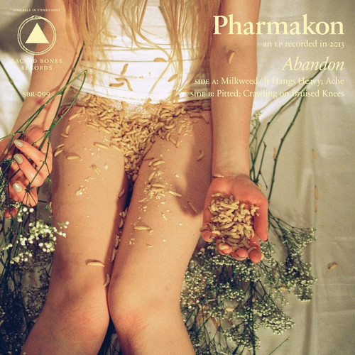
“The artwork was conceived and executed by me, and photographed by my sister Jane. The concept comes from a very real experience where I was throwing away most of my belongings and going through old ephemera, and I found an old love letter. When I opened it, there was a pressed flower that fell onto my lap, along with a bunch of writhing maggots. They had been eating the flower. I had this sense of abandon and I just burned it all. I thought, “This isn’t true anymore. I don’t own this.” And I just let it go.
I recently went through sudden, drastic life changes that were completely out of my control and not by choice. All of a sudden, there was no stability in my life; everything I’d viewed as constant slipped away. In this weird way, it became a catalyst for a drastic shift in my creative life as well. When the bottom falls out and you have to crawl your way out, when you get to the top, you’re alone– and you’re different than you were. If you let go and give yourself over to it, you’re lighter and freer, too. The album’s about fiercely holding on to what’s true and unapologetically abandoning what’s not.”
– Margaret Chardiet of Pharmakon, via Pitchfork
Phosphorescent – Muchacho ___ Dead Oceans
Photography by Dusdin Condren
Art Direction by Matthew Houck
Design by Daniel Murphy
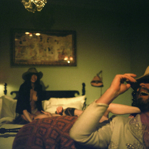
An early mock-up of the album artwork can be found on Daniel Murphy’s instagram.
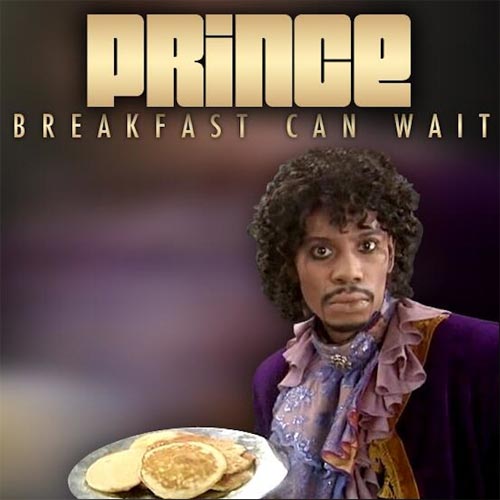
Prince – Breakfast Can Wait
Seams – Quarters
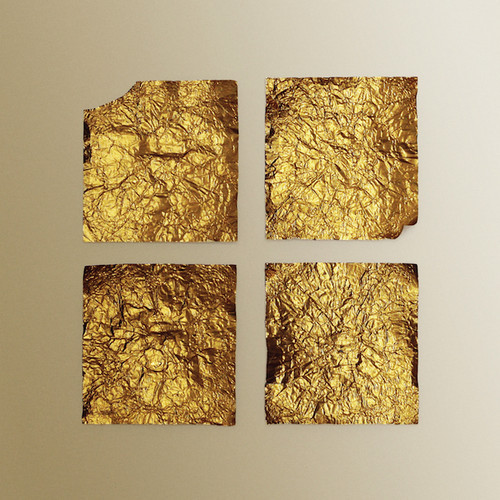
Quarters was recorded in four different locations across Berlin, and the album and title are reflective of that detail.
Shearwater – Fellow Travelers ___ Sub Pop Records
Artwork and Design by Kahn & Selesnick
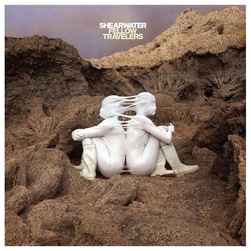
“We’ve been lucky enough to work with Kahn & Selesnick for every one of our album covers since Rook (2008).
I love their nearly fetishistic love of fine detail, the way they lace menacing scenes with whimsy, and the way they suggest entire worlds with many different works (a bit like the way the songs on our albums relate to one another). When I first stumbled across their City of Salt series, I was reminded of classic album covers I loved, like the late Storm Thorgerson’s best work, and I was stunned they hadn’t done album covers before. But Nicholas and Richard are their own animals, unlike anyone else I’ve ever met or worked with, and they’re always creating new objects, large and small, in two and three dimensions. Their constant productivity, and the way they’re always adding to their own projects (each one never really seems to ‘end’), is inspiring to me. They’re also intuitive collaborators, and each time I’ve worked with them they’ve tinkered with the artwork to make it suit our albums, even if it was based on a preexisting image.
For Fellow Travelers, their Martian series was a natural fit; the pale figures and astronauts wandering through an alien landscape worked beautifully with the album’s central inspiration, which was the way that touring bands affect and infect each other in the course of hundreds of shows and thousands of miles. All the songs on the record are by artists we’ve toured with over the years (except for one original, which I wrote about the dislocated feeling that endless touring brings on).
The cover image, “Symbiosis”, was a clear winner for the front cover from the instant I saw it; these two figures, facing apart from one another but bound (or growing) together, beautifully summed up the feeling of being on tour with a small group of other musicians; you become a part of one another whether you like it or not. That the whole scene was a bit sci-fi added a healthy dash of humor—we took that a bit further in the video for “I Luv the Valley OH!”, which Kahn & Selesnick art-directed. I loved getting to wear the space suit I’d seen in the Hourglass Sea images; making the video was like walking around inside one of their panoramas.”
– Jonathan Meiburg of Shearwater





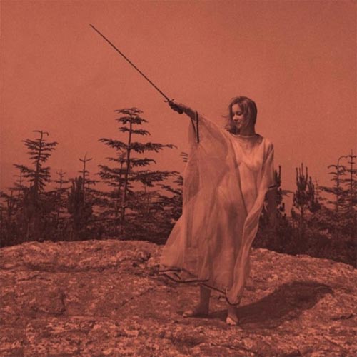

[…] Redefine Magazine has listed Benjamin A. Vierling’s artwork used for the cover of Munly & The Lee Lewis Harlots to be one of the best Narrative & Mythological Album Covers of 2013. See that list here: http://www.redefinemag.com/2013/album-covers-year-2013/ […]
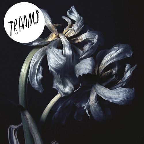
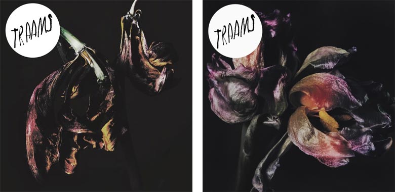
[…] TRAAMS / LADDERSEditOK This is a cover from the recent album campaign I photographed for Traams. I like their neo-kraut single ‘Klaus’. This particular cover was voted into the top 500million best covers by Redefine Magazine and you can read a short synopsis, if you have seven hours to scroll down, here. […]
Man, you guys really missed out on Underling’s (Bay Area Atmospheric BM) new artwork this year for their “Breathe Deeply” EP. They commissioned Richey Beckett to do the work. underling.bandcamp.com. Check it out for yourselves.
That’s a great one – thanks for sharing. As you imagine, we tried our best to catch them all but some definitely slipped through the cracks! – Vivian
Slava’s “Raw Solutions” makes me sooo think of “Diagnostic”‘s artwork (2005) from the french band Daisybox. I don’t know if it’s the same artist. Here is it : http://www.tranbavang.com/in/documents/collaborations/daisybox/Daisybox%20Album.jpg
Great article by the way 🙂
For sure. Thanks for sharing that!