GRAPHICS & GEOMETRY
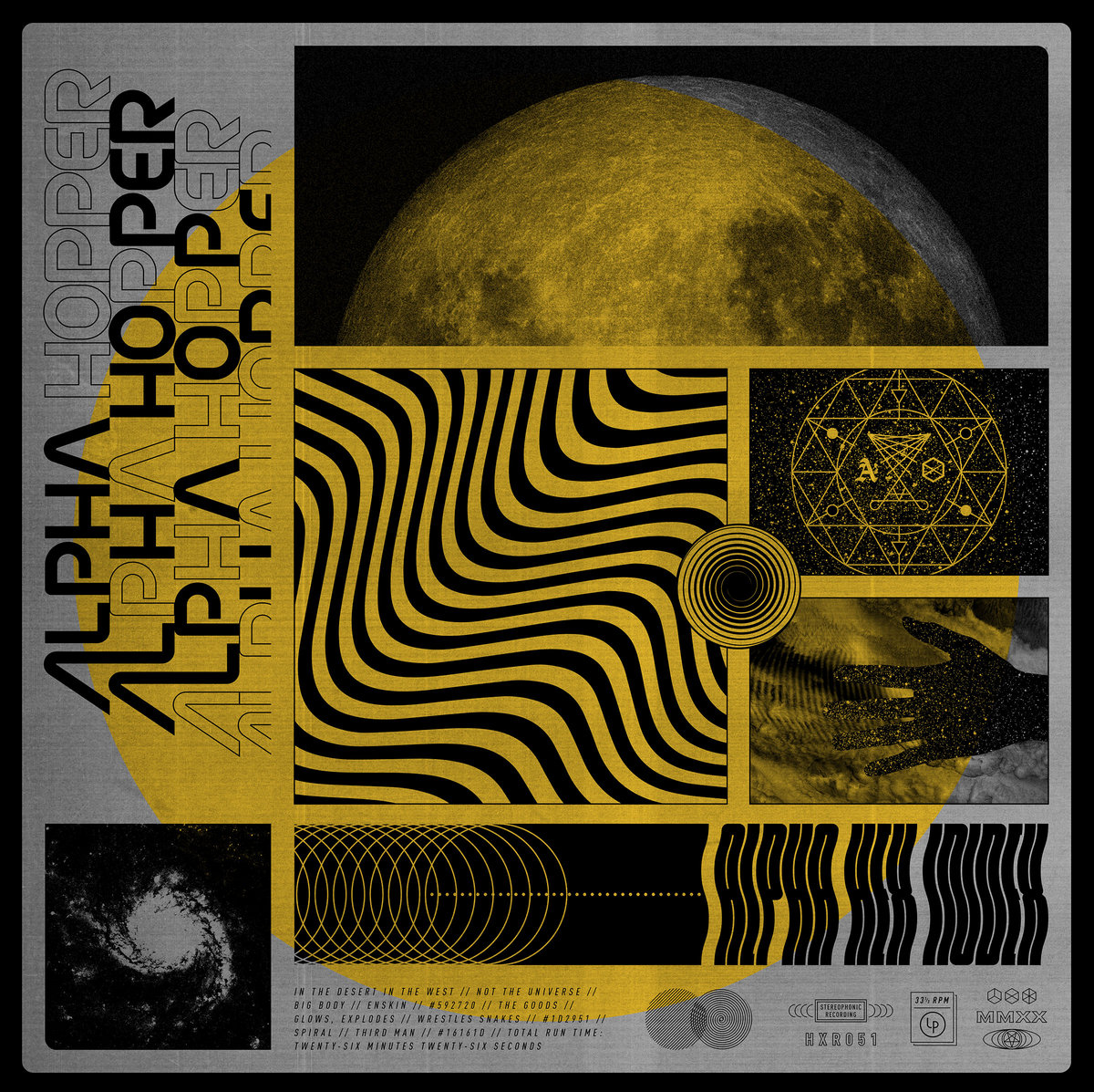
Alpha Hopper – Alpha Hex Index (Hex Records)
Ryan McMullen (Artist):
Drawing from the themes of the album, the title, and the general aesthetic of the band, I basically set out to hybridize a mid-century retro-future aesthetic with a dark, occult vibe — both of which were fine lines to walk without being too specifically referential or too on-the-nose. I wanted to vaguely evoke both of these feelings simultaneously while still creating something unique that could stand on its own. There’s a sort of science fiction aspect to everything Alpha Hopper does and the record title references hexes or spell casting, so I was interested in carving out a visual space where that arcane mysticism of witchcraft and the cold, unknown final frontier of space could potentially coexist and intermingle. Basically, I think I just watched the movie Event Horizon way too many times when I was younger.
When I first pitched some of my initial ideas to the rest of the band, we had a group discussion in which we landed on this funny catchphrase as sort of a joke — “we’re going to outer space because we think the devil’s there” — but honestly, it became my north star, guiding me through the project. I looked at a bunch of pagan, Wiccan, and witchcraft symbology and tried to create my own symbols that borrowed the look and feel of that stuff without directly lifting anything, while also putting more of a futuristic spin on things. I also started looking at a lot of astrophysics stuff about gravitational waves and orbital mechanics and finding inspiration in some of the shapes and forms there, again trying to put together something original that felt related without any direct specificity. With all the space imagery, I liked the idea of distorting things as if they were being acted on by intense gravity, like being pulled into a black hole or perhaps being transmuted by some mystical spell.
Finally, I wanted to bring everything together in this busy, gridded-out sort of information-heavy, text-book-style layout that reminded me of that space-race, Cold War-era aesthetic.
Sounds: Chester Watson
Art Direction, Design & Layout: Ryan McMullen
Insert Photography: Mark Duggan
Styling: Jessica Wegrzyn

Amazondotcom & Siete Catorce – Vague Currency EP (SUBREAL)
For its fourth release, SUBREAL founders Amazondotcom and Siete Catorce assemble their first split EP, Vague Currency. The two producers build and un-build upon some of the themes that bring their practices together: the dissection of rhythms and dance sounds, new digital imaginaries, and heterogenous cultural and personal identities in constant flux. The split consists of two tracks from each artist plus one collaborative track.
Sounds: Amazondotcom & Siete Catorce
Artwork: Stella Ahn of SUBREAL
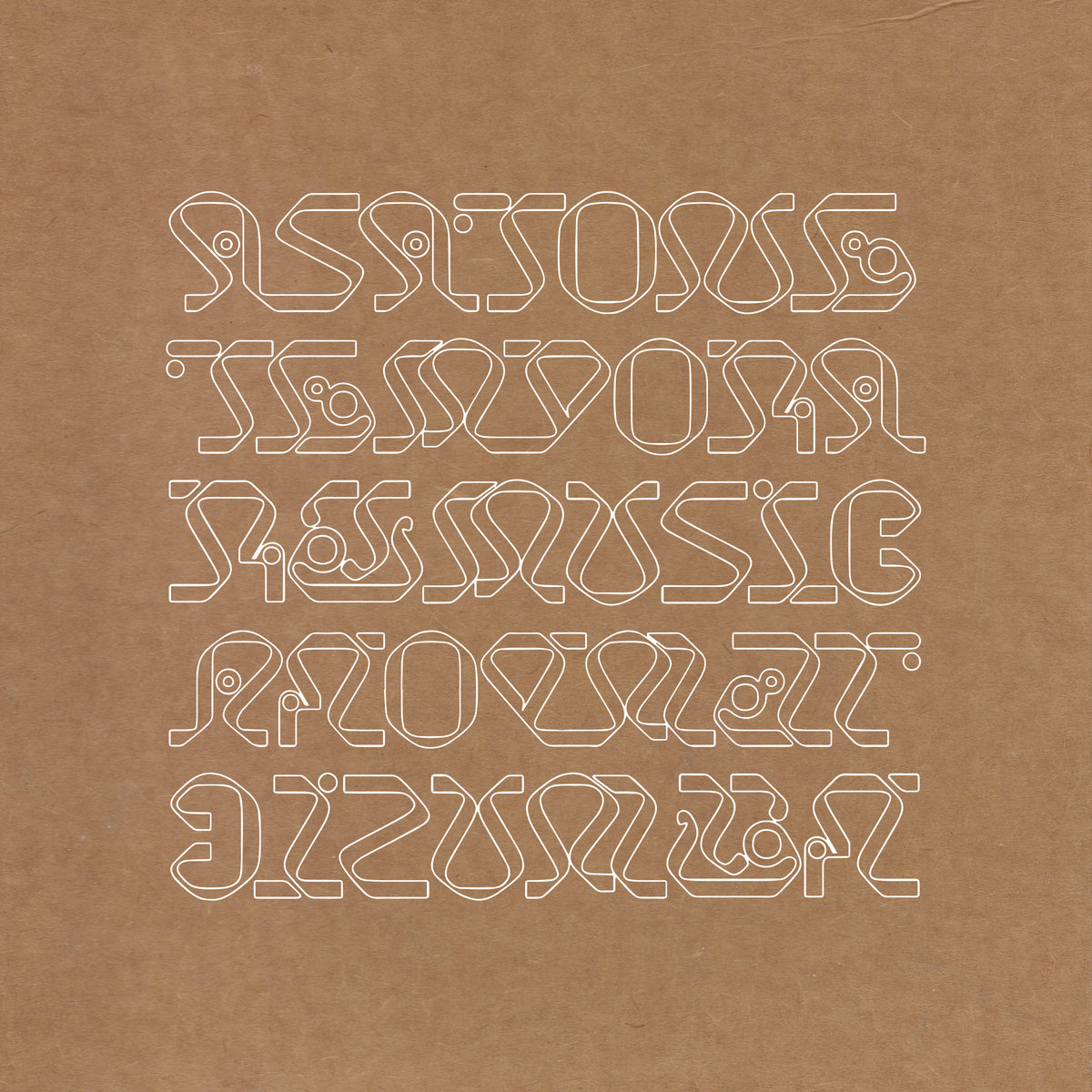
Asa Tone – Temporary Music (Leaving Records)
Asa Tone is Jakarta-born Melati Malay and New York based Tristan Arp and Kaazi. In January 2018 the trio travelled to Indonesia during Melati’s annual return home, set up a temporary studio in a house nestled in the jungle’s canopy and recorded a series of improvisational pieces together, later edited for brevity… The result is an idiosyncratic voyage of equatorial excursions in voice, mallets and synthesis, both transportative and fluid, yet firmly grounded in the earth. Cyclical, randomized patterns grow and blossom during these often delicate and heartfelt renderings, staying with the listener long after both sides fall silent.
Sounds: Asa Tone
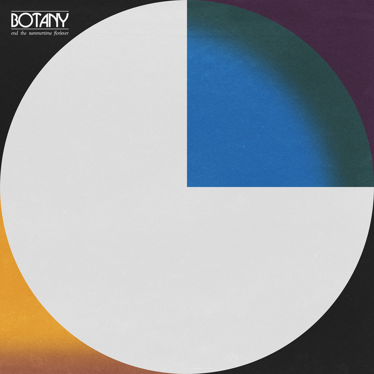
Botany – End the Summertime F(or)ever
Miles Wintner (Visual Artist):
The process of creating this cover began with a phone call from Spencer [Stephenson] of Botany in summer 2019. Keywords and themes were exchanged: heat, warping, destruction, stoned, American flag, black. So were visual references: early Sesame Street animations, the 1977 NYC blackout, the original PBS logo, and past work of mine (something I always request, to get a sense of the desired style). Over the next 11 months, a human was born, a vinyl record lacquer factory burned, record release duties skipped from one label to another, a global pandemic began, etc. The cover art itself mapped these events, taking on a half dozen distinct forms and moods before landing on its final form, a full-frame circle caught between two diametric fields of color. The abstract shapes ended up encapsulating the tone of the record better than any of the more focused imagery we had previously tried.
Working with Spencer was like exploring a cave with a complete stranger, putting complete trust into one another, illuminating each others’ paths until we found what we were looking for. I value clients who won’t settle for a subpar idea and who push me to be a better artist. A true collaboration!
Sounds: Botany
Artwork: Miles Wintner
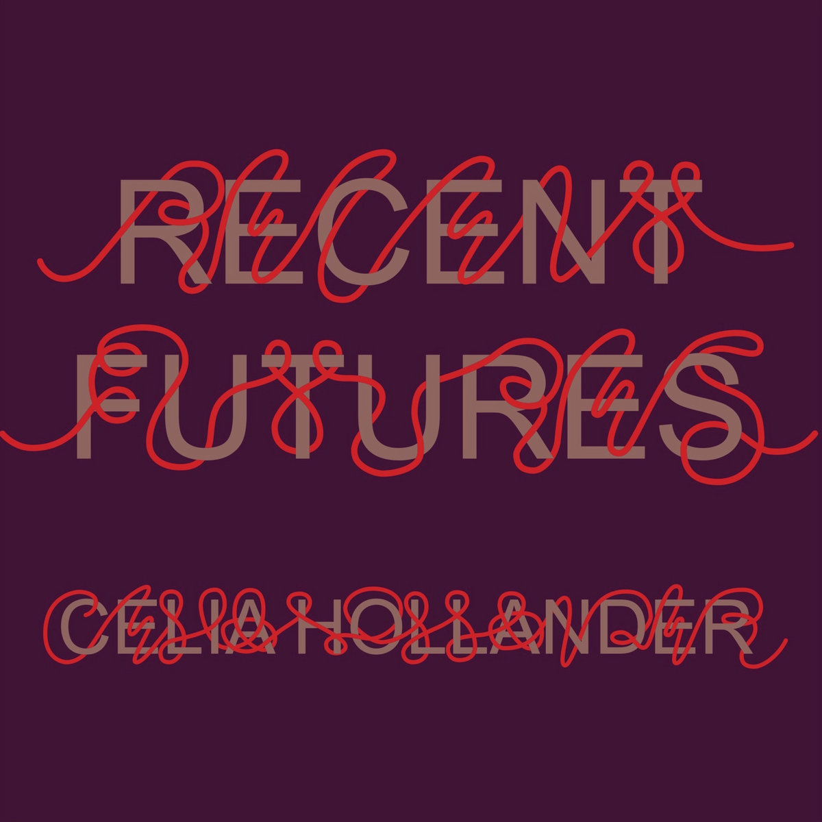
Celia Hollander – Recent Futures (Leaving Records)
Rosa McElheny (Visual Artist):
The three of us have been friends for many years. Celia asked us to design the artwork for this album, which is a collection of music made as part of a series of videos. Celia showed us some of her handwriting and lettering experiments, and we knew we wanted to work with this graphic. The all-caps type is a reference to text in the videos.
Sounds & Script: Celia Hollander
Artwork: Hilary duPont & Rosa McElheny of News to Me
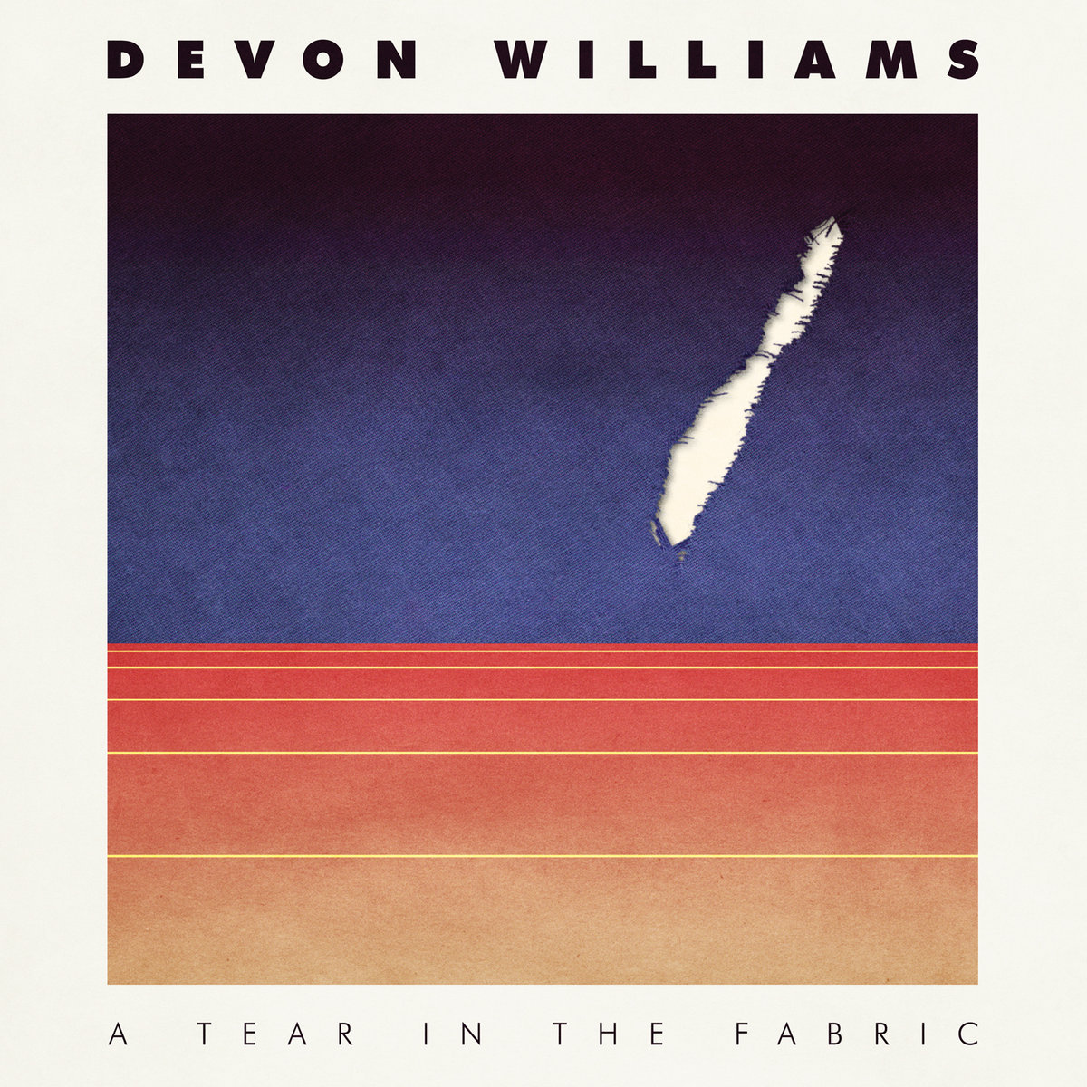
Devon Williams – A Tear in the Fabric (Slumberland Records)
Miles Wintner (Visual Artist):
As soon as I learned the title for Devon’s latest record, I knew I wanted to interpret it literally. I ripped up a bed sheet over and over until I got the perfect tear, scanning and overlaying it onto a barren, geometric landscape. The biggest challenge was getting the organic textures and digital shapes to look natural together. Early versions of the artwork used collages and hand-drawn sketches. I’ve been a fan of Devon’s for over a decade and was honored to work with him on this project. The record deals with a number of serious themes, and I’m grateful he trusted me to create artwork that addressed them.
Sounds: Devon Williams
Artwork: Miles Wintner
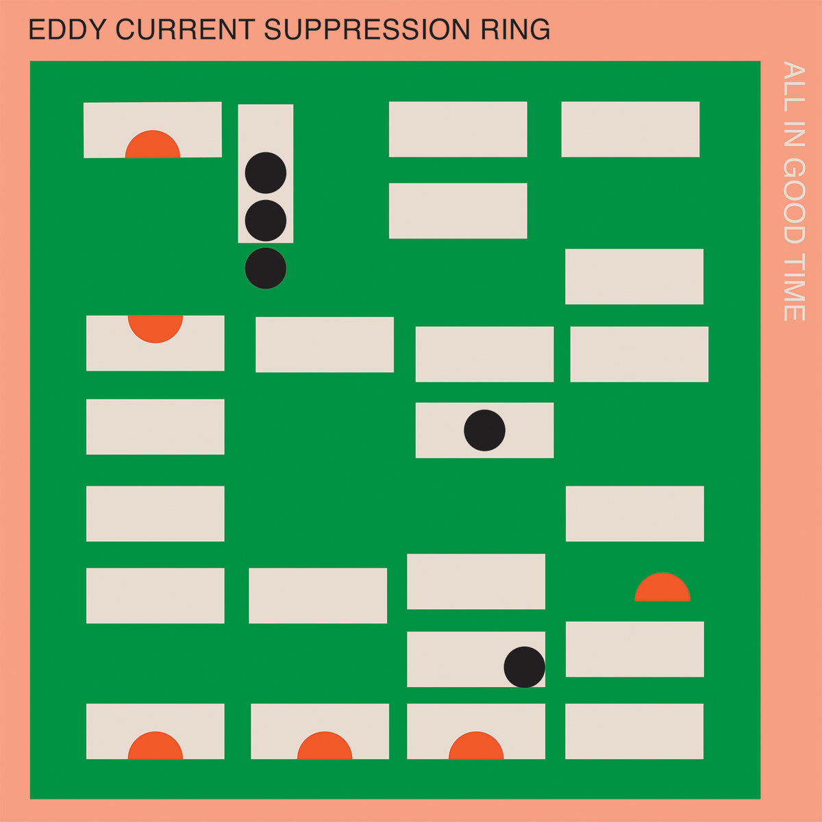
Eddy Current Suppression Ring – All In Good Time (Castle Face Records)
Raven Mahon (Artist):
I listened to much of All In Good Time in the process of being mixed, mostly as ambient sounds in the house I share with Mikey [of Eddy Current Suppression Ring], so I had a familiarity with the songs by the time I attempted some album art. There wasn’t a particularly driving theme in the painting, just an idea to try to reflect the brightness and presence in their songs.
I used some leftover bits of wood in the studio as printing tools and created the basic shapes and layout that they then digitised and found the right colours for [it].
Sounds: Eddy Current Suppression Ring
Artwork: Raven Mahon
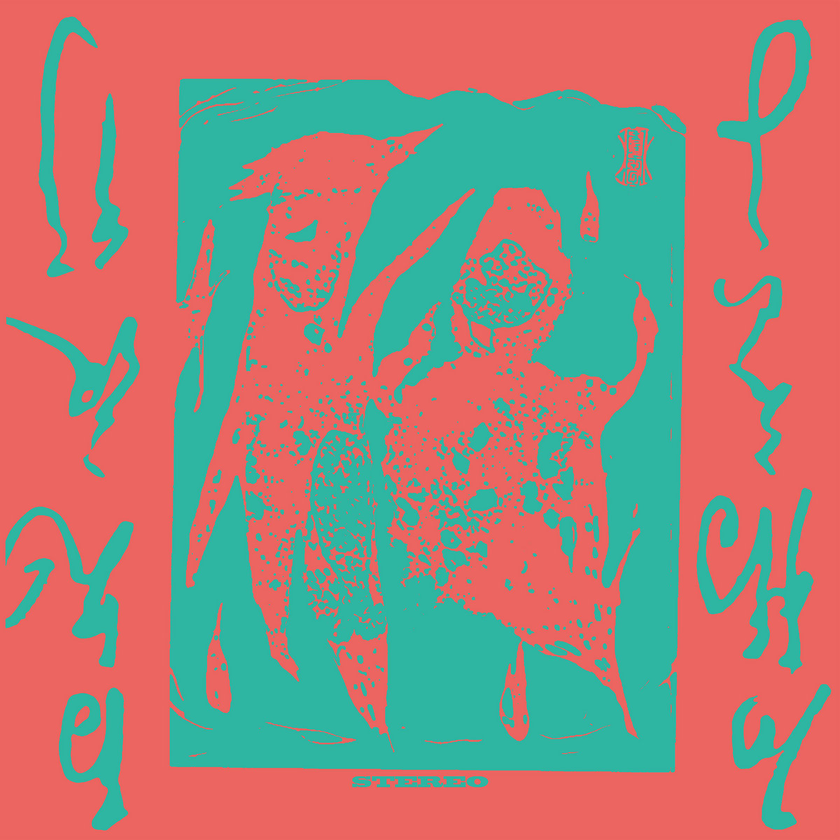
Eiko Ishibashi – Hyakki Yagyō (Black Truffle)
Sounds: Celia Hollander
Cover & Label Design: Shuhei Abe
Back Cover Design: Lasse Marhaug
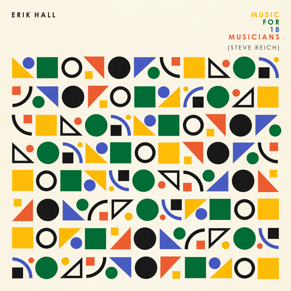
Erik Hall – Music For 18 Musicians (Steve Reich) (Western Vinyl)
Erik Hall (Musician):
My only wish for this album’s artwork was for something repetitive and systematic that reflected the nature of the music. With that idea, I was grateful for Aaron to lead the way visually. I had seen the work he’d done for several of my friends and was excited to see what he’d come up with. When I got his first set of ideas back I was immediately happy and frankly rather amazed, because he not only executed the detail I’d loosely asked for but also created something pleasing and beautiful when taken as a whole, which is just like the piece.
Aaron Lowell Denton (Designer):
I found this project to be pretty challenging to find a starting spot. Especially when working on something that has such a singular origin, it was important for me not to derive too far from that while at the same time making something that reflected Erik’s unique take on the piece. I wanted it to be somewhat minimal. The piece works from individual components (rhythm patterns, tones, etc) vibrating and changing with one another. The artwork tried to reflect this with repeating shapes alluding to a pattern while also making something altogether pleasing when taken in at a glance.
Sounds: Erik Hall
Artwork & Design: Aaron Lowell Denton
Grotta Veterano – Recurrent (Fallen Moon Recordings)
Nicola Narbone (Visual Artist):
I would like to quote an email sent to me by Gianluca (Grotta Veterano)…
“[…] I created patterns and modules that I could repeat to solve the duration problem. Since I couldn’t make half an hour of totally new music, I thought of making small pieces lasting about ten minutes and assembling them together, cutting them up and breaking them down, so that I could repeat recurring cells. If the problem was to make 30 minutes of music, I tried to solve it by dividing the 30 into four. In the end I got four sections of 7.5 minutes each. It would have been more convenient to divide the 30 by 10, and make three 10-minute sections, but that would have given me an odd figure.
Instead I needed an even figure so that I could have an ABAB structure, so that the last module would precede another A module. This is because if ABAB forms 30 minutes, the following 30 minutes, in case there was a need to loop, would start again from A, without interruption.
The “music” or “soundscape” ultimately derives first from an almost “graphic” reasoning. The music, on the other hand, is graphic in the sense of texture; there is a lot of texture in the 30 minutes, between field recordings and processed sounds, because I felt I was doing something close to the world of graphics, patterns, and textures rather than typography […].”
After reading this email, I was sure that the elements I was going to work on were the two numbers (three and four) and the possibility of combining them so that their union could give rise to a new form. Consequently, I began to look for all those artists who, working with simple forms and through their interaction, manage to create a new form from extremely simple elements. I studied a lot of artists like Sol Lewitt, Josef Albers, Richard Serra, Olivier Mosset and many others.
What I think makes the cover interesting is that it can be read in many different ways. The drawn shapes interact so that they can be seen as three separate elements, but at the same time, four distinct shapes can also be recognised.
Sounds: Grotta Veterano
Artwork: Nicola Narbone
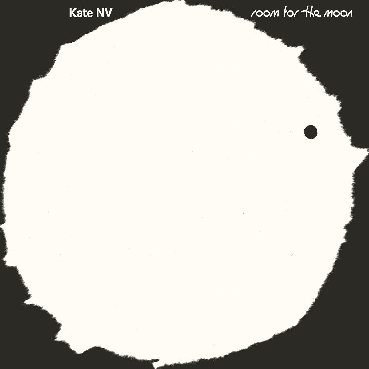
Kate NV – Room for the Moon (RVNG Intl.)
Will Work for Good (Visual Artist & Designer):
After various iterations of this album art, this message from Kate really resonated and shifted our approach: “with this record, there should be something magical, like a secret, mystery maybe? like a children’s book cover.”
With this in mind, we wanted to really minimize / simplify the art / idea. The artwork was reduced to black and white, and multiple moons were created with torn paper. We then started looking at each cover surface (LP, CD, cassette) as the literal “rooms” for the moon, with moon characters filling the spaces, coming and going. Additionally, we made a simple title typeface of circles and slight crescents.
Kate created so many worlds and characters with this record and all of its accompanying videos, so hopefully, this simple design can exist in any of those worlds. 🙂
Sounds: Kate NV
Artwork & Design: Will Work for Good
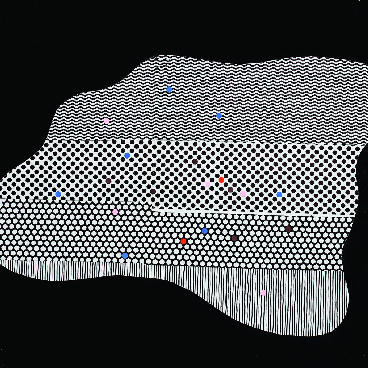
Million Lands – The Ochre World (Ernest Jenning Record Co.)
Million Lands is drummer Kid Millions (Man Forever, Oneida) and trombonist/guitarist/electronic manipulator Benjamin Lanz (Beirut, The National). A collaborative, co-compositional duo, Million Lands has long history beyond the release of their first record, The Ochre World, would suggest (including time in a Division 1 basketball pep band! in 2003). But it took some years for Kid and Ben to settle into a regular basement noise hang. What came out of these rolling-tape sessions could be described as a post-instrumental haze of dubbed out, free referentialism touching on a myriad of reference points – from Bitches Brew to Disintegration.
Sounds: Million Lands
Artwork: Dan Schechter
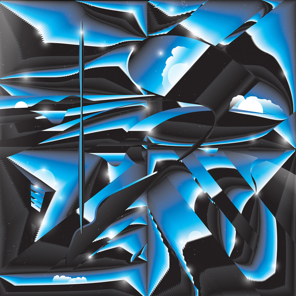
Oh Sees – Protean Dream (Castle Face Records)
Dylan Marcus McConnell (Artist):
Honestly I was just fucking around, doing gradient studies with the palette John Dwyer and I had settled on. I was working on what we thought the cover was going to be at the time and then this piece sorta popped up out of the blue and really reminded me of Brain label’s artwork and other Krautrock album covers from the ’70s, which I thought would be a perfect compliment to the Oh Sees sound. I sent it to John and he immediately said, “That’s the cover.” Full stop. So it was a bit of luck. We went off on a design tangent for a bit with making the colors more pink, but in the end decided (rightly IMHO) that the original version was better. The sort of mirroring effect of many worlds / planes / landscapes is very psych rock, and I love that stuff.
Sounds: Oh Sees
Artwork: Dylan Marcus McConnell
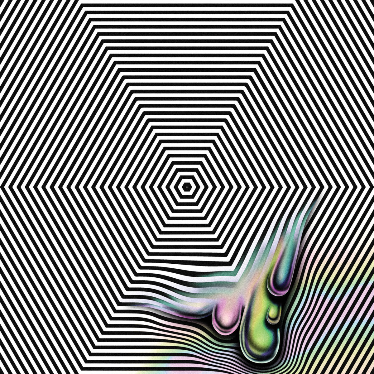
Oneohtrix Point Never – Magic Oneohtrix Point Never (Warp Records)
Magic Oneohtrix Point Never, the name a reference to a misheard play on words of Boston’s Magic 106.7, is a nostalgic and self-referential career defining body of work, collaging maximalist baroque-pop within atmospheric glitter.
Sounds: Oneohtrix Point Never
Artwork: Robert Beatty
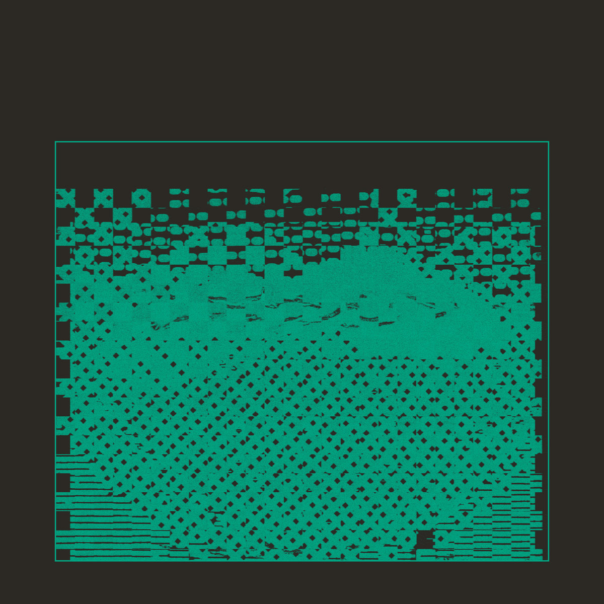
Pierre Rousseau – Musique Sans Paroles (RVNG Intl.)
Pierre Rousseau (Musician):
I made this record as an attempt to structure some pretty chaotic and contradictory artistic intentions. When discussing the cover with Kevin and Karisa at Will Work For Good, I was eager for this process to be translated visually, somehow.
When [Will Work for Good] first showed me this collage, which cements four different patterns, it resonated strongly with the experience I had making the music. It also reminded me of knitwear and weaving (a process which I find analogous to the craft of electronic music), particularly the work of Anni Albers.
The collage was initially in black and white, and its tones reminded me of the cover of From Brussels With Love, my favourite compilation, released in 1980. We borrowed that cover’s use of a frame to box in the artwork, which helped convey the aforementioned “translation.” The next step was to use a shade of green, instead of white, which was inspired by the tones of my Hameg Oscilloscope, a constant audio-visual translator in my studio. An influence for this was the cover of Spectral Display’s first record, released in 1982.
Another decision was to exclude text from the artwork, as a reminiscence of the title of the record, Musique Sans Paroles (music without lyrics, without words).
Will Work For Good (Visual Artist & Designer):
Pierre Rousseau’s Musique Sans Paroles in its current form is digital art, along with iterations for its single releases; all part of a series of visually connected TBD releases.
From Pierre’s early notes on the visuals is the phrase: “to make the digital tangible.” Some of Rousseau’s inspiration came from early’ 80s album art featuring visual representations of waveforms…
With a “naive spirit” in mind, we started with digital patterns printed by a broken laser printer and manipulated via a vintage portable copy machine which we then pieced together into a warm, textural, woven form that we shared back and forth with Pierre, cropping and reassembling.
In line with “an attempt to make the digital tangible,” we worked with a print-based color palette of what would be standard spot colors. In this case, green and black. In future releases: red/black and blue/black, satisfying both ours and Pierre’s appeal to “conventional colors.”
Sounds: Pierre Rousseau
Artwork: Will Work for Good
Videos: Joseph Bird
Artwork: Charles Nègre
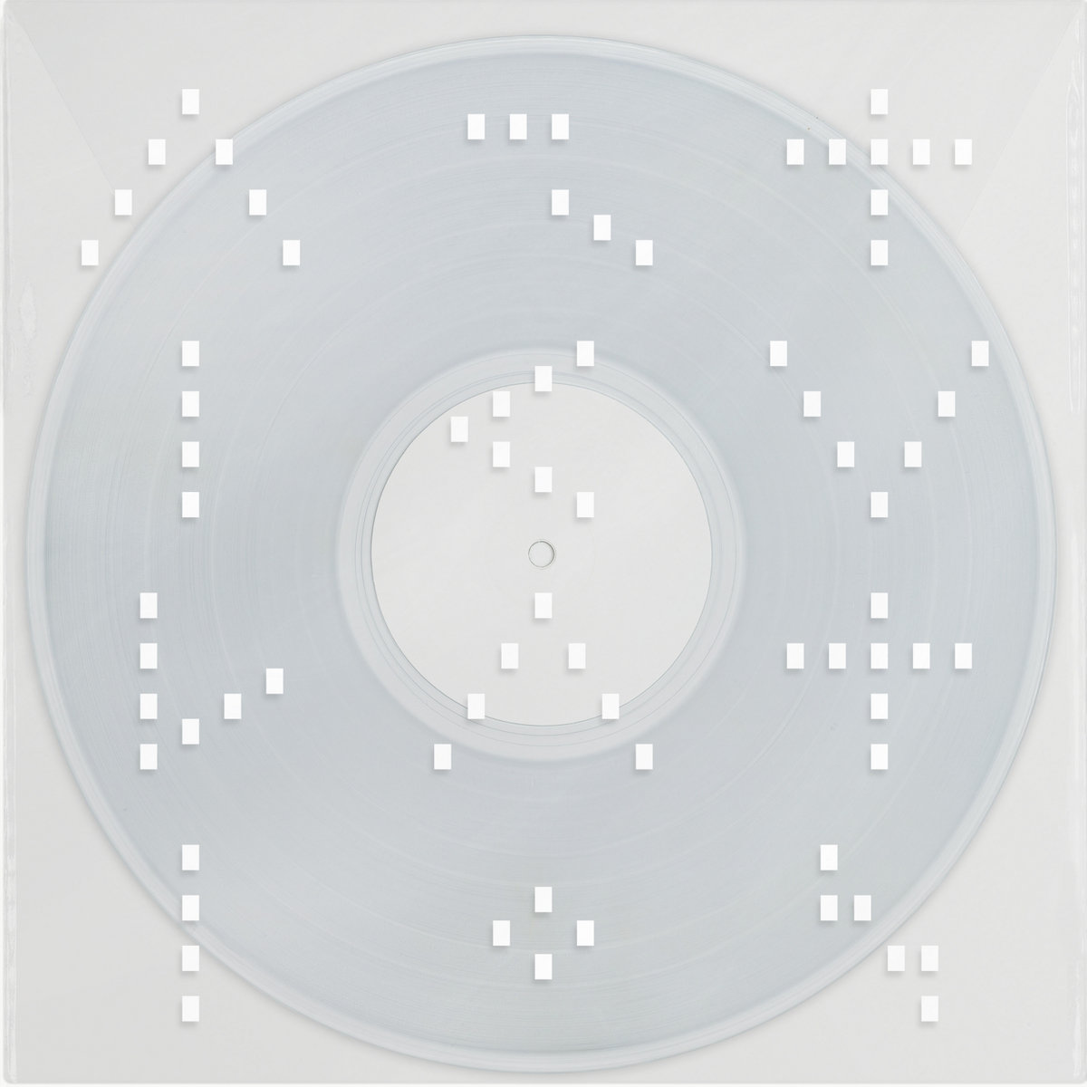
Rival Consoles – Articulation (Erased Tapes)
Robert Raths (Designer & Art Director):
The art direction for Articulation, like the music, went through multiple stages. Initially Ryan had envisaged something that should reflect the colourfulness in his music, whilst I was more drawn to the patterns he visualised with pen on paper in order to help him problem-solve those musical ideas he had in the process of making the album. But with notebooks worth of detailed sketches, there was a real danger of it overpowering the music. First, I set up a calligraphy session for us to explore highlighting yet simplifying those drawings with thick brush strokes, but that approach evoked too much unwanted symbolism.
Then I decided to focus on the rhythmic patterns, and to break things down to the mechanical level of ON/OFF, the 0s and 1s in today’s MIDI and computer notation, which dates back to the perforations in music rolls used for player pianos, organs and carillons in the late 1800s, I’ve been fascinated with of late. In order to do Ryan’s sonic explorations justice, I needed to embrace both traditional means and new technologies to invert what’s known into the unknown, allowing me to reduce the design to the point where it feels alien enough to evoke all those rich, otherworldly textures and colours found in the music before you even put the record on.
Sounds: Rival Consoles
Artwork & Design: Robert Raths of Erased Tapes
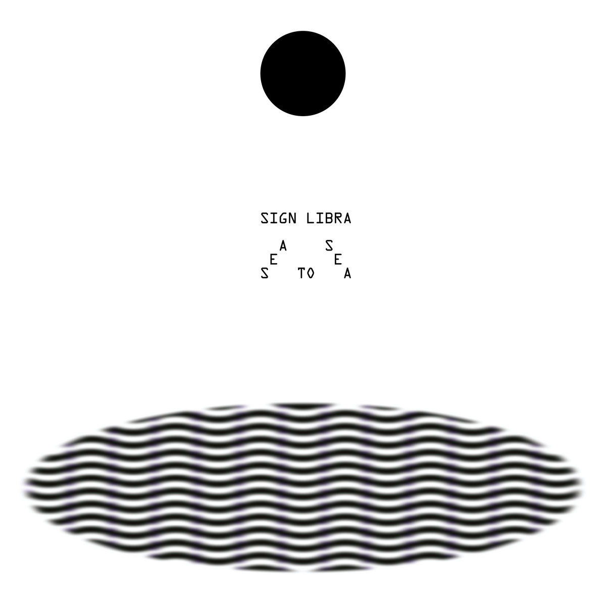
Sign Libra – Sea to Sea (RVNG Intl.)
On Sea to Sea, Sign Libra drifts between the cerebral and celestial, arranging, and then rearranging, the complex and magnificent systems of our immediate and greater cosmos into her own graceful and eccentric sound patterns. As the moon appears in different ways on different days, Sign Libra leaves Sea to Sea open like an ocean to listener interpretation and imagination.
Sounds: Sign Libra
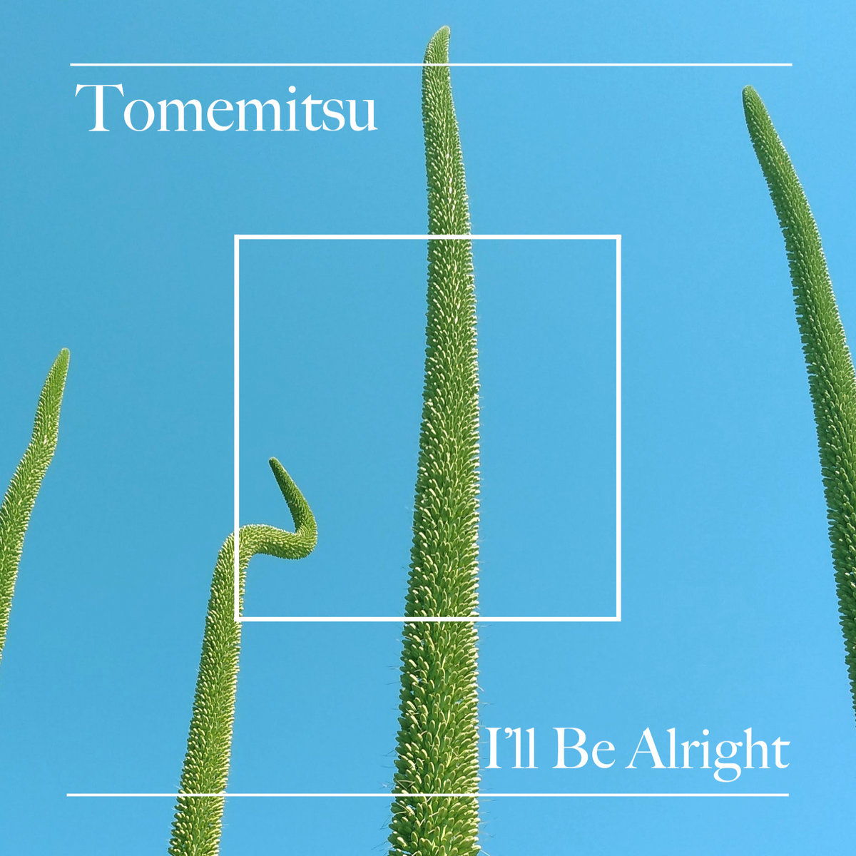
Tomemitsu – I’ll Be Alright (Friends of Friends Music)
Tomemitsu (Musician):
Since we live in Echo Park [in Los Angeles], it is pretty easy to just walk around and find inspiring colors and scenes on a sunny day in the neighborhood. [My girlfriend and I] had watched these plants growing bigger and bigger by a neighbor’s sidewalk since spring, and they were at peak height that summer when we captured this photo of them reaching to the sky. We were just trying to capture the spirit of this EP / album song cycle, which is supposed to feel like looking towards the sun with your eyes closed; warmth.
Sounds & Artwork: Tomemitsu
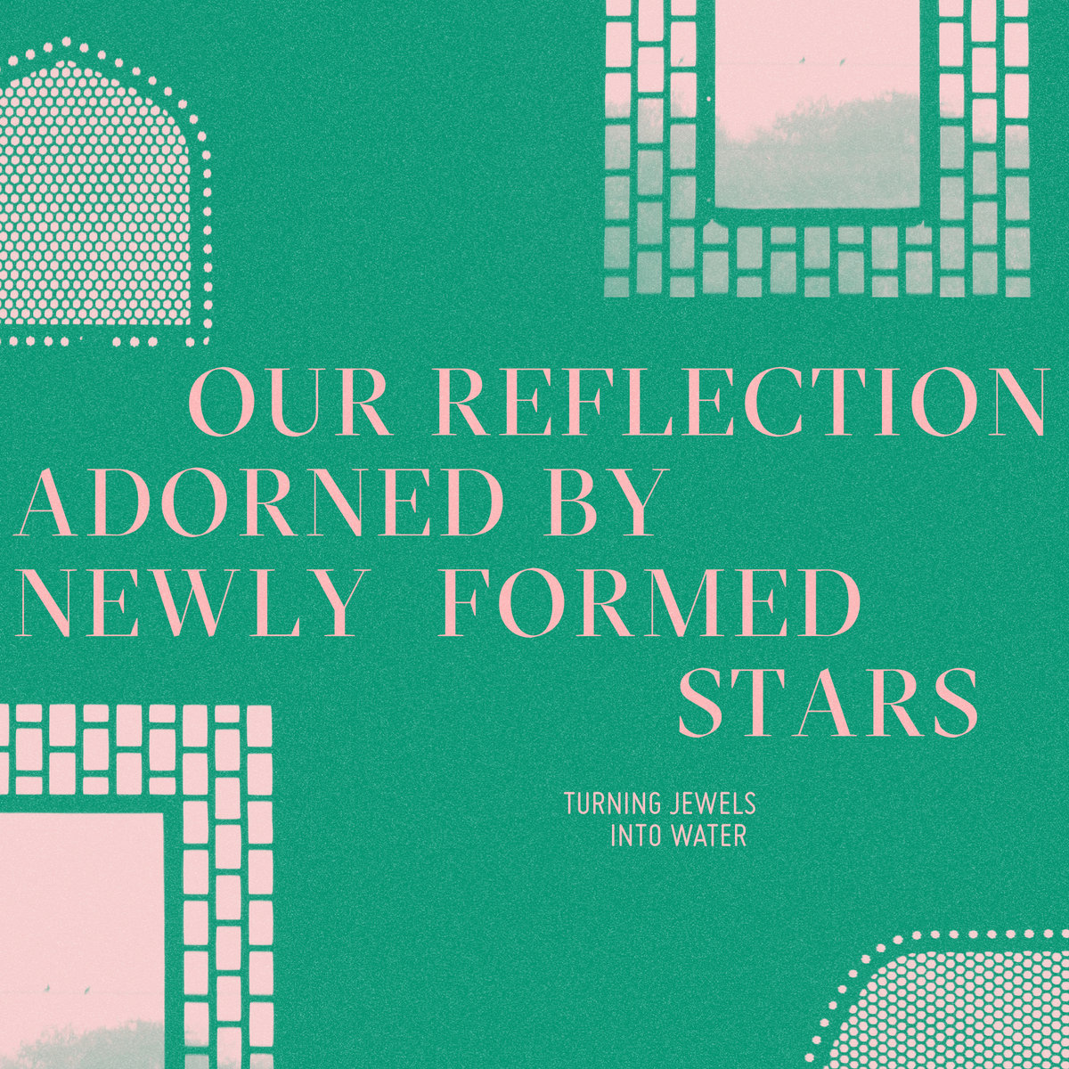
Turning Jewels Into Water – Our Reflection Adorned by Newly Formed Stars (FPE Records)
Ravish Momin (Musician):
The photo itself was taken inside of a palace in the city of Fatehpur Sikri, founded in India (1571) by the Emperor Akbar. What makes the city’s architecture unique is that it reflects both the Hindu and Muslim form of domestic architecture popular in India at the time — something that was revolutionary. Emperor Akbar was an open-minded ruler who believed in respecting all religions and cultures and sought to create a synthesis of architecture, religion, and cultural interactions.
The idea for the cover was initially inspired by the notion of a person looking into a mirror and feeling empowered by bright stars from distant galaxies being reflected back on top of their own reflection. However, for my suggestions for Diana Castro’s design, instead of interpreting the idea literally for the cover art, I asked her to use Alexandra’s photo from Fatehpur Sikri. I imagined someone sitting in the dark, looking out through this new/hybrid architecture, and seeing the night and stars in a new way or configuration. This glancing upwards, then leading to a fleeting feeling of newness; of infinite possibility that can take hold of someone as they look out at the sky, but see themselves (a reflection / a spirit) in that moment, as part of something bigger.
Diana Castro (Visual Artist):
On my end, I tried to play with the idea of multiple reflections, and how they can change direction; how we as individuals hold multiple perspectives. I chose green to represent nature, the universe, the water, and the jewels. Pink to represent our divine nature too, soft and bright.
Sounds & Artwork: Turning Jewels Into Water
Lead Graphic Designer: Diana Castro (Pana Li)
Sounds & Artwork: Alexandra Momin
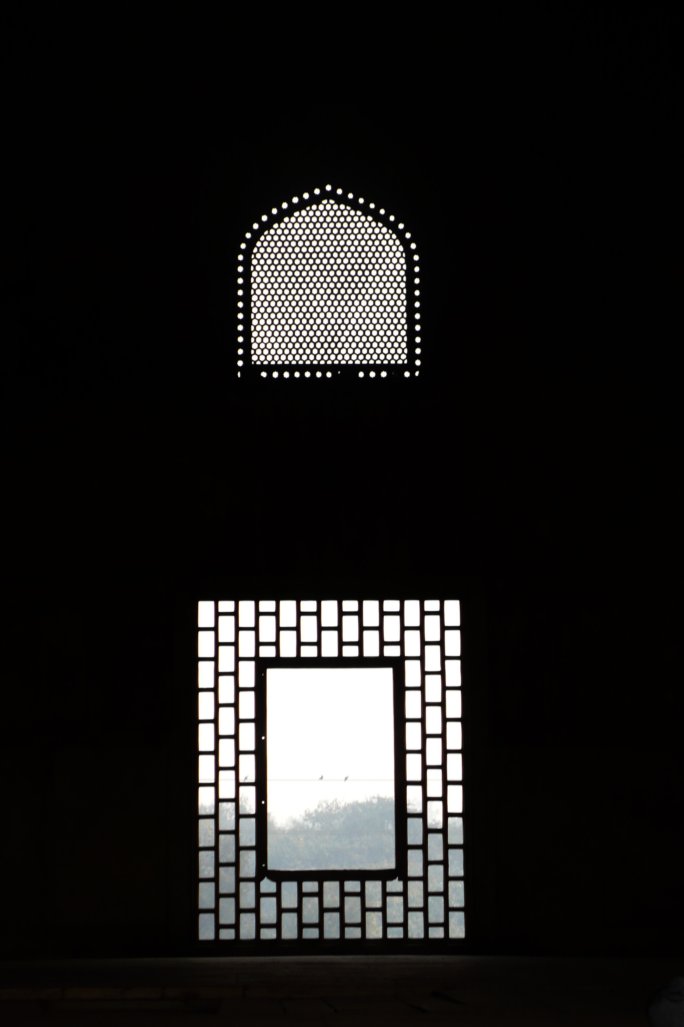
Original reference photo by Alexandra Momin.





thank you very much, I have been waiting for your return for a long time !!