ILLUSTRATION
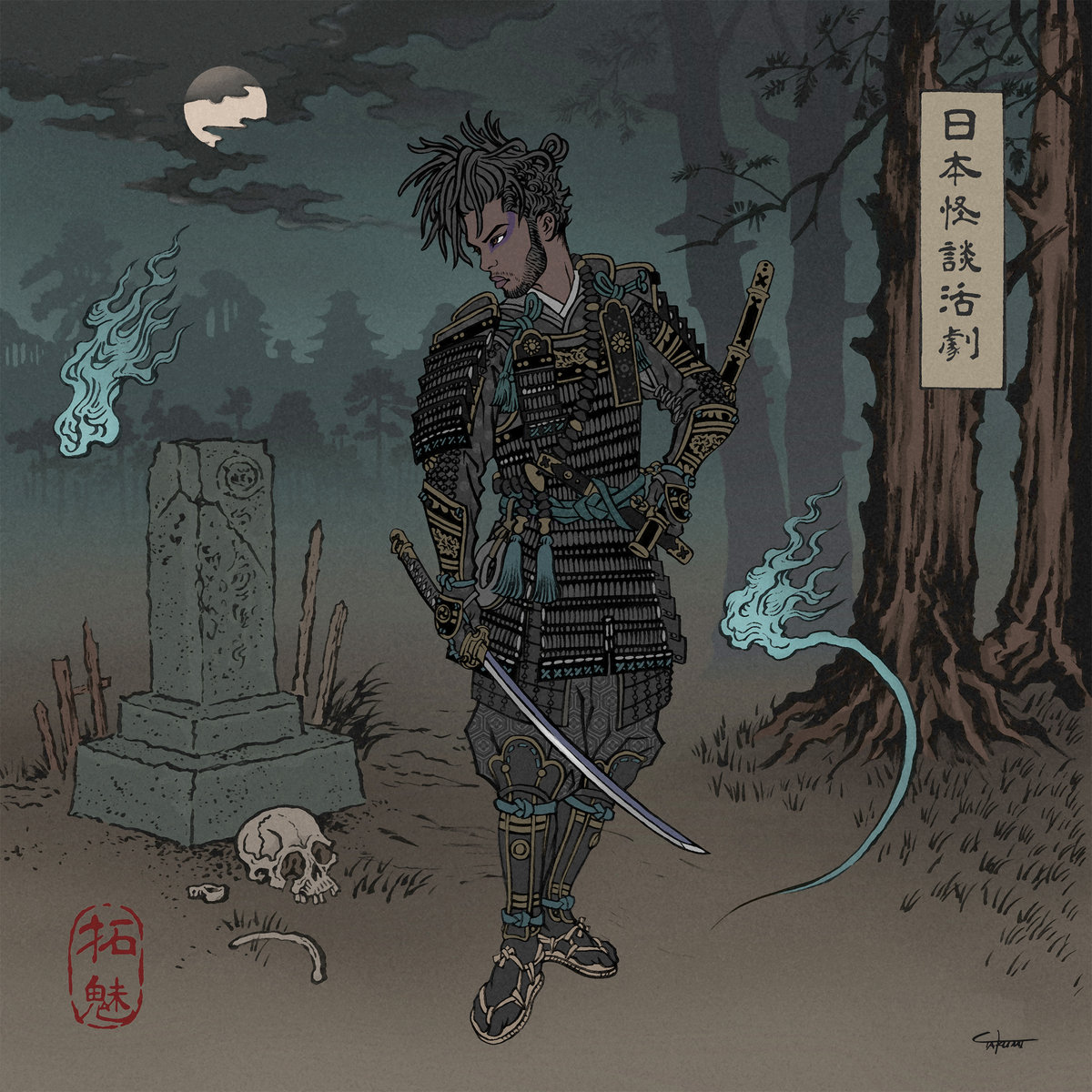
Chester Watson – A Japanese Horror Film (POW Recordings)
Chester Watson (Musician):
The album itself was a concept album, so I wanted something to portray that vision. The Yokai were a big part of the process, but I mainly wanted the main figure to be the focus of the piece. Takumi’s style was exactly what I wanted so I didn’t have to give too much direction. I just sent him a picture of me / my hair at the time for reference, and he did everything else. No real background story on the album artwork; I’m just a big fan of Ukiyo-e style artwork.
Sounds: Chester Watson
Artwork: Takumi Toxin
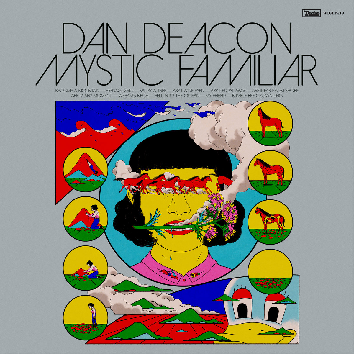
Dan Deacon – Mystic Familiar (Domino Recording Co Ltd)
Dan Deacon’s most emotionally open record and his most transcendent, Mystic Familiar is the result of obsessive work, play, and self-discovery. The album’s 11 kaleidoscopic tracks of majestic synth-pop expand his sound with unfettered imagination and newfound vulnerability.
Sounds: Dan Deacon
Artwork: Cristina Daura

Diet Cig – Do You Wonder About Me? (Frenchkiss)
Sounds: Diet Cig
Artwork: Dessy Baeva
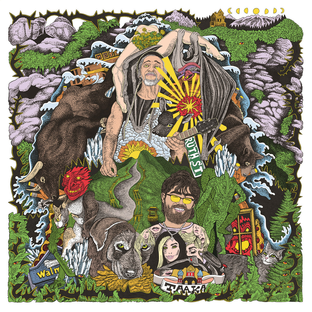
Frank & The Hurricanes – Love Ya Love Ya (Feeding Tube / Sophomore Lounge Records)
Frank Hurricane (Musician):
The idea behind the cover artwork is a huge coming together of all the elements of the songs on the record in visual form. The largest figures are Terry Turtle from the band Buck Gooter and Danny Cruz from the band Flaming Dragons of Middle Earth, whom the record is dedicated to. This is the fourth cover Turner Williams Jr. has done for my projects and it’s my favorite yet! Working with him is natural, easy, and always a deeply spiritual experience. I tell him an idea and some elements to include and he takes that and makes something next level.
Sounds: Frank & The Hurricanes
Artwork: Turner Williams Jr.
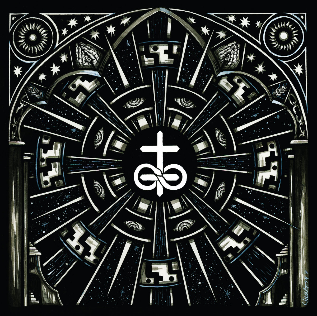
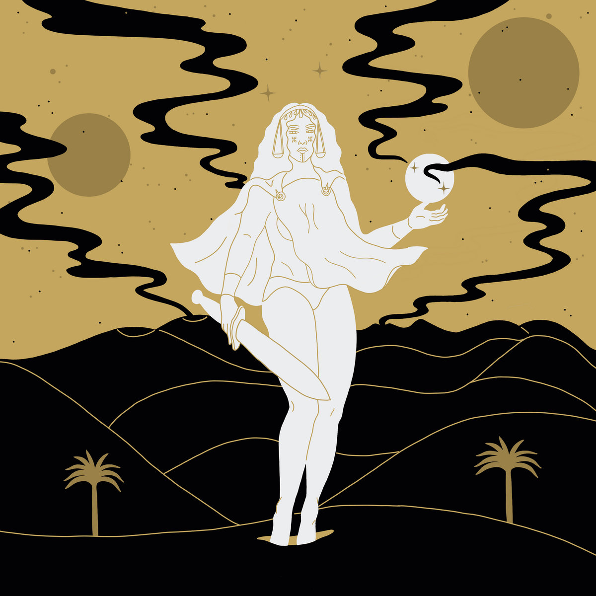
In the Company of Serpents – Lux (Self-Released)
Grant Netzorg (Vocalist & Guitarist of In the Company of Serpents):
On the album cover for Lux, the only guidance I really gave [Christina]… was that we were working heavily with Solar symbolism. As such, I wanted her to illustrate the cover as her interpretation of the Sun arcana from the tarot, albeit with the stipulation that our band’s dual cross insignia needed to be in the center of the piece.
Christina Hunt (Visual Artist):
Working with Grant on this project was a truly symbiotic experience due to both of us being similarly attuned to the esoteric realm. Grant came to me with a really strong concept that I hoped to do justice. The whole concept here had really evolved for me into the record itself becoming a portal with forward / frontal views and backward / adversarial views as the person holding the record will flip the cover to see both Within and Without (As Above, So Below). The back cover is intended to be the view behind the front arch in a parallel reality of “what if’s” and the “Fool’s” reality of chaos, enslavement and repercussions.
I have always loved the immersive experience that the listener / observer gets when holding up a record and exploring it. I think of how much I get lost in a Roger Dean album wrap, and I hoped to emulate a version of that experience.
Sounds: In the Company of Serpents
Front & Back Cover Illustration: Christina Hunt
A/B Side Block Print: Grant Netzorg
Photo: Colleen Donley
Layout: Jake Harnett

Jadu Heart – Hyper Romance (VLF Records)
Jadu Heart (Musician):
One thing we wanted to be included in the artwork was the continued imagery of the two people. We are both Gemini’s and the album sound reflects this juxtaposition between the calm and chaotic. I always thought of the sleeve image to reflect the dissection of a person’s soul and how in a relationship (romantic or otherwise) parts of your personality sync up with the other persons and a part of you becomes one. It’s not eternal and can sometimes be consuming, but I think that’s what this image means for me. Two becoming one.
Eugene Angelo (Designer):
I worked on the project from late last year until when the pandemic started, which was a turbulent period of travelling and working between Bali, Mumbai, Seoul and London. The artwork is a total reflection of that experience. It’s a clashing of spiritual and industrial, traditional and modern, human and machine. I wanted to interpret Jadu Heart through that lens, setting a hand-drawing of them against braille. The braille could be from a thousand years into the future; the drawing could be from a thousand years in the past… it felt like bringing the two together captured the current moment. It’s a compression of time, culture and space.
I wrote several short poems, which are embedded into the cover artwork and written in Braille on the vinyl’s inner sleeve.
Sounds: Jadu Heart
Art Direction & Design: Eugene Angelo / ANGELO®

KEVEL – Mutatis Mutandis (I, Voidhanger Records)
KEVEL:
The concept of the album focuses on exploration and the changes it brings. Exploration is viewed through a dual prism, on one hand as a cosmic journey leading to the most distant places of
cosmic conquest and on the other, as an introspective trip to reveal truths of our being. These concepts are conveyed through the 6 tracks, using metaphorical images and stories. One of these stories — the song “Cosmic Domination,” which explores the greedy and self-destructive nature of mankind — was the main influence for the album cover. It displays the portrait of a king/conqueror at his moment of triumph, in a fight over cosmic rule. His power is so enormous, that he is picking up planets off a cosmic pool and implementing them into his own “crown” (the
orbs surrounding his head), while the last opposing entity lies dead at his feet. The whole composition which was fully conceived by Kuba Sokolski, is partially inspired by Tibetan and Hindu art, as well as DMT / Alex Grey-inspired patterns, suggesting the interdimensional nature of the Dominator.
Sounds: KEVEL
Artwork: Kuba Sokólski

LADAMA – OYE MUJER (Six Degrees Records)
LADAMA:
OYE MUJER is a visceral album; something that came from deep within us. It’s emotive of the explosion of experiences we felt collectively as we traveled around the world together; the disappointments, ambiguities, and certainties connected to the constant access of information — and our frustration with the social inequities that we witnessed. All of this influenced the concept for the cover art of the record. When we first approached our collaborator for the artwork — visual artist Fluxus, from Bogotá, Colombia — we explained how important it was for us to be able to portray these emotions. We were focused on the anger, anguish and struggle that many people of the world, but especially women, were facing, and how that hoguera de emociones (bonfire of emotions) could lead us all to reconnect to a higher, collective consciousness.
This was not the first time we had collaborated with Daniel Acosta, aka Fluxus, and we have been admirers of his work for quite awhile. We knew that he would be open to the challenge and a great listener. To design the cover, we talked to him about the message and emotions behind the record, about everything we’ve mentioned, about the sexual emancipation of women and how all of this could be represented by color and imagery… we did not actually have a super clear picture in our minds of the cover; we only knew what we wanted people to feel. Fluxus had complete creative freedom to propose a design that he thought represented what we wanted others to feel when they looked at it.
Sounds: LADAMA
Artwork: Fluxus (Daniel Acosta)

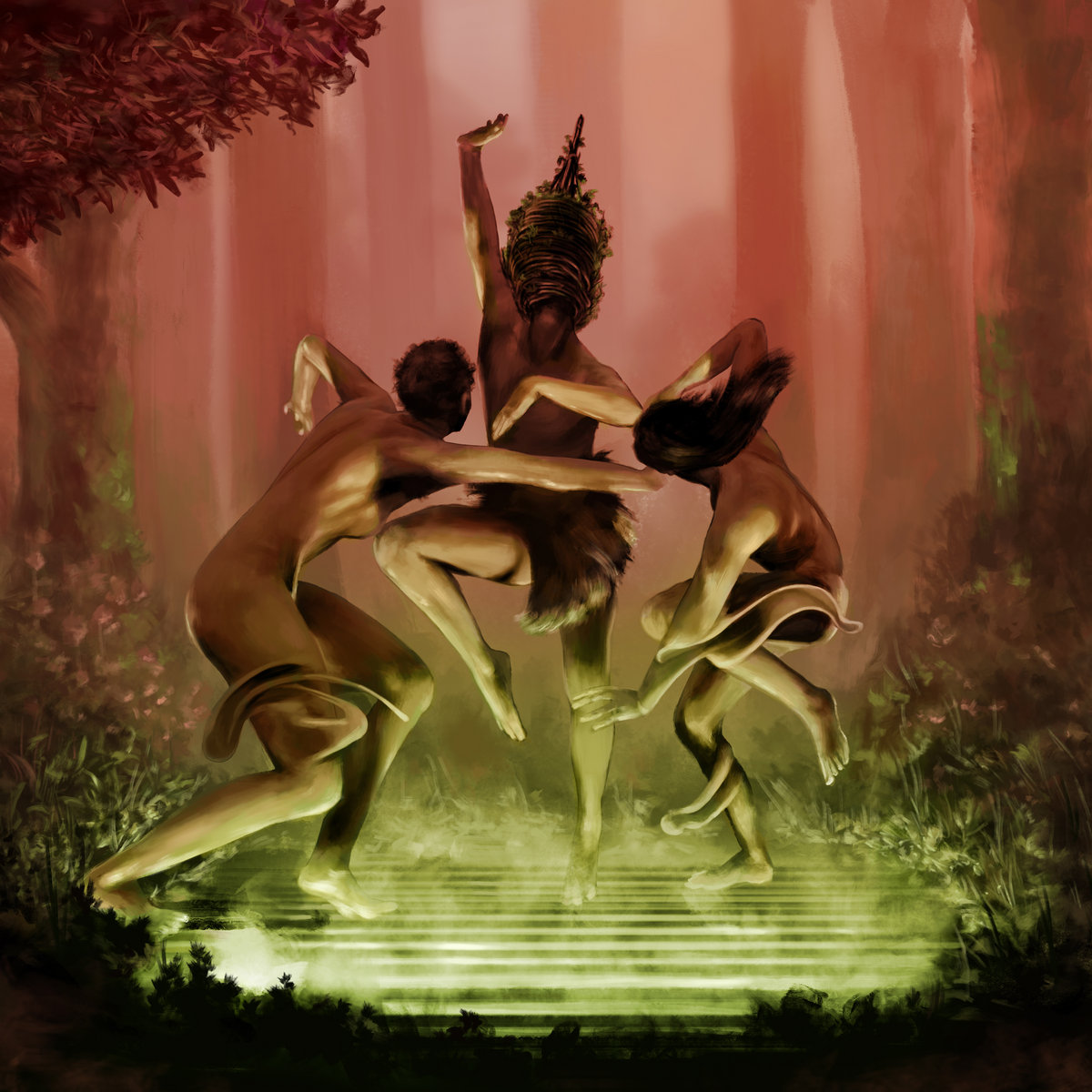
LOMA – Don’t Shy Away (Sub Pop Records)
Emily Cross (Vocalist of Loma):
Lisa and I have been friends since college; we went to the School of the Art Institute of Chicago together. She’s been such an inspiration throughout the years, and when it came time to select the first Loma album art, naturally, I thought of her work. It seemed to make sense that her art continue with us through to Don’t Shy Away. We had all made a number of selections, but this piece stood out to us as a great reflection of the music and we went with it.
Lisa Cline (Visual Artist):
I made this image at the beginning of lockdown as a response to feeling stressed and overwhelmed. The image is where I wanted to be: alone in a forest, safe and protected by nature. The red flower growing around the figure is a little gem of light in the dark, speaking to the figure. I think it means: even when you want to hide and be alone, there’s something inside that grows out of that dark place that reminds you, there’s still hope and joy. Just having that tiny revelation brings beauty to the darkness.
Sounds: LOMA
Artwork: Lisa Cline
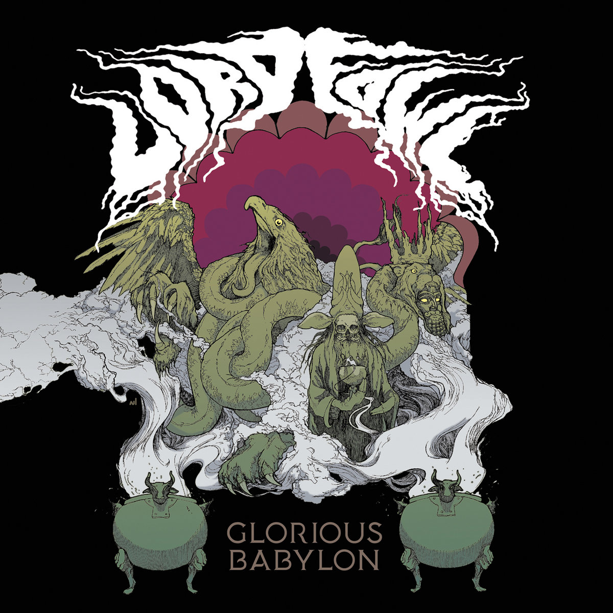
Lord Fowl – Glorious Babylon (Small Stone Records)
Blackunicorn Studios (Visual Artist):
As an illustrator, I work best when just given a brief description of what your looking for, and just going. Too much art direction always leads to dissatisfaction for everyone involved. For this one Lord Fowl just said to work off the title… I went straight to ancient Babylon. I’m a bit of a ancient history buff and always enjoy weaving some of that imagery into a piece. The cauldrons, wizards outfit, bearded face, arch, ziggurat, and eagle heads (on the back) are all references to ancient Babylon. Mix it with some trippy fantasy stuff and I’m more then excited to be working on it.
Sounds: Lord Fowl
Artwork: Andrew Perkowski of Blackunicorn Studios
Murlo – Primed for Primal (Coil Records)
Murlo (Musician & Visual Artist):
As with my past few releases, the artwork for this release was driven by a narrative I’ve been threading through my music for some time. With these covers as well as a combination of graphic novel art and an evolving live audio visual show that I’ve been touring, I’ve found ways to tell the story. I’ve tried to create everything in a single separate universe which allows me to have various stories that intertwine and collide with each other. Primed for Primal is one of these chunks of story that fits in with the larger story as a whole, which I focused mainly on a set of cult followers who live in the woods that were fooled by a rogue AI trying to escape the city. With every release, I try to present the music alongside art in various formats; with this EP it was focused more on art prints and the idea of interchangeable record sleeve covers.
Sounds & Visual Art: Murlo
Additional Design: David Kelly (DK)

Murlo’s album Dolos is also in the same thematic world.

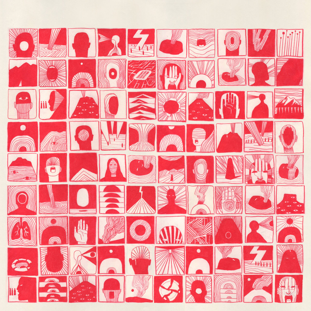
Nmesh – Pharma (Geometric Lullaby)
Keith Rankin (Artist):
There’s an image by the Dutch sci-fi artist Karel Thole that has a giant head collapsed on an ocean horizon line. I don’t know if it was a direct reference, but there’s also famous imagery from the anime End of Evangelion that has a very similar feel, and I wanted to make a piece in that lineage.


Sounds: Nmesh
Artwork: Keith Rankin
Patrick Shiroishi – descension (Black Editions Group)
Via Black Editions Group:
Patrick Shiroishi is an artist that engages historical issues on a deeply personal level. Some of his most poignant works have explored the Japanese-American experience, most particularly the incarceration of Japanese-Americans during World War II and its continuing relevance in contemporary America. His recently released album, descension, is his most powerful work to date to focus on these themes. Shiroishi asked renowned artist Rob Sato to create artwork for descension. Sato’s own work has explored similar topics.
Sounds: Patrick Shiroishi
Artwork: Rob Sato
Design: D. Norsen
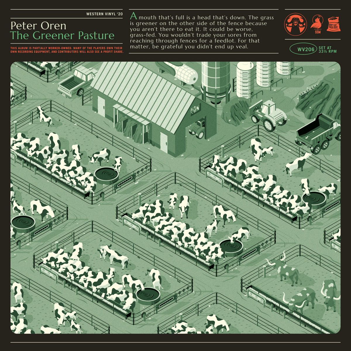
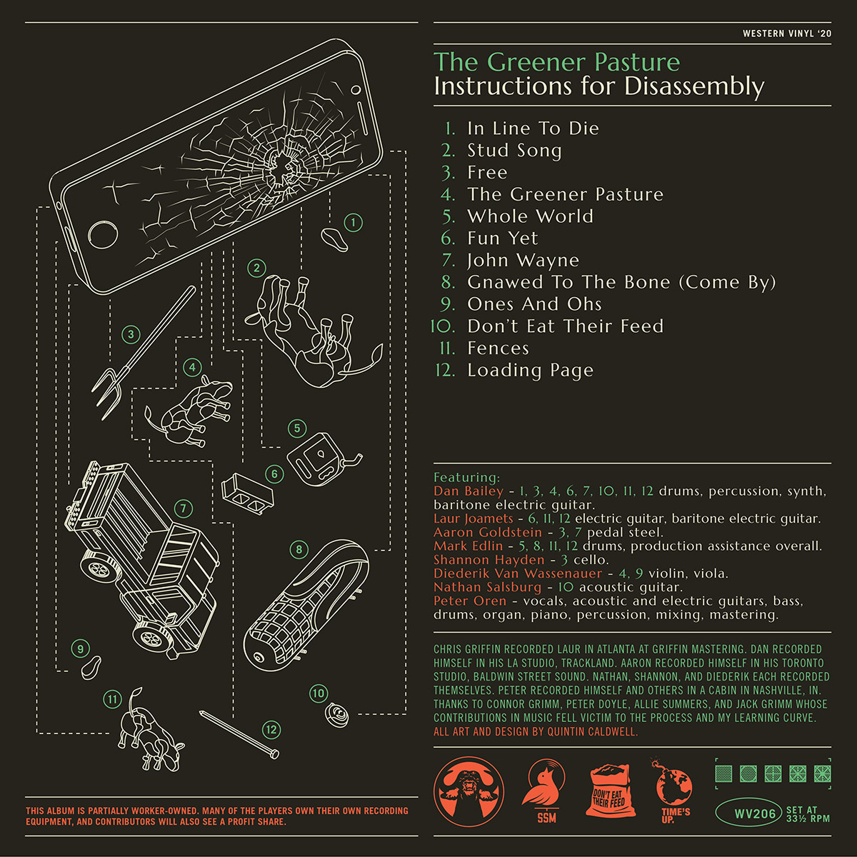
Peter Oren – The Greener Pasture (Western Vinyl)
Peter Oren (Musician):
I wanted the album art to visually represent the primary metaphor/ thesis of the album, which grapple with the power dynamics of phone usage under capitalism wherein our attention/ data is harvested and sold to benefit advertisers and more broadly to steer our choices and relationship the world. The idea is aligned with Foucault’s assessment of various aspects of society as prisons. If it’s not clear on first glance, the fencing in the artwork is intentioned to resemble phones. I had an idea to put a farm scene on a phone screen, and Quintin took that idea and rolled with it. We pressed a limited edition vinyl with each side labeled as the greener side.
Quintin Caldwell (Visual Artist):
Peter and I have been collaborating on projects since our friendship began back in high school. Our close artistic relationship has always allowed for creative ideas to flow unencumbered, which is a real privilege. For The Greener Pasture, I feel I’d been looped in before the initial seed really germinated. Peter had been sharing song ideas and demos with me for a couple years, and I’d watched them slowly take the shape of an album.
When we finally decided on the album’s concept, I sent over a handful of rough sketches. Our initial thought was to have farm elements exist atop a smartphone, as if the physical confines of the phone established the fence line of a feedlot. To step off the edge was to fall into the abyss, to exist completely beyond social media. Peter was really drawn to the isometric illustrations commonly used in tech apps and platforms. In terms of layout, I wanted to inject the feeling of old architectural drawings. This can be seen especially in the use of type.
What resulted was something that felt both modern and aged, an isometric farm scene where each individual feedlot suggests a smartphone in abstract. The back of the album was a complete deconstruction of the landscape, our lives within the phone turned on their heads. As the music questions the comforts of our technology dependencies, the art asks: “What have we lost along the way?”
Sounds: Peter Oren
Artwork: Quintin Caldwell
Quintin Caldwell (Visual Artist):
One special detail: my hoosier easter egg that I’m particularly fond of is the propane tank painted to look like a corn cob. I see them every now and then driving up I-65. Industrial farmers are some funny dudes.
Pine Barons – Mirage on the Meadow (Grind Select)
Bradford Pulley (Guitarist of Pine Barons):
[Pine Barons’ lead] Keith had a concept for the album art during the time he was demo’ing and writing. As we recorded and mixed the record, some songs had changed quite a bit texturally and the mixing process was bringing out something totally different from the original idea… The mixes were proving that the album was becoming more vibrant, shimmery and majestic than the original lo-fi mood of the record, with some dark unsettling undercurrents…
Keith Abrams (Lead of Pine Barons):
We wanted to create a landscape that was, at first glance, something peaceful and serene, but when concentrated on, would emanate subconscious visions of scary imagery. Like an underlying horror that pulsates among the vibrance and beauty. The music itself seemed to bring about this feeling of floating around in some colorful little world where an eerie darkness is weaved within.
Bradford Pulley (Guitarist of Pine Barons):
I hope that while it initially strikes the viewer as a beautiful spot you’d maybe want to walk through, they would start to see faces in the bark and plants in the foreground and feel that something is a little off. In the end, the golden hour color treatment leaves the spooky elements subtle.
Sounds: Pine Barons
Artwork: Bradford Pulley of Pine Barons, Colin Abrams, and Kyle Stetz

Populous – W (Wonderwheel Recordings)
Populous (Musician):
My album is completely inspired by women and, more widely, by femininity. When I discovered Nicola’s work, I immediately thought: “He’s the one!” He’s very active in the Berlin queer community… He worked with Berghain and with a lot of queer parties, so he was totally aligned to my visions. W was born as a family album, I decided to work with all my friends, as a kind of collective, so I wanted to show this in the cover. We imagined having this super inclusive club scene, where icons were dancing with common people, having fun, drinking, kissing, flirting. We wrote down a list of female artists that had a huge impact in our lives. At the beginning the list was endless — too many names — so Nicola just picked up only some of them.
Nicola Napoli (Artist):
I think our visions about the graphic identity of W were somehow aligned from the very beginning; we never had a difference of opinion but, on the contrary, kept giving each other fresh inputs and ideas all the time. We had a very informal brainstorming in front of a mojito when I visited him in Italy, and then I was given carte blanche to develop the idea with total freedom. We had a lot of fun while working on references, mood and vibes of the utopian party we represented — and I think this aspect is very visible in the final result! A big personal takeaway from this experience was indeed the chance of showing my work for the very first time in Italy, my country, after many years living and working abroad. W is one of the first albums openly paying tribute to the Italian queer community, a sorta of ice-breaking process that (hopefully) will wash away many conservative taboos still very present in the country. As a member of the queer community myself, having my art as a manifesto of the project represented a big satisfaction on both personal and professional level.
Sounds: Populous
Artwork: Nicola Napoli


Sabrina Bellaoue – We Don’t Need to Be Enemies EP (InFiné)
Po Nwar (Visual Artist), via Instagram:
Committed to the emergence of a Panafrican musical culture, her sounds experiments reveal the cultural richness that inhabits her. 🙌🏾 ✨
Sounds: Sabrina Bellaouel
Artwork: Po Nwar

Sorge – Sorge EP (Self-Released)
Bonner Sale (Visual Artist):
The narratives chosen are meant to depict a gothic western. I would envision desert themes when listening to the demo tapes and tried to capture that. Ellie took the raw sketches and really improved on the shading and line weight of the narratives, [and] also performed that great abstract line work around the narratives and the band logo. We had never worked [together] in the past before. I was ecstatic to see the end results.
Ellie Yanagisawa (Visual Artist):
For the left side of the desert cowboy, I immediately thought of White Sands National Park and how at twilight, the gypsum sand looks purple. This dictated the purple palette. For the mysterious room, I chose a contemplentary color to purple and imagined how both the Jing Cobra snake and goopy skull, stewing in the vase for a millenia, were radioactive, and therefore neon green. The linework around the diptych took a couple iterations… I like to call them dragonsnake veins. If you zoom in next to the Sorge logo, you’ll see the dragonsnakes with open mouths about to consume/merge with the letters.
Sounds: Sorge
Artwork: Bonner Sale & Ellie Yanagisawa
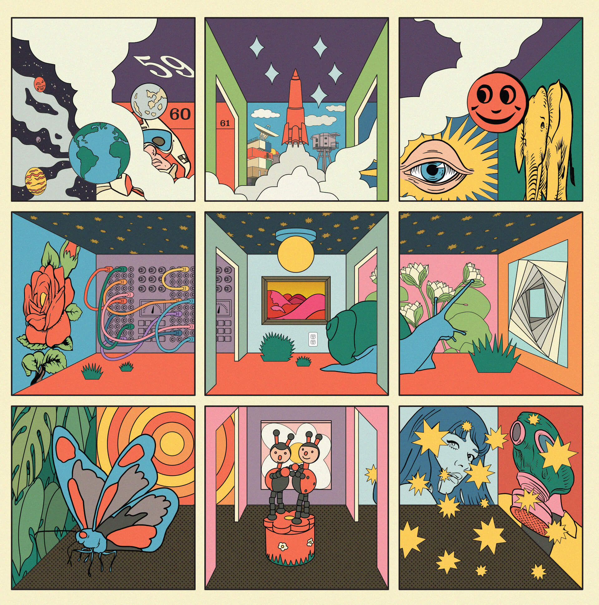
STRFKR – Future Past Life (Polyvinyl Record Co.)
Sohale Kevin Darouian (Visual Artist):
When I started working on the album art, the band had a few requests to be intertwined into the design. The Dutch ladybug figurines at the bottom are a nod to Josh’s trip to Amsterdam, which is where a few of the first songs on the album where written. The space elements on the record are a nod to NASA Astronaut Christina Hammond Koch, who is an outspoken fan of the band. We listed her mission numbers (59, 60, and 61) on the front cover and intertwined the icon for the International Space Station (where she spent much of her time in space) within the interior.
The rest of the record drew inspiration from the album’s recordings and my daily life using my own personal method of automatism, which helps me avoid any conscious storytelling in my art. I put the snail in there because I’d see them frequently on my winter forest hikes. The modular synthesizer came from my obsession with modular synthesis and the synth sounds on the album. Everything sort of drew from all over the place (the albums music, the daily news, internet explorations, books on my shelves, etc). Curating the rooms on the cover was a bit of a balancing act. I wanted to evoke a sense of wonder, discomfort, and joy. Things that are felt within a normal day or how you might feel listening to the record.
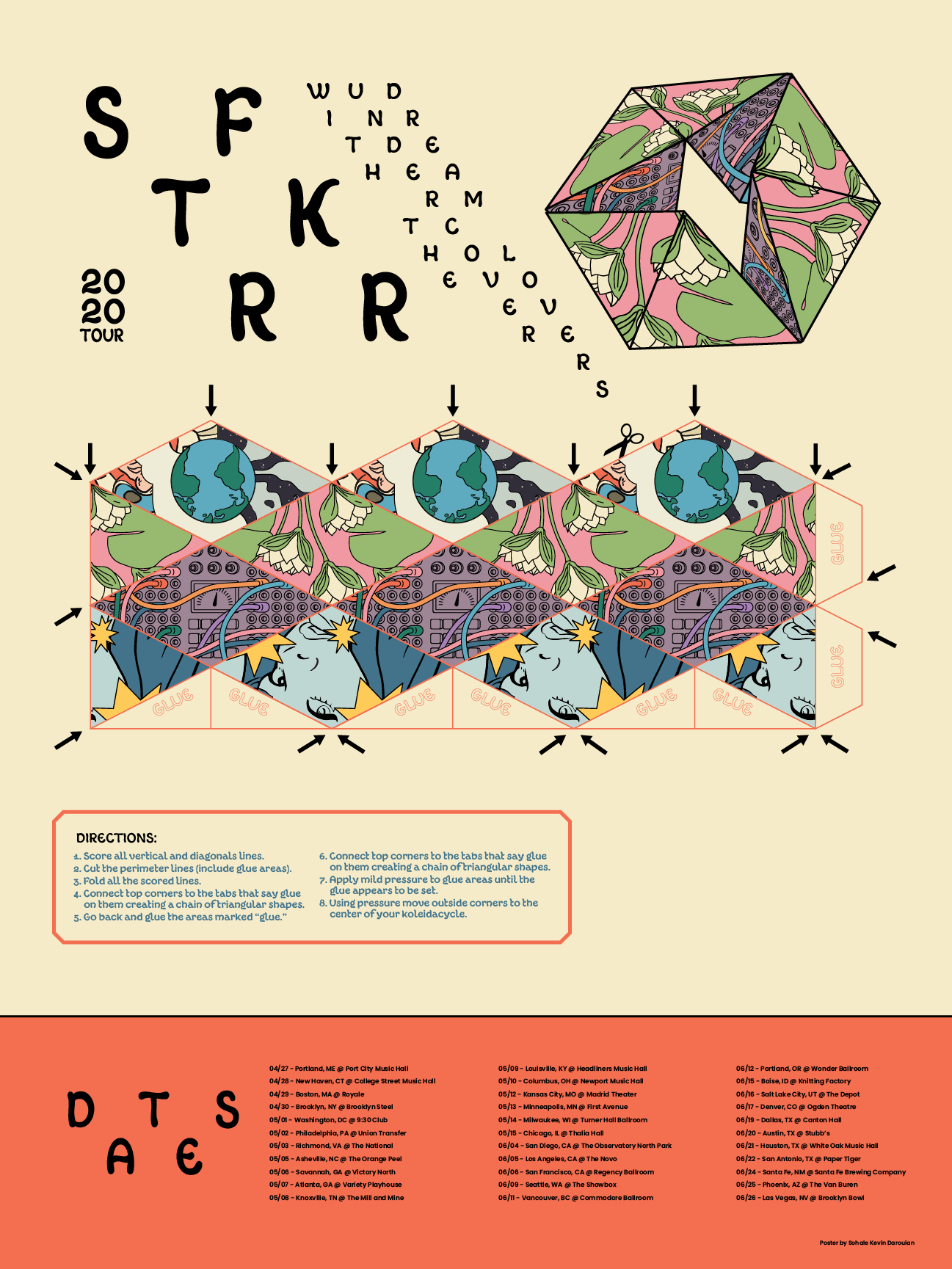
On the poster, there is a kaleidocycle (featuring some of the album’s art), which you can construct and play with. It’s sort of an analog version of the album stream video.

I also find the barcode quite entertaining. I really don’t like barcodes. They tend to get in the way of the design, but luckily we were able to make an obi strip for the record, and I flowered up the barcode, quite literally.
Sounds: STRFKR
Illustration, Packaging Design, Merch Design, Animation & Marketing Creative: Sohale Kevin Darouian
Project Management: Janelle Abad at Polvyinyl
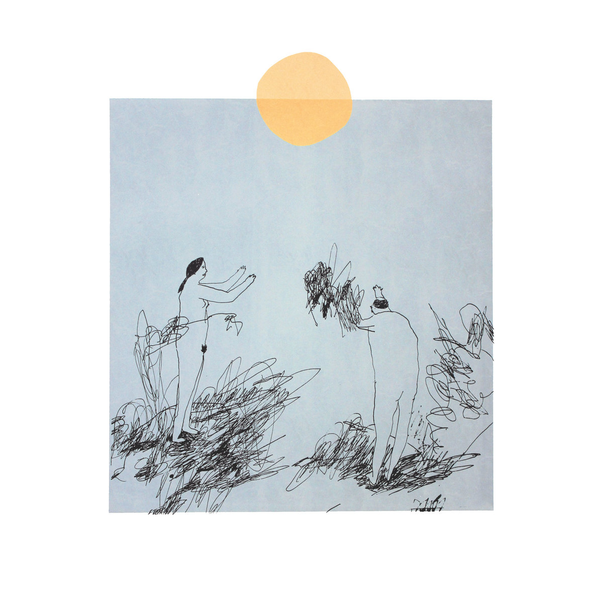
Trace Mountains – Lost In The Country (Lame-O Records)
Coco Klockner (Visual Artist):
The album art for Lost in the Country is a repurposing of an old screen print that I made years ago, originally printed in Baltimore in 2012… The style was an illustrative mode I was working through at the time, where characters blend into a surrounding chaotic mess of marks that never quite resolve into any recognizable form — which I think is what made the art such a good fit for the title Dave chose. I always liked the ambiguity in it: [about whether] the figures are beholding or lamenting the sun and the world they blend into. That really felt like the crux of the piece; the reason the piece resonated with the motifs that run so consistently through Dave’s songwriting.
Sounds: Trace Mountains
Artwork: Coco Klockner
EXPLORE ALBUM COVERS OF THE YEAR:


thank you very much, I have been waiting for your return for a long time !!