SCULPTURE & OBJECT

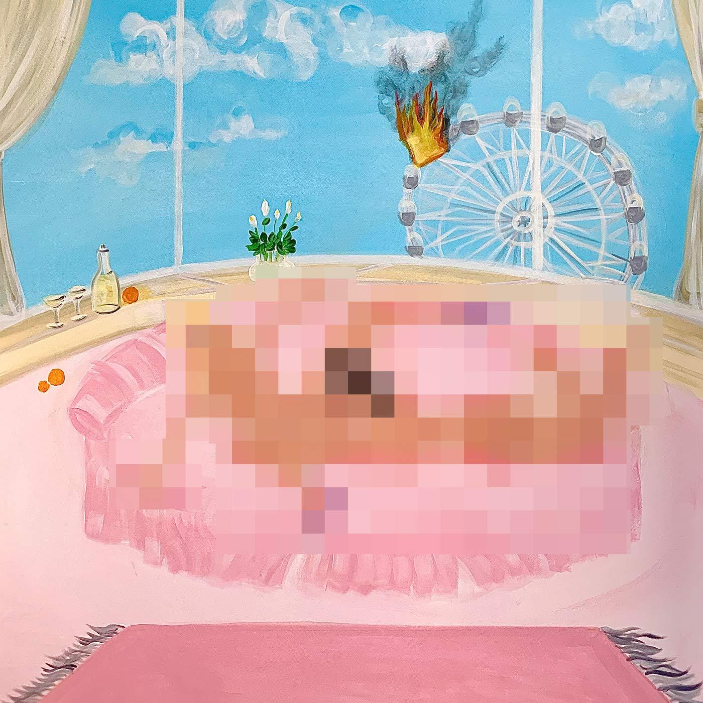
Discovery Zone – Remote Control (Mansions and Millions)
JJ Weihl (Discovery Zone):
The cover artwork for my debut record Remote Control is an original laser hologram which depicts a key floating in the clouds. A key is an object which throughout human history has come to symbolize knowledge, transitions, mystery and time. It is a familiar object; something we use everyday that separates private from public space, but as a symbol, it is the thing which gives us access to immaterial realms. The key also requires a lock. It is a part of a system — a duality.
In pagan mythology, the earth goddess Cybele, who rules over all nature, holds the key to Earth, closing her down in winter and opening her again in the spring. Her key was understood to open the gates to the invisible world.
As we enter an age of transcending physical objects, we still use keys, but the keys have transformed from wood to metal to data. Keys are used as passwords, or to transmit encoded information. The way we hold and share our digital worlds are contained in USB keys, or in icloud storage spaces which also require access in the form of keys. Access is now granted just by the sound of one’s voice, by a fingerprint, or by eye scan. We are witnessing objects and concepts transform from the material to the immaterial almost imperceptibly. But the truth is, the universe itself is immaterial. It is a holistic entanglement of energy. The cognitive scientist Karl Pribram wrote, “Our brains mathematically construct objective reality by interpreting frequencies that are ultimately projections from another dimension, a deeper order of existence that is beyond both space and time: The brain is a hologram enfolded in a holographic universe.” The record is a meditation on the relationship between humans and the machines we create, the perceptions and projections of this duality.
Sounds: Discovery Zone
Artwork & Design: Lucas Chantre
Hologram Fabrication: Detlev Abendroth
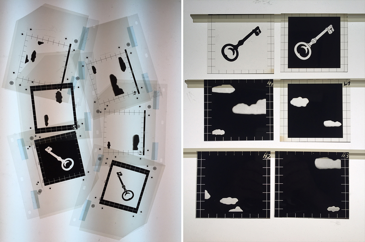
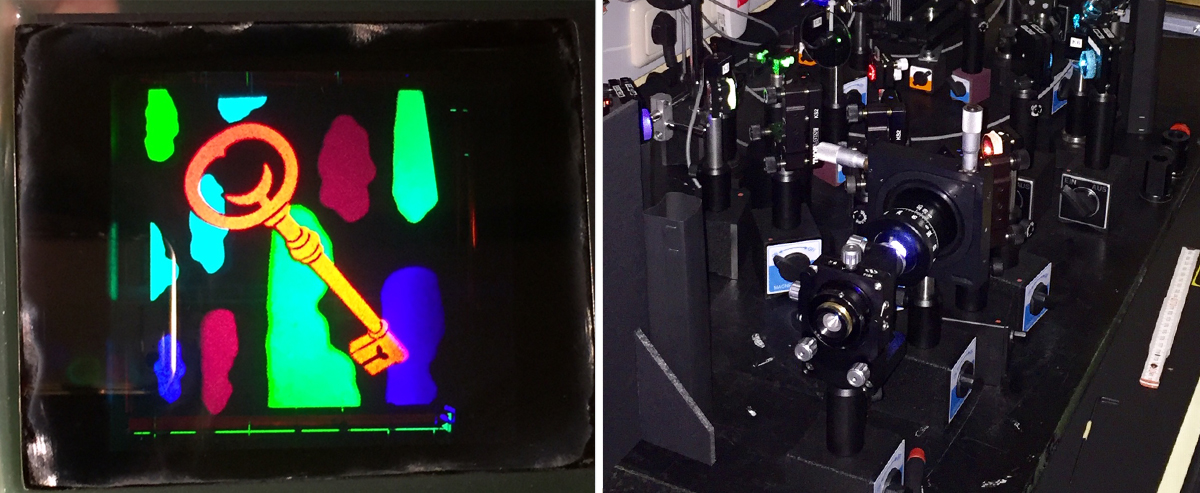
After thinking about different ways to express all of these themes visually, I worked with Lucas Chantre (aka World Brain) to design the image. He created a special key with a moon and a little plant. He also created the space in which the hologram is suspended. We did a lot of research to find someone who could make the image into a hologram sticker. It’s a pretty rare and niche process so it took some time. Finally, we found Detlev Abendroth from the AKS Holographie-Galerie in Essen, Germany. He was super into the project and it was a real pleasure to work with him the whole way through. He even shared his step by step process in creating the holograms. He sent us the stickers, and Lucas and Anton and I placed them by hand on each individual record.
(Images of the hologram fabrication process courtesy of Detlev Abendroth.)
FRKTL – Excision After Love Collapses
Sarah Badr (FRKTL):
Excision After Love Collapses is a very personal work. It’s rooted in grief and heartbreak, coping with sudden change and loss, grappling or coming to terms with facing new realities of self and surroundings. I wanted the artwork to reflect this internal turmoil through irregular forms and textures, as well as elements of unexpected beauty, clarity and resolve.
In recent years, I’ve been working a lot with 3D modelling and augmented photography. The artwork for Excision was the last in a series of sculpting, texturing, lighting and image manipulation studies that I’d been developing for some time using Blender and Adobe [Creative Cloud].
Sounds, Artwork, Graphics & Layout: Sarah Badr of FRKTL

GAIKA – Seguridad (NAAFI)
Alberto Bustamante (Creative Director of NAAFI):
For a few years now I have been selecting contemporary art pieces from the Mexico City art scene (artists and galleries that are close to the brand) as covers for the main catalogue of the label. A strategy to help contextualize the release with the creative climate.
We used a piece by Antonio Vega-Macotela. A young Mexican artist represented by LABOR. His work refers to alienation in economic systems and their social structures. GAIKA is not only an artist, but an active political figure with a global understanding. The bull is actually very small, and the 3rd time we’ve featured a 3D print model as a visual.
Sounds: GAIKA
Sculpture: Antonio Vega Macotela –Studies of Exhaustion: Study No. 4 Speculation (2014-2015) Marble dust and plaster, 3D printing. Courtesy of the artist and LABOR.

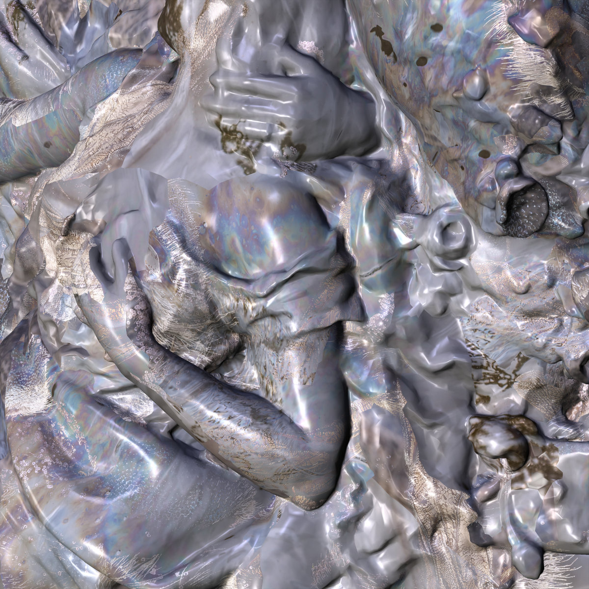
Heathered Pearls – Cast (Ghostly International)
Martyna Alexander (Art Direction & Design):
Jakub, Heathered Pearls, often imbues his art with the emotional and textural themes from his music for each album. In this case, Cast had a bold use of vocals as a new material in his ensemble of sounds to create the album. New sounds beckoned using materials that reflect the rawness in those vocal appearances. This is all to say: Cast deals with absence of staged perfection as much a presence of authentic feelings or materials. The move mirrors the multitudes of its namesake: collaborators comprise a cast, healing in the bind of a cast, complex emotions and the shadows they cast. Jakub saw the covers as naturally unfinished workstations; the gauzed and patinaed copper on Cast continues in this philosophy.
Creative Direction, Sculpture & Sounds: Jakub Alexander of Heathered Pearls
Sculpture Collaborator: Ewa Harabasz
Sleeve & Package Design, Art Direction & Styling: Martyna Alexander
Photography & Styling: Daniel Ribar


Martyna Alexander (Art Direction & Design):
It might be helpful / interesting to see the 3 single covers in addition to the album cover since they were created as a kind of set or series. Deliberately made to lean on one another.
Many of the materials you see in the images are made up of textures and art materials that Danny and I use regularly in our studio. The paint-flecked glass seen in the single art for “Salvaged Copper” was actually a palette I made for painting that I had created by taping up the edges of a raw cut of glass. It had real paint marks from old dried paint that I scraped off and a really beautiful natural feeling to it. In the actual album cover, we used gesso to create the white texture that the sculpture sits on.
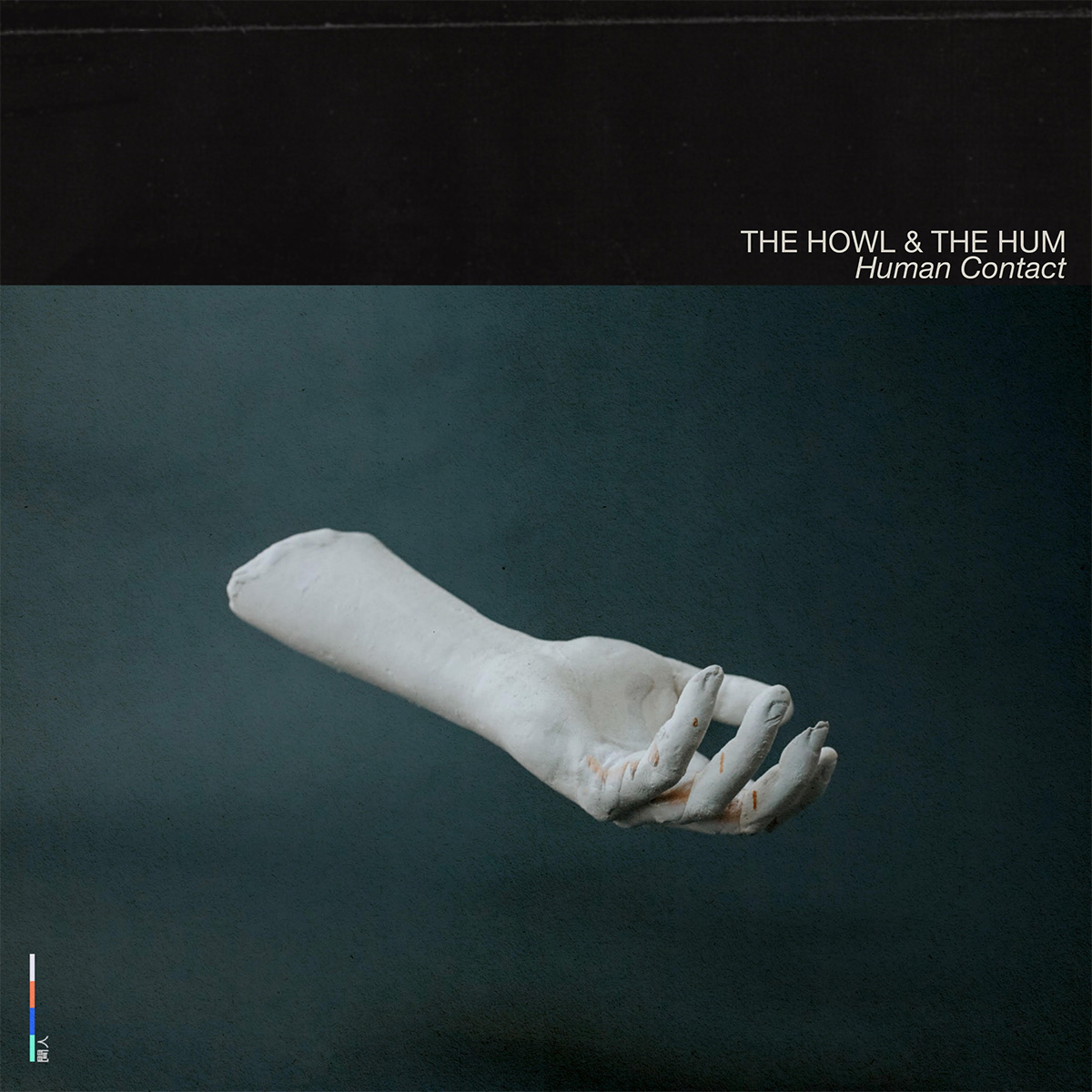
The Howl & The Hum – Human Contact
The Howl & The Hum (Musician):
We based this album around the ideas of modern loneliness: a 21st century view of personal connection in an age of digitised relationships. We made this artwork ourselves, based on an idea by our guitarist Conor Hirons, and photographed by friend and collaborator Andy Little.
The symbolism of the hand is through Conor’s obsession with limbs, and this limb in particular — the hand is one of the most human parts of someone: holding hands, manual labour, creative endeavours, holding on to something.It’s the very human aspect of a hand: making it an obviously fake hand is like trying to find the humanity in something that isn’t. It’s about the separation between human and non-human. The idea of separation and loneliness took on a very different meaning when lockdown started in the UK just before our album was released (we finished recording it in September 2019 so please quell those conspiracies NOW), so we felt oddly prescient.
Sounds: The Howl & The Hum
Artwork: Conor Hirons
Photography: Andy Little
Package Design: The Howl & The Hum and James Huw King

Ian Chang – 属 Belonging (City Slang)
Ian Chang (Musician):
From the beginning, I knew that I wanted the album artwork to be an expression of the 属 (Belonging) character, and I wanted it to be a modern/ disembodied take on natural inspirations, which parallels the ethos of the music and the sounds. I was really excited when Eileen Tjan agreed to create the artwork because she’s experimented with creative expressions of Chinese characters in her own work, so I knew she would be able to take the concept and run with it.
Eileen Tjan (Creative Director):
Ian Chang’s Belonging is a heartfelt musical narrative that follows Ian’s more transitory chapters of life that ultimately led to a home. It is a response to finding oneself through moving through both time and location. When Ian and I first met to discuss visuals for the album, he had a strong inclination to utilize natural imagery to convey the feeling of the EP and the abalone shell was one of the initial ideas. On the surface, the abalone shell is a symbolic representation of both home and security. The intricacy of the patterning reflects the complexity of spiritual and physical navigation through change. As the self moves through life, the spirit searches for a sense of belonging. The sleeve is a smooth, dreamy gradient that is reminiscent of the inner flesh of the abalone—the protective interior that houses something we all long for, a pearl. That pearl for Ian was realizing he had found his home, identity, and place in Texas. The sticker on the vinyl is the pearl, appropriately placed where the music lives!
Ian Chang (Musician):
I sent her a couple folders of inspiration for natural forms and Chinese typography, and she responded with a handful of rough concepts based off of the images/ ideas that resonated with her most. We ended up going with her idea of using an abalone shell’s natural patterns as a launching point for a custom drawn 属 character, nested within a shell itself, almost like a pendant. Once this idea was solidified, all the ideas for the inner sleeve and vinyl sticker fell into place.
Eileen Tjan (Creative Director):
In terms of the creative process, the album art is a mix of various renderings. The cover is a 3D rendering with some post work, and the interior materials are all photo collaged. Embedded within the patterning of the abalone shell is a custom drawn Chinese character for Belonging, 属.
Sounds: Ian Chang
Creative Direction: Eileen Tjan
3D Artist: Victor Uhal
Lafawndah – The Fifth Season
Inspired by her encounter with author NK Jemisin’s Broken Earth trilogy, Lafawndah both pays homage to and extends further the elemental, emotionally charged myths of Jemisin’s books. These are stories where a broken heart can tear apart a continent.
Sounds: Lafawndah
Artwork: Marguerite Humeau
Design: Studio Hugo Blanzat

Matt Evans – New Topographics (Whatever’s Clever)
Matt Evans (Musician):
The cover image on New Topographics is a photo from a 2016 installation of Devra’s sculpture, “Fluorescent Anomaly” (2014). I chose this image for a few reasons, one of which was that the image kind of found me while looking through her archives and ultimately because of the way it’s hyper-real digital-rendering-as-physical-object-ness related to the sound of the music on the record. There’s something oddly liminal about both the music and the image— they seem to question their own essence as strictly “real” or “digital.” I also love the neon hue and aqueous shape of the object; it really highlights the vibe of the record.
Sounds: Matt Evans
Artwork: Devra Freelander, “Fluorescent Anomaly,” 2014.
Layout & Design: Benedict Kupstas
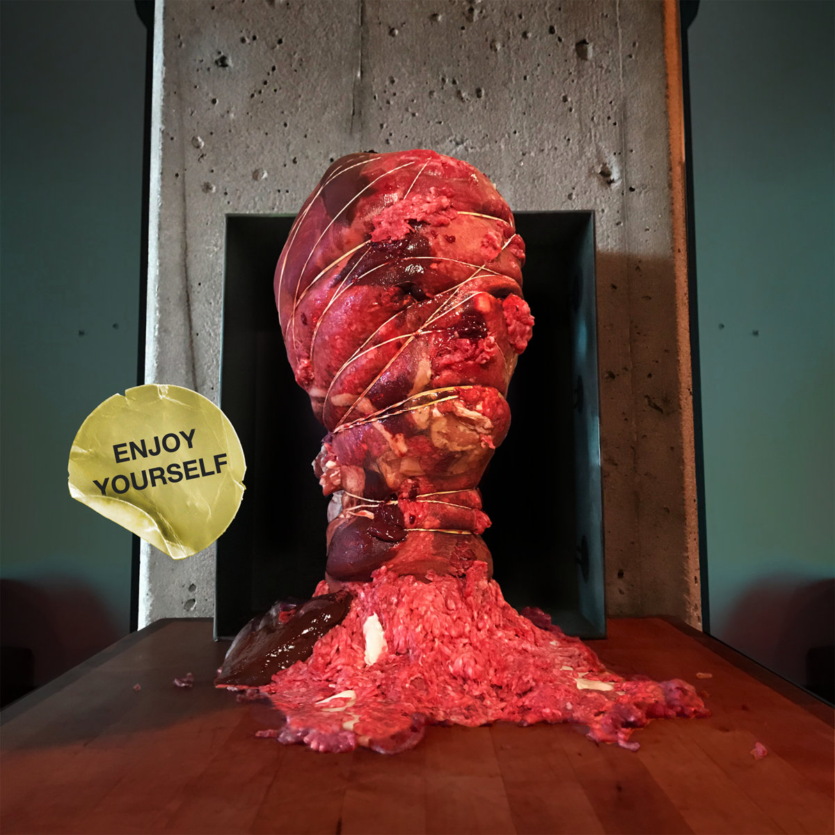
Melted Bodies – Enjoy Yourself (Sweatband Records)
Andy Hamm (Melted Bodies):
I have used raw meat in a lot of pieces for a number of years. It seems to evoke both a beautiful yet uncomfortable reaction which I am attracted to. Here we have this abundant and readily available form of dead flesh for sale at almost any grocery store which most humans without thinking twice will happily consume, and yet presenting it just slightly out of the context of “mass consumption“ suddenly it makes a lot of us uneasy.
I made the piece with four cuts of meat, all beef — and shot both covers in my apartment using natural lighting, some red/blue led lights and some post work in Photoshop.
Sounds: Melted Bodies
Artwork: Andy Hamm
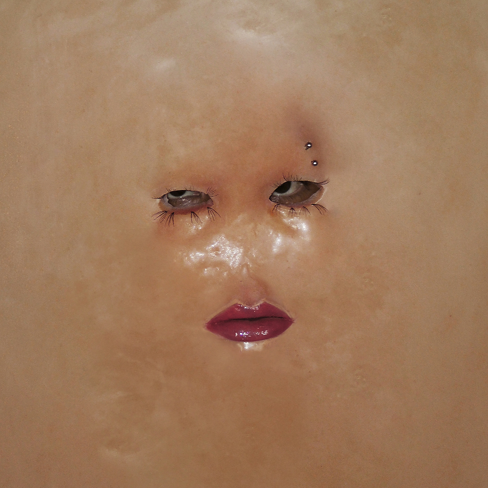
Shygirl – ALIAS EP
Via Creative Review’s Best Record Sleeves of 2020:
British rapper Shygirl’s latest EP Alias is a visceral exploration of sex, and there’s a suitable amount of skin on show on the release’s twisted cover. At the centre of the artwork is a fleshy face that sits somewhere between an ill-fitting mask and leather wallpaper, with a stare piercing through a pair of misshapen eyeholes rimmed by eyelash extensions. The harsh lighting picks up the shine of lip gloss as much as it does the puckered where a nose has seemingly sunken away, uncomfortably straddling the line between seductive and unsettling.
Working with make up artist Jimmy Owen Jones, a cast of Shygirl’s head was made and then flattened out as a way of distorting the familiarity of facial features. Photographer Henrik Schneider captured her expression peering from behind the cast for the cover artwork, which was heavily influenced by the period of introspection she experienced during the first national lockdown.
Shygirl absorbs multiple personas across the EP, and the allusion to a disguise on the cover art is a clever nod to this creative approach. The limited-edition EP bundle also came with stickers, a hand fan and a pack of condoms for good measure.
Sounds: Shygirl
Photography: Henrik Schneider
Make Up & Props: Jimmy Owen Jones
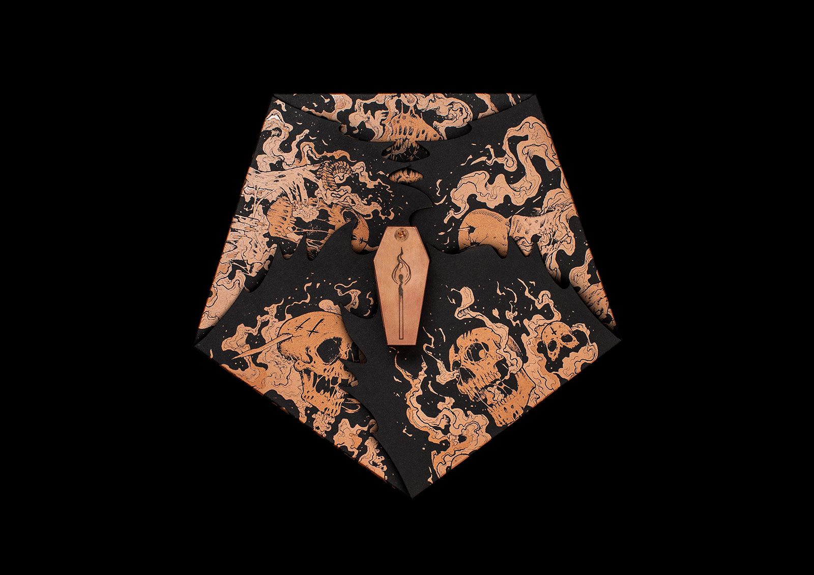
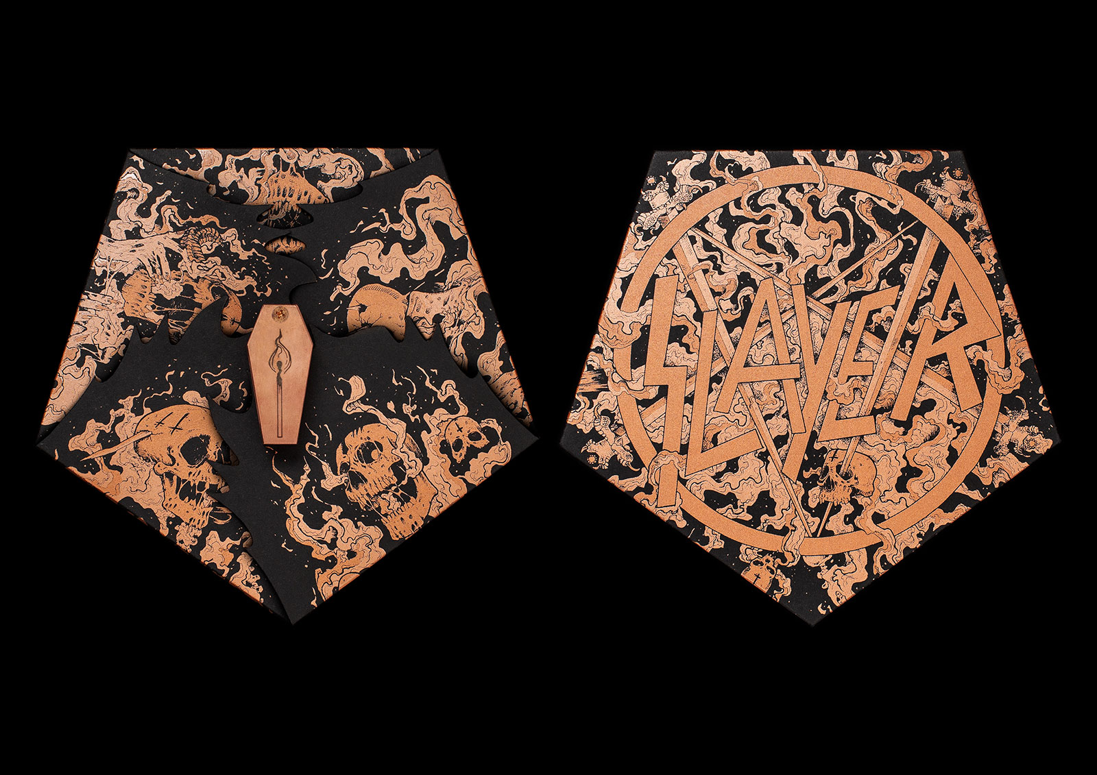
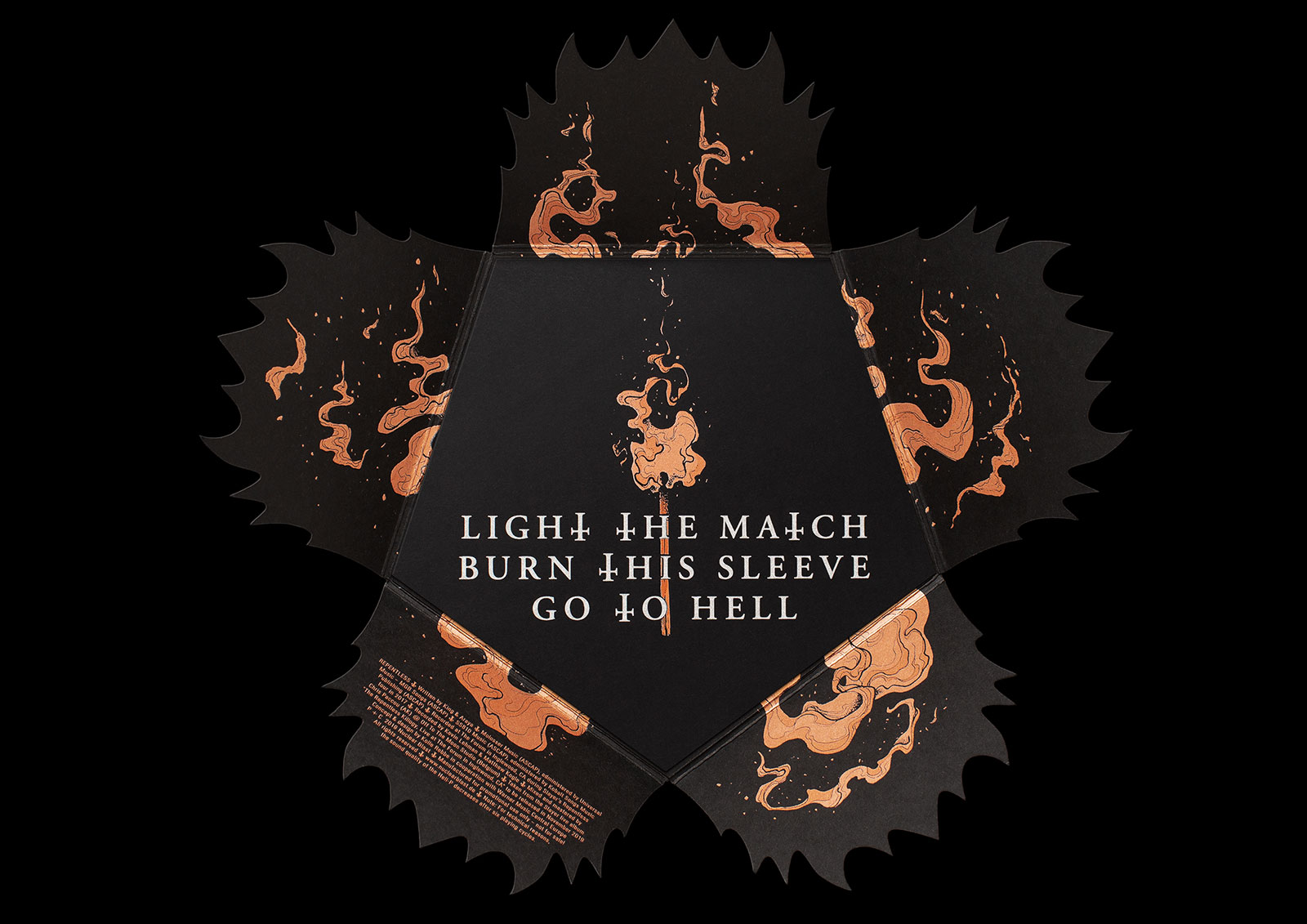
Slayer – HELL-P (Nuclear Blast Recfords)
Via Muse by Clio:
Iconic thrash-metal band Slayer unleashes some very hot licks on its latest release, a promotional disc billed as “the first record you can play in hell.” Developed by agency Kolle Rebbe to celebrate the band’s farewell world tour and final album, the fire-resistant, stainless-steel-and-copper record measures 6.66 inches (of course!). And in a devilish bit of wordplay, it’s billed as a Hell-P, a reference to vinyl’s LP or “long player” designation (though the disc actually plays at 45 RPM)…
“The idea of a record you can play in hell came up during a creative brainstorming session in our agency—by Martin Strobel and Alexander Michaelsen, a truly fantastic creative team,” agency executive creative director Thomas Knüwer tells Muse. “From the very beginning it was clear to us that this idea only deserved one band: Slayer. I grew up with their music and knew that nobody makes better music for hell.”
Sounds: Slayer
Artwork, Design & Packaging: Kolle Rebbe


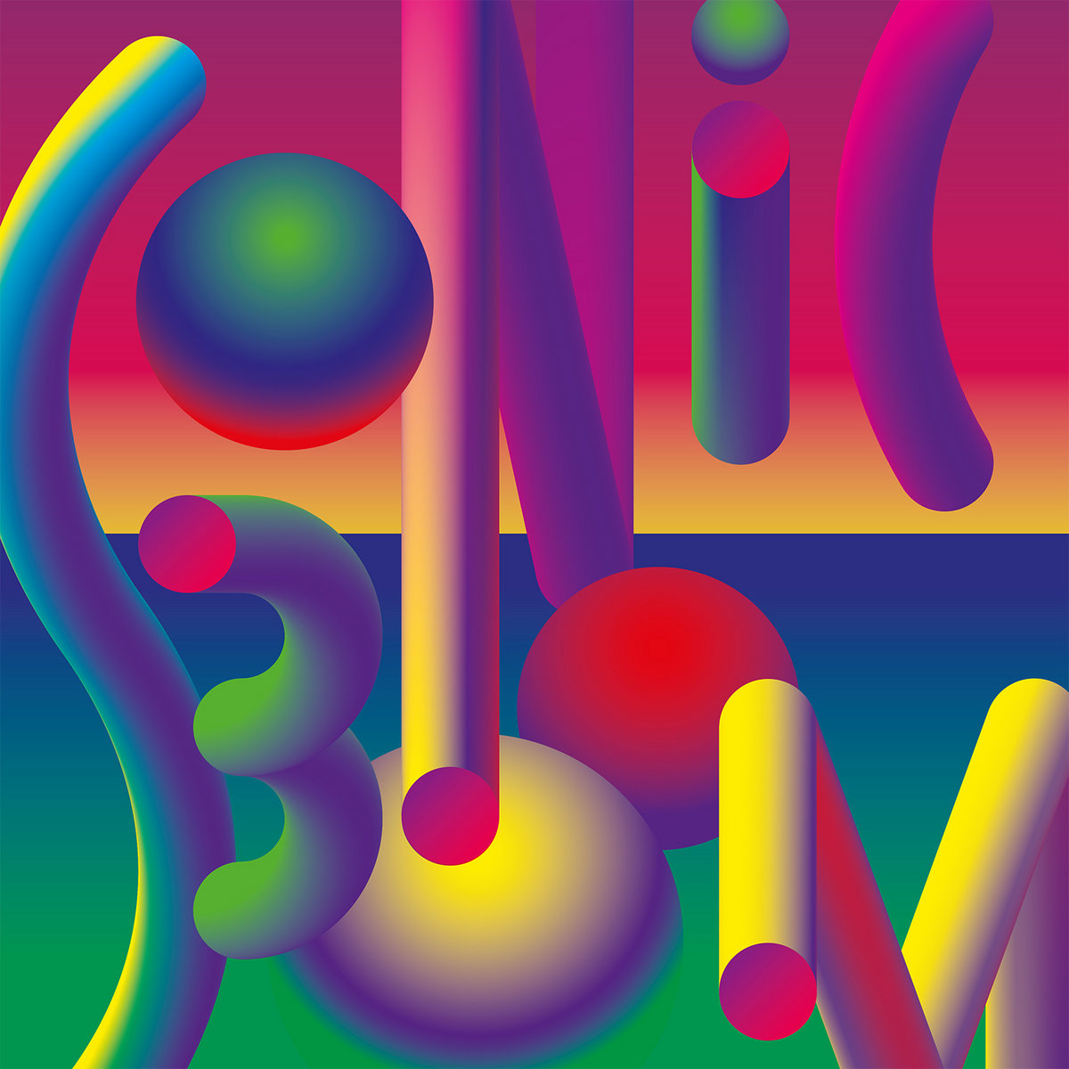
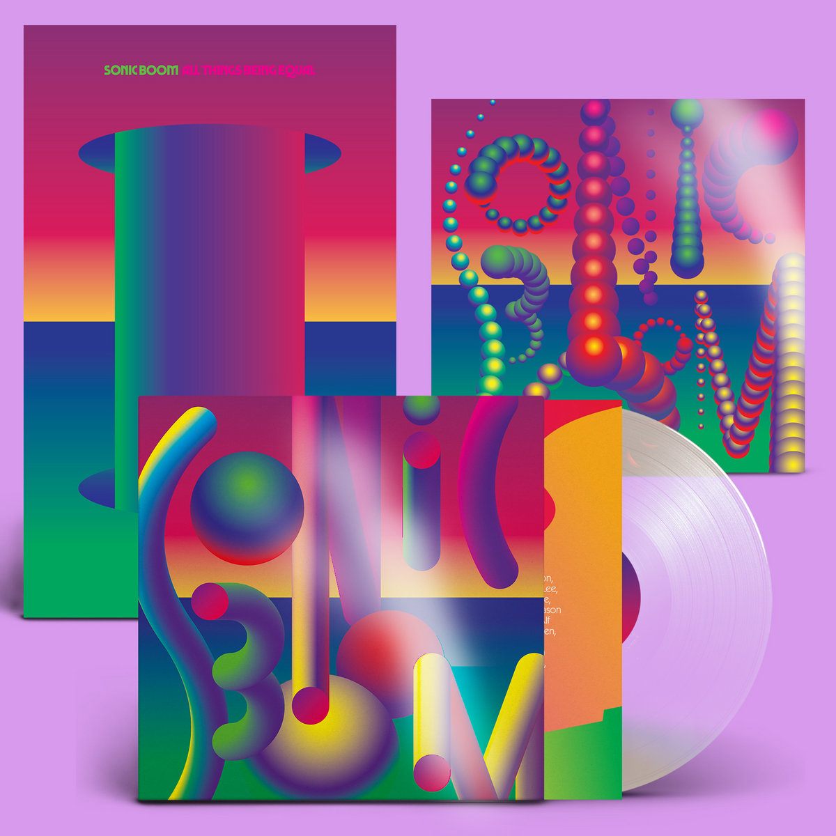
Sonic Boom – All Things Being Equal (Carpark Records)
I wanted to have a deep contrast and perspective in the artwork. I also wanted to use the geometric classical design alphabet associated with the space age era. Modulations of the simplest geometry. Smooth tones and curves. I also wanted to include a foil 12″ x 12″ insert, a poster, and have the download card even be an element of the whole. So even the non-[limited] edition LPs would be beautiful outside, but get more luxuriant and beautiful as you went inside.
I’ve worked with Marco Papiro on a number of sleeves now, and it’s always an evolving process. Initially, we talk and I send reference pics — in this case, mostly household items from Italian plastics companies like Artemide, Kartell, Gedy and Guzzini — whom I feel best understood the language of plastic and its inherent strengths and qualities. Also the work of Verner Panton, who resided in the same Swiss town as Marco Papiro — Basel — [which is] incidentally also the home of Albert Hoffman, the discoverer of LSD. Related here, because I believe that psychedelics inform well many aspects of our lives, including our design and ergonomic needs and were certainly a big influence in my life, but also particularly in this sleeve.
Sounds: Sonic Boom
Sleeve Design: Sonic Boom & Marco Papiro
Sleeve Layout: Marco Papiro
Production: Alec Moss
Production Liaison: Michael Black at Precision Pressing in the USA & GZ in the Czech Republic
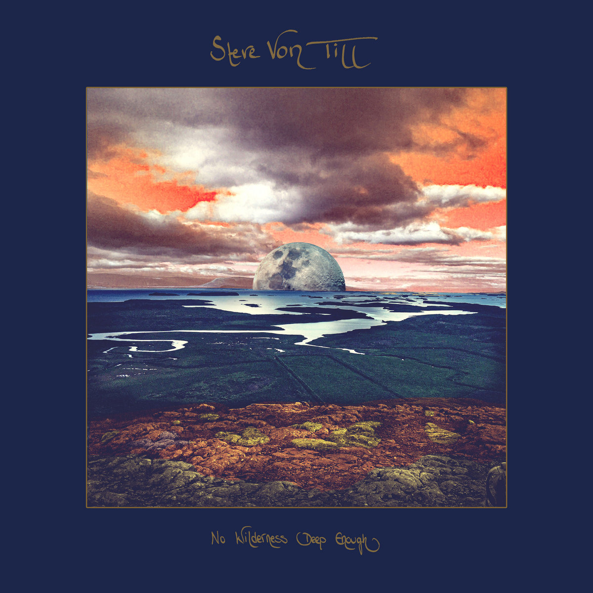
Steve Von Till – No Wilderness Deep Enough (Neurot Recordings)
Via Talkhouse:
Lyrically, No Wilderness Deep Enough touches on themes essential to living in the world around us, as well as co-existing with ourselves and others. “It’s about personal longings and loss, and the loves and insecurities we all feel combined with meditations on humanity as a whole,” Von Till explains while discussing his main artistic aims behind the album, as well as his poetic expressions captured in Harvestman. “I’m exploring the great disconnect: from the natural world, from each other, and ultimately from ourselves—trying to find meaning and depth in re-establishing those connections, to find a resonance in purpose and acknowledging the past while looking towards the future and still being in the moment.”
Sounds: Steve Von Till
The album comes paired with Von Till’s debut book, Harvestman: 23 Untitled Poems and Collected Lyrics which offers a voice of existential wisdom and experience to provide comfort and perspective in an era of uncharted territory.
EXPLORE ALBUM COVERS OF THE YEAR:


thank you very much, I have been waiting for your return for a long time !!