COLLAGE & MIXED MEDIA

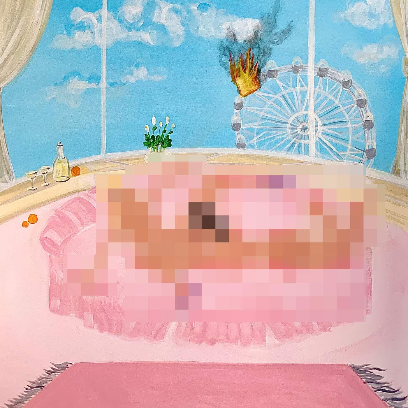
Cut Copy – Freeze, Melt (Cutters Records)
dan whitford (Cut Copy):
For me, the natural environment was of key importance to the music on our recent album, Freeze, Melt. I had relocated to a completely different part of the world (Denmark) when I started writing the songs for the album. And I think the cold stark environment in winter had a really profound effect on me, particularly because I’d grown up in Australia, where the seasons are not very distinct. This new environment felt really potent and alien to me. I was thinking a lot about the seasons and also the different emotional states described in the songs and wanted to express this cycle between warmth and coldness in the artwork. To convey this idea of freezing and melting I had the idea of using a temperature scale, but instead of being literal, I happened upon the concept of using simple coloured dots in the corners of the cover to show these two extremes. This combined with the rather beautiful photograph by Japanese artist Asako Narahashi conveyed the emotion that I felt in the music.
After creating a cover for the album, I started looking at ways to continue the theme across all the single artwork for songs from the album and also the remixes. It seemed pretty obvious to me that the coloured dots around the edge of the cover were a great way to continue the theme that had been established on the cover. Initially we looked at having different photographs for each single as well as coloured dots. But in the end we felt the theme was stronger with just one photograph used throughout the campaign as the hero image on the album cover, and then each single artwork created using flat colours. Therefore creating a naturing hierarchy. It’s an obvious reference, but the simple colours are almost a nod to designers like Peter Saville or Karel Martens, whose artwork is simple, colourful but so iconic when sitting on a record store shelf.
Sounds: Cut Copy
Artwork: dan whitford of Cut Copy and Rick Milovanovic
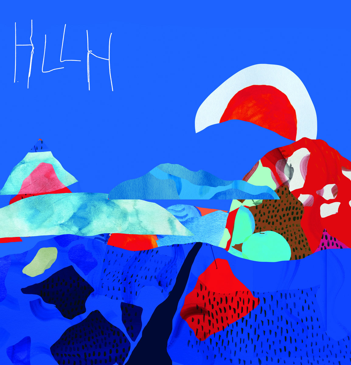
Cut Off Your Hands – HLLH (Super Fuzz)
Sounds: Cut Off Your Hands
Artwork: Joel Kefali
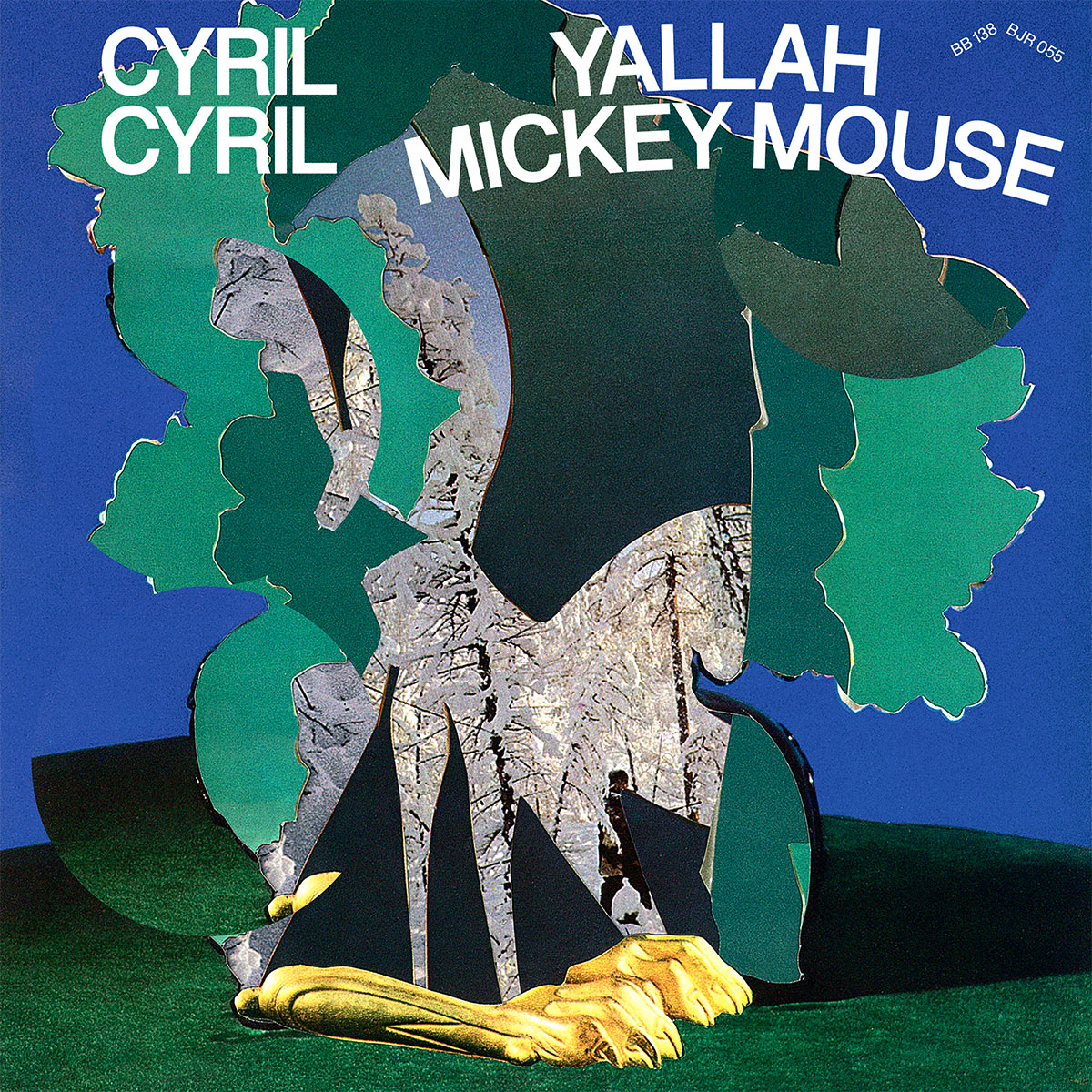
Cyril Cyril – Yallah Mickey Mouse (Bongo Joe Records)
Cyril Yeterian (Cyril Cyril):
Our lyrics are a blend of surrealistic poetry and politically oriented punchlines. Our music is kind of special and hard to describe. Rooted in so many different influences as well as very personal. Each time someone listens to it, we discover new aspects of what our music expresses. This time Mâra, decided use graphic pasting with different elements that fits well to our musical world. If you look well, you can discover a hunter in the winter’s forest; you can notice a horse as well (Trojan horse?), golden claws. All those images reveal our obsessions to history and cyclicality of human destiny.
The title of the album Yallah Mickey Mouse comes from an Egyptian camel we rode while touring in middle east. We had played in Cairo and we went to see the pyramids. One of camel’s name was Mickey Mouse and to have him walk we had to constantly encourage it with yallahs. So we kept it as a very funny story to tell, then it became a song name then our new album’s title!
Relations between United States and the Arabic world have always been very [conflict-ridden] and Yallah Mickey Mouse fits well to our wish of creating a music rooted in Western and well as Eastern world. Some of our songs are sung in arabic (Cyril Yeterian has Lebanese origins).
Sounds: Cyril Cyril
Artwork: Mâra Krastina & David Mamie
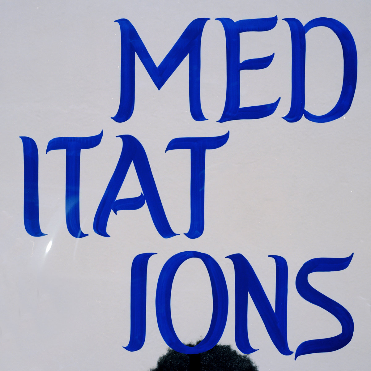
Caleb Giles – Meditations
Caleb Giles (Musician):
Conceptually, all I knew is that I wanted the colors on the cover to be blue and white. I toyed with the cover being just text, but cycled through many ideas before coming back to my initial idea. Once the idea was solidified, I brought it to Devlin, and he immediately knew where to take it. I referenced a sign I saw once in Harlem, that he also, incidentally, took note of years ago. Devlin took the idea to his homie Mat Rousso, and the rest is what you see now.
Devlin Claro-Resetar (Photographer):
Caleb and I agreed it was important that the cover be simple and bold, to not detract from all of the richness already packed into the album sonically. He’d given me a reference photo of some typography that he and I both noticed independent from one another, on separate trips uptown. Years back. Probably four years back by now. We talked about the immediacy and uniqueness of a sign painted by hand. How it feels like it needs to exist more. If you’re picking up a brush and finding some paint and a substrate because you need to tell people something right now and put it on the street for them to see. I think we liked that idea better than manipulating some type on-screen and having the cover only ever exist digitally. It felt similar to why he needed to make the music. The letters are actually painted on a small pane of glass which we then photographed against different backdrops to achieve a kind of live-action graphic design.
We have 50 or so negatives of Caleb holding the glass in different settings. We were pretty excited to experiment when we shot the photos, and I don’t think it’ll be the last time we use a technique like this.
It’s imperative to credit Mat “Matty Hands” Rousso, the sign painter in Queens who interpreted the typography and painted the actual letters on glass. I took our layouts to him, and he’s actually so finesse I had to tell him to let loose a little bit and introduce some wonkiness.
Sounds & Model: Caleb Giles
Photographer and Idea Elevator: Devlin Claro-Resetar
Sign Painter/Glass Painter for Typography: Mat Rousso

Claude Glass – Isekai EP (Syndicate / Alpha Pup Records)
Marc Gabriel Loh (Visual Artist):
Isekai is Japanese for “different world,” and in this, I tried to create the whimsical world of Claude Glass with imagery — inspired by the metaphors and narratives in the lyrics, anecdotes of his own experiences, as well as the media he consumes– — thrown together in a way that attempts to capture the vivid, maximalist nature of the music.
While technically classified as electronic, Claude Glass’ music draws a lot of groove and melodic inspiration from bossa nova and jazz. I wanted to draw focus to these more underlying elements, and steered clear of a purely digital aesthetic. Inspired by Claude’s meticulous process of recording instruments, chopping them up and running them through filters to make his beats, I strove for a similar approach. Making it a point to be a bit more explorative than i usually am, I experimented with chopping up the composition into layers and processing each layer with a printer and a scanner in different ways, which created textures and imperfections. Then I reassembled the image and uncovered an aesthetic reminiscent of an old screenprint, framing the album in a way that could maybe prompt the listener to look beyond the electronic surface.
Claude Glass (Musician):
The album’s title, Isekai, translates from Japanese to English to mean “different world”, and is a genre of anime that involves the “accidental travel” of a protagonist(s) from one reality to another – often against their will. Oftentimes set in a fantasy world, this transportation alludes to my own struggles with reality, and connects to my consumption and creation of media and art.
The idea of a portal was an important part aspect of the album and its artwork – as a main device for this “accidental travel.” At the same time, the ornamentation and embellishments in the artwork – for example, the spiral drill and threaded string were elements that connected to specific songs, such as “Isekai (Accidental Spirals)” and “dead knot,” respectively.
Sounds: Claude Glass
Artwork: Marc Gabriel Loh
Photography: Marc Gabriel Loh & Sadiq Mansor


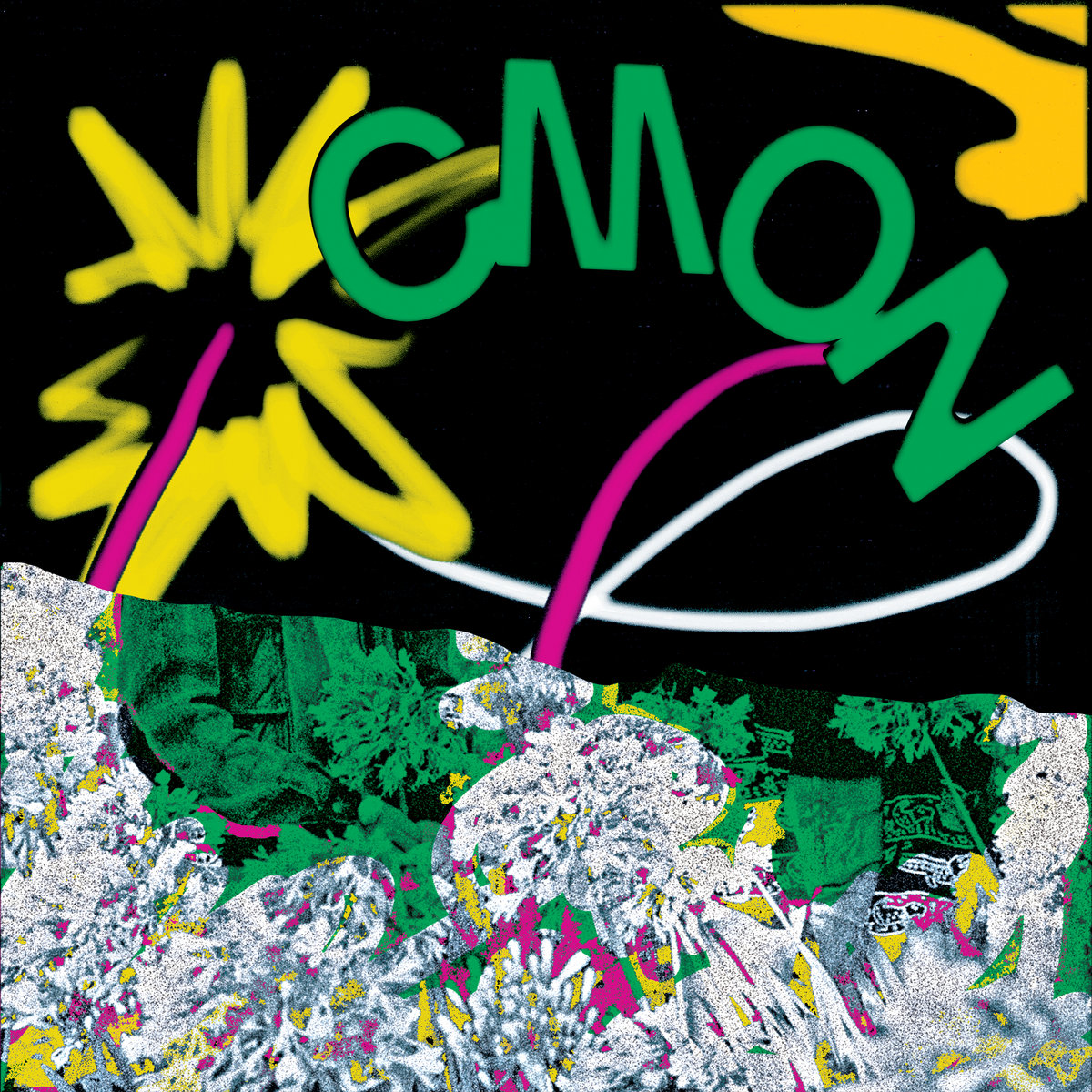
CMON – Confusing Mix of Nations (Mexican Summer)
Josh da Costa (CMON):
I wasn’t looking for something too thematic or meaningful, just something eye-catching and reminiscent of some of the more memorable albums I’ve listened to and encountered over the years of digging through tons of bins at used record shops around the world. Keywords: crude, vibrant, sketchy, shocking, saturated, clashy. References were records by Flying Lizards, Chrome, Happy Mondays, Dunkelziffer .. The final product ended up somewhere in Italo Disco land, pretty similar to Brand Image’s “Are You Loving” 12″… a track I couldn’t care less about, but the sleeve rules !!
Sounds: CMON
Graphic Designer: Bailey Elder
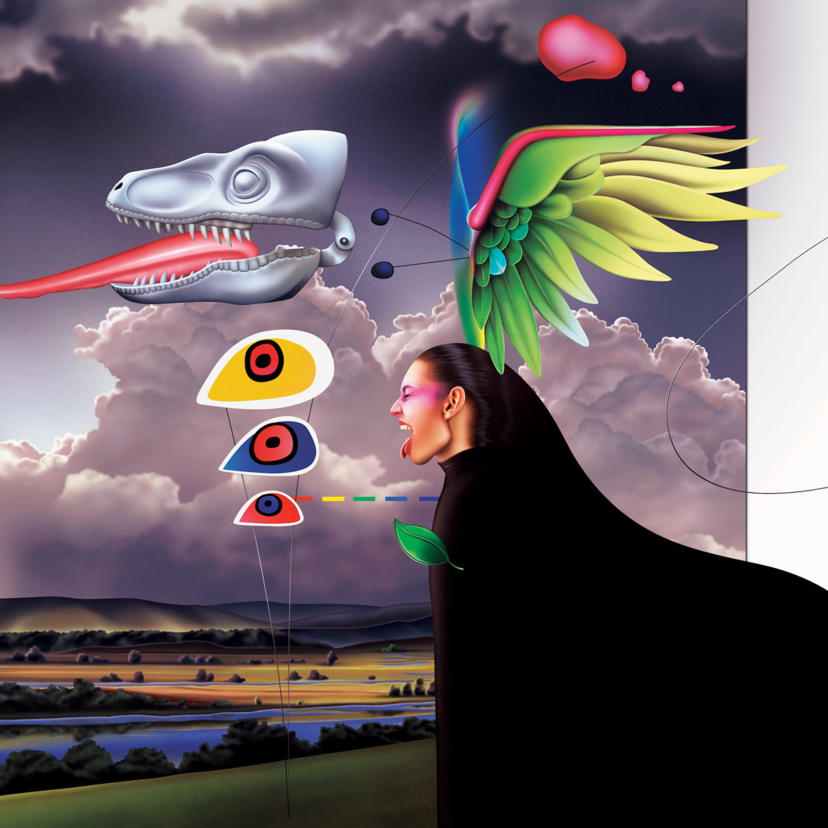
Diamond Soul – Maya’mi (Orange Milk Records)
Keith Rankin (Visual Artist):
The main idea behind the art was starting with a collage and then recreating it from the ground up in Photoshop, which is really how a lot of my pieces come about. The Diamond Soul music had particular relevance with that method though, because it has that same heavy edited feel, mixing genre, timbre, different eras of sound.
Sounds: Diamond Soul
Artwork: Keith Rankin
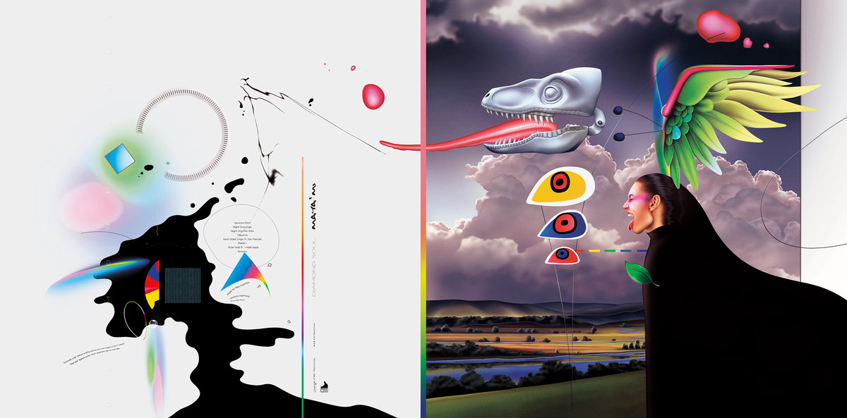
Keith Rankin (Visual Artist):
I knew the art was gonna be on vinyl, so I made kind of a diptych with the front and back cover images, it’s best seen that way I think:one side coming from a more abstract text and design mindset, and the other from a more painterly technical side.
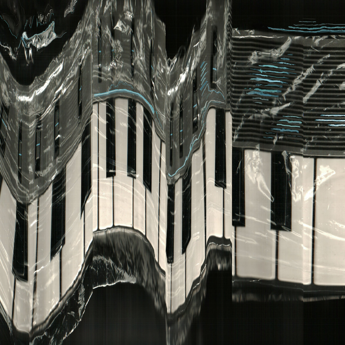
Dorian Concept – The Jitters (Brainfeeder)
Dorian Concept (Musician):
As the title suggests, The Jitters was a mixture of live-versions and outtakes from jams that were recorded in the process of my last album, The Nature Of Imitation. I wanted something that visually mirrors what my live show is about — me nervously and wildly improvising — and that’s why I went for a wobbly-scan of a small Yamaha Synthesizer (namely the CS01). It should somehow feel like a snapshot of what makes live music so special for me.
The process was pretty unusual — because I saran-wrapped a small keyboard to then capture with a hand-held scanner. The glow of the image, therefore, is just the reflection of the foil. But the real reason for the foil was so that I could smoothly move the scanner over the instrument. When scanning the synthesizer, I wildly moved my hands (similar to how I would play the keyboard) to create something similar to a musical “take.”
Sounds & Artwork: Dorian Concept

Entry – Detriment (Southern Lord Records)
Sounds: Entry
Photography: Katie Krulock
Layout: Emma Maatman
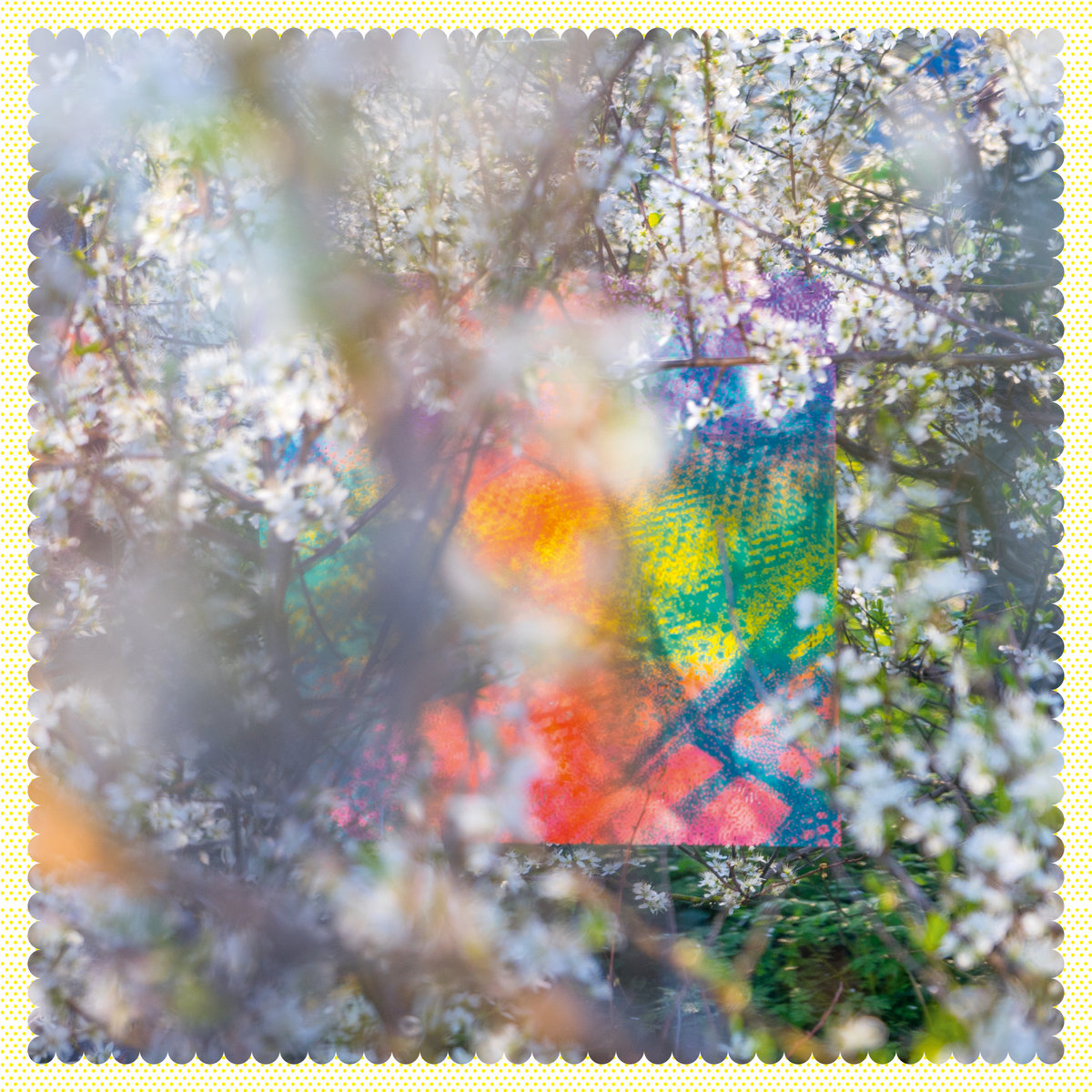
Four Tet – Sixteen Oceans (Text Records)
Jason Evans (Photographer & Art Director):
The artwork for Sixteen Oceans and its associated single releases is based around a “double-exposure” screenprint. I imagined this as a sort of futuristic QR code. In this print, photographs (from Kieran and myself, depicting happy times in our pasts) were put through diffusion dither filters and overlaid in opposing-pull directions in 3-colour gradient-flood prints; six colours in all. The print was applied to a range of surfaces which were then re-photographed (or motion-scanned) in a variety of settings / styles.
The front cover image features the print on a large plexi-mirror in a blossom tree. On the inside gatefold, working with long term collaborator Matt Cooper, we started combining these outcomes randomly using other diffusion dither scales to create further visual conundrums. A final process layer was added with a spot varnish. The polka-dot borders are a continuation from the stripes on New Energy cover and are inspired by Kazunari Hattori’s approach to CMYK print process.
Sounds: Four Tet
Photography & Art Direction: Jason Evans
Design: Matt Cooper
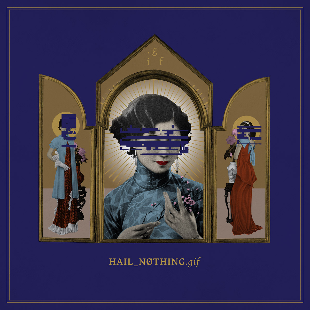
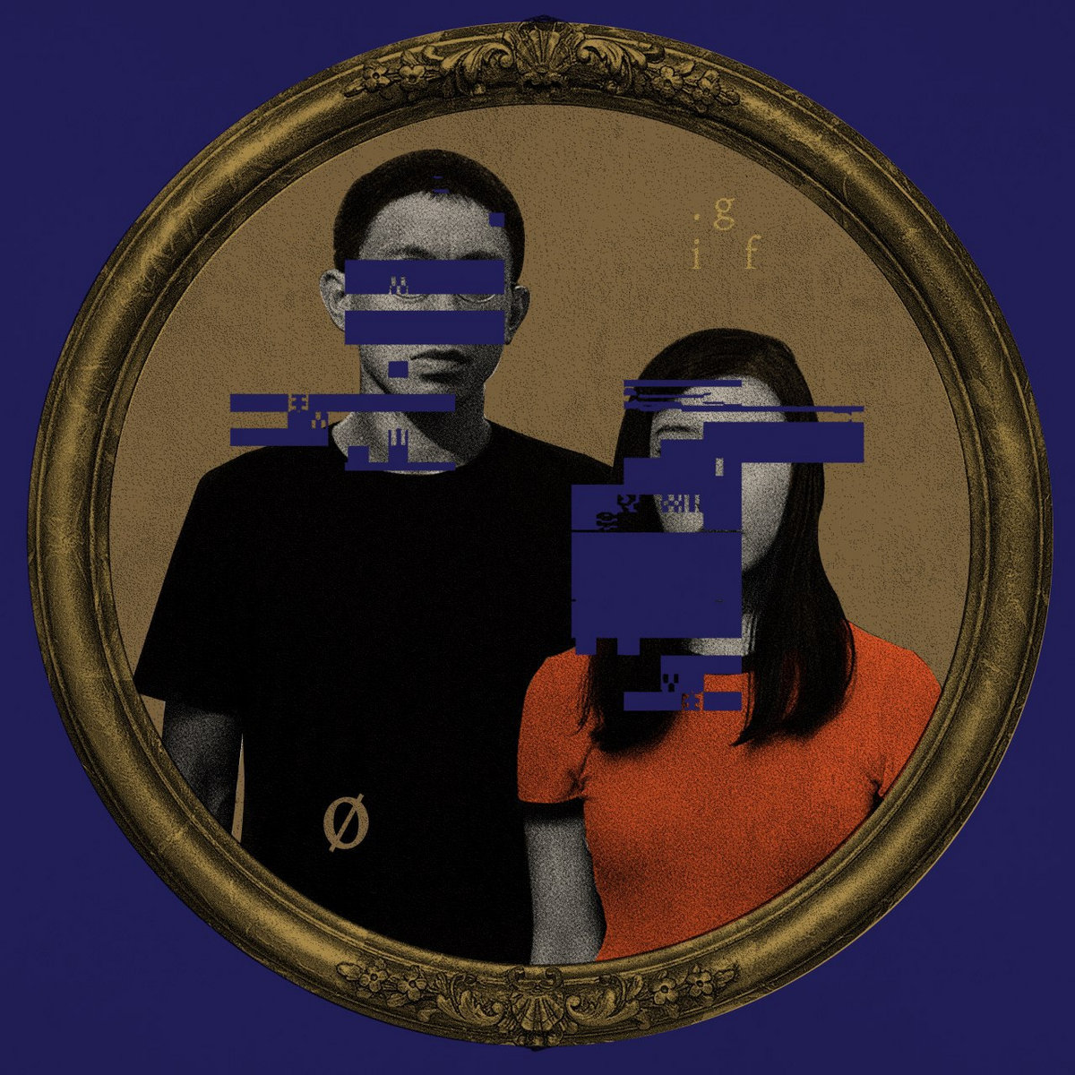
.gif – Hail Nothing (Syndicate)
Marc Gabriel Loh (Visual Artist):
It would be hard to discuss this album cover without reference to its predecessor, soma (2015, pictured below) — .gif’s previous record which had a nostalgic yet futuristic sound, and was all about displacement and disillusionment. For that album, I drew from the iconic women from old Shanghainese posters and thrust my subject into isolation, in outer space.
The concept behind Hail Nothing was a development; sort of a counterpoint to soma — no longer mourning but now embracing the notion that we are not special, or sacred, and celebrating that emptiness. So to convey that continuity, we used the Shanghainese woman as a starting point, this time glitching out her face and sort of erasing her identity and along with it, the sentiment of soma. To create an altar to erasure, and facelessness, I also drew on elements from old Catholic paintings and religious iconography. In line with that I chose a serif type reminiscent of old religious texts, subverting that with modern elements like the underscore and null symbol to reflect the stark, digital nature of the music.
weish (Vocalist of .gif):
In our collaborative process, there was a lot of dialogue, countless discarded drafts, and relentless questioning on Marc’s part. I appreciated how sensitive he was in responding to Hail Nothing, picking out the religious (well, more like a-religious) overtones in our lyrics. True enough, the album title is taken from ]Ernest] Hemingway’s nihilistic rendition of the Lord’s Prayer, “Hail nothing full of nothing, nothing is with thee.” This informed Marc’s use of religious imagery — the triptych, the shrine-like gold ornaments. To me, that triptych also looked like a changing room divider for the women, which created this uncanny balance between the grandiosity of “Hail” and the silent, domestic vulnerability of “Nothing”.
Sounds: .gif
Artwork: Marc Gabriel Loh

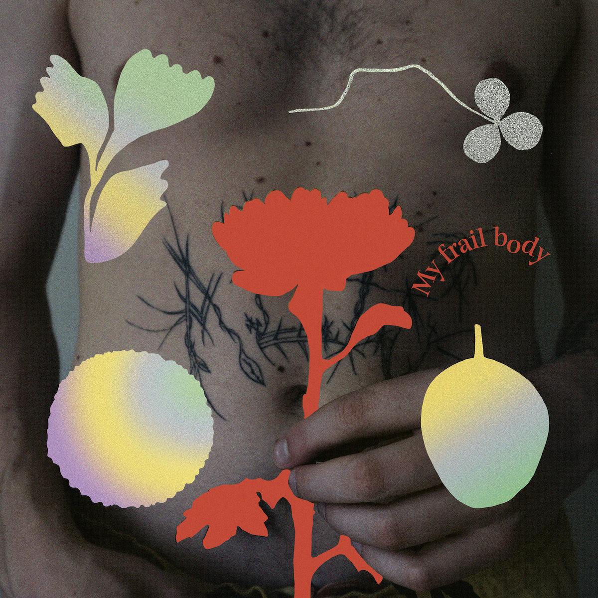
Gundelach – My Frail Body (U OK?)
Kai (Musician):
The conceptual idea that drove the creation of the album is the thought of the body being linked to nature in some way. Having recently been through a period of illness, the experience left me reflecting on how our bodies are deeply intertwined with our surroundings, a reflection that was forced in after an experience of some strong psychedelic mushrooms in wild nature, later on in this period.
Marie Steffensen (Designer):
The red flower being held on the front cover is somehow a symbol of the physicality Gundelach felt during the period of illness, and vulnerability that was felt towards nature, says the designer. The flower is accompanied by some leaves, three-leaf clover and puffy flower-shapes that were derived from our garden, pressed, dried, scanned and on a printer and enlarged digitally. This crafty approach and analogue technique ads on further to this concept of physicality.
The front and the back represent a psychological duality. On the front, the elements are presented in a square arrangement with the red flower in the center. The composition speaks a quiet language with its grounded arrangement in front of a calm body. But on the back, the same elements are spread out in an almost chaotic order, with wavy-bended typographic titles that represent a somewhat distorted mind, lost in a psychedelic trip in some forest in the Netherlands.
Sounds: Gundelach
Artwork & Design: Marie Steffensen

Hudson Mohawke
Mixtapes of old rarities, unreleased fan favorites, and unearthed gems, also available in a box set of three. The tracks date as far back as the mid-2000s, and as Hudson Mohawke explains, “There’s enough distance between this music now… At some point you have to set it free.”
Sounds: Hudson Mohawke
Artwork & Design: Cali Thornhill DeWitt
Boxset: Via Instagram

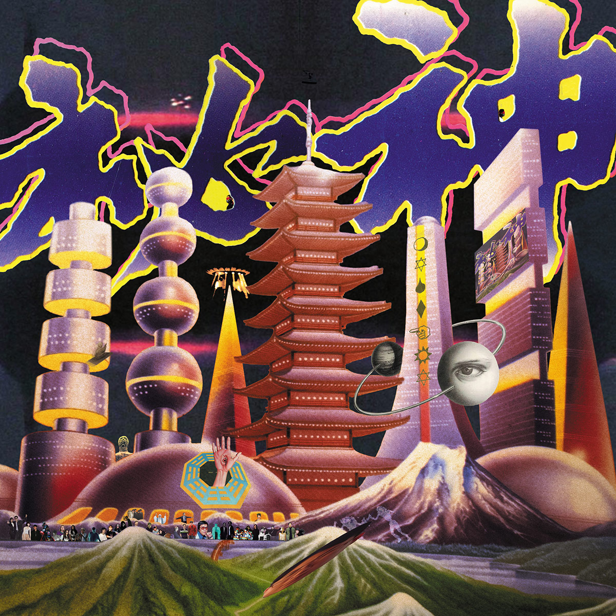
Mong Tong – Mystery 秘神 (Guruguru Brain)
Hom Yu & Jiun Chi (Musicians & Artists):
We collected many old books from our hometown about specific superstitions or conspiracy theories, trying to put them together to create a fictional world: all the superstitions are real, with ancient cities, high tech and psychedelic music. Based on the story, we built an impression through our music and artwork.
Sounds & Artwork: Mong Tong
Hom Yu’s Old Book Collection: Via Instagram
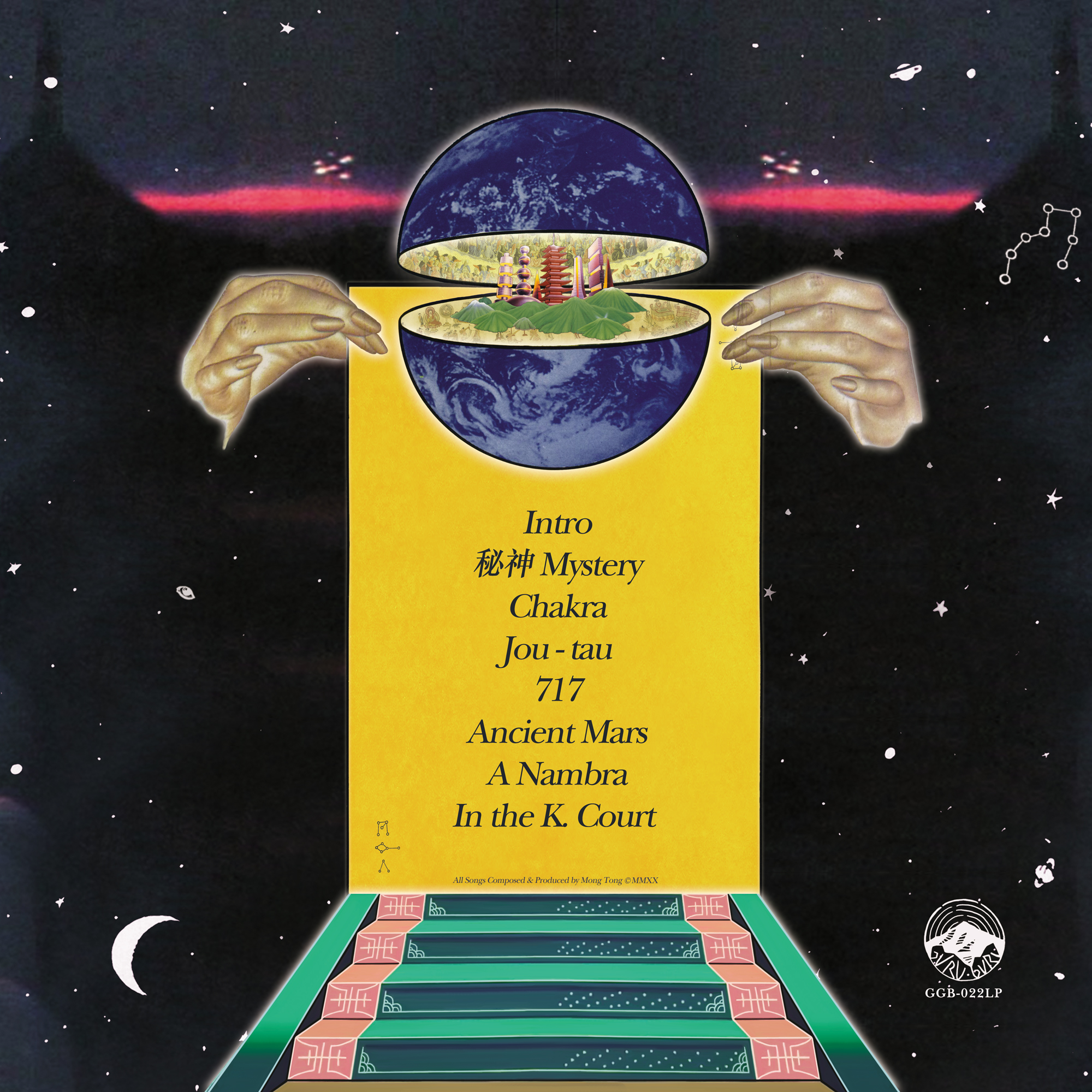

In fact, we put many puzzles in the artwork, too. Have you ever wondered who the third member of Mong Tong is? Its name is 仝 and you only can see it on a certain angle from the physical art cover, like Hans Holbein the Younger did in his famous painting, The Ambassadors.
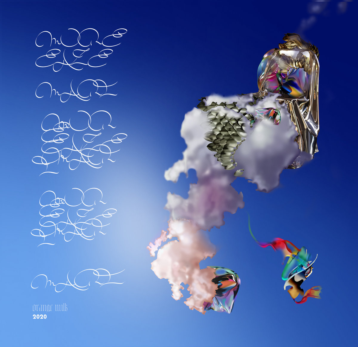
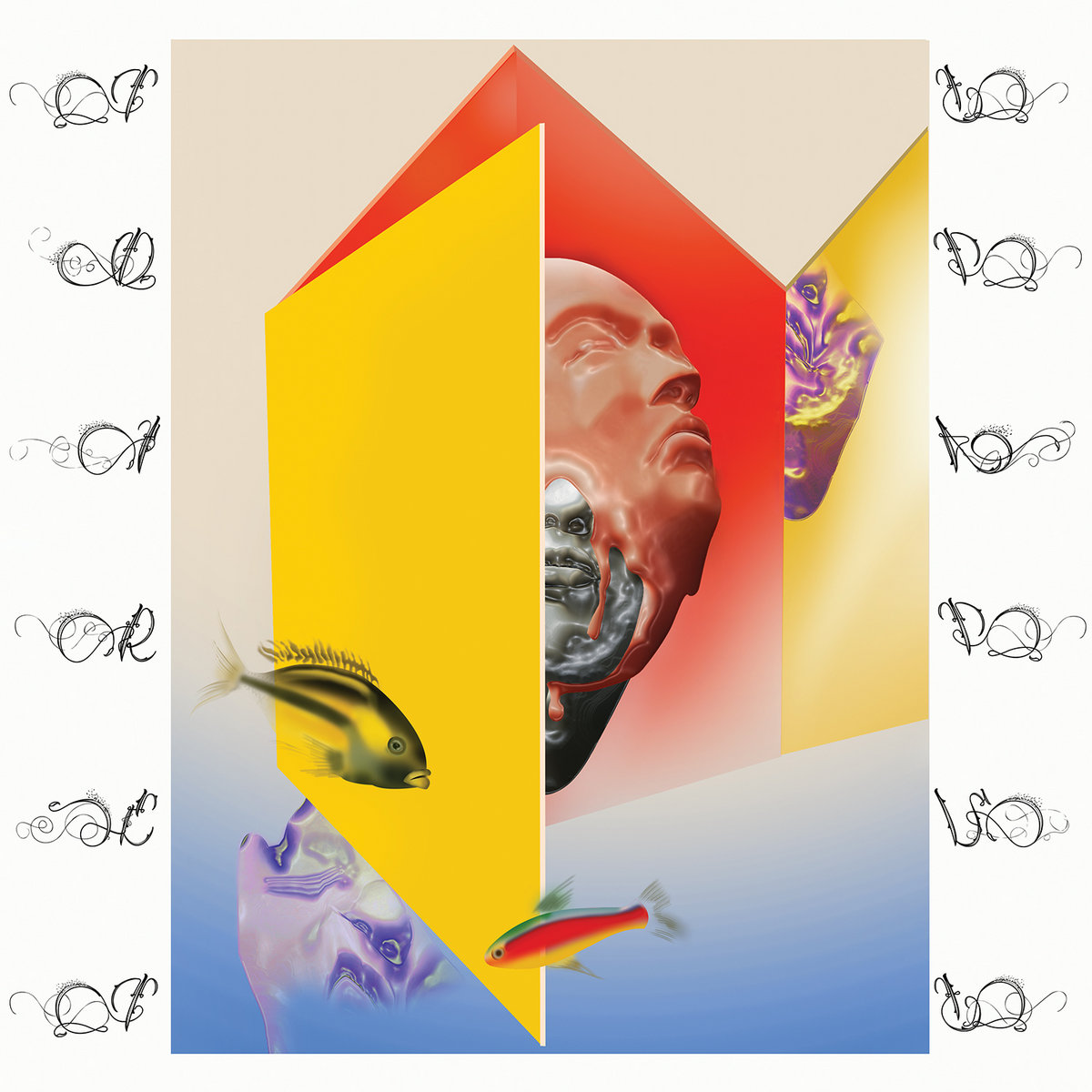
More Eaze – Mari (Orange Milk Records)
Seth Graham (Artist):
Mari was interested in chairs, so I rendered this silver glitter glam looking chair. It took over 30 hours to do; maybe overdid it on that one…
The More Eaze album is called Mari, and this was Mari coming out with a name change as a trans woman. I felt like the ascension from the sky somewhat meant a rebirth, like god, so the chair also symbolizes royalty and glamour. To me, the chair and odd things bursting from it symbolize re-birth, change, and something new.
Sounds: More Eaze
Artwork: Seth Graham
Observe since ’98 – Royaume Du Sauvage (Loretta Records)
Sounds: Observe since ’98
Art Direction & Design: Le Daltonien & Pablo Thunder
Variant Vinyl Art: Jordan Commandeur
Video: Corey Gipson

Rey Pila – Velox Veritas (Arts & Crafts México)
Rey Pila (Musicians):
For Velox Veritas, our third LP, we decided to work with a good friend of the band and an amazing Mexican artist, Dr. Lakra. Lakra swings between the world of tattooing (inking up people since the ’80s) and the world of fine art (represented by one of the coolest Mexican galleries, Kurimanzutto, and having his work as part of the MOMA collection, among others). In the music realm, Lakra is a huge vinyl collector with the broadest and best taste in music. His brain is also a hard drive of album covers; a lot of times using these covers as part of his work…
For us, Rey Pila, even though we sometimes reference artists from the ’80s, ’70s… we always feel it’s important to bring them to our realm. I feel that this is exactly what Lakra did for Velox Veritas. He showed us a collection of old diapositives he found in one of the flea markets that he frequents. After seeing a bunch of them, the picture of the mannequin bride came up, and we immediately knew that was the one. Lakra added his magic and that’s how our cover came to be.
Sounds & Artwork: Rey Pila
Artwork: Dr. Lakra

Sis – Fingerpaint (Native Cat)
Jenny Gillespie Mason (Sis):
I knew I wanted something gentle and childlike in line with the idea of fingerpainting: a simple, intuitive creative process. In the song, to “fingerpaint” over the day — if the day was not a very happy or successful one — is to start anew with innocence and hope. I feel Amelia captured this beautifully in the dreamlike quality of the cover.
Sounds: Sis
Artwork: Amelia Heron
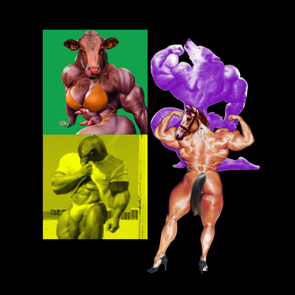
ShrapKnel – ShrapKnel (Backwoodz Studioz)
Kyle Tierce (Art Director & Designer):
Prem & Castro [of ShrapKnel] approached me in 2019 to create a bold aesthetic that would span the entirety of the release… My goal was to create something just short of visually overwhelming that would reflect the bombastic nature of their incredible music. I wanted it to feel somewhat futuristic and modernist, but with vignettes of collage hinting at a greater narrative. In the end, I drew inspiration from a series of daily exercises I had done in April of 2019 to build a set of motifs: a loosely-implied grid; warped and recontextualized images of explosions; rectangular collage elements and thin geometric figures. The entire look is tied together by the looming presence of ISO 7010 – W002: the universal “warning, explosive material” symbol, which I’ve always thought was dope and was one of the first things that came to mind when I started working on the project.
Sounds: ShrapKnel
Art Direction & Design: Kyle Tierce for Memetic Supply Co / Tierce.Design
![]()
Spook the Horses – Empty Body (Pelagic Records)
Spook the Horses (Musician):
Empty Body is a record that is sonically and thematically extremely heavy and noisy, so we strove to match that level of energy, distortion and abrasion visually. Intentionally forcing in otherwise unacceptable amounts of film grain, deliberately throwing all colour theory out the window to create jarring and unsettling combinations (including a highlighter yellow spine on the LP cover) and portraying partially recognizable humanoid figures appearing to be pulled and warped to the point of near disintegration was an attempt to visually complement the overwhelming amount of gain and distortion from the musical instruments. The asymmetric composition and collage-like aesthetic employed further hints at the idea of things being held together by a thread – with the intention of the artwork aiming to be migraine inducing, and representative of severe psychological distress.
Sounds & Artwork: Spook the Horses

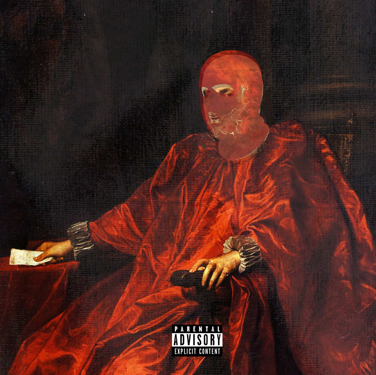
TOBACCO – Wet, Hot and Sassy (Ghostly International)
TOBACCO (Musician):
All my covers start out just playing around until something clicks. Just like the music. This one was 3 masks I have, combined, with the least human on the bottom to cleanest face on top. Manipulated until I got a shape that felt like the album sounds. There’s another take that shows up inside the physical versions and was used for the “Centaur Skin” single that I go back and forth on. Maybe it should’ve been the cover. It was too on the nose. But I love them both, so I don’t know.
Sounds & Artwork: TOBACCO
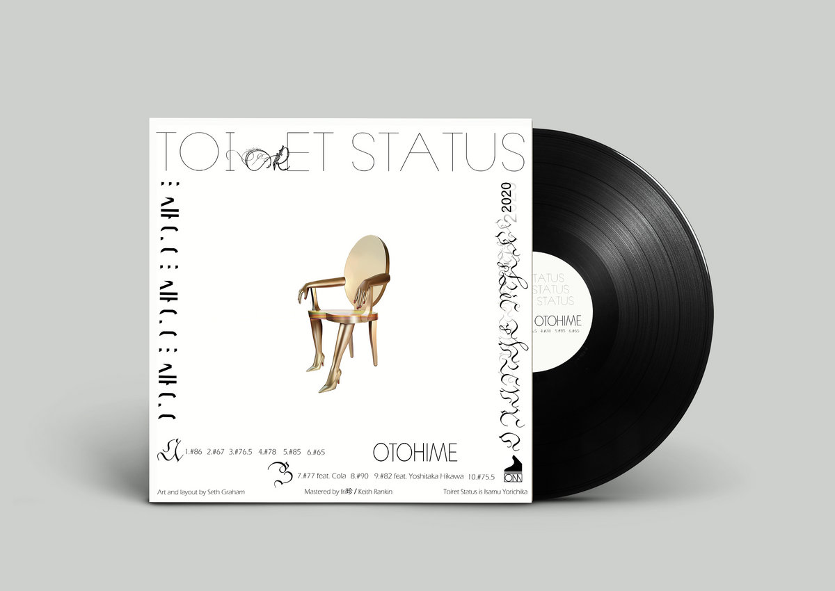
toiret status – OTOHIME (Orange Milk Records)
Seth Graham (Artist):
The [musician] wanted bright, colorful, opaque colors to contrast the aggressive music. The title OTOHIME is about an undersea princess, the fish symbolizing the undersea. The melting double face to me felt like how Toiret Status music feels: expressive, layered, and melting.
I was excited to do the cover; I played a show with toiret status in Fukuoka Japan 2 years ago. The show took place on a sumo ring in a shrine. I watched Isamu [of toiret status] perform a set with game controllers on a sumo rink, it was really memorable. I felt honored that he let me do his cover.
Sounds: toiret status
Artwork: Seth Graham
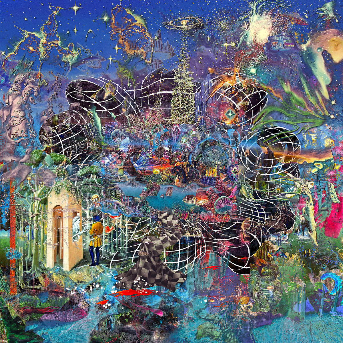
Vinyl Williams – Azure (Requiem Pour Un Twister)
Vinyl Williams (Musician & Visual Artist):
The art for Azure was created as an automatic & intuitive process of collaging 50 paintings for the front and back cover. The impetus behind the selection of imagery was to provide gateways into an imaginary exoplanet paradise, displaying a behind-the-curtain view at how huge invisible forces in the universe cause so much beautiful growth & expansion, through the feedback-system between the stars & the quantum world. Most of my work is meant to invoke a cathartic feeling of bliss & paradise within.
I usually don’t give myself too many options – similar to how I never make demos – the demo is always the final recording. The collage created for the front cover was the only option I gave myself.
It was a process of collecting 50 images of paintings by James McCarthy, Gilbert Williams, Wojtek Siudmak, Raffaelo Ossola, Gustave Moreau, Bruce Pennington, Aec Interesni Kazki, Jim Shaw, David Chewing Lee, David Hardy, Adrian Kenyon, Dustin Yellin, Neo Rauch, Marty Morales, Kate Klingbeil, Shane Moulton, Jordan Speer, Kay Nielsen, Ton Haring, Tuco Amalfi, Mario Martinez, Derek Carpenter, Luke Schroeder, Jonathan Solter, Toshio Matsumoto, James Sienna, Yoshi Sodeoka, Adolph Schaller, Remedios Varo, Roger Dean, Marcelo Germana, Henry Hudson, Sergio Macedo, Waldemar Borowski, Micah Ofstedahl, Christian Riese Lassen, Tokyo Aoyama, Carlos Ochagavia, Derek Sabiston, Brian Cooper, Sam Balfus, Michael Macari, Elvis Barlow Smith, Hiro Isono, Tsunehisa Kimura, Jacquelyn Blair, Rodeny Matthews, Robert McCall, & Vangel Naumovski.
Sounds & Artwork: Vinyl Williams
EXPLORE ALBUM COVERS OF THE YEAR:


thank you very much, I have been waiting for your return for a long time !!