PRODUCTION & SET DESIGN
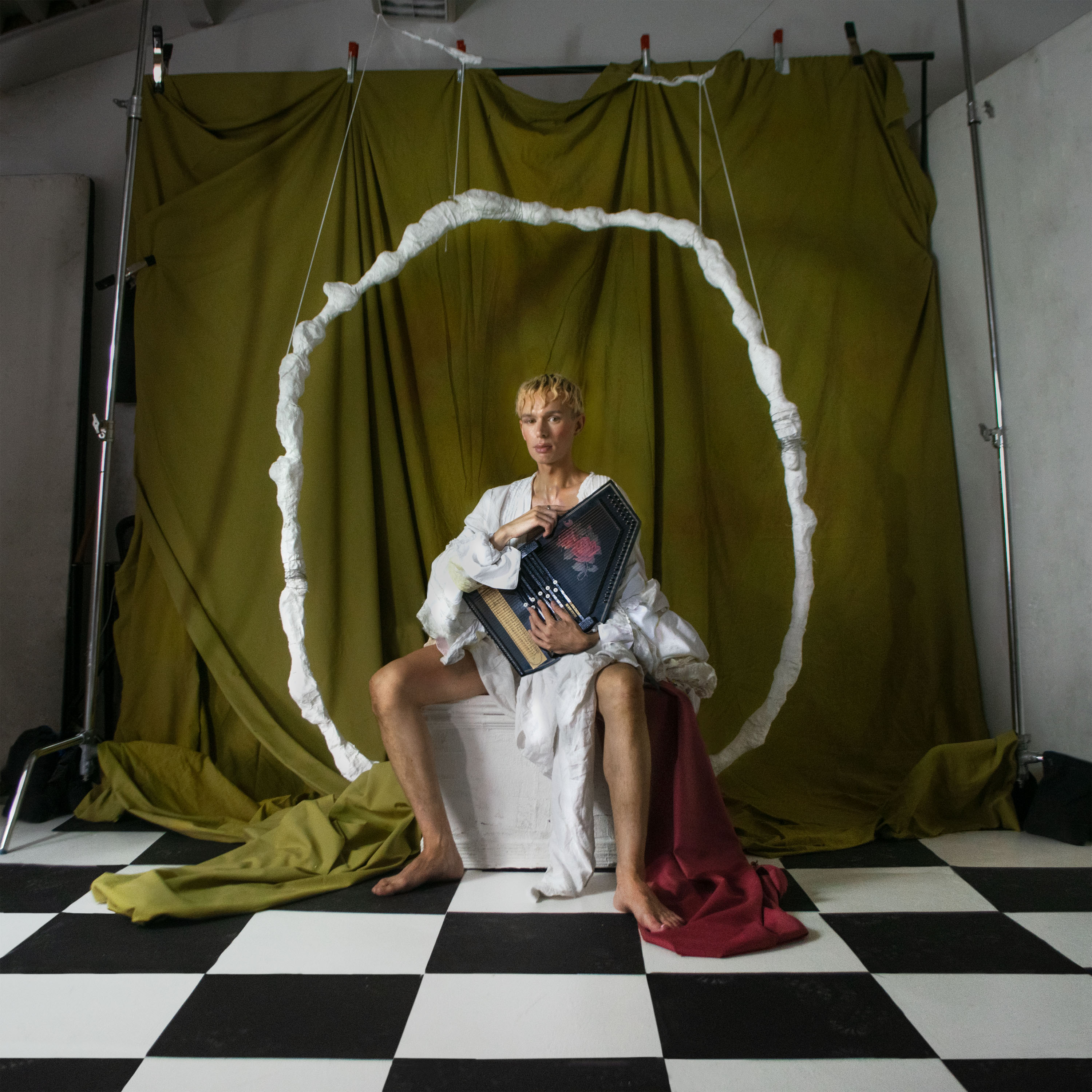
Douglas Dare – Milkteeth (Erased Tapes)
Douglas Dare (Musician):
For me, I trusted Furmaan’s interpretation of the music and I loved the apparent themes in their previous work of grandeur, androgyny and a dark playfulness. The only things I insisted on were colour and getting to dress up, as this related directly to my ideas of ‘memories of childhood’, which the album is based on.
Furmaan Ahmed (Photographer & Designer):
When drawing up ideas of the cover image, I was really inspired by the rules of Renaissance paintings and art. It’s a kind of idealisation of beauty and perfection, and when thinking about memories and how we relate to them, I think it was natural to think about Botticelli-like, Biblical and self-mythologising imagery. The set, image and how Douglas sits in the seat were designed like a theatre stage, in 3 parts; I was trying to create this feeling of a very constructed reality. The halo behind Douglas which frames him is made of plaster which is a little nod to the sculptures of the classical era, yet it’s suspended very badly by some very cheap yarn.
Douglas Dare (Musician):
Originally, the idea was to Photoshop out the backdrop stands and make it look like a giant seamless curtain but we kept coming back to the raw image that showed all the behind the scenes. I loved this because it showed the audience that this was playing dress up, make-believe and not taking itself too seriously. I think it’s also fun that the floor tiles are just pieces of paper that Furmaan cut and laid out on the floor.
Sounds: Douglas Dare
Photography & Design: Furmaan Ahmed
Lyric Video: Alex Kozobolis
Custom Earrings: Haus of Gugu
Flower Interpretation: Harriet Parry
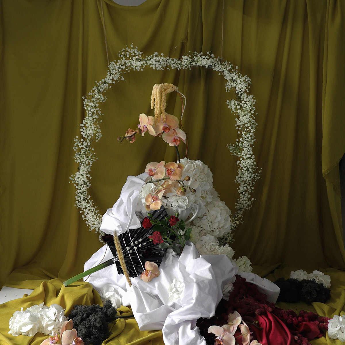
Douglas Dare (Musician):
Harriet Parry created a flower interpretation of the cover which had such a striking resemblance to the photograph that we used it for an insert, an alternative cover and a stop-motion lyric video. She is amazingly talented, interpreting famous classical artworks to modern portraits, all using different types of flowers.
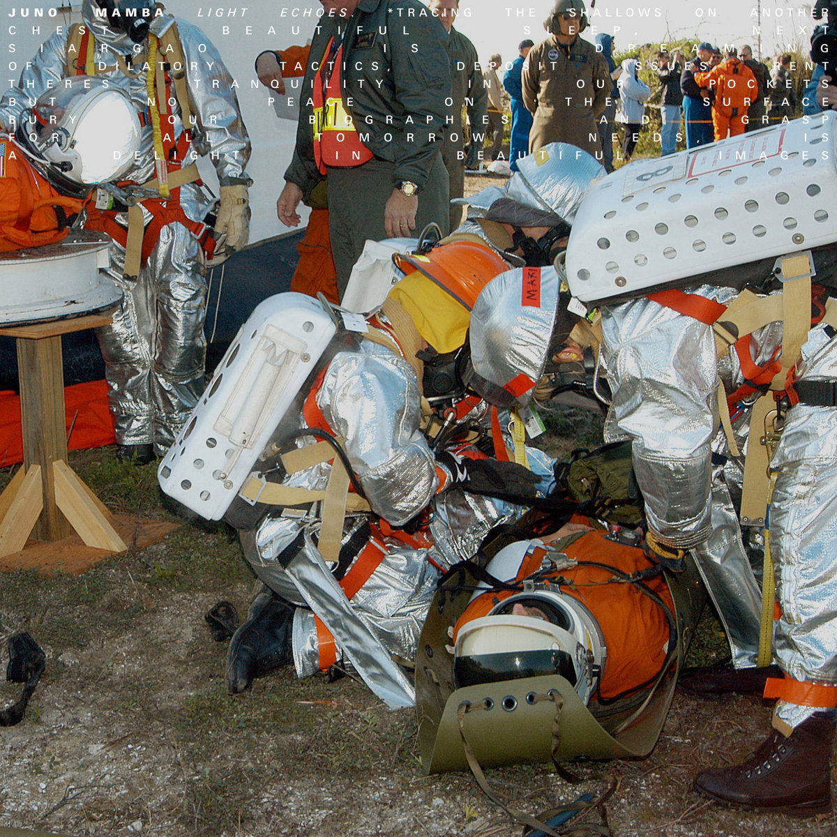
Juno Mamba – Light Echoes EP (Soothsayer)
Vinci Andanar (Juno Mamba):
Musically, Light Echoes represents self-discovery through exploration and experimentation. It represents my curiosity of the world; past, present and future and being at peace with the unknown. These were the themes that informed the direction of the artwork. The goal was to create something that would draw the viewer in and invite them to analyse and interpret the artwork and music in their own way.
When it came time to creating the video for “Blossom”, we knew that it needed to cover all the themes and be “out of this world.” Again, we wanted it to be relatable to the viewer but also allow them to draw their own conclusions. I’m obsessed with how things are connected in this world; and this translates to the music I make. If you listen closely to the songs, look carefully at the videos and analyse the artwork, you will notice threads connecting it all together, and there’s always more to discover.
Sounds: Juno Mamba
Artwork: Luke Brown
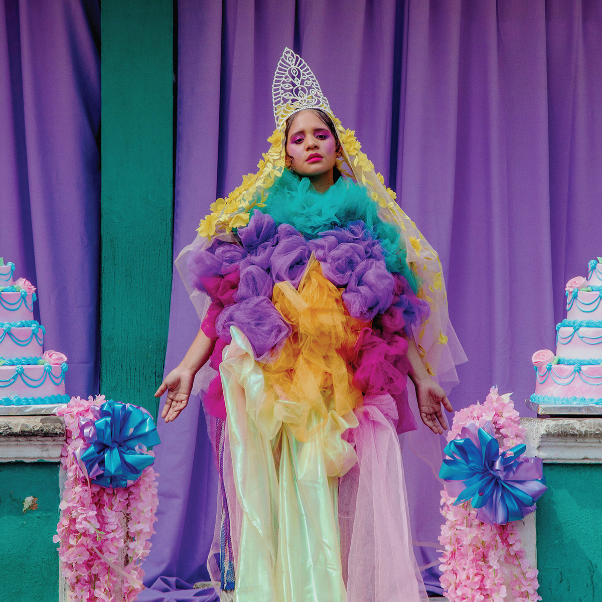
Lido Pimiento – Miss Colombia (ANTI-)
According to NPR:
Beauty pageants don’t often celebrate women like Pimienta, a Black Colombian woman of African and Indigenous Wayuu descent. On the album cover, Pimienta mirrors the classical tropes of the idealized Colombian woman in the stance of the Virgin Mary. She originally thought to recreate the sexed-up covers of the 14 Cañonazos Bailables series (think of it as Colombia’s ancestor to Now That’s What I Call Music), but opted for a Catholic image instead, exposing sinister intent under the guise of holiness.
“‘It starts when you get baptized and then you get your first communion,’ she explains of the anti-Blackness that young Colombian women internalize. ‘You become this perfect lady when you get your hair straightened for the first time. Strike one: You look Black. You got that Black blood in you. We need to thin that s*** out. Don’t be in the sun, straighten your hair, and put on this white dress for your first communion. You gotta look beautiful for the priests.’
“She laughs. ‘So I was like, how can I make a gay version of a wedding dress?'”
Sounds: Lido Pimienta
Photography: Daniel Murillo
Madeline Kenney – Sucker’s Lunch (Carpark Records)
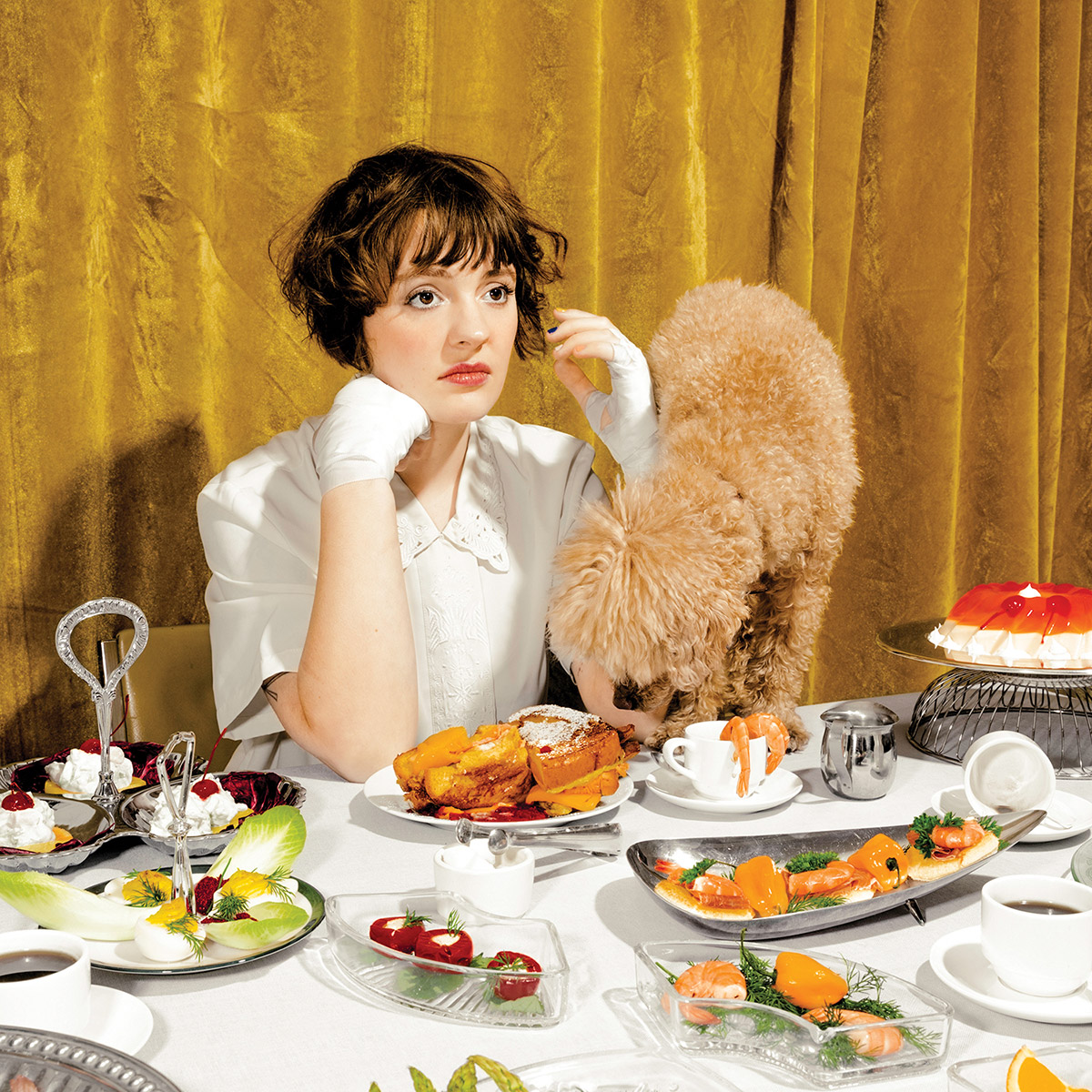
Thematically, Sucker’s Lunch sees Kenney soberly contrasting the risks and rewards of falling in love, eventually deciding to dive headfirst into her own foolishness and relish in the unknowing. “I’m not interested in something easy or immediately apparent,” Kenney says. “My experience writing these songs wasn’t easy, it was painful and difficult. I was terrified of falling in love, and as much as I’d like to write a sticky sweet song for someone, it doesn’t come naturally to me. Instead I wanted to explore the tiny moments; sitting alone in my room guessing what the other person was thinking, spiraling into a maze of logical reasons to bail and finding my way out again. When I spoke with friends about the theme of the ‘idiot’, it became apparent that everyone understood that feeling and was relieved to hear it echoed in someone else.”
Sounds: Madeline Kenney
Additional Credits: Via Instagram
Naeem – Startisha (37d03d)
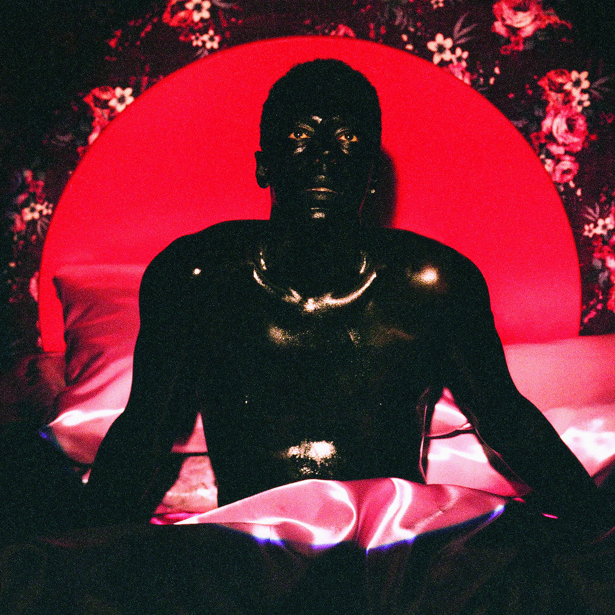
“Genesis, something coming from nothing, black, black holes giving birth to new universes.” – Naeem
Naeem:
I assembled a group of close friends from Philly, who I trusted with my image… [they] were completely supportive of the mood board I created, but also knew what I could and could not pull off. We all have crazy stories of each other partying throughout the years, so there was great comfort and positive energy on set. They all pushed me to be more ambitious than where the idea began, and got me in that body paint.
The image is homage to one of my favorite Kerry James Marshal paintings. I’ve never been envious of a figure in a painting before. But in this case, I wish I was her, so I put myself in the painting.
Sounds: Naeem
Photography: Shane McCauley
Styling: Trudy Nelson
Set Design: Sam McCurdy
Make Up Artist: Hadia Kabir
Design & Layout: Eric Timothy Carlson

NNAMDÏ – BRAT (Sooper Records)
Nnamdi (Musician):
The album themes cover different levels of want and need, from physical items, to intimacy, to mental stability. Throughout the tracks, there is sort of a longing present from song to song. Sometimes it’s somber and at other moments, it’s more playful. I think the album cover teeters towards the more playful direction. The concept was conceived in conjunction with the first video single for the song “Wasted,” that I kind of wanted to have some of the energy of a kids birthday gone awry.
Jess Myers Rigoni (Artist):
Nnamdi’s a visionary. When he approached me about working together again, I was thrilled to take up the challenge. Being a talented visual artist himself, he always has a vision for his work but never an oppressive one. Usually it’s encompassed in one sentence. For this cover, he sold me with “a sad kid’s birthday party goes awry” for both the album cover and the “Wasted” video. I feel like this record explored Nnamdi’s navigation of the line between want or need and how his feeling of deservingness and undeservingness plays into his humble character. The two elements, the album art and the video, seemed to me as extensions of one another. It seemed natural for the flow of one to bleed into the other, both in production and in the audience experience.
Sounds: NNAMDÏ
Artwork, Music Video Production & Direction: Jess Myers Rigoni of Union Division
Music Video Camera Work: Husni Ashiku
Music Video Direction: Sen Morimoto
Music Video Direction: Kaina
Jess Myers Rigoni (Artist):
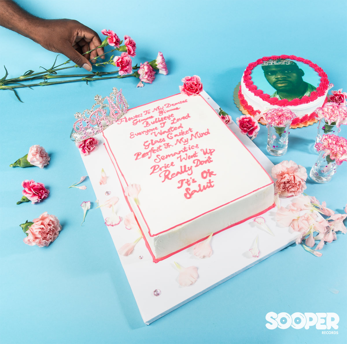
I loved working with the cakes on the back cover. The round cake with Nnamdi’s face on it was sort of accidental; the baker’s photo printed it in a sickly green color shift. That cake ended up being such a bizarre touch that I leaned into it; eventually we made it the central sticker on the vinyl.
Rituals of Mine – Hype Nostalgia (Carpark Records)
Rituals of Mine:
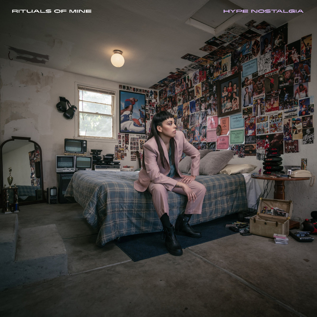
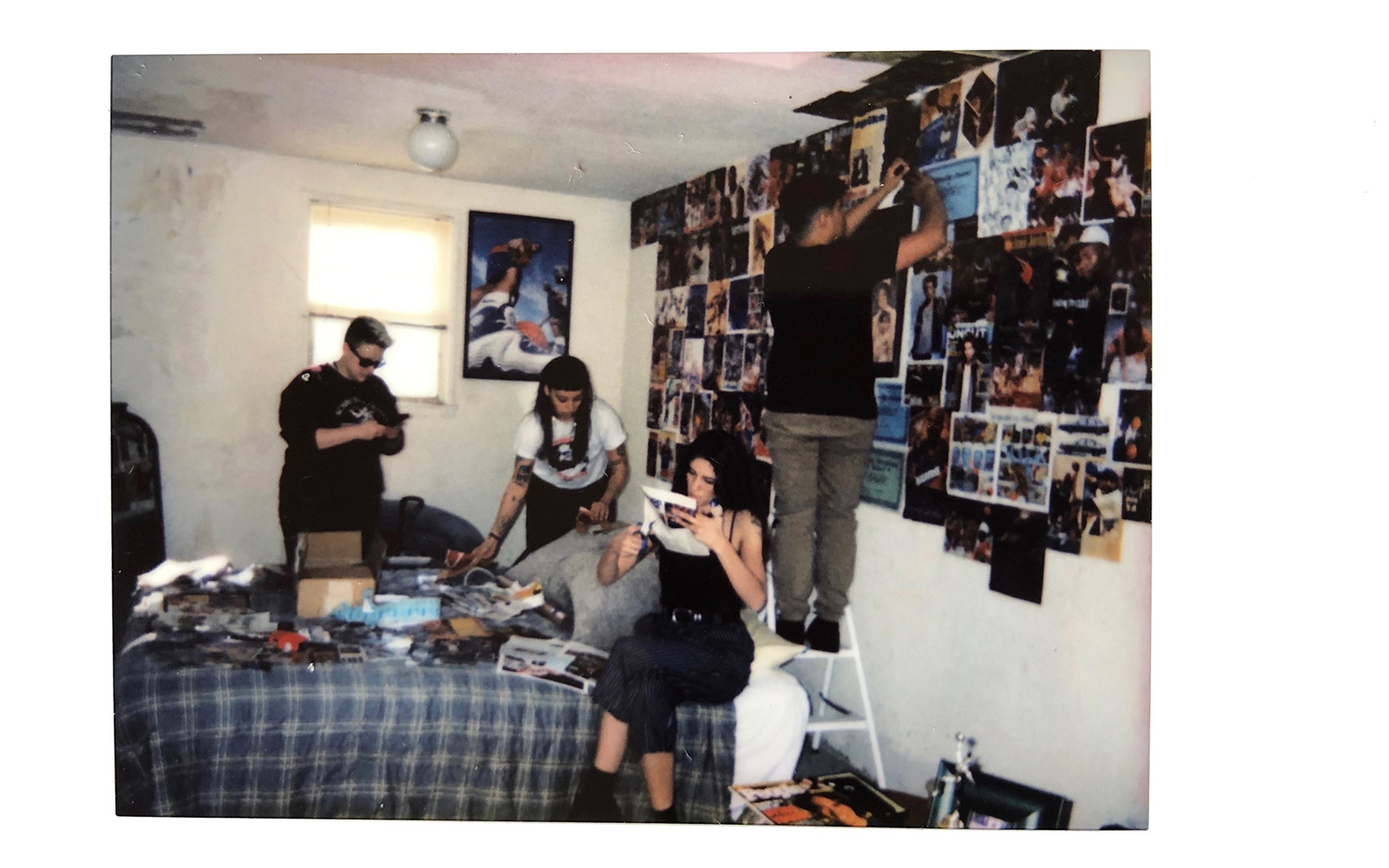
The album is deeply personal, so I knew that it had to have a personal album cover. My brother and I almost died in a house fire when we were kids. We were living in a renovated garage and the Christmas lights that were hanging outside of the house caught on fire. We were seconds away from dying in the fire. That’s never left me, and so when it came time to build out the bedroom, it was important to me to do so in a garage space. The record cover is drenched in symbolism and tells the story of my life in subtle and not so subtle ways. I wanted the album to tell its own story on its own and then to help build the story once you listen to the record.
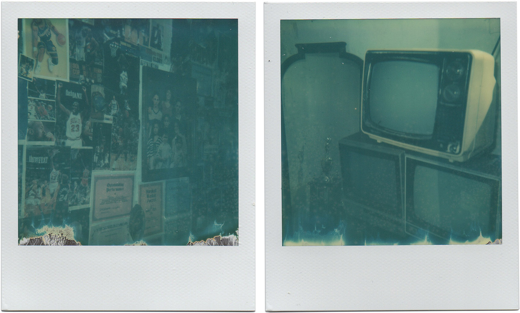
I knew that I wanted to recreate my teenage bedroom for the album artwork, because the entire album is about nostalgia and about how notalgia and memory inspires nearly everything that I do. Nostalgia has always been such a force in my life. I took old photos of my bedroom and the many different formations it was over the years and began sourcing out items from either my life (basketball trophies I had won, cassette tapes of mine, family photos, etc) and thrift shops. My partner and I scoured eBay, thrift stores and shops to find items from the 90’s so that everything was authentic. From the bedding to the VHS tapes – everything was from that era. My younger brother Alex also helped source all of the old tv’s, vcr’s and phones you see. We had a beautiful crew that helped us create the room. It took us hours to tape every single poster on the wall, hang up every photo, get the items all situated. It all came together better than I hoped.
Jeffrey LaTour (Photographer):
The creation of the Hype Nostalgia cover was very special to all involved. Each person brought a unique skill and frame of mind to the collaboration. We brainstormed for weeks in person and online with ideas and concepts. Terra’s vision for her childhood bedroom was the foundation for everything and through the process of recreating that, we all relived our own individual nostalgia. All of us grew up part of the same generation, so it was easy to recollect and remember that era together. After we listed all the items needed, the team set out to find them and did an incredible job gathering everything. The transformation of a bare room into a ’90s kid’s haven was absolutely amazing. As we started shooting, I could see the vision coming to life. Somehow, it felt like we were in a specific period of time, but simultaneously there was a sense of timelessness. It’s always a unique experience when an idea becomes reality, especially when it’s a collaboration. This was one that turned out exactly as it was envisioned, and that isn’t always the case, which I think speaks to the execution by all involved.
Justin Hunt Sloane (Creative Designer for Album Layout & Packaging):
The goal with the layout and typography was to call-back to an era and refresh those symbols to work now. The cover photo was already shot in a staged high school bedroom, so we began looking at things that felt time appropriate for the context of the bedroom set and ways to reference that time period (late’ 90’s, early ’00s). Pre-internet club culture was our main reference point… looking at a lot of RnB and drum and bass sleeves, Underground Resistance, Metalheadz, and sleeves that Designers Republic did back then. Thinking about the whole object in a way that reinforced the importance of the hard format was critical to building the design language.
Sounds: Rituals of Mine
Photography: Jeffrey LaTour
Design & Layout: Justin Hunt Sloane

Rone – Room With a View (InFiné)
The album cover for Room With a View was the result of a collaboration with the dance collective La Horde, of the National Ballet of Marseille: “In a marble quarry, various machines are in action, cutting and polishing the rock. In this otherworldly place and behind his machines, Rone sculpts sweeping electronic and emotional landscapes that he offers to a group of dancers. While sculptors worked with marble to ‘free the human form inside the block’ (Michelangelo), the performers dance to escape the stones’ white immobility, rising up to scrutinise the in nitely human contours of impending disaster and envisaging the very possibility of its beauty.” Learn more via Artistik Rezo or Châtelet.
Sounds: Rone
Additional Credits: Via Instagram

Sotomayor – Origines (Wonderwheel Recordings)
Raúl Sotomayor (Sotomayor):
We wanted to create characters that talk about different Afro Latin ancestral cultures, because Sotomayor’s music is a fusion between Afo Latin percussive rhythms and electronic music. But we wanted these creatures to be created, to be original, and Orly was the perfect fit for this task since the art she makes it’s exactly that. She is really talented, and she did an awesome work in creating characters that reflect the magic of the African and Latin American cultures.
Orly created 4 characters for this album, and with these creatures she took 10 different photographs, which later on were animated, so we could have a specific art for each song.
For the vinyl, we used 2 of these characters, because we wanted to portray the duality that exists in Sotomayor, since the band is conformed by me and my sister Paulina. We used the textures of the creatures and color palettes for the vinyl itself and the labels.
Sounds: Sotomayor
Art Direction: Orly Anan
Photography: Rodrigo Chapa y Paulo GarcÍa
Art Assistance: Maria Herrera, Blanca Lafarge y Leticia Loto
Styling: Francisco Rondon
H&M: Jesús Palencia
Packaging: Ingrid Rendón and Raúl Sotomayor





thank you very much, I have been waiting for your return for a long time !!