PAINTING

adam brian paul – wait, the path never ends? (Listenable Records)
adam brian paul (Musician):
My EP is titled, wait, the path never ends? and the artwork is quite a literal representation. It’s about realizing how the path (of life) never ends — about how we set goals for ourselves of wanting to be in a certain place or having to achieve a certain thing, then one day you get there and you’re like, “OK, now what?”
The artwork is a painting on canvas, which is nice to have in hand, since the entire project is digital otherwise. It’s been a deeply personal project, so I’m glad I have something physical in hand to grasp on to!
Sounds & Concept: adam brian paul
Artwork: Kudakwashe Mangoma
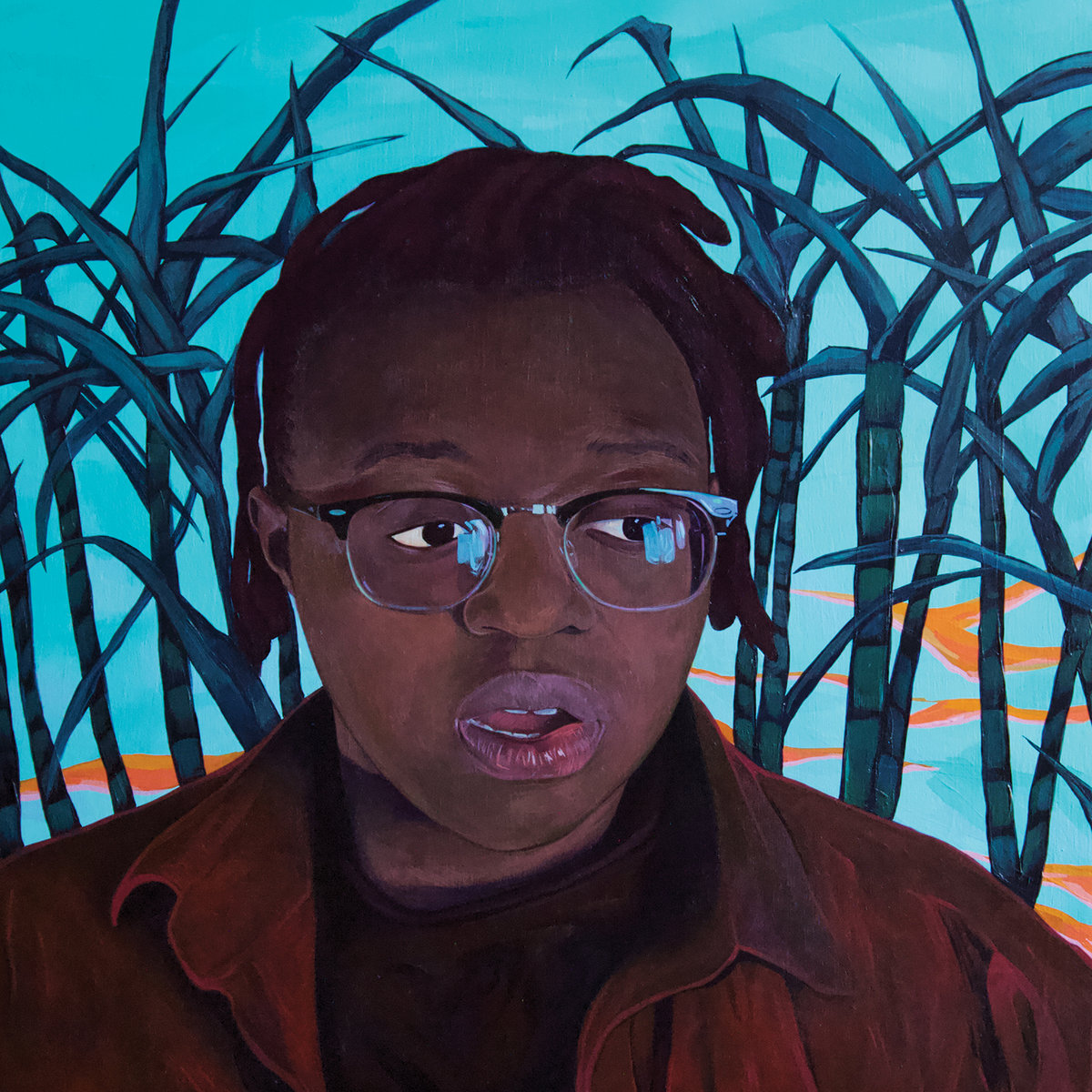
Anjimile – Giver Taker (Father/Daughter Records)
Anjimile (Musician):
The concept and theme for the Giver Taker artwork is my ancestry and my history. The foliage in the background is sugarcane, which is a major crop in Malawi where my family is from (my parents emigrated to the US from Malawi in the 1980s), and the water in the background is a reimagining of landscape from my favorite movie growing up, The Lion King. The real and the unreal are merged together in this cover, and I appreciate that juxtaposition. Giver Taker is a mess of contradictions and dichotomies and dualities, and I wanted that to be reflected in the album art. The image of my face is based on a photograph taken by my bandmate / producer Justine Bowe. We were hanging out at her house, and the light in the hallway was nice, so she snapped a few photos on her iPhone. I was mid-sentence, hence the raised eyebrows and open mouth of my image on the album cover. The content of Giver Taker is inextricably linked to my journey as a trans person, as a recovering alcoholic, and as a healing human. I am in the thick of my healing process to this day, and Giver Taker is a snapshot of a part of my becoming, my ongoing story, my sentence unfinished.
The painting was done by Rebecca Larios, an amazing artist based in Boston. She was incredible to work with – and she actually surprised me with the Lion King background. Justine and I had sent her stills from “I Just Can’t Wait to Be King” as references for the color palette we were thinking of for the album cover, and Rebecca more or less painted me into a scene from the “I Just Can’t Wait to Be King” sequence, so I’m incredibly happy about that. 10-year-old me is excited as well.
I think a fun fact is that the cover wasn’t going to be painting at all. We wanted it to be a photograph inspired by a Tom Waits album cover, but COVID had other plans. Justine kept floating the idea of a painting, and I kept shooting that idea down. It took her bringing it up for maybe the 10th time for me to be like, okay, you know what? Yes, this is a cool idea.
Rebecca Larios (Visual Artist):
The best people to create for are both excited to work with you and trust in your process. That was Anjimile; they had a lot of ideas from the start, and it just gelled. We discussed symbolic elements to incorporate a palette of semi-sunset hues, eventually going with a backdrop of sugarcane (for Anjimile’s Malawian heritage). Those silhouettes let me dapple in bright oranges and aquas by the more muted heart of the painting, and I think the soft echoes of those colors in the lens’ glare helped tie it all together. Just a lovely, engaging project; I learned so much, too!
Sounds: Anjimile
Artwork: Rebecca Larios

Carl Stone – Stolen Car (Unseen Worlds)
Tommy McCutchon (Art Director):
I art directed the album cover and selected Tim because I tend to like album art that works equally well as illustration and fine art. Carl’s music has a quality of pop art and a sort of hyperactive, Looney Tunes-like infusion of classical sensibility that I think is also present in Tim’s work.
Carl Stone (Musician):
Tim was given the tracks to listen to after all the music was finalized. I had the opportunity to review some of Tim’s work and ideas, and personally, I was attracted to the idea of discorporated facial parts being isolated and moved around, which I saw as a metaphorical reference to what I was doing in the music: separating and reorganizing elements.
Tim Lahan (Visual Artist):
I’d echo what Carl mentioned about the isolated face parts moving around yet still appearing to maintain the structure of a face. I’ve been interested in the idea of permanence, or lack thereof, in common situations and objects and how I can translate that sense of fracture in a static image. Carl’s music for this album seems to ride that same sort of wave, so I was thrilled to be asked to have my artwork be the visual component of the record.
Sounds: Carl Stone
Artwork: Tim Lahan
Art Direction: Tommy McCutchon
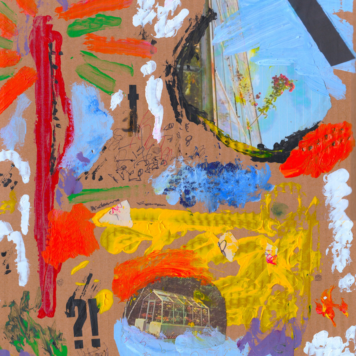
The Cool Greenhouse – Alexa! EP (Melodic Records)
Tom Greenhouse (Frontman of The Cool Greenhouse & Visual Artist):
I’ve tried my hand at painting here and there — in a relaxed and unambitious manner, for a few years — and have gradually developed a style which kind of resembles abstract expressionism, but I would say is its antithesis philosophically and symbolically. Where abstract expressionism is kind of serious, aiming at the transcendent, masculine and metaphysical, my paintings are more throwaway, “crappy” (you can hear our take on the “crap”, which we hold in high regard, in our long, manifesto-like song, “crap art”), playful and immediate. I think art only has meaning insofar as it has a social and historical context, so I prefer the readymades of the Dadaists and people like Ray Johnson to the super seriousness of people like Pollock and Rothko…
For this record, we also gave away packets of mystery seeds, which people were encouraged to grow and identify for a prize, for fun. Turns out they were stinging nettles. I was mostly just interested in the conceptual idea of getting hundreds of people to grow and care for stinging weeds in their houses. I like to think of the cool greenhouse as a multi-dimensional quasi-subversive conceptual art project more than a band when I am feeling pretentious.
Sounds: The Cool Greenhouse
Artwork: Tom Greenhouse of The Cool Greenhouse

Cressida – Sambo (Voitax)
Voitax (Record Label):
In the way he paints, Mathieu Wernert considers all the possibilities that are offered to him, and sets out more and more to abstract forms that question the limit of the frame, as if he wanted to intend the constraint the artist has to release himself of. He carries out colored shapes or ornamental patterns, like his latest arabesques, before scraping off the canvas until it is stripped down, not to say bruised by the strokes. A detail, a discrepancy, a failure warn him, putting an end to his intervention, the canvas is completed, now it can be shown to the public.
This artwork was a small format Tipps Baseball card that was edited with acrylic paint and further chemicals, that partly erased the image and gave it its visible stain-effects.
Sounds: Cressida
Artwork: Mathieu Wernert
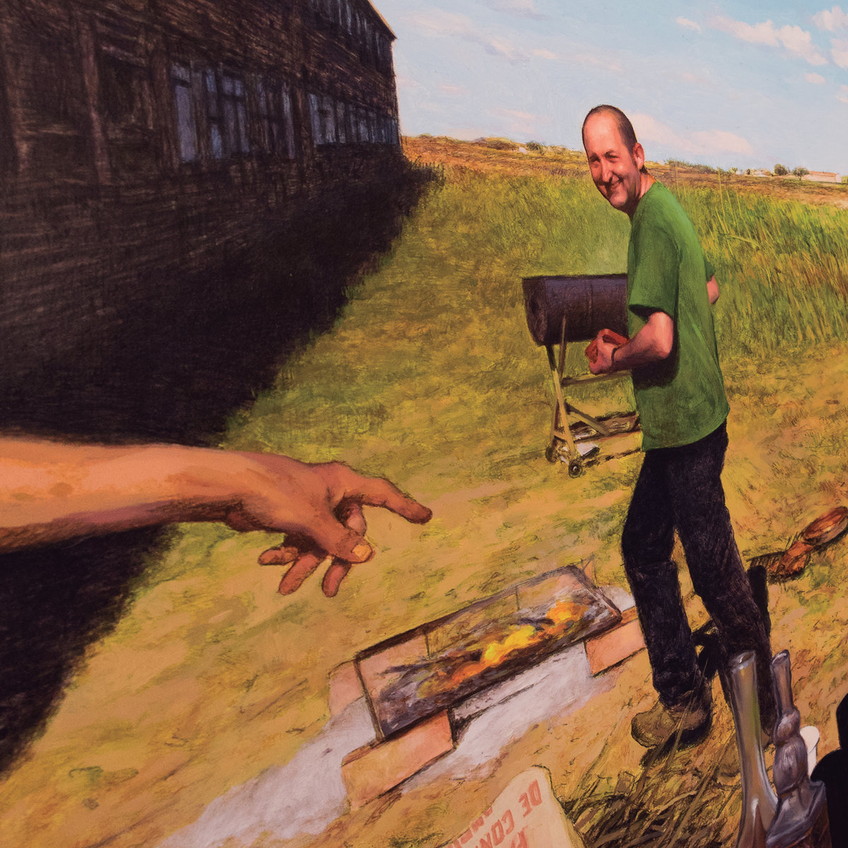
EJ Marais – CUTS (La Castanya)
EJ Marais (Musician):
The idea of the artwork is kind of accidental. Marcos Palazzi is a painter based in Barcelona who works in a rather old fashioned style – having his clients going to see his paintings in person rather than taking photos and uploading them to the internet. One day he took a picture of one of his paintings with his mobile phone from an angle in a way that it distorted the image, it was kind of trippy and surreal but classic at the same time. For my album’s artwork I wanted to escape the imaginary that is related to “urban music” and project the scenes of the countryside where I grew up, in the Catalan Pyrenees, which is far from idyllic and postcardy. Unfinished brick buildings, fences made with old mattress frames, BBQs with recycled oil cans are part of everyday life. Things tend to be more utilitarian than esthetic. The album is also a mix of folk (traditionally rural music) and Hip Hop (traditionally urban music) so the imaginary of Marcos’s painting worked perfectly.
Sounds & Concept: EJ Marais
Main Cover Painting: Marcos Palazzi
Graphic Design: Lara Coromina, Anxo Casal & Joan Guàrdia
Hand Drawing: Maria Pratts
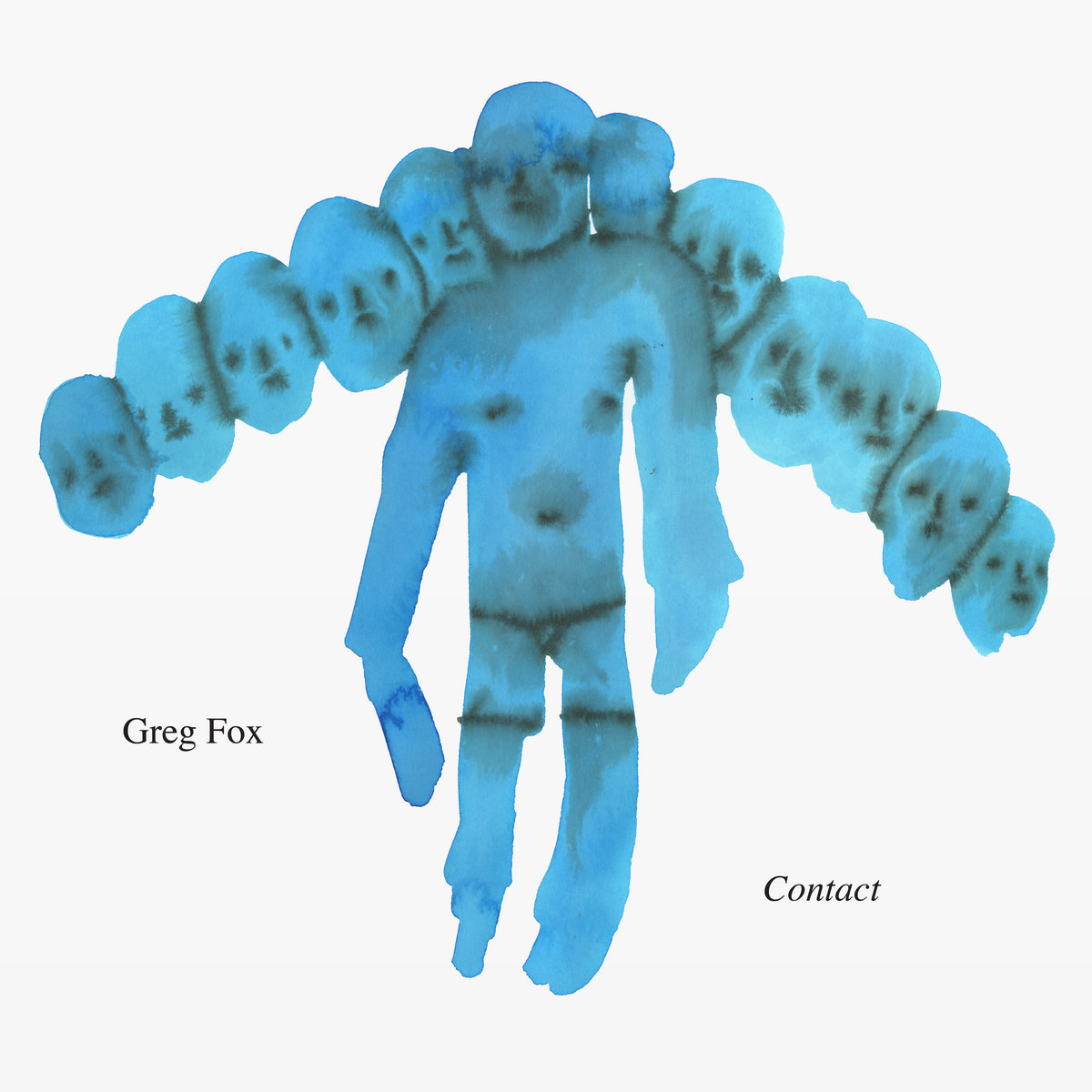
Greg Fox – Contact (RVNG Intl.)
Greg Fox (Musician):
I have just been a very big fan of Emma’s work since I first bought one of her t-shirts at the Printer Matter Art Book Fair years ago… We were introduced through Tauba Auerbach, who is a very good friend (who also made the artwork for my previous album), and I asked Emma if she would be into doing the album art. After talking a little, Emma asked me to share a few general images that resonate with me, but there were no rules or even really any guidelines. I knew that whatever Emma made would be something I loved, and as it turned out, my intuition was right about that. All of the images that Emma made for the album resonate with me very deeply.
Emma Kohlmann (Visual Artist):
I focused on the repetition that is within Greg’s music and especially in this album. When he first asked me to do album art, I really wanted to create work that resonated with the sounds that Greg was creating. There is something very spontaneous about Greg’s music and I wanted to capture that. I would listen to the entirety of the album, while I was painting, I think I listened to it around four or five times straight. I would go off certain ideas I had while listening, certain types of movement and dancing figures. I wanted to make a visual translation of the sounds I heard.
Sounds: Greg Fox
Artwork: Emma Kohlman
Video Director: Michael A. Flanagan
Emma Kohlmann (Visual Artist):
I think sometimes collaborations can be really hard, especially if there is a firm thematic lens in which the music is based on. It becomes more of a commission and less of a piece inspired by the music. This project felt like more of a synthesis of both our works. I really enjoy exploring the nexus between music and visual art. Especially when the illustrations I made for the album were turned into a music video. That was also a really exciting component of the album as well.

IDLES – Ultra Mono (Partisan Records)
Russell Oliver (Visual Artist), via Our Culture Mag:
The painting – or the concept behind the painting – relates to Joe and the band’s ideal of unconditional love and acceptance for all, including their critics, or political opposition, or for other bands who may have positioned themselves as “rivals” or adversarial. The large pink ball (Joe’s favourite colour) represents this unstoppable and unavoidable ideal of love and acceptance colliding forcefully with such an opponent – to “Kill Them With Kindness” (Track 5 on Ultra Mono).
Sounds: IDLES
Artwork: Russell Oliver
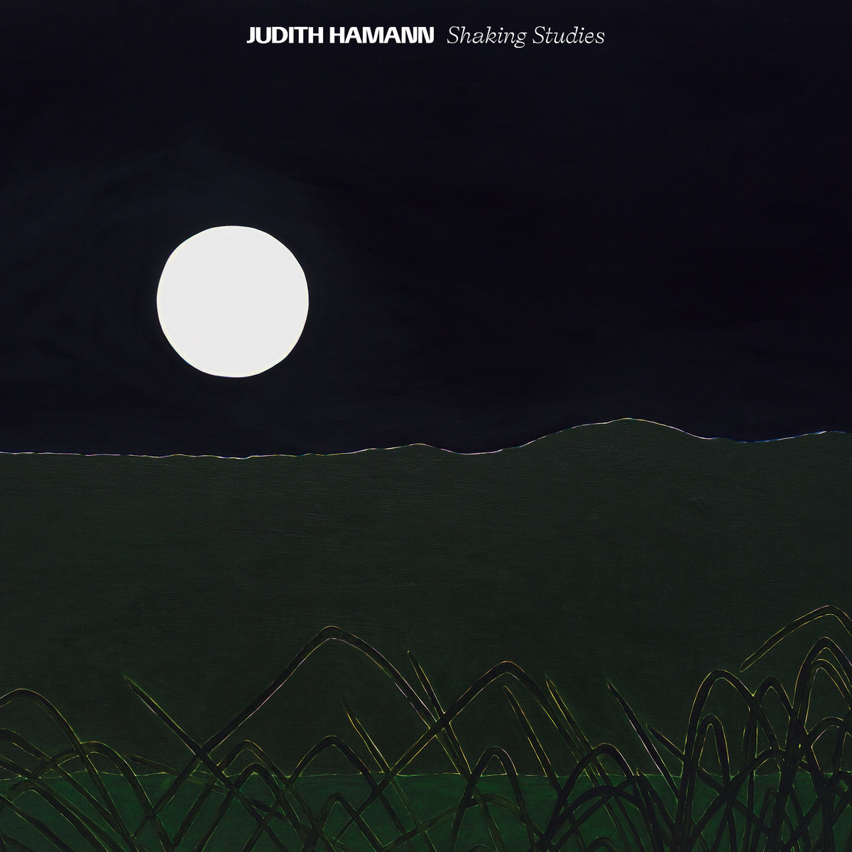
Judith Hamann – Shaking Studies (Blank Forms Editions)
Judith Hamann (Musician):
It took a long time to find the right artwork for this record, the right colour or image which would create a space for the recording, but not load it with a meaning that felt false. I worked for some time with Lawrence Kumpf at Blank Forms, and their designer Alec Mapes-Frances, trying different ideas with colour and fonts alone, until we arrived at this image by Brazilian artist Patricia Leite, which pairs so perfectly with this record.
Patricia’s work immediately resonated, drew analogues between the spaces my own work inhabits. The work, which is in its original form is painted on wood, holds within the tension of materials (shimmering wood grain and solid paint planes) a state of “constant transformation,” between figuration and abstraction, between solidity and inconsistency, carving out a space which can hold all those things simultaneously. This sort of “shimmer” between solid and ephemeral, fundamental and overtones, bodies of instrument and performer, is central to my ongoing work on shaking. I love this image, its exploration of landscape and of the intimacy of memory, its luminous capture of night.
Sounds: Judith Hamann
Cover Artwork: Patricia Leite, Super Luna com Citronelas (Super moon with citronellas), 2016. Oil on wood. 130 x 160 cm. Courtesy of the artist and Mendes Wood DM São Paulo, Brussels, New York.
Photography: Bruno Leão.

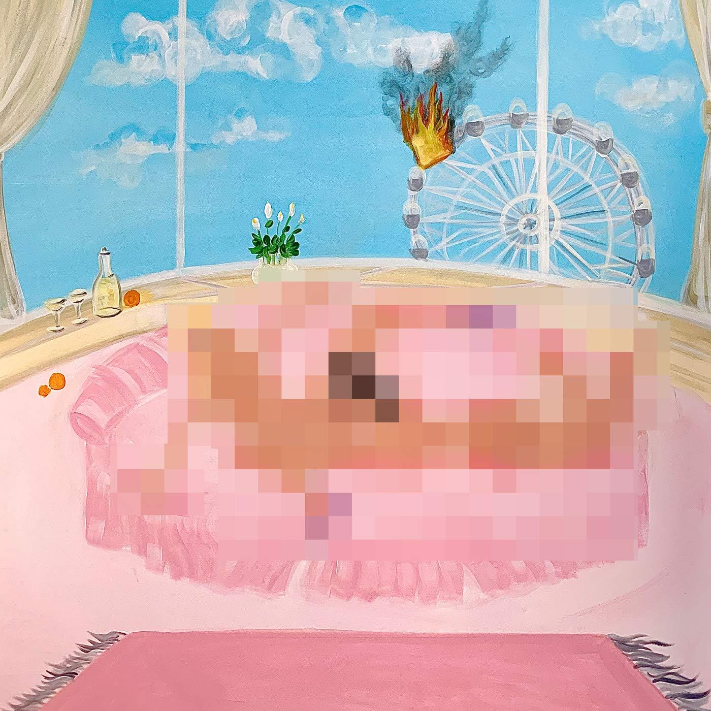
Kali Uchis – To Feel Alive (Virgin EMI Records / Interscope Records)
Via Instagram, Kali Uchis described the painting as “the isolation era of me eating the por vida era of me’s pussy”, referencing her 2018 album Isolation and 2015 album Por Vida. View the uncensored cover on Genius.
Sounds: Kali Uchis
Artwork: Oh de Laval
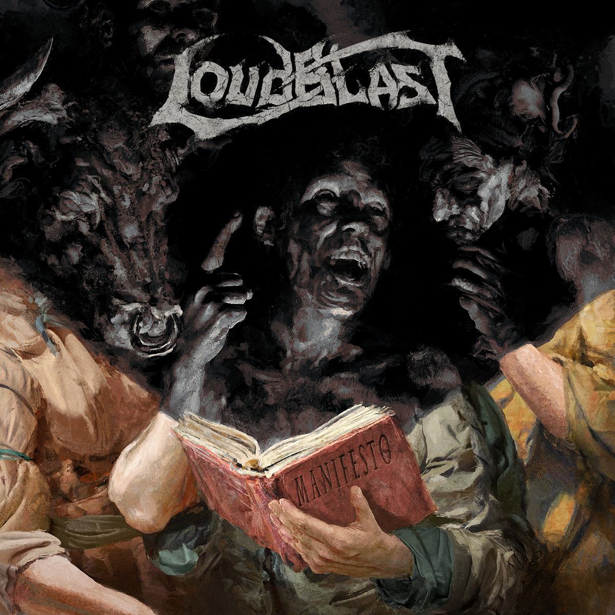
Loudblast – Manifesto (Listenable Records)
Eliran Kantor (Visual Artist):
Main songwriter and singer [Stéphane Buriez] told me about the album title, and I pictured a book which, instead of bringing enlightenment (usually portrayed by rays of light), is emanating shadows. A dark cast revealing the evil nature bubbling in black tar beneath those who read it.
Sounds: Loudblast
Artwork: Eliran Kantor
Photography: Lisa Klipsic

Mary Lattimore – Silver Ladders (Ghostly International)
Michael Cina (Designer):
Mary had recorded this album in a coastal setting, and we ran off of that setting as a point of reference. Mary picked the [Becky] Suss painting based on that fact and we expanded that world.
There are a lot of aspects that come into play here. Mary’s full length LP’s have been using Becky Suss paintings on the cover, and I developed a visual ‘world’ where her work exists. It’s a place that exists without graphic design. I also pulled in a long time friend and collaborator, Eric Hurtgen, and he has helped with illustration and some of the design on this one. I try and use only things that I have made myself, so that includes type/fonts.
My goal is to help build out a world around Mary’s inspiration and also the Suss painting. We had a wide range of illustrations and design ideas that Eric and I developed around this theme. Eventually hundreds of ideas and images get whittled down via reviews.
Sounds: Mary Lattimore
Painting: Becky Suss
Design, Type & Art Direction: Michael Cina
Illustration & Design: Eric Hurtgen
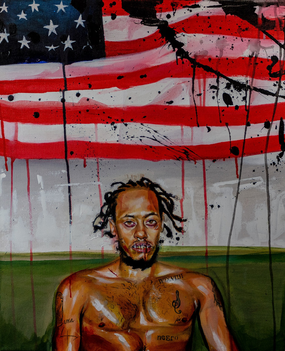
Pink Siifu – NEGRO (Self-Released)
Sounds: Pink Siifu
Painting: Junkyard
Original Photo: Eric Coleman
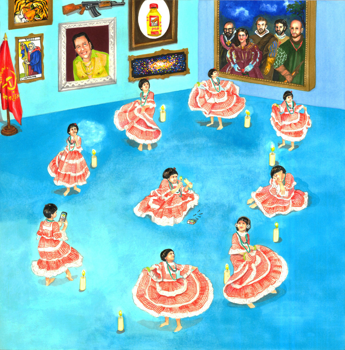
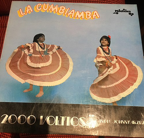
Meridian Brothers – Cumbia Siglo XXI (Bongo Joe Records)
Eblis Javier alvarez Vargas (Meridian Brothers):
The theme was based on a previous album and inspiration of the record 2000 Voltios. We wanted to show a 21th century approach to the traditional cumbia costume. We wanted also to include several elements both from [the artist] Glenda Torrado’s universe such as rooms with pictures and paintings, showing different elements in the lyrics of the album.
I issued some texts about the art and the political position of the record on the Meridian Brothers website, including something very specific about the artwork; this material was released in Spanish.
Sounds: Meridian Brothers
Artwork: Glenda Torrado
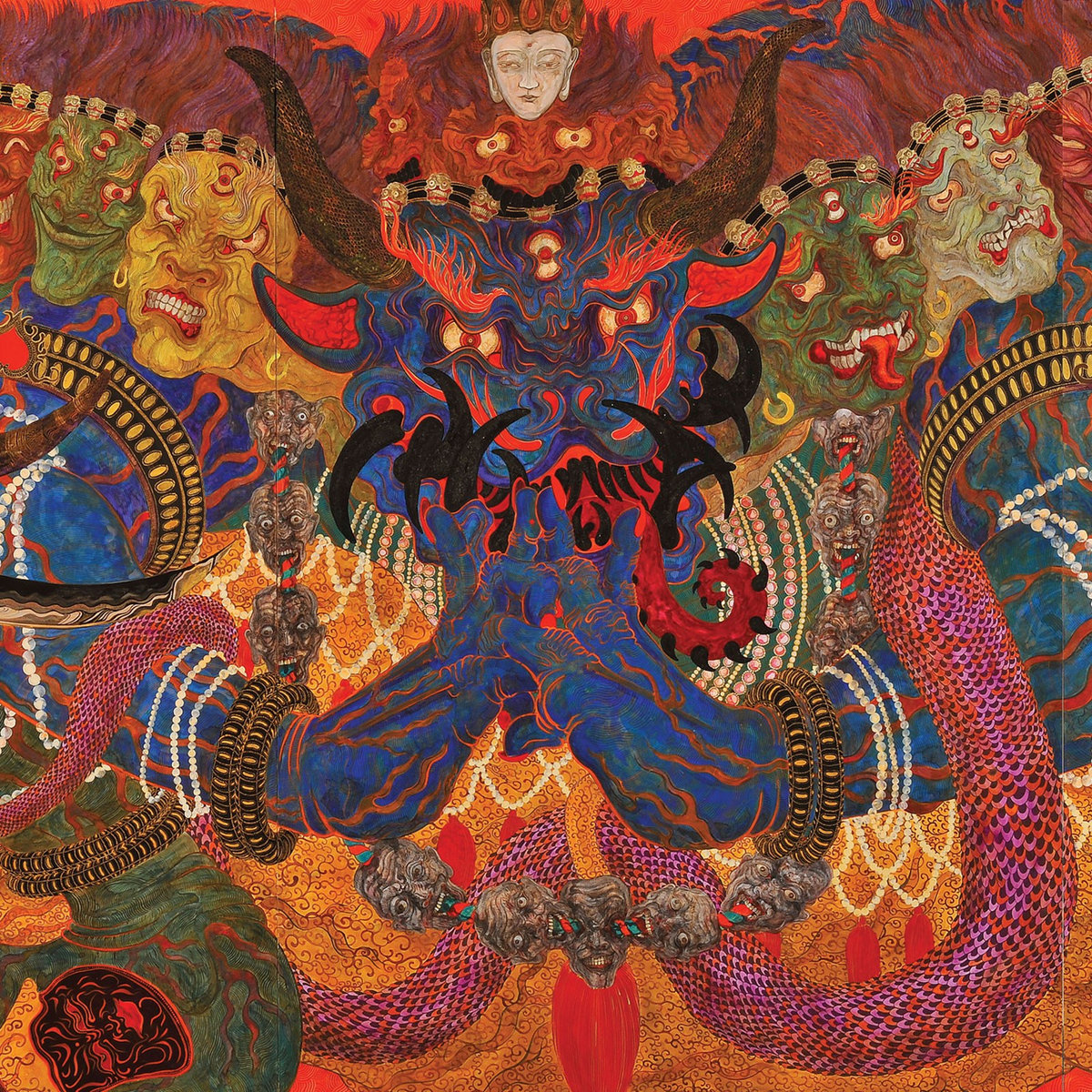
Neptunian Maximalism – Éons (I, Voidhanger)
Guillaume Cazalet aka CZLT (Neptunian Maximalism), via Marunouchi Muzik Magazine:
First Luciano (I, Voidhanger Records) and I had a total crush on this work by KANEKO Tomiyuki. Its psychedelism, the many colors, the complexity, the saturation of the space, etc. So many things that resonated with our music. But certainly the wrathful subject with multiple simultaneous faces and the sacrificing bull’s head had something to do with our cosmology. It is that in the West the bull therefore refers… to the Zodiacal area of Taurus, which brings us back to one of the periods that interests us: Egyptian and Mesopotamian antiquity.
In addition, the painting shows the sacrifice of a bull, cut off with a knife. In the West, it is the Greco-Roman sun god Mithra Tauroctone who sacrifices a bull, symbolizing the passage to the Aries area. To finish the hinge represents on the right (the future) a cosmic serpent heading towards a celestial portal. This idea also interests me. First on the artistic level, the presence of a celestial sphere responding to the chaos of the general composition, but also the idea of the other world to which it refers (we are Neptunians). The message is methaphysical and very psychedelic in nature. Cosmic snakes often visit us (or we do visit them) when we take Ayahuasca, for example.
Sounds: Neptunian Maximalism
Artwork: KANEKO Tomiyuki, “Vajrabhairava”, 2014 © KANEKO Tomiyuki Courtesy Mizuma Art Gallery
Layout, Logos & Art Direction: CZLT

PYNKIE – #37 (House Arrest)
PYNKIE (Musician):
I was obsessed with the number 37 and would see it everywhere during the making of the album… (Long story, but the significance of the number stems from it having been the high school football number of someone who died in my family.) My boyfriend told me about these recurring dreams he would have when he was younger about talking to people and their heads suddenly turning into giant colorful numbers or shapes. That combined with the fact that the number was commandeering my brain were the main sources of inspiration for the cover.
Sounds: PYNKIE
Artwork: Thomas John Carlson

SUUNS – Fiction EP (Joyful Noise Recordings)
Joe Yarmush (Guitarist & Bassist):
I generally start from a strictly visual point of reference. I’ve been dabbling with painting (sorry to painters) minimally for a while. Most of it’s shit, but to me and my eye, my paintings are interesting when they’re simple. I’m not showing them in galleries; they’re primarily for album art / t-shirt art, etc. so I’m not precious about them in either presentation nor approach. This situation is no different. It was initially a T-shirt design for ANOTHER band… ha. They declined to use it. So here we are, four years later. Also, there’s some digital manipulation going on. Like in a lot of our art, it’s physically made then processed digitally to some degree. There’s no actual version of this art in the corporeal world other than on the cover of this record. In the end it’s a kind of fiction, which ties into the record title etc.
Sounds: SUUNS
Artwork: Joe Yarmush of SUUNS

W.H. Lung – Incidental Music (Melodic Records)
Joseph E. (Frontman of W. H. Lung & Visual Artist)
I wanted to create a mise-en-scene for the music to live in. We originally had the idea of using the front cover of an IKEA catalogue from the ’60s, but ultimately, I think I just wanted to do some painting. As you might be able to tell, at the time I was really into the flatness of the David Hockney California paintings and the bold Picasso colours from the 1932 exhibition at the Tate.
I began to paint a front room and, as the drafts continued, different kinds of disruption started to occur. The sea pouring through the window happened one day and it looks to me like an appropriately strange disaster. In Inspiration! there’s a line ‘waiting, watching as the tide rolls in.’ The music had taken us two years to write, so perhaps there’s something in the artwork about patiently sitting with events as they happen.
Sounds: W. H. Lung
Artwork: Joseph E. of W.H. Lung, with assistance from Elli Kypriadis
EXPLORE ALBUM COVERS OF THE YEAR:


thank you very much, I have been waiting for your return for a long time !!