Another year of our favorites in Top Album Cover Artwork, and once again, we interview musicians and artists on the often-underappreciated work that goes into creating a product that not only tickles your ears, but speaks to your eyes and hearts. Album artwork, though often only viewed on tiny screens in this day and age, is indeed a long and laborious process that we love to give its due credit.
So read on, and choose your own artistic adventure:
> Digital & 3D Album Covers
> Fine Art & Illustration Album Covers
> Mixed Media & Collage Album Covers
> Photography & Digitally-Manipulated Album Covers
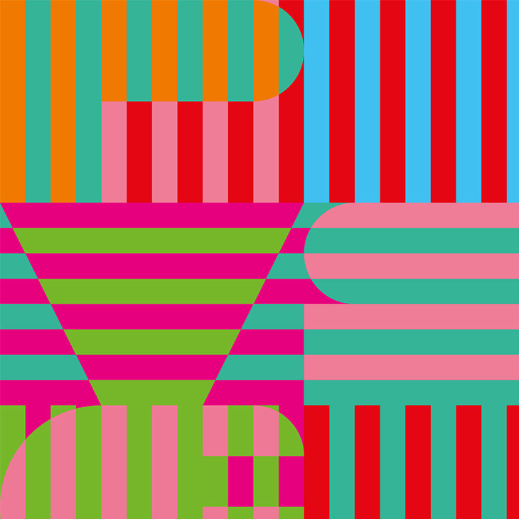
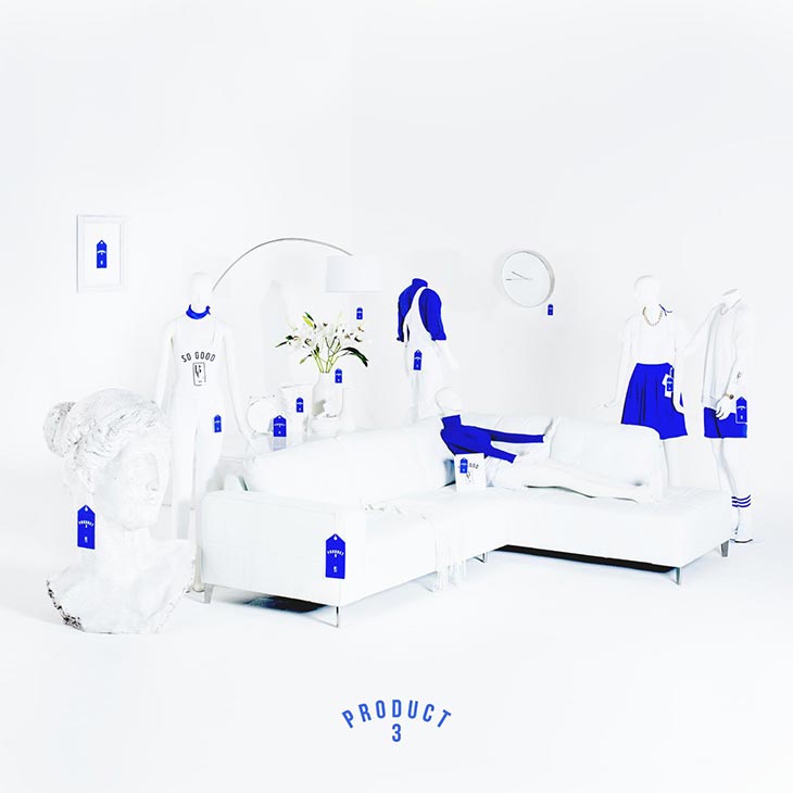
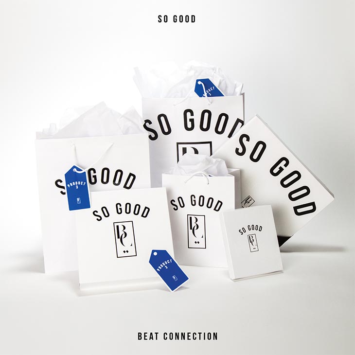
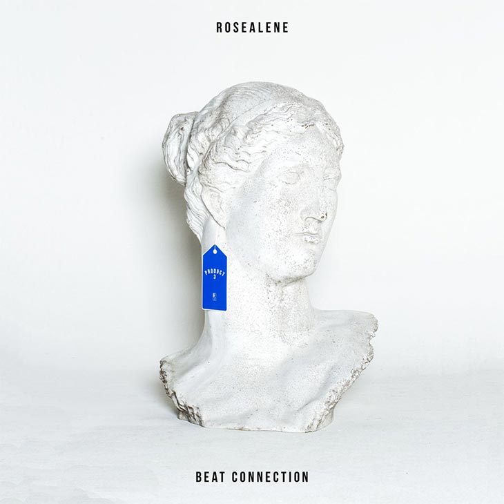
Mixed Media & Collage Album Covers of the Year 2015
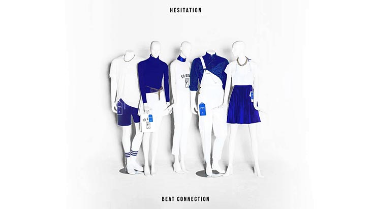
Beat Connection – Product 3 (Self-Released)
Art Direction, Design & Layout by Reed Juenger of Beat Connection
Photography by Coco Foto
Botany – Dimming Awe / The Light Is Raw (Western Vinyl)
Artwork by Jared Bell of Botany
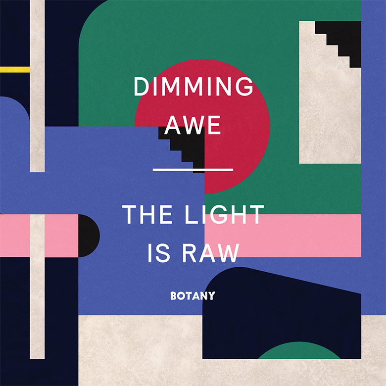
Jared Bell (Artist & Musician):
Botany creates rich psychological and emotional experiences dissolving the borders between psych, hip hop, free jazz and ambient influences. The artwork interprets this dense and complex musical mélange through geometric abstraction. I wanted to create a graphic, colorful and complex work, with overlapping layers and disjointed paths – something harmonious, but still slightly disorienting – like the music. Some initial visual references used for concepting: the Bauhaus abstractions of Anni Albers and Laszlo Moholy-Nagy; simple, reductive shapes of Ellsworth Kelly; monolithic blocks of Anne Truitt.
CFCF – The Colours of Life (1080p)
Design by Bobby Houlihan
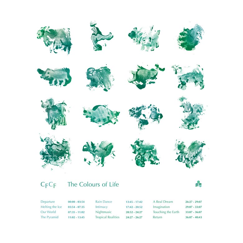
– Bobby Houlihan, Artist & Designer
Coma – This Side Of Paradise (Kompakt)
Copout & Orlando Volcano – Relax And Rolex (Escape From Nature)
Art Direction & Design by Jessica Tsai
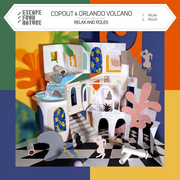
Jessica and I are friends, and I love her art. When I decided to set up the label, it made sense for her to take the role or Art Director. I love how she approaches the project in a direction of a fine artist. I wouldn’t want anyone else to be doing what she does. She’s one of my favorite artists, easily.

For Relax and Rolex, I wanted to design another interior environment, a continuing theme of the previous Escape from Nature covers. The image I had in mind was a structure, with hints of 1960s Italian architecture, that was both rigid and permeable, sort of like an Escher print; something surreal and just a little confusing visually, to reflect the soothing but odd atmospheric sound of the album. On the other EFN covers, I had worked 80% on the computer, digitally collaging paint strokes with some 3D modeling, but this time I wanted to physically build the environment without relying too much on digital work. Orlando let me take charge with this concept, and even though it seems at odds for a label that is interested in the possibilities of technology, I thought that creating a “futuristic” all computer-generated image would be too literal and that, above all, experimentation with different processes was more important for the cover. Obviously referencing Matisse in elements of design and in media, I built a diorama of three-dimensional paper structures and worked on top of them with pencil and paint, trying to add the illusion of space on top of real space like a trompe l’oiel. I thought that a paper version of [Constantin] Brancusi’s Bird in Space (left) sculpture would inhabit this abstract playhouse.
DOOMSQUAD – Pageantry Suite (Hand-Drawn Dracula)
Art Direction & Art by Chris Boni
Photography by Nick Pye
Digital Art by Brenda Dale

In our case, the visual work that made up the cover was almost entirely the intuitive response of Chris Boni to the music on the album. The larger conceptual idea behind Pageantry Suite was already carved out musically, lyrically and thematically. We were playing with notions of subversiveness by presenting lighter sounding, more pleasing, tropical grooves underneath strong, biting comments on youth culture, consumerism, late-night parties, surveillance, misogyny and apocalyptic death drives. For sure, our darkest themes yet, all sugar-coated by a nice, pop-music sheen. This was the pageantry. The display. The pleasant and arousing masquerade that hides a very sinister darkness underneath. We knew we wanted this whole suite to be a fully-realized conceptual package, and so we commissioned Chris Boni at the very beginning to create the entire visual element, from album art to videos. He had carte blanche essentially. We trusted him. And he certainly delivered.
We had worked with Boni before on a video from our last album, Ovoo. We had also established a great friendship and through that, always exchanging ideas and other things. For such a young artist, he has a really unique and specific aesthetic — something many artists don’t find till the second stage of their career. But all of Boni’s work, from his films through to his paintings, all capture the same sense of color, form and spirit. He’s certainly locked into something. And we’re big fans. We we’re confident that he would not only understand the album, what we we’re trying to achieve with it, but that he would certainly have a very unique, strange and specific response. We were just excited to see what that response would be. To expand our project into new dimensions.
[What drove the creation was making] a table-sized sculpture that would be photographed with various cinematic lighting setups. All the photographs were then layered together keeping all the best lighting/glimmers/elements from each photograph, then digitally composited to replicate the editing process of commercial billboard-sized photography.
I come from a visual art background, but making films has taken up my time these past 5 years. I wanted to fuse the intuitive nature of building a sculpture with this very focused post-production process used in commercial photography. I broke the sculpture by accident mid-way through the shoot and had to re-make it. The sculpture shown is the second attempt. The “support” for the sculpture is my kitchen table; the photographs were taken in my living room/kitchen. This is a tulip table, seen in full on the back of the album in the second composition, eventually digitally rendered at the base to look like spilt milk.
RELATED: DOOMSQUAD Band Interview: More Than A Family Band, A Total Time, Total Way of Life
Farben/Schwarz – Eins EP (Sportklub RotterDamm)
Artwork & Music by Farbenschwarz

Farben/Schwarz:
We’re a band of four, all working in or with the German creative or advertising industry. The skills we acquired over time, working in the industry, help us create anything for the band on our own.
The concept we tried to visualize was that inner conflict that, for many people in our society, occurs in a particular phase of life. Somewhere in the mid-’30s (which we in the band all are), when you start to reset or re-evaluate your life’s priorities (family instead of friends, liabilities instead of hobbies, healthy living instead of partying, etc.) and start to realize that you’re becoming a very different person compared to who you were in your 20’s. This inner conflict or change resonates in all our lyrics on the EP, and the cover was meant to be an extension to that concept.
We were pretty sure that the cover artwork (we had rough ideas in mind) had to be 3D-rendered because of its complexity. It happens to be on a rainy hamburg weekend, that one member of the band found this stag figurine on a flea market and instantly fell in love with it. He thought it would fit the EPs tonality and concept quite well. He went home, grabbed his camera and took some shots of the figurine while pouring molasses (which he found in a drawer) over it. He put two of the shots together and split it in half with a diagonal slash. That’s the moment the visual concept was born. And it was totally DIY, which is awesome.

Gemma – As Ever (Inflated Records)
Art Direction by Felicia Douglass

– Felicia Douglass, Art Director & Artist
Gurun Gurun – Kon B (Home Normal Records)
Artwork by Angela Deane
Design by Christian Roth and Jara Tarnovski

Hairy Hands – Battlecat (Tape Club Records)
Sounds by Hairy Hands
Artwork by Essy May

James Bright (Hairy Hands):
The whole Hairy Hands Battlecat EP is based around the story of a half man / half cat rebel that travels through time and space, saving minorities from persecution and stray female cats from overpowering brutes! So, it was important to get a feeling of a torn planet / destroyed landscape and a vastness all in one image.
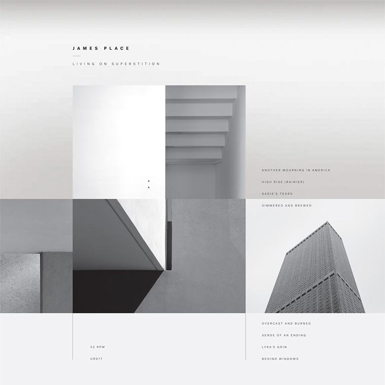
James Place – Living On Superstition (Umor Rex)
Design & layout by Daniel Castrejon
Cover photographs by Diego Berruecos
Insert photograph by Paul Harland-White
Jape – This Chemical Sea (Faction Records)
Sounds by Jape
Design & Photography by M&E
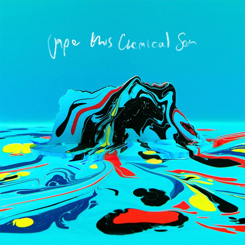
M&E (Artist):
The concept of the cover is based on the pollution of our oceans and seas, in combination with the sea of chemicals within our brains. Hence the bright psychedelic colours and the island in the centre.
This cover was created in camera. It was actually shot in an aquarium. A layer of marbling paint was dripped onto the surface of the water in the aquarium, and a white wooden cut out silhouette of Richie’s (Jape) profile was lowered through the marbled paint surface into the water below. The water pushed the paint over the wooden silhouette, coating it in a colourful marbled pattern. The camera was placed at the side of the aquarium and the photograph was then flipped upside down to give the appearance that the head was floating in a sea of colour.
Lymbyc Systym – Split Stones (Western Vinyl)
Artwork by Jared Bell
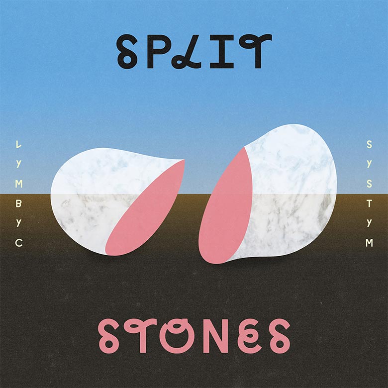
Jared Bell (Artist):
Split Stones is about disparate halves coming together. It’s a metaphor for the band’s long-distance relationship (writing an album together from opposite ends of the United States), the mind/body dichotomy (rational thought vs. human behavior), as well as the idea of “living machines” (using the inherent mechanical nature of electronic music to make something more organic). The imagery also references 1920’s surrealist and metaphysical artists – think Magritte or de Chirico – who explored the curious relationship between rational thought and dreams, societal norms and bizarre hidden feelings.
Lower Dens – Escape From Evil
Photography & Collage by Hermonie “Only” Williams
– Hermonie “Only” Williams, Artist
NOTE: “The art for the LP and the CD are visually similar but not identical. The cylindrical pieces are the same scale on both the LP and CD. I didn’t want the CD to just be a scaled down version of the LP.”
Kneebody & Daedelus – Kneedelus (Brainfeeder)
Artwork by Kozyndan
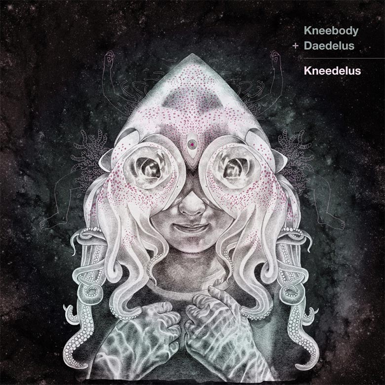
I had the initial idea to create a collaborative project between long-time band Kneebody and long-time friend Daedelus. I applied for a writing grant, and in the proposal, described making music that would be an organic meeting between acoustic and electronic instruments. The music explores the theory of technological singularity – the notion that humans and computer technology will increasingly blend together.
I think for kozy and I as the artists, listening to the tracks and watching the process of the recording a few themes seemed to bubble up to the surface. This was some strange alchemy going on between this older and newer means of producing music — seeing one form of music filtered through the tools of another form. They were creating a sort of beautiful chimera, to me. The music itself had really larger than life feel to it – like a grand fantasy epic or cosmic sci-fi narrative.
Kozy and I tend to think pretty literally when we work (our work is very figurative, mostly), so we took the idea of the chimera and combining two different forms of music and tried to do the same with the artwork. We wanted to make something that had a cosmic feel, but I actually began with a couple underwater photos I had shot — one of a squid at night (that I reflected in Photoshop to make a sort of mask), and another of a girl in a pool that kozy had always told me she wanted to make a drawing of. kozy took those two separate images as reference and just started drawing to make this realistic graphite rendering. She gave it back to me to start tweaking, adding background and foreground elements to take it from underwater to outer space (the two environments are always similar in our minds since you float weightless in both). It was a fun process for us since we knew the musicians trusted us – we have done several covers for Daedelus and tour posters for both he and Kneebody in the past, and they are dear friends of ours for over a decade.
Mall Walk – Criminal Code 7″ (Vacant Stare Records)
Artwork by Lauren Pakradooni
Lauren Pakradooni (Artist):
I was excited when Mall Walk asked me to do another album cover for them for their release Criminal Code. My process was fairly analog this time around; I worked with monotype printmaking techniques to make the image, and included shapes that has appeared in some of my sculptures and crosses over with the imagery I made for Mall Walk’s self-titled release from 2014. I like establishing a creative a relationship with a band/music project and get to develop artwork for their albums, and I am enthused to see how that evolves.
The Mantles – Hate To See You Go (Slumberland Records)
Artwork by Michael Olivares (Vocalist & Guitarist) and Virginia Weatherby (Drummer) of The Mantles
Photography by David Armstrong
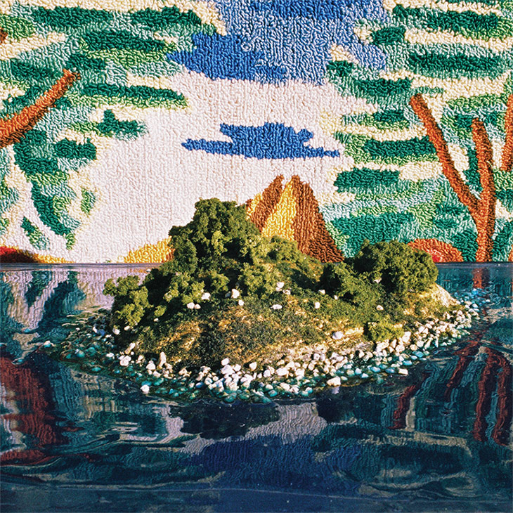
Virginia Weatherby (The Mantles):
The original idea for the cover came as a reference to the first track on the album, simply titled, “Island”. Who knows why; perhaps it was the California drought heatwave while we were creating the artwork, but we were feeling tropical. Howeve,r we realized just putting a picture of a real life island on the cover would be pretty boring, so we decided we wanted to make our own. We wanted to play with perception: make you question what exactly you’re looking at. Is it real or not? We flipped that age-old question, “If you were stranded on a desert island, and can only bring one record…” by stranding an island on a record.
At first, we were stumped at how we were going to create a realistic-looking island, but in doing research, we stumbled upon the underground world of diorama enthusiasts. These go way beyond just exploding volcanoes for science fair projects. We ordered a water and land mass kit and with a little papier-mâché, glue, paint, fake shrubs, rocks, and trees, we created our island AND found our new hobby. We unearthed some ’70s rug art from our garage that ended up being the perfect backdrop for our creation, and invited our favorite photographer, David Armstrong, to take some pictures of our magical island, and voila! There you have it.
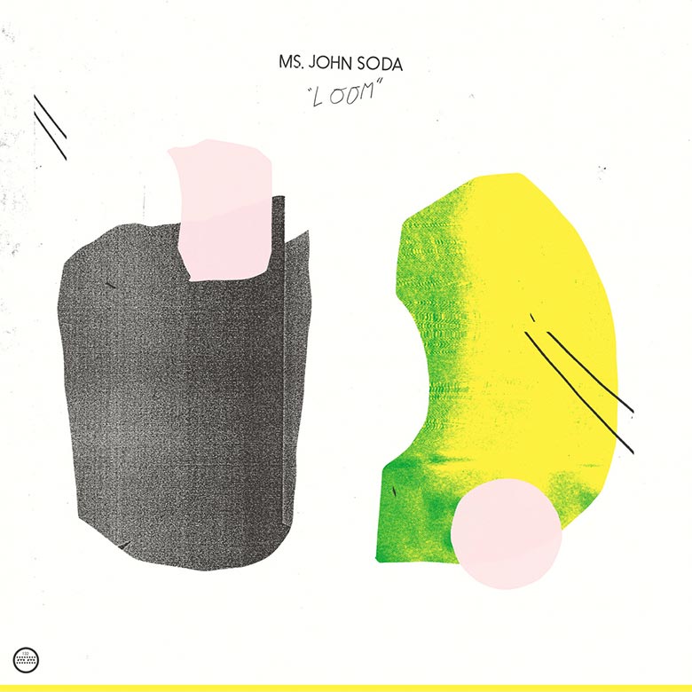
Ms. John Soda – Loom (Morr Music)
Peals – Seltzer (Thrill Jockey Records)
Sounds by Peals
Artwork by Zoe Friedman
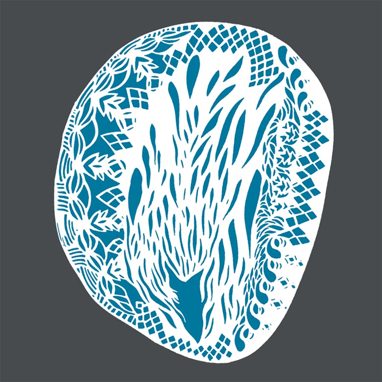
Zoe Friedman (Artist):
We wanted to create a visual to go with the ambient themes of the music – something somewhat abstract but that also had depth to it. The darker lace-like image on the front is actually a sticker on the cassette case; it rests above the the fold-out. It adds a bit of dimension to the flat surface. We wanted the cassette to be a unique object, a work of art in itself. We also released a limited edition set of laser-cut prints that included a digital download of the album.
Peals had asked me to create a music video for them. I said “Yes!”, and in exchange, I asked if they would perform live in the Bromo Seltzer Arts Tower amid my video projections — and our collaborative arts and music relationship was born. The recording on the Seltzer Cassette is from that performance, so it was only natural to also collaborate on the design of the album artwork. The original art is mine, but I worked closely with Bruce (who also runs the Baltimore design studio Post Typography) to develop the idea and design. I was awed by his amazing design and computer skills to make it into a finished piece.”
Michna – Thousand Thursday (Ghostly International)
Sounds by Michna
Art Direction, Design & Type by Michael Cina
Photography by Matthew Desmond
3D by Corey Holms
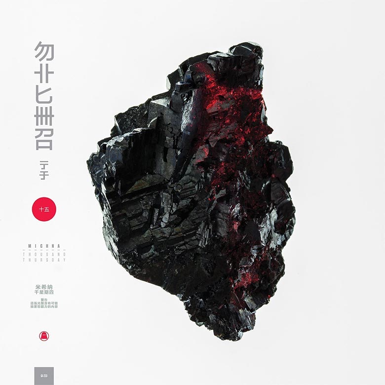
Michael Cina (Art Director & Designer):
We worked really closely together, probably the best true collaboration that I have had. We talked on the phone a lot and Michna was really open to new ideas and different approaches. It was really special.
It was a long process of work. The original concept was to create this science fiction-themed monolith scene. Through time and the creative process, it started becoming more minimal, focusing on the elements and how can we tie the different objects together. The end result was pairing this object on white with an egg on black. They do have symbolic importance, for sure, but my role is to let the viewer make those connections. Some of the original ideas are lost in translation, unfortunately…
Few people have been able to guess what anything really is verbatim. Especially the labels.
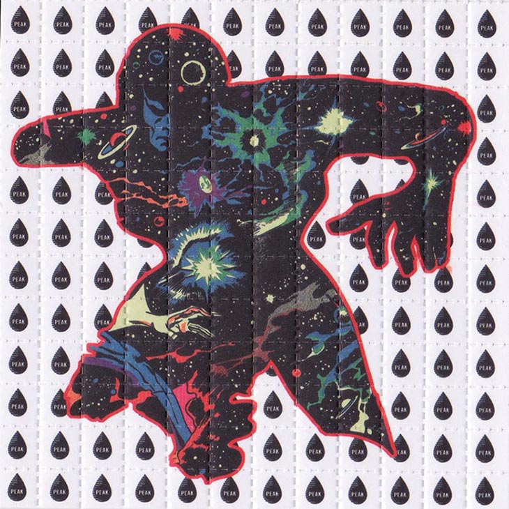
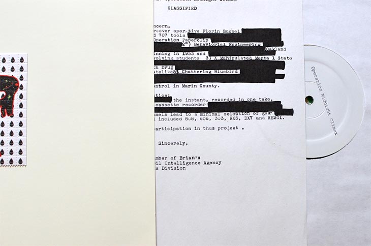
Operation Midnight Climax – New Lines (Peak Oil)
Artwork & Design by Peak Oil and Matthew Spiegelman
Logos by Briar Levit and Aaron Draplin
Florin Büchel (Operation Midnight Climax):
I wasn’t actually involved in the graphic design of the record, but received regular updates about the ideas and progress. As a musician, it’s nice to receive such an elaborate design and execution for an album cover, since that kind of dedication is not often the norm. Even more so as, musically, this is a special project for me as well, deviating from how I normally work: all tracks are done in one take and recorded directly to 4-track cassette tape, resulting in a certain lo-fi and live feeling. I always choose track titles carefully to be coherent within EPs, so this project demanded a dedicated name as well. With the Operation Midnight Climax moniker, countless CIA mind control experiments based on LSD in the ‘50s grant a wealth of inspiration for track labels and visual designs. The cleverly done redacted top-secret insert is but one nice example. The whole record is a well done and coherent package that integrates the various visual and musical aspects – just like a good piece of art should.
NOTE: Pressed in an edition of 300 copies, with perforated blotter art covers, neon screenprinted sleeves, and redacted document inserts.
Pearson Sound – Self-Titled (Hessle Audio)
Art Direction & Design by Andrew Stellitano
Photography by John Hopkinson

Andrew Stellitano (Art Director), via Creative Review:
Mirrors were suspended to create multiple reflections, creating the fluid, distorted effect shown in the cover image and CD insert. When we initially met up, David and I talked about the themes of audio feedback and distortion which he had explored throughout the album. I think the process of capturing the portrait through formed mirror was a nice reference to this visually.
Personable – New Lines (Peak Oil)
Artwork by Tim Goodwillie
The early design work I did with Ged was for his eponymous stuff as M. Geddes Gengras: hand-built geometric models and grid drawings that I bounced in and out of a computer, then cut into North American landscapes. Then Ged sent me the Personable tracks, and I was floored. Deep synthetic beauty with this heavy devastating romantic vibe. At the time, I was simultaneously working with Matt Hill on the design for his Umberto records, and I had gotten into the cinematic effect of simply appropriating a ready-made image with minimal assist, and letting it stand naked on a square in your hands.
So, for the Personable records, I would stone cruise libraries and webs for a kind of scientific psychedelia: early Mandelbrot printouts, Maxwell’s illustrations of lines of force, Fuller’s architectural schematics – whilst banging Ged’s tunes – and I had found this awesome Atlas of Optical Phenomena by Cagnet, Franc¸on, & Thrierr – too perfect – super foxy metallic gleam – light reflected on bent surface. It rang true to the Personable vibe, plus fit perfect with Brian’s idea of using a lenticular cell on the cover.
The interior insert is a blow up of some notecard grids I was sketching to the music; and that one, in particular, fit well – a sort of stumbling certainty in strange juxtapose to Ged’s synthetic metaplexities… and there may have been some shrooms left in the tea kettle.”
I’ve known Tim for 10 years, and he has contributed amazing pieces of art for several releases of mine, all the way back to my first solo LP. We will discuss broad terms, but I trust his instincts and unique interpretation of the musical content. Above all of that, his visuals consistently mirror the murky images I’m trying to ferret out of the corners of my brain. Usually we start with images he has made or collected, to hone in on a general zone, and then he’ll present me with several designs and elements to pick through.
Spires That In The Sunset Rise – Beasts In The Garden (alt.vinyl)
Sounds by Spires That In The Sunset Rise
Collage & Design by Kathleen Baird of Spires That In The Sunset Rise
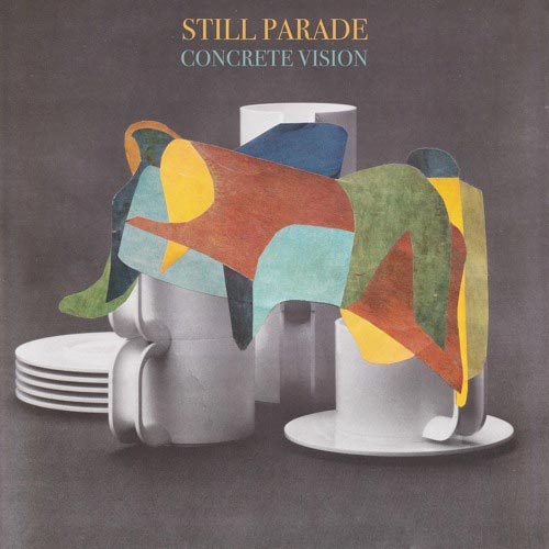
Still Parade – 07:41 / Concrete Vision (Art Is Hard Records)
Artwork by B.D. Graft
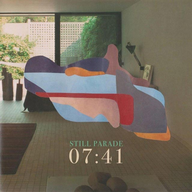
B.D. Graft (Artist):
When Niklas described his idea to me, I thought that it goes very well with what I try to convey with many of my collages: to combine the figurative and familiar with the abstract and emotional aspects of life. When I listened to his new album, fluid bursts of warm colour in combination with domestic, everyday settings and objects seemed very fitting. Whether a bedroom or set of tableware – nothing is significant until it is given meaning by the observer; the areas of colour allow for an individual, emotional interpretation.
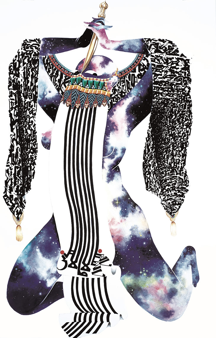
THEEsatisfaction – EarthEE (Sub Pop Records)
Artwork by Rajni Perera
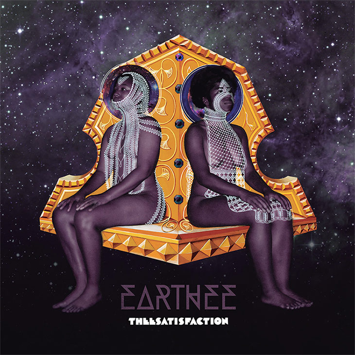
Rajni Perera (Artist):
“It all started with a Google chat, I believe, or it may have been a Skype meeting. They were familiar with my work through our friend Nep, who does visual direction for Shabazz Palaces. They wouldn’t have fucked with me if they didn’t believe I could pull it off visually, philosophically, thematically, and conceptually. We’ve been mutual fans for a while now so everything was easy. We were both ready to say yes to each other about most things.
After the Google chat, where they mentioned some ideas they had, including the name of the album cover, I did some sketches which were shown to Sub Pop’s art director Dusty [Summers], and once they were okayed, I shot them the next time they were in Toronto. We shot at a friend’s house and I totally McGyvered everything physical for the shoot. Since the album’s name had a planet in it, I thought I might as well stick to my guns and paint space – a place where I feel most comfortable. They gave me carte blanche with the cover really, for which I’m most grateful.
The cover artwork is based on a continuing series of mine called AFRIKA GALAKTIKA (BELOW), which has shown in Toronto and Houston. The series is about a black space heroine who commands an army of women all wearing lots of gold and armor. I like to come up with space gear for it and weapons and costumes. They live on a planet with dinosaurs on it and use them for food and transportation. For the cover itself, you SHOULD know that their outfits are hand-drawn with Sakura Gel pens, and the outfits themselves took about 3 days to draw. The throne is hand-painted as well.”
TOYS – Golden Line EP (Fairtrack / Caroline International)
Sounds by TOYS
Artwork by Julien Gougeat
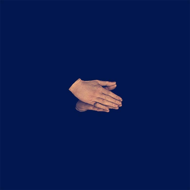
TOYS:
 We decided with Julien Gougeat, the man behind our EP artwork, to use a medieval paint as a basis for our cover. We started searching and looking at dozens of paints from great European medieval painters such as Uccelo, Fra Angelico or Jan Van Eyck, and ended up using the hands from Hans Memling’s Portrait of Tommaso di Folco Portianari (right). This symbol of hands joined together seemed quite strong, in our opinion. Some people see one hand and its reflection; some others, two hands praying. Of course we didn’t want to convey any religious message by showing this image; we just liked the idea of integrating an element from a very old painting in a pop context – and beside the symbolic analysis, I guess we just found it really beautiful.
We like the fact that our cover has nothing but two hands on it, and no text, so people can decide in which direction the hands should be headed. In this way, the physical object like the vinyl or CD has no direction itself, you can turn it upside down and in any way you like. The funny thing is that the hands have different meanings whether they’re heading north, south, east or west.
Vinyl Williams – Into (Company Records)
Photography by Omid Jafarnezhad
Inside Artwork by Ian Gibbs
Additional Artwork by Lionel Williams of Vinyl Williams
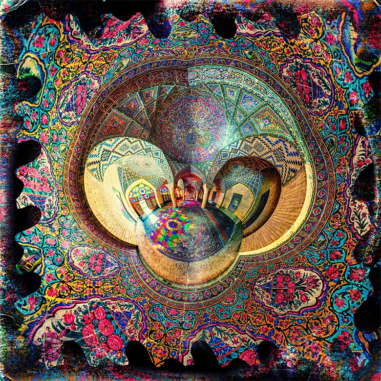
Vinyl Williams:
The album art is a collaboration between Omid Jafarnezhad and myself – although Omid should be credited with most of artistic work. It’s a 360º photograph taken inside of the Nasir Ol-Molk Mosque in Shiraz, Iran. When I first viewed this image I instantly knew it would be immaculate for the album artwork, because of its higher dimensional perspective. When one imagines a view outside of time, or in the spatial dimension of time, it may include all possible angles of any given environment. This photograph by Omid represents this octave of experience by providing an isotropic slice of the interior palace in Shiraz, as well as accentuating its extremely vast aesthetic & ornamental design. “Into” was written about the experiences outside of cognition and outside of the figurative / material world we’re familiar with. This image (to me) represents a space beyond space, so to say.
Omid was very gracious in allowing me to use his image for the album artwork. The main collaborative process involved printing & rescanning the image until it began to look weathered, until it appeared like a record you’d find in a subterranean chamber underneath a musigician’s wizard library. Another image was collaged in the center of the 360º photograph, which is another expansive outdoor set of columns and plinths, located in a garden in Iran. The image was placed at the end of the hallway, extending the hallway beyond perceivable view.
Void of Sleep – New World Order (Aural Music)
Artwork by Simone Bertozzi
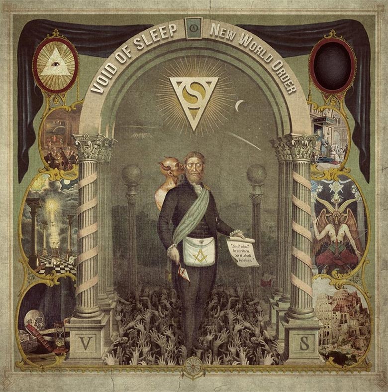
Simone Bertozzi (Artist):
While doing it, I experienced the breath of Lucifer on my back, the Illuminati around the corner and reptilians getting ready for my abduction. Coincidence? I think not.
Wolf Colony – Ocean EP

Xeno & Oaklander – Movements (Ghostly International)


[…] http://www.redefinemag.com/2015/album-covers-of-the-year-2015/ […]