Another year of our favorites in Top Album Cover Artwork, and once again, we interview musicians and artists on the often-underappreciated work that goes into creating a product that not only tickles your ears, but speaks to your eyes and hearts. Album artwork, though often only viewed on tiny screens in this day and age, is indeed a long and laborious process that we love to give its due credit.
So read on, and choose your own artistic adventure:
> Digital & 3D Album Covers
> Fine Art & Illustration Album Covers
> Mixed Media & Collage Album Covers
> Photography & Digitally-Manipulated Album Covers
Fine Art & Illustration Album Covers of the Year 2015
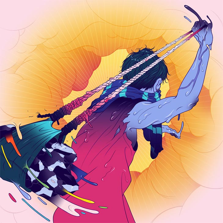
Action Bronson – Mr. Wonderful (Atlantic Records)
Art Direction & Illustration by Richard “FRKO” Montgomery
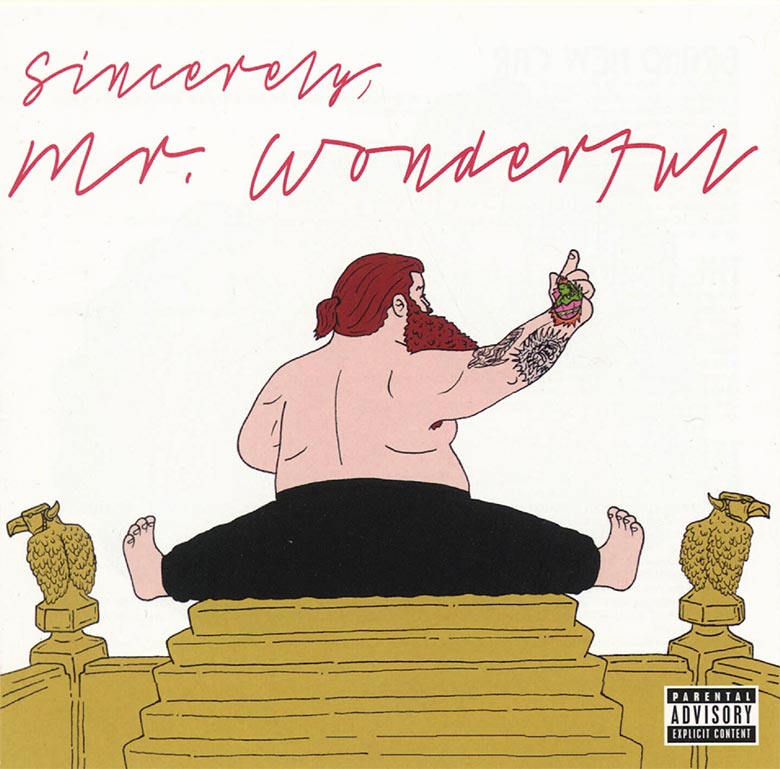
– Richard “FRKO” Montgomery, Artist
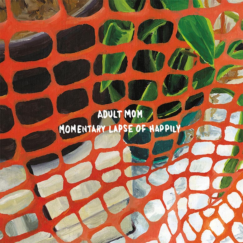
Adult Mom – Momentary Lapse of Happily (Tiny Engines)
Alix Perez & EPROM – Shades (Alpha Pup Records)
Ancient Sky – Mosaic (Wharf Cat Records)
Artwork by Ryan McClennan
Photography by Jaime Boddorff

Brian Markham (Ancient Sky):
The cover is a painting by our good friend, Ryan McClennan. He also painted the band name and album title. I’ve been a long-time fan of Ryan’s work, meeting in Richmond over 15 years ago at VCU.
We mixed the album in Greenpoint at Kutch 1 studios on the 3rd floor of the Pencil Factory. Ryan [McClennan] had a painting studio on the 4th floor, and I would visit him during breaks to check out some of his new work. The vibe of the new paintings just seemed to match well with our new songs, so we decided to collaborate. Themes of isolation and terror come through in both! We also shared a common interest in Kobe Abe’s novel, Woman in the Dunes, where the title of the album Mosaic came from. Our drummer Pat Broderick’s girlfriend Jaime Boddorff photographed Ryan’s piece keeping it in the family!
Air Waves – Parting Glances (Western Vinyl)
Artwork by Strauss Borque-LaFrance
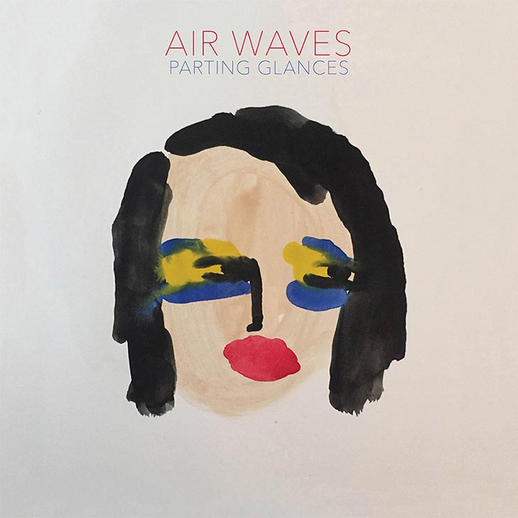
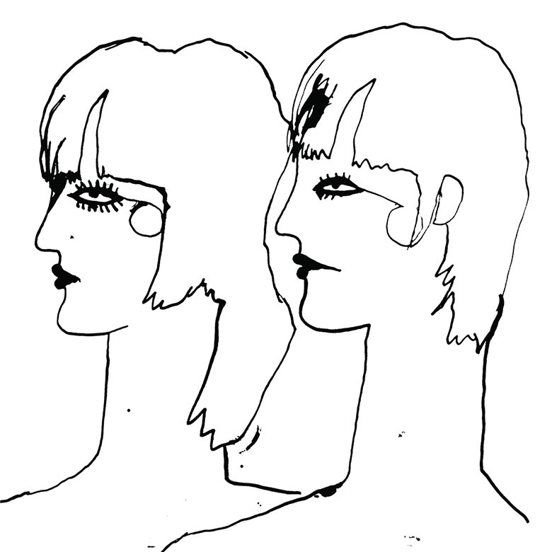
The album features two portraits of the same character – meant to be conceptually direct, but emotionally ambiguous. She looks away from you, succumbing to her fictitious, painted self. The process involved serially painting the same face until the expression was perfectly, sad, funny, and contemplative.
I went to Strauss’s show at Rachel Uffner gallery and was blown away by his work. There was something simple but also complex with his color choices and lines. When the album was coming out, I thought his artistic ideas would fit well with my songs. My songs are simple in their structure, but to me, they have deep meanings that go beyond what’s in the 3-4 chord structure. I found a correlation with the accessibility of both Strauss’s work and my music.
He sent me a series of faces with different “parting glances”, and those are the two that I picked. I was interested in the primary colors and the gender ambiguity of the characters. A few people have asked if it’s me, actually. Which is interesting because I think sometimes I come off as androgynous. My friend described the character as an avatar of me, haha! But I don’t think Strauss had my face in mind for the painting.
The Atom Age – Hot Shame (Asian Man Records)
Artwork by Jake Yerger

Peter Niven (The Atom Age):
After a night of drinking with our organ player Fred and some other friends, I found a text that I sent to myself that just said “album title – hot shame”, which seemed kinda weird, but cool. The girl on the cover is from a 1960s Korean pop record, which I randomly came across. When I saw it, “Hot Shame” instantly popped into my head. A lot of the songs on the album just came straight from the gut without too much time spent analyzing it, and in that way, the title and cover seemed to fit what we made just right.
AWA – All We Are (Domino Recording Co.)
Artwork by Leif Podhajsky
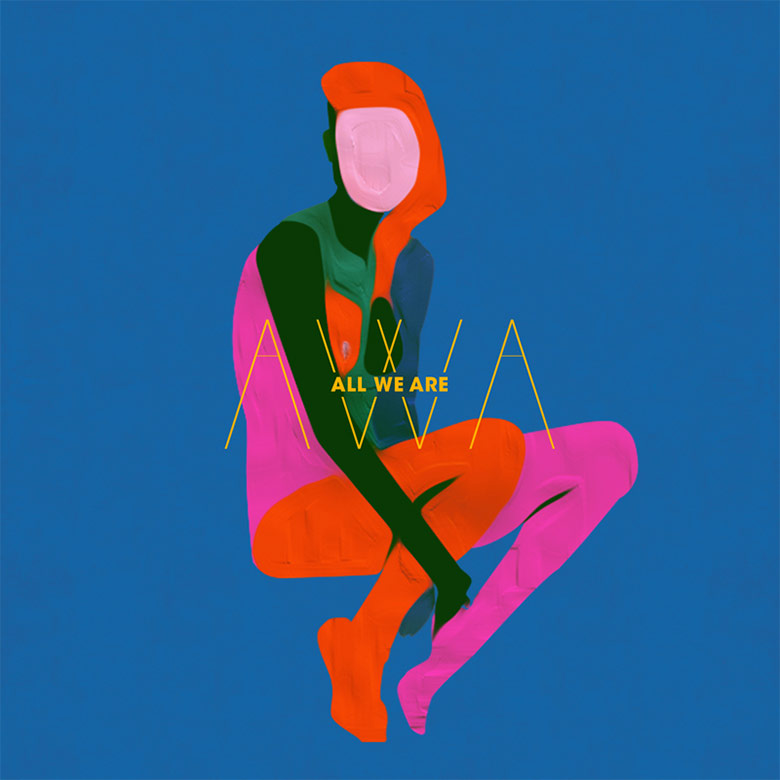
For us, music and visuals go very hand in hand. When we write tunes, we often use movies as inspiration to express our feelings and to get the right ‘colour’ of our moods. And more often than not, we watch a movie together to get on the same page, so we know exactly what we want to say when we are jamming. And for us, it was important to get all those colours/emotions across on the cover. Each track on the album is a specific colour that forms the girl.
We have always loved Leif Podhajsky’s work, and were pretty over the moon when he said he would like to meet up and chat about the tunes and our ideas on the artistic direction. Our first meeting was bang on. He just got it all. We chatted loosely about how we saw the music: bold but withdrawn, direct but spacious, sad but hopeful and confident but vulnerable. We talked about how we wanted colours to represent each track and left everything else up to Leif. We wanted him to have free artistic range and for him to make the tunes come to life. And so he did! He came back with the cover of the girl and we just looked at each other and smiled, yeah, that’s it!” – AWA
Baroness – Purple (Rostrum Records)
Artwork by John Dyer Baizley of Baroness

Ben Browning – Turns (Yellow Year)
Artwork by Mitchell Dickie

Ben and I initially spoke and exchanged our ideas and vibes, and were very much on the same wavelength from the start, which made it really great to work on.
Interpreting the title, Turns, led to my idea of illustrating something of a ‘turn of events’ – through which I wanted to reflect the themes in Ben’s songwriting in a loose way.
Through chatting with Ben, the song title and vibe of the track “Life Dude” influenced this strongly also, and so the characters themselves kind of inherently became “Life Dudes”.
Throughout both the idea development and refining of the concept, I was listening to the record a lot while drawing and working, so I think the vibe of the record informed the playful aesthetic of the final work in a pretty big way.
I’d worked with Mitchell’s brothers in the past on music videos and the graphic design for my previous EP, and I knew Mitchell had been developing these cool illustrations and I thought his graphic style would be perfect for the album cover. We both shared a fascination with Japanese graphic design and bands like Yellow Magic Orchestra, who were an inspiration for the album. As soon I saw some of the early drafts Mitch created, I knew he was on track to produce something pretty interesting and something that would match the theme of the record.
The Bird And The Bee – Recreational Love (Rostrum Records)
Artwork by Geoff McFetridge
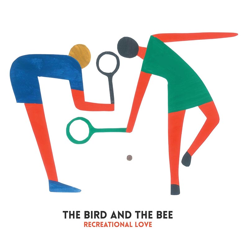
We’ve known Geoff for many years. We’re close friends but also huge fans. So when we asked him to do the album artwork and he said yes, we were very excited. Geoff is the kind of artist that really doesn’t need very much direction. He used the title of the record and some of our press photos and took it from there. What he came up with is far beyond what anything Greg or I could have imagined.
I wanted to do something that had the lightheartedness that is intrinsic to the project but that also gives it context.
I see Greg and Inara as parents and neighbors. As individuals and as artists, they are indigenous to this place. Where we live in Los Angeles is deep with golf, tennis, and long healthy lunches. I wanted the art to fictionalize the reality of their lives – a resort vibe, or a daytime concert live in Griffith Park. Conversely, it could be a club invaded by coyotes, hawks and ringtail Foxes, who are also indigenous to our neighborhood.
I wanted the art to feel decorative in a way that it feels pulled from their world, not necessarily designed specifically or as a portrait of what I heard on the album. A bit like it was found.
NOTE: I had just come back from New York and had seen the Matisse cutouts show… so they are cutouts, in a way. I actually used a thin masking material and cut away the images like stencils then painted in each figure. So it is not a collage, but composed on the page. Exactly as it appears in the album art.
Brothertiger – Out of Touch
Painting by John Jagos, Sr.
Design & Layout by Kenny Phillips
Cover Painting Photography by Jimmy Noyes
Clap! Clap! – Simple EP (Black Acre)
Artwork by Loup Blaster
Vinyl label by Patch D Keyes

Cristiano Cristi (Clap! Clap!):
The EP artwork is based on the concept of “simplicity”. I recorded those tracks during my girlfriend’s pregnancy and I’d been struck by the simplicity of life creation – so I produced the tracks, giving them the mood of what inspires simplicity to me.
To represent this concept, Iasked to Loup Blaster to concentrate her work on plants’ photogenesis. I asked her this because I think that it is more stylistic to represent that concept orienting on gree,n natural elements more than on human life genesis… I started the idea with “plants concept” and she changed that to “mandalas”. There is so much liberty for the creation process as for the inspiration process, from both parts!
DRINKS – Hermits on Holiday (Heavenly Recordings)
Artwork by Tim Presley of White Fence, 1/2 of the group with Cate Le Bon
– Tim Presley of White Fence and DRINKS, via Noisey Interview
EMEFE – Self-Titled (Self-Released)
Artwork by The Collected Works
One of the main conceptual themes of the record is the idea of tension and release, the breaking through static towards clarity, the duality between darkness and light. This led us in a direction where we also wanted to incorporate something that resonated with us from our early talks with Miles, how the band uses a mix of digital and analog techniques to hide and reveal musical patterns. We thought that this was just another extension of the duality of the themes explored in the record, and started exploring ways to bring all of these themes together. It all started to come together as we built a custom piece of software using the mathematical equations of ‘reaction-diffusion’ models, based on natural reactions found in geological, chemical and biological processes. This started to generate digital images that looked and felt organic, patterns that evolved and grew in front of our very eyes, with EMEFE at the center of it all.
The music on the album is about ‘breaking through the static of everyday life’. The songs wade through anxieties and fears in an effort to find some clarity. Working together with Justin Colt and Jose Fresneda at The Collected Works, we had the idea to have the album cover to be an abstract representation of the craziness of static, with the name EMEFE breaking through the madness. When you open the CD or Vinyl, the inside panels have a splash of digitized color bits over black, relieving the black-and-white front & back covers with color and light…
We didn’t want the traditional layout for the album artwork, where the tracklisting dominates the back cover. Instead, there is a continuous pattern front and back, where the back is the inverse of the front, offering a different perspective on their wonderful cover design. Musically, it is the equivalent of letting a groove simmer for a little while before moving on to the next section. Then, when you open the album, the inside features a splash of color and the tracklisting/credits. Each art panel (front and back, inside panels, on the album) is totally different – there isn’t any recycled or repeated material. Each panel builds on the overall theme, and there is an evolution to the art as the listener explores the album. This was our approach to the music on the album – EMEFE is more of a through-composed “journey” as opposed to a batch of songs – so the artwork aligned perfectly.
Eternal Tapestry – Wild Strawberries (Thrill Jockey Records)
Artwork by Natalie Anne Howard
Everything Everything – Get To Heaven (RCA Victor)
Artwork by Andrew Archer
– Jonathan Higgs of Everything Everything, via Brighton’s Finest
Father John Misty – I Love You, Honeybear (Sub Pop Records)
Artwork by Stacey Rozich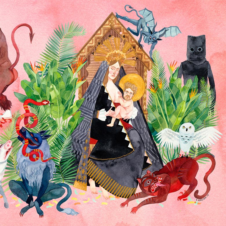
Stacey Rozich (Artist), via Creative Review:
The album itself is full of so much potent imagery, it was easy for me to pick out certain scenarios to bring into the whole piece, but it was sometimes hard to make a cut-off point because I could have made a billboard-sized LP cover with every idea Josh [Tillman] and I had based off of the lyrics.
Geographer – Ghost Modern (Roll Call Records)
Artwork by Amos Goldbaum

Geographer came to me with the basic idea: a sea of objects and scenes from around the world and throughout history, with a face-shaped piece missing in the middle.
We came up with a list of things to draw together, but quickly ran out and had to add more. We wanted a mix of objects, people, and places, some ordinary and some more emotionally charged. I drew the whole thing freehand in pen.
I wanted to convey the experience of living in our kinetic and overflowing times, to display the feeling of being surrounded by so much information that supposedly defines us, but really just creates an outline around us, a wall that defines only our borders, and obscures our interiors from others and even ourselves.
It was more about the cacophony of elements than any one element. The juxtapostions were very important to me. That there would be a violent image near a sexual act, a household item near a blue whale, a religious icon near a mundane household item.
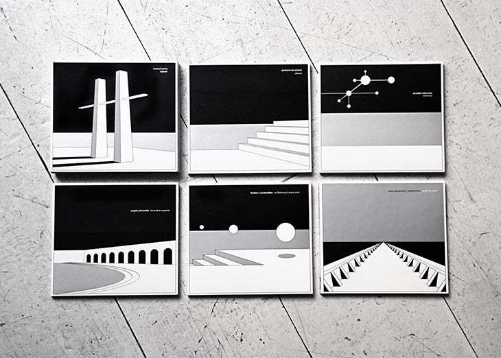
Giovanni di Domenico / Jim O’Rourke – Arco (Die Schatel)
Artwork & Design by Bruno Stucchi
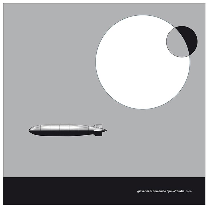
– Bruno Stucchi, Artist
“It all comes from hand drawing. As simple as that. All my covers (or my designs) are conceived on a piece of paper – sometimes a very humble one, using a pencil, or a feltpen, or a ballpen. plus some additional colors, usually limited to red, grey, silver or gold. And a lot of white space.
I use my Mac as a classic drawing tool, as well. No 3D software of any sort: no filters, no digital programming. I have constructed all of the featured designs starting from the basic rules of classic drawing: perspective, horizon, lines, my eyes. A pure analogical process. This also reflects the aesthetics of the majority of the music I love and produce as Die Schachtel, especially when it comes to archive releases…
Die Schachtel is (with very few exceptions) fully dedicated to the Italian avant-garde/experimental music scene, from the Fifties/Sixties up to our days. In some cases, we literally dig out treasures buried in archives that have been hidden and forgotten for years…
I want to recover and give back a little bit of that lost intelligence and bravery, by taking inspiration (apart from the music itself) from the ideas of the Italian artists and the designers who produced some of the most impressive work of the last century: clearly De Chirico (the Magic Architecture or Imaginary Landscapes for the new composers’ series – and yes, Borges too, in the sense of being stranded in some arcane landscape, feeling a sense of nostalgia for some lost myth); but also the Italian “informal” art of the fifties (MAC, Capogrossi, Burri); Fausto Melotti’s light sculptures and Lucio Fontana, Bruno Munari, Piero Manzoni and his conceptual approach to white or nothingness. There’s more more: the protest design of the seventies (Gianni Sassi of Cramps records who was one of my teachers many years ago); 50s’ Italian graphic design (Carboni, Pintori), concrete poetry (Magdalo Mussio), and many other references and names less known yet worth discovering.
– Bruno Stacchi, Artist, via HardFormat
Gyasi Ross – Isskootsik (K Records)

JAILL – Brain Cream (Burger Records)
Artwork by Helen Groom Poser
Design, Layout & Additional Artwork by Josh Evert of Jaill
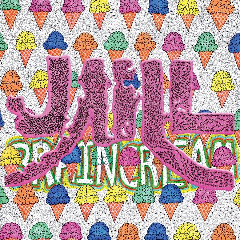
Vincent Kircher (Jaill):
The album cover was drawn by Milwaukee artist Helen Groom Poser. Brains on ice cream cones was her idea from the stop motion video for “Change Reaction”, in which a boy pulls out a unicorn horn and brains, and the horn form an ice cream cone. I really loved that imagery and thought it represented the album and music well, so so I asked her to incorporate it into a cover. I wanted a colorful album cover. All the rest of the ideas were hers. Josh Evert, Jaill’s drummer, helped with layout of the title and markered on the words, “Brain Cream”.
My favorite part of the imagery is how saccharine it appears but how nicely it belittles our most important asset, brains, into a delectable treat for others to gobble up while surrounded by the ghosts of all that came before. And the bubblegum-ish Jaill title is covered in ants cause swarms of pests will always find the sweetness.
James Blackshaw – Summoning Sons (Important Records)
Artwork by Ai Blackshaw
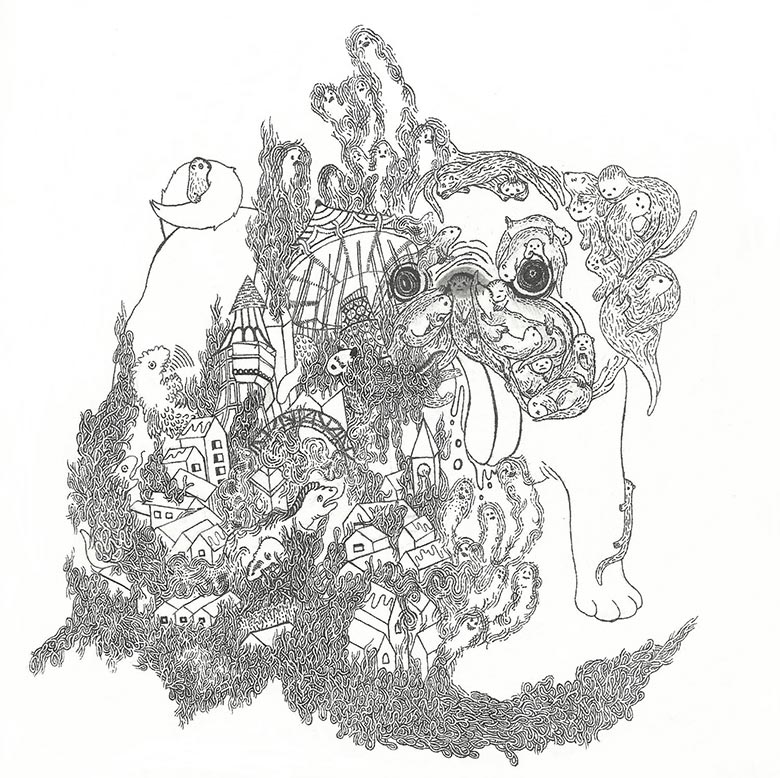
Ai Blackshaw (Artist):
One of the themes of the cover artwork is “dark fantasy”, as both myself and James share a common fascination with fantasy fiction, films, art and games, which is also reflected in the lyrics of the album.
At the time James was writing Summoning Suns, we really wanted to adopt a pug (we had what you might call “pug fever”!) and I wanted to include that in the imagery.
The giant pug is a shy, lonely and cowardly creature who lives through his imagination and can create anything he desires, but he has lost control of his imagination. The town and the otters are being attacked by monsters and the town is being destroyed by flames.
John Dwyer – Hubba Bubba (Castle Face Records)
Painting by Deirdre White

Lilacs & Champagne – Midnight Features Vol. 2 (Temporary Residence Ltd.)
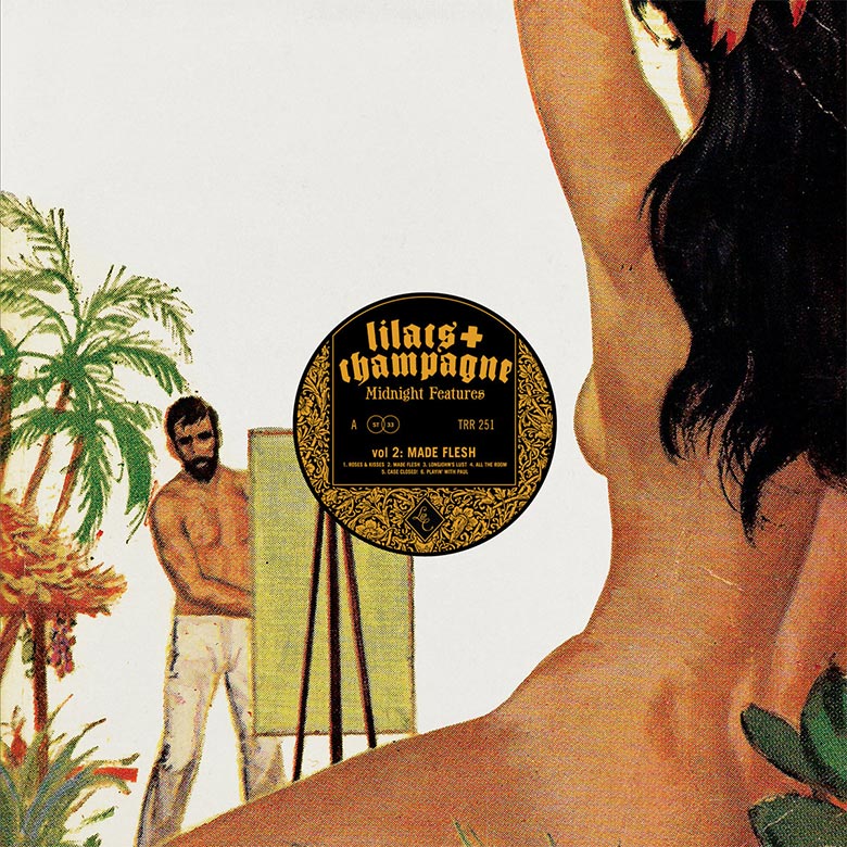
Things don’t really change that much within the realm of human nature. But it’s always easier to spot our collective idiocy in the past. So, to mock ourselves, we tend to pull from a time of easier targets. The specific circumstance we were referencing with this cover was from an old biography of [Jean-Paul] Sartre I’d read in college that said his insanely technical books like Critique of Dialectical Reason were written while he was fueled by a mental obsession over sexual imagery. And since we grew up around the sleazy music from early porn and the feelings that music evokes, it follows that we pull the artwork from a time and place that reflects those uneasy feelings too.
We’ve been super into old smut paperbacks and “Men’s” magazines from the mid-century for a while, and the cartoonish sleaze of the cover illustrations was a perfect fit for the Midnight Features series. The popularity of the soft-core aesthetic is easy to understand, but the appeal for us isn’t just retro for its own sake. We grew up in a time when pornography still had real transgressive power – something that you only peeked at between the slats in the saloon doors at the video rental store. And these paperbacks from the ’50s and ’60s are a look back even farther, to a time when sexuality and lust were forces better sublimated for the good of society and tucked away under the mattress. In the present moment, when an apparently significant portion of the American population seems obsessed with the fantasy of “making America great again” by driving culture back to that place of relative innocence, it’s probably important to recall some of the more absurd, dark aspects of the era.
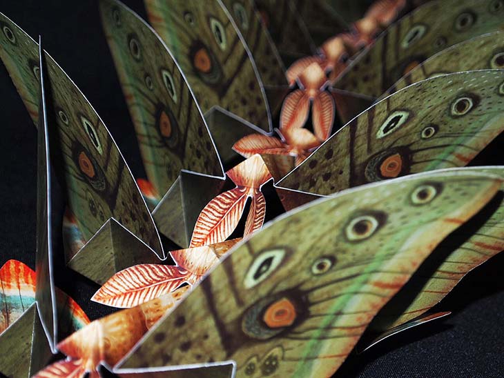
Merzbow – Konchuuki (Essence Music)
Artwork by Vladimir Stankovic
Art Direction & Packaging Concept by Uirajara Resende at Essence Music
Paper Engineering & Hand Assembly by Essence Music
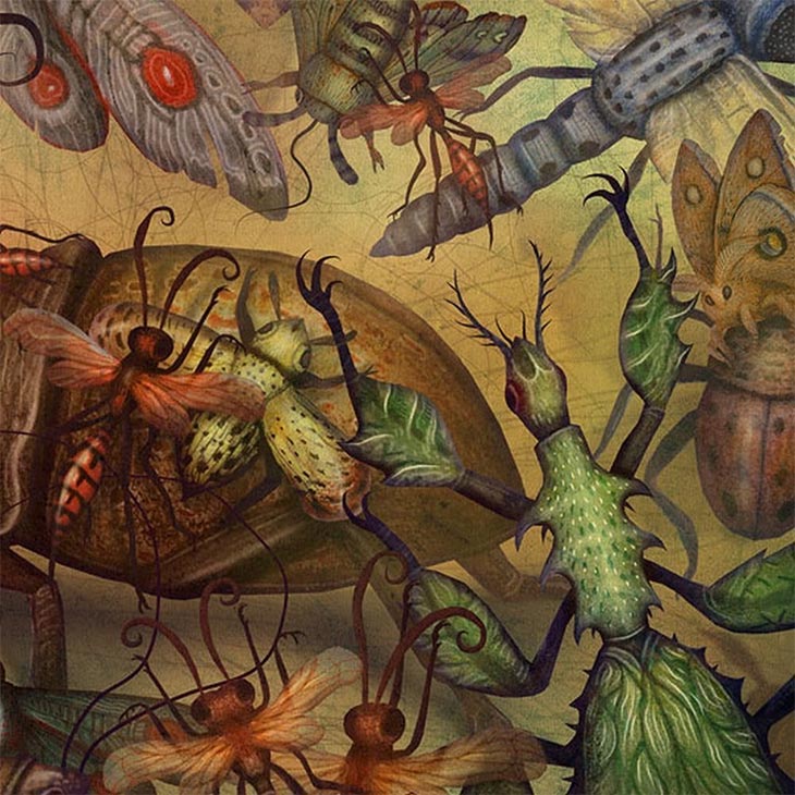
I’m a huge fan of children’s pop-up books and all the intricate paper engineering employed on them. On Konchuuki, we wanted to conceive something related to insects, yet using some of these books as inspiration. Giving life to a butterfly or a moth sounded like a natural direction, and after an endless number of mock-ups, we came up with the right dimensions, angles and mechanics that should be used for it on the packaging.
Vladimir Stankovic is a wonderful artist who had been caught my attention a few years back with his beautiful and incredibly detailed watercolor plant and animal illustrations. Not to mention some bizarre and surreal editorial works for children’s books. We had the pleasure to have him on board, laying down a beautiful artwork on the templates we had created. A project like that requires a lot of back-and-forth collaboration and patience, and he was definitely a perfect match.
All copies were hand-assembled in-house – one by one, piece by piece.
I was approached by Uirajara, the label owner, who had seen some of my works online, and when I read that it will be a pop-up packaging, it was enough for me to accept the offer.
For the creation of the illustrations, I used watercolors and colored pencils for the first hand-made phase, and afterwards, I used Photoshop to arrange and fine-tune the insects and all the details. Once I got the composition down, it was all about painting the insects and capturing the buzzing atmosphere for the cover.
It took about a year for the CD to get released but it was worth the wait as it was so masterfully printed and assembled, and I can say it is definitely one of my favorite projects I’ve worked on.


Mild High Club – Timeline (Stones Throw Records)
Artwork by Clay Hickson
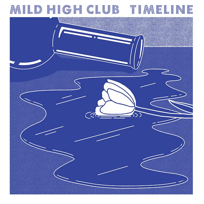
The way that I found out about Clay’s art is pretty weird, so my old roommate used to work for an art supply store in Hollywood and he would bring home Juxtapoz every once and a while and I would just flip through em’ and uh, I kind of wrote Juxtapoz off for years, because it seemed like it kind of shifted since I was in high school. For some reason, I was flipping through it and I saw this incredible airbrushed piece that Clay Hickson had done. It was this portrait of bongs and wine glasses and cheese, like all these things in airbrush form. So I just hit him up and was like, hey, here’s the record, I really think that we can make something together. Clay liked the record and he sent me some artwork and we just did it up. And it turned out that the artwork is probably better than the fucking album. I’m so fortunate to have an established artist do a painting for the cover for me.
I was going for a kind of subtle stoner-romanticism. The spilled vase is supposed to be reminiscent of a bong and the single white rose in the puddle (of bong water) is meant to symbolize heartbreak.
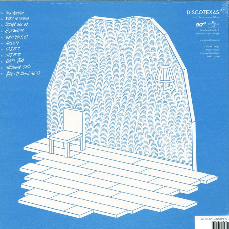
Moullinex – Elsewhere (Discotexas)
Artwork by Kevin Lucbert
Design by Braulio Amado
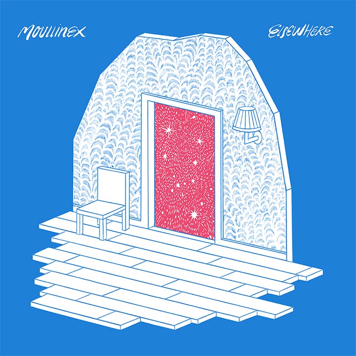
To me, this design is based on the thematic of dreaming. It works as an invitation to step into a new and strange world through the symbolic element of the open door. The stars, and the fact that the part of the house is floating in the air also tends to create a supernatural and dreamy atmosphere. Those elements, like dreams, can have many different interpretations. This is what I like to do in my work: create open metaphors that drive people’s imagination in many possible ways in order to make the viewer questions what he sees.
Luis (Moullinex) already had an idea of what the cover should be like when he approached me. I remember there were some sketches with photos, but it was only when Luis found Kevin’s amazing work that everything made more sense. When we got the final illustrations, I thought it would be interesting to play around with the door and add an extra dimension to the cover — so the vinyl version has a cut out with two different backgrounds printed on both sides of the insert, one with stars and the other with a jungle. Most people nowadays listen to music digitally, so I think that it’s always cool to add something else to the design of the package and make people excited about owning a (physical) vinyl record.


NRVS LVRS – The Golden West (Breakup Records)
Sounds by NRVS LVRS
Painting & Artwork by Ryan Shaffer
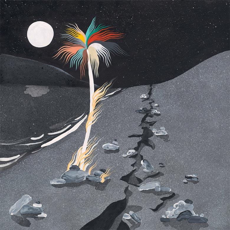
Andrew Gomez (NRVS LVRS):
When talking to the artist Ryan Shaffer, we discussed a number of ideas that we wanted to incorporate into the album artwork. Visually, we knew we wanted mainly shades of black, white, and grey with a few splashes of color. Conceptually, we wanted something that captured the theme of our record: dealing with the adverse effects of the tech explosion & the rising income inequality in San Francisco. At the same time, we also didn’t want something that was too literal.
Ryan sent us different images ranging from sketches he was working on to old photographs in order to set a tone and a direction. One photograph showed a woman standing near a gaping fissure from the 1906 earthquake, and we all loved it. He incorporated that into his painting, which to me could represent a number of things from the ever widening gap between the rich & the poor to the increased distance & loneliness people feel from the increased influence of technology in our lives. After Ryan came up with the burning palm tree, we started getting really excited as it felt that particular component nailed the feeling many of us had that we were rapidly losing one of the most vital aspects of San Francisco, namely its arts & culture scene.
The artwork on the back of the record frankly could’ve been used on the front, and we would’ve been happy. The black sun setting over a grey ocean is beautifully bleak as the color palette Ryan used takes the well-worn image of a sunset & removes the connotations of a tropical vacation, replacing it with a fascinating darkness. We feel like we got a two-for-one deal from Ryan’s extraordinary effort, and the artwork collectively feels like a lament for the uniformity & monotony imposed on us, while it’s simultaneously a love letter to the remaining color and vibrancy still left in the world.
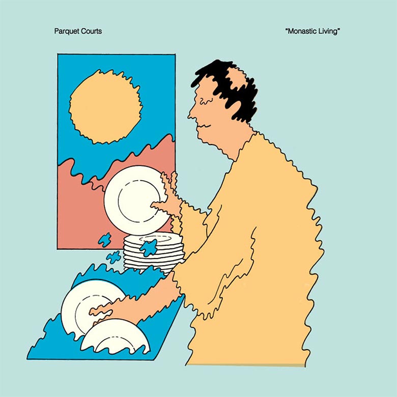
Parquet Courts – Monastic Living 12″ (Rough Trade)
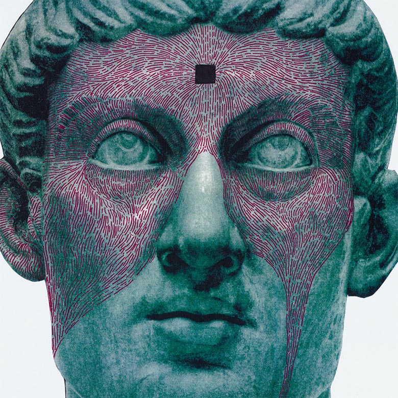
Protomartyr – The Agent Intellect (Hardly Art Records)
Artwork by Joe Casey of Protomartyr
The Sandwitches – Our Toast (Empty Cellar Records)
Painting & Artwork by Diedre White
Layout & Everything Else by Arvel Hernandez of Empty Cellar Records
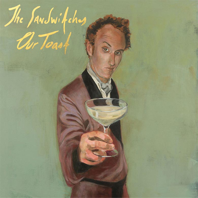
Heidi [Alexander of The Sandwitches] has worked with my husband Tom Heyman on musical projects, but I’m not sure how she came to know my work. Heidi worked pretty closely with me from the very beginning of the project to the end. I’d check in with her along the way as the painting progressed. She and Grace [Cooper] would then discuss and get back to me and I’d make changes. The concept was, by my standards, pretty specific, which makes it easier, but also challenging when you’re talking about color. For example, everyone might have a different idea of what “olive green” is. So I had them send me visual examples of color, not just verbal descriptions. The painting went through quite a few iterations!
We’ve been shamelessly exploiting James Finch as a studio bass man for our entire recorded history, underpaying him, bossing him around, etc., and we thought it was time to give him his due. The rest is pretty literal. The record’s called Our Toast; he’s toasting. James has always had a bit of a other era sexy nerd vibe, so we were trying to go for that, but darker.
Deirdre is an incredible painter who is incidentally married to an incredible guitar player. She, he, and we all know James — the subject — in our own ways and for many years, so I think we basically asked her to capture a certain essence of James Finch and she produced a perfect rendering, full of mood and personality. In earlier stages, the painting was a bit more Vegas Playboy in his prime, with really saturated bright colors and a slightly cockier expression. At some point, considering the mood of the record, we asked her to darken it up a bit, and Grace requested the ascot. It was a pleasure working with Deirdre – really incredible; she’s a fantastic artist.
Smurphy – A Shapeless Pool of Lovely Pale Colours Suspended in the Darkness (Leaving Records)
Artwork by Smurphy

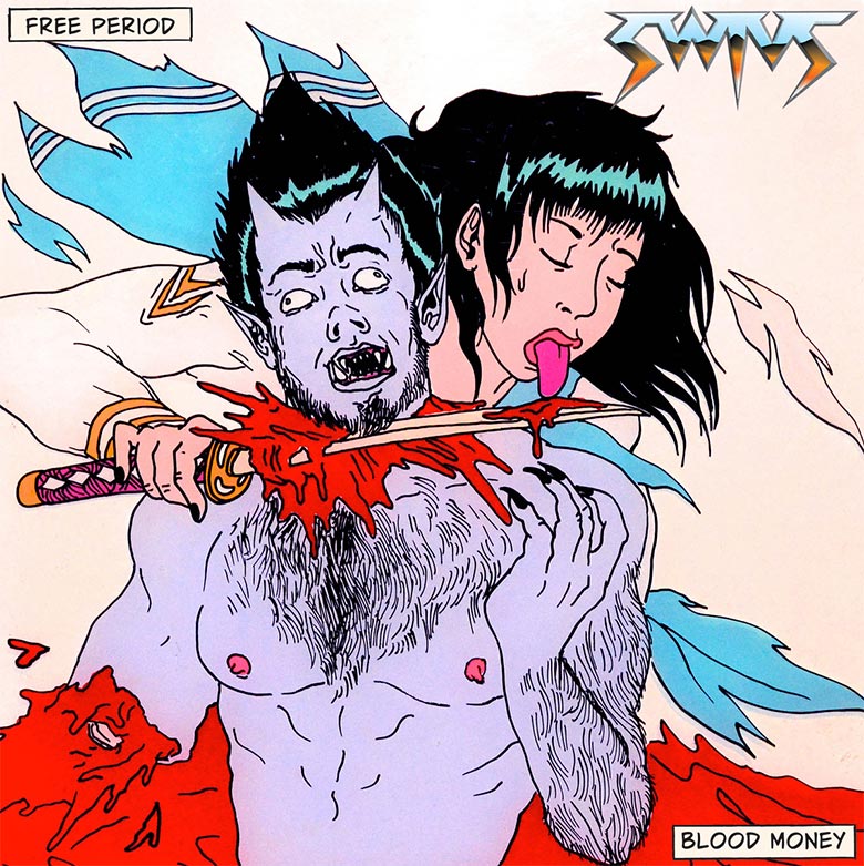
SWIVZ – Free Period Blood Money (Unblinking Ear Records)
Artwork by Tina Lugo
Twinsmith – Alligator Years (Saddle Creek Records)
Artwork by Anne Peterson
Layout by Zach Nipper of Saddle Creek Records
Additional Design by Bill Sharp
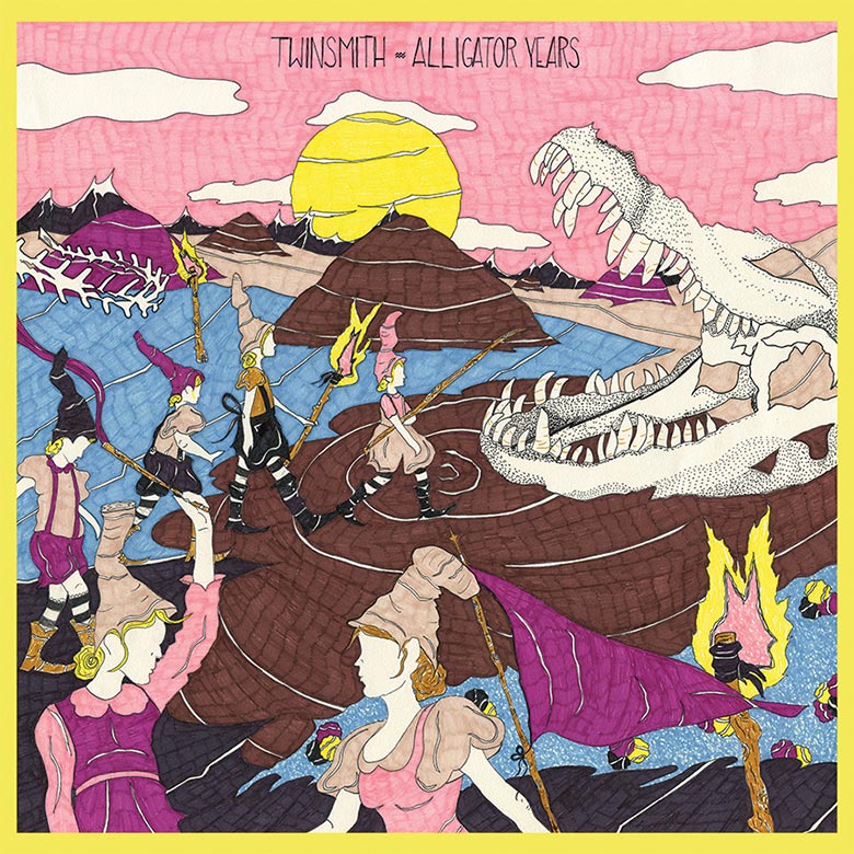
I had made the album art for our previous releases, and as we were kicking around ideas for Alligator Years, I brought up Anne’s work, which I had seen at art shows and on Instagram. I showed some pieces to the other guys in the band, and they were into it, so I sent Anne a message asking if she’d be interested. We really only had one meeting to discuss art direction, and that was really all it took. Being familiar with the themes of her previous works, I knew that whatever she came up with was going to be pretty cool.
My collaboration with Twinsmith began when Bill emailed me and asked if I would consider drawing something for Twinsmith’s upcoming record. He gave me the title, Alligator Years, and told me to do whatever I wanted, with the agreement that I would include an alligator. That’s really about it!
At that time, I was studying bog bodies and looking into archaeological excavation when I began to wonder about periodization of blocks of time in history. How these periods seem so far in the past that they like become futuristic fairy tales to me makes me laugh. The drawing is just a little narrative on coming and going, past and present; how time is silly, and who’s in charge of it? I’m not sure if the Twinsmith guys interpret it that way, but they liked the drawing anyway.
Woolen Men – Temporary Monument (Woodsist Records)
Artwork & Design by Stef Choi and Tony Candelaria of Belly and Bones
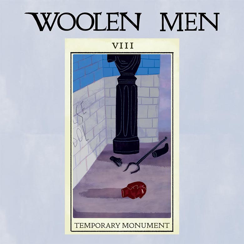
SC: The concept was for us to create a NEW tarot deck for the album, a card representing each individual song. We tried to follow the format of the Marseille deck, and created each card as if they could actually be used in a reading. We built a symbology, a color structure, and juxtaposed interpretations that ran through all 12 cards.
TC: What was really helpful to us was that the band shared the content and meaning behind each song and then gave us the room to find what it looked like visually. We first sent them quick sketches that we made while listening to early recordings of the songs. I enjoyed watching the visual styles come together slowly while at the same time the musical structure began to fall into place.
SC: Raf said clearly he didn’t want it “to be cute”, and coming from my sometimes very cute illustration style, I found it be a refreshing thing to hear. Tony and I basically created a whole new illustration style together for this project. It was the first time we illustrated in this way – going back and forth on the paintings, handing them off to each other until we found something that felt right.
TC: We shared our initial ideas that we had sketched on flash cards. These were very simplistic drawings that gave us a jumping off point to work from. We experimented with a handful of mediums, from digital to watercolor, eventually coming to a combination of both.
I think that for me it was the desire the have a unified theme and to work specifically with Tony and Stef. The more familiar you become with the images in the Marseille tarot, the more they systematically grow in power, and I wanted to approximate that — to recapture that old feeling of staring for hours at a record sleeve. I wanted to mimic the logic and composition of the tarot deck but avoid specific references or theme, to have respect for the Marseille deck and not just make knowing references to its specific visual style. Each card was the product of a conversation we already had going on musically within the band. The whole collaboration was made possible by a childhood friend of Raf’s — Andrew Engert — who ensured we could pay Tony and Stef properly for their excellent work without worrying about the bottom line and moving units.
NOTE: As per the apparent “rules and regulations” of the internet review process, only the front of the record was shown digitally to most reviews which meant that the true extent of the artwork was completely lost without a physical copy in your hand. Just another example of the faux conveniences and hidden distortions endemic on the net. (Editor’s Note: See below for additional images from the package.) – Lawton Browning, Woolen Men


[…] http://www.redefinemag.com/2015/album-covers-of-the-year-2015/ […]