Another year of our favorites in Top Album Cover Artwork, and once again, we interview musicians and artists on the often-underappreciated work that goes into creating a product that not only tickles your ears, but speaks to your eyes and hearts. Album artwork, though often only viewed on tiny screens in this day and age, is indeed a long and laborious process that we love to give its due credit.
So read on, and choose your own artistic adventure:
> Digital & 3D Album Covers
> Fine Art & Illustration Album Covers
> Mixed Media & Collage Album Covers
> Photography & Digitally-Manipulated Album Covers
Photography & Digitally-Manipulated Album Covers of the Year 2015
Anenon – Camembert (FoF Music)
Artwork & Design by Eric Hurtgen
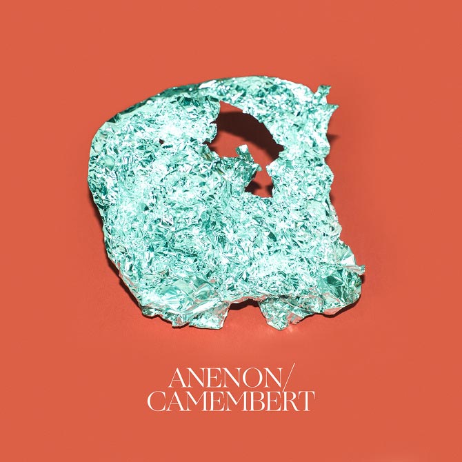
Eric Hurtgen (Artist):
With this particular project, I tried to work from my gut as much as possible. Brian’s music always has this sublime element to it, it always moves me in an emotional sense, so I wanted the artwork to reflect that. Also, any time you’re dealing with wordless music, it’s very easy for the listener to apply their own particular meaning onto it; the music is kind of a vehicle. So I imagined this odd piece of foil formed as a kind of mask that’s reflective but complex and stark. I wanted it to feel simultaneously royal and important but also kind of throwaway, almost like a food wrapper—just like a nice mix of completely mundane and also completely elevated and beautiful.
I created a couple other versions that were much more ‘safe’, I guess, and I did this one thinking, “This is the last one Brian is gonna choose”, but it was my favorite, so I included it. I was surprised and very excited when Brian came back and was like, “That last one is the one.” Also, I have to say Brian is great to work with. He’s very opinionated in what he’s looking for in a really good way, and knows how to push you to make things better.
Anna von Hausswolff – The Miraculous (Other Music Recording Company)
Photography & Design by Anders Nydam
Additional Images & Etchings by Anna von Hausswolff
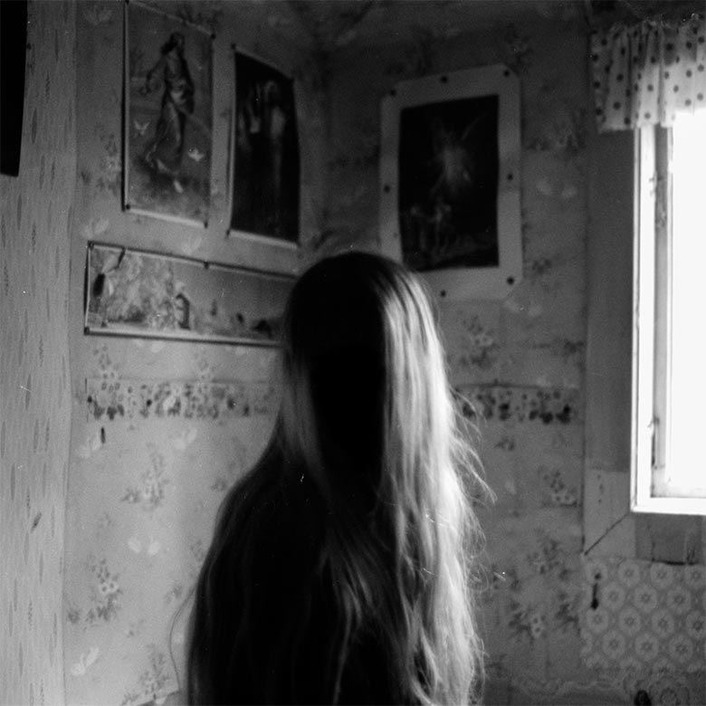
Anna von Hausswolff (Musician):
The Miraculous is about a place in Sweden where I´ve spend a lot of time, both in my youth and adulthood. This place has a long and fascinating history, and I´ve heard some incredible stories about this place, but I have no idea what has actually happened there. There´s seem to be a very blurred line between fantasy and reality, and I always have a hard time to separate the truths from the lies.
The imagination that thrives there is strong, and the nature inspires a lot of creativity. It´s impossible to go there and not become affected by the atmosphere. The nature — together with the emotional depth of the stories about this place — makes it magical. I go there, I get creative, I listen to the story, and I write the story at the same time. The front cover is a portrait of me in this place, a faceless creature surrounded by symbols, light and darkness. Anders Nydam took the photo with an old analog camera so we had to wait until our return to see the final result. When we scanned the image we were quite shaken. Everything in this image is real, but a shadow hides my face. It was a perfect metaphor for what The Miraculous is about: How all the magical things lurk in the dark corners of our reality.
Battles – La Di Da Di (Beat Records)
Art Direction by Dave Konopka of Battles


The Black Ryder – The Door Behind The Door
Art & Photography by Suzy Poling
Creative Direction & Graphic Design by Aimee Nash
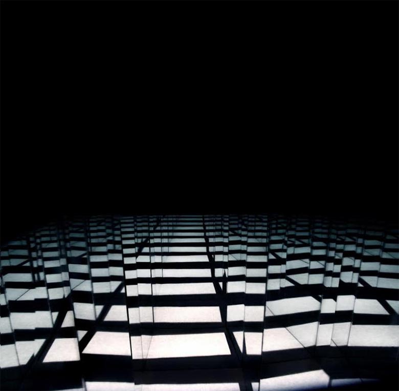
Thematically, I had a very specific idea about the visual direction for this album. This record has a cinematic and multi-dimensional quality to it which conjures up a sense of moving through space(s), transcendence, ascension and journeying into the unknown. I wanted the artwork to convey something that was enticing, alluring, dark; a portal into another dimension, a stairway ascending into the unknown.
I had the pleasure of meeting Suzy Poling completely by chance when I was out one day in Los Angeles. We spoke briefly at the time we met, but we had a very instant connection, and from there, we stayed in touch. At the time we met, I had no idea of Suzy’s immense artistic and creative talents. As our friendship grew, we began talking about collaborating together. We had many discussions about the possibilities and potential for the imagery, and Suzy began to create what would be the final album cover art. When we began to talk about portals, that was when the direction of this particular image began taking shape.
Suzy has an incredible collection of art and photographic work; her art is otherworldly. I was particularly drawn to her light art installations, and the more we spoke about portals and the meaning of the album (The Door Behind The Door), and also talking about a doorway to another dimension, the more it led Suzy towards creating something specifically for the cover art, which resulted in this final image.
The photograph used on cover of the Door Behind the Door is a part of an ongoing photographic series of my work called “Light Apparitions” that I started in 2011. I work extensively with mirrors, projections and light to create abstract landscapes with the effects of refraction and reflection.
Aimeé and I have some very similar tastes and interests and are close friends. We both love James Turrell and we would hang out and look at images and talk about portals and transdimensional spaces. I have my ongoing projects working with light art that I have been doing since 2008 that she was in support of. I just made images in the same vein that I did with my other “Light Apparition” photographs and it really fit the concept of the record. I created new pieces and shared work of mine that could relate to the idea of the Door Behind the Door. She did inspire me to relate to the name and concept of the album, of course there was a lot of thought and care to communicate accurately. We both inspired and pushed one another forward. She is a visionary person and I was happy to work with The Black Ryder. It all just clicked together naturally.
Blanck Mass – Dumb Flesh (Sacred Bones Records)
Photography by Alex de Mora
Retouching by Mike Harris
Art Direction by Benjamin John Power of Blanck Mass

Alex de Mora (Photographer):
For this project, it was much the same as the last ones. Ben normally has a very clear idea of what he wants the imagery to look like. After a few discussions, we normally agree on a visual idea and how I can make it work with photography. I asked my good friend Mike Harris to help out with retouching side of things, and then we basically roped in 3 non-shy friends and asked them to play a game on naked Twister in my studio.
I guess for me the funniest thing is that I personally couldn’t even tell you what body parts I’m looking at. I don’t have the original images anymore, so I couldn’t go back to check, either.
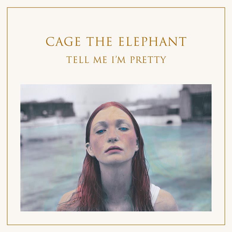
Cage The Elephant – Tell Me I’m Pretty (RCA Records)
Darwin Deez – Double Down (Lucky Number)

Deerhunter – Fading Frontier (4AD)
Photography by John Divola
Dimesland – Psychogenic Atrophy (Crucial Blast)
Photography by Chantal Michel
Drenge – Undertow (Heavenly Recordings)
Photography by Donald Milne
Design by Matthew Cooper

East India Youth – Culture of Volume (XL Recordings)
Artwork by Dan Tombs
Photography by Laura Lewis
Design & Layout by Phil Lee of XL Recordings
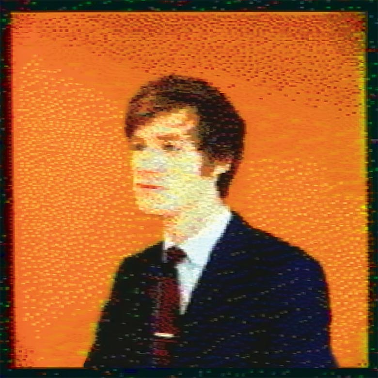
Dan Tombs (Artist):
Will [Doyle, of East India Youth] had recently stumbled across the computer graphic work Andy Warhol did in the eighties — crude by todays standard’s but decidedly compelling images created by the hand of Warhol: soup cans, celebrity portraits and a self-portrait all rendered in vibrant colours, rough cut-out shapes, and geometric fill patterns.
I have a strong interest in older and obsolete technology, especially video equipment and computers; Will asked if I thought I could find a similar Amiga system to create a portrait of him for the album sleeve, taking the work of Warhol as a starting point.
I set about researching the equipment and software Warhol used and got something working (just about) and started to produce test images. We then approached a photographer friend of mine, Laura Lewis, to do a proper shoot of Will for the album sleeve, to provide the source material. Even though the final image was to be heavily manipulated, I felt it important to start with a high-quality image and one of Will where he felt relaxed and at ease. The input of Laura was important to establish a traditional image of a musician before it being mangled by the early digitisers of the Amiga, a contemporary image, rooted in the tradition of record sleeve portraits.
Some of the early tests were heavily processed and were felt by all concerned a bit too wild for the record — much closer to the work of Warhol, but the final image ended up being quite a simple image straight out of the software and [with] a few interventions by me to complete the look, captured and finally edited on my laptop. I think the final image is much stronger for having a lighter touch to it and suits the record well, made with machines but full of soul and emotion.
I also called upon the expert help of Alex Peverett who is a bit of a guru at early computer imaging techniques and spent a fun day using some of his equipment in Brighton, I would have struggled to meet the deadlines if it wasn’t for his generous help…
Another strange breakthrough is due to Phil Lee (Art Director at XL Recordings); we were looking at proofs in the office and couldn’t work out what was off with the image, it just didn’t look right. Phil suggested rotating Will by 2 degrees, and that was it! A lot of meticulous pixel tidying later, and that was the final image; it just made everything sit right by having that tiny rotation to the image.
Errors – Lease Of Life (Rock Action Records)
FKA Twigs – EP3 (Young Turks)
Artwork by Matthew Stone

Matthew Stone (Artist), via Creative Review:
I’ve done a lot of photographic work exploring the body and bodies…I did tests years ago, when I was using digital manipulation in a similar way, and this was an opportunity to further that, [and] rather than just have bodies next to each other, to look at the idea of bodies passing through each other.
If you look at visual culture now, taking in art but also advertising, the body is ever present – it’s something we instantly connect to and we know in a second – but I’m interested in using the body to create imagery that takes us out of what we feel we know. When you look at an image, you read it quickly, it’s totally unconscious, but I’m interested in trying to disrupt that reading of the body, so people look again, and to create a moment of confusion.

Gibraltar – The New Century (Factory Belt Records)
Artwork by Andrew Waits

Grooms – Comb The Feelings Through Your Hair (Western Vinyl)

Travis Johnson (Grooms):
I mostly just wanted it to fit the music. I liked that it was something organic, a human hand, but with a visible layer of halftone — something synthetic/processed, to filter that through; a good way for us to think of… why we were making [the album]… It’s a very close-up photo from a magazine. So, you know, I hope the photographer never sees it.
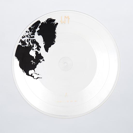
IS TROPICAL – Black Anything, Part 3 10″ (Axis Mundi Records)
Concept, Art Direction and Graphic Design by IS TROPICAL
Photography by David Abrahams
Sets by Christian Ashton
Produced by Luke Smith
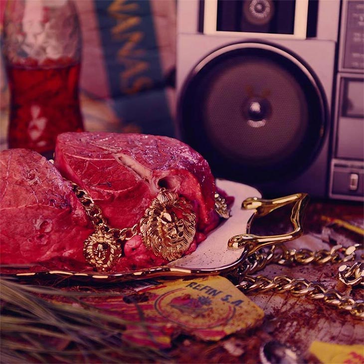
When we signed to New York based independent label Axis Mundi, we wanted to do something that totally embodied our crazy touring schedule and set out with producer Luke Smith to record our third full-length album across five continents: North America, Africa, Europe, Asia and South America. The result, Black Anything, is being released in five 10″ transparent picture disc installments, containing two tracks per vinyl. The artwork is a visual representation of both the recording process and the release, with each 10″ vinyl displaying the continent in which the tracks were recorded. The five vinyls, when displayed on top of each other, create the globe, unifying the concept as a whole…
We knew the concept for the album was strong, but it needed something else. We did all the graphic design for the vinyls ourselves, but it felt like the dark, dystopian side of the music was missing slightly from the slick vinyl design. I had been speaking with a friend, Christian Ashton, about our project and he showed me a shoot that he and photographer David Abrahams had recently done for Vogue Italia. The photos were amazing: super hi-fi, but with a dark twist. It was exactly the kind of thing our album needed to offset the graphics and complement the music. We had just redesigned our logo, and it had a symmetrical design based on old runes. We knew that we wanted the accompanying artwork to include this logo somehow, so we decided that the posters should be modular to in order to tie the artwork together, so that thematically, all the continents were connected by our logo. When all the album artwork is put together, the logo is formed with a gold foil block.
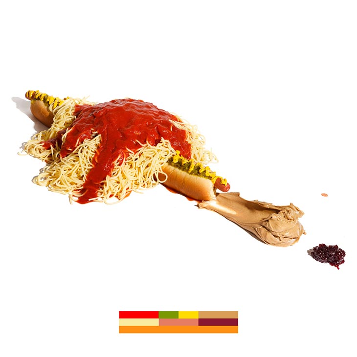
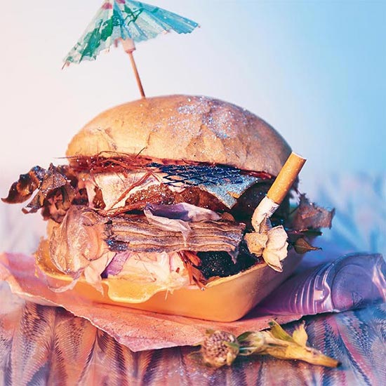
We started with the American burger – such an iconic American symbol – but we all know they’re full of shit. So that’s exactly what we did. We filled the bun with a £1 frozen burger and cheese, with petrol, wire, plastic, cardboard and cigarette butts, with a sprinkle of glitter to cover it up and a little cocktail umbrella on top.
Europe was next: instantly we thought of the dying wealth, old mansions, cobwebs, dust, and house mice. We thought it was quite beautiful that the mice were spooning in the last few moments before they died. The inclusion of the red velvet fabric was to add a Renaissance feel, like the paintings of the old European masters.
Africa was all about the bling, music, and the meat. We went to the local market where we live, which is primarily Ghanaian; it was a nice coincidence. We were not sure what meat we had
bought, but the weight of the gold chain cut through the slab as it defrosted. Yum.
I’m not sure how much we should say about the next two as they aren’t out yet… but for one of Them, it’s a neon swamp of packaging and flowers, with leftover food swilling around. The final cover is a mix of bones and fire. In fact, we had burnt the whole set down by the end of the photoshoot.
Overall, the main aim was to create something beautifully horrifying: unfamiliar but typical, and definitely with a nod to the Dutch still life masters, with modern day objects. We enjoy the awkward tension between the two factors.
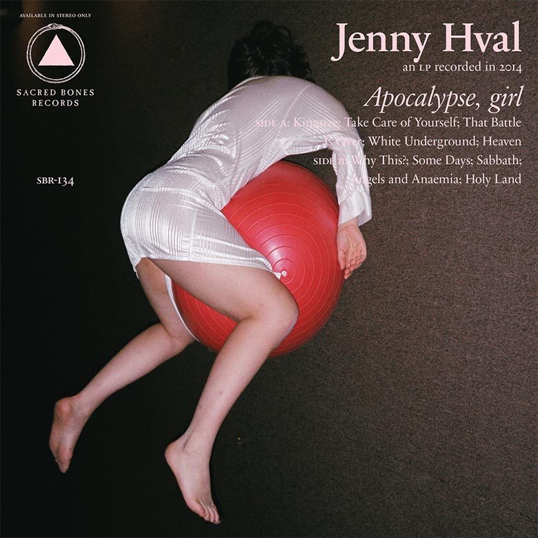
Jenny Hval – Apocalypse, girl (Sacred Bones Records)
Jim O’Rourke – Simple Songs (Drag City)
Art Direction, Design & Layout by Toshio Kuniyoshi

Kendrick Lamar – To Pimp A Butterfly (Top Dawg Entertainment)
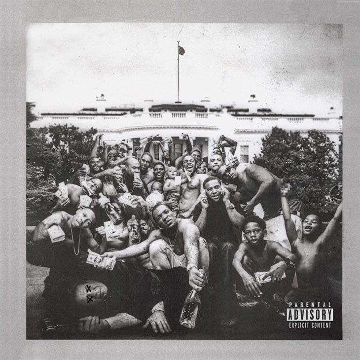
This record is on our Year-End Lists: Albums of the Year 2015
Kid Wave – Wonderlust (Heavenly Recordings)
Photography by Linn Koch-Emmery
Photography by Steve Glashier
Layout by Thomas Caslin

Linn Koch-Emmery (Photographer):
The picture was taken in Sydney in December last year and is a collaboration between me and my sister Lea, which also sings in Kid Wave. She had an idea, and we worked from that with me shooting and directing. We had a tight deadline, so we just tried to keep things simple and work fast; this picture was one of the first taken, and we only spent 10 minutes on it.
Kinoko Teikoku – 猫とアレルギー (Universal Music Japan)

London O’Connor – O∆
Photography by Olivia Bee

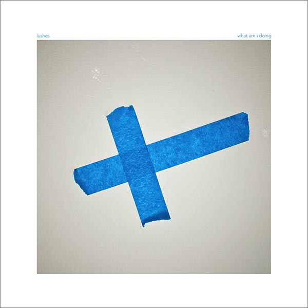
Lushes – Industry Service (felte)
Sounds by Lushes
Artwork & Design by Danny Scales
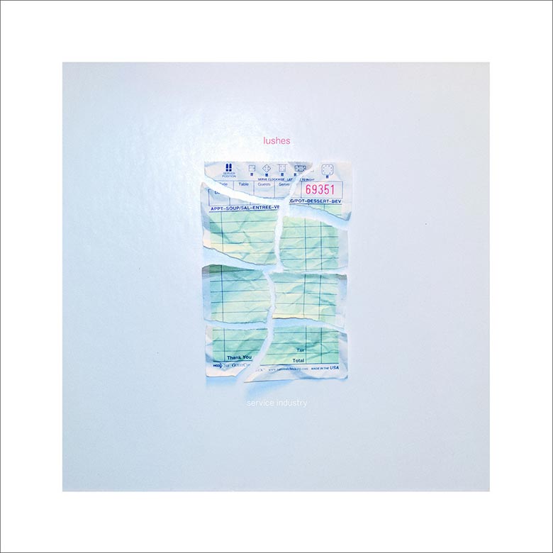
NOTE: “The cover is also aesthetically similar to our debut album, What Am I Doing, which was also designed closely with Philistine DSGN and ties our existing work together quite well when you see them side by side.”
Modest Mouse – Strangers To Ourselves (Glacial Pace Recordings)
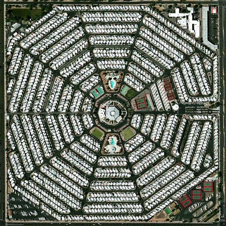
Based off of an actual location in Arizona, according to Reddit users.
n.Lannon – Falling Inside (Badman Recording Co.)
Photography by Laura Plageman
Design & Layout by Ammon Haggerty
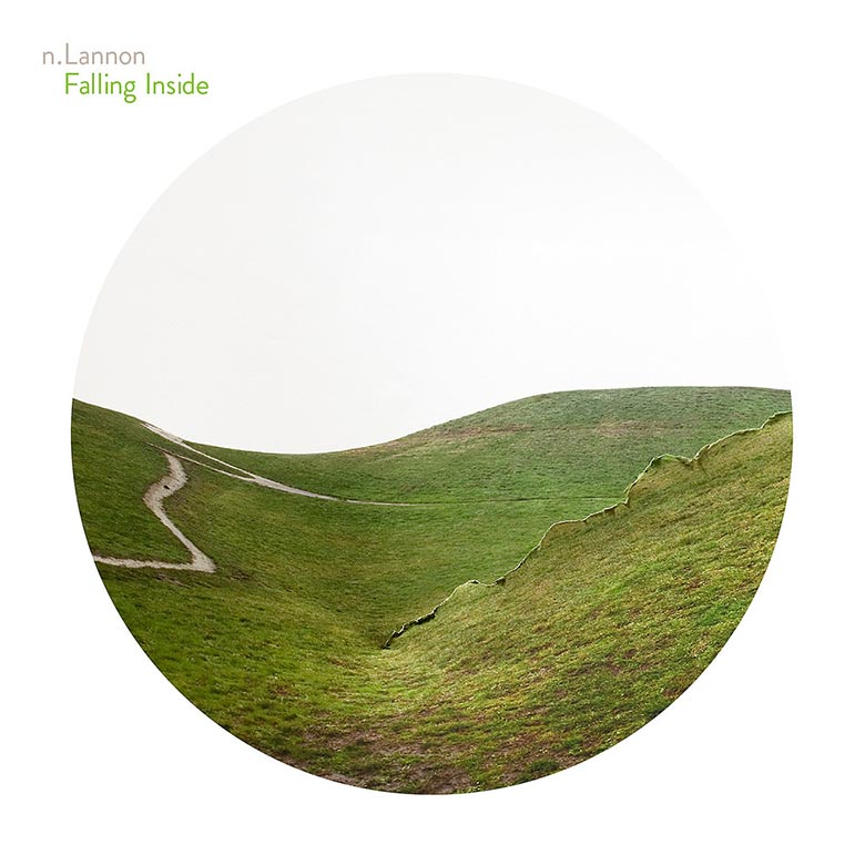
Nyles Lannon (n.Lannon):
I’ve known Laura Plageman for years, and I’ve always loved her work. In her Response collection, she took photos of nature, bent and tore them, and then took photos of the photos again. It’s such a simple idea, and yet it creates all these beautiful dimensions and creates a slightly disorienting feeling. I immediately felt like it fit nicely with my music; I’m always taking a very organic approach (acoustic singer-songwriter) and then trying to break it a little, make it somehow torn or bent in a direction that is very unlike what a singer-songwriter would do.
I had always loved Green Hill, but it didn’t really dawn on me that it would make a great cover until much later. It’s a photo of rolling hills that is bent and torn in such a way that it creates this feeling of falling into a hole in the Earth – a vertigo feeling. As it turned out, months later, I wrote a song called “Endless Night”, with the lyric, “I leave it all behind, falling inside”, and I was contemplating Falling Inside as the album title. And then suddenly it hit me: Green Hill was the perfect image for that title. It was just sitting there, waiting for me to figure it out.
Laura’s husband Ammon Haggerty, a designer, offered to help with the layout and CD package. He created such an elegant piece; he just took it over the top, using several other photos from Laura’s collection on a six-panel spread. They did such a great job; I’m still in awe and am very proud of this one.
Novella – Land (Sinderlyn Records)
Artwork by Suki Sou (Bassist) and Sophy Hollington (Guitarist) of Novella

Passion Pit – Kindred (Columbia Records)
Creative Direction by Hassan Rahim
Photography by Steven Brahms

Petite Noir – La Vie Est Belle / Life Is Beautiful (Domino Records)
Artwork by Lina Viktor
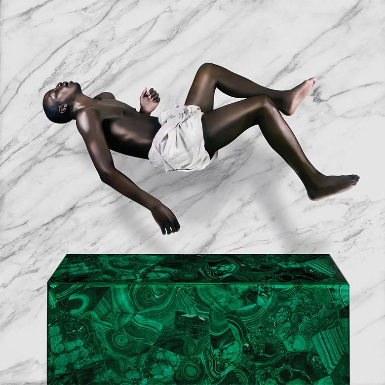
Lina Viktor (Artist) via Creative Review:
The cover image represents transcendence. I wanted to create an image that spoke to a new paradigm of thought – one which aligned with what Yannick & Rochelle [Nembhard, Iluga’s girlfriend, who co-directed the video for his track, “The Fall”] believe to be our birthright, our innate power to transcend the confines of this space and time.
However, it is still rooted within visual motifs that bridge recognisable moments in European art history, placing it in a different context and under a new lens — one that is universal. The use of carrara marble and Yannick’s frozen pose references Michelangelo’s Pietá, but rather than the literal Virgin Mary cradling Jesus, I wanted to shift the energy from one of mourning to one of exaltation and self-determination. So I removed what would be the supporting figure beneath, and instead made him levitate above this malachite altar to signify pure energy. It is unclear whether Yannick is falling or rising. That is the question we wanted to leave with the viewer.
Pale Blue – The Past We Leave Behind (Captured Tracks)
Photography by Ivan Bideac
Art Direction by Andrew Porter
pinkcourtesyphone – Sentimental Something (Important Records)
Sounds by pinkcourtesyphone
Art Direction by Richard Chartier
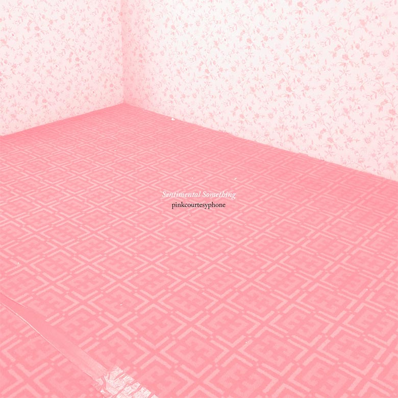
Richard Chartier (pinkcourtesyphone):
As with all of the pinkcourtesyphone releases, the imagery is part of a puzzle relating to not only piece titles, but the samples from which they are made. I do not like to go into details concerning the significance/correlations as it is part of the experience for the viewer/listener, but I will say I loved the upsetting interplay of patterns that I photographed.
The only constant for the pinkcourtesyphone releases is the ever present ‘corporate phone pink’ formula, meant to be both delicate and queasy.
Refused – Freedom (Epitaph Records)
Paintings by Fredrik Söderberg
Design by Daniel Andersson

Shunkan – The Pink Noise (Art Is Hard Records)
Artwork & Photography by Marina Sakimoto of Shunkan

Snoop Dogg – Bush (Doggystyle Records)
Art Direction by Anita Marisa Boriboon of I’m Another
Photography by Philippe Jarrigeon

Philippe Jarrigeon (Photographer)
 When Phi Hollinger, from I’m Another, the AD agency of Pharrell, contacted me to work on the album, she gives me some keywords: blue smoke, cannabis, feather, feathery tail, afro haircut, peaches [and] cream, squirrel… and a lot of freedom to play with them and to find how we can translate the spirit of album as images.
The Bush album cover shows a ferric artificial garden of lovely bushes where a fantastic blue dog seems to sniff something… But who is that blue dog? An allegory to Snoop himself? What is he looking for? His dog?
Snoop Dogg is a rare and extraordinary animal in the music world and behind the mirror, in a psychedelic paradise, he seems to turn into a blue doberman. The album is tainted of funk, particularly poetic, sweet, and fun, and the images I created are like comics apparition in real life.”


Stealing Sheep – Not Real (Heavenly Recordings)
Design by Louise Mason
Photography by Charlotte Rutherford

Sui Zhen – Secretly Susan (Dot Dash / Remote Control Records)
Design & Concept by Becky Sui Zhen Freeman
Photography by Phebe Schmidt
Makeup & Hair by Lauren Parker
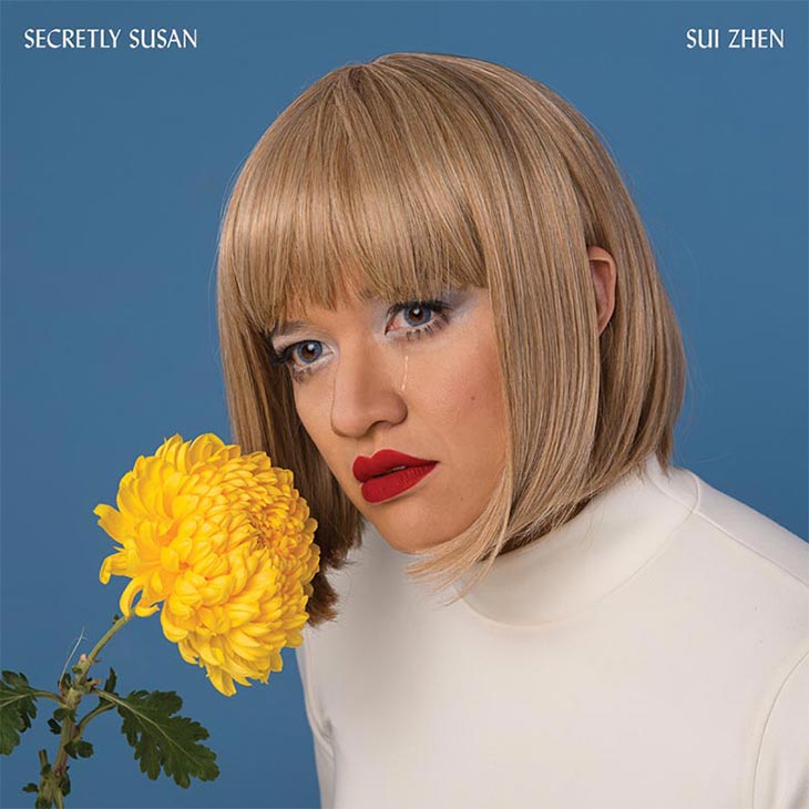
Becky Sui Zhen Freeman (Artist & Musician):
The idea behind the album artwork was to introduce the idea of Susan, whom the album was named after. It was a culmination of the reference images I’d found, and one in particular that stood out of a woman modelling a wig that I first saw on an eBay post. Her head was cocked ever so slightly to one side, her eyebrows black; the wig was blonde, and her eyes a glassy dark green/blue. She wore a cardigan and had dainty jewelry which gave off a kitsch homemaker vibe full of optimism coupled with a melancholy vacant stare. If she had any thoughts, we’d never know.
This reference image flowed on well from the uncanny valley feeling I had explored in music videos and also gave me a foundation to build Susan from. I knew I wanted the album to have that impact on people. “Who is this person? What is she feeling? Why does she look like that? – and what is that look?” I had already developed the concept of building a persona out of the narrowly filtered moments captured via online social media; Susan was borne out of digital detritus, metadata and our collective digital unconscious. The final pieces came together when experimenting in the studio with a few considered props, wigs and and a talented make-up artist and photographer who both knew how to help me achieve the vision of Susan on this cover. It needed to embody the same melancholy of that wig model, who could have been a mannequin was it not for the depth of empty sadness in her eyes.
I’d bought the colours for the background and knew the cover would be either blue or yellow; I liked keeping it to warm primary colours, and I wanted to make a move away from the pastel pinks for the cover. The blue and yellow chosen reminded me of the way Kodachrome film came out – a little saturated rich and warm. So in that way, it gives it a classic, almost retro feeling. The tear is probably the most obvious symbol and connects to some of the themes running through the songs, of grief, loss and continual change in life. And the composition of the large flower in proximity to the face is something I’d been toying with for a while, I like to bury my nose in roses to fully immerse myself in their scent and there are lots of rose filled gardens in my neighbourhood. Yellow is usually a friendly, optimistic happy colour, and yet Susan looks so distant and sad. I like the contrast in the image.
I had a vision for creating the cover and there was really only one photographer I had in mind. Phebe Schmidt and I had worked on the promotional images together so we’d been building up to the album cover over the past six months or so of doing shoots together. Once I had the concept written up about Susan, we looked at the reference images and just kind of knew we’d need to experiment in the studio to see how the ideas translated once in character and in camera. We had our friend Lauren Parker doing make-up and she was brilliant for adding the finer details Phebe’s likes to highlight. Every strand of hair was meticulously placed. The contacts, the contouring and the timing of the tear are no accident.
As far as the collaborative aspect, I need to have a clear vision in my own mind of what I want to get out of it before I can bring it to the others to make any sense of it. Once that is in place, I like to start bouncing ideas around, and mostly that will happen in the studio. It works best when we have a few days to try different things, without the pressure of finding that perfect pose or image in a one-off session. That way, we all feel more comfortable to experiment and try new and strange things. The final composition and styling always comes together on set in the studio. As long we the proper foundation is built for our ideas we are usually able to create the magic through collaborating on set to get the final moment.
Suzanne Kraft – Talk From Home (Melody As Truth)
Creative Direction by Jonny Nash of Melody As Truth
Photography by Andy Malone and Inda Datau
Styling for Suzanne Kraft by 69 Worldwide
Tropic of Cancer – Stop Suffering EP (Blackest Ever Black)
Photography by Jasmine Deporta
Layout & Design by Oliver Smith
Widowspeak – All Yours (Captured Tracks)
Art Direction, Design & Layout by Ryan McCardle
Art Direction & Design by Molly Hamilton of Widowspeak
Photography by Andre Ganesbohm

Ryan McCardle (Artist):
Molly [Hamilton of Widowspeak] and I were both living in Savannah, GA at the time of working on this album. One day, we realized we wanted to add a super close-up shot of the horse skin/hair, so we went out on an adventure to find some horses. Savannah has a lot of carriages, and typically you can find them on every square, but that day, for whatever reason, we could not find a single one. We drove to some farms, no luck without trespassing. We gave it one last shot in historic downtown, and sure enough, Molly was able to cozy up next to the horse you now see on the inner sleeve when you pull it out of the jacket.”
Ω


[…] http://www.redefinemag.com/2015/album-covers-of-the-year-2015/ […]