
Architecture-Driven Album Covers of the Year 2014
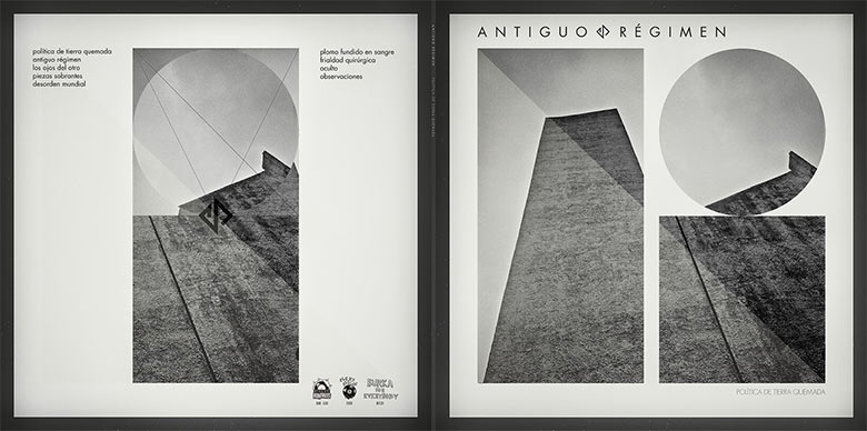
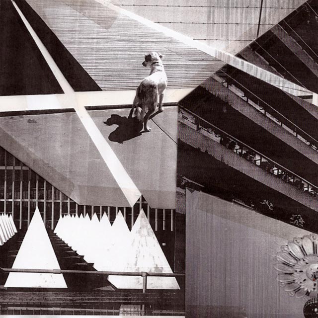
Antiguo Regimen – Politica de Tierra Quemada (Burka For Everybody Records)
Artwork & Design by Joaquín Barón Herranz
Photography by Aina Climent
Joaquín Barón Herranz (Artist):
There is something in [the track “Piezas Sobrantes”], and the album, that… escapes from a grid – something vital and primitive, something reduced to a minimal life expression; I don’t know exactly what but I don’t care…After sketching out various ideas, I decided to work with basic shapes: rectangles and circles (straight vs curved lines) because these shapes evoke to me ascension, elevation, fragility, and movement, and I thought that these meanings were more consistent with the lyrics claimed, at least as I understood. The shapes should be perfectly aligned on imaginaries grids and subgrids, locked, and needed to escape across diagonal lines (back cover) to finish in an certain calm (front cover). It’s something like… to be calm, you [must] channel the complexity.
Certainly, I would highlight the photography’s importance, as captured by Aina Climent. These pics contribute to give to the design a big weight, both aesthetically and conceptually. Perspectives point [towards] the heavens and heavy, rough concrete exercises weight.
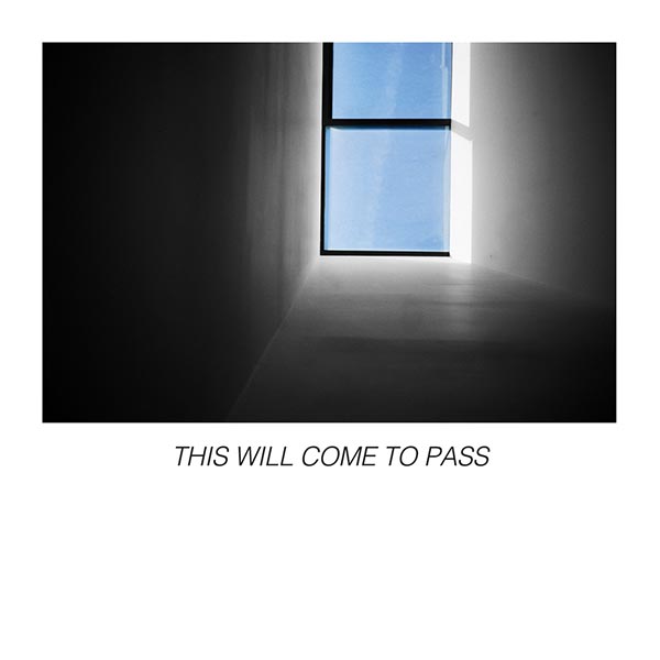
Calculator – This-Will-Come-To-Pass (Count Your Lucky Stars)
Artwork by Ramez Silyan of Calculator
Design & Layout by Brian Arnold
Sounds by Calculator
Craft Spells – Nausea (Captured Tracks)
Artwork by Vicki Ling
Design by Ryan McCardle of Captured Tracks
Sounds by Craft Spells

Dylan Shearer – garagearray (Empty Cellar Records / Castle Face Records)
Artwork, Photography & Design by Michael Coleman
Sounds by Dylan Shearer
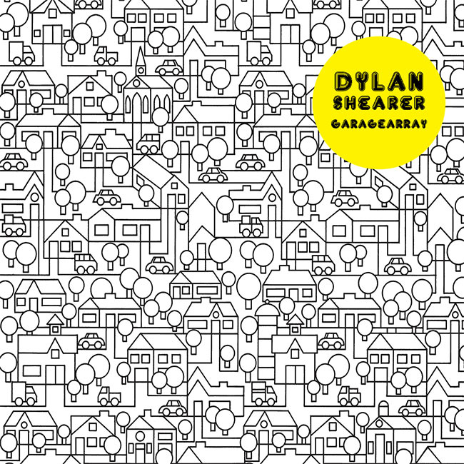
Michael Coleman (Artist):
I had met Dylan Shearer in the 1990s, while we were both living in the Mojave Desert town of Lancaster, CA. He apparently was an admirer of the visual art I was then doing (primarily collage/silkscreen on wood), though I was not aware of this. I, in turn, had been given a CD-R of Dylan’s first commercially released album, Planted/Plans (Yik-Yak, 2007), and it had become a favorite of mine. I was frankly surprised to receive a request from Dylan to design the packaging for his sophomore effort, porchpuddles (Empty Cellar, 2012), as we had had little to no contact through the preceding years. For the porchpuddles project, Dylan and I communicated through emails. He provided only the title of the album, and a demo of the recorded material, which for myself, helps greatly in determining a mood and a zeitgeist for the piece. The visual concept was my job. And so, when it came time to do the garagearray record, we repeated this…Initially, as with porchpuddles, I had to look at the composite of the two words. Dylan and I have never discussed this particular codex of his, and in order to interpret the title in any sort of visual way, I had to break it down literally. For me, keeping it simple works best. From that point, everything came together very quickly. I am primarily a photographer now, and I knew for this project I wanted to include a combination of my own pictures — and graphic elements. I chose a small “array” of large format color pictures from my portfolio and arranged them in a grid. This solved the array of garages problem. The images I chose were primarily vacant and disused properties, dystopian environments that I felt spoke to the music Dylan had created for the album. Singular, forgotten, personal spaces. I then wanted to counter balance the imagery in the pictures by choosing a utopian vision of what an array of garages/structures, and/or civilization is “supposed” to look like. And I wanted to convey this idea with a large dose of naiveté. This is where the project changed from being purely conceptual/thematic, to being somewhat philosophical. Through these images I am commenting on our fear of death, the process of decomposition (time, relationships, structures, our bodies), and the acceptance of things as they are.
My initial layout for the art had the grid of color pictures on the front cover (right); when the record is flipped over, the anachronistic graphic of the “perfect neighborhood” and the track listing/credits on the back. Black on white ground. This is what I sent to the label. My contact with Dylan and Arvel at Empty Cellar was sporadic for the remainder of the year. I received an email from Arvel, who explained to me that the record was coming out as a joint release with Castle Face, and that they were intending to do a limited run of colored vinyl copies with hand painted sleeves. I was curious, but resistant. Another email soon followed, this one contained a PDF of some additional layout and color ideas Matt Jones over at Castle Face had come up with. I was immediately struck with the color. I love color. I collect vintage prints, psychedelic posters, and lithography. My main photographic influence, Bill Eggleston, printed in a super color saturated process called dye transfer. So, though I was after subtlety in the scheme – the limited edition color run was fine. It was the changes to the overall layout Matt had suggested, I wasn’t so sure about. Moving the picture grid and lyric/credits to the inside sleeve allowed the entire cover – front and back – to be covered by the illustration. I did not want the illustration to only serve as a decorative element. It was after all, making a statement on perception. But whether Matt knew this or not – and I believe he did – by moving the grid to the inside sleeve, the impact of the visual message was delivered much more effectively. Holding that record in your hands and looking at the safe little neighborhood, with it’s array of homes – and garages – give way to reality. One only has to slide out the inner sleeve. Quite dramatic, and much more in line with what I had originally envisioned.
Gardens & Villa – Televisor EP (Secretly Canadian)
Artwork by Bryan Olson
Sounds by Gardens & Villa
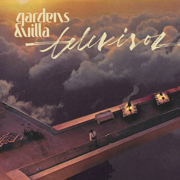
– Chris Lynch, Gardens & Villa
Mall Walk – Mall Walk EP (Vacant Stare)
Artwork by Lauren Pakradooni
Sounds by Mall Walk
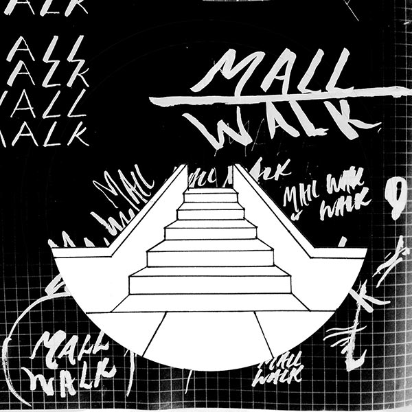
– Lauren Pakradooni, Artist
Rob Miller (Mall Walk):
There is certain degree of minimalism in Lauren’s work that we felt paired well with our music. The space is as much a part of our sound as the instruments themselves. We felt Lauren’s design symbolically represented the role space plays in our music.
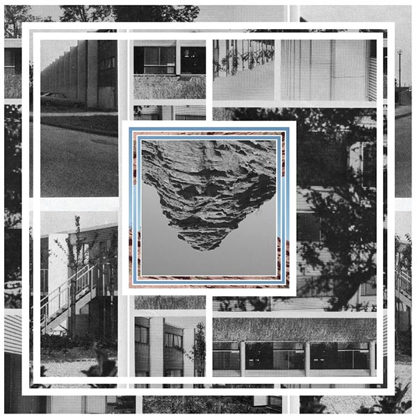
Opera Mort – Dedales (Alter)
Artwork by Unknown
Panabrite – Pavilion (Immune Recordings)
Artwork & Sounds by Panabrite
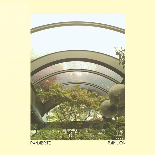
Norm Chambers (Panabrite)
I took this picture in a beautiful Japanese style garden (complete with a large fake waterfall) right in the middle of downtown Seattle. There’s an almost fantastical aura to the trees on the other side of the glass that really makes the image compelling. There’s also an element of futurism to the overhead glass structure that almost makes it appear to be part of a dome, with the way it’s cropped. In terms of relation to the music or any specific concept, these things did not necessarily match up initially. At the very beginning I planned to use some of my hand-drawn black and white ink illustrations for the cover; however, when going over the music, it was clear I needed something a bit more “classy” or stark. I love ornate illustrations and designs, but I’ve always had a thing for really minimal covers as well. Sometimes the less visual information you have, the more your brain fills in the blanks.In this instance I chose the image because I had a really strong gut reaction to it immediately, although it has no bearing on the music necessarily. There is an element present in the music in the form of acoustic instrumentation and plenty of field recordings that lend a sort of naturalism to the music, a more “earthy” tone. It’s fitting. The back cover features a collage made up of images from a few more locations in Seattle, which was coincidental and not intended as a Seattle-centric concept by any means, but more an appreciation of some of the local architecture that I feel works in a more ambiguous manner in this presentation. Those images were the ones that stood out the most. In hindsight, the collage, color and layout coupled with the hand-drawn grid work remind me of an old Superstudio or Archigram design, which I’m perfectly happy with!
Sam De La Rosa – Chameleon 12″ (Burka For Everybody Records)
Artwork by Nathan Antolik
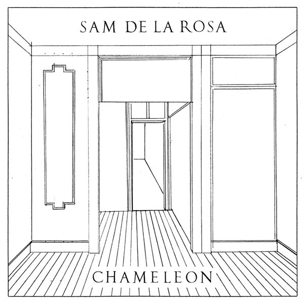
– Nathan Antolik, Artist
Tense Men – Dull Care Is Forgotten (Faux Discx)
Artwork by Richard James Phoenix
Photography by Oliver Fisher of Tense Men
Sounds by Tense Men
They are all photographs that I’ve taken so they mean something to me, but literally not symbolically. Rich chose the images from a load of photographs I gave him. I would guess the choices he made were mainly based on aesthetic instinct but of course there could be some subconscious urges pushing him to make the choices he did, perhaps reflecting the music in some way. I personally wanted it to be more vague and ambiguous rather than choosing one main image in a “statement” sort of way. Collage can be so appealing I think because it is more like the chaos of a mind rather than a singular image which maybe represents the clarity of just one decision or thought. I don’t know.
I figured that to try and make the task of creating the artwork for the LP as painless as possible we’d work in a similar way to how we write music, having constraints and whatever came out of those limitations we’d have to stick with, embracing all the imperfections that would come out of that. They were that the artwork had to be physically made with no digital processes involved (except scanning at the end) and for the source material to be of our own creation. I used a load of Ollie’s photos, photocopying them and collaging the sleeve together as it is, the text I letraset on to this and it ended up coming together in a few hours.
Ultimate Painting – Ultimate Painting (Trouble In Mind)
Artwork by Bradley Kerl
Sounds by Ultimate Painting
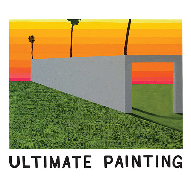
The way I work in general is by amassing imagery –– personal photographs and memories, stock imagery from the internet, art books, etc. –– and once I’ve accumulated a critical mass, I set out creating a situation or scenario where all these images can mix and mingle. At that point, it really becomes a formal investigation of painting where I’m asking myself how I should paint this and why.I had taken a trip to Palm Springs, CA with a group of close friends back in January before the final push towards my thesis show. The vast majority of my time is spent alone, hunkered down in my studio listening to records and podcasts, looking, thinking and mixing paint. As you might expect, these are the perfect conditions to foster a bit of wanderlust, and after a few months of being stuck in that really close headspace, I needed to break out a bit. I began thinking about Palm Springs again in relationship to my work, and decided that I wanted to make a painting about that sort of longing. There’s a brick wall that maybe extends into infinity but doesn’t really –– there’s a break! The whole thing from conception to finished painting took about a week, if I’m remembering correctly.
The colours, the time of year and the time of day that the painting depicts feels very much like the hazy images in my head when we were making the LP and when I’ve listened to it. The area in which James and I live and the time of year we made the LP, is very drab and grey… it rained a lot but Bradley’s painting is somewhere I wish we made the album… but maybe that’s the point. I think a lot of this record is about feeling out of place.We were kicking ideas around for what seemed like months with Bill at Trouble In Mind, but none of us were convinced with the proposed sleeves. It was very frustrating and getting to the point where we needed something pretty sharpish. I’d describe Bradley Kerl as a friend of mine although we’ve never actually met in person. We have what seems like dozens of great mutual friends but we’re yet to cross paths. My other band, Mazes, had used a painting of his as the sleeve of our last LP and I’m a massive fan of his. The one thing we’d all agreed on was that we couldn’t use a painting… the name of the band being too heavy a burden on any potential painting. That went out the window… I was idly browsing through Bradley’s work and saw the image ‘Untitled Brick Wall’, and it just seemed to sum up how I felt about the LP James and I had made. He’s my favourite artist… I’m pretty convinced Bradley will be held in great regard, if he’s not already.


Hey guys, l made that Mansions album art. Thanks for the inclusion! Can you add my name? – Jesse Treece
yes’m! if you have any website or insight to include, feel free to e-mail! huav@redefinemag.com
Cover photo for “To The Top” by Twin Shadow is incredible, I believe Milan Zrnic is the photographer
Indeed!!! An accidental one we forgot to include. Will make a note. Thank you!!
[…] spin. That dynamic is well supported by the album’s cover art, a collage Noah recently told Redefine […]
[…] an album cover he designed for the Philadelphia based band Cassavetes was as picked as part of Redefine Mags“best album covers of 2014”. I thought it was aesthetically pleasing and not much else until I […]