
Object-Oriented & Deluxe Packaging Album Artwork
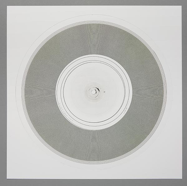
Aphex Twin – Syro (Warp Records)
Artwork by The Designer’s Republic
Sounds by Aphex Twin

“Richard [James, aka Aphex Twin] and I have known each other for almost 20 years and have worked together on various Aphex Twin / AFX / GAK / Polygon Window projects in the past. Usually Richard supplies us with an image or set of images and brief description of what they mean to him or why he has created them or collaborated with others, such as Chris Cunningham, in making them. This time he approached us with a set of non-visual ideas. He wanted to demystify the production process with a list of costs incurred in making the album. He liked the idea of deconstructing an album into the physicality of a product — so we shot some vinyl pucks from which an LP is pressed, and he liked the idea of listing every piece of equipment used in the making of the music on the album.
Richard and I have a similar approach to our work — we do it for ourselves, primarily, and we make time to make it good because we care. We both like playing (inclusive) games with our audiences, playing with ideas based on disinformation and hypertransparency — ‘the more you know the less you know’. We’re comfortable with each other’s work and ideas and processes, so the exchange of ideas was primarily via email (we live at opposite ends of the country).”
– Ian Anderson, The Designer’s Republic

Ian Anderson (The Designer’s Republic):
Every part of a design should be there for a reason; the quality of the aesthetic should be there to enhance the communication. Nothing has beauty outside context. Nothing exists outside context. The design for Syro is essentially no design, or the absence of design. It is a list. The choice of font conveys digital (and therefore neutral) information. The number of panels in the gatefold packaging for each format is dependent entirely on the length of the list, at optimum reading point size for that format. There is no imagery as none is needed. The choice of materials is based on the fact that all surfaces need to be pure white and that there has to be tactility inherent to the packaging when you hold it. The holder needs to be aware they are holding something physical.The images of the vinyl pucks on the vinyl labels suggest that the image of the puck you are looking at may be the one from which the vinyl you are holding may have been pressed.
The equipment list lists every single piece of hardware and / or software used in the making of every track on the album, as well as the space or room in Richard’s house where each was recorded. Inspired by information graphics, it was designed to be disinformation graphics.
Essentially, the information on the packaging design tells the viewer exactly how to make their own Syro — if you can decipher the information overload…
The idea is that the detail in the financial information on the packaging is totally accurate so James Burton at Warp Records had to push the finance department hard to make sure all the relevant information was included. I think there were few sleepless nights there checking and rechecking the figures.
– Ian Anderson, The Designer’s Republic
Bathetic Records – Dynasty at Ghost Town Tape Series
Artwork by Simon Fowler
Curation by Bathetic Records

CLICK TO SEE THE ARTWORK FOR THE WHOLE 11-TAPE SERIES
Bonobo – Flashlight EP (Ninja Tune Records)
Artwork by Leif Podhajsky
Sounds by Bonobo

– Leif Podhajsky, Artist

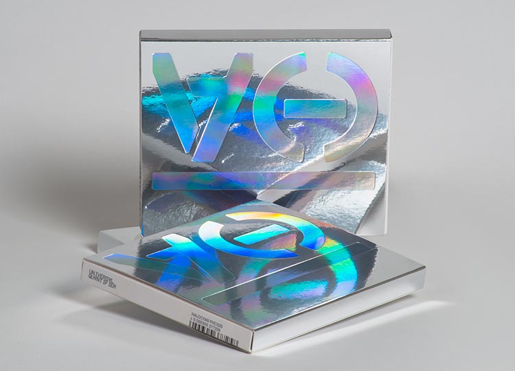
Halocyan / Various Artists – Universal Quantifier (Halocyan)
Artwork & Art Direction by Michael C. Place of Build
Additional Assistance by Sophie James, Joe Luxton, Nicky Place, and the whole group at Build
At Halocyan, we make no strong moral or socio-political claims about the status of all existence being computerized. But we do have an existential or “metaphysical” claim about the status of this computerization of everything. We simply point out that the scope and depth of this computerization is formidable (e.g. as expressed by a trendy slogan we’ve recently seen: “The Internet of Everything”). The computerization of everything is not just fashionable assumptions or a sign of the times, but a strong thesis. Computer science uses formal language (which includes characters like the “∀” or “universal quantifier”) to define and manipulate existence — and this is a decisively strong opinion and view about existence.
I believe this strong thesis is at risk of becoming a background assumption because of the ubiquity of computer science in 2014. Often strong theses about existence risk becoming background assumptions because of their ubiquity. People think, “That’s just the way reality is…” While the computerization of everything is a strong contemporary thesis, I want to make sure technology does not become a background assumption. For this reason, I named Halocyan’s latest release Universal Quantifier.
Since there is an intimate relation between computer programming and techno music, Halocyan believes it’s culturally relevant to draw attention to this intimate relation, and its metaphysical implications, which I have just now described.
The Universal Quantifier album concept, which represents both an aesthetic as well as a symbolic choice, is the most important concept within the music of 2014. In order to maintain fidelity to our view about complication, the view that everything begins with and ends in complication, we provocatively chose to highlight an aporetic tension within our choices about materials, process, and print. On one hand, this aporetic relation of tension consists of mirrored surfaces together with the holographic laser foil, which are materials indicative of spectrality and the contingency of foundations. On the other hand, this aporetic relation of tension includes the inverted “∀,” which is the character for the universal quantifier of mathematical logic, philosophical logic, set-theory, model-theory, recursion-theory, proof-theory, and related discourses, together with the universal quantifier’s “bound variable.” In order to reference the “bound variable,” we thought it would be convenient to use the Halocyan logo-mark. Our logo-mark, which appears to resemble a dash enclosed between left and right parenthesis, is positioned to the right side of the “∀.” In these discourses, a variable or “bound variable” is familiar to be seen wherever the “∀” character appears.The aporia, between holographic spectrality on the one hand, and logical authority on the other, is central to the Universal Quantifier compilation, as well as to the leading thetics of Halocyan Records in general. Antoine de Saint-Exupéry said, “Pure logic is the ruin of the Spirit.” While we at Halocyan appreciate this sentiment and observation, the admonition which is here expressed by de Saint-Exupéry, calls for an exhortation whose dimensions are in fact more complicated, messy, and challenging than would be those dimensions of any simple attempt or desire to marginalize or brush aside the achievements of Gottlob Frege and today’s modern logic. We must always reckon with and criticize pure modern logic in order to prevent this pure modern logic from becoming “reality” itself — as is happening in today’s computerization of everything. The visual and printed artwork of Halocyan’s Universal Quantifier compilation fully encapsulates the idea that we can never simply let logic go by the boards and fall by the wayside just because we favor “humanity,” “soul,” “spirit,” or other poetic sentiments. There is the risk that these very values of humanity, soul, and spirit, become so finely interwoven with mathematical logic and its metaphysics, that this well-defined and decisive direction for metaphysics becomes totally invisible and basic to “reality” itself. This idea is very crucial for our contemporary culture.

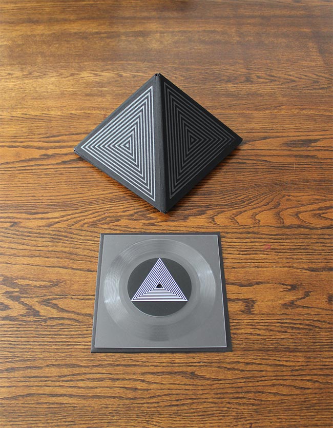
Hair & Space Museum – TEP ZEPI (LxWxH Gallery)
Artwork by Emily Pothast of Hair & Space Museum
Sounds by Hair & Space Museum
Emily Pothast (Hair & Space Museum):
In early 2014, we were approached by LxWxH Gallery in Seattle to create a limited edition artwork for a subscription series issued by the gallery. My background is in visual art—specifically printmaking—so I was interested in the idea of creating a Hair and Space Museum record that would also function as a seductive, handcrafted art object.
The result is TEP ZEPI, a limited edition of 7″ square lathe cut records featuring five minutes of improvised vocals and synths on either side. The title TEP ZEPI, which translates as “First Time,” refers to an ancient Egyptian creation myth in which key aspects of civilization were handed to the Egyptians by visitors from space. Taking inspiration from the Egyptian myth, as well as the Voyager 1 Golden Record and Carl Sagan’s Contact, we decided to make a sculptural package for the record that contained cryptic schematics for the assembly of an object of a mysterious origin to accompany the musical experience.
To produce the object, I wound up designing and executing my first ever bookbinding project: a 6-fold, fabric bound, hand silkscreened box for the record which transforms into a freestanding three-dimensional pyramid. The records themselves were cut by Mike Dixon at Lathe Cuts in Tucson, who took great care in mastering and preparing our music for this format. I’ve heard a few lathe cuts, and sometimes they can sound pretty rough, but the sound quality of these records is exceptional. The auditory artifacts that do exist serve to reinforce the intimate, handmade quality of the object, as though the entire thing is a fragile transmission from the cosmos, lovingly encoded for posterity by human forces.

Liars – Mess (Mute Records)
Artwork & Sounds by Liars
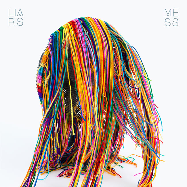

“What is a mess? The work needed to illustrate this very subjective question. What may appear to one person as a completely random collection of elements can simultaneously read to another as a precisely orchestrated work of art. Color was important as a reflection of the playfulness in the music and the fun we had making it. – Angus Andrew, Liars

– Angus Andrew, Liars
Mogwai – Rave Tapes (Sub Pop Records)
Artwork by DLT

– DLT, Artist
DLT (Artist):
The band’s sound has evolved over the last few records; those ideas from the band really served as a starting point for my research for the design, and I ended up going further into sci-fi-inspired imagery. Of course that source material has been used a lot in the past, so it was about finding a way in that the band felt was personal to them and represented their ideas for the record. From the research, I really started to get inspired by a lot of the sci-fi films of the ’60s/’70s, with a particular leaning towards the geometric shapes/motifs that kept occuring in them all. Looking at films like 2001AD, the original Solaris, Phase IV, and Russian films like Ikarie XB 1, you see a lot of repeat pattern octagon shapes in the set design, etc. Once I found out that the title was also going to be Rave Tapes, that also lead me into looking into vintage analog reel to reel tape box designs and also into diagrams of wave forms as well.I started to play with illustrations that took those shapes as a starting point and went back to the band with a number of directions, ranging from the straight geometric patterns to something that was more illustrative and maybe inspired by almost a loose psychedelic or semi-abstract direction. Initially, I saw it all as very much a monotone world that the imagery existed in, but in discussions with the band, they felt that having something more colourful would capture the mood of the album more…
With Mogwai, different from other bands I work with, where you tend to have a single member of the band who discusses artwork, they always discuss and almost vote on everything before deciding on the direction. I quite enjoy this different way of working with them; it always allows the design to go in interesting directions that otherwise might not have been taken. The image that was decided on by the band was the most direct and bold of all the options, which I think does pull from various areas I’d researched while also creating a world that this album could exist in.


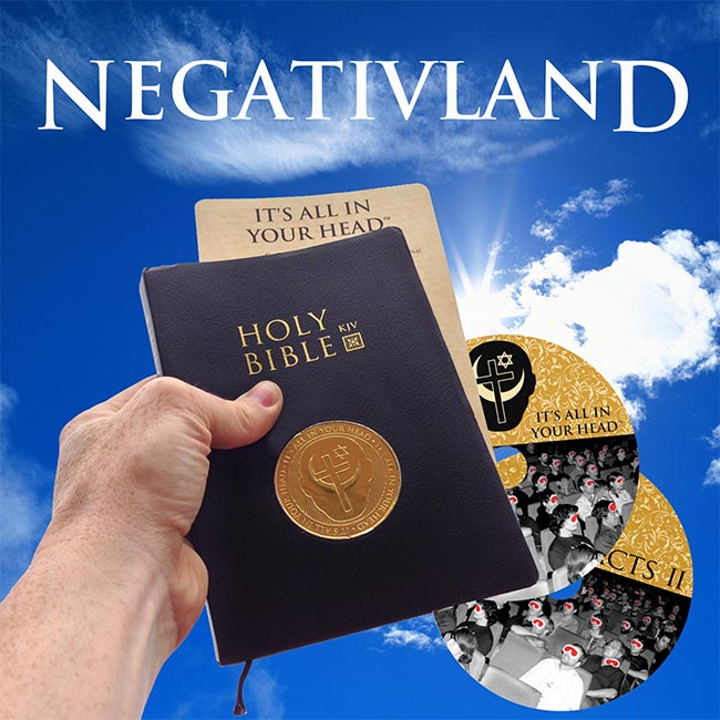
Negativland – It’s All In Your Head (Seeland)
Artwork & Sounds by Negativland
Design by Shawn Wolfe
Negativland:
Each copy of that first record (right) was in a numbered one-of-a kind, hand-made cover, using images cut out from late ’50s home improvement magazines on the front, and pages cut from wallpaper sample books on the back. We eventually made over 15,000 of them over the years, no two of them alike. A “mass-produced” version was never made. Since then, we’ve had various projects that came with custom made whoopee cushions, custom-made moist towelettes, custom-made key chains, fake newspapers, unusual stickers, posters, fake religious pamphlets, dictionaries, baggies of lawn clippings and beauty bark, a pseudo automotive user’s manual, and sometimes in unusually shaped die-cut outer sleeves. Each of these unique elements has always been tightly and conceptually related to the content of whatever project they were part of, and It’s All in Your Head is no exception.Over the years, Negativland’s conceptual audio, visual and cinematic collages have been made on a variety of both very serious and very silly topics. It’s All in Your Head is a more serious one: a lonf-form found sound collage that is all about why human beings believe in God. The finalized two-disc audio was in the works for over four years, and was obsessively worked on over that time to get it to where we wanted it. The idea of packaging this musical essay inside of an actual Bible came very near to the end of that creative process, and it was a creative “aha!” moment that seemed to frame and present the project to the public in a provocative and attention-getting way that perfectly fit the content of the work. This packaging idea gave us even greater enthusiasm for the project, as it turned the release into a much more intriguing “art object” in way that seems harder and harder to pull-off in an era when most music is just ones and zeros in random shuffle play on your device of choice (reading the attached Bible is optional).
Once the basic “CDs-in-a-Bible” idea was agreed upon by the group, our actual research and design process took some time, and many options and mock-ups were tried. We went to many Christian gift shops and Bible bookstores, tracked down various Bibles and Bible manufacturers, and slowly arrived at how we could modify the one we finally chose using various custom made gold-foiled stickers and inserts. We realized that we could reverse engineer the existing inside end paper design so that the CD graphics matched it. We were able to find the fonts used to print the Bible so that our own designs seamlessly fit, with the idea that it would at first appear as if it had not been altered at all. The UPC sticker became a conceptual part of the package, designed to look as if a clueless manufacturer in China had placed it there. Important final graphic design details were made with Seattle-based designer and long-time Negativland satellite member Shawn Wolfe, who has worked collaboratively with us on many past projects. Additionally, a limited edition Quran version was designed and made, but it quickly sold out.
We all agree that this conceptual re-purposing of the Bible might be our most favorite packaging of any project we have ever done in our 34 years as a group!

Stara Rzeka – Stara Rzeka (Infinite Greyscale)
Artwork by Paul McDevitt and Cornelius Quabeck of Infinite Greyscale
Sounds by Stara Rzeka

– Paul McDevitt & Cornelius Quabeck, Artists
Paul McDevitt & Cornelius Quabeck (Artists):
We’re both artists, and the label is the result of several years of collaborating on drawings. We studied at art school together in London, and both work with the same galleries in the UK and Denmark, so making work together was sort of inevitable. The drawings we made together worked well in printed form, so we made a few books, which led to us founding a small publishing company. The series of 10″ records followed not long after. The name Infinite Greyscale was coined to imply that there was a limitless scope within our limited means. It also refers to the one printing machine we have: an old Risograph which prints only black ink. The decision to make the records a 10″ format was decided by the limits of the Risograph. We wanted to make our own covers and because the Riso only prints DIN A3 (circa 16 1/2 x 11 3/4 inches), it wasn’t large enough to stretch to 12″.The covers are always the result of several collaborative drawings and collages. We print on coloured paper, masking off a section and spraying it with a second colour, before running the paper through the Riso to print black. We design, print, crop and pack them ourselves, which is important to us. Each cover is effectively a limited edition print, albeit unsigned. We see these releases as half-music, half-art, with the all the artwork handmade and a screen print for the b-side. The music so far has been a single, long-form piece on each release – so the whole thing is really a statement. We make them as we would artist prints, but we were clear that they should be priced as records and available through all the normal outlets. We are inspired by DIY culture and in many ways the whole laborious process is a reaction to the digital wound.
Fun Fact: “Aside from the cover, we always have a screen printed B-side. We make a single colour print on colour vinyl. Unlike the covers, these are usually simpler images that we have found, then altered slightly. Then there is also a photograph in each record, along with liner notes (also Riso printed). The Stara Rzeka record even has a T.E. Hulme poem printed on the reverse of the cover. Our fingerprints are all over each release, often literally.”
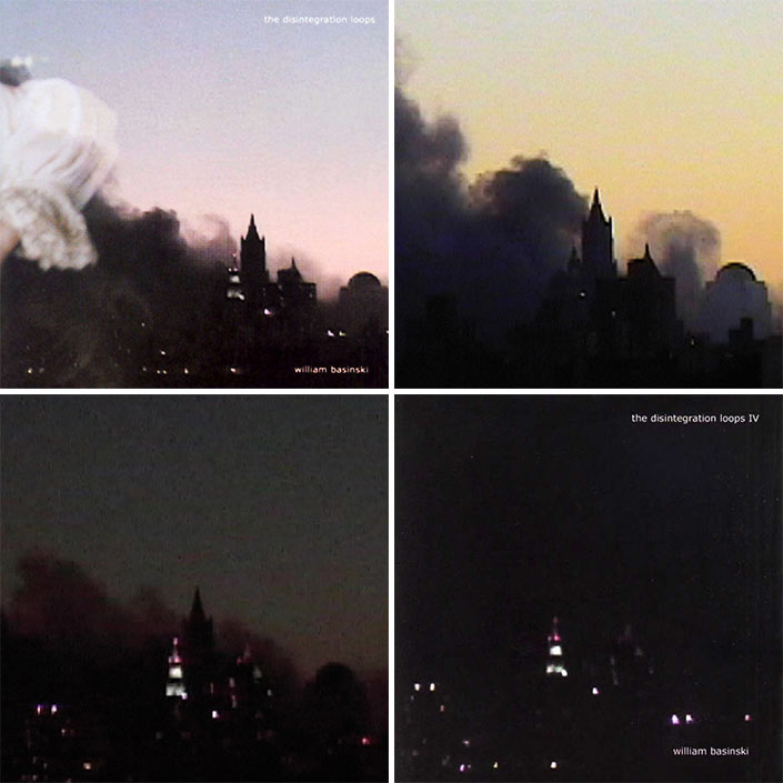
– Paul McDevitt & Cornelius Quabeck, ArtistsWilliam Basinski – The Disintegration Loops Reissue (Temporary Residence LTD)
Artwork & Music Composition, Performance, and Production by William Basinski
Art Direction, Design & Layout by Jeremy deVine of Temporary Residence LTD
“On September 11, 2001, we were shocked and stunned to witness the destruction of The World Trade Center from our windows and roof. We sat in stunned silence watching the smoke billowing to the east on this crystal clear autumn day. We turned off the babbling heads on the radio and listened to The Disintegration Loops as we pondered the end of the world as we knew it. I had the uncanny feeling that somehow I had been commissioned to create the soundtrack for the end of the world. That evening, I shot a video of one static shot of the billowing smoke downtown during the last hour of daylight. The next morning, I imported the video and set it with “Disintegration Loop 1.1″. Without knowing it, I had created an elegy. Over time, I decided to use four frames from the video for the 4 album covers, each getting progressively dark, and dedicate the series to those lost in the catastrophe. The whole world had changed, the meaning of the music had changed, all of our lives had changed. For a brief period, everyone was seriously considering what was most important in their lives: what really mattered? The answer was: each other.”
– William Basinski
Jeremy deVine (Art Direction & Design):
I contacted William after attending The Disintegration Loops live orchestral performance at The Met on 9/11/2011. I had the idea to release this amazing suite of music in a limited edition box set with remastered vinyl and CD editions, with accompanying coffee table book and DVD. I flew to LA and pitched the concept to William, and we just really bonded over it. It felt very natural and organic and harmonious. There was actually not a ton of back and forth during the creative process, as we seemed to be on a similar wavelength aesthetically from the beginning, and I tried to make vision and intentions as transparent and earnest as possible.The images are obviously very symbolic and iconic, so I wanted to preserve those in the service of making the box set more of a monolith, a kind of temple for this music to reside in. Each page of the book is a centerfold depicting one minute of the final hour of daylight on Ground Zero on September 11, 2001. As you flip through the book – along with the music – the image slowly fades into oblivion.
Virtually everything in the box has a purpose for being there, and a purpose for being the way it is. Nothing is in there without a very good reason, and a thoughtful concept.
Worthless – Greener Grass (Beyond Beyond is Beyond)
Artwork by Curtis Godino of Worthless and Drippy Eye Projections
Sounds by Worthless
Curtis Godino (Artist):
The idea of illustrated album cover was more of a train of thought subconscious feeling. Like put the pen to the paper and see what the line makes. The idea behind the liquid record was that I’ve always tried to find a way to properly merge my band with my light show. I feel when dealing with music like this it is more than just audio; it’s visual as well. So I thought I would try and make a record that was as psychedelic as the sounds. It was a dream for a while; then I just tried to make one, and it worked, so I made more. Maybe one day, I can make a light mat and a lens that can sit above the turntable and project the record onto the ceiling while it plays the album.The imagery in the illustrated cover does have symbolic importance. There’s a guy we call deputy dog, and he’s kind of the big boss. But it’s kind of simply saying, “Jeez I’m alive, and I exist in an overwhelming form with a plethora of emotions and holy shit this is all real (I think),” kind of thing. But they’re all aesthetic choices as well, which during the making tells its own story. The liquid record speaks for itself.
I silkscreened, cut out, and packaged each of the 7″s with some packaging help from Skyler Toski. It was fun. It’s always fun to finish the music and then sit down and listen to it and start drawing; it’s like a new song of the song. Every since I was a kid, I was really into packaging… I always wanted to design my own album cover and toys. It’s powerful. The liquid records were kind of a labor intensive process. Each one has to be so delicately made to not ruin the record or spring a leak. I ran into a problem every step of the way but eventually figured out my process for it. I’m working on more liquid discs now for a commissioned job, and I feel like I will be wearing a respirator for eternity. (The glues used are not too healthy).
Fun Fact: “Each liquid record takes about an hour-and-a-half to make!”
– Curtis Godino, WorthlessΩ
You’ve reached of our Albums Covers of the Year 2014 feature! If you joined us partway, navigate to any of the sections below or see archives from past years:


[…] spin. That dynamic is well supported by the album’s cover art, a collage Noah recently told Redefine […]
[…] an album cover he designed for the Philadelphia based band Cassavetes was as picked as part of Redefine Mags“best album covers of 2014”. I thought it was aesthetically pleasing and not much else until I […]
Hey guys, l made that Mansions album art. Thanks for the inclusion! Can you add my name? – Jesse Treece
yes’m! if you have any website or insight to include, feel free to e-mail! huav@redefinemag.com
Cover photo for “To The Top” by Twin Shadow is incredible, I believe Milan Zrnic is the photographer
Indeed!!! An accidental one we forgot to include. Will make a note. Thank you!!