
Narrative & Symbolic Album Covers of the Year 2014
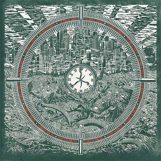
The Bug Vs Earth 12″ (Ninja Tune Records)
Artwork by Simon Fowler
Sounds by The Bug
– Simon Fowler, Artist
Simon Fowler (Artist):
For me, the classical imagery that comes to mind with such a title is extremely boring and cliché; for Kevin, too. So we brainstormed and picked apart various ideas until the cover was born. I wanted to convey some ambiguity between what defines and angel or a devil, falling from grace, transformation from good to evil and vice versa; from here, I found a lot of inspiration to explore a sort of world in decline, an end time scenario.It’s worth looking at the inner artwork for both the album and the Exit EP before getting onto the 12″ with Earth. The first image illustrate the moment of destruction and the second (Exit), the aftermath, an irradiated landscape.
The Bug Vs Earth 12″ is another look at that aftermath. fallen unexploded shells littering a landscape of irradiated mutating waste. The falling angel from the cover of the Exit EP is laying imaged on a spike before the clock the target is taking aim at. The city behind I suppose represents an island of wealth, ivory towers surrounded by an ever encroaching sea of detritus and mutation. On closer inspection, it’s also possible to pick out a fleet of drones flying over the horizon.”

Castle – Under Siege (Prosthetic Records)
Artwork by Denis Forkas Kostromitin
Sounds by Agusa

Denis Forkas Kostromitin (Artist):
I produced two paintings: The Dance of Asterion and The Golden Thread:

1. The Golden Thread (Duke of Athens and the Infamy of Crete)
I thought including a female figure in the original composition would create an additional resonance in the Castle context. In this painting the labyrinth and the beast are merged into the imposing figure of a brazen bull (I essentially split the beast into a bull and a man: the notorious torture device shaped as a bull and the skull beneath it). Ariadne attaches the golden thread to the foot of descending Theseus;2. The Dance of Asterion (as seen on the cover)
Here Asterion dances between the fires of initiation (the entrance to the labyrinth). The minotaur’s appearance has been borrowed from Bataille/Masson’s research of Nietzsche’s mythological symbolism, of course: the vision of an angry headless god (the head/fear is represented by the gorgoneion below; the searing Unconscious – by the star and the horns).

Denis Forkas Kostromitin (Artist):
In order to finalize the overall aesthetics of the project and following the example of great bands like Black Sabbath, Wishbone Ash, Deep Purple, etc., which changed their logo with each new album, I decided to do an all-new Castle logo. Figuring out the simple elegance took quite a bit of energy! It felt as if I were roaming around the palace without Ariadne’s thread! I have included subtle labyrinthine elements into the letters.Mat Davis (Castle):
The first song we wrote for the new album was “Labyrinth of Death”. From this song came a lot of the themes and overall concept that we explored musically and lyrically throughout the album. Musically, I was trying to create labyrinthine arrangements and touching on the labyrinth theme lyrically, both in a mythical and symbolical manner, to reinforce this musical effect. When we approached Denis with the concept, it was with great synchronicity that he had already been well into his own studies of very similar material. His conceptualization of the labyrinth as a physical embodiment of the beast/minotaur seemed to mirror our musical approach perfectly.Denis Forkas Kostromitin (Artist):
My ambition in both the paintings was to try and contain the vast mythological and philosophical subject in an instantly captivating piece suitable for an album cover. So aesthetic choices were directly defined by mythological symbolism, but they were also made to transcend it. You see, truly timeless mythological imagery doesn’t require extensive scholarly experience from a viewer. It rather bypasses all intellectual obstacles and touches the remotest strings of human psyche. In other words, in order to get inspired you don’t need to know the details of this and that story – you just need an image powerful enough to ignite your imagination. I hope to achieve that with my work.Mat Davis (Castle):
Denis has described the approach beautifully here. I could add the musical approach is very similar whereas the theme/concept gives direction to the writing process and we hope to the overall effect achieved but it’s not crucial for the listener to be aware of any of that to connect to the music. It can be enjoyed on different levels and in this way I think the art and music are very well-suited for each other.
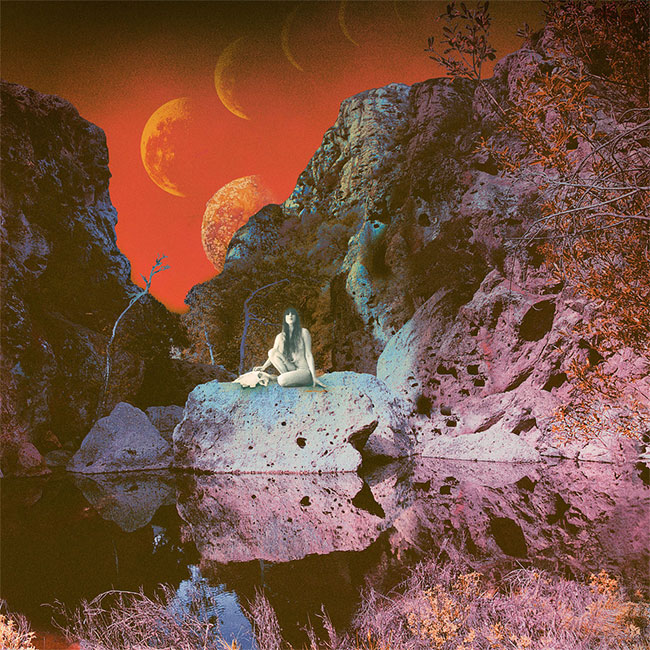
EARTH – Primitive And Deadly (Southern Lord Records)
Artwork & Photography by Samantha Muljat
Sounds by EARTH

Danny Daze – Silicon (Ultramajic)
Artwork by Jimmy Edgar and Pilar Zeta of Ultramajic
Sounds by Danny Daze

Silicon is basically an altar to the Sirius star system… [It] has a slinky in it because we needed to add more fun into it. It’s also a nice symbol, because it relates to vibration, movement, repetition.
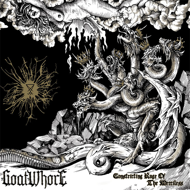
[Pilar Zeta and I] work together on separate computers in the same room, until our ideas merge and then we finish the piece together. We put on Janet Jackson and just make sure that we have the four pillars of Ultramajic present: fun, fashion, mystic and magic. Fun because we don’t want to be taken too seriously, fashion because we like to use current patterns when necessary and to be aware of how fixed time is important, mystic because something mysterious is always more enticing, and magic is obvious everything could use more magic.” – Jimmy Edgar, UltramajicGoatwhore – Constricting Rage of the Merciless (Metal Blade Records)
Artwork by Jordan Barlow
Concept & Design by Ben Falgoust of Goatwhore
Sounds by Goatwhore
Zack Simmons (Goatwhore):
Our good friend and artist, Jordan Barlow, and our singer, Ben, worked on the concept for the artwork and layout… Jordan is an old friend and had done tattoo work on all of us as well as the art for our previous album and numerous shirt designs. His style and approach fit very well into the aesthetic of this band and he and Ben work really well together to flesh out ideas. We’re all on the same page.Stylistically, we were going for an old woodcut look to avoid the cartoon kind of thing you see a lot of. The artwork itself really elaborates on the title and really brings that idea to life visually… There is definitely deeper symbolic meaning to a lot of the images and symbols in our artwork, especially with this album. You can find a lot of different sigils which represent different things. The sigil of Lucifer is a recurring one we have used since the beginning of the band. Some of the others you’ll have to do some homework and find out for yourself.
Giant Claw – Dark Web
Artwork by Ellen Thomas and Keith Rankin of Giant Claw
Sounds by Keith Rankin of Giant Claw

Keith Rankin (Giant Claw):
“I knew I was going to make a record that dealt with the idea of Transmodernism, basically toying with the perception of trends in past and present culture by embracing disparate musical strains and smashing them together. The goal was to have cultural reference, timbre, and compositional techniques that made sense independently, but also aligned with all the other elements at play. I started thinking about the concept in terms of layering realities, or at least letting my own variety of musical experiences intermingle to create new interactions and tensions.So for the cover, I wanted a visual equivalent of stacked realities, which entailed collecting imagery with heavy URL vs IRL meaning and history. I made a rough version of the piece digitally; then asked my partner and amazing painter Ellen Thomas to replicate the image using oils. She deserves all the credit for the beautiful rendering of the finished piece.
The Roman statue, the still life, the cell phone, the orb spewing ooze: all those elements I thought had multiple histories and contexts, or had taken on new meanings in the digital realm. Particularly something like the statue, which if you follow internet music closely, you’ll recognize as being an overused symbol for the vaporware scene. But obviously it’s also an esteemed art relic from a dead era, like an ancient precursor to a slowly decaying jpg or video file. I wanted there to be an almost surface level reading and a more submerged one – multiple layers that would be appreciated from either vantage point, even if one was entirely ignorant of the other.
Gravenhurst – Offerings (Warp Records)
Artwork by William Schaff
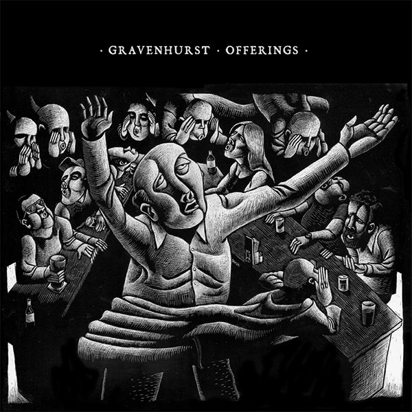
The piece wasn’t actually created for this album. It was a commission that asked me to give my response to the Biblical Story of Ezekiel, in the Valley of the Bones (Ezekiel Ch. 37: 1-14). One of the things I am appreciative about Nick is his ability to see my work – both that which has been done specifically for him, as well as other pieces, and feel a personal connection to it. I am honored that he saw this piece and felt such a strong connection to it that he wanted it to accompany his music.Whenever I have done a piece based on Biblical themes, I have often felt it important to place them in contemporary settings, as opposed to the stereotypical “ancient times” settings. So for me, thinking on the story, I chose a bar setting, with the patrons being those Ezekiel is prophesies to.
Editor’s Note: R.I.P. to Nick Talbot, aka Gravenhurst, who passed away in early December 2014. His responses at right are from what is likely one of his last interviews.
Since I met Will, there has been a recurring theme of serendipity linking our work. The only piece I commissioned him to create was used as the inside cover artwork for Flashlight Seasons. Originally, we wanted to use it as the front cover, but it was such a striking image – shocking even – that we came to the decision that we needed something simpler for the front cover, so we used Will’s piece on the inner sleeve. [It was] a peculiar figure piggy-backed by a parasitic twin, tramping their way through a forest surrounded by a coterie of paper chickens. But once we stopped making decisions and actually asking Will to provide artwork, strange and magickal things started to happen. Flashlight Seasons was quickly followed by Black Holes In The Sand, and we hadn’t even begun to think about artwork. But Will wrote to me around that time, and included the latest piece he was working on at the bottom of the email. It was a papercut of a bird of prey on a flowering branch. The title track to the record has the line, “I held the hand that threw the stone that killed the bird that woke the city/ And I could not feel the flower in my hand”. This was a remarkable incident of Jungian synchronicity, as Will had yet to hear the song or the record. Fast forward ten years. and we were looking for artwork for Offerings. Will had recently sent me his “Ezekiel in the Valley of the Bones” piece and it fit perfectly. Offerings is a collection of lost songs: songs I wasn’t sure about at the time; songs that got lost for reasons I cannot recall. Will’s piece fit this perfectly; it is exceptionally rich in multiple interpretations. To me, it looks like a performer of some kind, surrounded by indifferent bar flies while a balcony above appears to be populated by an audience booing the performer while he hold his hands aloft in despair, and a sinister cloaked figure rushes past him. My lyrics – at their best – are open to multiple interpretations; this is less evident on earlier records, but there are still moments of mystery, and as ever, Will’s work fits.
I Exist – From Darkness (Prosthetic Records)
Artwork by Richey Beckett
Design & Layout by Patrick Galvin
Sounds by I Exist
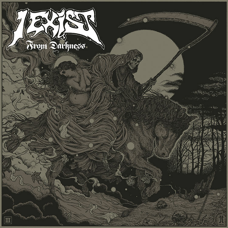
“For the band, our theme or plan for the album was for it to explore the themes of birth, life, and death in a time of war. The lyrical content of the record evolved around these ideas, so we wanted the artwork to reflect that. One of the concepts for the record was to have Death fathering a child, and how that child would grow to take his place in the world, and how the world is reacting to Death and the future of his existence. We tried to think up a lot of different ways this could be explored as an image and sent Richey our ideas.” – Aaron Osborne, Guitarist of I Exist
It’s always encouraging when a band approaches you with a clear idea in mind for the artwork. When it ties in with an overall theme that supports the record it adds such a greater depth than those bands who give you free reign but with nothing to inspire it. I immediately loved the idea of Death on horseback, as a really classic image, but more so having the pregnant figure added a dark, romantic but sinister feel to it. Having them passing through a post-war battlefield was a great way to suggest a greater story and I love the scope it had for interpretation.
– Richey Beckett, Artist
The way I see it, it’s my job to take the symbolic/thematic ideas and translate them into something aesthetically pleasing. I wouldn’t want either thing to be compromised, if possible. If you can communicate all of themes you want, and fit in motifs that really speak for the record, that’s the real aim, but at the same time it has to visually appealing and not become derailed by trying to perfectly explain the contents of the record. I think we hit the balance on this one. In the past I’ve struggled when bands want to fit way to many different things into a cover, or they want something really gorey or unpleasant that I’m not comfortable working with, or something that just doesn’t visually translate.. it’s not always as smooth sailing, but that comes down to these guys having a strong, focused and concise idea from the start.
The packaging for the record has a couple of different forms currently, Richey created the illustration of the cover and our friend Patrick Galvin, a great Graphic Designer worked with these illustrations to create the whole package. In Australia this was released as a 2xLP Gatefold with no insert and features elements of Richey’s illustration throughout and on the rear panel, with lyrics, credits etc added in by Patrick. The CD version and the single LP released internationally are slightly different with the inner workings of the art on an insert included with the album. We love that there are different formats of the album, and different versions of this record people can own, as collectors of records and art ourselves, we’re happy we’ve been able to offer some cool things to the people who listen to our music.
Richey Beckett (Artist): I really love what Patrick did with the layout. I only work on the illustration part, I create one single illustration for any record cover I do, with no digital editing or manipulation. So when I hand it over, I leave it in the hands of the band and whoever they decided should work on the layout/logos/graphic work. So there’s often a pretty big risk involved in that which can backfire. In this case, I was really thrilled with how it came out – the gatefold layout with the illuminated style text is beautiful and adds some real value for those who pick up the vinyl release. Patrick did a great job. Besides this, the band picked out a really nice paper stock for the CD version, which is important to me too. A nice heavy matte card, which smells really nice. The first thing I do when I open up a CD package is smell the paper, and this didn’t disappoint!
La Piramide Di Sangue – Sette (Sound of Cobra)
Artwork by Federico Zotta
Sounds by La Piramide Di Sangue
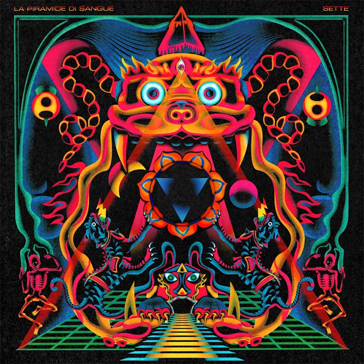
Federico Zotta (Artist):
I wanted to create a modern religious space age image with Tibetan, Nepali and Eastern aesthetics mixed with fluorescent neon colours from the West. I love the effect of bright neon colours on black and liked how they give the idea of suspension in an empty void, giving that feeling of creation coming from an outer world that wanted it.At first, in the middle of the lotus flowers in the cover, I drew a 3-headed Buddha-style alien, but then changed it with an easier version. In my mind, that one is still the “complete message” version, but the way I synthesized it probably is more straight and less confusing for the eye.
The cover is mostly an aesthetic choice, but we believe that symbols, forms and color have their own meanings, which can only be presumed. Other “rational meanings” are quite false and useless. It’s elaborate and extravagant like our sound… [there are] some references, like Cabiria‘s Moloch that eats people (the Italian [Giovanni] Pastrone’s movie shot in Turin in 1914)… Some Indian representations of gods and mandalas, and psychedelic illustration of the ’70s. We left the rest to Federico Zotta. We preferred not to interfere with the work of another artist. We only asked him to listen to the album. Some of us don’t like photography, so we wanted a painting or a drawing.
YOB – Clearing The Path To Ascend (Neurot Recordings)
Artwork & Design by Orion Landau
Sounds by YOB
![]()
“I had quite a few conversations with Mike Scheidt about where they were heading with this record prior to working on it. He was definitely going through a very transitional period, dealing with quite a bit of conflict but was also experiencing a lot of personal growth. I really wanted to convey that sense of expansion and spirituality that comes through struggle.
We started out playing with some pretty figurative imagery but quickly knew that the cover was going to be more about what we took out of it instead of what was being put into it. We wanted to somehow capture a meditative experience. A sense of inner peace in the midst of external distractions and conflict. I chose to paint this deep grey landscape that would initially convey a sense tranquility… but when you look deeper into it, you can see that there are jagged cliffs piercing the stormy skies. This is the external world, murky, dangerous and dark but also beautiful. The golden orbs represent the inner. They are intentionally stylized and abstract so that they could be interpreted as ascending spirit, or moonlike echoes, or even the three band members. I’m not sure that’s what I pulled off, but that’s what I was hoping people would feel when they viewed this.” – Orion Landau, Artist
Usurper of Modern Medicine – Omniliberation
Concept by Steven Aaron Hughes of Usurper of Modern Medicine
Illustration by Anne Barnetson
Design by Matthew Saville
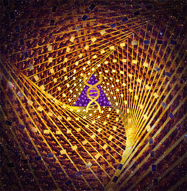
Steven Aaron Hughes (Usurper of Modern Medicine):
The centre of the image is a DNA helix that splits into two snakes. This is a symbol I created to represent the band name. It is a reference to the caduceus — the Greek symbol of two snakes entwined, which has been appropriated into a western medical symbol in modern times. I modified this concept to blend it into the DNA helix, the snakes breaking away, symbolising a breakdown of the genetic code, a symbol of evolution… This sits within a field of correlating geometric shapes arranged in a Fibonacci pattern. Aesthetically, nothing looks better to my eyes then the famous golden ratio. I was kind of obsessed with phyllotaxis seed patterns in nature when I was designing this image so couldn’t help but incorporate them. Fractals, man; gotta love them.I originally wanted heaps of Egyptian elements in the image. Floating golden pyramids in space. Ended up being too hard and busy for the image, so I just opted to put some pyramids on the inside cover instead. I’m still not happy with the final image in what I was trying to create, so maybe I’ll give it another shot on a future record, with the whole golden Egyptian space city I wanted in the first place.
To create the Fibonacci pattern, I used a program I discovered called GroBoto, which generates 3D patterns based on mathematical conditions. I’m not expert at that sort of stuff, but I found it real easy to figure out and make some great golden ratio things happen; check it out!
Vensaire – Perdix (Auraboros Records)
Artwork by John Stortz and Otium
Sounds by Vensaire
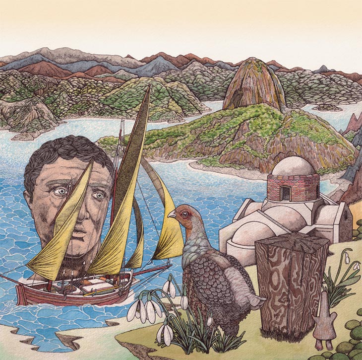
John Stortz and Otium (Artists):
The album is also somewhat in two parts; the first half has a man’s head looking off into the distance, and that represents the first half of the record which is a man searching for himself and his artistic creation (his Penelope). The second half of the record is a woman’s face and signifies the man finding other people and not being alone, an important step in becoming an artist is other people…The boat signifies the journey the man takes as he searches for himself; the uncarved block of wood and the wooden statue represent the idea that once you have created something you can never take that creation or action away, which is generally the concept of the Perdix allegory. The cave of flowers represents Calypso’s cave in the Odyssey, which has obvious references to femininity, closeness, fertility etc. but also represents human connection and discovering yourself through other people. There are many more symbols, like the sacred objects of the Japanese empire, the Iroha Momiji representing change, the Moly plant representing the story of Circe as well as self control, the grey partridge whose taxonomical name is Perdix Perdix. Sugar Loaf represents the carefree expression of an artist coming into his own and also the song Porteño. The Daidala in the bottom right corner (little statue) stands for the Motif “De-Da-La” in-between every song, as well as the the greek festival of reconciliation, which is also tied in with the funeral pyre which represents a cleansing which can be heard at the end of the record as well. The Penelope Obscura representing obscured artistic perfection. The Torii represents the crossing over from the world of the mundane to that of the spiritual realm. I think that is it for the symbols.
– John Stortz and Otium, Artists


[…] spin. That dynamic is well supported by the album’s cover art, a collage Noah recently told Redefine […]
[…] an album cover he designed for the Philadelphia based band Cassavetes was as picked as part of Redefine Mags“best album covers of 2014”. I thought it was aesthetically pleasing and not much else until I […]
Hey guys, l made that Mansions album art. Thanks for the inclusion! Can you add my name? – Jesse Treece
yes’m! if you have any website or insight to include, feel free to e-mail! huav@redefinemag.com
Cover photo for “To The Top” by Twin Shadow is incredible, I believe Milan Zrnic is the photographer
Indeed!!! An accidental one we forgot to include. Will make a note. Thank you!!