Historically-Inspired Album Covers of the Year 2014
American Heritage – Prolapse (Solar Flare Records)
Artwork by Allison Sommers
Design by Scott Shellhamer of American Heritage
Sounds by American Heritage
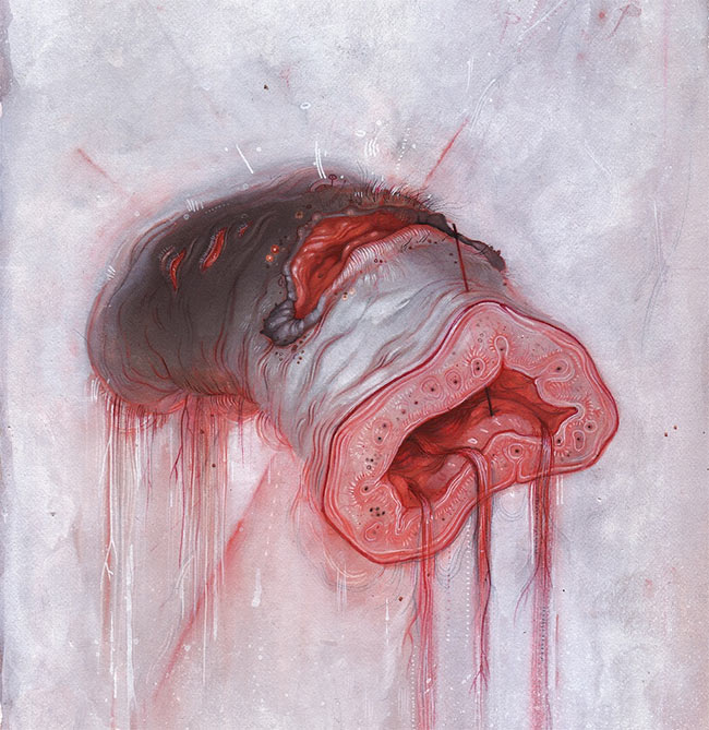
The piece is roughly based on the classic motif of Judith and Holofernes, which is rather common in Baroque and Renaissance painting. I like the thought of the verb of the act of beheading being visually absent, leaving only the artifact of the act — a sort of further disembodiment of character and context.I like to be somewhere in between the two poles, with the caveat that I employ a lot of things that masquerade as symbolism but represent nothing in particular. For instance, I use a lot of piercing of flesh in my work, which (at least, for me) hearkens back to the motif of the Agnus Dei, but I don’t necessarily mean to bring the contextual connotations into the work.
I do a lot of album artwork myself, but have a rule to never do artwork for my own band. I’ve done that in the past and ended up hating the album cover later. You can move on as an artist but that record is stuck in that period of your visual work. Allison is consistently churning out some my favorite contemporary work. She was my first choice. The painting used for the cover was a pre-existing piece that I felt conveyed the feel of the album really well. It’s a bit unsettling, and you’re not quite sure what to make of it. She made a great painting, and I feel really lucky to be able to have used it. I did the design / layout but we didn’t work together or exchange ideas, per se.
Bastard Sapling – Instinct Is Forever (Gilead Media)
Artwork & Illustration by Shaun Beaudry (heavily influenced by Zdzisław Beksinski)
Design & Layout by Adam Bartlett
Sounds by Bastard Sapling
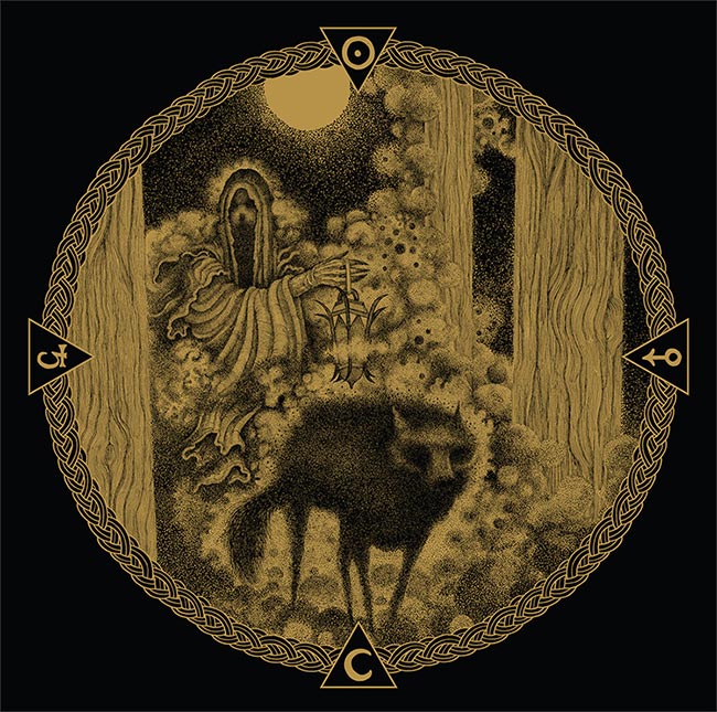
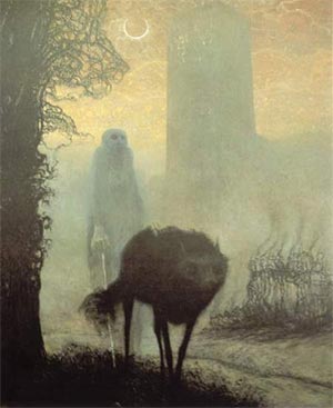
Shaun Beaudry (Artist): Pen and ink fits really well with the band’s musical aesthetics; it’s bold, raw, and a very visceral medium. Their music is very isolating, hence a isolated shrouded human figure, and a lone wolf. The figure is also a light bearer synonymous with Lucifer. The black triangles and the images inside them are alchemical symbols for metal.
Canopies – Maximize Your Faith (Forged Artifacts)
Artwork by Étienne-Louis Boullée (“Vue intérieure du Cénotaphe de Newton” – 1784)
Design by Craig Leren of Canopies

– Jake Brahm of Canopies
Jake Brahm (Canopies): Maximize Your Faith, as an album, includes a multitude of thematic elements, which were created utilizing an array of creative processes and immemorial equipment. Because of this abounding oblation, it was important to us that the album artwork be a representation of a simplified and overarching theme, while at the same time remaining aesthetically powerful and simple enough to convey the diversity of the music held within…
Because Étienne-Louis Boullée lost use of his physical being 215 years ago, direct collaboration with him was nearly impossible. However, multiple graphic designers were enlisted in an attempt to affix additional flourishes to the base image. These attempts proved largely futile, being as if the Shroud of Turin were Bedazzled by a wayward teen in the mid-nineteen eighties. At the end, our own Craig Leren was used as a medium to facilitate our collaborative decisions, which included the cropping of the original image, the extending of various aspects of that image, the addition of the border, and the placement of the album title and group name.
There were also several collaborative attempts made at creating a font that would accentuate Canopies and Maximize Your Faith. In the end, here too, our own Craig Leren came through with the best option. Culled from a 1960’s anti-war button that professed “DO IT FOR YOUR HEART”, the font gives thought to an eternal moment wherein time is not a specific point on a linear plane, but a possibility unto forever.”
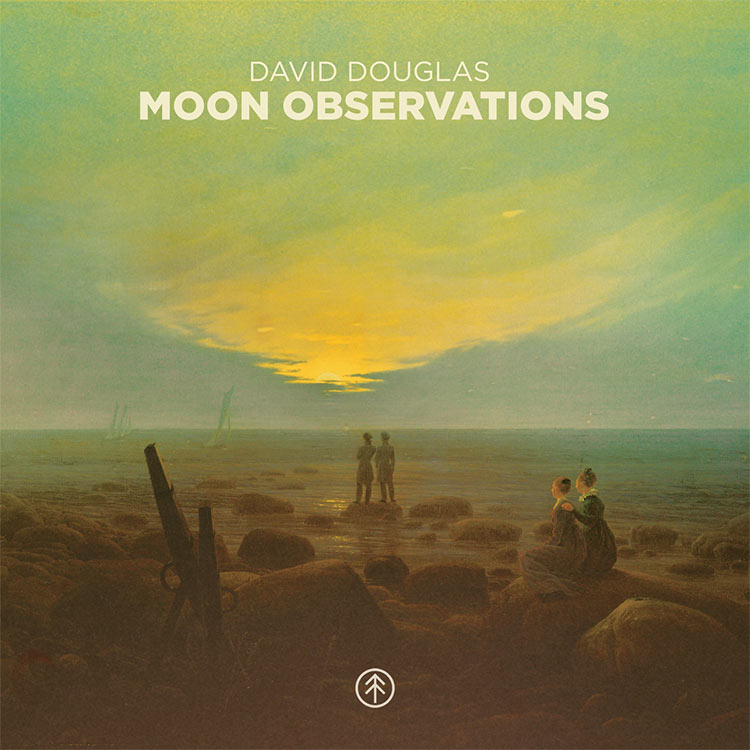
David Douglas – Moon Observations (Atomnation)
Artwork by Caspar David Friedrich
Design & Sounds by David Douglas
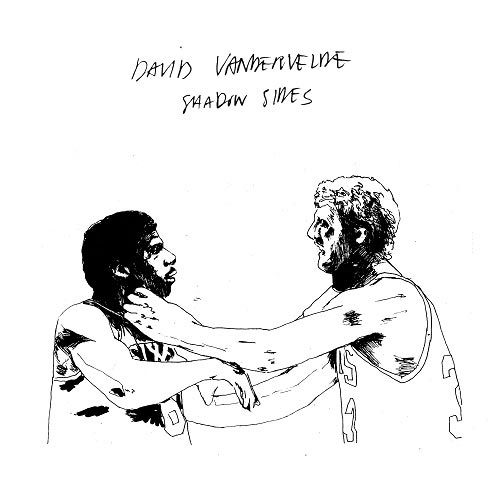
David Vandervelve – Shadow Sides (Secretly Canadian)
Artwork & Art Direction by Dirk Knibbe
Sounds by David Vandervele
Dignan Porch – Observatory (Faux Discx)
Illustration by Edmund Harris
Layout & Additional Illustration by Hayley Akins of Dignan Porch
Sounds by Dignan Porch

– Joseph Walsh, Dignan Porch
Joseph Walsh (Dignan Porch): I did a crude sketch of the logo and sent it to my illustrator friend Edmund Harris who did a great job drawing us some different versions that feature throughout the vinyl artwork and insert etc… The main clown image is from a magic trick book that’s around 100 years old (so no copyright issues); the trick is called ‘The Mysterious Ball’.
Our keyboard player Hayley drew additional artwork for the insert and arranged the layout, she also wrote the text for the band name on the front. Hayley animated Ed’s logo for a video playlist.
Del Venicci – Haunted Hall (Prima Satisfaction)
Artwork & Collage by Ross Politi
Creative Direction by Grace Bellury of Del Venicci
Sounds by Del Venicci

– Grace Bellury of Del Venicci
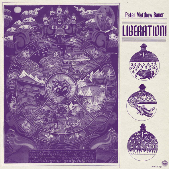
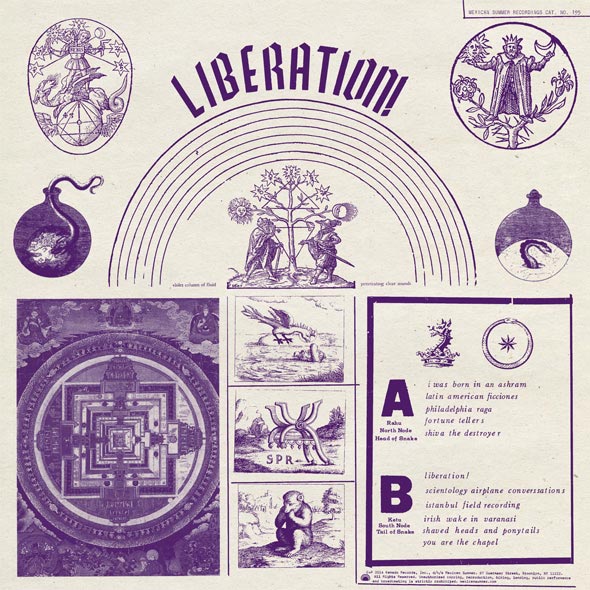
Peter Matthew Bauer – Liberation! (Mexican Summer)
Design & Layout by Rob Carmichael at SEEN Studio
Sounds by Peter Matthew Bauer
Primitive Parts – Open Heads / Signals (Faux Discx)
Artwork by Robin Christian of Primitive Parts
Sounds by Primitive Parts
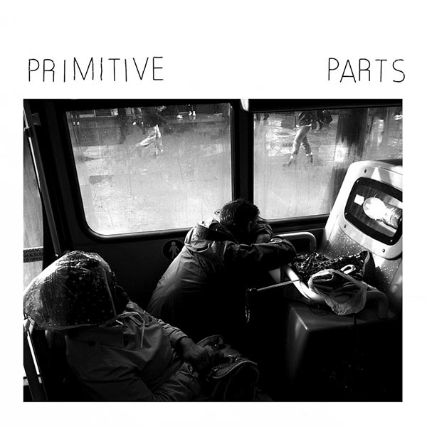
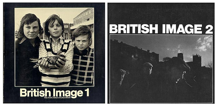
British Image 1, British Image 2, Arts Council of Great Britain, 1975 /1976
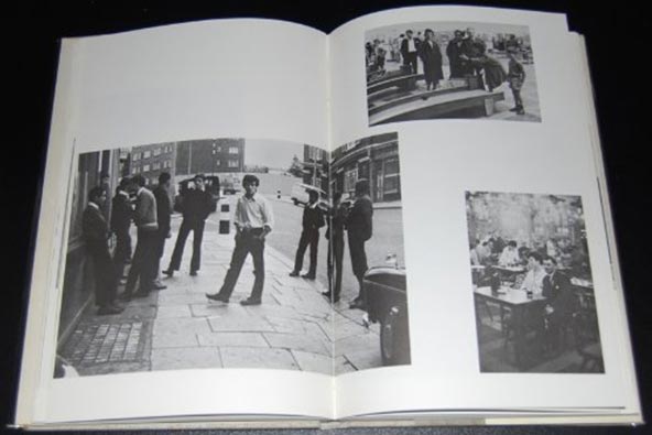
Euan Duff – How We Are, Hardcover, 1 September 1971
The Pop Group – Cabinet of Curiosities (Freaks R Us)
Artwork by Unknown
Sounds by The Pop Group
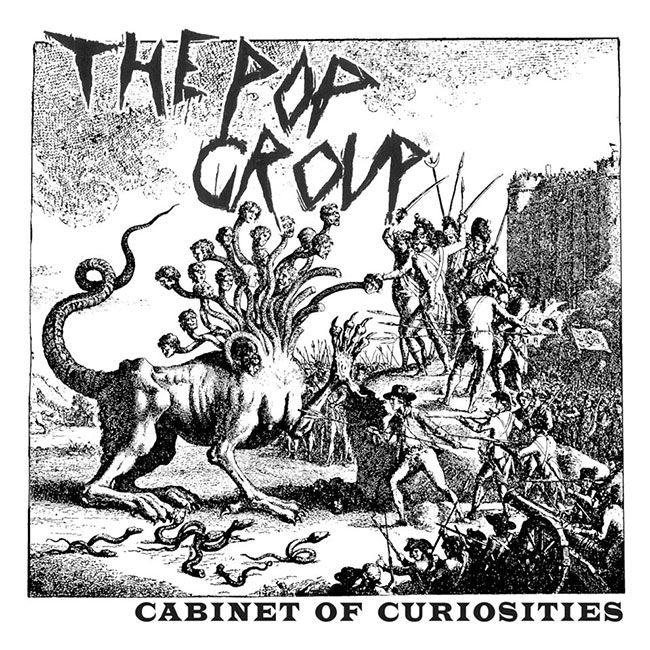
– Mark Stewart, Vocalist of The Pop Group
The Roofer’s Union – By Degrees (Flat Box Recordings)
Artwork by Joshua Yun
Sounds by The Roofer’s Union
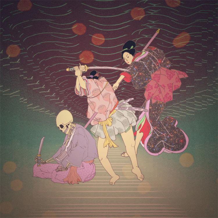
Joshua Yun (Artwork):
What ended up being the album artwork for By Degrees was originally the single art for “Man Kills God, Man Creates Dinosaur,” which is a reference to the classic Jurassic Park quote. In my interpretation, I implied the full dialogue in the scene: “Dinosaur eats man. Woman inherits Earth.” I wanted to emulate the traditional ukiyo-e style of Japanese art to bring light to a style that isn’t really present in Western art, much less album covers for cool bands.The skeleton is a reference to the giant, mythical skeletal spirit in Utagawa Kuniyoshi’s “Takiyasha the Witch and the Skeleton Spectre” (below), a really stunning print and one of my favorites. However, the skeleton here is chastised in defeat, modeled after Yoshitoshi Tsukioka’s illustration of General Akashi Gidayu, who is preparing for ritual suicide (right). If the seated skeleton is God, and the kaishakunin about to decapitate him is Man, then the onna-bugeisha is the badass female samurai that ends them both.
Kevin Walker (The Roofer’s Union):
We released limited edition cassettes for this record. We re-formatted the artwork to make it fit on a cassette J-card while still keeping the image centered on the cover. To compliment the artwork, we chose a clear Barney purple color for the tapes, which look so cool.
Woman’s Hour – Conversations (Secretly Canadian)
Artwork by Woman’s Hour and Broomberg & Chanarin
Sounds by Woman’s Hour
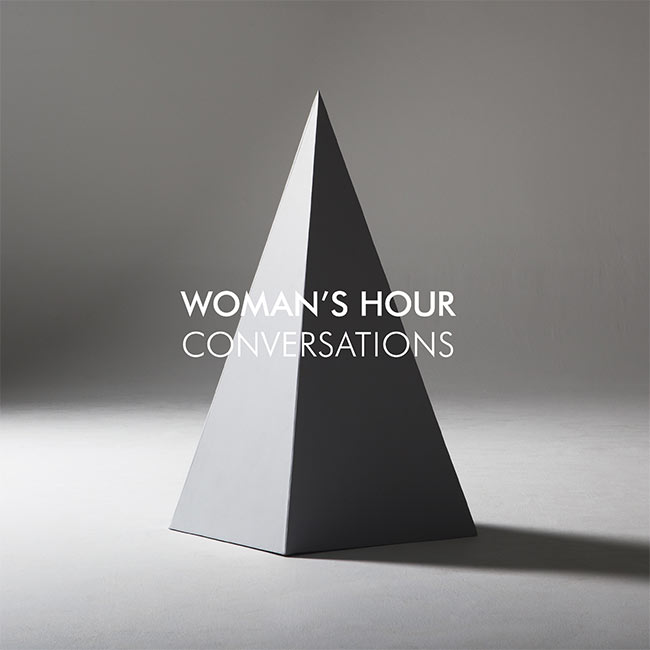
“We collaborated with the artists Adam Broomberg and Oliver Chanarin to create our album artwork. They have created all of our artwork with us for our singles and videos. Our collaboration began with a love of didactic images. Images that explain things; how to resuscitate a dying man, or put a chain on your Chihuahua, or fall over without hurting yourself. These are images made with a certain purpose, but they can be very beautiful too. Accidentally beautiful, which is what we like about them.
Ambiguity is important to us. In all our artwork, we strive to complicate the reading of the image by de-contextualising it. In most aspects, this happens by zooming in on one aspect of an image and re-appropriating it. In the same way an image can be understood differently depending on the context in which it is encountered, a song’s meaning can also change depending on who is listening and how they choose to interpret it.”
– Fiona Jane, Vocalist of Woman’s Hour
This photograph was the inspiration for our album artwork.
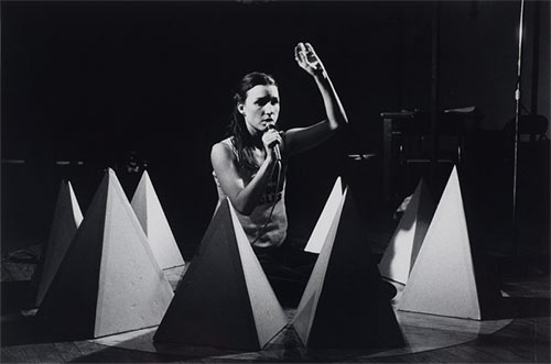
‘Jill Kroesen, The Original Lou and Walter Story, performance at The Kitchen 21-23 December 1978.’ Photo: Robert Alexander.
Wrekmeister Harmonies – Then It All Came Down (Thrill Jockey Records)
Artwork by Simon Fowler
Sounds by Wrekmeister Harmonies
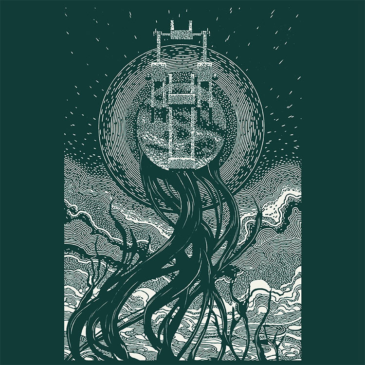
The album was conceived as a response to an essay written by Truman Capote in 1973 about an encounter he had with Bobby Beausoleil in San Quentin Prison. The essay posits many interesting ideas to me. Namely, the transition of light into darkness, which I viewed in a more metaphysical sense, and in conjunction with that, the idea of surrendering the self to total abandonment of preconceived ideals which conceivably would leave the individual lost, not knowing what lies ahead or if any actions or conversely reactions, would be “right”.I’ve always been an admirer of Simon Fowler’s artwork. He has a completely unique and engaging visual style that commands attention. Working with him on communicating my ideas is effortless.
When looking at both images together, the top panel’s perspective shifts from originally being a close-up to being a monolithic object in the sky raining down on the subject at the bottom.I also created a large format art print of the artwork in tandem with the album design; the prints are made from the exact same plates as the album jacket but feature some more elaborate details and a border pattern which again changes the perspective of the overall image, this time making it appear as if it’s framed by a brick window frame, suggesting we are observing the scene from a place of sanctuary or imprisonment. Possibly putting the viewer in the shoes of either Capote or Bobby Beausoleil, depending on how we choose to engage with the image and album track, I also recommend people [seek] out the essay (of the same title) by Capote, as it clearly has a lot of relevance to the project as a whole.
We worked together before on the first album, which was a smooth process. This time was no different; I appreciate how much trust J.R puts in me to reflect his vision. Also, having such potent material provided as a starting point always helps in achieving something we are both happy with. This, for me is the ultimate relationship when making a record jacket, as it’s enjoyable throughout.



[…] spin. That dynamic is well supported by the album’s cover art, a collage Noah recently told Redefine […]
[…] an album cover he designed for the Philadelphia based band Cassavetes was as picked as part of Redefine Mags“best album covers of 2014”. I thought it was aesthetically pleasing and not much else until I […]
Hey guys, l made that Mansions album art. Thanks for the inclusion! Can you add my name? – Jesse Treece
yes’m! if you have any website or insight to include, feel free to e-mail! huav@redefinemag.com
Cover photo for “To The Top” by Twin Shadow is incredible, I believe Milan Zrnic is the photographer
Indeed!!! An accidental one we forgot to include. Will make a note. Thank you!!