
Photography & Manipulation-Based Album Covers
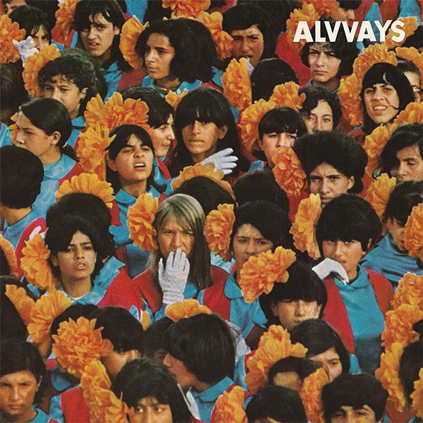
Alvvays – Alvvays (Polyvinyl Records)
Artwork by Unknown
Amen Dunes – Love (Sacred Bones Records)
Artwork by Tuomas Korpijaakko
Sounds by Amen Dunes

Love was not an easy title to illustrate. What I think drove the creation of the artwork, in the end, was the album. After having burned through a few ideas for what the art could have been, it wasn’t until we had both sat listening to the songs over and over that the artwork found us. In a way, we had to trash a lot of what we thought was an idea of Love, and let any themes or concepts we might have had disintegrate. In the end, we were left with just an atmosphere of the music and the image.I have to say that the picture is, in a way, very symbolic of what love is… because of the fact that I’m tied up in the picture’s narrative, personally. But aesthetically it fits quite perfectly. The mood, the color, the cosmos, contrasting with her nakedness point to how complicated an idea of love can be…
All images in Amen Dunes artwork are more than simply aesthetically pleasing. Not to get to get too theoretical about it all (since that is the opposite of what Amen Dunes is about), but the woman on the front could be said to be both subject and object of the title.We spent a long time trying to figure out what kind of image would represent the subtle or abstract nature of the title. There were several photo shoots of alternate ideas we tried, but none felt right. None felt simple enough. Then one day, I referred again to the photo Tuomas had hanging on his wall which he had always thought was too obvious. But when we tried it it was at once perfectly simple and simply complex, if you will. It was just obvious that it worked with the music and the broader message.
Tuomas Korpijaakko (Artist):
Yes, I had been living with the photo on my wall for a year or two. When you have artwork on your wall it just starts to become part of the wall… So the idea ofusing it for this album at first felt way too easy in a way. I always want to make something new and take most opportunities to do so. The original picture is 35mm, so you have a much wider frame where the figure is central, and the horizon extending out. After playing with the crop for a while, the picture really started to marry the energy of the album. It’s nice to find new strengths in an older artwork.
Ballet School – The Dew Lasts An Hour (Bella Union)
Art Direction by Nova Dando
Photography by Sophie Allen
Design by Nova Dando and Sophie Allen
Sounds by Ballet School
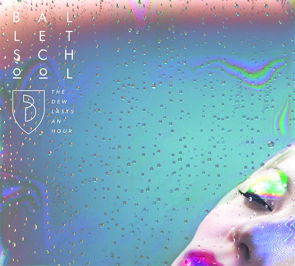
– Rosie Blair, Ballet School
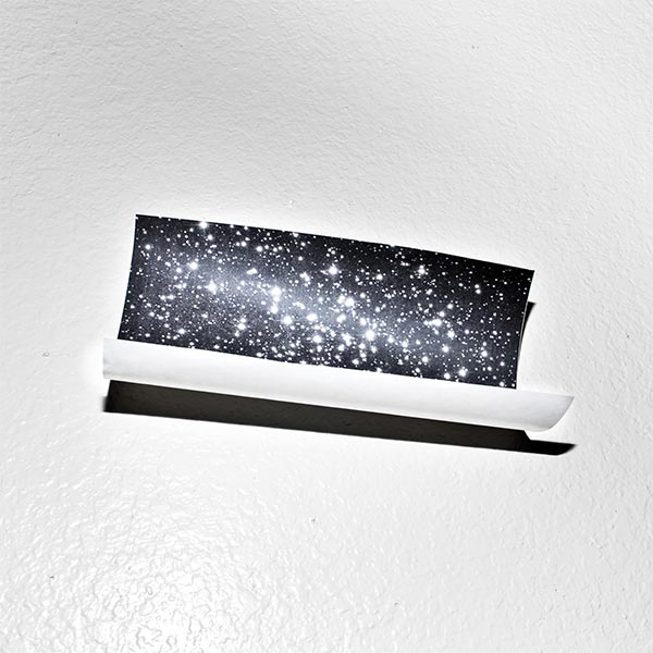
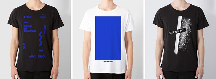
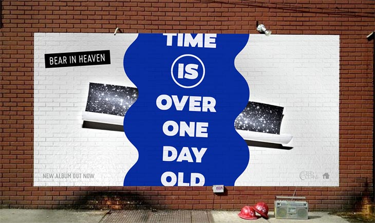
Bear In Heaven – Time Is Over One Day Old (Dead Oceans / Hometapes)
Art Direction & Design by Sadek Bazaara
Photography by Bobby Scheiddeman
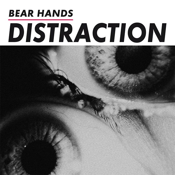
Bear Hands – Distraction (Cantora Records)
Artwork by Rebecca Cairns
Design & Layout by Charles Pailler
Sounds by Bear Hands
Ted Feldman (Bear Hands):
The photo is close up, intimate but jarring, claustrophobic, personal but universal. In my mind, the image fit in with some tones and lyrical themes on the album, and it worked in perfect contrast with some broad, saturated satellite photos we had picked out for single artwork.We took forever to decide on the layout. So many emails! Nick Panama of Cantora, our label, brought in a designer named Charles Pailler who is based in France. Nick and I had discussed some ideas before we had even decided on the image, but once we got into design, the two of them mocked up some options, and we went from there.
It is very difficult to find consensus in my band about anything — even where to eat lunch every day on tour. So you might imagine how many weeks it took of back and forth to satisfy all 4 of us plus Nick and the designer. Came down to the wire. Luckily, Nick and I are able to laugh from time to time about how exhausting a process it was. In spite of all the stress, I think we agree it was worth it in the end.
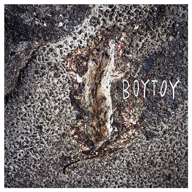
BOYTOY – BOYTOY (PaperCup Music)
Photography by Jesse Untracht-Oakner
Design by Saara Untracht-Oakner
Sounds by BOYTOY
Saara Untracht-Oakner (BOYTOY):
The image is a photo my brother, Jesse Untracht-Oakner had taken. He has a few photos of “smooshed” things. We sent him an inspiration board of the vibe we were looking for and he sent back a few choices, the road kill rat being one of them.Aesthetically, there are a few things going on that we all really liked. The pattern of the pavement looks like leopard print or some kind of animal print, and the rat is smooshed onto it so that some of the gravel pattern shows through on its coat. The rat is sort of camouflaged, and you have to stare at it at first to see what it really is.
Also, the rat seemed fitting for us. When I first moved back to NY from Boston, I moved in with Glenn in her Bushwick basement apartment where there were rats in the walls and ceilings that would keep me up at night and infiltrate my dreams. The first song we actually wrote together in that basement is called “Rat Blood.” We never released it but have a demo of it. Rats are everywhere in NY. I don’t go a day walking down the street without seeing one. Dead or alive. This is where we live.
FKA Twigs – LP1 (Young Turks)
Artwork by Jesse Kanda
Design by Phil Lee


Film – Eclipse (Inner Ear Records)
Artwork & Design by dB aka Dimitris Borsis of Film
Sounds by Film
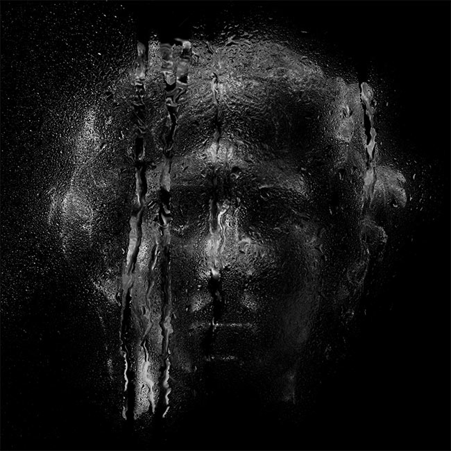
Dimitris Borsis (Film):
I used words from the lyrics as references and starting points to choose the images. But it was mostly aesthetically driven. For the cover, we needed something iconic and epic like a film’s poster and that statues head with the strict and sad enigmatic face expression mirrored exactly those characteristics. For the inner art parts, I used an image of a deer and one of tree brunches to complete the “dystopian” environment. The key element was the distortion of the wet glass in front of the images that added motion and brought out an abstractive and dramatic style, a different and emotional interpretation of the album’s title.The album was mostly recorded and produced with analogue instruments and equipment, so I decided to follow a more analogue process with the artwork. I wanted a physical optical effect to achieve a more authentic retro look. Instead of using filters and plugins for processing, I shot all images from the computer screen behind two layers of glass that I was spraying with water, to create and work with those distortions. It was really like simulating Photoshop layers in the real world outside the screen where there is no “undo” option, which I had to remind myself several times after hitting cmd+Z by habit. 🙂
Foxes In Fiction – Ontario Gothic (Orchid Tapes)
Artwork by Unknown
French For Rabbits – Spirits (Lefse Records)
Photography & Modeling by Misma Andrews
Sounds by French For Rabbits
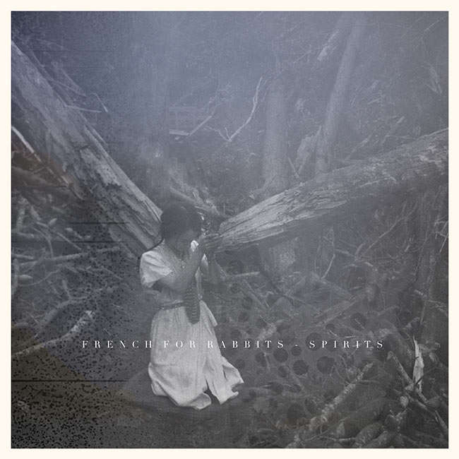
We met Misma Andrews not long after we moved to Wellington and started making music as French for Rabbits. I’d been admiring her photographs from afar and decided we should be friends! I love the dreamy aesthetic of her work, and that she only takes photos on film and experiments with developing processes — like soaking the film in whisky or hand painting the negatives. She has an incredible eye for light and emotions. She has taken many of our photographs, and also directed our music video for “Goat”, which is the one we are most proud of… and it was only her first time directing for video!
The photographs were taken in an area of forest close to where I live that had been greatly damaged by a huge storm; whole trees had been uprooted and the place had overnight become unrecognisable. The feeling I had in the creation of the photos was of a kind of healing ritual, performing a small act of love for the forest. And then later, they were later chosen by my dear friend Brooke as the album artwork. I haven’t asked Brooke specifically why she chose these pictures, but she has such a canny, clear vision for her music and its presentation that they must have struck the right balance between the two. I don’t think she would choose one over the other. And I think they tie in beautifully with the feel of the album: melancholic whimsy, characters engaged with, or at the mercy of the elements.
Holy Strays – ‘Pathless March’ x ‘Séance’ (Atelier Ciseaux)
Photography by Anthony Forrester
Design & Sounds by Sebastien Forrester of Holy Strays
“The picture I used to make the artwork of ‘Pathless March’ x ‘Séance’ was taken by my brother Anthony. The story behind it is pretty cool, as it’s closely linked to the way I finalized the two songs. Both of them didn’t have any drums at some point, and sounded more like floating improvisations. I was experimenting with a more traditional instrumentation.
On a trip to the west coast of France last December, my brother and I found ourselves in an abandoned submarine base in St. Nazaire, trying to hide from a pretty violent storm. We fell in love with the place and ended spending a whole day there, exploring every corner of the building, trying to draw from its unique atmosphere and rewriting its history. I finally made lots of field recordings, recorded percussions, claps, snaps, noises and vocals in the main room of the base. My brother took lots of weird pictures of the place and me making sounds there; one of them naturally ended up on the cover because it was the perfect reflection of the way the music was born. The experience naturally fed the concept in this case. We even decided to make a digital zine and a website to accompany the release, using the pictures, drawings I had made there and found documents. – Sebastien Forrester of Holy Strays
How To Dress Well – What Is This Heart? (Weird World)
Artwork by Unknown

Rome Fortune – Beautiful Pimp 2 (Self-Released)
Photography by Mike Kusumadjaja
Creative Direction & Sounds by Rome Fortune
Rome Fortune – Small VVorld (Self-Released)
Photography by Zoa
Creative Direction & Sounds by Rome Fortune

Rome Fortune:
Everything in the artwork is symbolic. The tub, myself, and the young lady symbolize being submerged in wealth, comfort, etc. That part of the cover is the fruits of your labor. Being too comfortable, you can overlook the evils that you initially fought through on your path to gain your position in life. The hand yielding the gun is the approach of that demise, capable of dethroning you. It’s a small world, and people rise and fall every single day.I already had the concept in mind but it needed to be captured in a specific way. That’s when I reached out to Zoa, whom I frequently do visual work with. I knew after explaining the concept she would know how to amplify that depth I wanted to showcase… I truly believe she’s one of the most naturally talented and resourceful people I’ve worked with.
Snowmine – Dialects (Mystery Buildings)
Artwork by Unknown

Spiritual Front – Open Wounds (Trisol)
Artwork by Unknown
Spoon – They Want My Soul (Loma Vista Recordings)
Art Direction & Design by Matthew Johnson, Todd Baxter, and Britt Daniel of Spoon
Photography by Todd Baxter
Styling by Sage Reed
Production by Aubrey Videtto
Todd Baxter (Photography):
Designer Matthew Jacobson and I teamed up to put together a whole package of images, merchandise, and possible music video concepts for Spoon’s 2014 album They Want My Soul. Matthew and I have collaborated on other album covers over the years, and he reached out to me after he and Britt talked through options, and Britt mentioned really liking the idea of working with me to make some iconic images for the cover and album insert.After about a million brainstorming sessions in collaboration with Britt, we all fell in love with the idea of using the visuals to tell the story of a young teenage girl waking up to a town taken over by some kind of a supernatural cult. We worked really closely with the band to polish the creative direction. And since I do my own post-production, we were in touch pretty steadily during that phase, since that’s when everything really comes together.
Originally, we thought we’d make about 12 images that would show up on the cover and in an insert in the LP. And there were several possible merchandise ideas to go along with the concept, including some that did come to life (like the bloody beach ball) and some that didn’t (like playing cards using the design that made its way onto the t-shirt).We stuck with the idea of the story we’d envisioned when making the images, and that let us make a cohesive body of work for the band to choose from for the album art. Not all of the images ended up in the album, I don’t think – but all of them were turned into a creepy, twisty music video (edited by Mau Morgó). Ultimately, it was up to Britt to decide what was the right image for the cover. All along he was wanting something iconic, and I think he made a good choice with the one he picked. It was a blast creating this whole world and story inspired by the music.


Total Control – Typical System (Iron Lung Records)
Art Direction & Design by Bart De Baets
Sounds by Total Control
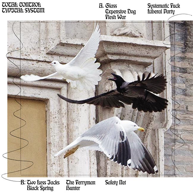
The idea of using that particular image on the cover was Bart’s, and it was an inspired choice, definitely. Because he is an expert typographer I really wanted to harness that, so I/we asked a range of different people to write material, all of which is quite disparate…I wanted to create the same sense of confusion people have when they look at the sleeve of the first album, only this time using words. The project became a bit full-on, and I ended up making the poster insert. It’s not very good. This is Bart’s first album sleeve, and he has done a stellar job.” – James Vinciguerra, Total Control, via Broadsheet
St. Vincent – St. Vincent (Loma Vista Recordings / Republic)
Creative Direction by Willo Perron
Design by Brian Roettinger
Photography by Renata Raksha

Vessel – Punish, Honey (Tri Angle Records)
Artwork by Harry Wright
Photography by Stephanie Elizabeth


Hey guys, l made that Mansions album art. Thanks for the inclusion! Can you add my name? – Jesse Treece
yes’m! if you have any website or insight to include, feel free to e-mail! huav@redefinemag.com
Cover photo for “To The Top” by Twin Shadow is incredible, I believe Milan Zrnic is the photographer
Indeed!!! An accidental one we forgot to include. Will make a note. Thank you!!
[…] spin. That dynamic is well supported by the album’s cover art, a collage Noah recently told Redefine […]
[…] an album cover he designed for the Philadelphia based band Cassavetes was as picked as part of Redefine Mags“best album covers of 2014”. I thought it was aesthetically pleasing and not much else until I […]