Album Covers of the Year 2014 Interviews

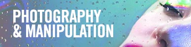
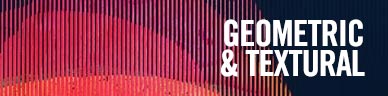
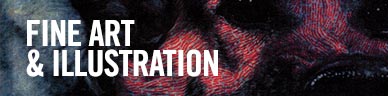
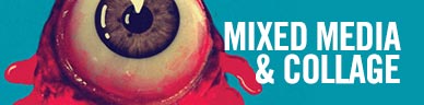
Psychology-Inspired Album Covers

Bleeding Rainbow – Interrupt (Kanine Records)

Artwork by Sarah Everton
Sounds by Bleeding Rainbow

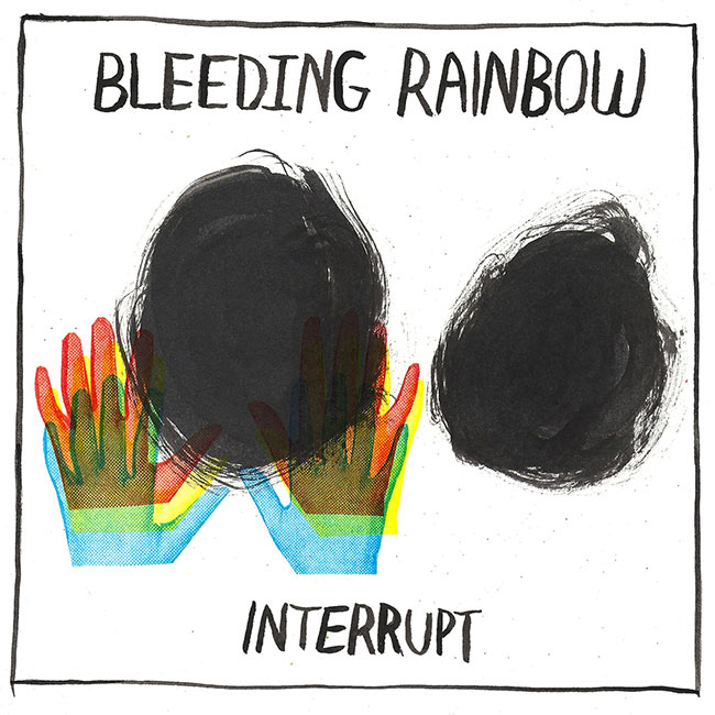
Sarah Everton (Bleeding Rainbow):
With both Interrupt and our previous album, Yeah Right, I was thinking a lot about black holes as a metaphor and used that concept in the artwork. Specifically, I was thinking about the mind as a black hole where thoughts, obligations, and memories become distorted and overwhelming. Also on my mind was the concept of negative capability which is this philosophical idea about human beings viewing limitations placed on them as changeable. Therefore, I see the cover of Interrupt as being a beautiful repurposing of stressful and stifling circumstances.

As far as the aesthetic goes, I wanted to combine punk flyer Xerox (the hands are photocopied) with abstract mid-century modern art vibe and extreme simplicity — right to the point, like the album’s songs. (Abstract mid-century modern art meaning specifically work by Robert Rauschenberg, Cy Twombly, and this one painting called “Rolling” by Adolph Gottlieb.)

The hands are there to represent anybody — women or men — because I didn’t want to use a typical repurposed sexy ’60s girl cut out from an old magazine for instance. The hands are out like they are trying to stop from being sucked into the black holes; but also, they’re making trails like you’re tripping on LSD.


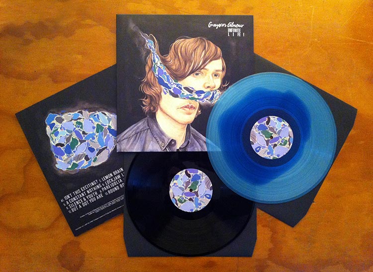
Grayson Gilmour – Infinite Life! (Flying Nun Records)

Artwork by Henrietta Harris
Sounds by Grayson Gilmour

Infinite Life! is very much a existential album, musing over themes of love, life and what lies beyond… intangible thoughts, meaning and meaninglessness in everything, the quasi-philosophical wonder that one should experience in their 20s! For this reason, I think, the album cover had to convey some kind of serene acceptance of this maelstrom… Henrietta has a really striking style of portraiture that I’m a fan of, which was why I asked her to collaborate with me. In terms of symbolism, the psychedelic split in my head is the physical representation of all the overwhelming thought I mentioned earlier, the flipside of the LP leaving only a lone cloud of thought, floating in the black ether…” – Grayson Gilmour

Gem Club – In Roses (Hardly Art)

Artwork by Yinling Hsu
Sounds by Gem Club

“These images talk about a way to find the sense of belonging for me or for other human beings. It might as well be kids playing house, everyone and everything in the world just like the equipments or facilities that make the world become more complete, so they always impersonate that which is outside themselves.” – Yinling Hsu, Artist

Christopher Barnes (Gem Club):
I found Yinling Hsu’s paintings online. I was instantly drawn to them. This painting is from her series, longevity club. Since she lives in Taipei, I wasn’t sure if I’d be able to even get in touch with her, let alone use the painting for the cover of the record, so I kept searching for alternatives. All throughout the recording process, I kept coming back to this painting. I became obsessed. I was very excited when she agreed to lend her art to the album cover.

I recorded this album to tape at an analogue studio. I think, in part, it was appropriate to look for an artist that worked in traditional media — that whatever was on the cover have a more tactile quality to it. Many of the songs on this record deal with detachment, loss, and uncertainty. Her painting embodies this atmosphere. At first it looks a bit ordinary, until you spend some time with it. Slowly, everything is a bit off — the space, the content, the characters. I love this. Everything feels disjointed and somewhat alienated from its surroundings.

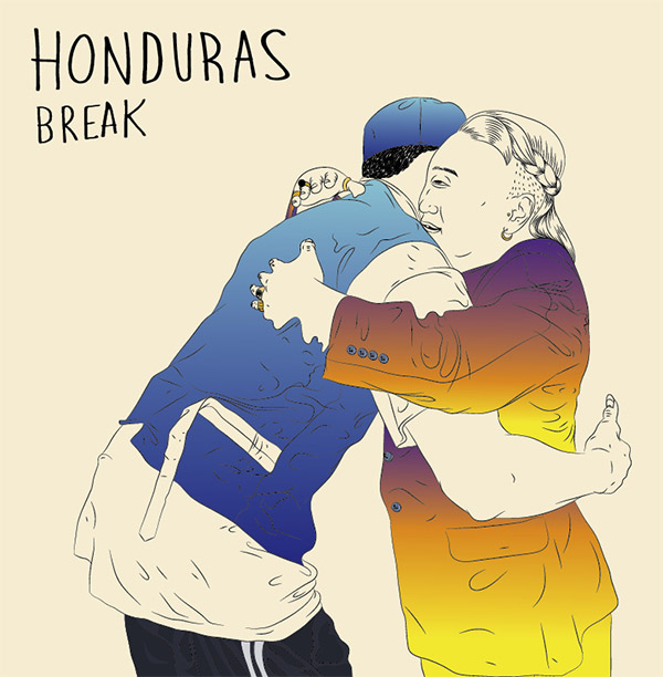
Honduras – Break EP (Black Bell Records)

Artwork by Dan G. Windsor
Design & Layout by Nicole Cody
Sounds by Honduras

“My idea was to visualize a warm fuzzy feeling… something that didn’t fit the word “break”. The 2 characters have this unnatural sick embrace because of how “unsuitable” they are for another… [Band member] Josh [Wehle] had a great idea to use the back side of the EP to show the reverse viewpoint of the scene you see on the front. There are some subtle, weird things happening on the front if you look closely, but things take a darker turn on the back.” – Dan G. Windsor, Artist

Magic Fades – Push Thru (1080p)

Artwork by Jan Gieseking
Sounds by Magic Fades

“We really like the rendered human figures because they have this cold, clean quality to them, which I think goes well with the music style. If you look at our other album cover, by Faux/Real, it also has this kinda abstract, minimal look to it, which we definitely wanted to be a thread through our album aesthetic.”
– Mike Grabarek, Magic Fades
Jan Gieseking (Artist):
I got the album in advance and listened to it quite a lot. Mike and Jeremy had a pretty clear vision to stay true to the title, and we took it from there. The work process was great and rapid which I really enjoyed; using social media to emerge in conversation it was a very fluent process…People write me that they really like the cover and that it reminds them of a lot of different popular culture/media examples that I really never had in mind or didn’t even know.

Mike Grabarek (Magic Fades):
We knew that we wanted something clean and computer-rendered because we thought it would complement the production. The concept was just of this person pushing through a plane/grid…. You can see in the image that the main figure actually has their hand on another figure’s head, using it to push off… [it] is kinda supposed to represent the fact that in order to get somewhere, sometimes people will resort to using somebody else to achieve their goals. Kinda dark, I know.

Monokino – Fake Virtue (Modern Sky / Zip Records)

Artwork by Rachell Sumpter
Sounds by Monokino

“We basically wanted the album artwork of Fake Virtue to be a portrayal of human characteristics. It should, for example, reflect the human abilities to convince and empower, as well as to manipulate and deceive… The work of Rachell Sumpter was chosen because of the intensity of richness of colours, as well as the presence of the horses. We wanted an image in which you can immerse yourself completely, and which represents some form of human complexity. We think the horses in the colour field nicely represent the human capability of showing different virtues, which may or may not be sincere.” – Monokino

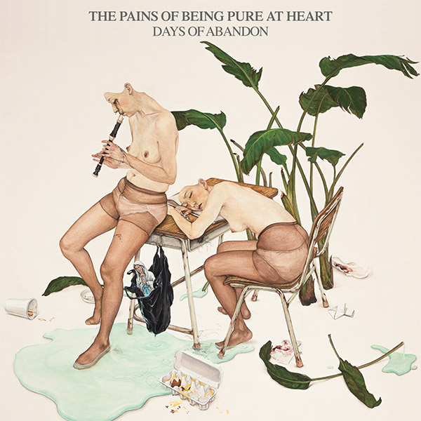
The Pains of Being Pure at Heart – Days of Ambition (Yebo Music)

Artwork by Jinju Lee
Design & Layout by Brian Arnold
Sounds by The Pains of Being Pure at Heart

“The work used as a cover, The Substance of Mind (2010) is about the emotions that cannot be removed no matter how hard I tried to avoid or deny. I used Korean traditional colors and technique to describe ‘psycho landscape’ that is very realistic and also unfamiliar. I’m showing the space of simultaneity here. That is, I mix ‘everyday life of present’, and ‘spaces and emotions of the past that were left behind’ together in one frame, like a melting pot. And also I make a stage by putting some egoistic persons (who transfer in time) in the frame.” – Jinju Lee, Artist

The Skygreen Leopards – Family Crimes (Woodsist Records)

Artwork by Glenn Donaldson of The Skygreen Leopards
Sounds by The Skygreen Leopards

“Although somewhat tongue-in-cheek, the title Family Crimes refers to the crimes your family commits against you. We made an album of suburban tales and domestic conflict. The cover art is an abstracted bedroom scene. I associate living in the suburbs with being depressed and staring out the window, trying to hide from problems behind closed doors. The skull is the terror and inevitability of real life cascading in the window. It eventually perches on the night stand. The orange refers to Orange County California, a suburb where I grew up. The socks represent psychic baggage, as we all keep personal things hidden in sock drawers… The collage images come from 1970s educational children’s books, mostly found discarded on the street.” – Glenn Donaldson, Vocalist and Guitarist of The Skygreen Leopards

Triathalon – Lo-Tide (Broken Circles Records)

Photography by Lucy Prouty
Additional Design by Alex Previty and Chad Chilton of Triathalon
Sounds by Triathalon

“The album’s theme is solely based on coming to terms with what comes after one stage of your life is complete while letting go of those around you who are moving on to something else. The album was written close to summer’s end and the beginning of last fall. The two people in the pool represent that strange transition of seasons. I wanted to emphasize the emotion that one can feel when someone close to them leaves. In the photo, one person is facedown and the other is standing up; this strongly depicts that feeling.” Adam Intrator, Triathalon

Adam Intrator (Triathalon):
This album cover is reminiscent of our first EP, Relationships, that we released in 2011, which is a guy laying face first in ocean water. It happens to be a close friend of ours who is in that photo. I thought it was fitting stylistically for our first release and our latest release to have a similar feel. It just seemed like a very natural and fitting progression…

The photo was taken by a close friend, Lucy Prouty. I actually saw it a few years back, and right away, knew I would forever use it as an album cover. I’m really thankful she let us use it for the album. The photo has so much meaning and creates such an interesting aesthetic.


We Were Promised Jetpacks – Unravelling (Fat Cat Records)

Artwork by DLT
Sounds by We Were Promised Jetpacks

“It started off with us wanting to capture an image, situation of a feeling of something that was delicately balanced. The idea was if one variable changed, the whole thing would fall apart. Then after a while, we realised we wanted something that would grab your attention and make you look closer and that there should be something unsettling bubbling under the surface that wasn’t immediately apparent… I think the artwork looks cool and interesting but also expresses a person’s underlying frustration and confusion, and also conveys the idea that everyone may appear normal but just underneath the surface, everyone has the potential to be a little unstable.” – We Were Promised Jetpacks

1 2 3 4 5 6 7 8 9 10 11

Written by
Vee Hua 華婷婷

Vee Hua 華婷婷 (they/them) is a writer, filmmaker, and organizer with semi-nomadic tendencies. Much of their work unifies their metaphysical interests with their belief that art can positively transform the self and society. They are the Editor-in-Chief of REDEFINE, Interim Managing Editor of South Seattle Emerald, and Co-Chair of the Seattle Arts Commission. They also previously served as the Executive Director of the interdisciplinary community hub, Northwest Film Forum, where they played a key role in making the space more welcoming and accessible for diverse audiences.

Vee has two narrative short films. Searching Skies (2017) touches on Syrian refugee resettlement in the United States; with it, they helped co-organize The Seventh Art Stand, a national film and civil rights discussion series against Islamophobia. Reckless Spirits (2022) is a metaphysical, multi-lingual POC buddy comedy for a bleak new era, in anticipation of a feature-length project.

Vee is passionate about cultural space, the environment, and finding ways to covertly and overtly disrupt oppressive structures. They also regularly share observational human stories through their storytelling newsletter, RAMBLIN’ WITH VEE!, and are pursuing a Master’s in Tribal Resource and Environmental Stewardship under the Native American Studies Department at the University of Minnesota.

View all articles
Subscribe
Notify of
guest

6 Comments
Oldest
Newest Most Voted
Inline Feedbacks
View all comments
trackback

[…] spin. That dynamic is well supported by the album’s cover art, a collage Noah recently told Redefine […]

trackback

[…] an album cover he designed for the Philadelphia based band Cassavetes was as picked as part of Redefine Mags“best album covers of 2014”.  I thought it was aesthetically pleasing and not much else until I […]

jesseLT
jesseLT
9 years ago

Hey guys, l made that Mansions album art. Thanks for the inclusion! Can you add my name? – Jesse Treece

sOopahvi
sOopahvi
9 years ago
Reply to  jesseLT

yes’m! if you have any website or insight to include, feel free to e-mail! huav@redefinemag.com

Qualifying
Qualifying
9 years ago

Cover photo for “To The Top” by Twin Shadow is incredible, I believe Milan Zrnic is the photographer

sOopahvi
sOopahvi
9 years ago
Reply to  Qualifying

Indeed!!! An accidental one we forgot to include. Will make a note. Thank you!!

Written by Vee Hua 華婷婷
6
0
Would love your thoughts, please comment.x
()
x